February linkfest

The linkfest is back! All the best bits from the news feed. Tips? Get in touch.

The latest QGIS — the free and open-source GIS we use — dropped last week. QGIS v2.8 'Wien' has lots of new features like expressions in property fields, better legends, and colour palettes.

On the subject of new open-source software, I've mentioned Wayne Mogg's OpendTect plug-ins before. This time he's outdone himself, with an epic new plug-in providing an easy way to write OpendTect attributes in Python. This means we can write seismic attribute algorithms in Python, using OpendTect for I/O,project management, visualization, and interpretation. 

It's not open source, but Google Earth Pro is now free! The free version was pretty great, but Pro has a few nice features, like better measuring tools, higher resolution screen-grabs, movies, and ESRI shapefile import. Great for scoping field areas.

Speaking of fieldwork, is this the most amazing outcrop you've ever seen? Those are house-sized blocks floating around in a mass-transport deposit. If you want to know more, you're in luck, because Zane Jobe blogged about it recently.  (You do follow his blog, right?)

By the way, if sedimentology is your thing, for some laboratory eye-candy, follow SedimentExp on Twitter. (Zane's on Twitter too!)

If you like to look after your figures, Rougier et al. recently offered 10 simple rules for making them better. Not only is the article open access (more amazing: it's public domain), the authors provide Python code for all their figures. Inspiring.

Open, even interactive, code will — it's clear — be de rigueur before the decade is out. Even Nature is at it. (Well, I shouldn't say 'even', because Nature is a progressive publishing hose, at the same time as being part of 'the establishment'.) Take a few minutes to play with it... it's pretty cool. We have published lots of static notebooks, as has SEG; interactivity is coming!

A question came up recently on the Earth Science Stack Exchange that made me stop and think: why do geophysicists use \(V_\mathrm{P}/V_\mathrm{S}\) ratio, and not \(V_\mathrm{S}/V_\mathrm{P}\) ratio, which is naturally bounded. (Or is it? Are there any materials for which \(V_\mathrm{S} > V_\mathrm{P}\)?) I think it's tradition, but maybe you have a better answer?

On the subject of geophysics, I think this is the best paper title I've seen for a while: A current look at geophysical detection of illicit tunnels (Steve Sloan in The Leading Edge, February 2015). Rather topical just now too.

At the SEG Annual Meeting in Denver, I recorded an interview with SEG's Isaac Farley about wikis and knowledge sharing...

OK, well if this is just going to turn into blatant self-promotion, I might as well ask you to check out Pick This, now with over 600 interpretations! Please be patient with it, we have a lot of optimization to do...

Rock property catalog

RPC.png

One of the first things I do on a new play is to start building a Big Giant Spreadsheet. What goes in the big giant spreadsheet? Everything — XRD results, petrography, geochemistry, curve values, elastic parameters, core photo attributes (e.g. RGB triples), and so on. If you're working in the Athabasca or the Eagle Ford then one thing you have is heaps of wells. So the spreadsheet is Big. And Giant. 

But other people's spreadsheets are hard to use. There's no documentation, no references. And how to share them? Email just generates obsolete duplicates and data chaos. And while XLS files are not hard to put on the intranet or Internet,  it's hard to do it in a way that doesn't involve asking people to download the entire spreadsheet — duplicates again. So spreadsheets are not the best choice for collaboration or open science. But wikis might be...

The wiki as database

Regular readers will know that I'm a big fan of MediaWiki. One of the most interesting extensions for the software is Semantic MediaWiki (SMW), which essentially turns a wiki into a database — I've written about it before. Of course we can read any wiki page over the web, but you can query an SMW-powered wiki, which means you can, for example, ask for the elastic properties of a rock, such as this Mesaverde sandstone from Thomsen (1986). And the wiki will send you this JSON string:

{u'exists': True,
 u'fulltext': u'Mesaverde immature sandstone 3 (Kelly 1983)',
 u'fullurl': u'http://subsurfwiki.org/wiki/Mesaverde_immature_sandstone_3_(Kelly_1983)',
 u'namespace': 0,
 u'printouts': {
    u'Lithology': [{u'exists': True,
      u'fulltext': u'Sandstone',
      u'fullurl': u'http://www.subsurfwiki.org/wiki/Sandstone',
      u'namespace': 0}],
    u'Delta': [0.148],
    u'Epsilon': [0.091],
    u'Rho': [{u'unit': u'kg/m\xb3', u'value': 2460}],
    u'Vp': [{u'unit': u'm/s', u'value': 4349}],
    u'Vs': [{u'unit': u'm/s', u'value': 2571}]
  }
}

This might look horrendous at first, or even at last, but it's actually perfectly legible to Python. A little bit of data wrangling and we end up with data we can easily plot. It takes no more than a few lines of code to read the wiki's data, and construct this plot of \(V_\text{P}\) vs \(V_\text{S}\) for all the rocks I have so far put in the wiki — grouped by gross lithology:

A page from the Rock Property Catalog in Subsurfwiki.org. Very much an experiment, rocks contain only a few key properties today.

A page from the Rock Property Catalog in Subsurfwiki.org. Very much an experiment, rocks contain only a few key properties today.

If you're interested in seeing how to make these queries, have a look at this IPython Notebook. It takes you through reading the data from my embryonic catalogue on Subsurfwiki, processing the JSON response from the wiki, and making the plot. Once you see how easy it is, I hope you can imagine a day when people are publishing open data on the web, and sharing tools to query and visualize it.

Imagine it, then figure out how you can help build it!


References

Thomsen, L (1986). Weak elastic anisotropy. Geophysics 51 (10), 1954–1966. DOI 10.1190/1.1442051.

Minecraft for geoscience

The Isle of Wight, complete with geology. ©Crown copyright. 

The Isle of Wight, complete with geology. ©Crown copyright. 

You might have heard of Minecraft. If you live with any children, then you definitely have. It's a computer game, but it's a little unusual — there isn't really a score, and the gameplay has no particular goal or narrative, leaving everything to the player or players. It's more like playing with Lego than, say, playing chess or tennis or paintball. The game was created by Swede Markus Persson and then marketed by his company Mojang. Microsoft bought Mojang in September last year for $2.5 billion. 

What does this have to do with geoscience?

Apart from being played by 100 million people, the game has attracted a lot of attention from geospatial nerds over the last 12–18 months. Or rather, the Minecraft environment has. The game chiefly consists of fabricating, placing and breaking 1-m-cubed blocks of various materials. Even in normal use, people create remarkable structures, and I don't just mean 'big' or 'cool', I mean truly remarkable. So the attention from the British Geological Survey and the Danish Geodata Agency. If you've spent any time building geocellular models, then the process of constructing elaborate digital models is familiar to you. And perhaps it's not too big a leap to see how the virtual world of Minecraft could be an interesting way to model the subsurface. 

Still I was surprised when, chatting to Thomas Rapstine at the Geophysics Hackathon in Denver, he mentioned Joe Capriotti and Yaoguo Li, fellow researchers at Colorado School of Mines. Faced with the problem of building 3D earth models for simulating geophysical experiments — a problem we've faced with modelr.io — they hit on the idea of adapting Minecraft models. This is not just a gimmick, because Minecraft is specifically designed for simulating and manipulating landscapes.

The Minecraft model (left) and synthetic gravity data (right). Image ©2014 SEG and Capriotti & Li. Used in acordance with SEG's permissions. 

The Minecraft model (left) and synthetic gravity data (right). Image ©2014 SEG and Capriotti & Li. Used in acordance with SEG's permissions

If you'd like to dabble in geospatial Minecraft yourself, the FME software from Safe now has a standardized way to get Minecraft data into and out of the environment. Essentially they treat the blocks as point clouds (e.g. as you might get from Lidar or a laser scan), so they can do conventional operations, such as differences or filtering, with the software. They recorded a webinar on the subject yesterday.

Minecraft is here to stay

There are two other important angles to Minecraft, both good reasons why it will probably be around for a while, and probably both something to do with why Microsoft bought Mojang...

  1. It is a programming gateway drug. Like web coding, and image processing, Minecraft might be another way to get people, especially young people, interested in computing. The tiny Linux machine Raspberry Pi comes with a version of the game with a full Python API, so you can control the game programmatically.  
  2. Its potential beyond programming as a STEM teaching aid and engagement tool. Here's another example. Indeed, the United Nations is involved in Block By Block, an effort around collaborative public space design echoing the Blockholm project, an early attempt to explore social city planning in the tool.

All of which is enough to make me more curious about the crazy-sounding world my kids have built, with its Houston-like city planning: house, school, house, Home Sense, house, rocket launch pad...

References

Capriotti, J and Yaoguo Li (2014) Gravity and gravity gradient data: Understanding their information content through joint inversions. SEG Technical Program Expanded Abstracts 2014: pp. 1329-1333. DOI 10.1190/segam2014-1581.1 

The thumbnail image is from an image by Terry Madeley.

UPDATE: Thank you to Andy for pointing out that Yaoguo Li is a prof, not a student.

What is anisotropy?

anisotropy_vs_heterogeneity.png

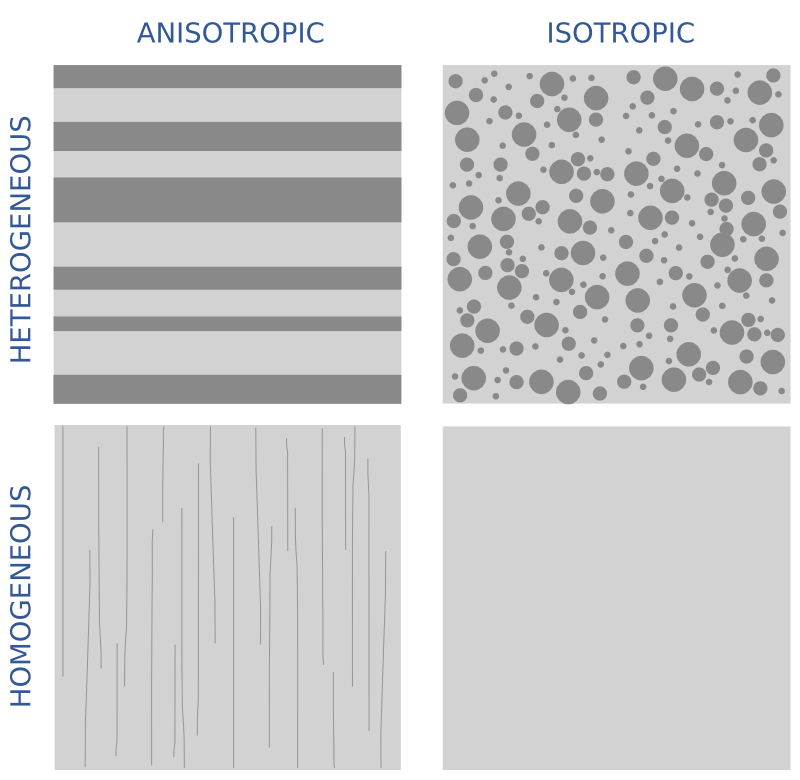
Geophysicists often assume that the earth is isotropic. This word comes from 'iso', meaning same, and 'tropikos', meaning something to do with turning. The idea is that isotropic materials look the same in all directions — they have no orientation, and we can make measurements in any direction and get the same result. Note that this is different from homogeneous, which is the quality of uniformity of composition. You can think of anisotropy as a directional (not just spatial) variation in homogeneity. 

In the illustration, I may have cheated a bit. The lower-left image shows a material that is homogeneous but anisotropic. The thin lines are supposed to indicate microfractures, say, or the alignment of clay flakes, or even just stress. So although the material has uniform composition, at least at this scale, it has an orientation.

The recognition of the earth's anisotropy is a dominant theme among papers in our forthcoming 52 Things book on rock physics. It's not exactly a new thing — it was an emerging trend 10 years ago when Larry Lines at U of C reviewed Milo Backus's famous 'challenges' (Lines 2005). And even then, the spread of anisotropic processing and analysis had been underway for almost 20 years since Leon Thomsen's classic 1986 paper, Weak elastic anisotropy. This paper introduced three parameters that we need—alongside the usual \(V_\text{P}\), \(V_\text{S}\), and \(\rho\)—to describe anisotropy. They are \(\delta\) (delta), \(\epsilon\) (epsilon), and \(\gamma\) (gamma), collectively referred to as Thomsen's parameters

  • \(\delta\) or delta — the short offset effect — captures the relationship between the velocity required to flatten gathers (the NMO velocity) and the zero-offset average velocity as recorded by checkshots. It's easy to measure, but perhaps hard to understand in physical terms.
  • \(\epsilon\) or epsilon — the long offset effect — is, according to Thomsen himself:  "the fractional difference between vertical and horizontal P velocities; i.e., it is the parameter usually referred to as 'the' anisotropy of a rock". Unfortunately, the horizontal velocity is rather hard to measure. 
  • \(\gamma\) or gamma — the shear wave effect — relates, as rock physics meister Colin Sayers put it on Twitter, a horizontal shear wave with horizontal polarization to a vertical shear wave. He added, "\(\gamma\) can be determined in a single well using sonic. So the correlation with \(\epsilon\) and \(\delta\) is of great interest."

Sidenote to aspiring authors: Thomsen's seminal paper, which has been cited over 2800 times, is barely 13 pages long. Three and a half of those pages are taken up by... data! A huge table containing the elastic parameters of almost 60 samples. And this is from a corporate scientist at Amoco. So no more excuses: publish you data! </rant>

Vertical transverse what now?

The other bit of jargon you will come across is the concept of transverse isotropy, which is a slightly perverse (to me) way of expressing the orientation of the anisotropy effect. In vertical transverse isotropy, the horizontal velocity is different from the vertical velocity. Think of flat-lying shales with gravity dominating the stress field. Usually, the velocity is faster along the beds than it is across the beds. This manifests as nonhyperbolic moveout in the far offsets, in particular a pull-up or 'hockey stick' effect in the gathers — the arrivals are unexpectedly early at long offsets. Clearly, this will also affect AVO analysis

There's more jargon. If the rocks are dipping, we call it tilted transverse isotropy, or TTI. But if the anisotropies, so to speak, are oriented vertically — as with fractures, for example, or simply horizontal stress — then it's horizontal transverse isotropy, or HTI. This causes azimuthal (compass directional) travel-time variations. We can even venture into situations where we encounter orthorhombic anisotropy, as in the combined VTI/HTI model shown above. It's easy to imagine how these effects, if not accounted for in processing, can (and do!) result in suboptimal seismic images. Accounting for them is not easy though, and trying can do more harm than good.

If you have handy rules of thumb of ways of conceptualizing anisotropy, I'd love to hear about them. Some time soon I want to write about thin-layer anisotropy, which is where this post was going until I got sidetracked...

References

Lines, L (2005). Addressing Milo's challenges with 25 years of seismic advances. The Leading Edge 24 (1), 32–35. DOI 10.1190/1.2112389.

Thomsen, L (1986). Weak elastic anisotropy. Geophysics 51 (10), 1954–1966. DOI 10.1190/1.1442051.

The (bad) stuff of legend

What is a legend? Merriam–Webster says:

  1. A story from the past that is believed by many people but cannot be proved to be true.
  2. An explanatory list of the symbols on a map or chart.

I think we can combine these:

An explanatory list from the past that is believed by many to be useful but which cannot be proved to be.

Maybe that goes too far, sometimes you need a legend. But often, very often, you don't. At the very least, you should always try hard to make the legend irrelevant. Why, and how, can you do this? 

A case study

On the right is a non-scientific caricature of a figure from a paper I just finished reviewing for Geophysics. I won't give any more details because I don't want to pick on it unduly — lots of authors make the same mistakes.

Here are some of the things I think are confusing about this figure, detracting from the science in the paper. 

  • Making the reader cross-reference the line decoration with the legend makes it harder to make the comparison you're asking them to make. Just label the lines directly. 
  • Using unhelpful, generic names like 1, 2, and 3 for the models leads the reader into cross-reference Inception. The models were shown and explained on the previous page. 
  • Inception again: the models 1, 2, and 3 were shown in the previous figure parts (a), (b), and (c) respectively. So I had to cross-reference deeper still to really find out about them. 
  • The paper used colour elsewhere, so the use of black and white line decoration here seems unnecessary. There are other ways to ensure clarity if the paper is photocopied.
  • Everything on the same visual plane, so to speak, so the chart cannot take any more detail, such as gridlines. 

Getting better

I have tried to fix some of this in the version of the figure shown here. It's the same size as the original. The legend, such as it is, is now a visual key to the models. Careful juxtaposition of figures could obviate the need even for this extra key. The idea would be to use the colours and names of the models in every figure, to link them more intuitively.

The principles at work:

  • Reduce the fatigue of reading by labeling things directly.
  • Avoid using 'a' and 'b' or other generic names. Call the parts before and after, or 8 ms gate and 16 ms gate
  • Put things you want people to compare next to each other: models with data, output with input, etc. 
  • Use less ink for decoration, more ink for data. Gently direct the reader's attention. 

I'm sure there are other improvements we could make. Do you have any tips to share for making better figures? Leave them in the comments. 


Update, 30 Jan 2015

Some great comments came in today, and the point about black and white is well taken. Indeed, our 52 Things books are all black and white, and I end up transforming most images and figures to (I hope) make them clearer without colour. Here's how I'd do this figure in black and white.

Test driven development geoscience

Sometimes I wonder how much of what we do in applied geoscience is really science. Is it really about objective enquiry? Do we form hypotheses, then test them? The scientific method is largely a caricature — science is more accidental and more fun than a step-by-step recipe — but I think our field sometimes falls short of even basic rigour. Go and sit through a conference session on seismic attribute analysis some time and you'll see what I mean. Let's just say there's a lot of arm-waving and shape-ology. 

Learning from geeks

We've written before about the virtues of the software engineering community. Innovation has been so rapid recently, that I think it's a great place to find interpretation hacks like pair picking. Learning about and experiencing the amazing productivity of programmers is one of the reasons I think all scientists should learn to program (but not learn to be a programmer). You'll find out about concepts like version control, user-centered design, and test-driven development. Programmers embrace these ideas to a greater or lesser degree, depending on their goals and those of the project they're working on. But all programmers know them.

I'm especially into test-driven development at the moment. The idea is that before implementing a new module or feature, you write a test — a short program that gives the new thing some input, inspects the output, and compares it to a known answer. The first version of the code will likely fail the test. The idea is to refactor the code until it passes the test. Then you add that test to a suite that runs every time you build anything in the same project, so you know your new thing doesn't get broken by something else later. And you aren't tempted to implement features that weren't part of the test.

Fail — Refactor — Pass

Imagine test-driven development geology (or any other kind of geoscience). What would that look like?

  • When planning wells, we often do write tests — they're called prognoses. But the comparison with the result is rarely formalized or quantified, especially outside the target zone. Once the well is drilled, it becomes data and we move on. No-one likes to dwell on the poorly understood or error-prone, but naturally that's where the greatest room for improvement is.  
  • When designing a new seismic attribute, or embarking on a seismic processing project, we often have a vague idea of success in our heads, and that's about it. What if we explicitly defined an input test dataset, some wells or bits of wells, and set 'passing' performance criteria on those? "I won't interpret the reprocessed seismic until it improves those synthetic correlation coefficients by 40%."
  • When designing a seismic survey, we could establish acceptable criteria for trace density, minimum offset, azimuth distribution, and recording time, then use these as a cost function to find the best possible survey for our dollars. Wait, perhaps we actually do this one. Is seismic acquisition unusually scientific? Or is it an inherently more linear problem?

What do you think? Can you see ways to define 'success' before you begin, then somewhat quantitatively compare your results with that? Ideas wanted!

Seismic survey layout: from theory to practice

Up to this point, we've modeled the subsurface moveout and the range of useful offsets, we've build an array of sources and receivers, and we've examined the offset and azimuth statistics in the bins. And we've done it all using open source Python libraries and only about 100 lines of source code. What we have now is a theoretical seismic program. Now it's time to put that survey on the ground. 

The theoretical survey

Ours is a theoretical plot because it idealizes the locations of sources and receivers, as if there were no surface constraints. But it's unlikely that we'll be able to put sources and receivers in perfectly straight lines and at perfectly regular intervals. Topography, ground conditions, buildings, pipelines, and other surface factors have an impact on where stations can't be placed. One of the jobs of the survey designer is to indicate how far sources and receivers can be skidded, or moved away from their theoretical locations before rejecting them entirely.

From theory to practice

In order to see through the noise, we need to collect lots of traces with plenty of redundancy. The effect of station gaps or relocations won't be as immediately obvious as dead pixels on a digital camera, but they can cause some bins to have fewer traces than the idealized layout, which could be detrimental to the quality of imaging in that region. We can examine the impact of moving and removing stations on the data quality, by recomputing the bin statistics based on the new geometries, and comparing them to the results we were designing for. 

When one station needs to be adjusted, it may make sense to adjust several neighbouring points to compensate, or to add more somewhere nearby. But how can we tell what makes sense? The points should resemble the idealized fold and minimum offset statistics bin by bin. For example, let's assume that we can't put sources or receivers in river valleys and channels. Say they are too steep, or water would destroy the instrumentation, or are otherwise off limits. So we remove the invalid points from our series, giving our survey a more realistic surface layout based on the ground conditions. 

Unlike the theoretical layout, we now have bins that aren't served by any traces at all so we've made them invisible (no data). On the right, bins that have a minimum offset greater than 800 m are highlighted in grey. Beneath these grey bins is where the onset of imaging would be the deepest, which would not be a good thing if we have interests in the shallow part of the subsurface. (Because seismic energy spreads out more or less spherically from the source, we will eventually undershoot all but the largest gaps.)

This ends the mini-series on seismic acquisition. I'll end with the final state of the IPython Notebook we've been developing, complete with the suggested edits of reader Jake Wasserman in the last post — this single change resulted in a speed-up of the midpoint-gathering step from about 30 minutes to under 30 seconds!

We want to know... How do you plan seismic acquisitions? Do you have a favourite back-of-the-envelope calculation, a big giant spreadsheet, or a piece of software you like? Let us know in the comments.

It goes in the bin

The cells of a digital image sensor.&nbsp;CC-BY-SA Natural Philo.

The cells of a digital image sensor. CC-BY-SA Natural Philo.

Inlines and crosslines of a 3D seismic volume are like the rows and columns of the cells in your digital camera's image sensor. Seismic bins are directly analogous to pixels — tile-like containers for digital information. The smaller the tiles, the higher the maximum realisable spatial resolution. A square survey with 4 million bins (or 4 megapixels) gives us 2000 inlines and 2000 crosslines to interpret, after processing the data of course. Small bins can mean high resolution, but just as with cameras, bin size is only one aspect of image quality.

Unlike your digital camera however, seismic surveys don't come with a preset number of megapixels. There aren't any bins until you form them. They are an abstraction.

Making bins

This post picks up where Laying out a seismic survey left off. Follow the link to refresh your memory; I'll wait here. 

At the end of that post, we had a network of sources and receivers, and the Notebook showed how I computed the midpoints of the source–receiver pairs. At the end, we had a plot of the midpoints. Next we'd like to collect those midpoints into bins. We'll use the so-called natural bins of this orthogonal survey — squares with sides half the source and receiver spacing.

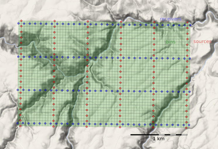
Just as we represented the midpoints as a GeoSeries of Point objects, we will represent  the bins with a GeoSeries of Polygons. GeoPandas provides the GeoSeries; Shapely provides the geometries; take a look at the IPython Notebook for the code. This green mesh is the result, and will hold the stacked traces after processing.

bins_physical.png

Fetching the traces within each bin

To create a CMP gather like the one we modelled at the start, we need to grab all the traces that have midpoints within a particular bin. And we'll want to create gathers for every bin, so it is a huge number of comparisons to make, even for a small example such as this: 128 receivers and 120 sources make 15 320 midpoints. In a purely GIS environment, we could perform a spatial join operation between the midpoint and bin GeoDataFrames, but instead we can use Shapely's contains method inside nested loops. Because of the loops, this code block takes a long time to run.

# Make a copy because I'm going to drop points as I
# assign them to polys, to speed up subsequent search.
midpts = midpoints.copy()

offsets, azimuths = [], [] # To hold complete list.

# Loop over bin polygons with index i.
for i, bin_i in bins.iterrows():
    
    o, a = [], [] # To hold list for this bin only.
    
    # Now loop over all midpoints with index j.
    for j, midpt_j in midpts.iterrows():
        if bin_i.geometry.contains(midpt_j.geometry):
            # Then it's a hit! Add it to the lists,
            # and drop it so we have less hunting.
            o.append(midpt_j.offset)
            a.append(midpt_j.azimuth)
            midpts = midpts.drop([j])
            
    # Add the bin_i lists to the master list
    # and go around the outer loop again.
    offsets.append(o)
    azimuths.append(a)
    
# Add everything to the dataframe.    
bins['offsets'] = gpd.GeoSeries(offsets)
bins['azimuths'] = gpd.GeoSeries(azimuths)

After we've assigned traces to their respective bins, we can make displays of the bin statistics. Three common views we can look at are:

  1. A spider plot to illustrate the offset and azimuth distribution.
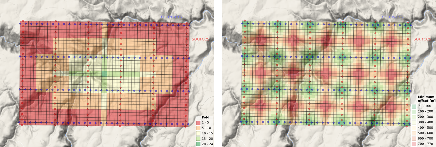
  2. A heat map of the number of traces contributing to each bin, usually called fold.
  3. A heat map of the minimum offset that is servicing each bin. 

The spider plot is easily achieved with Matplotlib's quiver plot:

spider_bubble_zoom.png

And the arrays representing our data are also quite easy to display as heatmaps of fold (left) and minimum offset (right): 

fold_and_xmin_physical.png

In the next and final post of this seismic survey mini-series, we'll analyze the impact of data quality when there are gaps and shifts in the source and receiver stations from these idealized locations.

Last thought: if the bins of a seismic survey are like a digital camera's image sensor, then what is the apparatus that acts like a lens? 

Geocomputing: Call for papers

52 Things .+? Geocomputing is in the works.

For previous books, we've reached out to people we know and trust. This felt like the right way to start our micropublishing project, because we had zero credibility as publishers, and were asking a lot from people to believe anything would come of it.

Now we know we can do it, but personal invitation means writing to a lot of people. We only hear back from about 50% of everyone we write to, and only about 50% of those ever submit anything. So each book takes about 160 invitations.

This time, I'd like to try something different, and see if we can truly crowdsource these books. If you would like to write a short contribution for this book on geoscience and computing, please have a look at the author guidelines. In a nutshell, we need about 600 words before the end of March. A figure or two is OK, and code is very much encouraged. Publication date: fall 2015.

We would also like to find some reviewers. If you would be available to read at least 5 essays, and provide feedback to us and the authors, please let me know

In keeping with past practice, we will be donating money from sales of the book to scientific Python community projects via the non-profit NumFOCUS Foundation.

What the cover might look like.&nbsp;If you'd like to write for us, please read&nbsp;the author guidelines.

What the cover might look like. If you'd like to write for us, please read the author guidelines.

Laying out a seismic survey

Cutlines for a dense 3D survey at Surmont field, Alberta, Canada. Image: Google Maps.

Cutlines for a dense 3D survey at Surmont field, Alberta, Canada. Image: Google Maps.

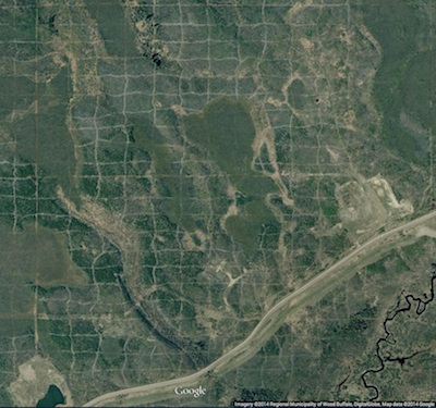
Cutlines for a dense 3D survey at Surmont field, Alberta, Canada. Image: Google Maps.There are a number of ways to lay out sources and receivers for a 3D seismic survey. In forested areas, a designer may choose a pattern that minimizes the number of trees that need to be felled. Where land access is easier, designers may opt for a pattern that is efficient for the recording crew to deploy and pick up receivers. However, no matter what survey pattern used, most geometries consist of receivers strung together along receiver lines and source points placed along source lines. The pairing of source points with live receiver stations comprises the collection of traces that go into making a seismic volume.

An orthogonal surface pattern, with receiver lines laid out perpendicular to the source lines, is the simplest surface geometry to think about. This pattern can be specified over an area of interest by merely choosing the spacing interval between lines well as the station intervals along the lines. For instance:

xmi = 575000        # Easting of bottom-left corner of grid (m)
ymi = 4710000       # Northing of bottom-left corner (m)
SL = 600            # Source line interval (m)
RL = 600            # Receiver line interval (m)
si = 100            # Source point interval (m)
ri = 100            # Receiver point interval (m)
x = 3000            # x extent of survey (m)
y = 1800            # y extent of survey (m)

We can calculate the number of receiver lines and source lines, as well as the number of receivers and sources for each.

# Calculate the number of receiver and source lines.
rlines = int(y/RL) + 1
slines = int(x/SL) + 1

# Calculate the number of points per line (add 2 to straddle the edges). 
rperline = int(x/ri) + 2 
sperline = int(y/si) + 2

# Offset the receiver points.
shiftx = -si/2.
shifty = -ri/2.

Computing coordinates

We create a list of x and y coordinates with a nested list comprehension — essentially a compact way to write 'for' loops in Python — that iterates over all the stations along the line, and all the lines in the survey.

# Find x and y coordinates of receivers and sources.
rcvrx = [xmi+rcvr*ri+shifty for line in range(rlines) for rcvr in range(rperline)]
rcvry = [ymi+line*RL+shiftx for line in range(rlines) for rcvr in range(rperline)]

srcx = [xmi+line*SL for line in range(slines) for src in range(sperline)]
srcy = [ymi+src*si for line in range(slines) for src in range(sperline)]

To make a map of the ideal surface locations, we simply pass this list of x and y coordinates to a scatter plot:

srcs_recs_pattern.png

Plotting these lists is useful, but it is rather limited by itself. We're probably going to want to do more calculations with these points — midpoints, azimuth distributions, and so on — and put these data on a real map. What we need is to insert these coordinates into a more flexible data structure that can hold additional information.

Shapely, Pandas, and GeoPandas

Shapely is a library for creating and manipulating geometric objects like points, lines, and polygons. For example, Shapely can easily calculate the (x, y) coordinates halfway along a straight line between two points.

Pandas provides high-performance, easy-to-use data structures and data analysis tools, designed to make working with tabular data easy. The two primary data structures of Pandas are:

  • Series — a one-dimensional labelled array capable of holding any data type (strings, integers, floating point numbers, lists, objects, etc.)
  • DataFrame — a 2-dimensional labelled data structure where the columns can contain many different types of data. This is similar to the NumPy structured array but much easier to use.

GeoPandas combines the capabilities of Shapely and Pandas and greatly simplifies geospatial operations in Python, without the need for a spatial database. GeoDataFrames are a special case of DataFrames that are specifically for representing geospatial data via a geometry column. One awesome thing about GeoDataFrame objects is they have methods for saving data to shapefiles.

So let's make a set of (x,y) pairs for receivers and sources, then make Point objects using Shapely, and in turn add those to GeoDataFrame objects, which we can write out as shapefiles:

# Zip into x,y pairs.
rcvrxy = zip(rcvrx, rcvry)
srcxy = zip(srcx, srcy)

# Create lists of shapely Point objects.
rcvrs = [Point(x,y) for x,y in rcvrxy]
srcs = [Point(x,y) for x,y in srcxy]

# Add lists to GeoPandas GeoDataFrame objects.
receivers = GeoDataFrame({'geometry': rcvrs})
sources = GeoDataFrame({'geometry': srcs})

# Save the GeoDataFrames as shapefiles.
receivers.to_file('receivers.shp')
sources.to_file('sources.shp')

It's a cinch to fire up QGIS and load these files as layers on top of a satellite image or physical topography map. As a survey designer, we can now add, delete, and move source and receiver points based on topography and land issues, sending the data back to Python for further analysis.

seismic_GIS_physical.png

All the code used in this post is in an IPython notebook. You can read it, and even execute it yourself. Put your own data in there and see how it comes out!

NEWSFLASH — If you think the geoscientists in your company would like to learn how to play with geological and geophysical models and data — exploring seismic acquisition, or novel well log displays — we can come and get you started! Best of all, we'll help you get up and running on your own data and your own ideas.

If you or your company needs a dose of creative geocomputing, check out our new geocomputing course brochure, and give us a shout if you have any questions. We're now booking for 2015.