St Nick's list for the geoscientist

It's that time again. Perhaps you know a geoscientist that needs a tiny gift, carefully wrapped, under a tiny tree. Perhaps that geoscientist has subtly emailed you this blog post, or non-subtly printed it out and left copies of it around your house and/or office and/or person. Perhaps you will finally take the hint and get them something awesomely geological.

Or perhaps 2016 really is the rubbish year everyone says it is, and it's gonna be boring non-geological things for everyone again. You decide.

Science!

I have a feeling science is going to stick around for a while. Get used to it. Better still, do some! You can get started on a fun science project for well under USD 100 — how about these spectrometers from Public Lab? Or these amazing aerial photography kits

All scientists must have a globe. It's compulsory. Nice ones are expensive, and they don't get much nicer than this one (right) from Real World Globes (USD 175 to USD 3000, depending on size). You can even draw on it. Check out their extra-terrestrial globes too: you can have Ganymede for only USD 125!

If you can't decide what kind of science gear to get, you could inspire someone to make their own with a bunch of Arduino accessories from SparkFun. When you need something to power your gadget in the field, get a fuel cell — just add water! Or if it's all just too much, play with some toy science like this UNBELIEVABLE Lego volcano, drone, crystal egg scenario.

Stuff for your house

Just because you're at home doesn't mean you have to stop loving rocks. Relive those idyllic field lunches with this crazy rock sofa that looks exactly like a rock but is not actually a rock (below left). Complete the fieldwork effect with a rainhead shower and some mosquitoes.

No? OK, check out these very cool Livingstone bouldery cushions and seats (below right, EUR 72 to EUR 4750).

If you already have enough rocks and/or sofas to sit on, there are some earth sciencey ceramics out there, like this contour-based coffee cup by Polish designer Kina Gorska, who's based in Oxford, UK. You'll need something to put it on; how about a nice absorbent sandstone coaster?

Wearables

T-shirts can make powerful statements, so don't waste it on tired old tropes like "schist happens" or "it's not my fault". Go for bold design before nerdy puns... check out these beauties: one pretty bold one containing the text to Lyell's Principles of Geology (below left), one celebrating Bob Moog with waveforms (perfect for a geophysicist!), and one featuring the lonely Chrome T-Rex (about her). Or if you don't like those, you can scour Etsy for volcano shirts.

Books

You're probably expecting me to lamely plug our own books, like the new 52 Things you Should Know About Rock Physics, which came out a few weeks ago. Well, you'd be wrong. There are lots of other great books about geoscience out there!

For example, Brian Frehner (a historian at Oklahoma State) has Finding Oil (2016, U Nebraska Press) coming out on Thursday this week. It covers the early history of petroleum geology, and I'm sure it'll be a great read. Or how about a slightly 'deeper history' book the new one from Walter Alvarez (the Alvarez), A Most Improbable Journey: A Big History of Our Planet and Ourselves (2016, WW Norton), which is getting good reviews. Or for something a little lighter, check out my post on scientific comic books — all of which are fantastic — or this book, which I don't think I can describe.

Dry your eyes

If you're still at a loss, you could try poking around in the prehistoric giftological posts from 2011201220132014, or 2015. They contain over a hundred ideas between them, I mean, come on.

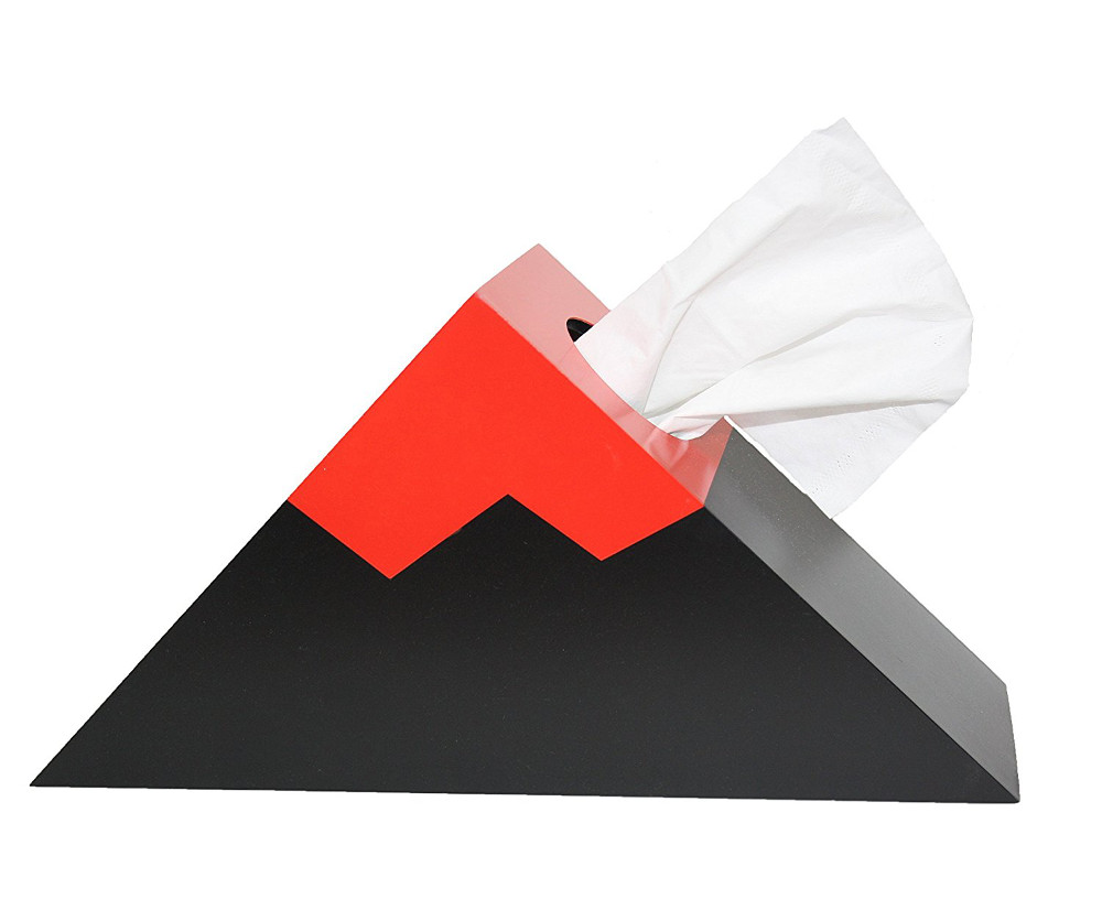
Still nothing? Nevermind, dry your eyes in style with one of these tissue box holders. Paaarp!


The images in this post are all someone else's copyright and are used here under fair use guidelines. I'm hoping the owners are cool with people helping them sell stuff!

The disappearing lake trick

On Sunday 20 November it's the 36th anniversary of the 1980 Lake Peigneur drilling disaster. The shallow lake — almost just a puddle at about 3 m deep — disappeared completely when the Texaco wellbore penetrated the Diamond Crystal Salt Company mine at a depth of about 350 m.

Location, location, location

It's thought that the rig, operated by Wilson Brothers Ltd, was in the wrong place. It seems a calculation error or misunderstanding resulted in the incorrect coordinates being used for the well site. (I'd love to know if anyone knows more about this as the Wikipedia page and the video below offer slightly different versions of this story, one suggesting a CRS error, the other a triangulation error.)

The entire lake sits on top of the Jefferson Island salt dome, but the steep sides of the salt dome, and a bit of bad luck, meant that a few metres were enough to spoil everyone's day. If you have 10 minutes, it's worth watching this video...

Apparently the accident happened at about 0430, and the crew abandoned the subsiding rig before breakfast. The lake was gone by dinner time. Here's how John Warren, a geologist and proprietor of Saltworks, describes the emptying in his book Evaporites (Springer 2006, and repeated on his awesome blog, Salty Matters):

Eyewitnesses all agreed that the lake drained like a giant unplugged bathtub—taking with it trees, two oil rigs [...], eleven barges, a tugboat and a sizeable part of the Live Oak Botanical Garden. It almost took local fisherman Leonce Viator Jr. as well. He was out fishing with his nephew Timmy on his fourteen-foot aluminium boat when the disaster struck. The water drained from the lake so quickly that the boat got stuck in the mud, and they were able to walk away! The drained lake didn’t stay dry for long, within two days it was refilled to its normal level by Gulf of Mexico waters flowing backwards into the lake depression through a connecting bayou...

The other source that seems reliable is Oil Rig Disasters, a nice little collection of data about various accidents. It ends with this:

Federal experts from the Mine Safety and Health Administration were not able to apportion blame due to confusion over whether Texaco was drilling in the wrong place or that the mine’s maps were inaccurate. Of course, all evidence was lost.

If the bit about the location is true, it may be one of the best stories of the perils of data management errors. If anyone (at Chevron?!) can find out more about it, please share!

x lines of Python: web scraping and web APIs

The Web is obviously an incredible source of information, and sometimes we'd like access to that information from within our code. Indeed, if the information keeps changing — like the price of natural gas, say — then we really have no alternative.

Fortunately, Python provides tools to make it easy to access the web from within a program. In this installment of x lines of Python, I look at getting information from Wikipedia and requesting natural gas prices from Yahoo Finance. All that in 10 lines of Python — total.

As before, there's a completely interactive, live notebook version of this post for you to run, right in your browser. Quick tip: Just keep hitting Shift+Enter to run the cells. There's also a static repo if you want to run it locally.

Geological ages from Wikipedia

Instead of writing the sentences that describe the code, I'll just show you the code. Here's how we can get the duration of the Jurassic period fresh from Wikipedia:

url = "http://en.wikipedia.org/wiki/Jurassic"
r = requests.get(url).text
start, end = re.search(r'<i>([\.0-9]+)–([\.0-9]+)&#160;million</i>', r.text).groups()
duration = float(start) - float(end)
print("According to Wikipedia, the Jurassic lasted {:.2f} Ma.".format(duration))

The output:

According to Wikipedia, the Jurassic lasted 56.30 Ma.

There's the opportunity for you to try writing a little function to get the age of any period from Wikipedia. I've given you a spot of help, and you can even complete it right in your browser — just click here to launch your own copy of the notebook.

Gas price from Yahoo Finance

url = "http://download.finance.yahoo.com/d/quotes.csv"
params = {'s': 'HHG17.NYM', 'f': 'l1'}
r = requests.get(url, params=params)
price = float(r.text)
print("Henry Hub price for Feb 2017: ${:.2f}".format(price))

Again, the output is fast, and pleasingly up-to-the-minute:

Henry Hub price for Feb 2017: $2.86

I've added another little challenge in the notebook. Give it a try... maybe you can even adapt it to find other live financial information, such as stock prices or interest rates.

What would you like to see in x lines of Python? Requests welcome!

Welly to the wescue

I apologize for the widiculous title.

Last week I described some headaches I was having with well data, and I introduced welly, an open source Python tool that we've built to help cure the migraine. The first versions of welly were built — along with the first versions of striplog — for the Nova Scotia Department of Energy, to help with their various data wrangling efforts.

Aside — all software projects funded by government should in principle be open source.

Today we're using welly to get data out of LAS files and into so-called feature vectors for a machine learning project we're doing for Canstrat (kudos to Canstrat for their support for open source software!). In our case, the features are wireline log measurements. The workflow looks something like this:

  1. Read LAS files into a welly 'project', which contains all the wells. This bit depends on lasio.
  2. Check what curves we have with the project table I showed you on Thursday.
  3. Check curve quality by passing a test suite to the project, and making a quality table (see below).
  4. Fix problems with curves with whatever tricks you like. I'm not sure how to automate this.
  5. Export as the X matrix, all ready for the machine learning task.

Let's look at these key steps as Python code.

1. Read LAS files

 
from welly import Project
p = Project.from_las('data/*.las')

2. Check what curves we have

Now we have a project full of wells and can easily make the table we saw last week. This time we'll use aliases to simplify things a bit — this trick allows us to refer to all GR curves as 'Gamma', so for a given well, welly will take the first curve it finds in the list of alternatives we give it. We'll also pass a list of the curves (called keys here) we are interested in:

The project table. The name of the curve selected for each alias is selected. The mean and units of each curve are shown as a quick QC. A couple of those RHOB curves definitely look dodgy, and they turned out to be DRHO correction curves.

The project table. The name of the curve selected for each alias is selected. The mean and units of each curve are shown as a quick QC. A couple of those RHOB curves definitely look dodgy, and they turned out to be DRHO correction curves.

3. Check curve quality

Now we have to define a suite of tests. Lists of test to run on each curve are held in a Python data structure called a dictionary. As well as tests for specific curves, there are two special test lists: Each and All, which are run on each curve encountered, and on all curves together, respectively. (The latter is required to, for example, compare the curves to each other to look for duplicates). The welly module quality contains some predefined tests, but you can also define your own test functions — these functions take a curve as input, and return either True (for a test pass) for False.

 
import welly.quality as qty
tests = {
    'All': [qty.no_similarities],
    'Each': [qty.no_monotonic],
    'Gamma': [
        qty.all_positive,
        qty.mean_between(10, 100),
    ],
    'Density': [qty.mean_between(1000,3000)],
    'Sonic': [qty.mean_between(180, 400)],
    }

html = p.curve_table_html(keys=keys, alias=alias, tests=tests)
HTML(html)
the green dot means that all tests passed for that curve. Orange means some tests failed. If all tests fail, the dot is red. The quality score shows a normalized score for all the tests on that well. In this case, RHOB and DT are failing the 'mean_b…

the green dot means that all tests passed for that curve. Orange means some tests failed. If all tests fail, the dot is red. The quality score shows a normalized score for all the tests on that well. In this case, RHOB and DT are failing the 'mean_between' test because they have Imperial units.

4. Fix problems

Now we can fix any problems. This part is not yet automated, so it's a fairly hands-on process. Here's a very high-level example of how I fix one issue, just as an example:

 
def fix_negs(c):
    c[c < 0] = np.nan
    return c

# Glossing over some details, we give a mnemonic, a test
# to apply, and the function to apply if the test fails.
fix_curve_if_bad('GAM', qty.all_positive, fix_negs)

What I like about this workflow is that the code itself is the documentation. Everything is fully reproducible: load the data, apply some tests, fix some problems, and export or process the data. There's no need for intermediate files called things like DT_MATT_EDIT or RHOB_DESPIKE_FINAL_DELETEME. The workflow is completely self-contained.

5. Export

The data can now be exported as a matrix, specifying a depth step that all data will be interpolated to:

 
X, _ = p.data_as_matrix(X_keys=keys, step=0.1, alias=alias)

That's it. We end up with a 2D array of log values that will go straight into, say, scikit-learn*. I've omitted here the process of loading the Canstrat data and exporting that, because it's a bit more involved. I will try to look at that part in a future post. For now, I hope this is useful to someone. If you'd like to collaborate on this project in the future — you know where to find us.

* For more on scikit-learn, don't miss Brendon Hall's tutorial in October's Leading Edge.


I'm happy to let you know that agilegeoscience.com and agilelibre.com are now served over HTTPS — so connections are private and secure by default. This is just a matter of principle for the Web, and we go to great pains to ensure our web apps modelr.io and pickthis.io are served over HTTPS. Find out more about SSL from DigiCert, the provider of Squarespace's (and Agile's) certs, which are implemented with the help of the non-profit Let's Encrypt, who we use and support with dollars.

Well data woes

I probably shouldn't be telling you this, but we've built a little tool for wrangling well data. I wanted to mention it, becase it's doing some really useful things for us — and maybe it can help you too. But I probably shouldn't because it's far from stable and we're messing with it every day.

But hey, what software doesn't have a few or several or loads of bugs?

Buggy data?

It's not just software that's buggy. Data is as buggy as heck, and subsurface data is, I assert, the buggiest data of all. Give units or datums or coordinate reference systems or filenames or standards or basically anything at all a chance to get corrupted in cryptic ways, and they take it. Twice if possible.

By way of example, we got a package of 10 wells recently. It came from a "data management" company. There are issues... Here are some of them:

  • All of the latitude and longitude data were in the wrong header fields. No coordinate reference system in sight anywhere. This is normal of course, and the only real side-effect is that YOU HAVE NO IDEA WHERE THE WELL IS.
  • Header chaos aside, the files were non-standard LAS sort-of-2.0 format, because tops had been added in their own little completely illegal section. But the LAS specification has a section for stuff like this (it's called OTHER in LAS 2.0).
  • Half the porosity curves had units of v/v, and half %. No big deal...
  • ...but a different half of the porosity curves were actually v/v. Nice.
  • One of the porosity curves couldn't make its mind up and changed scale halfway down. I am not making this up.
  • Several of the curves were repeated with other names, e.g. GR and GAM, DT and AC. Always good to have a spare, if only you knew if or how they were different. Our tool curvenam.es tries to help with this, but it's far from perfect.
  • One well's RHOB curve was actually the PEF curve. I can't even...

The remarkable thing is not really that I have this headache. It's that I expected it. But this time, I was out of paracetamol.

Cards on the table

Our tool welly, which I stress is very much still in development, tries to simplify the process of wrangling data like this. It has a project object for collecting a lot of wells into a single data structure, so we can get a nice overview of everything: 

Click to enlarge.

Our goal is to include these curves in the training data for a machine learning task to predict lithology from well logs. The trained model can make really good lithology predictions... if we start with non-terrible data. Next time I'll tell you more about how welly has been helping us get from this chaos to non-terrible data.