Isn't everything on the internet free?

A couple of weeks ago I wrote about a new publication from Elsevier. The book seems to contain quite a bit of unlicensed copyrighted material, collected without proper permission from public and private groups on LinkedIn, SPE papers, and various websites. I had hoped to have an update for you today, but the company is still "looking into" the matter.

The comments on that post, and on Twitter, raised some interesting views. Like most views, these views usually come in pairs. There is a segment of the community that feels quite enraged by the use of (fully attributed) LinkedIn comments in a book; but many people hold the opposing view, that everything on the Internet is fair game.

I sympathise with this permissive view, to an extent. If you put stuff on the web, people are (one hopes) going to see it, interpret it, and perhaps want to re-use it. If they do re-use it, they may do so in ways you did not expect, or perhaps even disagree with. This is okay — this is how ideas develop. 

I mean, if I can't use a properly attributed LinkedIn post as the basis for a discussion, or a YouTube video to illustrate a point, then what's really the point of those platforms? It would undermine the idea of the web as a place for interaction and collaboration, for cultural or scientific evolution. 

Freely accessible but not free

Not to labour the point, but I think we all understand that what we put on the Internet is 'out there'. Indeed, some security researchers suggest you should assume that every email you type will be in the local newspaper tomorrow morning. This isn't just 'a feeling', it's built into how the web works. most websites are exclusively composed of strictly copyrighted content, but most websites also have conspicuous buttons to share that copyrighted content — Tweet this, Pin that, or whatever. The signals are confusing... do you want me to share this or not? 

One can definitely get carried away with the idea that everything should be free. There's a spectrum of infractions. On the 'everyday abuse' end of things, we have the point of view that grabbing randoms images from the web and putting the URL at the bottom is 'good enough'. Based on papers at conferences, I suspect that most people think this and, as I explained before, it's definitely not true: you usually need permission. 

At the other end of the scale, you end up with Sci-Hub (which sounds like it's under pressure to close at the moment) and various book-sharing sites, both of which I think are retrograde and anti-open-access (as well as illegal). I believe we should respect the copyright of others — even that of supposedly evil academic publishers — if we want others to respect ours.

So what's the problem with a bookful of LinkedIn posts and other dubious content? Leaving aside for now the possibility of more serious plagiarism, I think the main problem is simply that the author went too far — it is a wholesale rip-off of 350 people's work, not especially well done, with no added value, and sold for a hefty sum.

Best practice for re-using stuff on the web

So how do we know what is too far? Is it just a value judgment? How do you re-use stuff on the web properly? My advice:

  • Stop it. Resist the temptation to Google around, grabbing whatever catches your eye.
  • Re-use sparingly, only using one or two of the real gems. Do you really need that picture of a casino on your slide entitled "Risk and reward"? (No, you definitely don't.)
  • Make your own. Ideas are not copyrightable, so it might be easier to copy the idea and make the thing you want yourself (giving credit where it's due, of course).
  • Ask for permission from the creator if you do use someone's stuff. Like I said before, this is only fair and right.
  • Go open! Preferentially share things by people who seem to be into sharing their stuff.
  • Respect the work. Make other people's stuff look awesome. You might even...
  • ...improve the work if you can — redraw a diagram, fix a typo — then share it back to them and the community.
  • Add value. Add real insight, combine things in new ways, surprise and delight the original creators.
  • And finally, if you're not doing any of these things, you better not be trying to profit from it. 

Everything on the Internet is not free. My bet is that you'll be glad of this fact when you start putting your own stuff out there. We can all do our homework and model good practice. This is especially important for those people in influential positions in academia, because their behaviours rub off on so many impressionable people. 


We talked to Fernando Enrique Ziegler on the Undersampled Radio podcast last week. He was embroiled in the 'bad book' furore too, in fact he brought it to many people's attention. So this topic came up in the show, as well as a lot of stuff about pore pressure and hurricanes. Check it out...

x lines of Python: web scraping and web APIs

The Web is obviously an incredible source of information, and sometimes we'd like access to that information from within our code. Indeed, if the information keeps changing — like the price of natural gas, say — then we really have no alternative.

Fortunately, Python provides tools to make it easy to access the web from within a program. In this installment of x lines of Python, I look at getting information from Wikipedia and requesting natural gas prices from Yahoo Finance. All that in 10 lines of Python — total.

As before, there's a completely interactive, live notebook version of this post for you to run, right in your browser. Quick tip: Just keep hitting Shift+Enter to run the cells. There's also a static repo if you want to run it locally.

Geological ages from Wikipedia

Instead of writing the sentences that describe the code, I'll just show you the code. Here's how we can get the duration of the Jurassic period fresh from Wikipedia:

url = "http://en.wikipedia.org/wiki/Jurassic"
r = requests.get(url).text
start, end = re.search(r'<i>([\.0-9]+)–([\.0-9]+)&#160;million</i>', r.text).groups()
duration = float(start) - float(end)
print("According to Wikipedia, the Jurassic lasted {:.2f} Ma.".format(duration))

The output:

According to Wikipedia, the Jurassic lasted 56.30 Ma.

There's the opportunity for you to try writing a little function to get the age of any period from Wikipedia. I've given you a spot of help, and you can even complete it right in your browser — just click here to launch your own copy of the notebook.

Gas price from Yahoo Finance

url = "http://download.finance.yahoo.com/d/quotes.csv"
params = {'s': 'HHG17.NYM', 'f': 'l1'}
r = requests.get(url, params=params)
price = float(r.text)
print("Henry Hub price for Feb 2017: ${:.2f}".format(price))

Again, the output is fast, and pleasingly up-to-the-minute:

Henry Hub price for Feb 2017: $2.86

I've added another little challenge in the notebook. Give it a try... maybe you can even adapt it to find other live financial information, such as stock prices or interest rates.

What would you like to see in x lines of Python? Requests welcome!

Pick This again, again

Today we're proud to be launching the latest, all new iteration of Pick This!

Last June I told you about some new features we'd added to our social image interpretation tool. This new release is not really about features, but more about architecture. Late in 2015, we were challenged by BG Group, a UK energy company, to port the app to Amazon's cloud (AWS), so that they could run it in their own environment. Once we'd done that, we brought the data over from Google — where it was hosted — and set up the new public site on AWS. It will be much easier for us to add new features to this version.

One notable feature is that you no longer have to have a Google account to log in! This may have been a show-stopper for some people.

The app has been completely re-written from scratch, so there are a few differences. But fundamentally it's the same as before — you can ask your peers questions about images, and they can draw their answers. For example, Don Herron's "Where's the unconformity?" now has over 450 interpretations!

As we improve the tool over the coming weeks, we'll add ways to filter the results down, to attenuate some of the 'interpretation noise'. It's interesting to think about ways to represent this result — what is the 'true interpretation'? Is it the cloud of all opinions? Is there one answer?

Click here to visit the new site. For now it only plays nicely on a desktop computer (mobile is such a headache, but we will get there!). But you should be able to log in, interpret images, and upload new ones. You can let me know about bugs, or tweet @nowpickthis. If you like it, and I really hope you do, please tell your friends!


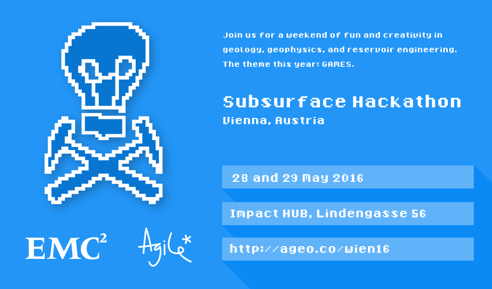
A quick reminder about the hackathon in Vienna next month. It will be an intense weekend of learning about programming and building some fun projects. I hope you can come, and if you know any geos in central Europe, please let them know!

Moving ahead with social interpretation

After quietly launching Pick This — our social image interpretation tool — in February, we've been busily improving the tool and now we're moving into 2016 with a plan for world domination. I summed up the first year of development in one of the interpretation sessions at SEG 2015. Here's a 13-minute version of my talk:

In 2016 we'll be exploring ways to adapt the tool to in-house corporate use, mainly by adding encryption and private groups. This way, everyone with @awesome.com email addresses, say, would be connected to each other, and their stuff would only be shared among the group, not with the general public.

Some other functionality is on the list of things to do:

  • Other types of interpretation than points, lines and polygons.
  • Ways to find content more easily, for example with tags like 'Seismic' or 'Outcrop'.
  • Ways to follow individuals, or get notifications of new interpretations on an image.
  • More ways to visualize and generally get at the data Pick This produces.

We're always open to suggestions. Please get in touch if you have a neat idea!

The hackathon is coming to Calgary

Before you stop reading and surf away thinking hackathons are not for you, stop. They are most definitely for you. If you still read this blog after me wittering on about Minecraft, anisotropy, and Python practically every week — then I'm convinced you'll have fun at a hackathon. And we're doing an new event this year for newbies.

For its fourth edition, the hackathon is coming to Calgary. The city is home to thousands of highly motivated and very creative geoscience nuts, so it should be just as epic as the last edition in Denver. The hackathon will be the weekend before the GeoConvention — 2 and 3 May. The location is the Global Business Centre, which is part of the Telus Convention Centre on 8th Avenue. The space is large and bright; it should be perfect, once it smells of coffee...

Now's the time to carpe diem and go sign up. You won't regret it. 

On the Friday before the hackathon, 1 May, we're trying something new. We'll be running a one-day bootcamp. you can sign up for the bootcamp here on the site. It's an easy, low-key way to experience the technology and goings-on of a hackathon. We'll be doing some gentle introductions to scientific computing for those who want it, and for the more seasoned hackers, we'll be looking at some previous projects, useful libraries, and tips and tricks for building a software tool in less than 2 days.

The event would definitely not be possible without the help of progressive people who want to see more creativity and invention in our industry and our science. These companies and the people that work there deserve your attention. 

Last quick thing: if you know a geeky geoscientist in Calgary, I'd love it if you forwarded this post to them right now. 


UPDATE
Great new: Ikon Science are joining our existing sponsors, dGB Earth Sciences and OpenGeoSolutions — both long-time supporters of the hackathon events — to help make something awesome happen. We're grateful for the support!


UPDATE
More good news: Geomodeling have joined the event as a sponsor. Thank you for being awesome! Wouldn't a geomodel hackathon be fun? Hmm...

Rock property catalog

RPC.png

One of the first things I do on a new play is to start building a Big Giant Spreadsheet. What goes in the big giant spreadsheet? Everything — XRD results, petrography, geochemistry, curve values, elastic parameters, core photo attributes (e.g. RGB triples), and so on. If you're working in the Athabasca or the Eagle Ford then one thing you have is heaps of wells. So the spreadsheet is Big. And Giant. 

But other people's spreadsheets are hard to use. There's no documentation, no references. And how to share them? Email just generates obsolete duplicates and data chaos. And while XLS files are not hard to put on the intranet or Internet,  it's hard to do it in a way that doesn't involve asking people to download the entire spreadsheet — duplicates again. So spreadsheets are not the best choice for collaboration or open science. But wikis might be...

The wiki as database

Regular readers will know that I'm a big fan of MediaWiki. One of the most interesting extensions for the software is Semantic MediaWiki (SMW), which essentially turns a wiki into a database — I've written about it before. Of course we can read any wiki page over the web, but you can query an SMW-powered wiki, which means you can, for example, ask for the elastic properties of a rock, such as this Mesaverde sandstone from Thomsen (1986). And the wiki will send you this JSON string:

{u'exists': True,
 u'fulltext': u'Mesaverde immature sandstone 3 (Kelly 1983)',
 u'fullurl': u'http://subsurfwiki.org/wiki/Mesaverde_immature_sandstone_3_(Kelly_1983)',
 u'namespace': 0,
 u'printouts': {
    u'Lithology': [{u'exists': True,
      u'fulltext': u'Sandstone',
      u'fullurl': u'http://www.subsurfwiki.org/wiki/Sandstone',
      u'namespace': 0}],
    u'Delta': [0.148],
    u'Epsilon': [0.091],
    u'Rho': [{u'unit': u'kg/m\xb3', u'value': 2460}],
    u'Vp': [{u'unit': u'm/s', u'value': 4349}],
    u'Vs': [{u'unit': u'm/s', u'value': 2571}]
  }
}

This might look horrendous at first, or even at last, but it's actually perfectly legible to Python. A little bit of data wrangling and we end up with data we can easily plot. It takes no more than a few lines of code to read the wiki's data, and construct this plot of \(V_\text{P}\) vs \(V_\text{S}\) for all the rocks I have so far put in the wiki — grouped by gross lithology:

A page from the Rock Property Catalog in Subsurfwiki.org. Very much an experiment, rocks contain only a few key properties today.

A page from the Rock Property Catalog in Subsurfwiki.org. Very much an experiment, rocks contain only a few key properties today.

If you're interested in seeing how to make these queries, have a look at this IPython Notebook. It takes you through reading the data from my embryonic catalogue on Subsurfwiki, processing the JSON response from the wiki, and making the plot. Once you see how easy it is, I hope you can imagine a day when people are publishing open data on the web, and sharing tools to query and visualize it.

Imagine it, then figure out how you can help build it!


References

Thomsen, L (1986). Weak elastic anisotropy. Geophysics 51 (10), 1954–1966. DOI 10.1190/1.1442051.

Pick This! Social interpretation

PIck This is a new web app for social image interpretation. Sort of Stack Exchange or Quora (both awesome Q&A sites) meets Flickr. You look for an interesting image and offer your interpretation with a quick drawing. Interpretations earn reputation points. Once you have enough rep, you can upload images and invite others to interpret them. Find out how others would outline that subtle brain tumour on the MRI, or pick that bifurcated fault...

A section from the Penobscot 3D, offshore Nova Scotia, Canada. Overlain on the seismic image is a heatmap of interpretations of the main fault by 26 different interpreters. The distribution of interpretations prompts questions about what is 'the' an…

A section from the Penobscot 3D, offshore Nova Scotia, Canada. Overlain on the seismic image is a heatmap of interpretations of the main fault by 26 different interpreters. The distribution of interpretations prompts questions about what is 'the' answer. Pick this image yourself at pickthis.io.

The app was born at the Geophysics Hackathon in Denver last year. The original team consisted of Ben Bougher, a UBC student and long-time Agile collaborator, Jacob Foshee, a co-founder of Durwella, Chris Chalcraft, a geoscientist at OpenGeoSolutions, Agile's own Evan Bianco of course, and me ordering pizzas and googling domain names. By demo time on Sunday afternoon, we had a rough prototype, good enough for the audience to provide the first seismic interpretations.

Getting from prototype to release

After the hackathon, we were very excited about Pick This, with lots of ideas for new features. We wanted it to be easy to upload an image, being clear about its provenance, and extremely easy to make an interpretation, right in the browser. After some great progress, we ran into trouble bending the drawing library, Raphael.js, to our will. The app languished until Steve Purves, an affable geoscientist–programmer who lives on a volcano in the middle of the Atlantic, came to the rescue a few days ago. Now we have something you can use, and it's fun! For example, how would you pick this unconformity

This data is proprietary to MultiKlient Invest AS. Licensed CC-BY-SA.&nbsp;

This data is proprietary to MultiKlient Invest AS. Licensed CC-BY-SA. 

This beautiful section is part of this month's Tutorial in SEG's The Leading Edge magazine, and was the original inspiration for the app. The open access essay is by Don Herron, the creator of Interpreter Sam, and describes his approach to interpreting unconformities, using this image as the partially worked example. We wanted a way for readers to try the interpretation themselves, without having to download anything — it's always good to have a use case before building something new. 

What's next for Pick This?

I'm really excited about the possibilities ahead. Apart from the fun of interpreting other people's data, I'm especially excited about what we could learn from the tool — how long do people spend interpreting? How many edits do they make before submitting? And we'd love to add other modes to the tool, like choosing between two image enhancement results, or picking multiple features. And these possibilities only multiply when you think about applications outside earth science, in medical imaging, remote sensing, or astronomy. So much to do, so little time! 

We trust your opinion. Maybe you can help us:

  • Is Pick This at all interesting or fun or useful to you? Is there a use case that occurs to you? 
  • Making the app better will take time and therefore money. If your organization is interested in image enhancement, subjectivity in interpretation, or machine learning, then maybe we can work together. Get in touch!

Whatever you do, please have a look at Pick This and let us know what you think.

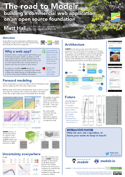
The road to Modelr: my EuroSciPy poster

At EuroSciPy recently, I gave a poster-ized version of the talk I did at SciPy. Unlike most of the other presentations at EuroSciPy, my poster didn't cover a lot of the science (which is well understood), or the code (which is esoteric).

Instead it focused on the advantages of spreading software via web applications, rather than only via source code, and on the challenges that we overcame — well, that we're still overcoming — to get our Modelr tool out there. I wanted other programmer-scientists to think about running some of their code as a web app for others to enjoy, but to be aware of the effort involved in doing this.

I've written before about my dislike of posters, though I'm told they are an important component at, say, the AGU Fall Meeting. I admit I do quite like the process of making them, and — on advice from Colin Purrington's useful page — I left a space on the poster for people to write comments or leave sticky notes. As a result, I heard about Docker, a lead I'll certainly follow up,

What's new in modelr

This wasn't part of the poster, but I might as well take the chance to let you know what we've updated recently:

  • You can now add noise to models by specifying the signal:noise.
  • Instead of automatic scaling, you can choose your own gain.
  • The app now returns the elastic moduli of the rocks in the model.
  • You can choose a spatial cross-section view or a space–offset–frequency view.

All of these features are now available to subscribers for only $9/month. Amazing value :)

Figshare

I've stored my poster on Figshare, a data storage site and part of Macmillan's Digital Science effort. What I love about Figshare, apart from the convenience of cloud-based storage and easy access for others, is that every item gets a digital object identifier or DOI. You've probably seen these on journal articles. They're a bit like other persistent and unique IDs for publications, such as ISBNs for books, but the idea is to provide more interactivity by making it easily linkable: you can get to any object with a DOI by prepending it with "http://dx.doi.org/".

Reference

Hall, M (2014). The road to modelr: building a commercial web app on an open source foundation. EuroSciPy, Cambridge, UK, August 29–30, 2014. Poster presentation. DOI:10.6084/m9.figshare.1151653

A culture of asking questions

When I worked at ConocoPhillips, I was quite involved in their knowledge sharing efforts (and I still am). The most important part of the online component is a set of 100 or so open discussion forums. These are much like the ones you find all over the Internet (indeed, they're a big part of what made the Internet what it is — many of us remember Usenet, now Google Groups). But they're better because they're highly relevant, well moderated, and free of trolls. They are an important part of an 'asking' culture, which is an essential prerequisite for a learning organization

Stack Exchange is awesome

Today, the Q&A site I use most is Stack Overflow. I read something on it almost every day. This is the place to get questions about programming answered fast. It is one of over 100 sites at Stack Exchange, all excellent — readers might especially like the GIS Stack Exchange. These are not your normal forums... Fields medallist Tim Gowers recognizes Math Overflow as an important research tool. The guy has a blog. He is awesome.

What's so great about the Stack Exchange family? A few things:

  • A simple system of up- and down-voting questions and answers that ensures good ones are easy to find.
  • A transparent system of user reputation that reflects engagement and expertise, and is not easy to game. 
  • A well defined path from proposal, to garnering support, to private testing, to public testing, to launch.
  • Like good waiters, the moderators keep a very low profile. I rarely notice them. 
  • There are lots of people there! This always helps.

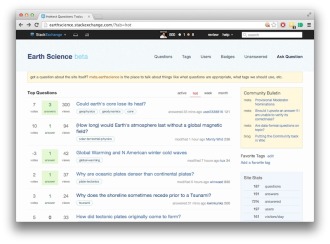
The new site for earth science

The exciting news is that, two years after being proposed in Area 51, the Earth Science site has reached the minimum commitment, spent a week in beta, and is now open to all. What happens next is up to us — the community of geoscientists that want a well-run, well-populated place to ask and answer scientific questions.

You can sign in instantly with your Google or Facebook credentials. So go and take a look... Then take a deep breath and help someone. 

Private public data

Our recent trip to the AAPG Annual Convention in Houston was much enhanced by meeting some inspiring geoscientist–programmers. People like...

  • Our old friend Jacob Foshee hung out with us and built his customary awesomeness.
  • Wassim Benhallam, at the University of Utah, came to our Rock Hack and impressed everyone with his knowledge of clustering algorithms, and sedimentary geology.
  • Sebastian Good, of Palladium Consulting, is full of beans and big ideas — and is a much more accomplished programmer than most of us will ever be. If you're coding geoscience, you'll like his blog.
  • We had a laugh with Nick Thompson from Schlumberger, who we bumped into at a 100% geeky meet-up for Python programmers interested in web sockets. I cannot explain why we were there.

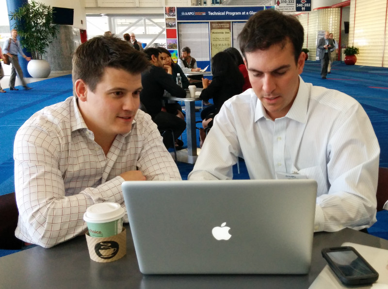
Perhaps the most animated person we met was Ted Kernan (right). A recent graduate of Colorado School of Mines, Ted has taught himself PHP, one of the most prevalent programming languages on the web (WordPress, Joomla, and MediaWiki are written in PHP). He's also up on all the important bits of web tech, like hosting, and HTML frameworks.

But the really cool thing is what he's built: a search utility for public well data in the United States. You can go and check it out at publicwelldata.com — and if you like it, let Ted know!

Actually, that's not even the really cool thing. The really cool thing is how passionate he is about exposing this important public resource, and making it discoverable and accessible. He highlights the stark difference between Colorado's easy access to digital well data, complete with well logs, and the sorry state of affairs in North Dakota, where he can't even get his app in to read well names. 'Public data' can no longer mean "we'll sell you a paper printout for $40". It belongs on the web — machines can read too.

More than just wells

There's so much potential power here — not only for human geoscientists looking for well data, but also for geoscientist–programmers building tools that need well data. For example, I imagine being able to point modelr.io at any public well to grab its curves and make a quick synthetic. Ready access to open services like Ted's will free subsurface software from the deadweight of corporate databases filled with years of junk, and make us all a bit more nimble. 

We'll be discussing open data, and openness in general, at the Openness Unsession in Calgary on the afternoon of 12 May — part of GeoConvention 2014. Join us!