Get a telescope!

In the recent How deep are the presents? post, I mentioned that I got a telescope this year — and I encouraged you to get one, because I kind of wish I’d got mine years ago. Since the observing conditions aren’t great tonight and I’m indoors anyway, I thought I’d elaborate a bit.

Not Hubble

The fun might not be obvious to all. Superficially, the experience is terrible — you read about some interesting object, noting its spectacular appearance in the obligatory Hubble photo, only to spend 45 minutes hunting for it before realizing it must be that dim grey smudge you tried to wipe off the eyepiece half an hour ago.

Messier 51: the Whirlpool Galaxy, which is actually a pair of colliding galaxies about 23 million light years away. What you’re expecting (left) vs what you might see on a really dark night with a lot of patience (right).

And yet… you did find it. Out in the dark, on your own, among the owls and foxes, you made an observation. You navigated to it, learning the names of ancient constellations and asterisms. You found out that it’s a pair of colliding galaxies 23 million light years away, and we know that because we can measure the light from individual stars they contain. Its photons were absorbed, after 23 million years oscillating through space, by your retinal cells. And maybe, just possibly, you glimpsed its archetypal spiral arms. And you ticked another Messier object off your list. Thirty minutes well spent! On to the next thing…

There are so many things to see

I knew it would be pretty cool to be able to see Saturn’s rings and the surface of the Moon, but a lot of things have been surprising to me:

  • Jupiter and Saturn are genuinely breathtaking. Seeing the moons of Jupter change continuously, or a shadow pass across its face, is remarkable — it’s the view that changed Galileo’s, then humanity’s, understanding of the universe, proving that Earth is not the centre of every celestial body’s orbit.

  • The moon looks different every day. This is obvious, of course, but with a decent telescope, you can see individual mountains and valleys pass from obscurity into high contrast, and then into blinding sunlight. The only trouble is that once it’s well-lit, the moonlight basically obliterates everything else.

  • Indeed, the whole sky changes continuously. Every month it advances two hours — so in January you can see at 8 pm what you had to wait until 10 pm for in December. So every month’s non-moonlit fortnight is different, with new constellations full of new objects appearing over the eastern horizon.

  • There’s a ready-made list of achievements for beginners to unlock, at least in the Northern Hemisphere. The objects on Charles Messier’s list of 110 “things that aren’t comets” are, because his late-18th-Century telescope was rubbish, fairly easy to observe — even from places that aren’t especially dark.

  • Many of the objects on that list are mind-blowingly cool. The colliding galaxies of M51 were the first thing I pointed my telescope at. M57, the famous Ring Nebula, is tiny but perfect and jewel-like. M42 is legitimately gasp-inducing. M13, the Great Globular Cluster, is extraordinarily bright and beautiful.

If you do start observing the night sky, I strongly recommend keeping a journal. You’ll quickly forget what you saw, and besides it’s fun to look back on all the things you’ve found. My own notes are pretty sketchy, as you can see below, but they have helped me learn the craft and I refer back to them quite often.

Buying a telescope

Telescopes are one of those purchases that can throw you into analysis paralysis, so I thought I’d share what I’ve learned as a noob stargazer.

  • Whatever you’re buying, buy from a telescope shop or online store that serves astronomers. If at all possible, don’t go to Amazon, a sporting goods store, or a department store.

  • If you’re spending under about $200, get the best binoculars you can find instead of a telescope. Look for aperture, not magnification (e.g. for 10 x 50 bins, 10 is the magnification, 50 is the aperture in mm). Just be aware that anything with an aperture greater than about 50 mm will start to get heavy and may need a tripod (and a binocular screw mount) to use effectively. Ideally, try some out in a shop.

  • Like lots of other things (groceries, bikes, empathy), telescopes are hard to find at the moment. So focus on what’s available — unless you are prepared to wait. There are good scopes available now, just maybe not that exact one you were looking for.

  • There are three basic kinds of optical telescope the beginner needs to know about: refractors, reflectors, and catadioptrics (a bit of both). I recommend going for a reflector, because big ones are cheap, and you can see more with a big scope. On the downside, they do get quite large and once you hit a 12-inch mirror, awkward to store, manoeuvre, and transport.

  • I know technology is cool, but if at all possible you should forget about fancy electronics, ‘go-to’ mounts, GPS-this, WiFi-that, and so on — for now. Relatedly, forget about anything to do with photographing the heavens. Unless you’ve been at it for a couple of years already (why are you reading this?), wait.

  • For your first scope, you’re looking for an alt-azimuth or Dobsonian mount, not an equatorial one. They aren’t ideal for taking photographs of anything other than very bright objects, but they are perfect for visual observation.

  • Don’t buy any extra doo-dads, except maybe a collimator (your scope will need aligning now and again), some sort of finder (red-dot finders are popular), and a moon filter (once its past first quarter, it’s too bright to look at). Everything else can wait. (Many scopes include these items though, so do check.)

I think that’s all the advice I’m entitled to offer at this point. But don’t just take it from me, here are some awesome “buying your first telescope” videos:

After much deliberation, I bought a Sky-Watcher Flextube 250P, which is a non-motorized, Dobsonian-mounted, 250-mm (10-inch) aperture Newtonian reflector. It’s been a delight, and I highly recommend it. If you decide to take the plunge, good luck! And do let me know how it goes.

Why do wavelets have sidelobes?

Brian Romans (a geology professor at Virginia Tech) asked a great question in the Software Underground’s Slack earlier this month:

I was teaching my Seismic Stratigrapher course the other day and a student asked me about the origin of ‘side lobes’ on the Ricker wavelet. I didn’t have a great answer [...] what is a succinct explanation for the side lobes?

Questions like this are fantastic because they really aren’t easy to answer. There’s usually a breadcrumb trail of concepts that lead to an answer, but the trail might be difficult to navigate, and some of those breadcrumbs will lead to more questions… and soon you’ve written a textbook on signal processing.

Here’s how I attempted, rather long-windedly, to help Brian’s student (edited a bit for brevity):

Wavelets measure displacement, or velocity, or acceleration (or some proxy for these things like voltage or capacitance), but eventually we can compute a signal that represents displacement. (In seismic reflection surveys, we don't care about the units.)

The Ricker wavelet represents an impulsive signal (the 'bang' of dynamite or the 'pop' of an airgun; let's leave Vibroseis out of it for now). The impulse is bandlimited ('band' as in radio band) — in other words, it doesn't contain all frequencies. Unfortunately, you need a lot of frequencies to represent very sudden or abrupt (short in time) things like bangs and pops, otherwise they spread out in time. Since our wavelet is restricted to a band of frequencies (eg 10 to 80 Hz), it must be (infinitely) spread out in time.

Additionally, since the frequencies don't contain what we call a 'DC' signal (0 Hz, in other words a bias or shift), it must return to zero when displaced. So it starts and ends on zero amplitude.

So the wavelet is spread out, and it starts and ends on zero amplitude. Why does it wiggle? In other words, why is seismic oscillatory? It's not the geophone: although it contains a spring (or something like one), its specially chosen/tuned to be able to move freely at the frequencies we're trying to record. So it's the stiffness of the earth itself which causes the oscillation, dissipating the vibrational energy (as heat) and damping the signal. At least, this explains why it dies out, but not really why it oscillates... Physics! Simple harmonic motion! Or something.

Yeah, I guess I’m a bit hazy on the micro-mechanics of wave propagation. Evan came to my rescue (see below), but I had a couple more things to say first:

The other thing is that classic wavelets like the Ricker are noncausal, aka non-realizable, because they have energy at negative time (i.e. they are centered around t = 0) and there’s no such thing as negative time. This is a clue that a zero-phase wavelet is a geological convenience contrived during processing, not a physical thing. The field seismic data would contain a so-called 'minimum phase' wavelet, which looks more like what you'd expect a recording of a dynamite blast to look like (see below).

To try to make up for the fact that I trailed off at ‘simple harmonic motion’, Evan offered this:

If you imagine the medium being made up of a bunch of particles, then propagating a wave means causing a stress (say, sudden compression at the surface) and then stretching and squeezing those particles to accommodate that stress. A compression (which we may measure or draw as a peak) does not come without a stretching (a dilation or trough) of particles on either side. So a side lobe (or a dilation) has to exist in a way: the particles are connected together and stretch and squeeze when they feel pressure.

Choice of wavelet matters

There was more from Doug McClymont, who’s always up for some chat about wavelets. He pointed out that although high-bandwidth Ormsby wavelets have more sidelobes, they generally have lower amplitudes than a Ricker wavelet, whose sidelobes always have the same ampitude (exactly \( 2 \mathrm{e}^{-3/2} \)). He added:

I tend not to use Ricker wavelets for very much as you can't control the bandwidth of them (just the peak frequency) so they tend to be very narrow-band and have quite high (and constant) amplitude side lobes. As I work a lot with broadband seismic data I use Ormsby wavelets much more for any well-ties and seismic modelling.

Good reasons to use an Ormsby wavelet as your analaytic wavelet of choice! Check out this other post all about Ormsby wavelets and how to make them.

What do you think? Do you have an intuitive explanation for why wavelets have sidelobes? Ideally shorter than mine!

100 years of seismic reflection

Where would we be without seismic reflection? Is there a remote sensing technology that is as unlikely, as difficult, or as magical as the seismic reflection method? OK, maybe neutrino tomography. But anyway, seismic has contributed a great deal to society — helping us discover and describe hydrocarbon resources, aquifers, geothermal anomalies, sea-floor hazards, and plenty more besides.

It even indirectly led to the integrated circuit, but that’s another story.

Depending on who you ask, 9 August 2021 may or may not be the 100th anniversary of the seismic reflection method. Or maybe 5th August. Or maybe it was June or July. But there’s no doubt that, although the first discovery with seismic did not happen until several years later, 1921 was the year that the seismic reflection method was invented.

Ryan, Karcher and Haseman in the field, August 1921. Badly colourized by an AI.

Ryan, Karcher and Haseman in the field, August 1921. Badly colourized by an AI.

The timeline

I’ve tried to put together a timeline by scouring a few sources. Several people — Clarence Karcher (a physicist), William Haseman (a physicist), Irving Perrine (a geologist), William Kite (a geologist) at the University of Oklahoma, and later Daniel Ohern (a geologist) — conducted the following experiments:

  • 12 April 1919 — Karcher recorded the first exploration seismograph record near the National Bureau of Standards (now NIST) in Washington, DC.

  • 1919 to 1920 — Karcher continues his experimentation.

  • April 1921 — Karcher, whilst working at the National Bureau of Standards in Washington, DC, designed and constructed apparatus for recording seismic reflections.

  • 4 June 1921 — the first field tests of the refleciton seismograph at Belle Isle, Oklahoma City, using a dynamite source.

  • 6 June until early July — various profiles were acquired at different offsets and spacings.

  • 14 July 1921 — Testing in the Arbuckle Mountains. The team of Karcher, Haseman, Ohern and Perrine determined the velocities of the Hunton limestone, Sylvan shale, and Viola limestone.

  • Early August 1921 — The group moves to Vines Branch where “the world’s first reflection seismograph geologic section was measured”, according to a commemorative plaque on I-35 in Oklahoma. That plaque claims it was 9 August, but there are also records from 5 August. The depth to the Viola limestone is recorded and observed to change with geological structure.

  • 1 September 1921 — Karcher, Haseman, and Rex Ryan (a geologist) conduct experiments at the Newkirk Anticline near Ponca City.

  • 13 September 1921 — a survey was begun for Marland Oil Company and continues into October. Success seems mixed.

So what did these physicists and geologists actually do? Here’s an explanation from Bill Dragoset in his excellent review of the history of seismic from 2005:

Using a dynamite charge as a seismic source and a special instrument called a seismograph, the team recorded seismic waves that had traveled through the subsurface of the earth. Analysis of the recorded data showed that seismic reflections from a boundary between two underground rock layers had been detected. Further analysis of the data produced an image of the subsurface—called a seismic reflection profile—that agreed with a known geologic feature. That result is widely regarded as the first proof that an accurate image of the earth’s subsurface could be made using reflected seismic waves.
— Bill Dragoset, A Historical Reflection on Reflections

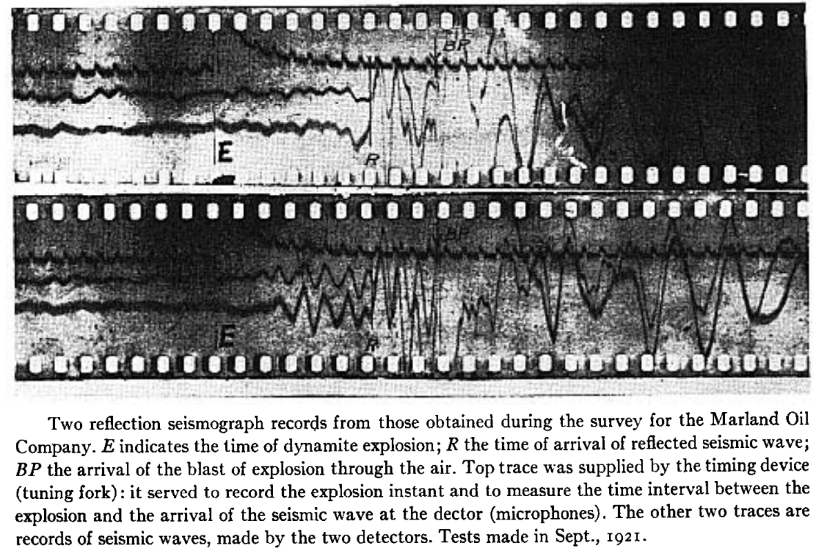
The data was a bit hard to interpret! This is from William Schriever’s paper:

Marland_seismic.png

Nonetheless, here’s the section the team managed to draw at Vine Creek. This is the world’s first reflection seismograph section — 9 August 1921:

The method took a few years to catch on — and at least a few years to be credited with a discovery. Karcher founded Geophysical Research Corporation (now Sercel) in 1925, then left and founded Geophysical Service International — which later spun out Texas Instruments — in 1930. And, eventually, seismic reflection turned into an idsutry worth tens of billions of dollars per year. Sometimes.

References

Bill Dragoset, (2005), A historical reflection on reflections, The Leading Edge 24: s46-s70. https://doi.org/10.1190/1.2112392

Clarence Karcher (1932). DETERMINATION OF .SUBSURFACE FORMATIONS. Patent no. 1843725A. Patented 2 Feb 1932.

William Schriever (1952). Reflection seismograph prospecting; how it started; contributions. Geophysics 17 (4): 936–942. doi: https://doi.org/10.1190/1.1437831

B Wells and K Wells (2013). American Oil & Gas Historical Society. American Oil & Gas Historical Society. Exploring Seismic Waves. Last Updated: August 7, 2021. Original Published Date: April 29, 2013.

An open source wish list

After reviewing a few code-dependent scientific papers recently, I’ve been thinking about reproducibility. Is there a minimum requirement for scientific code, or should we just be grateful for any code at all?

The sky’s the limit

Click to enlarge

I’ve come to the conclusion that there are a few things that are essential if you want anyone to be able to do more than simply read your code. (If that’s all you want, just add a code listing to your supplementary material.)

The number one thing is an open licence. (I recently wrote about how to choose one). Assuming the licence is consistent with everything you have used (e.g. you haven’t used a library with the GPL, then put an Apache licence on it), then you are protected by the indeminity clauses and other people can re-use your code on your terms.

After that, good practice is to improve the quality of your code. Most of us write horrible code a lot of the time. But after bit of review, some refactoring, some input from colleagues, you will have something that is less buggy, more readable, and more reusable (even by you!).

If this was a one-off piece of code, providing figures for a paper for instance, you can stop here. But if you are going to keep developing this thing, and especially if you want others to use it to, you should keep going.

Best practice is to start using continuous integration, to help ensure that the code stays in good shape as you continue to develop it. And after that, you can make your tool more citable, maybe write a paper about it, and start developing a user/contributor community. The sky’s the limit — and now you have help!

Other models

When I shared this on Twitter, Simon Waldman mentioned that he had recently co-authored a paper on this topic. Harrison et al (2021) proposed that there are three priorities for scientific software: to be correct, to be reusable, and to be documented. From there, they developed a hierachy of research software projects:

  • Level 0 — Barely repeatable: the code is clear and tested in a basic way.

  • Level 1 — Publication: code is tested, readable, available and ideally openly licensed.

  • Level 2 — Tool: code is installable and managed by continuous integration.

  • Level 3 — Infrastructure: code is reviewed, semantically versioned, archived, and sustainable.

There are probably still other models out there.— if you know if a good one, please drop it in the Comments.

References

Sam Harrison, Abhishek Dasgupta, Simon Waldman, Alex Henderson & Christopher Lovell (2021, May 14). How reproducible should research software be? Zenodo. DOI: 10.5281/zenodo.4761867

Projects from the Geothermal Hackathon 2021

geothermal_skull_thumb.png

The second Geothermal Hackathon happened last week. Timed to coincide with the Geosciences virtual event of the World Geothermal Congress, our 2-day event brought about 24 people together in the famous Software Underground Chateau (I’m sorry if I missed anyone!). For comparison, last year we were 13 people, so we’re going in the right direction! Next time I hope we’re as big as one of our ‘real world’ events — maybe we’ll even be able to meet up in local clusters.

Here’s a rundown of the projects at this year’s event:

Induced seismicity at Espoo, Finland

Alex Hobé, Mohsen Bazagan and Matteo Niccoli

Alex’s original workflow for creating dynamic displays of microseismic events was to create thousands of static images then stack them into a movie, so the first goal was something more interactive. On Day 1 Alex built a Plotly widget with a time zoomer/slider in a Jupyter Notebook. On day 2 he and Matteo tried Panel for a dynamic 3D plot. Alex then moved the data into LLNL Visit for fully interactive 3D plots. The team continues to hack on the idea.

geothermal_hack_2021_seismic.png

Fluid inclusions at Coso, USA

Diana Acero-Allard, Jeremy Zhao, Samuel Price, Lawrence Kwan, Jacqueline Floyd, Brendan, Gavin, Rob Leckenby and Martin Bentley

Diana had the idea of a gas analysis case study for Coso Field, USA. The team’s specific goal was to develop visualization tools for interetpaton of fluid inclusion gas data to identify fluid types, regions of permeability, and geothermal processes. They had access to analyses from 29 wells, requiring the usual data science workflow: find and load the data, clean the data, make some visualizations and maps, and finally analyse the permeability. GitHub repo here.

geothermal_hack_2021_fluid-incl.png

Utah Forge data pipeline

Andrea Balza, Evan Bianco, and Diego Castañeda

Andrea was driven to dive into the Utah FORGE project. Navigating the OpenEI data portal was a bit hit-and-miss, having to download files to get into ZIP files and so on (this is a common issue with open data repositories). The team eventually figured out how to programmatically access the files to explore things more easily — right from a Jupyter Notebook. Their code for any data on the OpenEI site, not just Utah FORGE, so it’s potentially a great research tool. GitHub repo here.

geothermal_hack_2021_forge.png

Pythonizing a power density estimation tool

Irene Wallis, Jan Niederau, Hannah Wood, Will Middlebrook, Jeff Jex, and Bill Cummings

Like a lot of cool hackathon projects, this one started with spreadsheet that Bill created to simplify the process of making power density estimates for geothermal fields under some statistical assumptions. Such a clear goal always helps focus the mind and the team put together some Python notebooks and then a Streamlit app — which you can test-drive here! From this solid foundation, the team has plenty of plans for new directions to take the tool. GitHub repo here.

geothermal_hack_2021_streamlit2.png
geothermal_hack_2021_streamlit1.png

Computing boiling point for depth

Thorsten Hörbrand, Irene Wallis, Jan Niederau and Matt Hall

Irene identified the need for a Python tool to generate boiling-point-for-depth curves, accommodating various water salinities and chemistries. As she showed during her recent TRANSFORM tutorial (which you must watch!), so-called BPD curves are an important part of geothermal well engineering. The team produced some scripts to compute various scenarios, based on corrections in the IAPWS standards and using the PHREEQC aqueous geochemistry modeling software. GitHub repo here.

geothermal_hack_2021_bpd-curves.png

A big Thank You to all of the hackers that came along to this virtual event. Not quite the same as a meatspace hackathon, admittedly, but Gather.town + Slack was definitely an improvement over Zoom + Slack. At least we have an environment in which people can arrive and immediately get a sense of what is happening in the event. When you realize that people at the tables are actually sitting in Canada, the US, the UK, Switzerland, South Africa, and Auckland — it’s clear that this could become an important new way to collaborate across large distances.

geothermal_hack_2021_chateau.png

Do check out all these awesome and open-source projects — and check out the #geothermal channel in the Software Underground to keep up with what happens next. We’ll be back in the future — perhaps the near future! — with more hackathons and more geothermal technology. Hopefully we’ll see you there! 🌋

Which programming language should you learn first?

The question I get asked most often is:

I want to learn to code, where should I start?

To which there’s really no perfect answer. It depends on a lot of things… Why do you want to learn to program? What domain are you in? Have you tried before? Do you like computers? Do your colleagues use anything in particular?

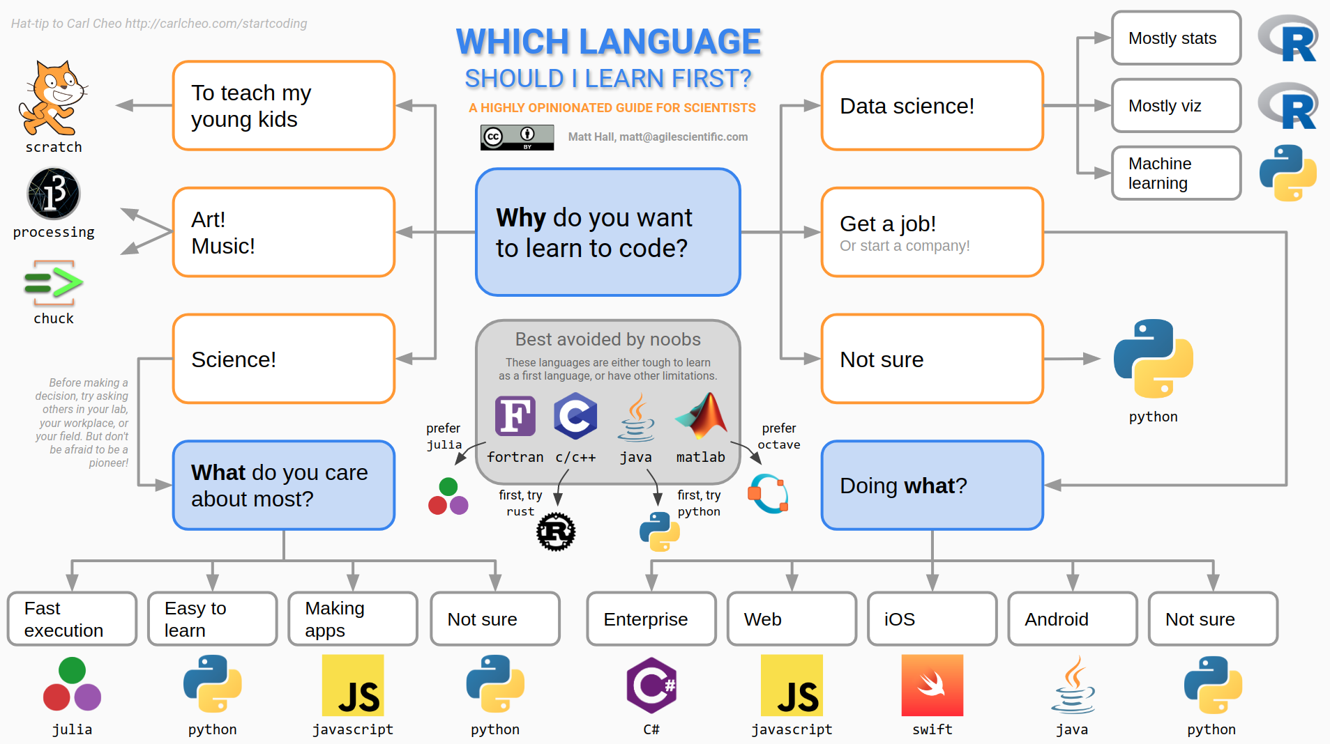
Undeterred by the futility, and inspired by an awesome blog post on freecodecamp.org, which advises you to learn JavaScript (not terrible advice), I thought I’d try to answer the question — for scientists. I adapted a rather old decision tree in that blog post to the specific needs of scientists. Here is the latest version:

which.png

Yes, it does have a lot of Python on it. Yes, I am biased.

These sorts of things are necessarily rather one-dimensional. In an effort to give general advice, all the interesting corners are sanded down. For instance, there is definitely some domain specificity to languages. In the subsurface domain, a lot of geophysicists learned their craft in MATLAB, but today are excited about Julia. I think environmental folks are more into R. Geologists mostly still like coloured pencils best. And of course reservoir engineers mastered VBA years ago. Clearly, if you’re learning to code to start a postgraduate degree, you should probably find out what language others in your lab are using before you crack into that old copy of FORTRAN in a Weekend.*

Anyway, this decision tree thing provoked quite a bit of discussion on Software Underground and Twitter. Some people felt challenged, although my purpose was to suggest a starting point for people, not to say “Never touch Java” (although, seriously, never touch Java). It’s natural — learning to master a language takes years and people are sensitive to perceived criticism of how they spent their time. But this misses the point a bit — programming is really just about getting things done, preferably in an open language (<cough> not MATLAB). So what’s the quickest path for a new programmer to start getting things done?

I appreciated this thoughtful comment from Kris Kuhlman:

I think it worked out more or less that way for me. I learned a bit of BASIC as a 12-year-old, and knew enough assembly to crash a BBC Micro. Then I learned awk in 1993, and used it for basically everything — including many things it certainly was not designed for. I tried and failed to learn Java in 2002, instead picking up MATLAB… which led to Python in about 2008. I was a slow learner though; it took years to be convinced that I needed NumPy. (Yes, you can load seismic as a list of lists.)

In the end, you need several tools in your belt. Several people pointed out that SQL (a so-called ‘domain specific language’ rather than a full-blown programming language) is incredibly useful to know. I think you could say the same for HTML and maybe even XML — or perhaps JSON these days. Then again, maybe these stretch the definition of ‘programming language’ a bit too far. Besides, if you write code, you’ll meet them eventually.

In the end, the point is to get things done. Every language on that tree will enable you to get things done. (Admittedly, Scratch, Processing, ChucK have rather narrow domains.) Fortran has been around for 70 years (not a typo) and is still in the top 20 languages. So don’t sweat it — if Kris is right, you’ll need to learn 2 languages before one sticks anyway.


* There is no such book, lol.

All the wedges

Wedges are a staple of the seismic interpreter’s diet. These simple little models show at a glance how two seismic reflections interact with each other when a rock layer thins down to — and below — the resolution limit of the data. We can also easily study how the interaction changes as we vary the wavelet’s properties, especially its frequency content.

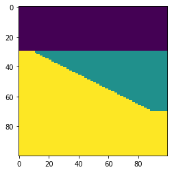
Here’s how to make and plot a basic wedge model with Python in the latest version of bruges, v0.4.2:

 
import bruges as bg
import matplotlib.pyplot as plt

wedge, *_ = bg.models.wedge()

plt.imshow(wedge)
wedge_basic.png

It really is that simple! This model is rather simplistic though: it contains no stratigraphy, and the numerical content of the 2D array is just a bunch of integers. Let’s instead make a P-wave velocity model, with an internal bed of faster rock inside the wedge:

 
strat = [2.35, (2.40, 2.50, 2.40), 2.65]
wedge, *_ = bg.models.wedge(strat=strat)

plt.imshow(wedge)
plt.colorbar()
wedge_layer.png

We can also choose to make the internal geometry top- or bottom-conformant, mimicking onlap or an unconformity, respectively.

 
strat = strat=[0, 7*[1,2], 3]
wedge, *_ = bg.models.wedge(strat=strat,
                            conformance='base'
                           )

plt.imshow(wedge)
wedge_unconformity.png

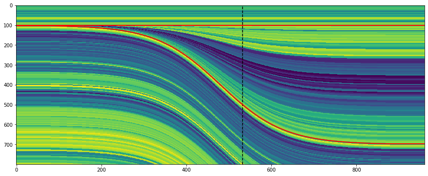
The killer feature of this new function might be using a log to make the stratigraphy, rather than just a few beds. This is straightforward to do with welly, because it makes selecting depth intervals and resampling a bit easier:

 
import welly

gr = welly.Well.from_las('R-39.las').data['GR']
log_above = gr.to_basis(stop=2620, step=1.0)
log_wedge = gr.to_basis(start=2620, stop=2720, step=1.0)
log_below = gr.to_basis(start=2720, step=1.0)

strat = (log_above, log_wedge, log_below)
depth, width = (100, 400, 100), (40, 200, 40)
wedge, top, base, ref = bg.models.wedge(depth=depth,
                                        width=width,
                                        strat=strat,
                                        thickness=(0, 1.5)
                                       )

plt.figure(figsize=(15, 6))
plt.imshow(wedge, aspect='auto')
plt.axvline(ref, color='k', ls='--')
plt.plot(top, 'r', lw=2)
plt.plot(base, 'r', lw=2)
wedge_log.png

Notice that the function returns to you the top and base of the wedgy part, as well as the position of the ‘reference’, in this case the well.

I’m not sure if anyone wanted this feature… but you can make clinoform models too:

wedge_log_clino.png

Lastly, the whole point of all this was to make a synthetic — the forward model of the seismic experiment. We can make a convolutional model with just a few more lines of code:

 
strat = np.array([2.32 * 2.65,  # Layer 1
                  2.35 * 2.60,  # Layer 2
                  2.35 * 2.62,  # Layer 3
                 ])

# Fancy indexing into the rocks with the model.
wedge, top, base, ref = bg.models.wedge(strat=strat)

# Make reflectivity.
rc = (wedge[1:] - wedge[:-1]) / (wedge[1:] + wedge[:-1])

# Get a wavelet.
ricker = bg.filters.ricker(0.064, 0.001, 40)

# Repeated 1D convolution for a synthetic.
syn = np.apply_along_axis(np.convolve, arr=rc, axis=0, v=ricker, mode='same')
wedge_synthetic.png

That covers most of what the tool can do — for now. I’m working on extending the models to three dimensions, so you will be able to vary layers or rock properties in the 3rd dimension. In the meantime, take these wedges for a spin and see what you can make! Do share your models on Twitter or LinkedIn, and have fun!

The procedural generation of geology

Procedural generation is a way of faking stuff with computers. But by writing code, or otherwise defining algorithms — not by manually choosing or composing or sculpting things. It’s used to produce landscapes and other assets in computer games, or just to make beautiful things. Honestly, I know almost nothing about it, and I don’t play computer games, so I’m really just coming at it from the ‘beautiful things’ side. So let’s just stick to looking at some examples…

Robert Hodgin produces jaw-dropping images, and happily one of his favourite subjects is meandering rivers. Better yet, Harold Fisk’s maps are among his inspirations. The results are mindblowing — just check this animation out:

What’s really remarkable is that everything on that map is procedurally generated: the roadways, the vegetation, the wonderful names.

If you love meanders (who doesn’t love meanders?), then you also need to know about Zoltan Sylvester’s work (not to mention his Etsy store). He produces some great animations, and also maintains some open-source Python projects (e.g. meanderpy) for producing them, so you can get stuck in and make your own.

It’s not just about meanders. Artist Tyler Hobbs has produced some striking images that strongly resemble structural cross-sections. In this thread he mentions that this wasn’t his goal, they just came out that way.

Mattias Herder, a space-obsessed viz wizard, did intend to produce crystals though. He’s using Houdini software, which I believe is also what Robert Hodgin uses for his maps. I wonder if any geologists are using it…

Landscapes are one of the big areas of application of this sort of tech, and while not strictly geological, I love these frozen vistas by French artist Guillaume Cottet:

Finally, this example from digital artist Ian Smith hints at a bit of the creative process. This guy really knows how to make rocks…

This is all so much magic to me, but I’m intrigued. Like the black hole in Interstellar, could this kind of work actually shed light on how dynamic, non-linear natural systems work? Or is it just an illusion?

What is an Ormsby wavelet anyway?

If you dabble in reflection seismic analysis, you probably know the Ricker wavelet. We’ve visited it a few times on this blog — Evan once showed how to make and plot one, I looked at some analytic properties of it, and we even played golf with it.

The Ricker is everywhere, but it has an important limitation — bandwidth. Its shape in the frequency domain is roughly Gaussian (below, left), which is the reason it only really has one parameter: the central frequency. This kind of spectrum is sometimes okay for older seismic surveys, especially marine data, because it matches the bandwidth reasonably. But for modern surveys, or even old land data, we often want a broader set of frequencies — more of a trapezoidal spectral shape. We need the Ormsby wavelet:

ricker-vs-ormsby.png

How to make an Ormsby wavelet

The earliest reference I can find to the Ormsby wavelet is in an article by Harold Ryan entitled, Ricker, Ormsby, Klauder, Butterworth — a choice of wavelets, in the September 1994 issue of the CSEG Recorder. It’s not clear at all who Ormsby was, other than “an aeronautical engineer”. And I don’t think anyone outside exploration geophysics knows what an Ormsby is, they just call it a ‘bandpass filter’.

Ryan helpfully provided both a time-domain analytic expression — which turns out to have four typos use the classical definiton of the sinc function — and a plot:

The equation in Ryan, and my modified Figure 3 (right). the result of the equation is in red.

The equation in Ryan, and my modified Figure 3 (right). the result of the equation is in red.

ryan_ormsby-cf-expression-2.png

This equation does not produce the wavelet (black) in the plot, however, it produces the one I’ve added in red. If you find this surprising, you shouldn’t — in my experience, it’s very common for the words and/or maths in a paper not to match its figures. [Edit: as noted above, in this case it’s because of how NumPy’s sinc function is defined; see the comment from Robert Kern, below.] We established this at the SEG Repro Zoo in 2018. If an author is not required to produce code or data, it’s not very surprising; and even if they do, the peer review system is not set up for referees to do this kind of check — apart from anything else, it’s far too onerous. But I digress.

After some fiddling around, I realized that the expression being passed to NumPy’s sinc function should be \(ft\), not \(\pi ft\). This produces a result that matches the figure almost exactly (and, counting wiggles, has the right frequency). So here’s the result of that new expression, shown in green here with the original figure (black) and the same red wavelet as above:

ryan_ormsby-cf-bruges.png

This green thing is the wavelet implemented in bruges so it’s easy to produce it; the arguments are the duration (0.4 seconds), the sample interval dt (4 ms) and the corner frequencies f (5, 10, 40, and 45 Hz respectively):

bruges.filters.ormsby(duration=0.4, dt=0.004, f=[5, 10, 40, 45])

What about other examples from the literature?

Good question! Apart from my own Python code in bruges, I did find one or two other implementations:

So it seems from this tiny experiment that only one of the implementations I found matched the figure in the Ryan article perfectly. The other wavelets are variations on the theme. Which is probably fine — after all, they are all only models for real seismic impulses — but in the interests of scientific reproducibility, I think it underscores the importance of transparent methodology and publishing your code.


Update on 9 Feb: A conversation in Software Underground revealed that Petrel’s version of the Ormsby wavelet matches the bruges implementation — but with a triangular window multiplied in (similar to how a Hamming window is multiplied into the seismic.jl version.


518px-Jupyter_logo.svg.png

I pushed my Python Jupyter Notebook to the new repro-zoo repository on GitHub. Please feel free to fork this project and add your own attempted reproductions of computational geoscience papers.

The original repro-zoo repo from the 2018 event is on SEG’s GitHub.


References

Ryan, H (1994). Ricker, Ormsby, Klauder, Butterworth — a choice of wavelets. CSEG Recorder 19 (7). Available online.

Soo-Kyung Miong, Robert R. Stewart and Joe Wong (2007). Characterizing the near surface with VSP and well logs. CREWES Research Report 19. Available online.

Illuminated equations

Last year I wrote a post about annotated equations, and why they are useful teaching tools. But I never shared all the cool examples people tweeted back, and some of them are too good not to share.

Let’s start with this one from Andrew Alexander that he uses to explain complex number notation:

illuminated_complex.png

Paige Bailey tweeted some examples of annotated equations and code from the reinforcement learning tutorial, Building a Powerful DQN in TensorFlow by Sebastian Theiler. Here’s one of the algorithms, with slightly muted annotations:

Illuminated_code_Theiler_edit.jpeg.png

Finally, Jesper Dramsch shared a new one today (and reminded me that I never finished this post). It links to Edward Raff’s book, Inside Deep Learning, which has some nice annotations, e.g. expressing a fundamental idea of machine learning:

Raff_cost_function.png

Dynamic explication

The annotations are nice, but it’s quite hard to fully explain an equation or algorithm in one shot like this. It’s easier to do, and easier to digest, over time, in a presentation. I remember a wonderful presentation by Ross Mitchell (then U of Calgary) at the also brilliant lunchtime mathematics lectures that Shell used to sponsor in Calgary. He unpeeled time-frequency analysis, especially the S transform, and I still think about his talk today.

What Ross understood is that the learner really wants to see the maths build, more or less from first principles. Here’s a nice example — admittedly in the non-ideal medium of Twitter: make sure you read the whole thread — from Darrel Francis, a cardiologist at Imperial Colege, London:

A video is even more dynamic of course. Josef Murad shared a video in which he derives the Navier–Stokes equation:

In this video, Grant Sanderson, perhaps the equation explainer nonpareil, unpacks the Fourier transform. He creeps up on the equation, starting instead with building the intuition around frequency decomposition:

If you’d like to try making this sort of thing, you might like to know that Sanderson’s Python software, manim, is open source.


Multi-modal explication

Sanderson illustrates nicely that the teacher has several pedagogic tools at their disposal:

  • The spoken word.

  • The written word, especially the paragraph describing a function.

  • A symbolic representation of the function.

  • A graphical representation of the function.

  • A code representation of the function, which might also have a docstring, which is a formal description of the code, its inputs, and its outputs. It might also produce the graphical representation.

  • Still other modes, e.g. pseudocode (see Theiler’s example, above), a cartoon (esssentially a ‘pseudofigure’),

Virtually all of these things are, or can be dynamic (in a video, on a whiteboard) and annotated. They approach the problem from different directions. The spoken and written descriptions should be rigorous and unambiguous, but this can make them clumsy. Symbolic maths can be useful to those that can read it, but authors must take care to define symbols properly and to be consistent. The code representation must be strict (assuming it works), but might be hard for non-programmers to parse. Figures help most people, but are more about building intuition than providing the detail you might need for implementation, say. So perhaps the best explanations have several modes of explication.

In this vein of multi-modal explication, Jeremy Howard shared a nice example from his book, Deep learning for coders, of combining text, symbolic maths, and code:

illuminated_jeremy_howard.png

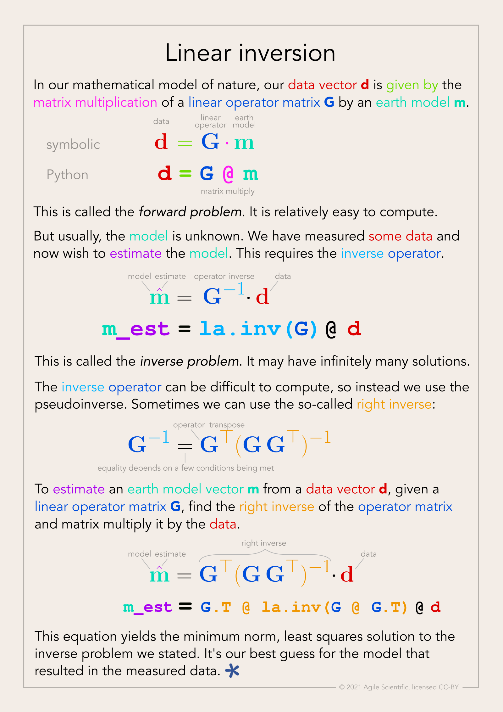
Eventually I settled on calling these things, that go beyond mere annotation, illuminated equations (not to directly compare them to the beautiful works of devotion produced by monks in the 13th century, but that’s the general idea). I made an attempt to describe linear regression and the neural network equation (not sure what else to call it!) in a series of tweets last year. Here’s the all-in-one poster version (as a PDF):

linear_inversion_page.png

There’s nothing intuitive about physics, maths, or programming. The more tricks we have for spreading intuition about these important scientific tools, the better. I think there’s something in illuminated equations for teachers to practice — and students too. In fact, Jackie Caplan-Auerbach decribes coaching her students in creating ‘equation dictionaries’ in her geophysics classes. I think this is a wonderful idea.

If you’re teaching or learning maths, I’d love to hear your thoughts. Are these things worth the effort to produce? Do you have any favourite examples to share?