x lines of Python: contour maps

Difficulty rating: EASY

Following on from the post a couple of weeks ago about colourmaps, I wanted to poke into contour maps a little more. Ostensibly, making a contour plot in matplotlib is a one-liner:

plt.contour(data)

But making a contour plot look nice takes a little more work than most of matplotlib's other plotting functions. For example, to change the contour levels you need to make an array containing the levels you want... another line of code. Adding index contours needs another line. And then there's all the other plotty stuff.

Here's what we'll do:

  1. Load the data from a binary NumPy file.
  2. Check the data looks OK.
  3. Get the min and max values from the map.
  4. Generate the contour levels.
  5. Make a filled contour map and overlay contour lines.
  6. Make a map with index contours and contour labels.

The accompanying notebook sets out all the code you will need. You can even run the code right in your browser, no installation required.

Here's the guts of the notebook:

 
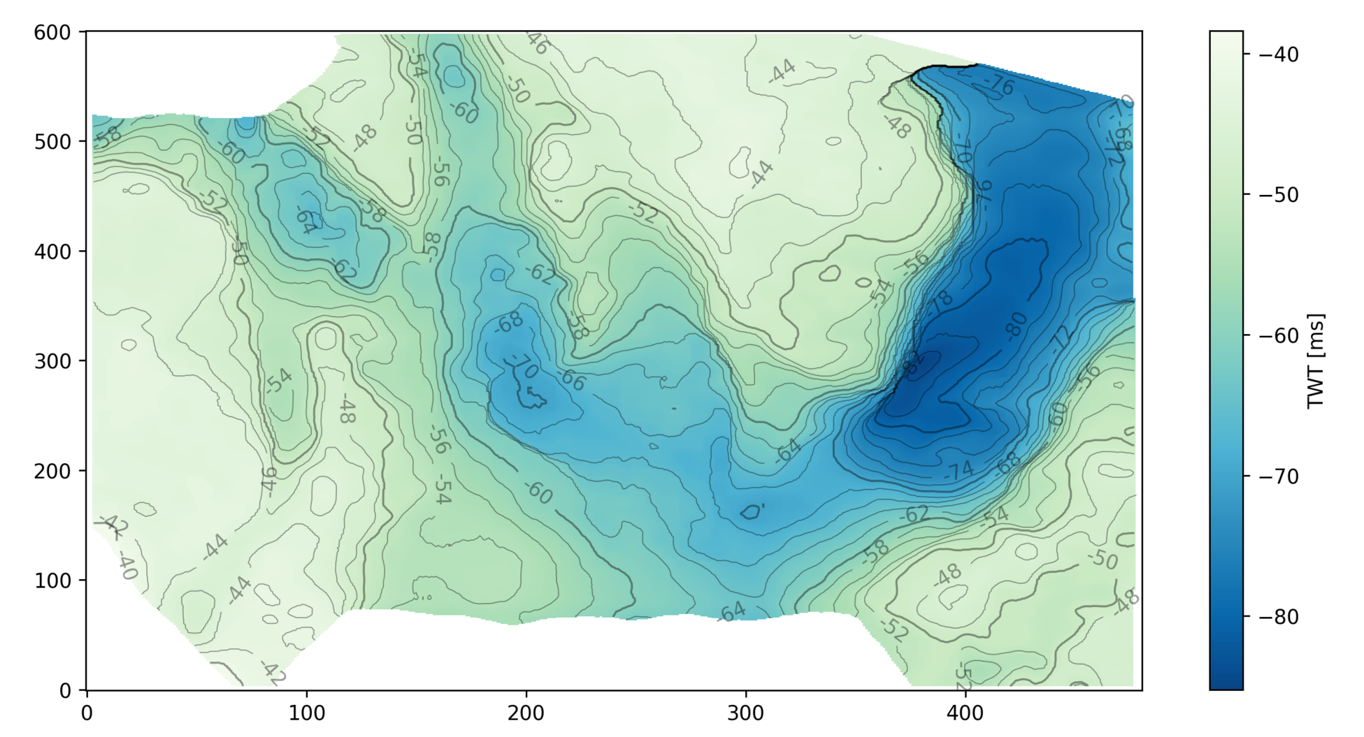
import numpy as np
import matplotlib.pyplot as plt

seabed = np.load('../data/Penobscot_Seabed.npy')
seabed *= -1
mi, ma = np.floor(np.nanmin(seabed)), np.ceil(np.nanmax(seabed))
step = 2
levels = np.arange(10*(mi//10), ma+step, step)
lws = [0.5 if level % 10 else 1 for level in levels]

# Make the plot
fig = plt.figure(figsize=(12, 8))
ax = fig.add_subplot(1,1,1)
im = ax.imshow(seabed, cmap='GnBu_r', aspect=0.5, origin='lower')
cb = plt.colorbar(im, label="TWT [ms]")
cb.set_clim(mi, ma)
params = dict(linestyles='solid', colors=['black'], alpha=0.4)
cs = ax.contour(seabed, levels=levels, linewidths=lws, **params)
ax.clabel(cs, fmt='%d')
plt.show()

This produces the following plot:

my_map.png

2017 retrospective

Another year pulls on its winter boots and prepares to hurry through the frigid night to wherever old years go to die. From a purely Agile point of view, putting aside all the odious nonsense going on in the world for a moment, it was a good year here at Agile, and I hope it was for you too. If not — if you were unduly affected by any of the manifold calamities in 2017 — then we wish you the best and hope life bounces back with renewed vigour in 2018.


>>>
A reproducible festive card for you, made from a well-
log and a bunch of random numbers. Make your own. 


agile_star_2016_sq_256px.png

It's that time when I like to self-indulgently glance back over the last twelve months — both on the blog and elsewhere in the Agile universe. Let's start with the blog...

The most popular posts

We should top 52 posts this year (there's just something about the number 52). Some of them do little more than transmit news, events and such, but we try to bring you entertainment and education too. Just no sport or weather. These were our most visited posts in this year:

As usual though, the most popular page on the site is k is for wavenumber, the 2012 post that keeps on giving. The other perennials are Well tie workflowWhat is anisotropy? and What is SEG Y? 

Engagement

We love getting comments! Most people tend to chime in via Twitter or LinkedIn, but we get quite a few on the blog. Indeed, the posts listed above got more than 60 comments between them. The following were the next most commented upon:

Agile_demographic_2017.png

Where is everybody?

  1. Houston (about 6.6% of you)
  2. Calgary (4.8%)
  3. London (3.3%)
  4. Perth (1.8%)
  5. Moscow (1.3%)
  6. Stavanger (1.2%)
  7. Rio de Janiero (1.1%)
  8. Kuala Lumpur (1.0%)
  9. Paris (1.0%)
  10. Aberdeen (0.9%)

Work

We're fortunate to have had a good year at Agile. I won't beat our drum too hard, but here's a bit of what we've been up to:

  • We're doing a machine learning project on GPR interpretation.
  • We finished a machine learning lithology prediction project for Canstrat.
  • Matt did more seep and DHI mapping on Canada's Atlantic margin.
  • It was a good year for hackathons, with over 100 people taking part in 2017.
  • Agile Libre brought out a new book, 52 More Things... Palaeontology.
  • We hired awesome data scientist Diego Castañeda (right) full time. 

Thank you

Last but far from least — thank you. We appreciate your attention, one of the most precious resources you have. We love writing useful-and/or-interesting stuff, and are lucky to have friends and colleagues who read it and push us to do more, and a bit better than before. It would be a chore if it wasn't for your readership.

All the best for this Yuletide season, and for a peaceful New Year. Cheers!

No more rainbows!

"the rainbow color map can significantly reduce a person’s accuracy and efficiency"
Borkin et al. (2011)

File under "Aaarrrrrrgghhhhhhh"

File under "Aaarrrrrrgghhhhhhh"

The world has known for at least 20 years that the rainbow colourmap is A Bad Thing, perhaps even A Very Bad Thing. IBM researchers Bernice Rogowitz and Lloyd Treinish — whose research on the subject goes back to the early 90s — wrote their famous article Why should engineers and scientists be worried about color? in 1996. Visualization guru Edward Tufte highlighted the problems with it in his 1997 book Visual Explanations (if you haven't read this book, you must buy it immediately). 

This isn't a matter of taste, or opinion. We know — for sure, with science! — that the rainbow is a bad choice for the visualization of data. And yet people use it every day, even in peer-reviewed literature. And — purely anecdotally — it seems to be especially rife in geoscience <citation needed>.

Why are we talking about this? 

The rainbow colourmap suffers from a number of severe problems:

  • It's been linked to inferior image interpretation by professionals (Borkin et al 2011).

  • It introduces ambiguity into the display: are we looking at the data's distribution, or the colourmap's?

  • It introduces non-existent structure into the display — notice the yellow and cyan stripes, which manifest as contours:

rainbow.png
  • Colourblind people cannot read the colours properly — I made this protanopic simulation with Coblis

rainbow_protanope.png
  • It does not have monotonically increasing lightness, so you can't reproduce it in greyscale.

rainbow_grey.png
  • There's no implicit order to hues, so it's hard to interpret meaning intuitively.

  • On a practical note, it uses every available colour, leaving you none for annotation.

For all of these reasons, MATLAB and Matplotlib no longer use rainbow-like colourmaps by default. And neither should you.

But I like rainbows!

People tend like things that are bad for them. Chris Jackson (Imperial, see here and here) and Bert Bril (dGB, in Slack) have both expressed an appreciation for rainbow-like colourmaps, or at least an indifference. Bert went so far as to say he doesn't like 'perceptual' colourmaps — those that monotonically and linearly increase in brightness. 

I don't think indifference is allowed. Research with professional image interpreters has shown us that rainbow colourmaps impair the quality of their work. We know that these colours are hard for colourblind people to use. The practical issues of not being readable in greyscale and leaving no colours for annotation are always present. There's just no way we can ask, "Does it matter?" — at least not without offering some evidence that goes beyond mere anecdote.

I think what people like is the colour variance — it acts like contours, highlighting subtle features in the surface. Some of this extra detail is probably noise, but some is certainly signal, maybe even opportunity. 

See what you think of these renderings of the seafloor pick on the Penobscot dataset, offshore Nova Scotia (licensed CC-BY-SA by dGB Earth Sciences and The Government of Nova Scotia). The top row are some rainbow-like colourmaps, all bad. The others are a selection of (more-or-less) perceptually awesome colourmaps. The names under each map are the names of the colourmaps in Python's matplotlib package.

The solution

We know what kind of colourmaps are good for interpretation: those that increase linearly and monotonically in brightness, with no jumps or stripes of luminance. I've linked to lots of places where you can read about these — see the end of the post. You already know one perceptual colourmap: the humble Greyscale. But there are lots of others, so let's start with one of them.

Next, instead of using something that acts like contours, let's try using contours!

I think that's a big improvement already. Some tips for contouring:

  1. Make them thin and black, with opacity at about 0.2 to 0.5. Transparency is essential. 

  2. Choose a fairly small interval; use index contours if there are more than about 10.

  3. Label the contours directly on a large map. State the contour interval in the caption.

Let's try hillshading instead:

Also really nice.

Given that this is a water-bottom horizon, I like the YlGnBu colourmap, which resembles the thing it is modeling. (I think this is also a good basis for selecting a colourmap, by the way, all else being equal.)

I must admit I do find a lot of these perceptual colormaps get too dark at the 'low' end, which can make annotation (or seeing contours) hard. So we will fix that with a function (see the notebook) that generates perceptually linear colourmaps.

Now tell me the spectrum beats a perceptual colourmap...

Horizons_faceoff.png

Let's check that it is indeed colourblind-safe and grey-safe:

Horizons_faceoff_protanope.png
Horizons_faceoff_grey.png

There you have it. If you care about your data and your readers, avoid rainbow-like colourmaps in the lab and in publications. Go perceptual!

The Python code and data to generate these images is available on GitHub.

Binder     Better yet, click here to play with the data right in your browser!

What do you think? Are rainbow colourmaps here to stay? 

References and bibliography

Still not convinced?

For goodness sake, just listen to Kristin Thyng for 20 minutes: