x lines of Python: Gridding map data

Difficulty rating: moderate.

Welcome to the latest in the X lines of Python series. You probably thought it had died, gawn to ‘eaven, was an x-series. Well, it’s back!

Today we’re going to fit a regularly sampled surface — a grid — to an irregular set of points in (x, y) space. The points represent porosity, measured in volume percent.

Here’s what we’re going to do; it all comes to only 9 lines of code!

  1. Load the data from a text file (needs 1 line of code).

  2. Compute the extents and then the coordinates of the new grid (2 lines).

  3. Make a radial basis function interpolator using SciPy (1 line).

  4. Perform the interpolation (1 line).

  5. Make a plot (4 lines).

As usual, there’s a Jupyter Notebook accompanying this blog post, and you can run it right now without installing anything.


Binder Run the accompanying notebook in MyBinder

Open In Colab Run the notebook in Google Colaboratory

Just the juicy bits

The notebook goes over the workflow in a bit more detail — with more plots and a few different ways of doing the interpolation. For example, we try out triangulation and demonstrate using scikit-learn’s Gaussian process model to show how we might use kriging (turns out kriging was machine learning all along!).

If you don’t have time for all that, and just want the meat of the notebook, here it is:

 
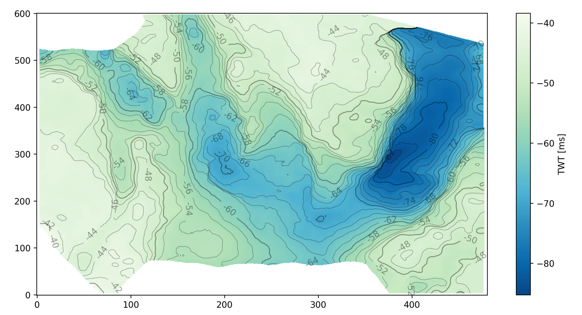
import numpy as np
import pandas as pd
import matplotlib.pyplot as plt
from scipy.interpolate import Rbf

# Load the data.
df = pd.read_csv('../data/ZoneA.dat',
                 sep=' ',
                 header=9,
                 usecols=[0, 1, 2, 3],
                 names=['x', 'y', 'thick', 'por']
                )

# Build a regular grid with 500-metre cells.
extent = x_min, x_max, y_min, y_max = [df.x.min()-1000, df.x.max()+1000,
                                       df.y.min()-1000, df.y.max()+1000]
grid_x, grid_y = np.mgrid[x_min:x_max:500, y_min:y_max:500]

# Make the interpolator and do the interpolation.
rbfi = Rbf(df.x, df.y, df.por)
di = rbfi(grid_x, grid_y)

# Make the plot.
plt.figure(figsize=(15, 15))
plt.imshow(di.T, origin="lower", extent=extent)
cb = plt.scatter(df.x, df.y, s=60, c=df.por, edgecolor='#ffffff66')
plt.colorbar(cb, shrink=0.67)
plt.show()

This results in the following plot, in which the points are the original data, plotted with the same colourmap as the surface itself (so they should be the same colour, more or less, as their background).

rbf_interpolation.png

The geospatial sport

An orienteer leaving a control site. 

If you love studying maps or solving puzzles, and you love being outside, then orienteering — the thinking runner's sport — might be the sport you've been looking for.

There are many, many flavours of orienteering (on foot, on skis, in kayaks, etc), but here's how it generally works:

  • Competitors make their way to an event, perhaps on a weekday evening, maybe a weekend morning.
  • Several courses are offered, varying in length (usually 2 to 12 km) and difficulty (from walk-in-the-park to he's-still-not-back-call-search-and-rescue).
  • A course consists of about 20 or so 'controls', which must be visited in order. Visits are recorded on an electronic 'dibber' carried by the orienteer, or by shapes punched on a card.
  • Each person chooses a course , and is allotted a start time.
  • You can't see your course — or the map — until you start. You have 0 seconds to prepare.
  • You walk or run or ski or bike around the controls, at various speeds and in various (occasionally incorrect) directions.
  • After making it to the finish, everyone engages in at least 30 minutes of analysis and dissection of route choices and split times, while eating everything in sight.

The catch is that your navigation system is entirely analog: you are only allowed a paper map and an analog compass, plus a whistle for safety. The only digital components are the timing system and the map-making process — which starts with LiDAR and ends in a software package like OCAD or OOM.

Orienteering maps are especially awesome. They are usually made especially for the sport, typically at 1:5000 or 1:7500, with a 2.5 m or 5 m contour interval. Many small features are mapped, for example walls and fences, small pits and mounds, and even individual trees and boulders.

The sample orienteering map from the Open Orienteering Mapper software, licensed GNU GPL. White areas correspond to open, runnable (high velocity) woodland, with darker shades of green indicating slower running. Yellow areas are open. Olive green ar…

The sample orienteering map from the Open Orienteering Mapper software, licensed GNU GPL. White areas correspond to open, runnable (high velocity) woodland, with darker shades of green indicating slower running. Yellow areas are open. Olive green areas are out of bounds.

Other than the contours and paths, the most salient feature is usually the vegetation, which is always carefully mapped. Geophysicists will like this: the colours correspond more to the speed with which you can run than to the type of vegetation. Orienteering maps are velocity maps!

Here's part of another map, this one from Debert, Nova Scotia:

bluenose-map-debert.png

So, sporty cartophile friends, I urge you to get out and give it a try. My family loves it because it's something we can do together — we all get to compete on our own terms, with our own peers, and there's a course for everyone. I'm coming up on 26 years in the sport, and every event is still a new adventure!


World Orienteering Day — really a whole week — is in the last week in May. It's a great time to give orienteering a try. There are events all over the world, but especially in Europe. If you can't find one near you, track down your national organization and check for events near you.

x lines of Python: contour maps

Difficulty rating: EASY

Following on from the post a couple of weeks ago about colourmaps, I wanted to poke into contour maps a little more. Ostensibly, making a contour plot in matplotlib is a one-liner:

plt.contour(data)

But making a contour plot look nice takes a little more work than most of matplotlib's other plotting functions. For example, to change the contour levels you need to make an array containing the levels you want... another line of code. Adding index contours needs another line. And then there's all the other plotty stuff.

Here's what we'll do:

  1. Load the data from a binary NumPy file.
  2. Check the data looks OK.
  3. Get the min and max values from the map.
  4. Generate the contour levels.
  5. Make a filled contour map and overlay contour lines.
  6. Make a map with index contours and contour labels.

The accompanying notebook sets out all the code you will need. You can even run the code right in your browser, no installation required.

Here's the guts of the notebook:

 
import numpy as np
import matplotlib.pyplot as plt

seabed = np.load('../data/Penobscot_Seabed.npy')
seabed *= -1
mi, ma = np.floor(np.nanmin(seabed)), np.ceil(np.nanmax(seabed))
step = 2
levels = np.arange(10*(mi//10), ma+step, step)
lws = [0.5 if level % 10 else 1 for level in levels]

# Make the plot
fig = plt.figure(figsize=(12, 8))
ax = fig.add_subplot(1,1,1)
im = ax.imshow(seabed, cmap='GnBu_r', aspect=0.5, origin='lower')
cb = plt.colorbar(im, label="TWT [ms]")
cb.set_clim(mi, ma)
params = dict(linestyles='solid', colors=['black'], alpha=0.4)
cs = ax.contour(seabed, levels=levels, linewidths=lws, **params)
ax.clabel(cs, fmt='%d')
plt.show()

This produces the following plot:

my_map.png

In search of the Kennetcook Thrust

Behind every geologic map, is a much more complex geologic truth. Most of the time it's hidden under soil and vegetation, forcing geologists into a detective game in order to fill gaps between hopelessly sparse spatterings of evidence.

Two weeks ago, I joined up with an assortment of geologists on the side of the highway an hour north of Halifax for John Waldron to guide us along some spectacular stratigraphy exposed in the coastline cliffs on the southern side of the Minas Basin (below). John has visited these sites repeatedly over his career, and he's supervised more than a handful of graduate students probing a variety of geologic processes on display here. He's published numerous papers teasing out the complex evolution of the Windsor-Kennetcook Basin: one of three small basins onshore Nova Scotia with the potential to contain economic quantities of hydrocarbons.

John retold the history of mappers past and present riddled by the massively deformed, often duplicated Carboniferous evaporites in the Windsor Group which are underlain by sub-horizontal seismic reflectors at depth. Local geologists agree that this relationship reflects thrusting of the near-surface package, but there is disagreement on where this thrust is located, and whether and where it intersects the surface. On this field trip, John showed us symptoms of this Kennetcook thrust system, at three sites. We started in the footwall. The second and third sites were long stretches spectacularly deformed exposures in the hangingwall.  

Footwall: Cheverie Point

SEE GALLERY BELOW FOR ENLARGEMENT

SEE GALLERY BELOW FOR ENLARGEMENT

The first stop was Cheverie Point and is interpreted to be well in the footwall of the Kennetcook thrust. Small thrust faults (right) cut through the type section of the Macumber Formation and match the general direction of the main thrust system. The Macumber Formation is a shallow marine microbial limestone that would have fooled anyone as a mudstone, except it fizzed violently under a drop of HCl. Just to the right of this photo, we stood on the unconformity between the petroliferous and prospective Horton Group and the overlying Windsor Group. It's a pick that turns out to be one of the most reliably mappable seismic events on seismic sections so it was neat to stand on that interface.

Further down section we studied the Mississippian Cheverie Formation: stacked cycles of point-bar deposits ranging from accretionary lag conglomerates to caliche paleosols with upright tree trunks. Trees more than a metre or more in diameter were around from the mid Devonian, but Cheverie forests are still early and good examples of trees within point-bars and levees.  

Hangingwall: Red Head / Johnson Beach / Split Rock

SEE GALLERY BELOW FOR ENLARGEMENT

SEE GALLERY BELOW FOR ENLARGEMENT

The second site featured some spectacularly folded black shales from the Horton Bluff Formation, as well as protruding sills up to two metres thick that occasionally jumped across bedding (right). We were clumsily contemplating the curious occurrence of these intrusions for quite some time until hard-rock guru Trevor McHattie halted the chatter, struck off a clean piece rock with a few blows of his hammer, wetted it with a slobbering lick, and inspected it with his hand lens. We all watched him in silence and waited for his description. I felt a little schooled. He could have said anything. It was my favourite part of the day.

Hangingwall continued: Rainy Cove

The patterns in the rocks at Rainy Cove are a wonderland for any structural geologist. It's a popular site for geology labs from Atlantic Universities, but it would be an absolute nightmare to try to actually measure the section here. 

SEE GALLERY BELOW FOR ENLARGEMENT

SEE GALLERY BELOW FOR ENLARGEMENT

John stands next to a small system of duplicated thrusts in the main hangingwall that have been subsequently folded (left). I tried tracing out the fault planes by following the offsets in the red sandstone bed amidst black shales whose fabric has been deformed into an accordion effect. Your picks might very well be different from mine.

A short distance away we were pointed to an upside-down view of load structures in folded beds. "This antiform is a syncline", John paused while we processed. "This synform over here is an anticline". Features telling of such intense deformation are hard to fathom. Especially in plain sight.

The rock lessons ended in the early evening at the far end of Rainy Cove where the Triassic Wolfville formation sits unconformably on top of ridiculously folded, sometimes doubly overturned Carboniferous Horton Rocks. John said it has to be one of the most spectacularly exposed unconformities in the world. 

I often take for granted the vast stretches of geology hiding beneath soil and vegetation, and the preciousness of finding quality outcrop. Check out the gallery below for pictures from our day.  

I was quite enamoured with John's format. His field trip technologies. The maps and sections: canvases for communication and works in progress. His white boarding, his map-folding techniques: a practised impresario.

What are some of the key elements from the best field trips you've been on? Let us know in the comments.

October linkfest

The linkfest has come early this month, to accommodate the blogging blitz that always accompanies the SEG Annual Meeting. If you're looking forward to hearing all about it, you can make sure you don't miss a thing by getting our posts in your email inbox. Guaranteed no spam, only bacn. If you're reading this on the website, just use the box on the right →


Open geoscience goodness

I've been alerted to a few new things in the open geoscience category in the last few days:

  • Dave Hale released his cool-looking fault detection code
  • Wayne Mogg released some OpendTect plugins for AVO, filtering, and time-frequency decomposition
  • Joel Gehman and others at U of A and McGill have built WellWiki, a wiki... for wells!
  • Jon Claerbout, Stanford legend, has released his latest book with Sergey Formel, Austin legend: Geophysical Image Estimation by Example. As you'd expect, it's brilliant, and better still: the code is available. Amazing resource.

And there's one more resource I will mention, but it's not free as in speech, only free as in beerPetroacoustics: A Tool for Applied Seismics, by Patrick Rasolofosaon and Bernard Zinszner. So it's nice because you can read it, but not that useful because the terms of use are quite stringent. Hat tip to Chris Liner.

So what's the diff if things are truly open or not? Well, here's an example of the good things that happen with open science: near-real-time post-publication peer review and rapid research: How massive was Dreadnoughtus?

Technology and geoscience

Napa earthquakeOpen data sharing has great potential in earthquake sensing, as there are many more people with smartphones than there are seismometers. The USGS shake map (right) is of course completely perceptual, but builds in real time. And Jawbone, makers of the UP activity tracker, were able to sense sleep interruption (in their proprietary data): the first passive human-digital sensors?

We love all things at the intersection of the web and computation... so Wolfram Alpha's new "Tweet a program" bot is pretty cool. I asked it:

GeoListPlot[GeoEntities[=[Atlantic Ocean], "Volcano"]]

And I got back a map!

This might be the coolest piece of image processing I've ever seen. Recovering sound from silent video images:

Actually, these time-frequency decompositions [PDF] of frack jobs are just as cool (Tary et al., 2014, Journal of Geophysical Research: Solid Earth 119 (2), 1295-1315). These deserve a post of their own some time.

It turns out we can recover signals from all sorts of unexpected places. There were hardly any seismic sensors around when Krakatoa exploded in 1883. But there were plenty of barometers, and those recorded the pressure wave as it circled the earth — four times! Here's an animation from the event.

It's hard to keep up with all the footage from volcanic eruptions lately. But this one has an acoustic angle: watch for the shockwave and the resulting spontaneous condensation in the air. Nonlinear waves are fascinating because the wave equation and other things we take for granted, like the superposition principle and the speed of sound, no longer apply.

Discussion and collaboration

Our community has a way to go before we ask questions and help each other as readily as, say, programmers do, but there's enough activity out there to give hope. My recent posts (one and two) about data (mis)management sparked a great discussion both here on the blog and on LinkedIn. There was also some epic discussion — well, an argument — about the Lusi post, as it transpired that the story was more complicated that I originally suggested (it always is!). Anyway, it's the first debate I've seen on the web about a sonic log. And there continues to be promising engagement on the Earth Science Stack Exchange. It needs more applied science questions, and really just more people. Maybe you have a question to ask...?

Géophysiciens avec des ordinateurs

Don't forget there's the hackathon next weekend! If you're in Denver, free come along and soak up the geeky rays. If you're around on the afternoon of Sunday 26 October, then drop by for the demos and prizes, and a local brew, at about 4 pm. It's all happening at Thrive, 1835 Blake Street, a few blocks north of the convention centre. We'll all be heading to the SEG Icebreaker right afterwards. It's free, and the doors will be open.

Colouring maps

Over the last fortnight, I've shared five things, and then five more things, about colour. Some of the main points:

  • Our non-linear, heuristic-soaked brains are easily fooled by colour.
  • Lots of the most common colour bars (linear ramps, bright spectrums) are not good choices.
  • You can learn a lot by reading Robert Simmon, Matteo Niccoli, and others.

Last time I finished on two questions:

  1. How many attributes can a seismic interpreter show with colour in a single display?
  2. On thickness maps should the thicks be blue or red?

One attribute, two attributes

The answer to the first question may be a matter of personal preference. Doubtless we could show lots and lots, but the meaning would be lost. Combined red-green-blue displays are a nice way to cram more into a map, but they work best on very closely related attributes, such as seismic amplitude of three particular frequencies

Here's some seismic reflection data — the open F3 dataset, offshore Netherlands, in OpendTect

A horizon — just below the prominent clinoforms — is displayed (below, left) and coloured according to elevation, using one of Matteo's perceptual colour bars (now included in OpendTect!). A colour scale like this varies monotonically in hue and luminance.

Some of the luminance channel (sometimes called brightness or value) is showing elevation, and a little is being used up by the 3D shading on the surface, but not much. I think the brain processes this automatically because the 3D illusion is quite good, especially when the scene is moving. Elevation and shape are sort of the same thing, so we've still only really got one attribute. Adding contours is quite nice (above, middle), and only uses a narrow slice of the luminance channel... but again, it's the same data. Much better to add new data. Similarity (a member of the family that includes coherence, semblance, and so on) is a natural fit: it emphasizes a particular aspect of the shape of the surface, but which was measured independently of the interpretaion, directly from the data itself. And it looks awesome (above, right).

Three attributes, four

OK, we have elevation and/or shape, and similarity. What else can we add? Another intuitive attribute of seismic is amplitude (below, left) — closely related to the strength of the reflected energy. Two things: we don't trust amplitudes in areas with low fold — so we can mask those (below, middle). And we're only really interested in bright spots, so we can edit the opacity profile of the attribute and make low values transparent (below, right). Two more attributes — amplitude (with a cut-off that reflects my opinion of what's interesting — is that an attribute?) and fold.

Since we have only used one hue for the amplitude, and it was not in Matteo's colour bar, we can layer it on the original map without clobbering anything. Unfortunately, there's no easy way for the low fold mask to modulate amplitude without interfering with elevation, because the elevation map needs to be almost completely opaque. What I need is a way to modulate a surface's opacity with an attribute it is not displaying with hue...

Thickness maps

The second question — what to colour thicks — is easy. Thicks should be towards the red end of the spectrum, sometimes not-necessarily-intuitively called 'warm' colours. (As I mentioned before in the comments, a quick Google image poll suggests that about 75% of people agree). If you colour your map otherwise, perhaps because you like the way it suggests palaeobathymetry in some depositional settings, be careful to make this very clear with labels and legends (which you always do anyway, right?). And think about just making a 'palaeobathymetry' map, not a thickness map.

I suspect there are lots of quite personal opinions out there. Like grammar, I do think much of this is a matter of taste. The only real test is clarity. Do you agree? Is there a right and wrong here? 

The map that changed the man

This is my contribution to the Accretionary Wedge geoblogfest, number 43: My Favourite Geological Illustration. You can read all about it, and see the full list of entries, at In the Company of Plants and Rocks. To quote Hollis:

All types of geological illustrations qualify — drawings, paintings, maps, charts, graphs, cross-sections, diagrams, etc., but not photographs.  You might choose something because of its impact, its beauty, its humor, its clear message or perhaps because of a special role it played in your life.  Let us know the reasons for your choice!

The map that changed the man

In 1987, at the age of 16, I became a geologist wannabe. A week on Rùm (called Rhum at the time) with volcanologist Steve Sparks convinced me that it was the most complete science of nature, being a satisfying stew of physics, chemistry, geomorphology, cosmology, fluid dynamics, and single malt whisky. One afternoon, he showed me cross-beds in the Torridonian sandstones on the shore of Loch Scresort, and identical cross-beds in the world-famous layered gabbros in the magma chamber of a Palaeogene volcano. 

View of Rum image by Southside Images, see below for credit.

But I was just a wannabe. So I studied hard at school and went off to the University of Durham. The usual studying and non-studying ensued, during which I discovered which parts of the science drew me in. There were awesome field trips, boring crystallography lectures, and tough structural geology labs. And at the end of the second year, there was the 6-week independent mapping project

As far as I know, independent mapping projects sensu stricto are a British phenomenon. I hope they still exist. Two groups decided the UK, while offering incredible basemaps and rich geological literature, was too soggy. One group went to the French Alps, where carbonates legend Maurice Tucker would be vacationing and available for advice, the other group decided that was too easy and went off to the wild mountains of northern Spain and the thrust front of the Pyrenees, where no-one was vacationing and no-one would be available for anything. Guess which group I was in. 

To say we were green would be like saying geologists think beer is OK. I hitchhiked there (but only had one creepy ride). We lived in tents (but in a peach orchard). It was July, and 35 degrees Celsius on a cool day (but there was a lake). We had no money (but lots of coloured pencils). It wasn't so bad. We all fell in love with Spain. 

Anyway, long story short, I made this map. It's no good, but that's not the point. It's my map. It's the map that turned me from wannabe into actual (if poor). It doesn't really need any commentary. It took hours and hours of scratching with Rotring Rapidographs on drawing film, then colouring the Diazo print by hand. This sounds like ancient history, but the methods I used to create it were already on the verge of extinction—the following year I started using Adobe Illustrator for draughting, and now I use Inkscape. And while some field tools have changed (of course we were not armed with laptops, Google Earth, GPS, or digital cameras), others are pure and true and timeless. Whack, whack,...

The ring of my hammer on Late Cretaceous limestones is still echoing through the Pyrenees. 

Geological map of the Embaase de Santa Ana, Alfarras, Spain; click to enlarge.

My map of the geology around the Embalse de Santa Ana. Hand-drawn by me in 1992, though I admit it looks like it's from 1892. Click for a larger view. View of Rùm by flickr user Southside Images, licensed CC-BY-NC-SA.

Best online geological maps

Fisk map of Mississippi RiverOne of Fisk's beautiful maps of the Mississippi River, near Readland, Arkansas. Click the map to see more detail.Like most earth scientists I know, I love maps. As a child, I pored over the AA Atlas of Britain on long car journeys. As a student, I spent hours making my first geological map. As an orienteer I learned to read maps running through rhododendron bushes in the rain. As a professional geoscientist, my greatest pleasure is still producing a fine map.

When I worked on the McMurray Formation of Alberta, my colleague came across Harold Fisk's incredible maps of the Mississippi River. These maps have to be seen to be believed, and for me they show how far computers have to go before they can be considered to have replaced paper. The effort and commitment is palpable. If I ever produce anything half as beautiful in my career, I will consider myself privileged. Even more marvellously, since they were made by the Army Corps of Engineers, they are all downloadable for free.

This resource made me wonder what other maps are out there on the web. Not surprisingly, there are lots, and some are quite special. Here's a list of my favourites:

No doubt I have missed some. If you have a favourite of your own, please add it to the comments or drop me a line and I'll be happy to post a follow-up.