Why petrophysics is hard

Earlier this week we published our fourth cheatsheet, this time for well log analysis or petrophysics. (Have you seen our other cheatsheets?) Why did we think this was a subject tricky enough to need a cheatsheet in the back of your notebook? I think there are at least three things which make the interpretation of log data difficult:

Most of the tools do not directly measure properties we are interested in. For example, the radioactivity of the rocks is not important to us, but it does make a reliable clay and organic matter proxy, because these substances tend to have more uranium and other radioactive elements in them. Almost all of the logs are just proxies for the data we really need. 

We only see the rocks through the filter of the method. Even if we could perfectly derive apparent reservoir properties from the logs, there are lots of reasons why they might be less than accurate. For example, the drilling fluid (usually some sort of brine- or oil-based suspension of mud) tends to invade the rocks, especially the more permeable formations, the very ones we are interested in. The drilling fluid can also interfere with some tools, depending on its composition: barite absorbs gamma-rays, for example. 

The field is infested with jargon and historical baggage. Since Conrad and Marcel Schlumberger invented the technique almost 100 years ago, thousands of new tools and new methods have been invented. Every tool and log has its own name, method (usually proprietary these days) and idiosyncracies, making for a bewildering, intimidating even, menagerie. Worse still, lots of modern tools collect multi-dimensional data: for example, sonic spectra on multiple axes, magnetic resonance T2 distributions, dynamically-scaled image logs. 

We drew from several sources to build our cheatsheet. We drew partly from our own experience, but also relied on input from some petrophysical specialists: Neil Watson of Atlantic Petrophysics, Andrea Creemer of Corridor Resources, and Ross Crain of Spectrum 2000. We also consulted the following references, synthesizing liberally where they disagreed (quite often, given the range of vintages of these works).

Despite referring to some of the best sources in the industry, we hereby assert that all errors are attributable to us, not our sources. If you find errors, please let us know. Get in touch on Twitter, use the contact form, or leave a comment.

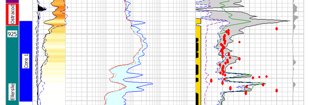
Part of Viking's Provost A4-23 in 36-6, in Alberta, Canada.

Petrophysics cheatsheet

Geophysical logging is magic. After drilling, a set of high-tech sensors is lowered to the bottom of the hole on a cable, then slowly pulled up collecting data as it goes. A sort of geological endoscope, the tool string can measure manifold characteristics of the rocks the drillbit has penetrated: temperature, density, radioactivity, acoustic properties, electrical properties, fluid content, porosity, to name a few. The result is a set of well logs or wireline logs.

The trouble is there are a lot of different logs, each with its own idiosyncracies. The tools have different spatial resolutions, for example, and are used for different geological interpretations. Most exploration and production companies have specialists, called petrophysicists, to interpret logs. But these individuals are sometimes (usually, in my experience) thinly spread, and besides all geologists and geophysicists are sometimes faced with interpreting logs alone.

We wanted to make something to help the non-specialist. Like our previous efforts, our new cheatsheet is a small contribution, but we hope that you will want to stick it into the back of your notebook. We have simplified things quite a bit: almost every single entry in this table needs a lengthy footnote. But we're confident we're giving you the 80% solution. Or 70% anyway. 

Please let us know if and how you use this. We love hearing from our users, especially if you have enhancements or comments about usability. You can use the contact form, or leave a comment here

News of the week

We hope you're having a great summer. Our website has been quieter than usual this week, but we're busy building things—stay tuned. And we haven't done a news post for a few weeks, so here are some things that have caught our eye.

A new imaging paradigm

Lytro has begun what may be a revolution for photography with the light field camera, putting the choice of the focal point and depth of field in the hands of the viewer, not the photographer. Try it yourself: click on these examples to change the focal point of the images.

The radical new sensor works by not only capturing the intensity of light, but also its direction. This means the full visual field can be reconstructed. You can view the inspiring gallery of dynamic images or read more about the methods behind computational photography from Ian Hopkinson's blog post. The analogy to full wavefield imaging is obvious, but perhaps the most exciting story is not the technology, but the shift of control from imager (processor) to viewer (interpreter). 

Don't compress the data, expand the medium

Wolfram, makers of Mathematica among other things, are a deeply innovative bunch. This week they launched the Computable Document Format, or CDF, for interactive documents. These new documents could make reports, presentations, e-textbooks, and journal articles much more interesting. 

INT releases Geo Toolkit 4.2

Interactive Network Technologies, makers of the INTViewer interpretation software, have released a new version of its GeoToolkit, version 4.2. It's a proprietary C++ library for developers of geoscience software, and is used by many of the major exploration companies. New features include

  • Improved Seismic display with support for anti-aliasing, transparency, and image rotation
  • New indexed seismic data support for rapid access of large datasets
  • Enhancements to Chart libraries, including multiple selection within charts and ability to link charts.

TimeScale Creator gets a major upgrade

We have written before about this handy application from a Purdue consortium; it should be in every geoscientist's toolbox. Keep an eye out over the summer and fall for new datapacks (including Arctic Canada, Australia, NE Russia), and an all-new web version. Version 5 has some great enhancements:

  • A new data input format, and some limits on user data in the free version
  • Database and display improvements for humanoids, dinocycsts, and passive margins, plus new datapacks
  • Improved geographic interface, now with index maps

This regular news feature is for information only. We aren't connected with any of these organizations, and don't necessarily endorse their products or services.

Geophysical stamps 3: Geophone

Back in May I bought some stamps on eBay. I'm not really a stamp collector, but when I saw these in all their geophysical glory, I couldn't resist them. They are East German stamps from 1980, and they are unusual because they aren't schematic illustrations so much as precise, technical drawings. I have already written about the the gravimeter and the sonic tool stamps; today I thought I'd tell a bit about the most basic seismic sensor, the geophone.

← The 35 pfennig stamp in the series of four shows a surface geophone, with a schematic cross-section and cartoon of the seismic acquisition process, complete with ray-paths and a recording truck. Erdöl and Erdgas are oil and gas, Erkundung translates as surveying or exploration. The actual size of the stamp is 43 × 26 mm.

There are four basic types of seismic sensor (sometimes generically referred to as receivers in exploration geophysics):

Seismometers — precision instruments not used in exploration seismology because they are usually quite bulky and require careful set-up and calibration. [Most modern models] are accelerometers, much like relative gravimeters, measuring ground acceleration from the force on a proof mass. Seismometers can detect frequencies in a very broad band, on the order of 0.001 Hz to 500 Hz: that's 19 octaves!

Geophones — are small, cheap, and intended for rapid deployment in large numbers. The one illustrated on the stamp, like the modern cut-away example shown here, would be about 4 × 20 cm, with a total mass of about 400 g. The design has barely changed in decades. The mean-looking spike is to try to ensure good contact with the ground (coupling). A frame-mounted magnet is surrounded by a proof mass affixed to a copper coil. This analog instrument measures particle [velocity], not acceleration, as the differential motion induces a current in the coil. Because of the small proof mass, the lower practical frequency limit is usually only about 6 Hz, the upper about 250 Hz (5 octaves). Geophones are used on land, and on the sea-floor. If repeatability over time is important, as with a time-lapse survey, phones like this may be buried in the ground and cemented in place.

Hydrophones — as the name suggests, are for deployment in the water column. Naturally, there is a lot of non-seismic motion in water, so measuring displacement will not do. Instead, hydrophones contain two piezoelectric components, which generates a current when deformed by pressure, and use cunning physics to mute spurious, non-seismic pressure changes. Hydrophones are usually towed in streamers behind a boat. They have a similar response band to geophones.

MEMS accelerometers — exactly like the accelerometer chip in your laptop or cellphone, these tiny mechanical systems can be housed in a robust casing and used to record seismic waves. Response frequencies range from 4–1000 Hz (8 octaves; theoretically they will measure down to 0 Hz, or DC in geophysish, but not in my experience). These are sometimes referred to as digital receivers, but they are really micro-analog devices with built-in digital conversion. 

I think the geophone is the single most important remote sensing device in geoscience. Is that justified hyperbole? A couple of recent stories from Scotland and Spain have highlighted the incredible clarity of seismic images, which can be awe-inspiring as well as scientifically and economically important.

Next time I'll look at the 50 pfennig stamp, which depicts deep seismic tomography. 

Building Tune*

Last Friday, I wrote a post on tuning effects in seismic, which serves as the motivation behind our latest app for Android™ devices, Tune*. I have done technical and scientific computing in the past, but I am a newcomer to 'consumer' software programming, so like Matt in a previous post about the back of the digital envelope, I thought I would share some of my experiences trying to put geo-computing on a mobile, tactile, always-handy platform like a phone.

Google's App Inventor tool has two parts: the interface designer and the blocks editor. Programming with the blocks involves defining and assembling a series of procedures and variables that respond to the user interface. I made very little progress doing the introductory demos online, and only made real progress when I programmed the tuning equation itself—the science. The equation only accounts for about 10% of the blocks. But the logic, control elements, and defaults that (I hope) result in a pleasant design and user experience, take up the remainder of the work. This supporting architecture, enabling someone else to pick it up and use it, is where most of the sweat and tears go. I must admit, I found it an intimidating mindset to design for somebody else, but perhaps being a novice means I can think more like a user? 

This screenshot shows the blocks that build the tuning equation I showed in last week's post. It makes a text block out of an equation with variables, and the result is passed to a graph to be plotted. We are making text because the plot is actually built by Google's Charts API, which is called by passing this equation for the tuning curve in a long URL. 

Agile Tune app screenshotUpcoming versions of this app will include handling the 3-layer case, whereby the acoustic properties above and below the wedge can be different. In the future, I would like to incorporate a third dimension into the wedge space, so that the acoustic properties or wavelet can vary in the third dimension, so that seismic response and sensitivity can be tested dynamically.

Even though the Ricker wavelet is the most commonly used, I am working on extending this to include other wavelets like Klauder, Ormsby, and Butterworth filters. I would like build a wavelet toolbox where any type of wavelet can be defined based on frequency and phase spectra. 

Please let me know if you have had a chance to play with this app and if there are other features you would like to see. You can read more about the science in this app on the wiki, or get it from the Android Market. At the risk (and fun) of nakedly exposing my lack of programming prowess to the world, I have put a copy of the package on the DOWNLOAD page, so you can grab Tune.zip, load it into App Inventor and check it out for yourself. It's a little messy; I am learning more elegant and parsimonious ways to build these blocks. But hey, it works!

Tuning geology

It's summer! We will be blogging a little less often over July and August, but have lots of great posts lined up so check back often, or subscribe by email to be sure not to miss anything. Our regular news feature will be a little less regular too, until the industry gets going again in September. But for today... here's the motivation behind our latest app for Android devices, Tune*.

Geophysicists like wedges. But why? I can think of only a few geological settings with a triangular shape; a stratigraphic pinchout or an angular unconformity. Is there more behind the ubiquitous geophysicist's wedge than first appears?

Seismic interpretation is partly the craft of interpreting artifacts, and a wedge model illustrates several examples of artifacts found in seismic data. In Widess' famous paper, How thin is a thin bed? he set out a formula for vertical seismic resolution, and constructed the wedge as an aid for quantitative seismic interpretation. Taken literally, a synthetic seismic wedge has only a few real-world equivalents. But as a purely quantitative model, it can be used to calibrate seismic waveforms and interpret data in any geological environment. In particular, seismic wedge models allow us to study how the seismic response changes as a function of layer thickness. For fans of simplicity, most of the important information from a wedge model can be represented by a single function called a tuning curve.

In this figure, a seismic wedge model is shown for a 25 Hz Ricker wavelet. The effects of tuning (or interference) are clearly seen as variations in shape, amplitude, and travel time along the top and base of the wedge. The tuning curve shows the amplitude along the top of the wedge (thin black lines). Interestingly, the apex of the wedge straddles the top and base reflections, an apparent mis-timing of the boundaries.

On a tuning curve there are (at least) two values worth noting; the onset of tuning, and the tuning thickness. The onset of tuning (marked by the green line) is the thickness at which the bottom of the wedge begins to interfere with the top of the wedge, perturbing the amplitude of the reflections, and the tuning thickness (blue line) is the thickness at which amplitude interference is a maximum.

For a Ricker wavelet the amplitude along the top of the wedge is given by:

where R is the reflection coefficient at the boundary, f is the dominant frequency and t is the wedge thickness (in seconds). Building the seismic expression of the wedge helps to verify this analytic solution.

Wedge artifacts

The synthetic seismogram and the tuning curve reveal some important artifacts that the seismic interpreter needs to know about, because they could be pitfalls, or they could provide geological information:

Bright (and dim) spots: A bed thickness equal to the tuning thickness (in this case 15.6 ms) has considerably more reflective power than any other thickness, even though the acoustic properties are constant along the wedge. Below the tuning thickness, the amplitude is approximately proportional to thickness.

Mis-timed events: Below 15 ms the apparent wedge top changes elevation: for a bed below the tuning thickness, and with this wavelet, the apparent elevation of the top of the wedge is actually higher by about 7 ms. If you picked the blue event as the top of the structure, you'd be picking it erroneously too high at the thinnest part of the wedge. Tuning can make it challenging to account for amplitude changes and time shifts simultaneously when picking seismic horizons.

Limit of resolution: For a bed thinner than about 10 ms, the travel time between the absolute reflection maxima—where you would pick the bed boundaries—is not proportional to bed thickness. The bed appears thicker than it actually is.

Bottom line: if you interpret seismic data, and you are mapping beds around 10–20 ms thick, you should take time to study the effects of thin beds. We want to help! On Monday, I'll write about our new app for Android mobile devices, Tune*. 

Reference

Widess, M (1973). How thin is a thin bed? Geophysics, 38, 1176–1180. 

Well worth showing off

Have you ever had difficulty displaying a well log in a presentation? Now, instead of cycling through slides, you can fluidly move across a digital, zoomable canvas using Prezi. I think it could be a powerful visual tool and presentation aid for geoscientists. Prezi allows users to to construct intuitive, animated visualizations, using size to denote emphasis or scale, and proximity to convey relevance. You navigate through the content simply by moving the field of view and zooming in and out through scale space. In geoscience, scale isn't just a concept for presentation design, it is a fundamental property that can now be properly tied-in and shown in a dynamic way.

I built this example to illustrate how geoscience images, spread across several orders of magnitude, can be traversed seamlessly for a better presentation. In a matter of seconds, one can navigate a complete petrophysical analysis, a raw FMI log, a segment of core, and thin section microscopy embedded at its true location. Explore heterogeniety and interpret geology with scale in context. How could you use a tool like this in your work?

Clicking on the play button will steer the viewer step by step through a predefined set of animations, but you can break off and roam around freely at any time (click and drag with your mouse, try it!). Prezi could be very handy for workshops, working meetings, or any place where it is appropriate to be transparent and thorough in your visualizations.

You can also try roaming Prezi by clicking on the image of this cheatsheet. Let us know what you think!

Thanks to Burns Cheadle for Prezi enthusiasm, and to Neil Watson for sharing the petrophysical analysis he built from public data in Alberta.

News of the week

Happy Canada Day! Here is the news.

Scotian basin revivial?

Geologist–reporter Susan Eaton has a nice piece in the AAPG Explorer this month, explaining why some operators still see promise in the Scotian Basin, on Canada's Atlantic margin. The recent play fairway analysis mentioned in the report, however, is long overdue and still not forthcoming. When it is, we hope the CNSOPB and government promoters fully embrace openess and get more data into the public domain.

Yet another social network!

In the wake of LinkedIn's IPO, in which the first day of trading was over 500 times its net earnings in 2010, many other social networks are starting to pop up. Last month we mentioned SEG's new Communities. Finding Petroleum is a new social network, supported by the publishers of the Digital Energy Journal, aimed at oil and gas professionals. These sites are an anti-trust anomaly, since they almost have to be monopolies to succeed, and with so much momemtum carried by LinkedIn and Facebook, new entrants will struggle for attention. Most of the Commmunities in SEG seem to be essentially committee-based and closed, and LinkedIn micro-networks are getting chaotic, so maybe there's a gap here. Our guess is that there isn't.

The oil & gas blogosphere

Companies are increasingly turning to blogging and social media tools to expand their reach and promote their pursuits. Here are a couple of industry blogs that have caught our eye recently. If you are looking to read more about what's happening in subsurface oil and gas technology, these blogs are a good place to start.

If you use a microblogging service like Yammer, you may not know that you can also follow Twitter feeds. For example, here's a Twitter list of various companies in oil & gas.

Job security in geoscience

Historically, the oil and gas industry follows hot and cold (or, if you prefer, boom and bust) cycles, but the US Bureau of Labor Statistics predicts geoscience jobs will be increasingly in demand. A recent article from The Street reports on these statistics suggesting that the earth science sector is shaping up to be genuinely recession proof. If there is such a thing.

Agile* apps update

We're happy to report that all of Agile's apps have been updated in the last week, and we have a brand new app in the Android Market! The newest app, called Tune*, is a simple calculator for wedge modeling and estimating the amplitude tuning response of thin-beds, as shown here.

In our other apps, the biggest new feature is the ability to save cases or scenarios to a database on the device, so you can pull them up later.

Read more on our Apps page.

This regular news feature is for information only. Apart from Agile*, obviously, we aren't connected with any of these organizations, and don't necessarily endorse their products or services.