Unweaving the rainbow

Last week at the Canada GeoConvention in Calgary I gave a slightly silly talk on colourmaps with Matteo Niccoli. It was the longest, funnest, and least fruitful piece of research I think I've ever embarked upon. And that's saying something.

Freeing data from figures

It all started at the Unsession we ran at the GeoConvention in 2013. We asked a roomful of geoscientists, 'What are the biggest unsolved problems in petroleum geoscience?'. The list we generated was topped by Free the data, and that one topic alone has inspired several projects, including this one. 

Our goal: recover digital data from any pseudocoloured scientific image, without prior knowledge of the colourmap.

I subsequently proferred this challenge at the 2015 Geophysics Hackathon in New Orleans, and a team from Colorado School of Mines took it on. Their first step was to plot a pseudocoloured image in (red, green blue) space, which reveals the colourmap and brings you tantalizingly close to retrieving the data. Or so it seems...

Here's our talk:

Strategies for a revolution

This must be a record. It has taken me several months to get around to recording the talk I gave last year at EAGE in Vienna — Strategies for a revolution. Rather a gradiose title, sorry about that, especially over-the-top given that I was preaching to the converted: the workshop on open source. I did, at least, blog aobut the goings on in the workshop itself at the time. I even followed it up with a slightly cheeky analysis of the discussion at the event. But I never posted my own talk, so here it is:

Too long didn't watch? No worries, my main points were:

  1. It's not just about open source code. We must write open access content, put our data online, and push the whole culture towards openness and reproducibility. 
  2. We, as researchers, professionals, and authors, need to take responsibility for being more open in our practices. It has to come from within the community.
  3. Our conferences need more tutorials, bootcamps, , hackathons and sprints. These events build skills and networks much faster than (just) lectures and courses.
  4. We need something like an Open Geoscience Foundation to help streamline funding channels for open source projects and community events.

If you depend on open source software, or care about seeing more of it in our field, I'd love to hear your thoughts about how we might achieve the goal of having greater (scientific, professional, societal) impact with technology. Please leave a comment.


Geophysics at SciPy 2015

Yesterday was the geoscience day at SciPy 2015 in Austin.

At lunchtime, Paige Bailey (Chevron) organized a Birds of a Feather on GIS. This was a much-needed meetup for anyone interested in spatial data. It was useful to hear about the tools the fifty-or-so participants  use every day, and a great chance to air some frustrations like Why is it so hard to install a geospatial stack? And questions like How do people make attractive maps with the toolset?

One way to make attractive maps is go beyond the screen and 3D print them. Almost any subsurface dataset could seem more tangible and believable as a 3D object, and Joe Kington (Chevron) showed us how to make data into objects. Just watch:

Matteus Ueckermann followed up with some virtual elevation models, showing how Python can process not just a few tiles of data, but can handle hydrology modeling for the entire world:

Nicola Creati (OGS, Trieste) showed us the PyGmod package, a new and fully parallel geodynamic simulation tool for HPC nuts. So now you can make more plate tectonic models before most people are out of bed!

We also heard from Lindsey Heagy and Gudnir Rosenkjaer from UBC, talking about various applications of Rowan Cockett's awesome SimPEG package to their work. As at the hackathon in Denver, it's very clear that this group's investment in and passion for a well-architected, integrated package is well worth the work, giving everyone who works with it superpowers. And, as we all know, superpowers are awesome. Especially geophysical ones.

Last up, I talked about striplog, a small package for handling interval and point data in logs, core, and other 1D datasets. It's still very immature, but almost ready for real-world users, so if you think you have a use case, I'd love to hear from you.

Today is the last day of the conference part, before we head into the coding sprints tomorrow. Stay tuned for more, or follow the #scipy2015 hashtag to keep up. See all the videos, which go up almost right after talks, on YouTube.

Neglected near-surface workhorses

Yesterday afternoon, I attended a talk at Dalhousie by Peter Cary who has begun the CSEG distinguished lecture tour series. Peter's work is well known in the seismic processing world, and he's now spreading his insights to the broader geoscience community. This was only his fourth stop out of 26 on the tour, so there's plenty of time to catch it.

Three steps of seismic processing

In the head-spinning jargon of seismic processing, if you're lost, it's maybe not be your fault. Sometimes it might even seem like you're going in circles.

Ask the vendor or processing specialist first to keep it simple, and second to tell you in which of the three processing stages you are in. Seismic data processing has steps:

  • Attenuate all types of noise.
  • Remove the effects of the near surface.
  • Migration, sometimes called imaging.

If time migration is the workshorse of seismic processing, and if is fk filtering (or f–anything filtering) is the workhorse of noise attenuation, then surface consistent deconvolution is the workhorse of the near surface. These topics aren't as sexy or as new as FWI or compressed sensing, but Peter has been questioning the basics of surface-consistent scaling, and the approximations we make when processing land seismic data. 

The ambiguity of phase and travel-time corrections

To the processor, removing the effects of the near surface means making things flat in the CMP domain. It turns out you can do this with travel time corrections (static shifts), you can do this with phase corrections, or you can do it with both.

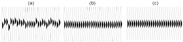
A simple synthetic example showing (a) a gather with surface-consistent statics and phase variations; (b) the same gather after surface-consistent residual statics correction, and (c) after simultaneous surface-consistent statics and phase correcition. Image © Cary & Nagarajappa and CSEG.

It's troubling that there is more than one way to achieve flatness. Peter's advice is to use shot stacks and receiver stacks to compare the efficacy of static corrections. They eliminate doubt about whether surface consistent scaling is working, and are a better QC tool than other data domains.

Deeper than shallow

It may sound trivial, but the hardest part about using seismic waves for imaging is that they have to travel down and back up through the near surface on their path to the target. It might seem counter-intuitive, but the geometric configurations that work well for the deep earth are not well suited to the shallow earth, and how we might correct for it. I can imagine that two surveys could be useful, one for the target and one for characterizing the shallow that gets in the way of the target, but seismic experiments are already expensive enough when there is only target to be concerned with.

Still, the near surface is something we can't avoid. Much like astronomers using ground-based telescopes shooting for the stars, seismic processors too have to get the noisy stuff that is sitting closest to the detectors out of the way.

Cut the small print

We received a contract for a new piece of work recently. This wouldn't normally be worth remarking on, but this contract was special. It was different. It was 52 pages long.

It was so comically long that the contracts analyst at the company that sent it to me actually called me up before sending it to say, "The contract is comically long. It's just standard procedure. Sorry." Because it's so long, it's effectively all small print — if there's anything important in there, I'm unlikely to see it. The document bullies me into submission. I give in.

Unfortunately, this is a familiar story. Some (mostly non-lawyers) like Alan Siegel are trying to change it:

Before we all laugh derisively at lawyers, wait a second. Are you sure that everyone reads every word in your reports and emails? Do they look at every slide in your presentations? Do they listen to every word in your talks? 

If you suspect they don't, ask yourself why not. And then cut. Cut until all that's left is what matters. If there's other important stuff — exceptions, examples, footnotes, small print, legal jargon — move it somewhere and give people a link.

When to use vectors not rasters

In yesterday's post, I looked at advantages and disadvantages of various image formats. Some chat ensued in the comments and on Twitter about making drawings and figures and such. I realized I hadn't been very clear: when I say 'image', I really mean 'raster' or 'bitmap'. That is, a discretized (pixel-based) grid of data.

What are vector graphics?

Click to enlarge — see a simulation of the difference between vector and raster art.What I was not writing about was drawings and graphics combining text, lines, and images. Such files usually contain vector graphics. Vector graphics do not contain descriptions of pixels, but instead they contain descriptions and positions of text, paths, and polygons. Example file formats are:

  • SVGScalable Vector Graphics, an open format and web standard
  • AI — a proprietary format used by Adobe Illustrator
  • CDRCorelDRAW's proprietary format
  • PPT — pictures in Microsoft PowerPoint are vector format
  • SHP — shapefiles are a (mostly) generic vector format for GIS

One of the most important properties of vector graphics is that you can rescale it without worrying about changing the resolution — as in the example (right).

What are composite formats?

Vector and raster graphics can be combined in all sorts of ways, and vector files can contain raster images. They can therefore be used for very large displays like posters. But vector files are subject to interpretation by different software, may be proprietary, and have complex features like guides and layers that you may not want to expose to someone else. So when you publish or share your work it's often a good idea to export to either a high-res PNG, or a composite page description format:

  • PDFPortable Document Format, the closest thing to an open, ubiquitous format; stable and predictable.
  • EPSEncapsulated PostScript; the precursor to PDF, it's rarely called for today, unless PDF is giving you problems.
  • PSPostScript is a programming and page description language underlying EPS and PDF; avoid it.
  • CGMComputer Graphics Metafiles are best left alone. If you are stuck with them, complain loudly.

What software do I need?

Any time you want to add text, or annotation, or anything else to a raster, or you wish to create a drawing from scratch, vector formats are the way to go. There are several tools for creating such graphics:

Judging by figures I see submitted to journals, some people use Microsoft PowerPoint for creating vector graphics. For a simple figure, this may be fine, but for anything complex — curved or wavy lines, complicated filled objects, image effects, pattern fills — it is hard work. And the drawing tools listed above have some great advantages over PowerPoint — layers, tracing, guides, proper typography, and a hundred other things.

Plus, and perhaps I'm just being a snob here, figures created in PowerPoint make it look like you just don't care. Do yourself a favour: take half a day to teach yourself to use Inkscape, and make beautiful figures for the rest of your career.

How to choose an image format

Choosing a file format for scientific images can be tricky. It seems simple enough on the outside, but the details turn out to be full of nuance and gotchas. Plenty of papers and presentations are spoiled by low quality images. Don't let yours be one! Get to know your image editor (I recommend GIMP), and your formats.

What determines quality?

The factors determining the quality of an image are:

  • The number of pixels in the image (aim for 1 million)
  • The size of the image (large images need more pixels)
  • If the image is compressed, e.g. a JPG, the fidelity of the compression (use 90% or more)
  • If the image is indexed, e.g. a GIF, the number of colours available (the bit-depth)

Beware: what really matters is the lowest-quality version of the image file over its entire history. In other words, it doesn't matter if you have a 1200 × 800 TIF today, if this same file was previously saved as a 600 × 400 GIF with 16 colours. You will never get the lost pixels or bit-depth back, though you can try to mitigate the quality loss with filters and careful editing. This seems obvious, but I have seen it catch people out.

JPG is only for photographs

Click on the image to see some artifacts.The problem with JPG is that the lossy compression can bite you, even if you're careful. What is lossy compression? The JPEG algorithm makes files much smaller by throwing some of the data away. It 'decides' which data to discard based on the smoothness of the image in the wavenumber domain, in which the algorithm looks for a property called sparseness. Once discarded, the data cannot be recovered. In discontinuous data — images with lots of variance or hard edges — you might see artifacts (e.g. see How to cheat at spot the difference). Bottom line: only use JPG for photographs with lots of pixels.

Formats in a nutshell

Rather than list advantages and disadvantages exhaustively, I've tried to summarize everything you need to know in the table below. There are lots of other formats, but you can do almost anything with the ones I've listed... except BMP, which you should just avoid completely. A couple of footnotes: PGM is strictly for geeks only; GIF is alone in supporting animation (animations are easy to make in GIMP). 

All this advice could have been much shorter: use PNG for everything. Unless file size is your main concern, or you need special features like animation or georeferencing, you really can't go wrong.

There's a version of this post on SubSurfWiki. Feel free to edit it!

The evolution of open mobile geocomputing

A few weeks ago I attended the EAGE conference in Copenhagen (read my reports on Day 2 and Day 3). I presented a paper at the open source geoscience workshop on the last day, and wanted to share it here. I finally got around to recording it:

As at the PTTC Open Source workshop last year (Day 1Day 2, and my presentation), I focused on mobile geocomputing — geoscience computing on mobile devices like phones and tablets. The main update to the talk was a segment on our new open source web application, Modelr. We haven't written about this project before, and I'd be the first to admit it's rather half-baked, but I wanted to plant the kernel of awareness now. We'll write more on it in the near future, but briefly: Modelr is a small web app that takes rock properties and model parameters, and generates synthetic seismic data images. We hope to use it to add functionality to our mobile apps, much as we already use Google's chart images. Stay tuned!

If you're interested in seeing what's out there for geoscience, don't miss our list of mobile geoscience apps on SubSurfWiki! Do add any others you know of.

Well worth showing off

Have you ever had difficulty displaying a well log in a presentation? Now, instead of cycling through slides, you can fluidly move across a digital, zoomable canvas using Prezi. I think it could be a powerful visual tool and presentation aid for geoscientists. Prezi allows users to to construct intuitive, animated visualizations, using size to denote emphasis or scale, and proximity to convey relevance. You navigate through the content simply by moving the field of view and zooming in and out through scale space. In geoscience, scale isn't just a concept for presentation design, it is a fundamental property that can now be properly tied-in and shown in a dynamic way.

I built this example to illustrate how geoscience images, spread across several orders of magnitude, can be traversed seamlessly for a better presentation. In a matter of seconds, one can navigate a complete petrophysical analysis, a raw FMI log, a segment of core, and thin section microscopy embedded at its true location. Explore heterogeniety and interpret geology with scale in context. How could you use a tool like this in your work?

Clicking on the play button will steer the viewer step by step through a predefined set of animations, but you can break off and roam around freely at any time (click and drag with your mouse, try it!). Prezi could be very handy for workshops, working meetings, or any place where it is appropriate to be transparent and thorough in your visualizations.

You can also try roaming Prezi by clicking on the image of this cheatsheet. Let us know what you think!

Thanks to Burns Cheadle for Prezi enthusiasm, and to Neil Watson for sharing the petrophysical analysis he built from public data in Alberta.