May linkfest

The pick of the links from the last couple of months. We look for the awesome, so you don't have to :)

ICYMI on Pi Day, pimeariver.com wants to check how close river sinuosity comes to pi. (TL;DR — not very.)

If you're into statistics, someone at Imperial College London recently released a nice little app for stochastic simulations of simple calculations. Here's a back-of-the-envelope volumetric calculation by way of example. Good inspiration for our Volume* app.

I love it when people solve problems together on the web. A few days ago Chris Jackson (also at Imperial) posted a question about converting projected coordinates...

I responded with a code snippet that people quickly improved. Chris got several answers to his question, and I learned something about the pyproj library. Open source wins again!

In answering that question, I also discovered that Github now renders most IPython Notebooks. Sweet!

Speaking of notebooks, Beaker looks interesting: individual code blocks support different programming languages within the same notebook and allow you to pass data from one cell to another. For instance, you could do your basic stuff in Python, computationally expensive stuff in Julia, then render a visualization with JavaScript. Here's a simple example from their site.

Python is the language for science, but JavaScript certainly rules the visual side of the web. Taking after JavaScript data-artists like Bret Victor and Mike Bostock, Jack Schaedler has built a fantastic website called Seeing circles, sines, and signals containing visual explanations of signal processing concepts.

If that's not enough for you, there's loads more where that came from: Gallery of Concept Visualization. You're welcome.

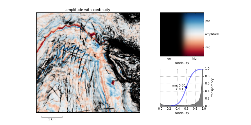
My recent notebook about finding small things with 2D seismic grids sparked some chatter on Twitter. People had some great ideas about modeling non-random distributions, like clustered or anisotropic populations. Lots to think about!

Getting help quickly is perhaps social media's most potent capability — though some people do insist on spoiling everything by sharing U might be a genius if u can solve this! posts (gah, stop it!). Earth Science Stack Exchange is still far from being the tool is can be, but there have been some relevant questions on geophysics lately:

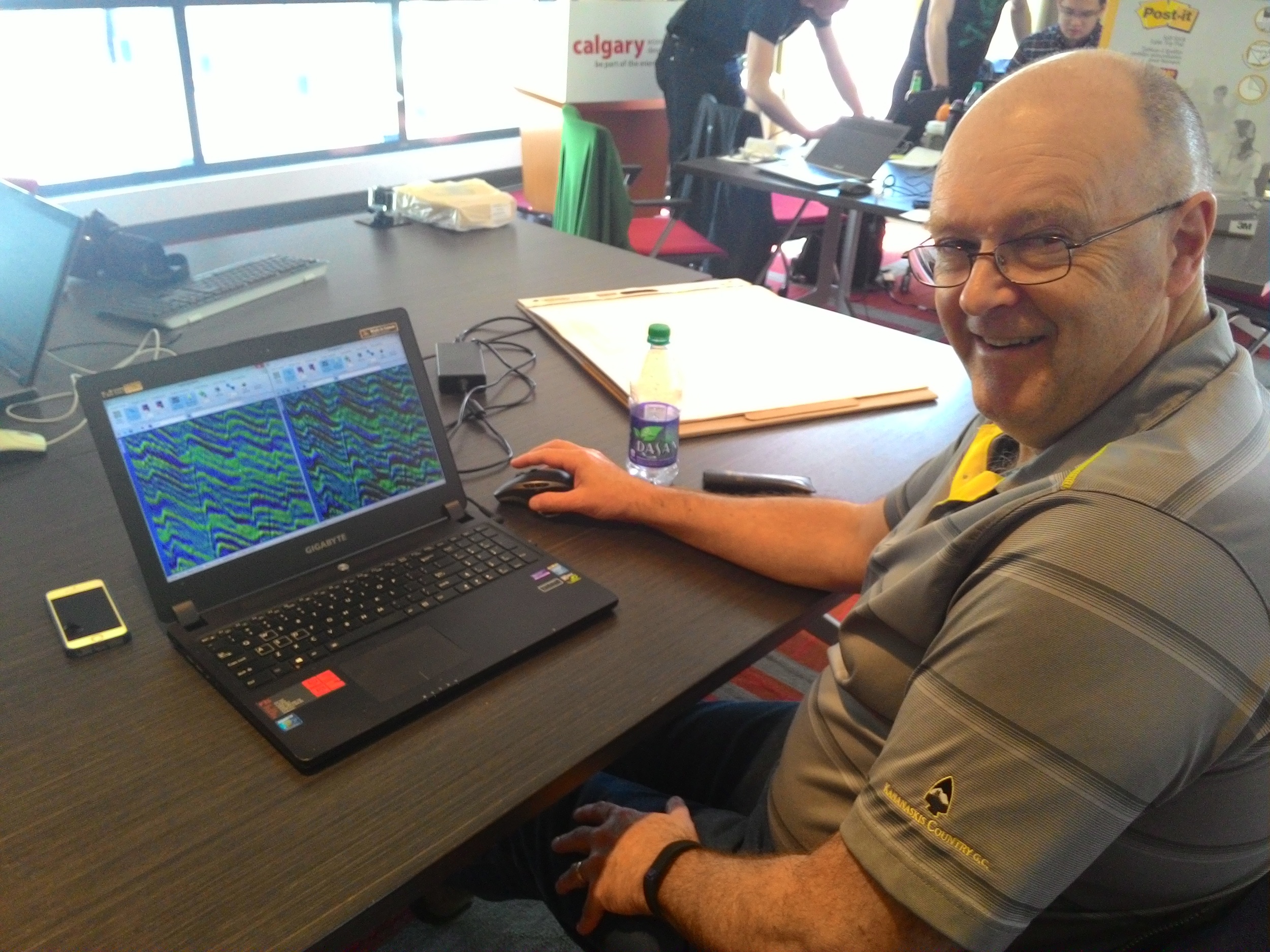
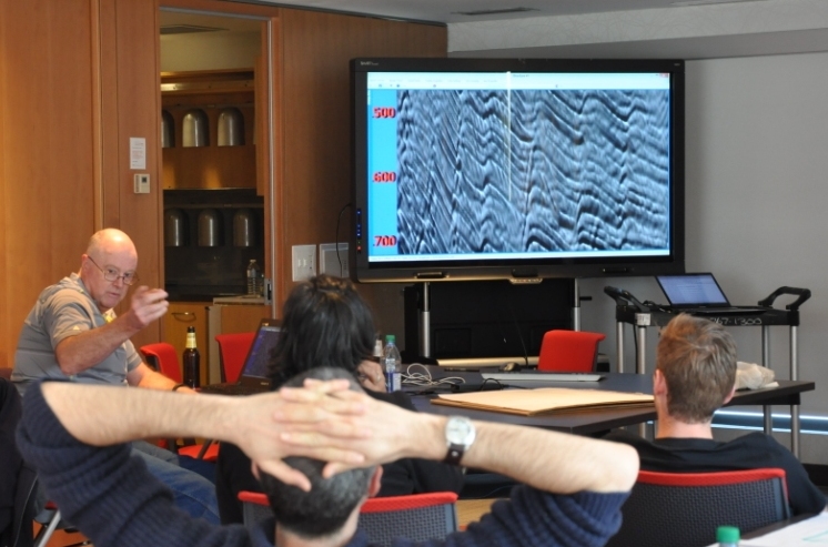
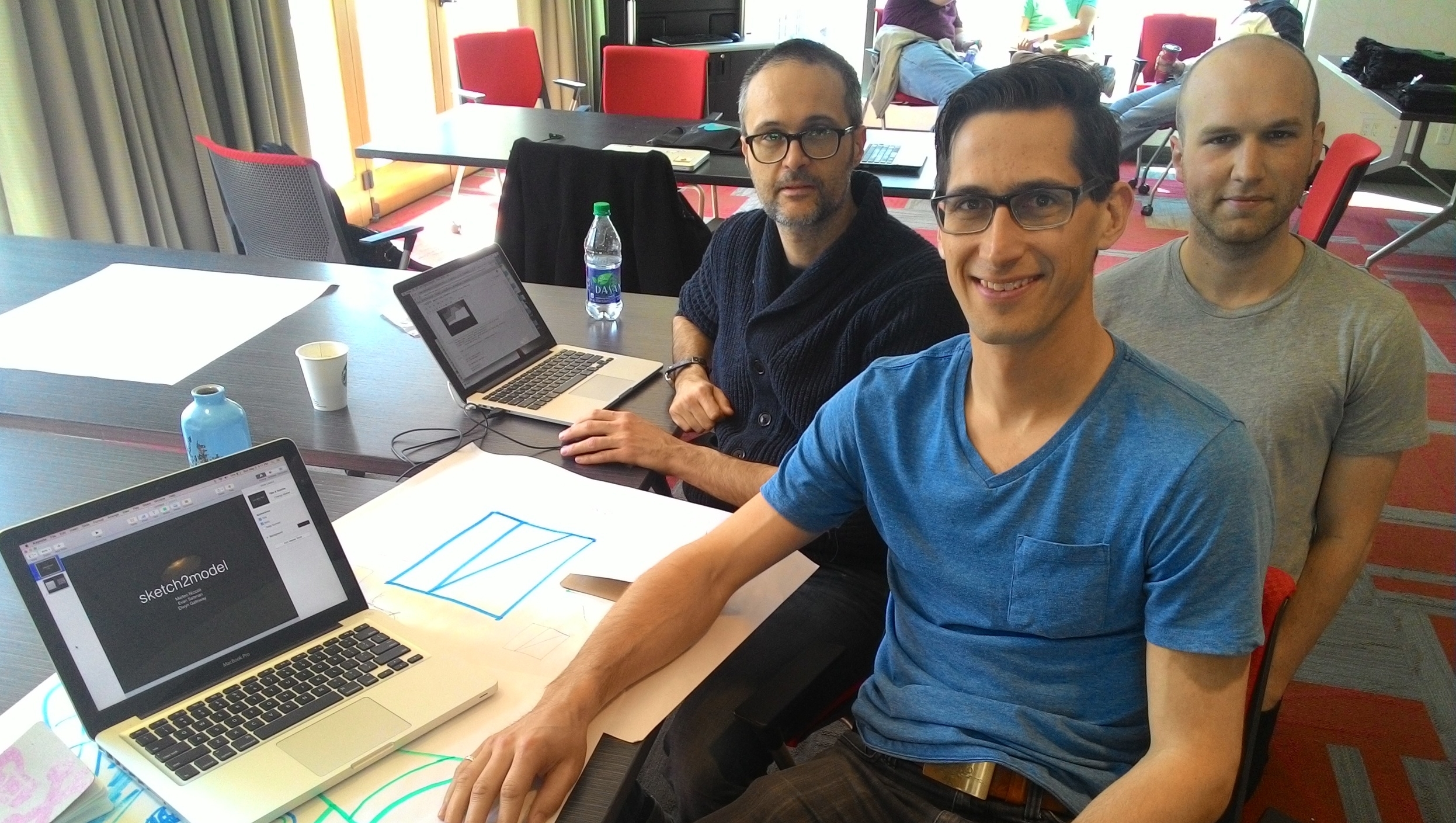
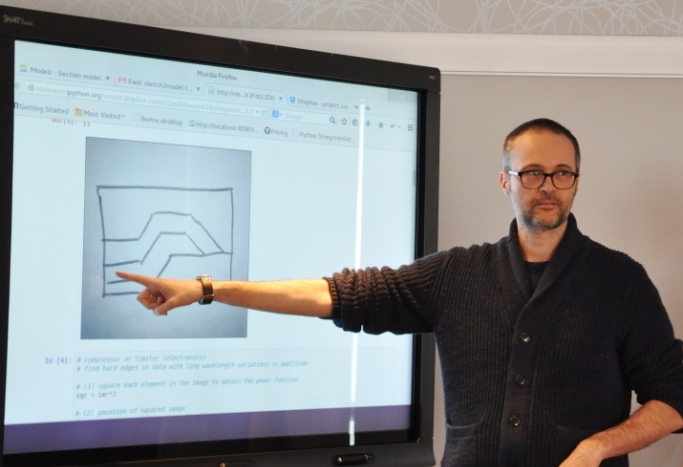
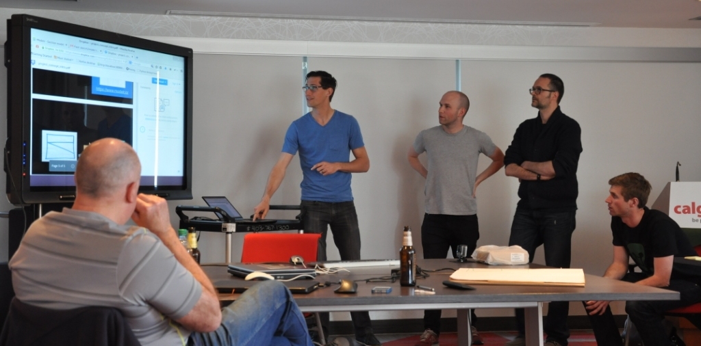
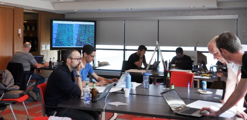
A fun thread came up on Reddit too recently: Geophysics software you wish existed. Perfect for inspiring people at hackathons! I'm keeping a list of hacky projects for the next one, by the way.

Not much to say about 3D models in Sketchfab, other than: they're wicked! I mean, check out this annotated anticline. And here's one by R Mahon based on sedimentological experiments by John Shaw and others...

Corendering attributes and 2D colourmaps

The reason we use colourmaps is to facilitate the human eye in interpreting the morphology of the data. There are no hard and fast rules when it comes to choosing a good colourmap, but a poorly chosen colourmap can make you see features in your data that don't actually exist. 

Colourmaps are typically implemented in visualization software as 1D lookup tables. Given a value, what colour should I plot it? But most spatial data is multi-dimensional, and it's useful to look at more than one aspect of the data at one time. Previously, Matt asked, "how many attributes can a seismic interpreter show with colour on a single display?" He did this by stacking up a series of semi-opaque layers, each one assigned its own 1D colourbar. 

Another way to add more dimensions to the display is corendering. This effectively adds another dimension to the colourmap itself: instead of a 1D colour line for a single attribute, for two attributes we're defining a colour square; for 3 attributes, a colour cube, and so on.

Let's illustrate this by looking at a time-slice through a portion of the F3 seismic volume. A simple way of displaying two attributes is to decrease the opacity of one, and lay it on top of the other. In the figure below, I'm setting the opacity of the continuity to 75% in the third panel. At first glance, this looks pretty good; you can see both attributes, and because they have different hues, they complement each other without competing for visual bandwidth. But the approach is flawed. The vividness of each dataset is diminished; we don't see the same range of colours as we do in the colour palette shown above.

Overlaying one map on top of the other is one way to look at multiple attributes within a scene. It's not ideal however.

Overlaying one map on top of the other is one way to look at multiple attributes within a scene. It's not ideal however.

Instead of overlaying maps, we can improve the result by modulating the lightness of the amplitude image according to the magnitude of the continuity attribute. This time the corendered result is one image, instead of two. I prefer it, because it preserves the original colours we see in the amplitude image. If anything, it seems to deepen the contrast:

The lightness value of the seismic amplitude time slice has been modulated by the continuity attribute. 

The lightness value of the seismic amplitude time slice has been modulated by the continuity attribute. 

Such a composite display needs a two-dimensional colormap for a legend. Just as a 1D colourbar, it's also a lookup table; each position in the scene corresponds to a unique pair of values in the colourmap plane.

We can go one step further. Say we want to emphasize only the largest discontinuities in the data. We can modulate the opacity with a non-linear function. In this example, I'm using a sigmoid function:

In order to achieve this effect in most conventional software, you usually have to copy the attribute, colour it black, apply an opacity curve, then position it just above the base amplitude layer. Software companies call this workaround a 'workflow'. 

Are there data visualizations you want to create, but you're stuck with software limitations? In a future post, I'll recreate some cool co-rendering effects; like bump-mapping, and hill-shading.

To view and run the code that I used in creating the images for this post, grab the iPython/Jupyter Notebook.


You can do it too!

If you're in Calgary, Houston, New Orleans, or Stavanger, listen up!

If you'd like to gear up on coding skills and explore the benefits of scientific computing, we're going to be running the 2-day version of the Geocomputing Course several times this fall in select cities. To buy tickets or for more information about our courses, check out the courses page.

None of these times or locations good for you? Consider rounding up your colleagues for an in-house training option. We'll come to your turf, we can spend more than 2 days, and customize the content to suit your team's needs. Get in touch.

The curse of hunting rare things

What are the chances of intersecting features with a grid of cross-sections? I often wonder about this when interpreting 2D seismic data, but I think it also applies to outcrops, or any other transects. I want to know:

  1. If there are only a few of these features, how many should I see?
  2. What's the probability of the lines missing them all? 
  3. Conversely, if I interpret x of them, then how many are there really?
  4. How is the detectability affected by the reliability of the data or my skills?

I used to have a spreadsheet for computing all this stuff, but spreadsheets are dead to me so here's an IPython Notebook :)

An example

I'm interpreting seep locations on 2D data at the moment. So I'm looking for subvertical pipes and chimneys, mud volcanos, seafloor pockmarks and pingos, that sort of thing (see Løseth et al., 2009 for a great overview). Here are some similar features from the Norwegian continental shelf from Hustoft et al., 2010:

Figure 3 from hustoft et al. (2010) showing the 3D expression of some hydrocarbon leakage features in Norway. © The Authors.

As Hustoft et al. show, these can be rather small features — most pockmarks are in the 100–800 m diameter range, so let's call it 500 m. The dataset I have is an orthogonal grid of decent quality 2D lines with a 3 km spacing. The area is about 120,000 km². For the sake of argument (and a forward model), let's imagine there are 120 features I'm interested in — one per 1000 km². Here's a zoomed-in view showing a subset of the problem:

Zoomed-in view of part of my example. A grid of 2D seismic lines, 3 km apart, and randomly distributed features, each 500 m in diameter. If a feature's centre falls inside a grey square, then the feature is not intersected by the data. The grey squa…

Zoomed-in view of part of my example. A grid of 2D seismic lines, 3 km apart, and randomly distributed features, each 500 m in diameter. If a feature's centre falls inside a grey square, then the feature is not intersected by the data. The grey squares are 2.5 km across.

According to my calculations...

  1. Of the 120 features in the area, we expect 37 to be intersected by the data. Of course, some of those intersections might be very subtle, if they are right at the edge of the feature.
  2. The probability of intersecting a given feature is 0.31. There are 120 features, so the probability of the whole dataset intersecting at least one is essentially 1 (certain). That's good! Conversely, the probability of missing them all is effectively 0. (If there were only 5 features, then there'd be about a 16% chance of missing them all.)
  3. Clearly, if I interpret 37 features, there are about 120 in total (that was my a priori). It's a linear relationship, so if I interpret 10 features, I can expect there to be about 33 altogether, and if I see 100 then I can expect that there are almost 330 in total. (I think the probability distribution would be log-normal, but would appreciate others' insights here.)
  4. Reliability? That sounds like a job for Bayes' theorem...

It's far from certain that I will interpret everything the data intersects, for all sorts of reasons:

  • I am human and therefore inconsistent, biased, and fallible.
  • The feature may be cryptic in the section , because of how it was intersected.
  • The data may be poor quality at that point, or everywhere.

Let's assume that if a feature has been intersected by the data, then I have a 75% chance of actually interpreting it. Bayes' theorem tells us how to update the prior probability of 0.31 (for a given feature; point 2 above) to get a posterior probability. Here's the table:

Interpreted Not interpreted
Intersected by a 2D line 28 9
Not intersected by any lines 21 63

What do the numbers mean?

  • Of the 37 intersected features, I interpret 28.
  • I fail to interpret 9 features that are intersected by the data. These are Type II errors, false negatives.
  • I interpret another 21 features which are not real! These are Type I errors: false positives. 
  • Therefore I interpret 48 features, of which only 57% are real. This seems like a lot, but it's a function of my imperfect reliability (75%) and the poor sampling, resulting in a large number of 'missed' features.

Interestingly, my 75% reliability translates into a 57% chance of being right about the existence of a feature. We've seen this effect before — it's the curse of hunting rare things: with imperfect knowledge, we are often wrong


References

Hustoft, S, S Bünz, and J Mienart (2010). Three-dimensional seismic analysis of the morphology and spatial distribution of chimneys beneath the Nyegga pockmark field, offshore mid-Norway. Basin Research 22, 465–480. DOI 10.1111/j.1365-2117.2010.00486.x 

Løseth, H, M Gading, and L Wensaas (2009). Hydrocarbon leakage interpreted on seismic data. Marine & Petroleum Geology 26, 1304–1319. DOI 10.1016/j.marpetgeo.2008.09.008 

Six comic books about science

Ever since reading my dad's old Tintin books late into the night as a kid, I've loved comics and graphic novels. I've never been into the usual Marvel and DC stuff — superheroes aren't my thing. But I often re-read Tintin, I think I've read every Astérix, and since moving to Canada I've been a big fan of Seth and Chester Brown.

Last year in France I bought an album of Léonard, an amusing imagining of da Vinci's exploits as an inventor... Almost but not quite about science. These six books, on the other hand, show meticulous research and a love of natural philosophy. Enjoy!


The Thrilling Adventures of Lovelace and Babbage

Sydney Padua, 2015. New York, USA: Pantheon. List price USD 28.95.

I just finished devouring this terrific book by Padua, a young Canadian animator. It's an amazing mish-mash of writing and drawing, science and story, computing and history, fiction and non-fiction. This book has gone straight into my top 10 favourite books ever. It's really, really good.

Author — Amazon — Google — Pantheon

T-Minus: The Race to the Moon

Jim Ottaviani, Zander Cannon, Kevin Cannon, 2009. GT Labs. List price USD 15.99.

Who doesn't love books about space exploration? This is a relatively short exposition, aimed primarily at kids, but is thoroughly researched and suspenseful enough for anyone. The black and white artwork bounces between the USA and USSR, visualizing this unique time in history.

Amazon — GoogleGT Labs

Feynman

Jim Ottaviani, Leland Myrick, 2011. First Second Books. List price USD 19.99.

A 248-page colour biography of the great physicist, whose personality was almost as remarkable as his work. The book covers the period 1923 to 1986 — almost birth to death — and is neither overly critical of Feynman's flaws, nor hero-worshipping. Just well-researched, and skillfully told.

AmazonGoogleFirst Second.

A Wrinkle in Time

Hope Larson, Madeleine L'Engle, 2012. New York, USA: Farrar, Straus & Giroux. List price USD 19.99

A graphic adaptation of L'Engle's young adult novel, first published in 1963. The story is pretty wacky, and the science is far from literal, so perhaps not for all tastes — but if you or your kids enjoy Doctor Who and Red Dwarf, then I predict you'll enjoy this. Warning: sentimental in places.

Amazon — MacmillanAuthor 

Destination Moon and Explorers on the Moon

Hergé, 1953, 1954. Tournai, Belgium: Casterman (English: 1959, Methuen). List price USD 24.95.

These remarkable books show what Hergé was capable of imagining — and drawing — at his peak. The iconic ligne claire artwork depicts space travel and lunar exploration over a decade before Apollo. There is the usual espionage subplot and Thom(p)son-based humour, but it's the story that thrills.

AmazonGoogle


What about you? Have you read anything good lately?

Canadian codeshow

Earlier this month we brought the world-famous geoscience hackathon to Calgary, tacking on a geocomputing bootcamp for good measure. Fourteen creative geoscientists came and honed their skills, leaving 4 varied projects in their wake. So varied in fact that this event had the most diversity of all the hackathons so far. 

Thank you to Raquel Theodoro and Penny Colton for all the great photographs. You both did a great job of capturing what went on. Cheers!

Thank you as well to our generous and generally awesome sponsors. These events would not be possible without them.

Bootcamp

The bootcamp was a big experiment. We have taught beginner classes before, but this time we also invited beyond-novice programmers to come and learn together. Rather than making it a classroom experience, we were trying to make a friendly space where people could learn from us, from each other, or from books or the web. After some group discussion about hackathons and dream projects (captured here), we split into two groups: beginners and 'other'. The beginners got an introduction to scientific Python; the others got a web application masterclass from Ben Bougher (UBC master's student and Agile code ninja). During the day, we harvested a pretty awesome list of potential future hackathon projects. 

Hackathon

The hackathon itself yielded four very cool projects, fuelled this time not by tacos but by bánh mì and pizza (separately):

  1. Hacking data inside Seismic Terrain Explorer, by Steve Lynch of Calgary
  2. Launching GLauncher, a crowdfunding tool, by Raquel Theodoro of Rio de Janeiro and Ben Bougher of UBC
  3. Hacksaw: A quick-look for LAS files in a web app, by Gord Foo, Gerry Cao, Yongxin Liu of Calgary, plus me
  4. Turning sketches in to models, by Evan Saltman, Elwyn Galloway, and Matteo Niccoli of Calgary, and Ben again

Sketch2model was remarkable for a few reasons: it was the first hackathon for most of the team, they had not worked together before, Elwyn dreamt up the idea more or less on the spot, and they seemed to nail it with a minimum of fuss. Matteo quietly got on with the image processing magic, Evan and Ben modified modelr.io to do the modeling bit, and Elwyn orchestrated the project, providing a large number of example sketches to keep the others from getting too cocky.

We'll be doing it all again in New Orleans this fall. Get it in your calendar now!