Transformation in 2021

SU_square_rnd.png

Virtual confererences have become — for now — the norm. In many ways they are far better than traditional conferences: accessible to all, inexpensive to organize and attend, asynchronous, recorded, and no-one has to fly 5,000 km to deliver a PowerPoint. In other ways, they fall short, for example as a way to meet new collaborators or socialize with old ones. As face-to-face meetings become a possibility again this summer, smart organizations will figure out ways to get the best of both worlds.

The Software Underground is continuing its exploration of virtual events next month with the latest edition of the TRANSFORM festival of the digital subsurface. In broad strokes, here’s what’s on offer:

  • The Subsurface Hackathon, starting on 16 April — all are welcome, including those new to programming.

  • 20 free & awesome tutorials, covering topics from Python to R, geothermal wells to seismic, and even reservoir simulation! And of course there’s a bit of machine learning and physics-based modeling in there too. Look forward to content from scientists in North & South America, Norway, Nigeria, and New Zealand.

  • Lightning talks from 24 members of the community — would you like to do one?

  • Birds of a Feather community meet-ups, a special Xeek challenge, and other special events.

  • The Annual General Meeting of the Software Underground, where we’ll adopt our by-law and appoint the board.

gather-town-rosay.png

We’ll even try to get at that tricky “hang out with other scientists” component, because we will have a virtual Gather.town world in which to hang out and hack, chat, or watch the livestreams.

If last year’s event is anything to go by, we can expect fantastic tutorial content, innovative hackathon projects, and great conversation between at least 750 digital geoscientists and engineers. (If you missed TRANSFORM 2020, don’t worry — all the content from last year is online and free forever, so it’s not too late to take part! Check it out.)


Registering for TRANSFORM

Registration is free, or pay-what-you-like. In other words, if you have funding or expenses for conferences and training, there’s an option to pay a small amount. But anyone can attend TRANSFORM free of charge. Thank you to the event sponsors, Studio X, for making this possible. (I will write about Studio X at a later date — they are doing some really cool things in the digital subsurface.)


To register for any part of TRANSFORM — even if you just want to come to the hackathon or a tutorial — click this button and complete the process on the Software Underground website. It’s a ‘pay what you like’ event, so there are 3 registration options with different prices — these are just different donation amounts. They don’t change anything about your registration.

I hope we see you at TRANSFORM. In the meantime, please jump into the Software Underground Slack and get involved in the conversations there. (You can also catch up on recent Software Underground highlights in the new series of blog posts.)

Corendering attributes and 2D colourmaps

The reason we use colourmaps is to facilitate the human eye in interpreting the morphology of the data. There are no hard and fast rules when it comes to choosing a good colourmap, but a poorly chosen colourmap can make you see features in your data that don't actually exist. 

Colourmaps are typically implemented in visualization software as 1D lookup tables. Given a value, what colour should I plot it? But most spatial data is multi-dimensional, and it's useful to look at more than one aspect of the data at one time. Previously, Matt asked, "how many attributes can a seismic interpreter show with colour on a single display?" He did this by stacking up a series of semi-opaque layers, each one assigned its own 1D colourbar. 

Another way to add more dimensions to the display is corendering. This effectively adds another dimension to the colourmap itself: instead of a 1D colour line for a single attribute, for two attributes we're defining a colour square; for 3 attributes, a colour cube, and so on.

Let's illustrate this by looking at a time-slice through a portion of the F3 seismic volume. A simple way of displaying two attributes is to decrease the opacity of one, and lay it on top of the other. In the figure below, I'm setting the opacity of the continuity to 75% in the third panel. At first glance, this looks pretty good; you can see both attributes, and because they have different hues, they complement each other without competing for visual bandwidth. But the approach is flawed. The vividness of each dataset is diminished; we don't see the same range of colours as we do in the colour palette shown above.

Overlaying one map on top of the other is one way to look at multiple attributes within a scene. It's not ideal however.

Overlaying one map on top of the other is one way to look at multiple attributes within a scene. It's not ideal however.

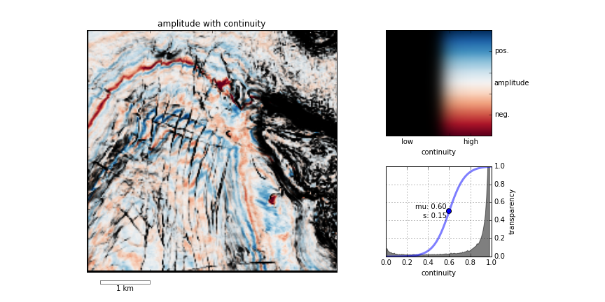
Instead of overlaying maps, we can improve the result by modulating the lightness of the amplitude image according to the magnitude of the continuity attribute. This time the corendered result is one image, instead of two. I prefer it, because it preserves the original colours we see in the amplitude image. If anything, it seems to deepen the contrast:

The lightness value of the seismic amplitude time slice has been modulated by the continuity attribute. 

The lightness value of the seismic amplitude time slice has been modulated by the continuity attribute. 

Such a composite display needs a two-dimensional colormap for a legend. Just as a 1D colourbar, it's also a lookup table; each position in the scene corresponds to a unique pair of values in the colourmap plane.

We can go one step further. Say we want to emphasize only the largest discontinuities in the data. We can modulate the opacity with a non-linear function. In this example, I'm using a sigmoid function:

In order to achieve this effect in most conventional software, you usually have to copy the attribute, colour it black, apply an opacity curve, then position it just above the base amplitude layer. Software companies call this workaround a 'workflow'. 

Are there data visualizations you want to create, but you're stuck with software limitations? In a future post, I'll recreate some cool co-rendering effects; like bump-mapping, and hill-shading.

To view and run the code that I used in creating the images for this post, grab the iPython/Jupyter Notebook.


You can do it too!

If you're in Calgary, Houston, New Orleans, or Stavanger, listen up!

If you'd like to gear up on coding skills and explore the benefits of scientific computing, we're going to be running the 2-day version of the Geocomputing Course several times this fall in select cities. To buy tickets or for more information about our courses, check out the courses page.

None of these times or locations good for you? Consider rounding up your colleagues for an in-house training option. We'll come to your turf, we can spend more than 2 days, and customize the content to suit your team's needs. Get in touch.

Laying out a seismic survey

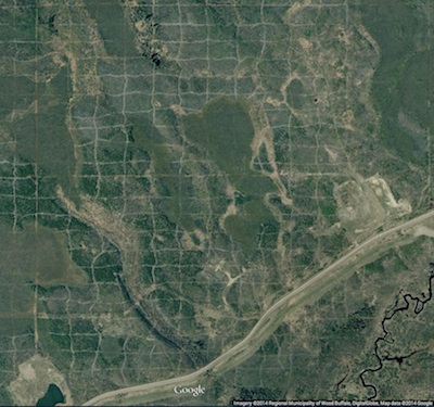
Cutlines for a dense 3D survey at Surmont field, Alberta, Canada. Image: Google Maps.

Cutlines for a dense 3D survey at Surmont field, Alberta, Canada. Image: Google Maps.

Cutlines for a dense 3D survey at Surmont field, Alberta, Canada. Image: Google Maps.There are a number of ways to lay out sources and receivers for a 3D seismic survey. In forested areas, a designer may choose a pattern that minimizes the number of trees that need to be felled. Where land access is easier, designers may opt for a pattern that is efficient for the recording crew to deploy and pick up receivers. However, no matter what survey pattern used, most geometries consist of receivers strung together along receiver lines and source points placed along source lines. The pairing of source points with live receiver stations comprises the collection of traces that go into making a seismic volume.

An orthogonal surface pattern, with receiver lines laid out perpendicular to the source lines, is the simplest surface geometry to think about. This pattern can be specified over an area of interest by merely choosing the spacing interval between lines well as the station intervals along the lines. For instance:

xmi = 575000        # Easting of bottom-left corner of grid (m)
ymi = 4710000       # Northing of bottom-left corner (m)
SL = 600            # Source line interval (m)
RL = 600            # Receiver line interval (m)
si = 100            # Source point interval (m)
ri = 100            # Receiver point interval (m)
x = 3000            # x extent of survey (m)
y = 1800            # y extent of survey (m)

We can calculate the number of receiver lines and source lines, as well as the number of receivers and sources for each.

# Calculate the number of receiver and source lines.
rlines = int(y/RL) + 1
slines = int(x/SL) + 1

# Calculate the number of points per line (add 2 to straddle the edges). 
rperline = int(x/ri) + 2 
sperline = int(y/si) + 2

# Offset the receiver points.
shiftx = -si/2.
shifty = -ri/2.

Computing coordinates

We create a list of x and y coordinates with a nested list comprehension — essentially a compact way to write 'for' loops in Python — that iterates over all the stations along the line, and all the lines in the survey.

# Find x and y coordinates of receivers and sources.
rcvrx = [xmi+rcvr*ri+shifty for line in range(rlines) for rcvr in range(rperline)]
rcvry = [ymi+line*RL+shiftx for line in range(rlines) for rcvr in range(rperline)]

srcx = [xmi+line*SL for line in range(slines) for src in range(sperline)]
srcy = [ymi+src*si for line in range(slines) for src in range(sperline)]

To make a map of the ideal surface locations, we simply pass this list of x and y coordinates to a scatter plot:

srcs_recs_pattern.png

Plotting these lists is useful, but it is rather limited by itself. We're probably going to want to do more calculations with these points — midpoints, azimuth distributions, and so on — and put these data on a real map. What we need is to insert these coordinates into a more flexible data structure that can hold additional information.

Shapely, Pandas, and GeoPandas

Shapely is a library for creating and manipulating geometric objects like points, lines, and polygons. For example, Shapely can easily calculate the (x, y) coordinates halfway along a straight line between two points.

Pandas provides high-performance, easy-to-use data structures and data analysis tools, designed to make working with tabular data easy. The two primary data structures of Pandas are:

  • Series — a one-dimensional labelled array capable of holding any data type (strings, integers, floating point numbers, lists, objects, etc.)
  • DataFrame — a 2-dimensional labelled data structure where the columns can contain many different types of data. This is similar to the NumPy structured array but much easier to use.

GeoPandas combines the capabilities of Shapely and Pandas and greatly simplifies geospatial operations in Python, without the need for a spatial database. GeoDataFrames are a special case of DataFrames that are specifically for representing geospatial data via a geometry column. One awesome thing about GeoDataFrame objects is they have methods for saving data to shapefiles.

So let's make a set of (x,y) pairs for receivers and sources, then make Point objects using Shapely, and in turn add those to GeoDataFrame objects, which we can write out as shapefiles:

# Zip into x,y pairs.
rcvrxy = zip(rcvrx, rcvry)
srcxy = zip(srcx, srcy)

# Create lists of shapely Point objects.
rcvrs = [Point(x,y) for x,y in rcvrxy]
srcs = [Point(x,y) for x,y in srcxy]

# Add lists to GeoPandas GeoDataFrame objects.
receivers = GeoDataFrame({'geometry': rcvrs})
sources = GeoDataFrame({'geometry': srcs})

# Save the GeoDataFrames as shapefiles.
receivers.to_file('receivers.shp')
sources.to_file('sources.shp')

It's a cinch to fire up QGIS and load these files as layers on top of a satellite image or physical topography map. As a survey designer, we can now add, delete, and move source and receiver points based on topography and land issues, sending the data back to Python for further analysis.

seismic_GIS_physical.png

All the code used in this post is in an IPython notebook. You can read it, and even execute it yourself. Put your own data in there and see how it comes out!

NEWSFLASH — If you think the geoscientists in your company would like to learn how to play with geological and geophysical models and data — exploring seismic acquisition, or novel well log displays — we can come and get you started! Best of all, we'll help you get up and running on your own data and your own ideas.

If you or your company needs a dose of creative geocomputing, check out our new geocomputing course brochure, and give us a shout if you have any questions. We're now booking for 2015.

Well tie calculus

As Matt wrote in March, he is editing a regular Tutorial column in SEG's The Leading Edge. I contributed the June edition, entitled Well-tie calculus. This is a brief synopsis only; if you have any questions about the workflow, or how to get started in Python, get in touch or come to my course.


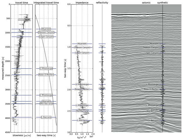
Synthetic seismograms can be created by doing basic calculus on traveltime functions. Integrating slowness (the reciprocal of velocity) yields a time-depth relationship. Differentiating acoustic impedance (velocity times density) yields a reflectivity function along the borehole. In effect, the integral tells us where a rock interface is positioned in the time domain, whereas the derivative tells us how the seismic wavelet will be scaled.

This tutorial starts from nothing more than sonic and density well logs, and some seismic trace data (from the #opendata Penobscot dataset in dGB's awesome Open Seismic Repository). It steps through a simple well-tie workflow, showing every step in an IPython Notebook:

  1. Loading data with the brilliant LASReader
  2. Dealing with incomplete, noisy logs
  3. Computing the time-to-depth relationship
  4. Computing acoustic impedance and reflection coefficients
  5. Converting the logs to 2-way travel time
  6. Creating a Ricker wavelet
  7. Convolving the reflection coefficients with the wavelet to get a synthetic
  8. Making an awesome plot, like so...

Final thoughts

If you find yourself stretching or squeezing a time-depth relationship to make synthetic events align better with seismic events, take the time to compute the implied corrections to the well logs. Differentiate the new time-depth curve. How much have the interval velocities changed? Are the rock properties still reasonable? Synthetic seismograms should adhere to the simple laws of calculus — and not imply unphysical versions of the earth.


Matt is looking for tutorial ideas and offers to write them. Here are the author instructions. If you have an idea for something, please drop him a line.

Relentlessly practical

This is one of my favourite knowledge sharing stories.

A farmer in my community had a problem with one of his cows — it was seriously unwell. He asked one of the old local farmers about the symptoms, and was told, “Oh yes, one of my herd had the same thing last summer. I gave her a cup of brandy and four aspirins every night for a week.” The young farmer went off and did this, but the poor cow got steadily worse and died. When he saw the old farmer next he told him, more than a little accusingly, “I did what you said, and the cow died anyway.” The old geezer looked into the distance and just said, “Yep, so did mine.”

Incomplete information can be less useful than no information. Yet incomplete information has somehow become our specialty in applied geoscience. How often do we share methods, results, or case studies without the critical details that would make it useful information? That is, not just marketing, or resumé padding. Inded, I heard this week that one large US operator will not approve a publication that does include these critical details! And we call ourselves scientists...

Completeness mandatory

Thankfully, Last month The Leading Edge — the magazine of the SEG — started a new tutorial column, edited by me. Well, I say 'edited', I'm just the person that pesters prospective authors until they give in and send me a manuscript. Tad Smith, Don Herron, and Jenny Kucera are the people that make it actually happen. But I get to take all the credit.

When I was asked about it, I suggested two things:

  1. Make each tutorial reproducible by publishing the code that makes the figures.
  2. Make the words, the data, and the code completely open and shareable. 

To my delight and, I admit, slight surprise, they said 'Sure!'. So the words are published under an open license (Creative Commons Attribution-ShareAlike, the same license for re-use that most of Wikipedia has), the tutorials use open data for everything, and the code is openly available and free to re-use. Complete transparency.

There's another interesting aspect to how the column is turning out. The first two episodes tell part of the story in IPython Notebook, a truly amazing executable writing environment that we've written about before. This enables you to seamlessly stich together text, code, and plots (left). If you know a bit of Python, or want to start learning it right now this second, go give wakari.io a try. It's pretty great. (If you really like it, come and learn more with us!).

Read the first tutorial: Hall, M. (2014). Smoothing surfaces and attributes. The Leading Edge, 33(2), 128–129. doi: 10.1190/tle33020128.1. A version of it is also on SEG Wiki, and you can read the IPython Notebook at nbviewer.org.

Do you fancy authoring something for this column? Wonderful — please do! Here are the author instructions. If you have an idea for something, please drop me a line, let's talk about how to make it relentlessly practical.

O is for Offset

Offset is one of those jargon words that geophysicists kick around without a second thought, but which might bewilder more geological interpreters. Like most jargon words, offset can mean a couple of different things: 

  • Offset distance, which is usually what is meant by simply 'offset'.
  • Offset angle, which is often what we really care about.
  • We are not talking about offset wells, or fault offset.

What is offset?

Sherriff's Encyclopedic Dictionary is characteristically terse:

Offset: The distance from the source point to a geophone or to the center of a geophone group.

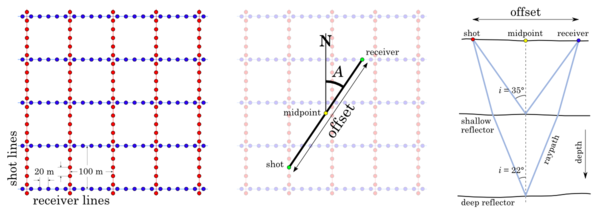
The concept of offset only really makes sense in the pre-stack world — to field data and gathers. The traces in stacked data (everyday seismic volumes) combine data from many offsets. So let's look at the geometry of seismic acquisition. A map shows the layout of shots (red) and receivers (blue). We can define offset and azimuth A at the midpoint of every shot–receiver pair, on a map (centre) and in section (right):

Offset distance applies to traces. The offset distance is the straight-line distance from the vibrator, shot-hole or air-gun (or any other source) to the particular receiver that recorded the trace in question. If we know the geometry of the acquisition, and the size of the recording patch or length of the streamers, then we can calculate offset distance exactly. 

Offset angle applies to specific samples on a trace. The offset angle is the incident angle of the reflected ray that that a given sample represents. Samples at the top of a trace have larger offset angles than those at the bottom, even though they have the same offset distance. To compute these angles, we need to know the vertical distances, and this requires knowledge of the velocity field, which is mostly unknown. So offset angle is not objective, but a partly interpreted quantity.

Why do we care?

Acquiring longer offsets can help undershoot gaps in a survey, or image beneath salt canopies and other recumbent features. Longer offsets also helps with velocity estimation, because we see more moveout.

Looking at how the amplitude of a reflection changes with offset is the basis of AVO analysis. AVO analysis, in turn, is the basis of many fluid and lithology prediction techniques.

Offset is one of the five canonical dimensions of pre-stack seismic data, along with inline, crossline, azimuth, and frequency. As such, it is a key part of the search for sparsity in the 5D interpolation method perfected by Daniel Trad at CGGVeritas. 

Recently, geophysicists have become interested not just in the angle of a reflection, but in the orientation of a reflection too. This is because, in some geological circumstances, the amplitude of a reflection depends on the orientation with respect to the compass, as well as the incidence angle. For example, looking at data in both of these dimensions can help us understand the earth's stress field.

Offset is the characteristic attribute of pre-stack seismic data. Seismic data would be nothing without it.

N is for Nyquist

In yesterday's post, I covered a few ideas from Fourier analysis for synthesizing and processing information. It serves as a primer for the next letter in our A to Z blog series: N is for Nyquist.

In seismology, the goal is to propagate a broadband impulse into the subsurface, and measure the reflected wavetrain that returns from the series of rock boundaries. A question that concerns the seismic experiment is: What sample rate should I choose to adequately capture the information from all the sinusoids that comprise the waveform? Sampling is the capturing of discrete data points from the continuous analog signal — a necessary step in recording digital data. Oversample it, using too high a sample rate, and you might run out of disk space. Undersample it and your recording will suffer from aliasing.

What is aliasing?

Aliasing is a phenomenon observed when the sample interval is not sufficiently brief to capture the higher range of frequencies in a signal. In order to avoid aliasing, each constituent frequency has to be sampled at least two times per wavelength. So the term Nyquist frequency is defined as half of the sampling frequency of a digital recording system. Nyquist has to be higher than all of the frequencies in the observed signal to allow perfect recontstruction of the signal from the samples.

Above Nyquist, the signal frequencies are not sampled twice per wavelength, and will experience a folding about Nyquist to low frequencies. So not obeying Nyquist gives a double blow, not only does it fail to record all the frequencies, the frequencies that you leave out actually destroy part of the frequencies you do record. Can you see this happening in the seismic reflection trace shown below? You may need to traverse back and forth between the time domain and frequency domain representation of this signal.

Nyquist_trace.png

Seismic data is usually acquired with either a 4 millisecond sample interval (250 Hz sample rate) if you are offshore, or 2 millisecond sample interval (500 Hz) if you are on land. A recording system with a 250 Hz sample rate has a Nyquist frequency of 125 Hz. So information coming in above 150 Hz will wrap around or fold to 100 Hz, and so on. 

It's important to note that the sampling rate of the recording system has nothing to do the native frequencies being observed. It turns out that most seismic acquisition systems are safe with Nyquist at 125 Hz, because seismic sources such as Vibroseis and dynamite don't send high frequencies very far; the earth filters and attenuates them out before they arrive at the receiver.

Space alias

Aliasing can happen in space, as well as in time. When the pixels in this image are larger than half the width of the bricks, we see these beautiful curved artifacts. In this case, the aliasing patterns are created by the very subtle perspective warping of the curved bricks across a regularly sampled grid of pixels. It creates a powerful illusion, a wonderful distortion of reality. The observations were not sampled at a high enough rate to adequately capture the nature of reality. Watch for this kind of thing on seismic records and sections. Spatial alaising. 

Click for the full demonstration (or adjust your screen resolution).You may also have seen this dizzying illusion of an accelerating wheel that suddenly appears to change direction after it rotates faster than the sample rate of the video frames captured. The classic example is the wagon whel effect in old Western movies.

Aliasing is just one phenomenon to worry about when transmitting and processing geophysical signals. After-the-fact tricks like anti-aliasing filters are sometimes employed, but if you really care about recovering all the information that the earth is spitting out at you, you probably need to oversample. At least two times for the shortest wavelengths.

M is for Migration

One of my favourite phrases in geophysics is the seismic experiment. I think we call it that to remind everyone, especially ourselves, that this is science: it's an experiment, it will yield results, and we must interpret those results. We are not observing anything, or remote sensing, or otherwise peering into the earth. When seismic processors talk about imaging, they mean image construction, not image capture

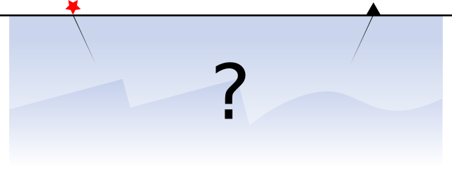
The classic cartoon of the seismic experiment shows flat geology. Rays go down, rays refract and reflect, rays come back up. Simple. If you know the acoustic properties of the medium—the speed of sound—and you know the locations of the source and receiver, then you know where a given reflection came from. Easy!

But... some geologists think that the rocks beneath the earth's surface are not flat. Some geologists think there are tilted beds and faults and big folds all over the place. And, more devastating still, we just don't know what the geometries are. All of this means trouble for the geophysicist, because now the reflection could have come from an infinite number of places. This makes choosing a finite number of well locations more of a challenge. 

What to do? This is a hard problem. Our solution is arm-wavingly called imaging. We wish to reconstruct an image of the subsurface, using only our data and our sharp intellects. And computers. Lots of those.

Imaging with geometry

Agile's good friend Brian Russell wrote one of my favourite papers (Russell, 1998) — an imaging tutorial. Please read it (grab some graph paper first). He walks us through a simple problem: imaging a single dipping reflector.

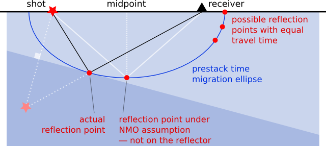
Remember that in the seismic experiment, all we know is the location of the shots and receivers, and the travel time of a sound wave from one to the other. We do not know the reflection points in the earth. If we assume dipping geology, we can use the NMO equation to compute the locus of all possible reflection points, because we know the travel time from shot to receiver. Solutions to the NMO equation — given source–receiver distance, travel time, and the speed of sound — thus give the ellipse of possible reflection points, shown here in blue:

Clearly, knowing all possible reflection points is interesting, but not very useful. We want to know which reflection point our recorded echo came from. It turns out we can do something quite easy, if we have plenty of data. Fortunately, we geophysicists always bring lots and lots of receivers along to the seismic experiment. Thousands usually. So we got data.

Now for the magic. Remember Huygens' principle? It says we can imagine a wavefront as a series of little secondary waves, the sum of which shows us what happens to the wavefront. We can apply this idea to the problem of the tilted bed. We have lots of little wavefronts — one for each receiver. Instead of trying to figure out the location of each reflection point, we just compute all possible reflection points, for all receivers, then add them all up. The wavefronts add constructively at the reflector, and we get the solution to the imaging problem. It's kind of a miracle. 

Try it yourself. Brian Russell's little exercise is (geeky) fun. It will take you about an hour. If you're not a geophysicist, and even if you are, I guarantee you will learn something about how the miracle of the seismic experiment. 

Reference
Russell, B (1998). A simple seismic imaging exercise. The Leading Edge 17 (7), 885–889. DOI: 10.1190/1.1438059

What do you mean by average?

I may need some help here. The truth is, while I can tell you what averages are, I can't rigorously explain when to use a particular one. I'll give it a shot, but if you disagree I am happy to be edificated. 

When we compute an average we are measuring the central tendency: a single quantity to represent the dataset. The trouble is, our data can have different distributions, different dimensionality, or different type (to use a computer science term): we may be dealing with lognormal distributions, or rates, or classes. To cope with this, we have different averages. 

Arithmetic mean

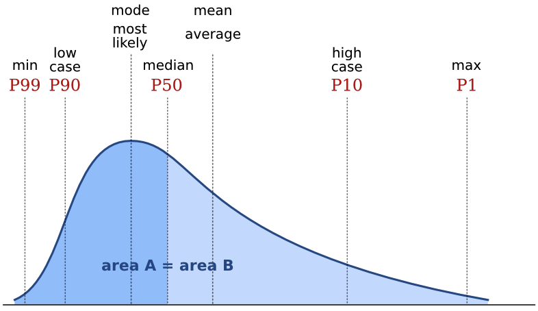
Everyone's friend, the plain old mean. The trouble is that it is, statistically speaking, not robust. This means that it's an estimator that is unduly affected by outliers, especially large ones. What are outliers? Data points that depart from some assumption of predictability in your data, from whatever model you have of what your data 'should' look like. Notwithstanding that your model might be wrong! Lots of distributions have important outliers. In exploration, the largest realizations in a gas prospect are critical to know about, even though they're unlikely.

Geometric mean

Like the arithmetic mean, this is one of the classical Pythagorean means. It is always equal to or smaller than the arithmetic mean. It has a simple geometric visualization: the geometric mean of a and b is the side of a square having the same area as the rectangle with sides a and b. Clearly, it is only meaningfully defined for positive numbers. When might you use it? For quantities with exponential distributions — permeability, say. And this is the only mean to use for data that have been normalized to some reference value. 

Harmonic mean

The third and final Pythagorean mean, always equal to or smaller than the geometric mean. It's sometimes (by 'sometimes' I mean 'never') called the subcontrary mean. It tends towards the smaller values in a dataset; if those small numbers are outliers, this is a bug not a feature. Use it for rates: if you drive 10 km at 60 km/hr (10 minutes), then 10 km at 120 km/hr (5 minutes), then your average speed over the 20 km is 80 km/hr, not the 90 km/hr the arithmetic mean might have led you to believe. 

Median average

The median is the central value in the sorted data. In some ways, it's the archetypal average: the middle, with 50% of values being greater and 50% being smaller. If there is an even number of data points, then its the arithmetic mean of the middle two. In a probability distribution, the median is often called the P50. In a positively skewed distribution (the most common one in petroleum geoscience), it is larger than the mode and smaller than the mean:

Mode average

The mode, or most likely, is the most frequent result in the data. We often use it for what are called nominal data: classes or names, rather than the cardinal numbers we've been discussing up to now. For example, the name Smith is not the 'average' name in the US, as such, since most people are called something else. But you might say it's the central tendency of names. One of the commonest applications of the mode is in a simple voting system: the person with the most votes wins. If you are averaging data like facies or waveform classes, say, then the mode is the only average that makes sense. 

Honourable mentions

Most geophysicists know about the root mean square, or quadratic mean, because it's a measure of magnitude independent of sign, so works on sinusoids varying around zero, for example. 

The root mean square equation

Finally, the weighted mean is worth a mention. Sometimes this one seems intuitive: if you want to average two datasets, but they have different populations, for example. If you have a mean porosity of 19% from a set of 90 samples, and another mean of 11% from a set of 10 similar samples, then it's clear you can't simply take their arithmetic average — you have to weight them first: (0.9 × 0.21) + (0.1 × 0.14) = 0.20. But other times, it's not so obvious you need the weighted sum, like when you care about the perception of the data points

Are there other averages you use? Do you see misuse and abuse of averages? Have you ever been caught out? I'm almost certain I have, but it's too late now...

There is an even longer version of this article in the wiki. I just couldn't bring myself to post it all here. 

What is AVO?

I used to be a geologist (but I'm OK now). When I first met seismic data, I took the reflections and geometries quite literally. The reflections come from geology, so it seems reasonable to interpret them as geology. But the reflections are waves, and waves are slippery things: they have to travel through kilometres of imperfectly known geology; they can interfere and diffract; they emanate spherically from the source and get much weaker quickly. This section from the Rockall Basin in the east Atlantic shows this attenuation nicely, as well as spectacular echo reflections from the ocean floor called multiples:

Rockall seismicData from the Virtual Seismic Atlas, contributed by the British Geological Survey.

Impedance is the product of density and velocity. Despite the complexity of seismic reflections, all is not lost. Even geologists interpreting seismic know that the strength of seismic reflections can have real, quantitative, geological meaning. For example, amplitude is related to changes in acoustic impedance Z, which is equal to the product of bulk density ρ and P-wave velocity V, itself related to lithology, fluid, and porosity.

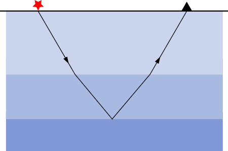
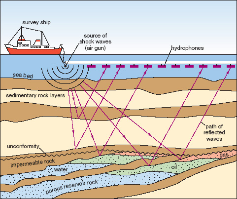
Flawed cartoon of a marine seismic survey. OU, CC-BY-SA-NC.

But when the amplitude versus offset (AVO) behaviour of seismic reflections gets mentioned, most non-geophysicists switch off. If that's your reaction too, don't be put off by the jargon, it's really not that complicated.

The idea that we collect data from different angles is not complicated or scary. Remember the classic cartoon of a seismic survey (right). It's clear that some of the ray paths bounce off the geological strata at relatively small incidence angles, closer to straight down-and-up. Others, arriving at receivers further away from the source, have greater angles of incidence. The distance between the source and an individual receiver is called offset, and is deducible from the seismic field data because the exact location of the source and receivers is always known.

The basic physics behind AVO analysis is that the strength of a reflection does not only depend on the acoustic impedance—it also depends on the angle of incidence. Only when this angle is 0 (a vertical, or zero-offset, ray) does the simple relationship above hold.

Total internal reflection underwater. Source: Mbz1 via Wikimedia Commons.Though it may be unintuitive at first, angle-dependent reflectivity is an idea we all know well. Imagine an ordinary glass window: you can see through it perfectly well when you look straight through it, but when you move to a wide angle it suddenly becomes very reflective (at the so-called critical angle). The interface between water and air is similarly reflective at wide angles, as in this underwater view.

Karl Bernhard Zoeppritz (German, 1881–1908) was the first seismologist to describe the relationship between reflectivity and angle of incidence. In this context, describe means write down the equations for. Not two or three equations, lots of equations.

The Zoeppritz equations are very good model for how seismic waves propagate in the earth. There are some unnatural assumptions about isotropy, total isolation of the interface, and other things, but they work well in many real situations. The problem is that the equations are unwieldy, especially if you are starting from seismic data and trying to extract rock properties—trying to solve the so-called inverse problem. Since we want to be able to do useful things quickly, and since seismic data are inherently approximate anyway, several geophysicists have devised much friendlier models of reflectivity with offset.Google Nexus S

I'll take a look at these more friendly models next time, because I want to tell a bit about how we've implemented them in our soon-to-be-released mobile app, AVO*. No equations, I promise! Well, one or two...