Great geophysicists #3
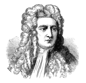
Today is a historic day for greatness: Rene Descartes was born exactly 415 years ago, and Isaac Newton died 284 years ago. They both contributed to our understanding of physical phenomena and the natural world and, while not exactly geophysicists, they changed how scientists think about waves in general, and light in particular.

Unweaving the rainbow

Scientists of the day recognized two types of colour. Apparent colours were those seen in prisms and rainbows, where light itself was refracted into colours. Real colours, on the other hand, were a property of bodies, disclosed by light but not produced by that light. Descartes studied refraction in raindrops and helped propagate Snell’s law in his 1637 paper, Dioptrica. His work severed this apparent–real dichotomy: all colours are apparent, and the colour of an object depends on the light you shine on it.

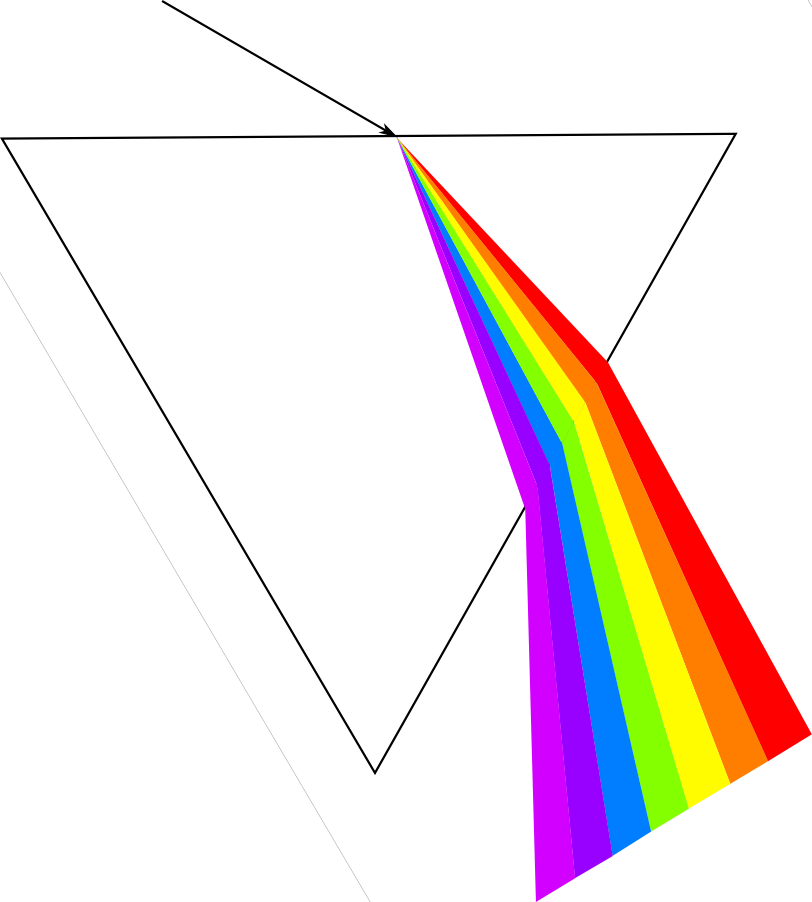
Newton began to work seriously with crystalline prisms around 1666. He was the first to demonstrate that white light is a scrambled superposition of wavelengths; a visual cacophony of information. Not only does a ray bend in relation to the wave speed of the material it is entering (read the post on Snellius), but Newton made one more connection. The intrinsic wave speed of the material, in turn depends on the frequency of the wave. This phenomenon is known as dispersion; different frequency components are slowed by different amounts, angling onto different paths.

What does all this mean for seismic data?

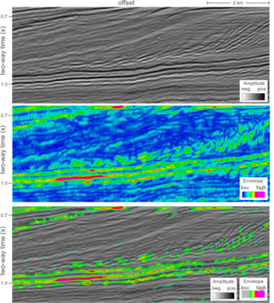
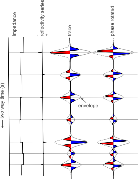
Seismic pulses, which strut and fret through the earth, reflecting and transmitting through its myriad contrasts, make for a more complicated type of prism-dispersion experiment. Compared to visible light, the effects of dispersion are subtle, negligible even, in the seismic band 2–200 Hz. However, we may measure a rock to have a wave speed of 3000 m/s at 50 Hz, and 3500 m/s at 20 kHz (logging frequencies), and 4000 m/s at 10 MHz (core laboratory frequencies). On one hand, this should be incredibly disconcerting for subsurface scientists: it keeps us from bridging the integration gap empirically. It is also a reason why geophysicists get away with haphazardly stretching and squeezing travel time measurements taken at different scales to tie wells to seismic. Is dispersion the interpreters’ fudge-factor when our multi-scale data don’t corroborate?

Chris Liner, blogging at Seismos, points out

...so much of classical seismology and wave theory is nondispersive: basic theory of P and S waves, Rayleigh waves in a half-space, geometric spreading, reflection and transmission coefficients, head waves, etc. Yet when we look at real data, strong dispersion abounds. The development of spectral decomposition has served to highlight this fact.

We should think about studying dispersion more, not just as a nuisance for what is lost (as it has been traditionally viewed), but as a colourful, scale-dependant property of the earth whose stories we seek to hear.

More on brevity

Yesterday, I wrote about one of Orwell's essays, and about Watson and Crick's famous letter to Nature. The theme: short expositions win. Today, I continue the theme, with two more brief but brilliant must-reads for the aspiring writer. 

Albert Einstein

The first time Einstein's equation appeared in printLike the Watson and Crick letter, Einstein's 1905 paper Does the inertia of a body depend on its energy content? was profound and eternal. In it, he derived the expression m = c2. Though the paper was arguably little more than an extension of others he published that year, it was very short: exactly three (small) pages long. His concluding remark couldn't be clearer or more succinct:

If the theory corresponds to the facts, radiation conveys inertia between the emitting and absorbing bodies.

Einstein's writing style was influenced by Ernst Mach's book, The Science of Mechanics (Minor, 1984). Mach adopted a pedagogic, step-by-step style that guided the reader through the scientist's reasoning. Asking the reader to imagine an analogous scenario or simplified example was, in my experience, common in physics books of the period. Richard Feynman used a similar straightforward style. I try to use it myself, but sometimes the desire to impress gets the better of me.

Kenneth Landes

Years of reviewing journal papers has convinced me: the abstract is one of the most abused and misunderstood animals of science. I regularly hand Landes' brilliant little plea to new writers, and it bears re-reading once every couple of years. Landes points out that the abstract should "concentrate in itself the essential information of a paper or article". Here is his superbly cheeky, information-free counterexample:

A partial biography of the writer is given. The inadequate abstract is discussed. What should be covered by an abstract is considered. The importance of the abstract is described. Dictionary definitions of 'abstract' are quoted. At the conclusion a revised abstract is presented. 

Read his short note for the improved version of this soggy squib of an abstract. 

What do we draw from these authors? I'll be brief: so should you.

References
Einstein, A (1905). Ist die Trägheit eines Körpers von seinem Energiegehalt abhängig?, in Annalen der Physik. 18:639, 1905. Published in English by Methuen, 1923.
Landes, K (1966). A scrutiny of the abstract II. American Association of Petroleum Geologists Bulletin 50 (9), p 1992.
Mach, E (1883). The science of mechanics. Later English translation here. 
Minor, D (1984). Albert Einstein on writing. J. Technical Writing and Communication 14 (1), p 13–18. [Requires subscription or purchase]. 

On brevity

As another of my new endeavours for the year, I plan to teach a short course on writing. I have been researching the subject, looking for advice, examples and counter-examples. Some of my favourites come from the archives, where I expected to find only dusty obfuscation, written in the tortuous prose many people associate with science. Instead, I came across some tiny but glittering gems. Today: Orwell, and Watson & Crick. 

George Orwell

George Orwell had advice for writersOrwell's short essay, Politics and the English Language, is partly about politics, but mostly about language. A little on the dusty side perhaps, at least to my taste, but it has two highlights. First, Orwell quotes some perverse paragraphs from the more pompous writers of the day, like this unreadable piffle from one scholar:

Above all, we cannot play ducks and drakes with a native battery of idioms which prescribes egregious collocations of vocables as the Basic put up with for tolerate, or put at a loss for bewilder.

Second, Orwell offers six rules to improve our writing:

  1. Never use a metaphor, simile, or other figure of speech which you are used to seeing in print.
  2. Never use a long word where a short one will do.
  3. If it is possible to cut a word out, always cut it out.
  4. Never use the passive where you can use the active.
  5. Never use a foreign phrase, a scientific word, or a jargon word if you can think of an everyday English equivalent.
  6. Break any of these rules sooner than say anything outright barbarous.

Watson and Crick

One of the most famous scientific papers of all timeOne of the most important and widely recognized scientific publications of the last century turns out to be nothing more than a one-page letter. As well as being brief, it even reads like a letter, with plain language and plenty of opinion and informed speculation. Although the results were published in full elsewhere, doubtless in more technical language, and although letters are still used in some journals, I love the unselfconscious ease with which this seismic discovery was announced. If anyone is up for the challenge, it would be fun to parody a modern press-release for this discovery.

Click the thumbnail for the full paper →

Tomorrow, I offer two more short pieces to rev up your writing. Meanwhile... do you have any favourites from the archives of science writing? Please share them! Unless they're in Latin.

Geo-FLOSS

Newton didn't need open source, so why do you?Free and open source software is catalyzing a revolution in subsurface science. As a key part of the growing movement to open access to data, information, and the very process of doing science, open software is not just for the geeks. It's a party we're all invited to. 

I have been in California this week, attending a conference in Long Beach called Mathematical and Computational Issues in the Geosciences, organized by the Society of Industrial and Applied Mathematicians. In 2009 I started being more active in my search for lectures and courses that lie outside my usual comfort zone. I have done courses in reservoir engineering and Java programming. I have heard talks on radiology and financial forecasting. It's like being back at university; I like it.

How did I end up at this conference? Last spring, I wrote a little review article about open source software (available here at dGB Earth Science's site). It was really just a copy-edited version of notes I had made whilst looking for free geoscience software and reading up on the subject for my own interest. After some brushes with open source, I was curious about the history behind the idea, how projects are built, and how they are licensed. At the same time, I also started a couple of Wikipedia articles about free software in geology and geophysics, as a place to list the projects I had come across. Kristin Flornes, of IRIS in Stavanger, Norway, saw the article and her colleagues got in touch about the conference.

The talk, which you can access via the thumbnail (left) or look at in Google Docs, is part FLOSS primer, part geo-FLOSS advert, part manifesto for a revolution of innovation. I hope the speaker notes are sufficient. 

What do you think? Is software availability or architecture or capable of driving change, or is it just a tool, passive and inert?

← Click the image for the PDF (6.9M)

E is for Envelope 2

This seismic profile offshore Netherlands is shown three ways to illustrate the relationship between amplitude and envelope, which we introduced yesterday. 

The first panel consists of seismic amplitude values, the second panel is the envelope, and the third panel is a combination of the two (co-rendered with transparency). I have given them different color scales because amplitude values oscillate about zero and envelope values are always positive.

The envelope might be helpful in this case for simplifying the geology at the base of the clinoforms, but doesn't seem to provide any detail along the high relief slopes.

It also enhances the bright spot in the toesets of the clinoforms, but, more subtly, it suggests that there are 3 key interfaces, out of a series of about 10 peaks and troughs. Used in this way, it may help the interpreter decide which reflections are important, and which reflections are noise (sidelobe).

Another utility of envelope is that it is independent of phase. If the maximum on the envelope does not correspond to a peak or trough on the seismic amplitudes, the seismic amplitudes may not be zero phase. In environments where phase is wandering, either pre-stack or post-stack domain, the envelope attribute is a handy accompaniment to constrain reflection picking or AVO analyses: envelope vs offset, or EVO. It also makes me wonder if adding envelopes to the modeling of synthetic seismiograms might yield better well ties?

E is for Envelope

There are 8 layers in this simple blocky earth model. You might say that there are only 7 important pieces of information for this cartoon earth; the 7 reflectivity contrasts at the layer boundaries.

The seismic traces however, have more information than that. On the zero phase trace, there are 21 extrema (peaks / troughs). Worse yet, on the phase rotated trace there are 28. So somehow, the process of wave propagation has embedded more information than we need. Actually, in that case, maybe we shouldn't call it information: it's noise.

It can be hard to tell what is real and what is side lobe and soon, you are assigning geological significance to noise. A literal interpretation of the peaks and troughs would produce far more layers than there actually are. If you interpret every extreme as being matched with a boundary, you would be wrong.

Consider the envelope. The envelope has extrema positioned exactly at each boundary, and perhaps more importantly, it literally envelopes (I enunciate it differently here for drama) the part of the waveform associated with that reflection. 7 boundaries, 7 bumps on the envelope, correctly positioned in the time domain.

Notice how the envelope encompasses all phase rotations from 0 to 360 degrees; it's phase invariant. Does this make it more robust? But it's so broad! Are we losing precision or accuracy by accompanying our trace with it's envelope? What does vertical resolution really mean anyway?

Does this mean that every time there is an envelope maximum, I can expect a true layer boundary? I for one, don't know if this is fool proof in the face of interferring wavelets, but it has implications for how we work as seismic interpreters. Tomorrow we'll take a look at the envelope attribute in the context of real data.

Confounded paradox

Probabilities are notoriously slippery things to deal with, so it shouldn’t be surprising that proportions, which are really probabilities in disguise, can catch us out too.

Simpson’s paradox is my favourite example of something simple, something we know we understand, indeed have always understood, suddenly turning on us.

Exploration geophysicists often use information extracted from seismic data, called attributes, to help predict rock properties in the subsurface. Suppose you are a geophysicist comparing two new seismic attributes, truth and beauty, each purported to predict fluid type. You compare their hydrocarbon-predicting success rates on 35 discoveries and it’s close, but beauty has an 83% hit rate, while truth manages only 77%. There's not much in it, but since you only need one attribute, all else being equal, beauty it is.

But then someone asks you about predicting oil in particular. You dig out your data and drill down:

Apparently, truth did a little better when you just look at oil. And what about gas, they ask? Well, the data showed that truth was also better than beauty at predicting gas. So truth does a better job at both oil and gas, but somehow beauty edges out overall.

Impossible? Clearly not: these numbers are real and plausible, I haven't done anything sneaky. In this case, hydrocarbon type is a confounding variable, and it’s important to look for such groupings in your data. Improbable? No, it’s quite common in all kinds of data and this trap is well known among statisticians.

How can you avoid it? Be especially wary when the sample size in one or more of the groups you are interested in is much smaller than the others. Be even more alert if group sizes are inconsistent across the variables, as in my example: oil is under-sampled for truth, gas for beauty.

Ultimately, there's no guarantee this effect won’t crop up; that’s just how proportions are. All you can do is make sure you ask your data the questions you care about. 

This post is a version of part of my article The rational geoscientist, The Leading Edge, May 2010

What is shale?

Until four or five years ago, it was enough just to know that shale is that dark grey stuff in between the sands. Being overly fascinated with shale was regarded as a little, well, unconventional. To be sure, seals and source rocks were interesting and sometimes critical, but always took a back seat to reservoir characterization.

Well, now the shale is the reservoir. So how do we characterize shale? We might start by asking: what is shale, really? Is it enough to say, "I don't know, but I know it when I see it"? No: sometimes you need to know what to call something, because it affects how it is perceived, explored for, developed, and even regulated.

Alberta government

Section 1.020(2)(27.1) of the Oil and Gas Conservation Regulations defines shale:

a lithostratigraphic unit having less than 50% by weight organic matter, with less than 10% of the sedimentary clasts having a grain size greater than 62.5 micrometres and more than 10% of the sedimentary clasts having a grain size less than 4 micrometres.
ERCB Bulletin 2009-23

This definition seems quite strict, but it open to interpretation. 'Ten percent of the sedimentary clasts' might be a very small volumetric component of the rock, much less than 10%, if those 'clasts' are small enough. I am sure they meant to write '...10% of the bulk rock volume comprising clasts having a grain size...'.

Read More

D is for Domain

Domain is a term used to describe a variable for which a set of functions or signals are defined.

Time-domain describes functions or signals that change over time; depth-domain describes functions or signal that change over space. The oscillioscope, geophone, and heartrate monitor are tools used to visualize real-world signals in the time domain. The map, photograph, and well log are tools to describe signals in the depth (spatial) domain.

Because seismic waves are recorded in time (jargon: time series), seismic data are naturally presented and interpreted with time as the z-axis. Routinely though, geoscientists must convert data and data objects between the time and depth domain.

Consider the top of a hydrocarbon-bearing reservoir in the time domain (top panel). In this domain, it looks like wells A and B will hit the reservoir at the same elevation and encounter the same amount of pay.

In this example the velocities that enable domain conversion vary from left to right, thereby changing the position of this structure in depth. The velocity model (second panel) linearly decreases from 4000 m/s on the left, to 3500 m/s on the right; this equates to a 12.5% variation in the average velocities in the overburden above the reservoir.

This velocity gradient yields a depth image that is significantly different than the time domain representation. The symmetric time structure bump has been rotated and the spill point shifted from the left side to the right. More importantly, the amount of reservoir underneath the trap has been drastically reduced. 

Have you encountered examples in your work where data domains have been misleading?

Although it is perhaps more intuitive to work with depth-domain data wherever possible, sometimes there are good reasons to work with time. Excessive velocity uncertainty makes depth conversion so ambiguous that you are better off in time-domain. Time-domain signals are recorded at regular sample rates, which is better for signal processing and seismic attributes. Additionally, travel-time itself is an attribute in that it may be recorded or mapped for its physical meaning in some cases, for example time-lapse seismic.

If you think about it, all three of these models are in fact different representations of the same earth. It might be tempting to regard the depth picture as 'reality' but if it's your only perspective, you're kidding yourself. 

Smaller than they look

Suppose that you are standing on a pier at the edge of the Pacific Ocean. You have just created a new isotope of oxygen, 11O. Somehow, despite the fact that 12O is comically unstable and has a half-life of 580 yoctoseconds, 11O is stable. In your hand, you have a small glass of superlight water made with 11O, so that every molecule in the glass contains the new isotope.

You pour the water into the world's ocean and go home. In your will, you leave instructions to be handed down through generations of your family: wait several millennia for the world's ocean to mix completely. Then go to that pier, or any pier, and take a glass of water from the sea. Then count the 11O atoms in the glass.

What are the odds of getting one back?

Read More