Are conferences failing you too?

I recently asked a big software company executive if big exhibitions are good marketing value. The reply:

It's not a waste of money. It's a colossal waste of money.

So that's a 'no'.

Is there a problem here?

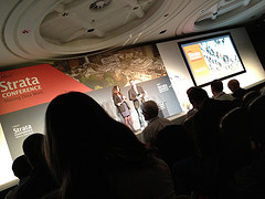
Next week I'll be at the biggest exhibition (and conference) in our sector: the SEG Annual Meeting. Thousands of others will be there, but far more won’t. Clearly it’s not indispensable or unmissable. Indeed, it’s patently missable — I did just fine in my career as a geophysicist without ever going. Last year was my first time.

Is this just the nature of mass market conferences? Is the traditional academic format necessarily unremarkable? Do the technical societies try too hard to be all things to all people, and thereby miss the mark for everyone? 

I don't know the answer to any of these questions, I can only speak for myself. I'm getting tired of conferences. Perhaps I've reached some new loop in the meandering of my career, or perhaps I'm just grumpy. But as I've started to whine, I'm finding more and more allies in my conviction that conferences aren't awesome.

What are conferences for?

  • They make lots of money for the technical societies that organize them.
  • A good way to do this is to provide marketing and sales opportunities for the exhibiting vendors.
  • A good way to do this is to attract lots of scientists there, baiting with talks by all the awesomest ones.
  • A good way to do this, apparently, is to hold it in Las Vegas.

But I don't think the conference format is great at any of these things, except possibly the first one. The vendors get prospects (that's what sales folk call people) that are only interested in toys and beer — they might be users, but they aren't really customers. The talks are samey and mostly not memorable (and you can only see 5% of them). Even the socializing is limited by the fact that the conference is gigantic and run on a tight schedule. And don't get me started on Las Vegas. 

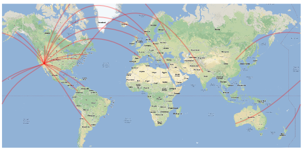
If we're going to take the trouble of flying 8000 people to Las Vegas, we had better have something remarkable to show for it. Do we? What do we get from this giant conference? By my conservative back-of-the-envelope calculation, we will burn through about 210 person-years of productivity in Las Vegas next week. That's about 6 careers' worth. Six! Are we as a community satisfied that we will produce 6 careers' worth of insight, creativity, and benefit?

You can probably tell that I am not convinced. Tomorrow, I will put away the wrecking ball of bellyaching, and offer some constructive ideas, and a promise. Meanwhile, if you have been to an amazing conference, or can describe one from your imagination, or think I'm just being a grouch — please use the comments below.

Map data ©2012 Google, INEGI, MapLink, Tele Atlas. 

News of the month

Another month flies by, and it's time for our regular news round-up! News tips, anyone?

Knowledge sharing

At the start of the month, SPE launched PetroWiki. The wiki has been seeded with one part of the 7-volume Petroleum Engineering Handbook, a tome that normally costs over $600. They started with Volume 2, Drilling Engineering, which includes lots of hot topics, like fracking (right). Agile was involved in the early design of the wiki, which is being built by Knowledge Reservoir

Agile stuff

Our cheatsheets are consistenly some of the most popular things on our site. We love them too, so we've been doing a little gardening — there are new, updated editions of the rock physics and geophysics cheatsheets.

Thank you so much to the readers who've let us know about typos! 

Wavelets

Nothing else really hit the headlines this month — perhaps people are waiting for SEG. Here are some nibbles...

  • We just upgraded a machine from Windows to Linux, sadly losing Spotfire in the process. So we're on the lookout for another awesome analytics tool. VISAGE isn't quite what we need, but you might like these nice graphs for oil and gas.
  • Last month we missed the newly awarded exploration licenses in the inhospitable Beaufort Sea [link opens a PDF]. Franklin Petroleum of the UK might have been surprised by the fact that they don't seem to have been bidding against anyone, as they picked up all six blocks for little more than the minimum bid.
  • It's the SEG Annual Meeting next week... and Matt will be there. Look out for daily updates from the technical sessions and the exhibition floor. There's at least one cool new thing this year: an app!

This regular news feature is for information only. We aren't connected with any of these organizations, and don't necessarily endorse their products or services. 

N is for Nyquist

In yesterday's post, I covered a few ideas from Fourier analysis for synthesizing and processing information. It serves as a primer for the next letter in our A to Z blog series: N is for Nyquist.

In seismology, the goal is to propagate a broadband impulse into the subsurface, and measure the reflected wavetrain that returns from the series of rock boundaries. A question that concerns the seismic experiment is: What sample rate should I choose to adequately capture the information from all the sinusoids that comprise the waveform? Sampling is the capturing of discrete data points from the continuous analog signal — a necessary step in recording digital data. Oversample it, using too high a sample rate, and you might run out of disk space. Undersample it and your recording will suffer from aliasing.

What is aliasing?

Aliasing is a phenomenon observed when the sample interval is not sufficiently brief to capture the higher range of frequencies in a signal. In order to avoid aliasing, each constituent frequency has to be sampled at least two times per wavelength. So the term Nyquist frequency is defined as half of the sampling frequency of a digital recording system. Nyquist has to be higher than all of the frequencies in the observed signal to allow perfect recontstruction of the signal from the samples.

Above Nyquist, the signal frequencies are not sampled twice per wavelength, and will experience a folding about Nyquist to low frequencies. So not obeying Nyquist gives a double blow, not only does it fail to record all the frequencies, the frequencies that you leave out actually destroy part of the frequencies you do record. Can you see this happening in the seismic reflection trace shown below? You may need to traverse back and forth between the time domain and frequency domain representation of this signal.

Nyquist_trace.png

Seismic data is usually acquired with either a 4 millisecond sample interval (250 Hz sample rate) if you are offshore, or 2 millisecond sample interval (500 Hz) if you are on land. A recording system with a 250 Hz sample rate has a Nyquist frequency of 125 Hz. So information coming in above 150 Hz will wrap around or fold to 100 Hz, and so on. 

It's important to note that the sampling rate of the recording system has nothing to do the native frequencies being observed. It turns out that most seismic acquisition systems are safe with Nyquist at 125 Hz, because seismic sources such as Vibroseis and dynamite don't send high frequencies very far; the earth filters and attenuates them out before they arrive at the receiver.

Space alias

Aliasing can happen in space, as well as in time. When the pixels in this image are larger than half the width of the bricks, we see these beautiful curved artifacts. In this case, the aliasing patterns are created by the very subtle perspective warping of the curved bricks across a regularly sampled grid of pixels. It creates a powerful illusion, a wonderful distortion of reality. The observations were not sampled at a high enough rate to adequately capture the nature of reality. Watch for this kind of thing on seismic records and sections. Spatial alaising. 

Click for the full demonstration (or adjust your screen resolution).You may also have seen this dizzying illusion of an accelerating wheel that suddenly appears to change direction after it rotates faster than the sample rate of the video frames captured. The classic example is the wagon whel effect in old Western movies.

Aliasing is just one phenomenon to worry about when transmitting and processing geophysical signals. After-the-fact tricks like anti-aliasing filters are sometimes employed, but if you really care about recovering all the information that the earth is spitting out at you, you probably need to oversample. At least two times for the shortest wavelengths.

Hooray for Fourier!

The theory of truth is a series of truisms - J.L Austin

The mathematical notion that any periodic function, no matter how jagged or irregular, can be represented as a sum of sines — called a Fourier series — is one of the most extraordinarily useful ideas ever. Ever! It is responsible for the theory of transmitting and recovering information, and yes, is ubiquitious in geophysics. Strikingly, any signal can be decomposed into an ensemble of sine waves. They are two different representations of the same object, two equal representations of the same information. Fourier analysis is this act of sending waves through a mathematical prism, breaking up a function into the frequencies that compose it.

To build an arbitrary signal, the trick is to mulitply each of the sines by a coefficient (to change thier amplitude) and to shift them so that they either add together or cancel (changing the phase). From the respective coefficients and phases of the composite sinusoids, one can reconstruct the original curve: no information is lost in translating from one state to the other. 

So the wiggle trace we plot of the seismic waveform has bits of information partitioned across each of its individual sinusoids. The more frequencies it has, the more information carrying capacity it has. Think of it as being able to paint with a full color palette. The degree of richess or range is known as bandwidth. In making this example, I was surprised how few sine waves (only ten) it took to make a signal that actually looks like a bonafide seismic trace. 

In 52 Things You Should Know About Geophysics, Mostafa Nagizadeh wrote an essay on the magic of Fourier; it's applications for geophysics data analysis. And he should know. In tomorrow's post, I will elaborate on the practical and economical issues we encounter making discrete measurements of continuous (analog) phenomena.

The blind geoscientist

Last time I wrote about using randomized, blind, controlled tests in geoscience. Today, I want to look a bit closer at what such a test or experiment might look like. But before we do anything else, it's worth taking 20 minutes, or at least 4, to watch Ben Goldacre's talk on the subject at Strata in London recently:

How would blind testing work?

It doesn't have to be complicated, or much different from what you already do. Here’s how it could work for the biostrat study I mentioned last time:

  1. Collect the samples as normal. There is plenty of nuance here too: do you sample regularly, or do you target ‘interesting’ zones? Only regular sampling is free from bias, but it’s expensive.
  2. Label the samples with unique identifiers, perhaps well name and depth.
  3. Give the samples to a disinterested, competent person. They repackage the samples and assign different identifiers randomly to the samples.
  4. Send the samples for analysis. Provide no other data. Ask for the most objective analysis possible, without guesswork about sample identification or origin. The samples should all be treated in the same way.
  5. When you get the results, analyse the data for quality issues. Perform any analysis that does not depend on depth or well location — for example, cluster analysis.
  6. If you want to be really thorough, the disinterested party to provide depths only, allowing you to sort by well and by depth but without knowing which wells are which. Perform any analysis that doesn’t depend on spatial location.
  7. Finally, ask for the key that reveals well names. Hopefully, any problems with the data have already revealed themselves. At this point, if something doesn’t fit your expectations, maybe your expectations need adjusting!

Where else could we apply these ideas?

  1. Random selection of some locations in a drilling program, perhaps in contraindicated locations
  2. Blinded, randomized inspection of gathers, for example with different processing parameters
  3. Random selection of wells as blind control for a seismic inversion or attribute analysis
  4. Random selection of realizations from geomodel simulation, for example for flow simulation
  5. Blinded inspection of the results of a 'turkey shoot' or vendor competition (e.g. Hayles et al, 2011)

It strikes me that we often see some of this — one or two wells held back for blind testing, or one well in a program that targets a non-optimal location. But I bet they are rarely selected randomly (more like grudgingly), and blind samples are often peeked at ('just to be sure'). It's easy to argue that "this is a business, not a science experiment", but that's fallacious. It's because it's a business that we must get the science right. Scientific rigour serves the business.

I'm sure there are dozens of other ways to push in this direction. Think about the science you're doing right now. How could you make it a little less prone to bias? How can you make it a shade less likely that you'll pull the wool over your own eyes?

Experimental good practice

Like hitting piñatas, scientific experiments need blindfolds. Image: Juergen. CC-BY.I once sent some samples to a biostratigrapher, who immediately asked for the logs to go with the well. 'Fair enough,' I thought, 'he wants to see where the samples are from'. Later, when we went over the results, I asked about a particular organism. I was surprised it was completely absent from one of the samples. He said, 'oh, it’s in there, it’s just not important in that facies, so I don’t count it.' I was stunned. The data had been interpreted before it had even been collected.

I made up my mind to do a blind test next time, but moved to another project before I got the chance. I haven’t ordered lab analyses since, so haven't put my plan into action. To find out if others already do it, I asked my Twitter friends:

Randomized, blinded, controlled testing should be standard practice in geoscience. I mean, if you can randomize trials of government policy, then rocks should be no problem. If there are multiple experimenters involved, like me and the biostrat guy in the story above, perhaps there’s an argument for double-blinding too.

Designing a good experiment

What should we be doing to make geoscience experiments, and the reported results, less prone to bias and error? I'm no expert on lab procedure, but for what it's worth, here are my seven Rs:

  • Randomized blinding or double-blinding. Look for opportunities to fight confirmation bias. There’s some anecdotal evidence that geochronologists do this, at least informally — can you do it too, or can you do more?
  • Regular instrument calibration, per manufacturer instructions. You should be doing this more often than you think you need to do it.
  • Repeatability tests. Does your method give you the same answer today as yesterday? Does an almost identical sample give you the same answer? Of course it does! Right? Right??
  • Report errors. Error estimates should be based on known problems with the method or the instrument, and on the outcomes of calibration and repeatability tests. What is the expected variance in your result?
  • Report all the data. Unless you know there was an operational problem that invalidated an experiment, report all your data. Don’t weed it, report it. 
  • Report precedents. How do your results compare to others’ work on the same stuff? Most academics do this well, but industrial scientists should report this rigorously too. If your results disagree, why is this? Can you prove it?
  • Release your data. Follow Hjalmar Gislason's advice — use CSV and earn at least 3 Berners-Lee stars. And state the license clearly, preferably a copyfree one. Open data is not altruistic — it's scientific.

Why go to all this trouble? Listen to Richard Feynman:

The first principle is that you must not fool yourself, and you are the easiest person to fool.

Thank you to @ToriHerridge@mammathus@volcan01010 and @ZeticaLtd for the stories about blinded experiments in geoscience. There are at least a few out there. Do you know of others? Have you tried blinding? We'd love to hear from you in the comments! 

M is for Migration

One of my favourite phrases in geophysics is the seismic experiment. I think we call it that to remind everyone, especially ourselves, that this is science: it's an experiment, it will yield results, and we must interpret those results. We are not observing anything, or remote sensing, or otherwise peering into the earth. When seismic processors talk about imaging, they mean image construction, not image capture

The classic cartoon of the seismic experiment shows flat geology. Rays go down, rays refract and reflect, rays come back up. Simple. If you know the acoustic properties of the medium—the speed of sound—and you know the locations of the source and receiver, then you know where a given reflection came from. Easy!

But... some geologists think that the rocks beneath the earth's surface are not flat. Some geologists think there are tilted beds and faults and big folds all over the place. And, more devastating still, we just don't know what the geometries are. All of this means trouble for the geophysicist, because now the reflection could have come from an infinite number of places. This makes choosing a finite number of well locations more of a challenge. 

What to do? This is a hard problem. Our solution is arm-wavingly called imaging. We wish to reconstruct an image of the subsurface, using only our data and our sharp intellects. And computers. Lots of those.

Imaging with geometry

Agile's good friend Brian Russell wrote one of my favourite papers (Russell, 1998) — an imaging tutorial. Please read it (grab some graph paper first). He walks us through a simple problem: imaging a single dipping reflector.

Remember that in the seismic experiment, all we know is the location of the shots and receivers, and the travel time of a sound wave from one to the other. We do not know the reflection points in the earth. If we assume dipping geology, we can use the NMO equation to compute the locus of all possible reflection points, because we know the travel time from shot to receiver. Solutions to the NMO equation — given source–receiver distance, travel time, and the speed of sound — thus give the ellipse of possible reflection points, shown here in blue:

Clearly, knowing all possible reflection points is interesting, but not very useful. We want to know which reflection point our recorded echo came from. It turns out we can do something quite easy, if we have plenty of data. Fortunately, we geophysicists always bring lots and lots of receivers along to the seismic experiment. Thousands usually. So we got data.

Now for the magic. Remember Huygens' principle? It says we can imagine a wavefront as a series of little secondary waves, the sum of which shows us what happens to the wavefront. We can apply this idea to the problem of the tilted bed. We have lots of little wavefronts — one for each receiver. Instead of trying to figure out the location of each reflection point, we just compute all possible reflection points, for all receivers, then add them all up. The wavefronts add constructively at the reflector, and we get the solution to the imaging problem. It's kind of a miracle. 

Try it yourself. Brian Russell's little exercise is (geeky) fun. It will take you about an hour. If you're not a geophysicist, and even if you are, I guarantee you will learn something about how the miracle of the seismic experiment. 

Reference
Russell, B (1998). A simple seismic imaging exercise. The Leading Edge 17 (7), 885–889. DOI: 10.1190/1.1438059

Your best work(space)

Doing your best work requires placing yourself in the right environment. For me, I need to be in an uncluttered space, free from major distractions, yet close enough to interactions to avoid prolonged isolation. I also believe in surrounding yourself with the energetic and inspired people, if you can afford such a luxury.

The model workspace

My wife an I are re-doing our office at home. Currently mulling over design ideas, but websites and catalogs only take me so far. I find they fall short of giving me the actual look and feel of a future space. To cope, I have built a model using SketchUp, catering to my geeky need for spatial visualization. It took me 35 minutes to build the framework using SketchUp: the walls, doors and closets and windows. Now, it's taking us much longer to design and build the workspace inside it. I was under the impression that, just as in geoscience, we need models for making detailed descisions. But perhaps, this model is complicating or delaying us getting started. Or maybe we are just being picky. Refined tastes.

This is a completely to-scale drafting of my new office. It is missing some furniture, but the main workspace is shown on the left wall; a large, expansive desk to house (up to) two monitors, two chairs, and two laptops. The wide window sill will be fitted with bench cushions for reading. Since we want a built-in look, it makes sense construct a digital model to see how the components line up with other features in the space. 

More than one place to work 

So much of what we do in geoscience is centered around effectively displaying information, so it helps to feel fresh and inspired by the environment beyond the desktop. Where we work affects how we work. Matt and I have that luxury of defining our professional spaces, and we are flexible and portable enough to work in a number of settings. I like this.

There is a second place to go to when I want to get out of the confines of my condo. I spend about 30 hours a month at a co-working space downtown. The change in scenery is invigorating. I can breathe the same air as like-minded entrepreneurs, freelancers, and sprouters of companies. I can plug into large monitors, duck into a private room for a conference call, hold a meeting, or collaborate with others. Part of what makes an office is the technology, the furniture, the lighting, which is important. The other part of a workspace is your relationship and interaction to other people and places; a sense of community.

What does your best work space look like? Are you working there now?

Journalists are scientists

Tim Radford. Image: Stevyn Colgan.On Thursday I visited The Guardian’s beautiful offices in King’s Cross for one of their Masterclass sessions. Many of them have sold out, but Tim Radford’s science writing evening did so in hours, and the hundred-or-so budding writers present were palpably excited to be there. The newspaper is one of the most progressive news outlets in the world, and boasts many venerable alumni (John Maddox and John Durant among them). It was a pleasure just to wander around the building with a glass of wine, with some of London’s most eloquent nerds.

Radford is not a trained scientist, but a pure journalist. He left school at 16, idolized Dylan Thomas, joined a paper, wrote like hell, and sat on almost every desk before mostly retiring from The Guardian in 2005. He has won four awards from the Association of British Science Writers. More people read any one of his science articles on a random Tuesday morning over breakfast than will ever read anything I ever write. Tim Radford is, according to Ed Yong, the Yoda of science writers.

Within about 30 minutes it became clear what it means to be a skilled writer: Radford’s real craft is story-telling. He is completely at home addressing a crowd of scientists — he knows how to hold a mirror up to the geeks and reflect the fun, fascinating, world-changing awesomeness back at them. “It’s a terrible mistake to think that because you know about a subject you are equipped to write about it,” he told us, getting at how hard it is to see something from within. It might be easier to write creatively, and with due wonder, about fields outside our own.

Some in the audience weren’t content with being entertained by Radford, watching him in action as it were, preferring instead to dwell on controversy. He mostly swatted them aside, perfectly pleasantly, but one thing he was having none of was the supposed divide between scientists and journalists. Indeed, Radford asserted that journalists and scientists do basically the same thing: imagine a story (hypothesis), ask questions (do experiments), form a coherent story (theory) from the results, and publish. Journalists are scientists. Kind of.

I loved Radford's committed and unapologetic pragmatism, presumably the result of several decades of deadlines. “You don’t have to be ever so clever, you just have to be ever so quick,” and as a sort of corollary: “You can’t be perfectly right, but you must be mostly right.” One questioner accused journalists of sensationalising science (yawn). “Of course we do!” he said — because he wants his story in the paper, and he wants people to read it. Specifically, he wants people who don’t read science stories to read it. After all, writing for other people is all about giving them a sensation of one kind or another.

I got so much out of the 3 hours I could write at least another 2000 words, but I won’t. The evening was so popular that the paper decided to record the event and experiment with a pay-per-view video, so you can get all the goodness yourself. If you want more Radford wisdom, his Manifesto for the simple scribe is a must-read for anyone who writes.

Tim Radford's most recent book, The Address Book: Our Place in the Scheme of Things, came out in spring 2011.

The photograph of Tim Radford, at The World's Most Improbable Event on 30 September, is copyright of Stevyn Colgan, and used with his gracious permission. You should read his blog, Colganology. The photograph of King's Place, the Guardian's office building, is by flickr user Davide Simonetti, licensed CC-BY-NC.

My StrataConf highlights

Lots went on at the geologically named, but not geologically inclined, Strata Conference in London. Here are my highlights:

George Dyson was one of the keynote speakers on the first morning. The son of the British–American mathematician Freeman Dyson, George is an author and historian of science and computing. He talked about the history of storage, starting with tally sticks, through the 53kB of global digital storage in 1953, to today. His talk was fascinating. 

Simon Rogers was one of several speakers from the Guardian newspaper, one of the most progressive and online-friendly news outlets in the world. The paper has a host of strategies for putting data first:

  • Their data and viz geeks sit in the middle of news room
  • They built their own software library for data viz, Miso
  • They share the data behind every story on their Datablog

Duncan Irving from Teradata gave the audience a glimpse of the big data geoscientists wield, as I alluded to yesterday. Teradata does data warehousing, but with high technology extras like distributed storage and level of detail layers. I was intrigued by one of the technologies he talked about — SQL on Hadoop. This sounds like gobbledygook, but here's the (possibly horribly misunderstood) gist: store statistical attributes of a massive seismic volume in a database, then you can query them. "Show me all the traces with such-and-such seismic facies."   

Hjalmar Gislason from Datamarket, whose recent products include Energy Portal, gave us his best practices for publishing data:

  • Use simple formats, like CSV
  • Aim for at least 3 stars in Tim Berners-Lee's system
  • Be consistent across the datasets you publish
  • Put unique IDs everywhere, especially on tables and columns
  • Provide FAQs and clear feedback channels for users
  • Be clear about the license terms of the data

Ben Goldacre, author and bad science crimefighter, gave a keynote on the second day. Almost vibrating with energy, he described how the most basic bias-fighting tool in medicine — randomized controlled trials — might be applied to improving government services (Haynes et al., 2012, Test, learn, adapt). 

At the end of the two days, I had the usual feeling of fullness, fatigue, and anticlimax... but also the inspired, impatient, creative energy that I hope for from events. The consistency of the themes was encouraging — data wants to be free, visualization is necessary but insufficient, reproducibility is core, stories drive us — these are ideas we embrace. They're at the heart of the quiet revolution going on in the world, but perhaps not yet at the heart of our subsurface professional communities. 

Photo by flickr user bjelkeman.