The right writing tools

Scientists write, it's part of the job. If writing feels laborious, it might be because you haven't found the right tools yet. 

The wrong tools <cough>Word</cough> feel like a lot of work. You spend a lot of time fiddling with font sizes and not being sure whether to use italic or bold. You're constantly renumbering sections after edits. Everything moves around when you resize a figure. Tables are a headache. Table of contents? LOL.

If this sounds familiar, check out the following tools — arranged more or less in order of complexity.

Markdown

If you've never experienced writing with a markup language, you're in for a treat. At first it might feel clunky, but it quickly gets out of the way, leaving you to focus on the writing. Markdown was invented by John Gruber in about 2004; it is now almost ubiquitous in tools for developers. It's very lightweight, but compatible with HTML and LaTeX math, so it has plenty of features. Styling is absent from the document itself, being applied enitrely in post-production, as it were. With help from pandoc, you can compile Markdown documents to almost any format (e.g. PDF or Word). As a result, Markdown is sufficient for at least 70% of my writing projects. Here's a sampling of Markdown markup, rendered on the right with no styling:

Markdown_raw.png
Markdown_render.png

Jupyter Notebook

If you've been following along with our X Lines of Python series, or any of our other code-centric content, you'll have come across Jupyter Notebooks. These documents combine Markdown with code (in more or less any language you can think of) and the outputs of code — data, charts, images, etc. More than containing code, a so-called kernel can also run the code: Notebooks are fully computable documents. Not only could you write a paper or book in a Notebook, many people use them to give presentations with fully interactive, live code blocks and widgets.

Notebook_example.png
latex_folder___by_missyobo-d3azzbh.png

LaTeX

I discovered LaTeX in about 1993 and it was love at first sight. I've always been a bit of a typography nerd, and LaTeX — like TeX, around which LaTeX is wrapped — really cares about typography. So you get ligatures, hyphenation, sentence spacing, and kerning for free. It also cares about mathematics, cross-references, bibliographies, page numbering, tables of contents, and everything else you need for publication-ready documents.

You can install LaTeX locally, but there are several ways to use LaTeX online, without installing anything — and you get the best of both worlds: markup with WYSIWYG editing. OverleafShareLaTex (which is merging with Overleaf), Authorea, and Papeeria are all worth a look, especially if you write scientific papers.

When WYSISYG works

Sometimes you just want a couple of headings and some text, or you need to share a document with others. I often go for WYSISYG in those situations too — Google Docs is the best WYSIWYG editor I've used. When it supports Markdown too, which is surely only a matter of time, it will be perfect.

What about you, do you have a favourite writing tool? Share it in the comments.

The abstract lead-time problem

On Tuesday I wrote about the generally low quality of abstracts submitted to conferences. In particular, their vagueness and consequent uninterestingness. Three academics pointed out to me that there's an obvious reason.

Brian Romans (Virginia Tech) —

One issue, among many, with conference abstracts is the lead time between abstract submission and presentation (if accepted). AAPG is particularly bad at this and it is, frankly, ridiculous. The conference is >6 months from now! A couple years ago, when it was in Calgary in June, abstracts were due ~9 months prior. This is absurd. It can lead to what you are calling vague abstracts because researchers are attempting to anticipate some of what they will do. People want to present their latest and greatest, and not just recycle the same-old, which leads to some of this anticipatory language.

Chris Jackson (Imperial College London) and Zane Jobe (Colorado School of Mines) both responded on Twitter —

What's the problem?

As I explained last time, most abstracts aren't fun to read. And people seem to be saying that this overlong lead time is to blame. I think they're probably right. So much of my advice was useless: you can't be precise about non-existent science.

In this light, another problem occurs to me. Writing abstracts months in advance seems to me to potentially fuel confirmation bias, as we encourage people to set out their hypothetical stalls before they've done the work. (I know people tend to do this anyway, but let's not throw more flammable material at it.)

So now I'm worried that we don't just have boring abstracts, we may be doing bad science too.

Why is it this way?

I think the scholarly societies' official line might be, "Propose talks on completed work." But let's face it, that's not going to happen, and thank goodness because it would lead to even more boring conferences. Like PowerPoint-only presentations, committees powered by Robert's Rules, and terrible coffee, year-old research is no longer good enough.

What can we do about it?

If we can't trust abstracts, how can we select who gets to present at a conference? I can't think of a way that doesn't introduce all sorts of bias or other unfairness, or is horribly prone to gaming.

So maybe the problem isn't abstracts, it's talks.

Maybe we don't need to select anything. We just need to let the research community take over the process of telling people about their work, in whatever way they want.

In this alternate reality, the role of the technical society is not to maintain a bunch of clunky processes to 'manage' (but not manage) the community. Instead, their role is to create the conditions for members of the community to dynamically share and progress their work. Research don't need 6 months' lead time, or giant spreadsheets full of abstracts, or broken websites (yes, I'm looking at you, Scholar One). They need an awesome space, whiteboards, Wi-Fi, AV equipment, and good coffee.

In short, maybe this is one of the nudges we need to start talking seriously about unconferences.

Abstract horror

This isn't really a horror story, more of a Grimm fairy tale. Still, I thought it worthy of a Hallowe'eny title.

I've been reviewing abstracts for the 2018 AAPG annual convention. It's fun, because you get to read about new research months ahead of the rest of the world. But it's also not fun because... well, most abstracts aren't that great. I have no idea what proportion of abstracts the conference accepts, but I hope it's not too far above about 50%. (There was some speculation at SEG that there are so many talks now — 18 parallel sessions! — because giving a talk is the only way for many people to get permission to travel to it. I hope this isn't true.)

Some of the abstracts were great; at least 1 in 4 was better than 'good'. So  what's wrong with the others? Here are the three main issues I saw: 

  1. Lots of abstracts were uninteresting.
  2. Even more of them were vague.
  3. Almost all of them were about unreproducible research.

Let's look at each of these in turn and ask what we can do about it.

Uninteresting

Let's face it, not all research is interesting research. That's OK — it might still be useful or otherwise important. I think you can still write an interesting abstract about it. Here are some tips:

  • Don't be vague! Details are interesting. See the next section.
  • Break things up a bit. Use at least 2 paragraphs, maybe 3 or 4. Maybe a list or two. 
  • Use natural, everyday language. Try reading your abstract aloud. 
  • In the first sentence, tell me why I should come to your talk or visit your poster. 

Vague

I scribbled 'Vague' on nearly every abstract. In almost every case, either the method or the results, and usually both, were described in woolly language. For example (this is not a direct quote, but paraphrased):

Machine learning was used to predict the reservoir quality in most of the wells in the area, using millions of training examples and getting good results. The inputs were wireline log data from nearby wells.

This is useless information — which algorithm? How did you optimize it? How much training data did you have, and how many data instances did you validate against? How many features did you use? What kind of validation did you do, and what scores did you achieve? Which competing methods did you compare with? Use numbers, be specific:

We used a 9-dimensional support vector machine, implemented in scikit-learn, to model the permeability. With over 3 million training examples from logs in 150 nearby wells in the training set, and 1 million in cross-validation, we achieved an F1 score of 0.75 or more in 18 of the 20 wells.

A roughly 50% increase in the number of words, but an ∞% increase in the information content.

Unreproducible

Maybe I'm being unfair on this one, because I can't really tell if something is going to be reproducible or not from an abstract... or can I?

I'd venture to say that, if the formations are called A, B, C, and D, and the wells are called 1, 2, 3, and 4, then I'm pretty sure I'm not going to find out much about your research. (I had a long debate with someone in Houston recently about whether this sort of thing even qualifies as science.)

So what can you do to make a more useful abstract? 

  • Name your methods and algorithms. Where did they come from? Which other work did you build on?
  • Name the dataset and tell me where it came from. Don't obfuscate the details — they're what make you interesting! Share as much of the data as you can.
  • Name the software you're using. If it's open source, it's the least you can do. If it's not open source, it's not reproducible, but I'd still like to know how you're doing what you do.

I realize not everyone is in a position to do 100% reproducible research, but you can aim for something over 50%. If your work really is top secret (<50% reproducible), then you might think twice about sharing your work at conferences, since no-one can really learn anything from you. Ask yourself if your paper is really just an advertisement.

So what does a good abstract look like?

Well, I do like this one-word abstract from Gardner & Knopoff (1974), from the Bulletin of the Seismological Society of America:

Is the sequence of earthquakes in Southern California, with aftershocks removed, Poissonian?

Yes.

A classic, but I'm not sure it would get your paper accepted at a conference. I don't collect awesome abstracts — maybe I should — but here are some papers with great abstracts that caught my interest recently:

  • Dean, T (2017). The seismic signature of rain. Geophysics 82 (5). The title is great too; what curious person could resist this paper? 
  • Durkin, P et al. (2017) on their beautiful McMurry Fm interpretation in JSR 27 (10). It could arguably be improved by a snappier first sentence that gives punchline of the paper.
  • Doughty-Jones, G, et al (2017) in AAPG Bulletin 101 (11). There's maybe a bit of an assumption that the reader cares about intraslope minibasins, but the abstract has meat.

Becoming a better abstracter

The number one thing to improve as a writer is probably asking other people — friendly but critical ones — for honest feedback. So start there.

As I mentioned in my post More on brevity way back in March 2011, you should probably read Landes (1966) once every couple of years:

Landes, K (1966). A scrutiny of the abstract II. AAPG Bulletin 50 (9). Available online. (An update to his original 1951 piece, A scrutiny of the abstract, AAPG Bulletin 35, no 7.)

There's also this plea from geophysicist Paul Lowman, to stop turning abstracts into introductions:

Lowman, Paul (1988). The abstract rescrutinized. Geology 16 (12). Available online.

Give those a read — they are very short — and maybe pay extra attention to the next dozen or so abstracts you read. Do they tell you what you need to know? Are they either useful or interesting? Do they paint a vivid picture? Or are they too... abstract?

Attribution is not permission

Onajite_cover.png

This morning a friend of mine, Fernando Enrique Ziegler, a pore pressure researcher and practitioner in Houston, let me know about an "interesting" new book from Elsevier: Practical Solutions to Integrated Oil and Gas Reservoir Analysis, by Enwenode Onajite, a geophysicist in Nigeria... And about 350 other people.

What's interesting about the book is that the majority of the content was not written by Onajite, but was copy-and-pasted from discussions on LinkedIn. A novel way to produce a book, certainly, but is it... legal?

Who owns the content?

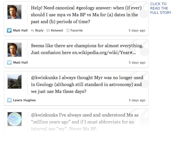
Before you read on, you might want to take a quick look at the way the book presents the LinkedIn material. Check it out, then come back here. By the way, if LinkedIn wasn't so damn difficult to search, or if the book included a link or some kind of proper citation of the discussion, I'd show you a conversation in LinkedIn too. But everything is completely untraceable, so I'll leave it as an exercise to the reader.

LinkedIn's User Agreement is crystal clear about the ownership of content its users post there:

[...] you own the content and information that you submit or post to the Services and you are only granting LinkedIn and our affiliates the following non-exclusive license: A worldwide, transferable and sublicensable right to use, copy, modify, distribute, publish, and process, information and content that you provide through our Services [...]

This is a good user agreement [Edit: see UPDATE, below]. It means everything you write on LinkedIn is © You — unless you choose to license it to others, e.g. under the terms of Creative Commons (please do!).

Fernando — whose material was used in the book — tells me that none of the several other authors he has asked gave, or were even asked for, permission to re-use their work. So I think we can say that this book represents a comprehensive infringement of copyright of the respective authors of the discussions on LinkedIn.

Roles and reponsibilities

Given the scale of this infringement, I think there's a clear lack of due diligence here on the part of the publisher and the editors. Having said that, while publishers are quick to establish their copyright on the material they publish, I would say that this lack of diligence is fairly normal. Publishers tend to leave this sort of thing to the author, hence the standard "Every effort has been made..." disclaimer you often find in non-fiction books... though not, apparently, in this book (perhaps because zero effort has been made!).

But this defence doesn't wash: Elsevier is the copyright holder here (Onajite signed it over to them, as most authors do), so I think the buck stops with them. Indeed, you can be sure that the company will make most of the money from the sale of this book — the author will be lucky to get 5% of gross sales, so the buck is both figurative and literal.

Incidentally, in Agile's publishing house, Agile Libre, authors retain copyright, but we take on the responsibility (and cost!) of seeking permissions for re-use. We do this because I consider it to be our reputation at stake, as much as the author's.

OK, so we should blame Elsevier for this book. Could Elsevier argue that it's really no different from quoting from a published research paper, say? Few researchers ask publishers or authors if they can do this — especially in the classroom, "for educational purposes", as if it is somehow exempt from copyright rules (it isn't). It's just part of the culture — an extension of the uneducated (uninterested?) attitude towards copyright that prevails in academia and industry. Until someone infringes your copyright, at least.

Seek permission not forgiveness

I notice that in the Acknowledgments section of the book, Onajite does what many people do — he gives acknowledgement ("for their contributions", he doesn't say they were unwitting) to some the authors of the content. Asking for forgiveness, as it were (but not really). He lists the rest at the back. It's normal to see this sort of casual hat tip in presentations at conferences — someone shows an unlicensed image they got from Google Images, slaps "Courtesy of A Scientist" or a URL at the bottom, and calls it a day. It isn't good enough: attribution is not permission. The word "courtesy" implies that you had some.

Indeed, most of the figures in Onajite's book seem to have been procured from elsewhere, with "Courtesy ExxonMobil" or whatever passing as a pseudolicense. If I was a gambler, I would bet that the large majority were used without permission.

OK, you're thinking, where's this going? Is it just a rant? Here's the bottom line:

The only courteous, professional and, yes, legal way to re-use copyrighted material — which is "anything someone created", more or less — is to seek written permission. It's that simple.

A bit of a hassle? Indeed it is. Time-consuming? Yep. The good news is that you'll usually get a "Sure! Thanks for asking". I can count on one hand the number of times I've been refused.

The only exceptions to the rule are when:

  • The copyrighted material already carries a license for re-use (as Agile does — read the footer on this page).
  • The copyright owner explicitly allows re-use in their terms and conditions (for example, allowing the re-publication of single figures, as some journals do).
  • The law allows for some kind of fair use, e.g. for the purposes of criticism.

In these cases, you do not need to ask, just be sure to attribute everything diligently.

A new low in scientific publishing?

What now? I believe Elsevier should retract this potentially useful book and begin the long process of asking the 350 authors for permission to re-use the content. But I'm not holding my breath.

By a very rough count of the preview of this $130 volume in Google Books, it looks like the ratio of LinkedIn chat to original text is about 2:1. Whatever the copyright situation, the book is definitely an uninspiring turn for scientific publishing. I hope we don't see more like it, but let's face it: if a massive publishing conglomerate can make $87 from comments on LinkedIn, it's gonna happen.

What do you think about all this? Does it matter? Should Elsevier do something about it? Let us know in the comments.


UPDATE Friday 1 September

Since this is a rather delicate issue, and events are still unfolding, I thought I'd post some updates from Twitter and the comments on this post:

  • Elsevier is aware of these questions and is looking into it.
  • Re-read the user agreement quote carefully. As Ronald points out below, I was too hasty — it's really not a good user agreement, LinkedIn have a lot of scope to re-use what you post there. 
  • It turns out that some people were asked for permission, though it seems it was unclear what they were agreeing to. So the author knew that seeking permission was a good idea.
  • It also turns out that at least one SPE paper was reproduced in the book, in a rather inconspicuous way. I don't know if SPE granted rights for this, but the author at least was not identified.
  • Some people are throwing the word 'plagiarism' around, which is rather a serious word. I'm personally willing to ascribe it to 'normal industry practices' and sloppy editing and reviewing (the book was apparently reviewed by no fewer than 5 people!). And, at least in the case of the LinkedIn content, proper attribution was made. For me, this is more about honesty, quality, and value in scientific publishing than about misconduct per se.
  • It's worth reading the comments on this post. People are raising good points.

Part of the thumbnail image was created by Jannoon028 — Freepik.com — and licensed CC-BY.

Six comic books about science

Ever since reading my dad's old Tintin books late into the night as a kid, I've loved comics and graphic novels. I've never been into the usual Marvel and DC stuff — superheroes aren't my thing. But I often re-read Tintin, I think I've read every Astérix, and since moving to Canada I've been a big fan of Seth and Chester Brown.

Last year in France I bought an album of Léonard, an amusing imagining of da Vinci's exploits as an inventor... Almost but not quite about science. These six books, on the other hand, show meticulous research and a love of natural philosophy. Enjoy!


The Thrilling Adventures of Lovelace and Babbage

Sydney Padua, 2015. New York, USA: Pantheon. List price USD 28.95.

I just finished devouring this terrific book by Padua, a young Canadian animator. It's an amazing mish-mash of writing and drawing, science and story, computing and history, fiction and non-fiction. This book has gone straight into my top 10 favourite books ever. It's really, really good.

Author — Amazon — Google — Pantheon

T-Minus: The Race to the Moon

Jim Ottaviani, Zander Cannon, Kevin Cannon, 2009. GT Labs. List price USD 15.99.

Who doesn't love books about space exploration? This is a relatively short exposition, aimed primarily at kids, but is thoroughly researched and suspenseful enough for anyone. The black and white artwork bounces between the USA and USSR, visualizing this unique time in history.

Amazon — GoogleGT Labs

Feynman

Jim Ottaviani, Leland Myrick, 2011. First Second Books. List price USD 19.99.

A 248-page colour biography of the great physicist, whose personality was almost as remarkable as his work. The book covers the period 1923 to 1986 — almost birth to death — and is neither overly critical of Feynman's flaws, nor hero-worshipping. Just well-researched, and skillfully told.

AmazonGoogleFirst Second.

A Wrinkle in Time

Hope Larson, Madeleine L'Engle, 2012. New York, USA: Farrar, Straus & Giroux. List price USD 19.99

A graphic adaptation of L'Engle's young adult novel, first published in 1963. The story is pretty wacky, and the science is far from literal, so perhaps not for all tastes — but if you or your kids enjoy Doctor Who and Red Dwarf, then I predict you'll enjoy this. Warning: sentimental in places.

Amazon — MacmillanAuthor 

Destination Moon and Explorers on the Moon

Hergé, 1953, 1954. Tournai, Belgium: Casterman (English: 1959, Methuen). List price USD 24.95.

These remarkable books show what Hergé was capable of imagining — and drawing — at his peak. The iconic ligne claire artwork depicts space travel and lunar exploration over a decade before Apollo. There is the usual espionage subplot and Thom(p)son-based humour, but it's the story that thrills.

AmazonGoogle


What about you? Have you read anything good lately?

The (bad) stuff of legend

What is a legend? Merriam–Webster says:

  1. A story from the past that is believed by many people but cannot be proved to be true.
  2. An explanatory list of the symbols on a map or chart.

I think we can combine these:

An explanatory list from the past that is believed by many to be useful but which cannot be proved to be.

Maybe that goes too far, sometimes you need a legend. But often, very often, you don't. At the very least, you should always try hard to make the legend irrelevant. Why, and how, can you do this? 

A case study

On the right is a non-scientific caricature of a figure from a paper I just finished reviewing for Geophysics. I won't give any more details because I don't want to pick on it unduly — lots of authors make the same mistakes.

Here are some of the things I think are confusing about this figure, detracting from the science in the paper. 

  • Making the reader cross-reference the line decoration with the legend makes it harder to make the comparison you're asking them to make. Just label the lines directly. 
  • Using unhelpful, generic names like 1, 2, and 3 for the models leads the reader into cross-reference Inception. The models were shown and explained on the previous page. 
  • Inception again: the models 1, 2, and 3 were shown in the previous figure parts (a), (b), and (c) respectively. So I had to cross-reference deeper still to really find out about them. 
  • The paper used colour elsewhere, so the use of black and white line decoration here seems unnecessary. There are other ways to ensure clarity if the paper is photocopied.
  • Everything on the same visual plane, so to speak, so the chart cannot take any more detail, such as gridlines. 

Getting better

I have tried to fix some of this in the version of the figure shown here. It's the same size as the original. The legend, such as it is, is now a visual key to the models. Careful juxtaposition of figures could obviate the need even for this extra key. The idea would be to use the colours and names of the models in every figure, to link them more intuitively.

The principles at work:

  • Reduce the fatigue of reading by labeling things directly.
  • Avoid using 'a' and 'b' or other generic names. Call the parts before and after, or 8 ms gate and 16 ms gate
  • Put things you want people to compare next to each other: models with data, output with input, etc. 
  • Use less ink for decoration, more ink for data. Gently direct the reader's attention. 

I'm sure there are other improvements we could make. Do you have any tips to share for making better figures? Leave them in the comments. 


Update, 30 Jan 2015

Some great comments came in today, and the point about black and white is well taken. Indeed, our 52 Things books are all black and white, and I end up transforming most images and figures to (I hope) make them clearer without colour. Here's how I'd do this figure in black and white.

Must-read geophysics blogs

Tuesday's must-read list was all about traditional publishing channels. Today, it's all about new media.

If you're anything like me before Agile, you don't read a lot of blogs. At least, not ones about geophysics. But they do exist! Get these in your browser favourites, or use a reader like Google Reader (anywhere) or Flipboard (on iPad).

Seismos

Chris Liner, a geophysics professor at the University of Arkansas, recently moved from the University of Houston. He's been writing Seismos, a parallel universe to his occasional Leading Edge column, since 2008.

MyCarta

Matteo Niccoli (@My_Carta on Twitter) is an exploration geoscientist in Stavanger, Norway, and he recently moved from Calgary, Canada. He's had MyCarta: Geophysics, visualization, image processing and planetary science, since 2011. This blog is a must-read for MATLAB hackers and image processing nuts. Matteo was one of our 52 Things authors.

GeoMika

Mika McKinnon (@mikamckinnon), a geophysicist in British Columbia, Canada, has been writing GeoMika: Fluid dynamics, diasters, geophysics, and fieldwork since 2008. She's also into education outreach and the maker-hacker scene.

The Way of the Geophysicist

Jesper Dramsch (@JesperDramsch), a geophysicist in Hamburg, Germany has written the wonderfully personal and philosophical The Way of The Geophysicist since 2011. His tales of internships at Fugro and Schlumberger provide great insights for students.

VatulBlog

Maitri Erwin (@maitri), an exploration geoscientist in Texas, USA. She has been blogging since 2001 (surely some kind of record), and both she and her unique VatulBlog: From Kuwait to Katrina and beyond defy categorization. Maitri was also one of our 52 Things authors. 

There are other blogs on topics around seismology and exploration geophysics — shout outs go to Hypocentre in the UK, the Laboratoire d'imagerie et acquisition des mesures géophysiques in Quebec, occasional seismicky posts from sedimentologists like @zzsylvester, and the panoply of bloggery at the AGU. Stick those in your reader!

Must-read geophysics

If you had to choose your three favourite, most revisited, best remembered papers in all of exploration geophysics, what would you choose? Are they short? Long? Full of math? Well illustrated? 

Keep it honest

Barnes, A (2007). Redundant and useless seismic attributes. Geophysics 72 (3). DOI:10.1190/1.2716717
Rarely do we see engaging papers, but they do crop up occasionally. I love Art Barnes's Redundant and useless seismic attributes paper. In this business, I sometimes feel like our opinions — at least our public ones — have been worn down by secrecy and marketing. So Barnes's directness is doubly refreshing:

There are too many duplicate attributes, too many attributes with obscure meaning, and too many unstable and unreliable attributes. This surfeit breeds confusion and makes it hard to apply seismic attributes effectively. You do not need them all.

And keep it honest

Blau, L (1936). Black magic in geophysical prospecting. Geophysics 1 (1). DOI:10.1190/1.1437076
I can't resist Ludwig Blau's wonderful Black magic geophysics, published 77 years ago this month in the very first issue of Geophysics. The language is a little dated, and the technology mostly sounds rather creaky, but the point, like Blau's wit, is as fresh as ever. You might not learn a lot of geophysics from this paper, but it's an enlightening history lesson, and a study in engaging writing the likes of which we rarely see in Geophysics today...

And also keep it honest

Bond, C, A Gibbs, Z Shipton, and S Jones (2007), What do you think this is? "Conceptual uncertainty" in geoscience interpretation. GSA Today 17 (11), DOI: 10.1130/GSAT01711A.1
I like to remind myself that interpreters are subjective and biased. I think we have to recognize this to get better at it. There was a wonderful reaction on Twitter yesterday to a recent photo from Mars Curiosity (right) — a volcanologist thought it looked like a basalt, while a generalist thought it more like a sandstone. This terrific paper by Clare Bond and others will help you remember your biases!

My full list is right here. I hope you think there's something missing... please edit the wiki, or put your personal favourites in the comments. 

The attribute figure is adapted from from Barnes (2007) is copyright of SEG. It may only be used in accordance with their Permissions guidelines. The Mars Curiosity figure is public domain. 

Units of geological time

I have an exercise in my writing course on scientific units. The last question is about units of geological time, and it always starts a debate. I favour ka, Ma, and Ga for all dates and spans of time, but I've never gone unchallenged. People like Ma BP, mya, m.y., myr, and lots of other things, and I've heard all sorts of rules for when to use which, and why. The sort of rules you can't quite remember the crucial details of.

Twitter isn't for everyone, but I think it has some real strengths — it's a great filter, a reliable connection finder, and a brilliant place to ask questions. So I asked Twitter, and compiled the responses in a storyboard:

The story exposed a useful blog postan attempt to standardize (Aubry et al., 2009, Stratigraphy 6 (2), 100–105], another attempt [Holden et al., 2011, IUPAC–IUGS recommendation], and a firm rebuttal from Nick Christie-Blick. Many thanks to all my Twitter friends — one of whom I've actually met IRL!

Bottom line — there are regional variations and personal preferences. There's no consensus. Make your choice. Write unambiguously.

Journalists are scientists

Tim Radford. Image: Stevyn Colgan.On Thursday I visited The Guardian’s beautiful offices in King’s Cross for one of their Masterclass sessions. Many of them have sold out, but Tim Radford’s science writing evening did so in hours, and the hundred-or-so budding writers present were palpably excited to be there. The newspaper is one of the most progressive news outlets in the world, and boasts many venerable alumni (John Maddox and John Durant among them). It was a pleasure just to wander around the building with a glass of wine, with some of London’s most eloquent nerds.

Radford is not a trained scientist, but a pure journalist. He left school at 16, idolized Dylan Thomas, joined a paper, wrote like hell, and sat on almost every desk before mostly retiring from The Guardian in 2005. He has won four awards from the Association of British Science Writers. More people read any one of his science articles on a random Tuesday morning over breakfast than will ever read anything I ever write. Tim Radford is, according to Ed Yong, the Yoda of science writers.

Within about 30 minutes it became clear what it means to be a skilled writer: Radford’s real craft is story-telling. He is completely at home addressing a crowd of scientists — he knows how to hold a mirror up to the geeks and reflect the fun, fascinating, world-changing awesomeness back at them. “It’s a terrible mistake to think that because you know about a subject you are equipped to write about it,” he told us, getting at how hard it is to see something from within. It might be easier to write creatively, and with due wonder, about fields outside our own.

Some in the audience weren’t content with being entertained by Radford, watching him in action as it were, preferring instead to dwell on controversy. He mostly swatted them aside, perfectly pleasantly, but one thing he was having none of was the supposed divide between scientists and journalists. Indeed, Radford asserted that journalists and scientists do basically the same thing: imagine a story (hypothesis), ask questions (do experiments), form a coherent story (theory) from the results, and publish. Journalists are scientists. Kind of.

I loved Radford's committed and unapologetic pragmatism, presumably the result of several decades of deadlines. “You don’t have to be ever so clever, you just have to be ever so quick,” and as a sort of corollary: “You can’t be perfectly right, but you must be mostly right.” One questioner accused journalists of sensationalising science (yawn). “Of course we do!” he said — because he wants his story in the paper, and he wants people to read it. Specifically, he wants people who don’t read science stories to read it. After all, writing for other people is all about giving them a sensation of one kind or another.

I got so much out of the 3 hours I could write at least another 2000 words, but I won’t. The evening was so popular that the paper decided to record the event and experiment with a pay-per-view video, so you can get all the goodness yourself. If you want more Radford wisdom, his Manifesto for the simple scribe is a must-read for anyone who writes.

Tim Radford's most recent book, The Address Book: Our Place in the Scheme of Things, came out in spring 2011.

The photograph of Tim Radford, at The World's Most Improbable Event on 30 September, is copyright of Stevyn Colgan, and used with his gracious permission. You should read his blog, Colganology. The photograph of King's Place, the Guardian's office building, is by flickr user Davide Simonetti, licensed CC-BY-NC.