News of the month

Like the full moon, our semi-regular news round-up has its second outing this month. News tips?

New software releases

QGIS, our favourite open source desktop GIS too, moves to v1.8 Lisboa. It gains pattern fills, terrain analysis, layer grouping, and lots of other things.

Midland Valley, according to their June newsletter, will put Move 2013 on the Mac, and they're working on iOS and Android versions too. Multi-platform keeps you agile. 

New online tools

The British Geological Survey launched their new borehole viewer for accessing data from the UK's hundreds of shallow holes. Available on mobile platforms too, this is how you do open data, staying relevant and useful to people.

Joanneum Research, whose talk at EAGE I mentioned, is launching their seismic attributes database seismic-attribute.info as a €6000/year consortium, according to an email we got this morning. Agile* won't be joining, we're too in love with Mendeley's platform, but maybe you'd like to — enquire by email.

Moar geoscience jobs

Neftex, a big geoscience consulting and research shop based in Oxford, UK, is growing. Already with over 80 people, they expect to hire another 50 or so. That's a lot of geologists and geophysicists! And Oxford is a lovely part of the world.

Ikon Science, another UK subsurface consulting and research firm, is opening a Calgary office. We're encouraged to see that they chose to announce this news on Twitter — progressive!

This regular news feature is for information only. We aren't connected with any of these organizations, and don't necessarily endorse their products or services. Except QGIS, which we definitely do endorse, cuz it's awesome. 

Cut the small print

We received a contract for a new piece of work recently. This wouldn't normally be worth remarking on, but this contract was special. It was different. It was 52 pages long.

It was so comically long that the contracts analyst at the company that sent it to me actually called me up before sending it to say, "The contract is comically long. It's just standard procedure. Sorry." Because it's so long, it's effectively all small print — if there's anything important in there, I'm unlikely to see it. The document bullies me into submission. I give in.

Unfortunately, this is a familiar story. Some (mostly non-lawyers) like Alan Siegel are trying to change it:

Before we all laugh derisively at lawyers, wait a second. Are you sure that everyone reads every word in your reports and emails? Do they look at every slide in your presentations? Do they listen to every word in your talks? 

If you suspect they don't, ask yourself why not. And then cut. Cut until all that's left is what matters. If there's other important stuff — exceptions, examples, footnotes, small print, legal jargon — move it somewhere and give people a link.

Shales and technology

Day three of the SEG IQ Earth Forum had more organizational diversity than the previous two days. The morning session was on seismic for unconventional plays. This afternoon was for showcasing novel implementations of seismic attributes.

Resource shale plays aren’t as wildly economic as people think. This is not only because geology is complex and heterogeneous, but also because drilling and completions processes aren't constant either. Robin Pearson from Anadarko presented a wonderful shale gas science experiment: three systematic field tests designed to target key uncertainties:

  • List all of your uncertainties and come up with a single test for evaluating each, holding all other variables constant.
  • Make sure you collect enough data so that results are statistically valid.
  • Make your experiment scalable — 10 measurements must be extrapolatable to influence hundreds.

To better understand production heterogeniety, they drilled and fracked three wells in exactly the same way. Logging and microseismic surface monitoring showed a tight limestone zone that was liberating gas from a strike slip fault, previously unseen. 

The best talk for interpreters so far was from Randy Pepper, who has done basin-scale modeling to define the erosional and non-depositional periods of geologic history not captured in the rock record. He used Wheeler diagrams to transform between two different representations of the same data, so that interpreters could work interactively between the structural and stratigraphic domains. It reminded me of dGB's Horizon Cube technology, allowing interpreters to explore between the mappable horizons in their data. Next step: allowing interpreters to perturb structural restorations on the fly. 

If you showed a seismic amplitude map to a radiologist, they might form completely rational arguments for arteries and other anatomical structures. Interpreters sometimes see what they want to see, which can be a problem. My favorite talk so far was from Jonathan Henderson from ffa. He is dedicated to keeping art and expertise in the interpretation process. His company has developed software for building data-guided geobodies with an organic and intuitive design. Automatic data classification can only go so far in elucidating what the human brain can perceive. Read his article.

I repeat his principles here:

  • Understanding the imaged geology: the art of interpretation,
  • Measurements and Uncertainty: a need for science
  • Adaptive Geobodies: combining art and science.

Kudos to John for ending the talk with a video demo of the software in action. Gasps from the crowd were a plenty. I'm hoping for more of this tomorrow!

Quantifying the earth

I am in Avon, Colorado, this week attending the SEG IQ Earth Forum. IQ (integrative and quantitative) Earth is a new SEG committee formed in reponse to a $1M monetary donation by Statoil to build a publicly available, industrial strength dataset for the petroleum community. In addition to hosting a standard conference format of podiums and Q and A's, the SEG is using the forum to ask delegates for opinions on how to run the committee. There are 12 people in attendance from consulting & software firms, 11 from service companies, 13 who work for operators, and 7 from SEG and academia. There's lively discussionafter each presentation, which has twice been cut short by adherence to the all important 2 hour lunch break. That's a shame. I wish the energy was left to linger. Here is a recap of the talks that have stood out for me so far:

Yesterday, Peter Wang from WesternGeco presented 3 mini-talks in 20 minutes showcasing novel treatments of uncertainty. In the first talk he did a stochastic map migration of 500 equally probable anisotropic velocity models that translated a fault plane within a 800 foot lateral uncertainty corridor. The result was even more startling on structure maps. Picking a single horizon or fault is wrong, and he showed by how much. Secondly, he showed a stocastic inversion using core, logs and seismic. He again showed the results of hundreds of non-unique but equally probable inversion realizations, each exactly fit the well logs. His point: one solution isn't enough. Only when we compute the range of possible answers can we quantify risk and capture our unknowns. Third, he showed an example from a North American resource shale, a setting where seismic methods are routinely under-utilized, and ironically, a setting where 70% of the production comes from less than 30% of the completed intervals. The geomechanical facies classification showed compelling frac barriers and non reservoir classes, coupled to an all-important error cube, showing the probability of each classification, the confidence of the method.

Ron Masters, from a software company called Headwave, presented a pre-recorded video demonstration of his software in action. Applause goes to him for a pseudo-interactive presentation. He used horizons as a boundary for scuplting away peripheral data for 3D AVO visualizations. He demostrated the technique of rotating a color wheel in the intercept-gradient domain, such that any and all linear combinations of AVO parameters can be mapped to a particular hue. No more need for hard polygons. Instead, with gradational crossplot color classes, the AVO signal doesn't get suddenly clipped out, unless there is a real change in fluid and lithology effects. Exposing AVO gathers in this interactive environment guards against imposing false distinctions that aren’t really there. 

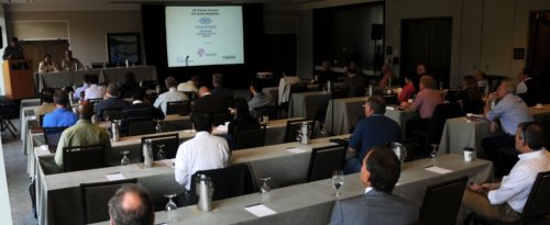
The session today consisted of five talks from WesternGeco / Schlumberger, a powerhouse of technology who stepped up to show their heft. Their full occupancy of the podium today, gives a new meaning to the rhyming quip; all-day Schlumberger. Despite having the bias of an internal company conference, it was still very entertaining, and informative. 

Andy Hawthorn showed how seismic images can be re-migrated around the borehole (almost) in real time by taking velocity measurements while drilling. The new measurements help drillers adjust trajectories and mud weights entering hazardous high pressure which has remarkable safety and cost benefits. He showed a case where a fault was repositioned by 1000 vertical feet; huge implications for wellbore stability, placing casing shoes, and other such mechanical considerations. His premise is that the only problem worth our attention is the following: it is expensive to drill and produce wells. Science should not be done for the sake of it; but to build usable models for drillers. 

In a characteristically enthusiastic talk, Ran Bachrach showed how he incorporated a compacting shale anisotropic rock physics model with borehole temperature and porosity measurements to expedite empirical hypothesis testing of imaging conditions. His talk, like many before him throughout the Forum, touched on the notion of generating many solutions, as fast as possible. Asking questions of the data, and being able to iterate. 

At the end of the first day, Peter Wang stepped boldy back to the to the microphone while others has started packing their bags, getting ready to leave the room. He commented that what an "integrated and quantitative" earth model desperately needs are financial models and simulations. They are what drive this industry; making money. As scientists and technologists we must work harder to demonstrate the cost savings and value of these techniques. We aren't getting the word out fast enough, and we aren't as relevant as we could be. It's time to make the economic case clear.
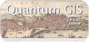
The power of stack

Multiplicity is a basic principle of seismic acquisition. Our goal is to acquite lots of traces—lots of spatial samples—with plenty of redundancy. We can then exploit the redundancy, by mixing traces, sacrificing some spatial resolution for increased signal:noise. When we add two traces, the repeatable signal adds constructively, reinforcing and clarifying. The noise, on the other hand, is spread evenly about zero and close to random, and tends to cancel itself. This is why you sometimes hear geophysicists refer to 'the power of stack'. 

Here's an example. There are 20 'traces' of 100-digit-long sequences of random numbers (white noise). The numbers range between –1 and +1. I added some signal to samples 20, 40, 60 and 80. The signals have amplitude 0.25, 0.5, 0.75, and 1. You can't see them in the traces, because these tiny amplitudes are completely hidden by noise. The stacked trace on the right is the sum of the 20 noisy traces. We see mostly noise, but the signal emerges. A signal of just 0.5—half the peak amplitude of the noise—is resolved by this stack of 20 traces; the 0.75 signal stands out beautifully.

Here's another example, but with real data. This is part of Figure 3 from Liu, G, S Fomel, L Jin, and X Chen (2009). Stacking seismic data using local correlation. Geophysics 74 (2) V43–V48. On the left is an NMO-corrected (flattened) common mid-point gather from a 2D synthetic model with Gaussian noise added. These 12 traces each came from a single receiver, though in this synthetic case the receiver was a virtual one. Now we can add the 12 traces to get a single trace, which has much stronger signal, relative to the background noise, than any of the input traces. This is the power of stack. In the paper, Liu et al. improve on the simple sum by weighting the traces adaptively. Click to enlarge.

The number of traces available for the stack is called fold. The examples above have folds of 20 and 12. Geophysicists like fold. Fold works. Let's look at another example.

Above, I've made a single digit 1 with 1% opacity — it's almost invisible. If I stack two 2s, with a little random jitter, the situation is still desperate. When I have five digits, I can at least see the hidden image with some fidelity. However, if I add random noise to the image, a fold of 5 is no longer enough. I need at least 10, and ideally more like 20 images stacked up to see any signal. So it is for seismic data: to see through the noise, we need fold.

Now you know a bit about why we want more traces from the field, next time I'll look at how much those traces cost, and how to figure out how many you need. 

Thank you to Stuart Mitchell of Calgary for the awesome analogy for seismic fold.  

Great geophysicists #4: Fermat

This Friday is Pierre de Fermat's 411th birthday. The great mathematician was born on 17 August 1601 in Beaumont-de-Lomagne, France, and died on 12 January 1665 in Castres, at the age of 63. While not a geophysicist sensu stricto, Fermat made a vast number of important discoveries that we use every day, including the principle of least time, and the foundations of probability theory. 

Fermat built on Heron of Alexandria's idea that light takes the shortest path, proposing instead that light takes the path of least time. These ideas might seem equivalent, but think about anisotropic and inhomogenous media. Fermat continued by deriving Snell's law. Let's see how that works.

We start by computing the time taken along a path:

Then we differentiate with respect to space. This effectively gives us the slope of the graph of time vs distance.

We want to minimize the time taken, which happens at the minimum on the time vs distance graph. At the minimum, the derivative is zero. The result is instantly recognizable as Snell's law:

Maupertuis's generalization

The principle is a core component of the principle of least action in classical mechanics, first proposed by Pierre Louis Maupertuis (1698–1759), another Frenchman. Indeed, it was Fermat's handling of Snell's law that Maupertuis objected to: he didn't like Fermat giving preference to least time over least distance.

Maupertuis's generalization of Fermat's principle was an important step. By the application of the calculus of variations, one can derive the equations of motion for any system. These are the equations at the heart of Newton's laws and Hooke's law, which underlie all of the physics of the seismic experiment. So, you know, quite useful.

Probably very clever

It's so hard to appreciate fundamental discoveries in hindsight. Together with Blaise Pascal, he solved basic problems in practical gambling that seem quite straightforward today. For example, Antoine Gombaud, the Chevalier de Méré, asked Pascal: why is it a good idea to bet on getting a 1 in four dice rolls, but not on a double-1 in twenty-four? But at the time, when no-one had thought about analysing problems in terms of permutations and combinations before, the solutions were revolutionary. And profitable.

For setting Snell's law on a firm theoretical footing, and introducing probability into the world, we say Pierre de Fermat (pictured here) is indeed a father of geophysics.

Lower case j

This morning I was looking over the schedule for the SEG IQ Earth Forum and a 35 minute block of time caught my eye. Did they not have enough talks to fill the morning? Perhaps. So instead a discussion: Do we need an Interpretation Journal?


What a cool idea! The book versus the machine. Deliberate and community-supported penmanship for scientists to connect with their work. A hand-crafted symbol of romantic scripture in the midst of the sound and fury of a working realm infested with white noise and draining digital abstractions. Old school fights back against tech. Getting back in touch with the analog world, chronicling observations, geologic doodles, jotting down questions and nonsense precisely at the teachable moment.

The da Vinci of seismic interpretation?

I wondered how many other interpreters might be longing for the same thing. Surely if it is to take up a slot in the conference agenda, there must be some ample demand from the geophysical workforce. I want to be a part of it. I start early. I built a wiki page, a series of notes to corral group action and discussion, somewhat naïvely anticipating roaring praise for my inititiative. Most folks have notebooks with shopping lists, and phone messages. But a dedicated, deliberate interpretation journal is refreshing. Just me, my thoughts, and my project. Me getting back in touch with my cursive.

Just now, I realize, while instant-messaging with Matt on Skype, that it is not a Diary the conference organizers are after, it's a Journal. Capital J. As in publication entity. A Journal for Interpreters. Huh. Well, I guess that'd be good too.

The image of Leonardo da Vinci's journal was modified from an original photograph by user Twid on Flickr. Click the image to view the original.

When to use vectors not rasters

In yesterday's post, I looked at advantages and disadvantages of various image formats. Some chat ensued in the comments and on Twitter about making drawings and figures and such. I realized I hadn't been very clear: when I say 'image', I really mean 'raster' or 'bitmap'. That is, a discretized (pixel-based) grid of data.

What are vector graphics?

Click to enlarge — see a simulation of the difference between vector and raster art.What I was not writing about was drawings and graphics combining text, lines, and images. Such files usually contain vector graphics. Vector graphics do not contain descriptions of pixels, but instead they contain descriptions and positions of text, paths, and polygons. Example file formats are:

  • SVGScalable Vector Graphics, an open format and web standard
  • AI — a proprietary format used by Adobe Illustrator
  • CDRCorelDRAW's proprietary format
  • PPT — pictures in Microsoft PowerPoint are vector format
  • SHP — shapefiles are a (mostly) generic vector format for GIS

One of the most important properties of vector graphics is that you can rescale it without worrying about changing the resolution — as in the example (right).

What are composite formats?

Vector and raster graphics can be combined in all sorts of ways, and vector files can contain raster images. They can therefore be used for very large displays like posters. But vector files are subject to interpretation by different software, may be proprietary, and have complex features like guides and layers that you may not want to expose to someone else. So when you publish or share your work it's often a good idea to export to either a high-res PNG, or a composite page description format:

  • PDFPortable Document Format, the closest thing to an open, ubiquitous format; stable and predictable.
  • EPSEncapsulated PostScript; the precursor to PDF, it's rarely called for today, unless PDF is giving you problems.
  • PSPostScript is a programming and page description language underlying EPS and PDF; avoid it.
  • CGMComputer Graphics Metafiles are best left alone. If you are stuck with them, complain loudly.

What software do I need?

Any time you want to add text, or annotation, or anything else to a raster, or you wish to create a drawing from scratch, vector formats are the way to go. There are several tools for creating such graphics:

Judging by figures I see submitted to journals, some people use Microsoft PowerPoint for creating vector graphics. For a simple figure, this may be fine, but for anything complex — curved or wavy lines, complicated filled objects, image effects, pattern fills — it is hard work. And the drawing tools listed above have some great advantages over PowerPoint — layers, tracing, guides, proper typography, and a hundred other things.

Plus, and perhaps I'm just being a snob here, figures created in PowerPoint make it look like you just don't care. Do yourself a favour: take half a day to teach yourself to use Inkscape, and make beautiful figures for the rest of your career.

How to choose an image format

Choosing a file format for scientific images can be tricky. It seems simple enough on the outside, but the details turn out to be full of nuance and gotchas. Plenty of papers and presentations are spoiled by low quality images. Don't let yours be one! Get to know your image editor (I recommend GIMP), and your formats.

What determines quality?

The factors determining the quality of an image are:

  • The number of pixels in the image (aim for 1 million)
  • The size of the image (large images need more pixels)
  • If the image is compressed, e.g. a JPG, the fidelity of the compression (use 90% or more)
  • If the image is indexed, e.g. a GIF, the number of colours available (the bit-depth)

Beware: what really matters is the lowest-quality version of the image file over its entire history. In other words, it doesn't matter if you have a 1200 × 800 TIF today, if this same file was previously saved as a 600 × 400 GIF with 16 colours. You will never get the lost pixels or bit-depth back, though you can try to mitigate the quality loss with filters and careful editing. This seems obvious, but I have seen it catch people out.

JPG is only for photographs

Click on the image to see some artifacts.The problem with JPG is that the lossy compression can bite you, even if you're careful. What is lossy compression? The JPEG algorithm makes files much smaller by throwing some of the data away. It 'decides' which data to discard based on the smoothness of the image in the wavenumber domain, in which the algorithm looks for a property called sparseness. Once discarded, the data cannot be recovered. In discontinuous data — images with lots of variance or hard edges — you might see artifacts (e.g. see How to cheat at spot the difference). Bottom line: only use JPG for photographs with lots of pixels.

Formats in a nutshell

Rather than list advantages and disadvantages exhaustively, I've tried to summarize everything you need to know in the table below. There are lots of other formats, but you can do almost anything with the ones I've listed... except BMP, which you should just avoid completely. A couple of footnotes: PGM is strictly for geeks only; GIF is alone in supporting animation (animations are easy to make in GIMP). 

All this advice could have been much shorter: use PNG for everything. Unless file size is your main concern, or you need special features like animation or georeferencing, you really can't go wrong.

There's a version of this post on SubSurfWiki. Feel free to edit it!

News of the month

Our semi-regular news round-up from the greenbelt between geoscience and technology.

OpendTect 4.4

Our favourite volume interpretation tool, OpendTect, moved to version 4.4 in June. It seems to have skipped 4.3 completely, which never made it into a stable release. With the new version come 3 new plug-ins: Seismic Net Pay, Seismic Feature Enhancement, and Computer Log Analysis Software (right)—we're looking forward to playing with that.

The cutting edge of interpretation

A new SEG event aimed especially at quantitative interpreters is coming later this month — the SEG IQ Earth Forum. Have a look at the technical program. Evan will be there, and is looking forward to some great discussion, and finding out more about Statoil's open Gullfaks dataset. On the last day, he will be talking about Agile's workflow for interpreting seismic in geothermal fields... stay tuned.

Geoscience freeware

We read in OilIT that US consultancy Ryder Scott has updated its Reservoir Solutions tools for Excel. These include Volumetrics, QuickLook Economics, Gas Material Balance, and LogWizard. If you try them out, do let us know what you think of them!

New iPad apps

Geoscience is perhaps a little slow picking up on the tablet revolution, but mobile apps are trickling out. We love seeing experiments like Pocket Seis, by Houston-based geoscientist-developer Jacob Foshee. And it's interesting to see what the more established software-makers do on these platforms... we think Landmark's OpenWells Mobile app looks rather tame.

This regular(ish) news feature is for information only. We aren't connected with any of these organizations, and don't necessarily endorse their products or services. Except OpendTect, which we do endorse, cuz it's awesome. The screenshot from CLAS is a low-res fair-use image for illustration only, and copyright of dGB Earth Sciences