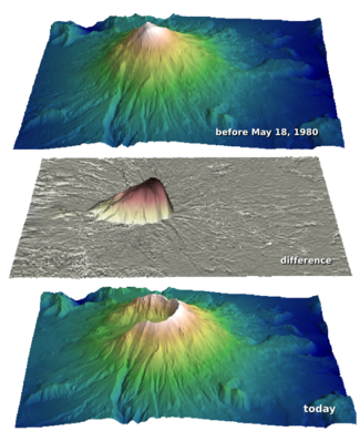
How much rock was erupted from Mt St Helens?

One of the reasons we struggle when learning a new skill is not necessarily because this thing is inherently hard, or that we are dim. We just don't yet have enough context for all the connecting ideas to, well, connect. With this in mind I wrote this introductory demo for my Creative Geocomputing class, and tried it out in the garage attached to START Houston, when we ran the course there a few weeks ago.

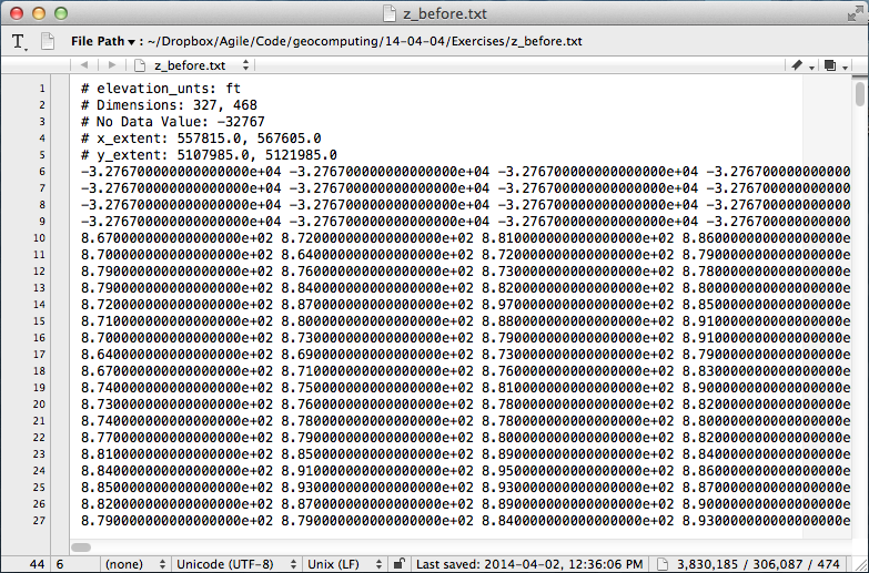
I walked through the process of transforming USGS text files to data graphics. The motivation was to try to answer the question: How much rock was erupted from Mount St Helens?

This gorgeous data set can be reworked to serve a lot of programming and data manipulation practice, and just have fun solving problems. My goal was to maintain a coherent stream of instructions, especially for folks who have never written a line of code before. The challenge, I found, is anticipating when words, phrases, and syntax are being heard like a foriegn language (as indeed they are), and to cope by augmenting with spoken narrative.

Text file to 3D plot

To start, we'll import a code library called NumPy that's great for crunching numbers, and we'll abbreviate it with the nickname np:

>>> import numpy as np

Then we can use one of its functions to load the text file into an array we'll call data:

>>> data = np.loadtxt('z_after.txt')

The variable data is a 2-dimensional array (matrix) of numbers. It has an attribute that we can call upon, called shape, that holds the number of elements it has in each dimension,

>>> data.shape
(1370, 949)

If we want to make a plot of this data, we might want to take a look at the range of the elements in the array, we can call the peak-to-peak method on data,

>>> data.ptp()
41134.0

Whoa, something's not right, there's not a surface on earth that has a min to max elevation that large. Let's dig a little deeper. The highest point on the surface is,

>>> np.amax(data)
8367.0

Which looks to the adequately trained eye like a reasonable elevation value with units of feet. Let's look at the minimum value of the array,

>>> np.amin(data)
-32767.0 

OK, here's the problem. GIS people might recognize this as a null value for elevation data, but since we aren't assuming any knowledge of GIS formats and data standards, we can simply replace the values in the array with not-a-number (NaN), so they won't contaminate our plot.

>>> data[data==-32767.0] = np.nan

To view this surface in 3D we can import the mlab module from Mayavi

>>> from mayavi import mlab

Finally we call the surface function from mlab, and pass the input data, and a colormap keyword to activate a geographically inspired colormap, and a vertical scale coefficient.

>>> mlab.surf(data,
              colormap='gist_earth',
              warp_scale=0.05)

After applying the same procedure to the pre-eruption digits, we're ready to do some calculations and visualize the result to reveal the output and its fascinating characteristics. Read more in the IPython Notebook.

If this 10 minute introduction is compelling and you'd like to learn how to wrangle data like this, sign up for the two-day version of this course next week in Calgary. 

Eventbrite - Agile Geocomputing

April linkfest

It's time for our regular linkfest!

There's a new book in town... Rob Simm and Mike Bacon have put together a great-looking text on seismic amplitude intepretation (Cambridge, 2014). Mine hasn't arrived yet, so I can't say much more — for now, you can preview it in Google Books. I should add it to my list.

Staying with new literature, I started editing a new column in SEG's magazine The Leading Edge in February. I wrote about the first instalment, and now the second is out, courtesy of Leo Uieda — check out his tutorial on Euler deconvolution, complete with code. Next up is Evan with a look at synthetics.

On a related note, Matteo Niccoli just put up a great blog post on his awesome perceptual colourmaps, showing how to port them to matplotlib, the MATLAB-like plotting environment lots of people use with the Python programming language. 

Dolf Seilacher, the German ichnologist and palaeontologist, died 4 days ago at the age of 89. For me at least, his name is associated with the mysterious trace fossil Palaeodictyon — easily one of the weirdest things on earth (right). 

Geoscience mysteries just got a little easier to solve. As I mentioned the other day, there's a new place on the Internet for geoscientists to ask questions and help each other out. Stack Exchange, the epic Q&A site, has a new Earth Science site — check out this tricky question about hydrocarbon generation.

And finally, who would have thought that waiting 13 years for a drop of bitumen could be an anticlimax? But in the end, the long (if not eagerly) awaited 9th drop in the University of Queensland's epic experiment just didn't have far enough to fall...

If you can't get enough of this, you can wait for the 10th drop here. Or check back here in 2027.

More AAPG highlights

Here are some of our highlights from the second half of the AAPG Annual Convention in Houston.

Conceptual uncertainty in interpretation

Fold-thrust belt, offshore Nigeria. Virtual Seismic Atlas.Rob Butler's research is concerned with the kinematic evolution of mountain ranges and fold thrust belts in order to understand the localization of deformation across many scales. Patterns of deformed rocks aren't adequately explained by stress fields alone; they are also controlled by the mechancial properties of the layers themselves. Given this fact, the definition of the layers becomes a doubly important part of the interpretation.

The biggest risk in structural interpretation is not geometrical accuracy but whether or not the concept is correct. This is not to say that we don't understand geologic processes. Rather, a section can always be described in more than one way. It is this risk in the first order model that impacts everything we do. To deal with conceptual uncertainty we must first capture the range, otherwise it is useless to do any more refinement. 

He showed a crowd-sourced compiliation of 24 interpretations from the Virtual Seismic Atlas as a way to stack up a series of possible structural frameworks. Fifteen out of twenty-four interviewees interpreted a continuous, forward-propagating thrust fault as the main structure. The disagreements were around the existence and location of a back thrust, linkage between fore- and back-thrusts, the existence and location of a detachment surface, and its linkage to the fault planes above. Given such complexity, "it's rather daft," he said, "to get an interpretation from only one or two people." 

CT scanning gravity flows

Mike Tilston and Bill Arnott gave a pair of talks about their research into sediment gravity flows in the lab. This wouldn't be newsworthy in itself, but their 2 key innovations caught our attention: 

  1. A 3D velocity profiler capable of making 23 measurements a second
  2. The flume tank ran through a CT scanner, giving a hi-res cross-section view

These two methods sidestep the two major problems with even low-density (say 4% by weight) sediment gravity flows: they are acoustically attenuative, and optically opaque. Using this approach Tilston and Arnott investigated the effect of grain size on the internal grain distribution, finding that fine-grained turbidity currents sustain a plug-like wall of sediment, while coarse-grained flows have a more carpet-like distribution. Next, they plan to look at particle shape effects, finer grain sizes, and grain mixtures. Technology for the win!

Hypothesizing a martian ocean

Lorena Moscardelli showed topograhic renderings of the Eberswalde delta (right) on the planet Mars, hypothesizing that some martian sedimentary rocks have been deposited by fluvial processes. An assertion that posits the red planet with a watery past. If there are sedimentary rocks formed by fluids, one of the fluids could have been water. If there has been water, who knows what else? Hydrocarbons? Imagine that! Her talk was in the afternoon session on Space and Energy Frontiers, sandwiched by less scientific speakers raising issues for staking claims and models for governing mineral and energy resources away from earth. The idea of tweaking earthly policies and state regulations to manage resources on other planets, somehow doesn't align with my vision of an advanced civilization. But the idea of doing seismic on other planets? So cool.

Poster gorgeousness

Matt and I were both invigorated by the quality, not to mention the giant size, of the posters at the back of the exhibition hall. It was a place for the hardcore geoscientists to retreat from the bright lights, uniformed sales reps, and the my-carpet-is-cushier-than-your-carpet marketing festival. An oasis of authentic geoscience and applied research.

We both finally got to meet Brian Romans, a sedimentologist at Virginia Tech, amidst the poster-paneled walls. He said that this is his 10th year venturing to the channel deposits that crop out in the Magallanes Basin of southern Chile. He is now one of the three young, energetic profs behind the hugely popular Chile Slope Systems consortium.

Three years ago he joined forces with Lisa Stright (University of Utah), and Steve Hubbard (University of Calgary) and formed the project investigating processes of sediment transfer across deepwater slopes exposed around Patagonia. It is a powerhouse of collaborative research, and the quality of graduate student work being pumped out is fantastic. Purposeful and intentional investigations carried out by passionate and tech-savvy scientists. What can be more exciting than that?

Do you have any highlights of your own? Please leave a note in the comments.

Dynamic geology at AAPG

Brad Moorman stands next to his 48 inch (122 cm) Omni Globe spherical projection system on the AAPG exhibition floor, greeting passers by drawn in by its cycling animations of Getech's dynamic plate reconstructions. His map-lamp projects evolutionary visions of geologic processes like a beacon of inspiration for petroleum explorers.

I've attended several themed sessions over the first day and a half at AAPG and the ones that have stood out for me have had this same appeal.

Computational stratigraphy

Processes such as accommodation rate and sedimentation rate can be difficult to unpeel from stratal geometries. Guy Prince's PhD Impact of non-uniqueness on sequence stratigraphy used a variety of input parameters and did numerical computations to make key stratigraphic surfaces with striking similarity. By forward modeling the depositional dynamics, he showed that there are at least two ways to make a maximum flooding surface, a sequence boundary, and top set aggradations. Non-uniqueness implies that there isn't just one model that fits the data, nor two, however Guy cleverly made simple comparisons to illustrate such ambiguities. The next step in this methodology, and it is a big step, is to express the entire model space: just how many solutions are there? 

If you were a farmer here, you lost your land

Henry Posamentier, seismic geomorphologist at Chevron, showed extremely high-resolution 3D sparker seismic imaging just beneath the seafloor in the Gulf of Thailand. Because this locale is more than 1000 km from the nearest continental shelf, it has been essentially unaffected by sea-level change, making it an ideal place to study pure fluvial depositional patterns. Such fluvial systems result in reservoirs in their accretionary point bars, but they are hard to predict.

To make his point, Henry showed a satellite image of the Ping River from a few years ago in the north of Chiang Mai, where meander loops had shifted sporadically in response to one flood season: "If you were a farmer here, you lost your land."

Wells can tell about channel thickness, and seismic may resolve the channel width and the sinuosity, but only a dynamic model of the environment can suggest how well-connected is the sand.

The evolution of a single meandering channel belt

Ron Boyd from ConocoPhillips showed a four-step process investigating the evolution of a single channel belt in his talk, Tidal-Fluvial Sedimentology and Stratigraphy of the McMurray Formation.

  1. Start with a cartoon facies interpretation of channel evolution.
  2. Trace out the static geomorphological model on seismic time slices.
  3. Identify directions of fluvial migrations point by point, time step by time step.
  4. Distribute petrophysical properties within each channel element in chronological sequence.

Mapping the dynamics of a geologic scenario along a timeline gives you access to all the pieces of a single geologic puzzle. But what really matters is how that puzzle compares with the handful of pieces in your hand.

More tomorrow — stay tuned.

Google Earth imagery ©2014 DigitalGlobe, maps ©2014 Google

This post was modified on April 16, 2014, mentioning and giving redirects to Getech.

Looking forward to AAPG

Today we're en route to the AAPG Annual Convention & Exhibition (the ACE) in Houston. We have various things going on before it and after it too, so we're in Houston for 10 days of geoscience. Epic!

The appetizers

On Friday we're hosting a 'learning geoscience programming' bootcamp at START, our favourite Houston coworking space. Then we roll straight into our weekend programming workshop — Rock Hack — also at START. Everyone is welcome — programming newbies, established hackers. We want to build tools for working with well logs. You don't need any special skills, just ideas. Bring whatever you have! We'll be there from 8 am on Saturday. (Want more info?)

At least come for the breakfast tacos.

Conference highlight forecast

Regular readers will know that I'm a bit of a jaded conference-goer. But I haven't been to AAPG since Calgary in 2005, and I am committed to reporting the latest in geoscience goodness — so I promise to go to some talks and report back on this very blog. I'm really looking forward to it since Brian Romans whet my appetite with a round-up of his group's research offerings last week. 

I thought I'd share what else I'll be trying to get to. I can't find a way to link to the abstracts — you'll have to hunt them down in the Itinerary Planner... 

  • Monday am. Communicating our science. Jim Reilly, Iain Stewart, and others.
  • Monday pm. Case Studies of Geological and Geophysical Integration sounds okay, but might under-deliver. And there's a talk called 3-D Printing Artificial Reservoir Rocks to Test Their Petrophysical Properties, by Sergey Ishutov that should be worth checking out.
  • Tuesday am.  Petroleum Geochemistry and Source Rock Characterization, in honour of Wally Dow
  • Tuesday pm. Turbidites and Contourites, Room 360, is the place to be. Zane Jobe is your host.
  • Wednesday am. I'll probably end up in Seismic Visualization of Hydrocarbon Play Fairways.
  • Wednesday pm. Who can resist Space and Energy Frontiers? Not me.

That's about it. I'm teaching my geoscience writing course at a client's offices on Friday, then heading home. Evan will be hanging out and hacking some more I expect. Expect some updates to modelr.io!

If you're reading this, and you will be at AAPG — look out for us! We'll be the ones sitting on the floor near electrical outlets, frantically typing blog posts.

Getting started with Modelr

Let's take a closer look at modelr.io, our new modeling tool. Just like real seismic experiments, there are four components:

  • Make a framework. Define the geometries of rock layers.
  • Make an earth. Assign a set of rock properties to each layer.
  • Make a kernel. Define the seismic survey.
  • Make a plot. Set the output parameters.

Modelr takes care of the physics of wave propagation and reflection, so you don't have to stick with normal incidence acoustic impedance models if you don't want to. You can explore the full range of possibilities.

3 ways to slice a wedge

To the uninitiated, the classic 3-layer wedge model may seem ridiculously trivial. Surely the earth looks more complicated than that! But we can leverage such geometric simplicity to systematically study how seismic waveforms change across spatial and non-spatial dimensions. 

Spatial domain. In cross-section (right), a seismic wedge model lets you analyse the resolving power of a given wavelet. In this display the onset of tuning is marked by the vertical red line, and the thickness at which maximum tuning occurs is shown in blue. Reflection profiles can be shown for any incidence angle, or range of incidence angles (offset stack).

Amplitude versus angle (AVA) domain. Maybe you are working on a seismic inversion problem so you might want to see what a CDP angle gather looks like above and below tuning thickness. Will a tuned AVA response change your quantitative analysis? This 3-layer model looks like a two-layer AVA gather except our original wavelet looks like it has undergone a 90 degree phase rotation. Looks can be deceiving. 

Amplitude versus frequency domain. If you are trying to design a seismic source for your next survey, and you want to ensure you've got sufficient bandwidth to resolve a thin bed, you can compute a frequency gather — right, bottom — and explore a swath of wavelets with regard to critical thickness in your prospect. The tuning frequency (blue) and resolving frequency (red) are revealed in this domain as well. 

Wedges are tools for seismic waveform classification. We aren't just interested in digitizing peaks and troughs, but the subtle interplay of amplitude tuning, and apparent phase rotation variations across the range of angles and bandwidths in the seismic experiment. We need to know what we can expect from the data, from our supposed geology. 

In a nutshell, all seismic models are about illustrating the band-limited nature of seismic data on specific geologic scenarios. They help us calibrate our intuition when bandwidth causes ambiguity in interpretation. Which is nearly all of the time.

How to load SEG-Y data

Yesterday I looked at the anatomy of SEG-Y files. But it's pathology we're really interested in. Three times in the last year, I've heard from frustrated people. In each case, the frustration stemmed from the same problem. The epic email trails led directly to these posts. Next time I can just send a URL!

In a nutshell, the specific problem these people experienced was missing or bad trace location data. Because I've run into this so many times before, I never trust location data in a SEG-Y file. You just don't know where it's been, or what has happened to it along the way — what's the datum? What are the units? And so on. So all you really want to get from the SEG-Y are the trace numbers, which you can then match to a trustworthy source for the geometry.

Easy as 1-2-3, er, 4

This is my standard approach to loading data. Your mileage will vary, depending on your software and your data. 

  1. Find the survey geometry information. For 2D data the geometry is usually in a separate navigation ('nav') file. For 3D you are just looking for cornerpoints, and something indicating how the lines and crosslines are numbered (they might not start at 1, and might not be oriented how you expect). This information may be in the processing report or, less reliably, in the EBCDIC text header of the SEG-Y file.
  2. Now define the survey geometry. You need a location for every trace for a 2D, and the survey's cornerpoints for a 3D. The geometry is a description of where the line goes on the earth, in surface coordinates, and where the starting trace is, how many traces there are, and what the trace spacing is. In other words, the geometry tells you where the traces go. It's variously called 'navigation', 'survey', or some other synonym.
  3. Finally, load the traces into their homes, one vintage (survey and processing cohort) at a time for 2D. The cross-reference between the geometry and the SEG-Y file is the trace or CDP number for a 2D, and the line and crossline numbers for a 3D.
  4. Check everything twice. Does the map look right? Is the survey the right shape and size? Is the line spacing right? Do timeslices look OK?

Where to get the geometry data?

So, where to find cornerpoints, line spacings, and so on? Sadly, the header cannot be trusted, even in newly-processed data. If you have it, the processing report is a better bet. It often helps to talk to someone involved in the acquisition and processing too. If you can corroborate with data from the acqusition planning (line spacings, station intervals, and so on), so much the better — but remember that some acquisition parameters may have changed during the job.

Of vital importance is some independent corroboration— a map, ideally —of the geometry and the shape and orientation of the survey. I can't count the number of back-to-front surveys I've seen. I even saw one upside-down (in the z dimension) once, but that's another story.

Next time, I'll break down the loading process a bit more, with some step-by-step for loading the data somewhere you can see it.

Calibrate your seismic intuition

On Tuesday we announced our new web app, modelr.io. Why are we so excited about it? 

  • We love the idea that subsurface software can cost dollars, not 1000's of dollars. 
  • We love the idea of subsurface software being online, not on the desktop.
  • We love the idea that subsurface software can be open source. Here's our code!
  • We love the idea of subsurface software that doesn't need a manual to master.
  • We love the idea of subsurface software that runs on a tablet or a phone.
  • We see software as an important way to share knowledge and connect people.

OK, that's enough reasons. There are more. Those are the main ones.

The point is: we love these ideas. And we hope that you, dear reader, at least like some of them a bit. Because we really want to keep developing modelr. We think it can be awesome. Imagine 3D earth models, imagine full waveform modeling, imagine gravity and magnetic models. We get very excited when we think about all the possiblities. There's no better way to calibrate your seismic intuition than modeling, and modelr is a great place to start modeling. 

Here's a challenge: take 3 minutes and see if you can generate...

 A wedge model & tuning curve An AVA gather for a Class 4 sand    A stochastic AVA crossplot          

 modelr seismic wedge modelmodelr seismic avo modelmodelr stochastic avo  model

The most important thing nobody does

A couple of weeks ago, we told you we were up to something. Today, we're excited to announce modelr.io — a new seismic forward modeling tool for interpreters and the seismically inclined.

Modelr is a web app, so it runs in the browser, on any device. You don't need permission to try it, and there's never anything to install. No licenses, no dongles, no not being able to run it at home, or on the train.

Later this week, we'll look at some of the things Modelr can do. In the meantime, please have a play with it.
Just go to modelr.io and hit Demo, or click on the screenshot below. If you like what you see, then think about signing up — the more support we get, the faster we can make it into the awesome tool we believe it can be. And tell your friends!

If you're intrigued but unconvinced, sign up for occasional news about Modelr:

This will add you to the email list for the modeling tool. We never share user details with anyone. You can unsubscribe any time.

Relentlessly practical

This is one of my favourite knowledge sharing stories.

A farmer in my community had a problem with one of his cows — it was seriously unwell. He asked one of the old local farmers about the symptoms, and was told, “Oh yes, one of my herd had the same thing last summer. I gave her a cup of brandy and four aspirins every night for a week.” The young farmer went off and did this, but the poor cow got steadily worse and died. When he saw the old farmer next he told him, more than a little accusingly, “I did what you said, and the cow died anyway.” The old geezer looked into the distance and just said, “Yep, so did mine.”

Incomplete information can be less useful than no information. Yet incomplete information has somehow become our specialty in applied geoscience. How often do we share methods, results, or case studies without the critical details that would make it useful information? That is, not just marketing, or resumé padding. Inded, I heard this week that one large US operator will not approve a publication that does include these critical details! And we call ourselves scientists...

Completeness mandatory

Thankfully, Last month The Leading Edge — the magazine of the SEG — started a new tutorial column, edited by me. Well, I say 'edited', I'm just the person that pesters prospective authors until they give in and send me a manuscript. Tad Smith, Don Herron, and Jenny Kucera are the people that make it actually happen. But I get to take all the credit.

When I was asked about it, I suggested two things:

  1. Make each tutorial reproducible by publishing the code that makes the figures.
  2. Make the words, the data, and the code completely open and shareable. 

To my delight and, I admit, slight surprise, they said 'Sure!'. So the words are published under an open license (Creative Commons Attribution-ShareAlike, the same license for re-use that most of Wikipedia has), the tutorials use open data for everything, and the code is openly available and free to re-use. Complete transparency.

There's another interesting aspect to how the column is turning out. The first two episodes tell part of the story in IPython Notebook, a truly amazing executable writing environment that we've written about before. This enables you to seamlessly stich together text, code, and plots (left). If you know a bit of Python, or want to start learning it right now this second, go give wakari.io a try. It's pretty great. (If you really like it, come and learn more with us!).

Read the first tutorial: Hall, M. (2014). Smoothing surfaces and attributes. The Leading Edge, 33(2), 128–129. doi: 10.1190/tle33020128.1. A version of it is also on SEG Wiki, and you can read the IPython Notebook at nbviewer.org.

Do you fancy authoring something for this column? Wonderful — please do! Here are the author instructions. If you have an idea for something, please drop me a line, let's talk about how to make it relentlessly practical.