The Agile toolbox

Some new businesses go out and raise millions in capital before they do anything else. Not us — we only do what we can afford. Money makes you lazy. It's technical consulting on a shoestring!

If you're on a budget, open source is your best friend. More than this, it's important an open toolbox is less dependent on hardware and less tied to workflows. Better yet, avoiding large technology investments helps us avoid vendor lock-in, and the resulting data lock-in, keeping us more agile. And there are two more important things about open source: 

  • You know exactly what the software does, because you can read the source code
  • You can change what the software does, becase you can change the source code

Anyone who has waited 18 months for a software vendor to fix a bug or add a feature, then 18 more months for their organization to upgrade the software, knows why these are good things.

So what do we use?

In the light of all this, people often ask us what software we use to get our work done.

Hardware  Matt is usually on a dual-screen Apple iMac running OS X 10.6, while Evan is on a Samsung Q laptop (with a sweet solid-state drive) running Windows. Our plan, insofar as we have a plan, is to move to Mac Pro as soon as the new ones come out in the next month or two. Pure Linux is tempting, but Macs are just so... nice.

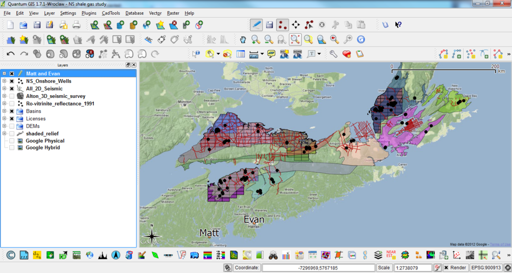
Geoscience interpretation  dGB OpendTect, GeoCraftQuantum GIS (above). The main thing we lack is a log visualization and interpretation tool. Beyond this, we don't use them much yet but Madagascar and GMT are plugged right into OpendTect. For getting started on stratigraphic charts, we use TimeScale Creator

A quick aside, for context: when I sold Landmark's GeoProbe seismic interpretation tool, back in 2003 or so, the list price was USD140 000 per user, choke, plus USD25k per year in maintenance. GeoProbe is very powerful now (and I have no idea what it costs), but OpendTect is a much better tool that that early edition was. And it's free (as in speech, and as in beer).

Geekery, data mining, analysis  Our core tools for data mining are Excel, Spotfire Silver (an amazing but proprietary tool), MATLAB and/or GNU Octave, random Python. We use Gephi for network analysis, FIJI for image analysis, and we have recently discovered VISAT for remote sensing images. All our mobile app development has been in MIT AppInventor so far, but we're playing with the PhoneGap framework in Eclipse too. 

Writing and drawing  Google Docs for words, Inkscape for vector art and composites, GIMP for rasters, iMovie for video, Adobe InDesign for page layout. And yeah, we use Microsoft Office and OpenOffice.org too — sometimes it's just easier that way. For managing references, Mendeley is another recent discovery — it is 100% awesome. If you only look at one tool in this post, look at this.

Collaboration  We collaborate with each other and with clients via SkypeDropbox, Google+ Hangouts, and various other Google tools (for calendars, etc). We also use wikis (especially SubSurfWiki) for asynchronous collaboration and documentation. As for social media, we try to maintain some presence in Google+, Facebook, and LinkedIn, but our main channel is Twitter.

Web  This website is hosted by Squarespace for reliability and reduced maintenance. The MediaWiki instances we maintain (both public and private) are on MediaWiki's open source platform, running on Amazon's Elastic Compute servers for flexibility. An EC2 instance is basically an online Linux box, running Ubuntu and Bitnami's software stack, plus some custom bits and pieces. We are launching another website soon, running WordPress on Amazon EC2. Hover provides our domain names — an awesome Canadian company.

Administrative tools  Every business has some business tools. We use Tick to track our time — it's very useful when working on multiple projects, subscontractors, etc. For accounting we recently found Wave, and it is the best thing ever. If you have a small business, please check it out — after headaches with several other products, it's the best bean-counting tool I've ever used.

If you have a geeky geo-toolbox of your own, we'd love to hear about it. What tools, open or proprietary, couldn't you live without?

Checklists for everyone

Avoidable failures are common and persistent, not to mention demoralizing and frustrating, across many fields — from medicine to finance, business to government. And the reason is increasingly evident: the volume and complexity of what we know has exceeded our individual ability to deliver its benefits correctly, safely, or reliably. Knowledge has both saved and burdened us.

I first learned about Atul Gawande from Bill Murphy's talk at the 1IWRP conference last August, where he offered the surgeon's research model for all imperfect sciences; casting the spectrum of problems in a simple–complicated–complex ternary space. In The Checklist Manifesto, Gawande writes about a topic that is relevant to all all geoscience: the problem of extreme complexity. And I have been batting around the related ideas of cookbooks, flowcharts, recipes, and to-do lists for maximizing professional excellence ever since. After all, it is challenging and takes a great deal of wisdom to cut through the chaff, and reduce a problem to its irreducible and essential bits. Then I finally read this book.

The creation of the now heralded 19-item surgical checklist found its roots in three places — the aviation industry, restaurant kitchens, and building construction:

Thinking about averting plane crashes in 1935, or stopping infections in central lines in 2003, or rescuing drowning victims today, I realized that the key problem in each instance was essentially a simple one, despite the number of contributing factors. One needed only to focus attention on the rudder and elevator controls in the first case, to maintain sterility in the second, and to be prepared for cardiac bypass in the third. All were amenable, as a result, to what engineers call "forcing functions": relatively straightforward solutions that force the necessary behavior — solutions like checklists.

What is amazing is that it took more than two years, and a global project sponsored by the World Health Organization, to devise such a seemingly simple piece of paper. But what a change it has had. Major complications fell by 36%, and deaths fells by 47%. Would you adopt a technology that had a 36% improvement in outcomes, or a 36% reduction in complications? Most would without batting an eye.

But the checklist paradigm is not without skeptics. There is resistance to the introduction of the checklist because it threatens our autonomy as professionals, our ego and intelligence that we have trained hard to attain. An individual must surrender being the virtuoso. It enables teamwork and communication, which engages subordinates and empowers them at crucial points in the activity. The secret is that a checklist, done right, is more than just tick marks on a piece of paper — it is a vehicle for delivering behavioural change.

I can imagine huge potential for checklists in the problems we face in petroleum geoscience. But what would such checklists look like? Do you know of any in use today?

News of the month

A few bits of news about geology, geophysics, and technology in the hydrocarbon and energy realm. Do drop us a line if you hear of something you think we ought to cover.

All your sequence strat

The SEPM, which today calls itself the Society for Sedimentary Geology (not the Society of Economic Palaeontologists and Mineralogists, which is where the name comes from, IIRC), has upgraded its website. It looks pretty great (nudge nudge, AAPG!). The awesome SEPM Strata, a resource for teaching and learning sequence stratigraphy, also got a facelift. 

Hat-tip to Brian Romans for this one.

Giant sand volcano

Helge Løseth of Statoil, whom we wrote about last week in connection with the Source Rocks from Seismic workflow, was recently in the news again. This time he and his exploration team were describing the Pleistocene extrusion of more than 10 km3 of sand onto the sea-floor in the northern North Sea, enough to bury Manhattan in 160 m of sand.

The results are reported in Løseth, H, N Rodrigues, and P Cobbold (2012) and build on earlier work by the same team (Rodrigues et al. 2009). 

Tape? There's still tape??

Yes, there's still tape. This story just caught my eye because I had no idea people were still using tape. It turns out that the next generation of tape, Ultrium LTO-6, will be along in the second half of 2012. The specs are pretty amazing: 8 TB (!) of compressed data, and about 200 MB/s (that's megabytes) transfer rates. The current generation of cartridges, LTO-5, cost about $60 and hold 3 TB — a similar-performing hard drive will set you back more than double that. 

The coolest cluster

Physics enables geophysics in lots of cool ways. CGGVeritas is using a 600 kW Green Revolution Cooling CarnotJet liquid cooling system to refrigerate 24 cluster racks in GRC's largest installation to date. In the video below, you can see an older 100 kW system. The company claims that these systems, in which the 40°C racks sit bathed in non-conductive oil, reduce the cost of cooling a supercomputer by about 90%... pretty amazing.

Awesomer still, this server is using Supermicro's SuperServer GPU-accelerated servers. GPUs, or graphics processing units, have massively parallel architectures (over 1000 cores per server), and can perform some operations much faster than ordinary CPUs, which are engineered to perform 'executive' functions as well as just math.

This regular news feature is for information only. We aren't connected with any of these organizations, and don't necessarily endorse their products or services. The cartridge image is licensed CC-BY-SA by Wikimedia Commons user andy_hazelbury. The CarnotJet image is from grcooling.com and thought to be fair use.

How big is that volume?

Sometimes you need to know how much space you need for a seismic volume. One of my machines only has 4GB of RAM, so if I don't want to run out of memory, I need to know how big a volume will be. Or your IT department might want help figuring out how much disk to buy next year.

Fortunately, since all seismic data is digital these days, it's easy to figure out how much space we will need. We simply count the samples in the volume, then account for the bit-depth. So, for example, if a 3D volume has 400 inlines and 300 traces per line, then it has 120 000 traces in total. If each trace is 6 seconds long, and the sample interval is 2 ms, then each trace has 6000/2 = 3000 samples (3001 actually, but let's not worry too much about that), so that's about 360 million samples. for a 32-bit volume, each sample requires 32/8 = 4 bytes, so we're at... a big number.  To convert to kilobytes, divide by 210, or 1024, then do it again for MB and again for GB.

It's worth noting that some seismic interpretation tools have proprietary compressed formats available for seismic data, Landmark's 'brick' format for example. This optionally applies a JPEG-like compression to reduce the file size, as well as making some sections display faster because of the way the compressed file is organized. The amount of compression depends on the frequency content of the data, and the compression is lossy, however, meaning that some of the original data is irretrievably lost in the process. If you do use such a file for visualization and interpretation, you may want to use a full bit-depth, full-fidelity file for attribute analysis. 

Do you have any tricks for managing large datasets? We'd love to hear them!

Polarity cartoons

...it is good practice to state polarity explicitly in discussions of seismic data, with some phrase such as: 'increase in impedance downwards gives rise to a red (or blue, or black) loop.'

Bacon, Simm & Redshaw (2003), 3D Seismic Interpretation, Cambridge

Good practice, but what a mouthful. And perhaps because it is such a cumbersome convention, it is often ignored, assumed, or skipped. We'd like to change that. Polarity is important, everyone needs to know what the wiggles (or colours) of seismic data mean.

Two important things

    Click the image to find your favorite colorbarSeismic data is about contrasts. The data are an abstraction of geological contrasts in the earth. To connect the data to the geology, there are two important things you need to know about your data:

  1. What do the colours mean in terms of digits?

  2. What do the digits mean in terms of impedance?

So whenever you show seismic to someone, you need to answers these questions for them. Show the colourbar, and the sign of the digits (the magnitude of the digits is not very important; amplitude are relative). Show the relationship between the sign of the digits and impedance.

Really useful

To help you show these things, we have created a table of polarity cartoons for some common colour scales.

  1. Decide if you want to use the American–Canadian convention of a downwards increase in impedance resulting in a positive amplitude, or the opposite European–Australian convention. Sometimes people talk about SEG Normal polarity — the de facto SEG standard is the American convention.

  2. Choose whether you want to show a high impedance layer sandwiched between low impedance ones, or vice versa. To make this decision, inspect your well ties or plot impedance against lithology. For example, if your sands are relatively fast and dense, you may want to choose the hard layer option.

  3. Select a colourmap that matches your displays. If you need another, you can download and edit the SVG file, or email us and we'll add it for you.

  4. Right-click on a thumbnail, copy it to your clipboard, and paste it into the corner of your section or timeslice in PowerPoint, Word, or wherever. If the thumbnail is too small or pixelated, click the thumbnail for higher resolution.

With so many options to choose from, we hope this little tool can help make your seismic discussions a little more transparent. What's more, if you see a seismic section without a legend like this, then are you sure the presenter knows about the polarity of their data? Perhaps they do, but it is an oversight to assume that you should know as well. 

What do you make your audience assume?


UPDATE [2020] — we built a small web app to serve up fresh polarity cartoons, whenever you need them! Check it out.

Source rocks from seismic

A couple of years ago, Statoil's head of exploration research, Ole Martinsen, told AAPG Explorer magazine about a new seismic analysis method. Not just another way to discriminate between sand and shale, or water and gas, this was a way to assess source rock potential. Very useful in under-explored basins, and Statoil developed it for that purpose, but only the very last sentence of the Explorer article hints at its real utility today: shale gas exploration.

Calling the method Source Rocks from Seismic, Martinsen was cagey about details, but the article made it clear that it's not rocket surgery: “We’re using technology that would normally be used, say, to predict sandstone and fluid content in sandstone,” said Marita Gading, a Statoil researcher. Last October Helge Løseth, along with Gading and others, published a complete account of the method (Løseth et al, 2011).

Because they are actively generating hydrocarbons, source rocks are usually overpressured. Geophysicists have used this fact to explore for overpressured zones and even shale before. For example, Mukerji et al (2002) outlined the rock physics basis for low velocities in overpressured zones. Applying the physics to shales, Liu et al (2007) suggested a three-step process for evaluating source rock potential in new basins: 1 Sequence stratigraphic interpretation; 2 Seismic velocity analysis to determine source rock thickness; 3 Source rock maturity prediction from seismic. Their method is also a little hazy, but the point is that people are looking for ways to get at source rock potential via seismic data. 

The Løseth et al article was exciting to see because it was the first explanation of the method that Statoil had offered. This was exciting enough that the publication was even covered by Greenwire, by Paul Voosen (@voooos on Twitter). It turns out to be fairly straightforward: acoustic impedance (AI) is inversely and non-linearly correlated with total organic carbon (TOC) in shales, though the relationship is rather noisy in the paper's examples (Kimmeridge Clay and Hekkingen Shale). This means that an AI inversion can be transformed to TOC, if the local relationship is known—local calibration is a must. This is similar to how companies estimate bitumen potential in the Athabasca oil sands (e.g. Dumitrescu 2009). 

Figure 6 from Løseth et al (2011). A Seismic section. B Acoustic impedance. C Inverted seismic section where source rock interval is converted to total organic carbon (TOC) percent. Seismically derived TOC percent values in source rock intervals can be imported to basin modeling software to evaluate hydrocarbon generation potential of a basin. Click for full size..The result is that thick rich source rocks tend to have strong negative amplitude at the top, at least in subsiding mud-rich basins like the North Sea and the Gulf of Mexico. Of course, amplitudes also depend on stratigraphy, tuning, and so on. The authors expect amplitudes to dim with offset, because of elastic and anisotropic effects, giving a Class 4 AVO response.

This is a nice piece of work and should find application worldwide. There's a twist though: if you're interested in trying it out yourself, you might be interested to know that it is patent-pending: 

WO/2011/026996
INVENTORS:  Løseth,  H;  Wensaas, L; Gading, M; Duffaut, K; Springer, HM
Method of assessing hydrocarbon source rock candidate
A method of assessing a hydrocarbon source rock candidate uses seismic data for a region of the Earth. The data are analysed to determine the presence, thickness and lateral extent of candidate source rock based on the knowledge of the seismic behaviour of hydrocarbon source rocks. An estimate is provided of the organic content of the candidate source rock from acoustic impedance. An estimate of the hydrocarbon generation potential of the candidate source rock is then provided from the thickness and lateral extent of the candidate source rock and from the estimate of the organic content.

References

Dumitrescu, C (2009). Case study of a heavy oil reservoir interpretation using Vp/Vs ratio and other seismic attributes. Proceedings of SEG Annual Meeting, Houston. Abstract is online

Liu, Z, M Chang, Y Zhang, Y Li, and H Shen (2007). Method of early prediction on source rocks in basins with low exploration activity. Earth Science Frontiers 14 (4), p 159–167. DOI 10.1016/S1872-5791(07)60031-1

Løseth, H, L Wensaas, M Gading, K Duffaut, and M Springer (2011). Can hydrocarbon source rocks be identified on seismic data? Geology 39 (12) p 1167–1170. First published online 21 October 2011. DOI 10.1130/​G32328.1

Mukerji, T, Dutta, M Prasad, J Dvorkin (2002). Seismic detection and estimation of overpressures. CSEG Recorder, September 2002. Part 1 and Part 2 (Dutta et al, same issue). 

The figure is reproduced from Løseth et al (2011) according to The Geological Society of America's fair use guidelines. Thank you GSA! The flaming Kimmeridge Clay photograph is public domain. 

Location, location, location

A quiz: how many pieces of information do you need to accurately and unambiguously locate a spot on the earth?

It depends a bit if we're talking about locations on a globe, in which case we can use latitude and longitude, or locations on a map, in which case we will need coordinates and a projection too. Since maps are flat, we need a transformation from the curved globe into flatland — a projection

So how many pieces of information do we need?

The answer is surprising to many people. Unless you deal with spatial data a lot, you may not realize that latitude and longitude are not enough to locate you on the earth. Likewise for a map, an easting (or x coordinate) and northing (y) are insufficient, even if you also give the projection, such as the Universal Transverse Mercator zone (20T for Nova Scotia). In each case, the missing information is the datum. 

Why do we need a datum? It's similar to the problem of measuring elevation. Where will you measure it from? You can use 'sea-level', but the sea moves up and down in complicated tidal rhythms that vary geographically and temporally. So we concoct synthetic datums like Mean Sea Level, or Mean High Water, or Mean Higher High Water, or... there are 17 to choose from! To try to simplify things, there are standards like the North American Vertical Datum of 1988, but it's important to recognize that these are human constructs: sea-level is simply not static, spatially or temporally.

To give coordinates faithfully, we need a standard grid. Cartesian coordinates plotted on a piece of paper are straightforward: the paper is flat and smooth. But the earth's sphere is not flat or smooth at any scale. So we construct a reference ellipsoid, and then locate that ellipsoid on the earth. Together, these references make a geodetic datum. When we give coordinates, whether it's geographic lat–long or cartographic xy, we must also give the datum. Without it, the coordinates are ambiguous. 

How ambiguous are they? It depends how much accuracy you need! If you're trying to locate a city, the differences are small — two important datums, NAD27 and NAD83, are different by up to about 80 m for most of North America. But 80 m is a long way when you're shooting seismic or drilling a well.

What are these datums then? In North America, especially in the energy business, we need to know three:

NAD27 — North American Datum of 1927, Based on the Clarke 1866 ellipsoid and fixed on Meades Ranch, Kansas. This datum is very commonly used in the oilfield, even today. The complexity and cost of moving to NAD83 is very large, and will probably happen v e r y  s l o w l y. In case you need it, here's an awesome tool for converting between datums. 

NAD83 — North American Datum of 1983, based on the GRS 80 ellipsoid and fixed using a gravity field model. This datum is also commonly seen in modern survey data — watch out if the rest of your project is NAD27! Since most people don't know the datum is important and therefore don't report it, you may never know the datum for some of your data. 

WGS84 — World Geodetic System of 1984, based on the 1996 Earth Gravitational Model. It's the only global datum, and the current standard in most geospatial contexts. The Global Positioning System uses this datum, and coordinates you find in places like Wikipedia and Google Earth use it. It is very, very close to NAD83, with less than 2 m difference in most of North America; but it gets a little worse every year, thanks to plate tectonics!

OK, that's enough about datums. To sum up: always ask for the datum. If you're generating geospatial information, always give the datum. You might not care too much about it today, but Evan and I have spent the better part of two days trying to unravel the locations of wells in Nova Scotia so trust me when I say that one day, you will care!

Disclaimer: we are not geodesy specialists, we just happen to be neck-deep in it at the moment. If you think we've got something wrong, please tell us! Map licensed CC-BY by Wikipedia user Alexrk2 — thank you! Public domain image of Earth from Apollo 17. 

The spectrum of the spectrum

A few weeks ago, I wrote about the notches we see in the spectrums of thin beds, and how they lead to the mysterious quefrency domain. Today I want to delve a bit deeper, borrowing from an article I wrote in 2006.

Why the funny name?

During the Cold War, the United States government was quite concerned with knowing when and where nuclear tests were happening. One method they used was seismic monitoring. To discriminate between detonations and earthquakes, a group of mathematicians from Bell Labs proposed detecting and timing echoes in the seismic recordings. These echoes gave rise to periodic but cryptic notches in the spectrum, the spacing of which was inversely proportional to the timing of the echoes. This is exactly analogous to the seismic response of a thin-bed.

To measure notch spacing, Bogert, Healy and Tukey (1963) invented the cepstrum (an anagram of spectrum and therefore usually pronounced kepstrum). The cepstrum is defined as the Fourier transform of the natural logarithm of the Fourier transform of the signal: in essence, the spectrum of the spectrum. To distinguish this new domain from time, to which is it dimensionally equivalent, they coined several new terms. For example, frequency is transformed to quefrency, phase to saphe, filtering to liftering, even analysis to alanysis.

Today, cepstral analysis is employed extensively in linguistic analysis, especially in connection with voice synthesis. This is because, as I wrote about last time, voiced human speech (consisting of vowel-type sounds that use the vocal chords) has a very different time–frequency signature from unvoiced speech; the difference is easy to quantify with the cepstrum.

What is the cepstrum?

To describe the key properties of the cepstrum, we must look at two fundamental consequences of Fourier theory:

  1. convolution in time is equivalent to multiplication in frequency
  2. the spectrum of an echo contains periodic peaks and notches

Let us look at these in turn. A noise-free seismic trace s can be represented in the time t domain by the convolution of a wavelet w and reflectivity series r thus

convolutional model

Then, in the frequency f domain

In other words, convolution in time becomes multiplication in frequency. The cepstrum is defined as the Fourier transform of the log of the spectrum. Thus, taking logs of the complex moduli

Since the Fourier transform F is a linear operation, the cepstrum is

We can see that the spectrums of the wavelet and reflectivity series are additively combined in the cepstrum. I have tried to show this relationship graphically below. The rows are domains. The columns are the components w, r, and s. Clearly, these thin beds are resolved by this wavelet, but they might not be in the presence of low frequencies and noise. Spectral and cepstral analysis—and alanysis—can help us cut through the seismic and get at the geology. 

Time series (top), spectra (middle), and cepstra (bottom) for a wavelet (left), a reflectivity series containing three 10-ms thin-beds (middle), and the corresponding synthetic trace (right). The band-limited wavelet has a featureless cepstrum, whereas the reflectivity series clearly shows two sets of harmonic peaks, corresponding to the thin- beds (each 10 ms thick) and the thicker composite package.

References

Bogert, B, Healy, M and Tukey, J (1963). The quefrency alanysis of time series for echoes: cepstrum, pseudo-autocovariance, cross- cepstrum, and saphe-cracking. Proceedings of the Symposium on Time Series Analysis, Wiley, 1963.

Hall, M (2006). Predicting stratigraphy with cepstral decomposition. The Leading Edge 25 (2), February 2006 (Special issue on spectral decomposition). doi:10.1190/1.2172313

Greenhouse George image is public domain.

J is for Journal

I'm aware of a few round-ups of journals for geologists, but none for those of us with more geophysical leanings. So here's a list of some of the publications that used to be on my reading list back when I used to actually read things. I've tried to categorize them a bit, but this turned out to be trickier than I thought it would be; I hope my buckets make some sense.

Journals with mirrored content at GeoScienceWorld are indicated by GSW

Peer-reviewed journals

Technical magazines

  • First Break — indispensible news from EAGE and the global petroleum scene, and a beautifully produced periodical to boot. No RSS feed, though. Boo. Subscription only.
  • The Leading EdgeGSWRSS — SEG's classic monthly that You Must Read. But... subscription only.
  • Recorder is brilliant value for money, even if it doesn't have an RSS feed. It is also publicly accessible after three months, which is rare to see in our field. Yay, CSEG!

Other petroleum geoscience readables

  • SPE Journal of Petroleum Technology — all the news you need from SPE. It's all online if you can bear the e-reader interface. Mostly manages to tread the marketing-as-article line that some other magazines transgress more often (none of those here; you know what they are).
  • CWLS InSite — openly accessible and often has excellent articles, though it only comes out twice a year now. Its sister organisation, SPWLA, allegedly has a journal called Petrophysics, but I've never seen it and can't find it online. Anyone?
  • Elsevier publish a number of excellent journals, but as you may know, a large part of the scientific community is pressuring the Dutch publishing giant to adopt a less exclusive distribution and pricing model for its content. So I am not reading them any more, or linking to them today. This might seem churlish, but consider that it's not uncommon to be asked for $40 per article, even if the research was publicly funded.

General interest magazines

  • IEEE SpectrumRSS — a terrific monthly from 'the world's largest association for the advancement of technology'. They also publish some awesome niche titles like the unbelievably geeky Signal Processing — RSS. You can subscribe to print issues of Spectrum without joining IEEE, and it's free to read online. My favourite.
  • Royal Statistical Society SignificanceRSS (seems to be empty) — another fantastic cross-disciplinary read. [Updated: You don't have to join the society to get it, and you can read everything online for free]. I've happily paid for this for many years.

How do I read all this stuff?

The easiest way is to grab the RSS feed addresses (right-click and Copy Link Address, or words to that effect) and put them in a feed reader like Google Reader. (Confused? What the heck is RSS?). If you prefer to get things in your email inbox, you can send RSS feeds to email.

If you read other publications that help you stay informed and inspired as an exploration geophysicist — or as any kind of subsurface scientist — let us know what's in your mailbox or RSS feed!

The cover images are copyright of CSEG, CWLS and IEEE. I'm claiming 'fair use' for these low-res images. More A to Z posts...

Shooting into the dark

Part of what makes uncertainty such a slippery subject is that it conflates several concepts that are better kept apart: precision, accuracy, and repeatability. People often mention the first two, less often the third.

It's clear that precision and accuracy are different things. If someone's shooting at you, for instance, it's better that they are inaccurate but precise so that every bullet whizzes exactly 1 metre over your head. But, though the idea of one-off repeatability is built in to the concept of multiple 'readings', scientists often repeat experiments and this wholesale repeatability also needs to be captured. Hence the third drawing. 

One of the things I really like in Peter Copeland's book Communicating Rocks is the accuracy-precision-repeatability figure (here's my review). He captured this concept very nicely, and gives a good description too. There are two weaknesses though, I think, in these classic target figures. First, they portray two dimensions (spatial, in this case), when really each measurement we make is on a single axis. So I tried re-drawing the figure, but on one axis:

The second thing that bothers me is that there is an implied 'correct answer'—the middle of the target. This seems reasonable: we are trying to measure some external reality, after all. The problem is that when we make our measurements, we do not know where the middle of the target is. We are blind.

If we don't know where the bullseye is, we cannot tell the difference between precise and imprecise. But if we don't know the size of the bullseye, we also do not know how accurate we are, or how repeatable our experiments are. Both of these things are entirely relative to the nature of the target. 

What can we do? Sound statistical methods can help us, but most of us don't know what we're doing with statistics (be honest). Do we just need more data? No. More expensive analysis equipment? No.

No, none of this will help. You cannot beat uncertainty. You just have to deal with it.

This is based on an article of mine in the February issue of the CSEG Recorder. Rather woolly, even for me, it's the beginning of a thought experiment about doing a better job dealing with uncertainty. See Hall, M (2012). Do you know what you think you know? CSEG Recorder, February 2012. Online in May. Figures are here.