H is for Horizon

Seismic interpretation is done by crafting, extracting, or digitally drawing horizons across data, but what is a horizon anyway? Coming up with a definition of horizon is hard. So I have narrowed it down to three.

Data-centric: a matrix of discrete samples in x,y,z that can be stored in a 3-column ASCII file. As such, a horizon is something that can be unambiguously drawn on a map, and treated like a raster image. Some software tools even call attribute maps horizons, blurring the definition further. The data-centric horizon is devoid of geology, and of geophysics; it is an artifact of software.

Geophysics-centric: an event, a reflection, in the seismic data; something you could pick with an automatic tracking tool. The quality is subject to the data itself. Change the data, or the processing, change the horizon. By this definition, a flat spot (a flattish reflection from a fluid contact) is a horizon, even though it's not stratigraphic. This type of horizon would be one of the inputs to instantaneous attribute analysis. The geophysics-centric horizon is still, in many ways, devoid of geology. It does not match your geological tops at the wells; it's not supposed to. 

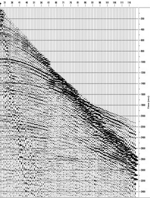
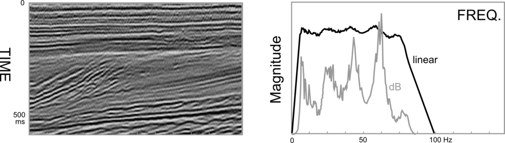
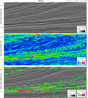
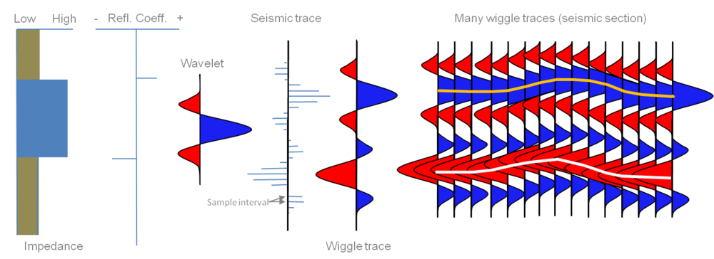
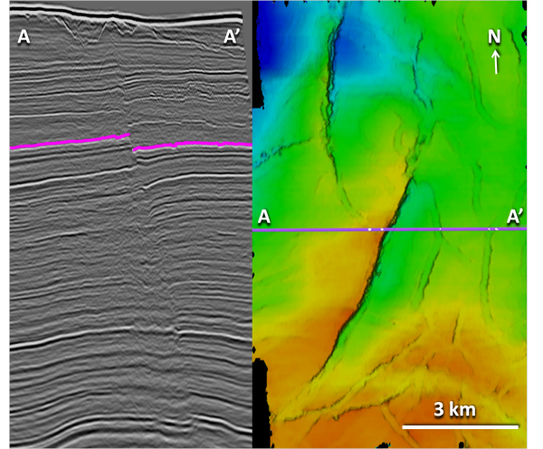
Crossline 1241 (left), and geophysics-centric horizon (right) from the Penobscot 3D (Open Seismic Repository). Reds are highs and blues are lows.Geology-centric: a layer, a surface, an interface, in the earth, and its manifestation in the seismic data. It is the goal of seismic interpretation. In its purest form, it is unattainable: you can never know exactly where the horizon is in the subsurface. We do our best to construct it from wells, seismic, and imagination. Interestingly, because it is, to some degree, not consistent with the seismic reflections, it would not be possible to use the geology-centric horizon for instantaneous seismic attributes. It would match your well tops, if you could build it. But you can't. 

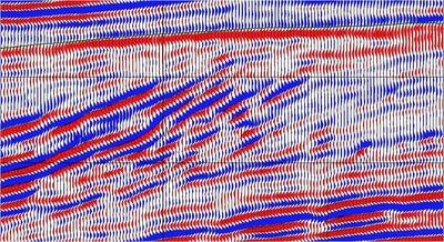
A four well model can help us illustrate this nuance. Geological tops have been correlated across these wells, and used as input to a seismic model to study the changes in thickness of the Bakken Formation (green to blue) interval.

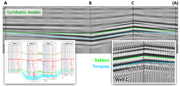
Four-well synthetic seismic model illustrating how a geological surface (green, blue) is not necessarily the same as a seismic reflection. From Hall & Trouillot (2004).

The synthetic model shows how the seismic character changes from well to well. Notice that a stratigraphic surface is not the same thing as a seismic event. The top Bakken (BKKN) pick is a peak-to-trough zero-crossing in the middle, and pinches out and tunes at either end. The top Torquay (TRQY), transitions from a trough, to a zero-crossing, and then to another trough.

This uncertainty is part of the integration gap. It is why building a predictive geologic model is so difficult to do. The word horizon can be a catch-all term; reckless to throw around. Instead, clearly communicate the definition of your horizon pick, it will prevent confusion for yourself and for other people who come in contact with it.

REFERENCE
Hall, M & E Trouillot (2004). Predicting stratigraphy with spectral decomposition. Canadian Society of Exploration Geophysicists annual conference, Calgary, May 2004.

G is for Gather

When a geophysicist speaks about pre-stack data, they are usually talking about a particular class of gather. A gather is a collection of seismic traces which share some common geometric attribute. The term gather usually refers to a common depth point (CDP) or common mid-point (CMP) gather. Gathers are sorted from field records in order to examine the dependence of amplitude, signal:noise, moveout, frequency content, phase, and other attributes that are important for data processing and imaging. 

Common shot or receiver gather: Basic quality assessment tools in field acquistion. When the traces of the gather come from a single shot and many receivers, it is called a common shot gather. A single receiver with many shots is called a common receiver gather. It is very easy to inspect traces in these displays for bad receivers or bad shots. 

shot gatherImage: gamut.to.it CC-BY-NC-NDCommon midpoint gather, CMP: The stereotypical gather: traces are sorted by surface geometry to approximate a single reflection point in the earth. Data from several shots and receivers are combined into a single gather. The traces are sorted by offset in order to perform velocity analysis for data processing and hyperbolic moveout correction. Only shot–receiver geometry is required to construct this type of gather.

Common depth point gather, CDP: A more sophisticated collection of traces that takes dipping reflector geometry other subsurface properties into account. CDPs can be stacked to produce a structure stack, and could be used for AVO work, though most authors recommend using image gathers or CIPs [see the update below for a description of CIPs]A priori information about the subsurface, usually a velocity model, must be applied with the shot–receiver geometry in order to construct this type of gather. [This paragraph has been edited to reflect the update below].

Common offset gather, COFF: Used for basic quality control, because it approximates a structural section. Since all the traces are at the same offset, it is also sometimes used in AVO analysis; one can quickly inspect the approximate spatial extent of a candidate AVO anomaly. If the near offset trace is used for each shot, this is called a brute stack.

Variable azimuth gather: If the offset between source and receiver is constant, but the azimuth is varied, the gather can be used to study variations in travel-time anisotropy from the presence of elliptical stress fields or reservoir fracturing. The fast and slow traveltime directions can be mapped from the sinsoidal curve. It can also be used as a pre-stack data quality indicator. 

Check out the wiki page for more information. Are there any gather types or applications that we have missed?

Find other A to Z posts

F is for Frequency

Frequency is the number of times an event repeats per unit time. Periodic signals oscillate with a frequency expressed as cycles per second, or hertz: 1 Hz means that an event repeats once every second. The frequency of a light wave determines its color, while the frequency of a sound wave determines its pitch. One of the greatest discoveries of the 18th century is that all signals can be decomposed into a set of simple sines and cosines oscillating at various strengths and frequencies. 

I'll use four toy examples to illustrate some key points about frequency and where it rears its head in seismology. Each example has a time-series representation (on the left) and a frequency spectrum representation (right).

The same signal, served two ways

This sinusoid has a period of 20 ms, which means it oscillates with a frequency of 50 Hz (1/20 ms-1). A sinusoid is composed of a single frequency, and that component displays as a spike in the frequency spectrum. A side note: we won't think about wavelength here, because it is a spatial concept, equal to the product of the period and the velocity of the wave.

In reflection seismology, we don't want things that are of infinitely long duration, like sine curves. We need events to be localized in time, in order for them to be localized in space. For this reason, we like to think of seismic impulses as a wavelet.

The Ricker wavelet is a simple model wavelet, common in geophysics because it has a symmetric shape and it's a relatively easy function to build (it's the second derivative of a Gaussian function). However, the answer to the question "what's the frequency of a Ricker wavelet?" is not straightforward. Wavelets are composed of a range (or band) of frequencies, not one. To put it another way: if you added monotonic sine waves together according to the relative amplitudes in the frequency spectrum on the right, you would produce the time-domain representation on the left. This particular one would be called a 50 Hz Ricker wavelet, because it has the highest spectral magnitude at the 50 Hz mark—the so-called peak frequency

Bandwidth

For a signal even shorter in duration, the frequency band must increase, not just the dominant frequency. What makes this wavelet shorter in duration is not only that it has a higher dominant frequency, but also that it has a higher number of sine waves at the high end of the frequency spectrum. You can imagine that this shorter duration signal traveling through the earth would be sensitive to more changes than the previous one, and would therefore capture more detail, more resolution.

The extreme end member case of infinite resolution is known mathematically as a delta function. Composing a signal of essentially zero time duration (notwithstanding the sample rate of a digital signal) takes not only high frequencies, but all frequencies. This is the ultimate broadband signal, and although it is impossible to reproduce in real-world experiments, it is a useful mathematical construct.

What about seismic data?

Real seismic data, which is acquired by sending wavelets into the earth, also has a representation in the frequency domain. Just as we can look at seismic data in time, we can look at seismic data in frequency. As is typical with all seismic data, the example below set lacks low and high frequencies: it has a bandwidth of 8–80 Hz. Many geophysical processes and algorithms have been developed to boost or widen this frequency band (at both the high and low ends), to increase the time domain resolution of the seismic data. Other methods, such as spectral decomposition, analyse local variations in frequency curves that may be otherwise unrecognizable in the time domain. 

High resolution signals are short in the time domain and wide or broadband in the frequency domain. Geoscientists often equate high resolution with high frequency, but that it not entirely true. The greater the frequency range, the larger the information carrying capacity of the signal.

In future posts we'll elaborate on Fourier transforms, sampling, and frequency domain treatments of data that are useful for seismic interpreters.

For more posts in our Geophysics from A to Z posts, click here.

E is for Envelope 2

This seismic profile offshore Netherlands is shown three ways to illustrate the relationship between amplitude and envelope, which we introduced yesterday. 

The first panel consists of seismic amplitude values, the second panel is the envelope, and the third panel is a combination of the two (co-rendered with transparency). I have given them different color scales because amplitude values oscillate about zero and envelope values are always positive.

The envelope might be helpful in this case for simplifying the geology at the base of the clinoforms, but doesn't seem to provide any detail along the high relief slopes.

It also enhances the bright spot in the toesets of the clinoforms, but, more subtly, it suggests that there are 3 key interfaces, out of a series of about 10 peaks and troughs. Used in this way, it may help the interpreter decide which reflections are important, and which reflections are noise (sidelobe).

Another utility of envelope is that it is independent of phase. If the maximum on the envelope does not correspond to a peak or trough on the seismic amplitudes, the seismic amplitudes may not be zero phase. In environments where phase is wandering, either pre-stack or post-stack domain, the envelope attribute is a handy accompaniment to constrain reflection picking or AVO analyses: envelope vs offset, or EVO. It also makes me wonder if adding envelopes to the modeling of synthetic seismiograms might yield better well ties?

E is for Envelope

There are 8 layers in this simple blocky earth model. You might say that there are only 7 important pieces of information for this cartoon earth; the 7 reflectivity contrasts at the layer boundaries.

The seismic traces however, have more information than that. On the zero phase trace, there are 21 extrema (peaks / troughs). Worse yet, on the phase rotated trace there are 28. So somehow, the process of wave propagation has embedded more information than we need. Actually, in that case, maybe we shouldn't call it information: it's noise.

It can be hard to tell what is real and what is side lobe and soon, you are assigning geological significance to noise. A literal interpretation of the peaks and troughs would produce far more layers than there actually are. If you interpret every extreme as being matched with a boundary, you would be wrong.

Consider the envelope. The envelope has extrema positioned exactly at each boundary, and perhaps more importantly, it literally envelopes (I enunciate it differently here for drama) the part of the waveform associated with that reflection. 7 boundaries, 7 bumps on the envelope, correctly positioned in the time domain.

Notice how the envelope encompasses all phase rotations from 0 to 360 degrees; it's phase invariant. Does this make it more robust? But it's so broad! Are we losing precision or accuracy by accompanying our trace with it's envelope? What does vertical resolution really mean anyway?

Does this mean that every time there is an envelope maximum, I can expect a true layer boundary? I for one, don't know if this is fool proof in the face of interferring wavelets, but it has implications for how we work as seismic interpreters. Tomorrow we'll take a look at the envelope attribute in the context of real data.

D is for Domain

Domain is a term used to describe a variable for which a set of functions or signals are defined.

Time-domain describes functions or signals that change over time; depth-domain describes functions or signal that change over space. The oscillioscope, geophone, and heartrate monitor are tools used to visualize real-world signals in the time domain. The map, photograph, and well log are tools to describe signals in the depth (spatial) domain.

Because seismic waves are recorded in time (jargon: time series), seismic data are naturally presented and interpreted with time as the z-axis. Routinely though, geoscientists must convert data and data objects between the time and depth domain.

Consider the top of a hydrocarbon-bearing reservoir in the time domain (top panel). In this domain, it looks like wells A and B will hit the reservoir at the same elevation and encounter the same amount of pay.

In this example the velocities that enable domain conversion vary from left to right, thereby changing the position of this structure in depth. The velocity model (second panel) linearly decreases from 4000 m/s on the left, to 3500 m/s on the right; this equates to a 12.5% variation in the average velocities in the overburden above the reservoir.

This velocity gradient yields a depth image that is significantly different than the time domain representation. The symmetric time structure bump has been rotated and the spill point shifted from the left side to the right. More importantly, the amount of reservoir underneath the trap has been drastically reduced. 

Have you encountered examples in your work where data domains have been misleading?

Although it is perhaps more intuitive to work with depth-domain data wherever possible, sometimes there are good reasons to work with time. Excessive velocity uncertainty makes depth conversion so ambiguous that you are better off in time-domain. Time-domain signals are recorded at regular sample rates, which is better for signal processing and seismic attributes. Additionally, travel-time itself is an attribute in that it may be recorded or mapped for its physical meaning in some cases, for example time-lapse seismic.

If you think about it, all three of these models are in fact different representations of the same earth. It might be tempting to regard the depth picture as 'reality' but if it's your only perspective, you're kidding yourself. 

C is for clipping

Previously in our A to Z series we covered seismic amplitude and bit depth. Bit depth determines how smooth the amplitude histogram is. Clipping describes what happens when this histogram is truncated. It is often done deliberately to allow more precision for the majority of samples (in the middle of the histogram), but at the cost of no precision at all for extreme values (at the ends of the histogram). One reason to do this, for example, might be when loading 16- or 32-bit data into a software application that can only use 8-bit data (e.g. most volume interpretation software). 

Let's look at an example. Suppose we start with a smooth, unclipped dataset represented by 2-byte integers, as in the top upper image in the figure below. Its histogram, to the right, is a close approximation to a bell curve, with no samples, or very few, at the extreme values. In a 16-bit volume, remember, these extreme values are -32 767 and +32 768. In other words, the data fit entirely within the range allowed by the bit-depth.

 Data from F3 dataset, offshore Netherlands, from the OpendTect Open Seismic Repository.

Now imagine we have to represent this data with 1-byte samples, or a bit-depth of 8. In the lower part of the figure, you see the data after this transformation with its histogram is to the right. Look at the extreme ends of the histogram: there is a big spike of samples there. All of the samples in the tails of the unclipped histogram (shown in red and blue) have been crammed into those two values: -127 and +128. For example, any sample with an amplitude of +10 000 or more in the unclipped data, now has a value of +128. Likewise, amplitudes of –10 000 or less are all now represented by a single amplitude: –127. Any nuance or subtlety in the data in those higher-magnitude samples has gone forever.

Notice the upside though: the contrast of the unclipped data has been boosted, and we might feel like we can see more detail and discriminate more features in this display. Paradoxically, there is less precision, but perhaps it's easier to interpret.

How much data did we affect? We remember to pull out our basic cheatsheet and look at the normal distribution, below. If we clip the data at about two standard deviations from the mean, then we are only affecting 4.2% of the samples in the data. This might include lots of samples of little quantitative interest (the sea-floor, for example), but is also likely to include samples you do care about: bright amplitudes in or near the zone of interest. For this reason, while clipping might not affect how you interpret the structural framework of your earth model, you need to be aware of it in any quantitative work.

Have you ever been tripped up by clipped seismic data? Do you think it should be avoided at all costs, or maybe you have a tip for avoiding severe clipping? Leave a comment!

B is for bit depth

If you give two bits about quantitative seismic interpretation, amplitude maps, inversion, or AVO, then you need to know a bit about bits.

When seismic data is recorded, four bytes are used to store the amplitude values. A byte contains 8 bits, so four of them means 32 bits for every seismic sample, or a bit-depth of 32. As Evan explained recently, amplitude values themselves don’t mean much. But we want to use 32 bits because, at least at the field recording stage, when a day might cost hundreds of thousands of dollars, we want to capture every nuance of the seismic wavefield, including noise, multiples, reverberations, and hopefully even some signal. We have time during processing to sort it all out.

First, it’s important to understand that I am not talking about spatial or vertical resolution, what we might think of as detail. That’s a separate problem which we can understand by considering a pixelated image. It has poor resolution: it is spatially under-sampled. Here is the same image at two different resolutions. The one on the left is 300 × 240 pixels; on the right, 80 × 64 pixels (but reproduced at the same size as the other picture, so the pixels are larger). Click to read more...

Read More

A is for amplitude

A seismic trace is a graph of amplitude versus time (Robinson & Treitel, 2008, Geophysical Reference 15)

Strictly speaking, amplitude is the measure of the displacement of a point along a seismic wave from the middle (zero crossing). Amplitudes can be positively valued (peaks) and negatively valued (troughs).

The amplitudes of seismic traces are often used to make a variety of geologic interpretations, either in 1D, 2D, or 3D and are often used in combination. Seismology is the imaging of the earth using seismic amplitudes (wave trains as a function of arrival time). Even though seismic amplitudes are not directly proportional to geological constrasts (expressed as reflection coefficients), there obviously is some connection. Big contrast = big amplitude, small contrast = small amplitude. Steve Henry has created a nice page that describes and summarizes many of the factors controlling seismic amplitudes.

Seismic traces are created by merging wave records from a range of angles, ray paths, and source and receiver positions. There is a large number of factors that affect seismic amplitude that have little to do with contrasts or geological interfaces. Here is a non-exhaustive list of things that might affect the amplitude of a seismic trace:

  • Lithology
  • Porosity
  • Pore fluid
  • Fluid saturation
  • Effective pressure
  • Faults and fractures
  • Reflector geometry
  • Bed thickness
  • Random noise
  • Acquisition footprint 
  • Interference
  • Near-surface effects
  • Processing operations
  • Geometrical spreading
  • Attenuation (energy loss)
  • Multiple reflections
 

This display from the F3 Block seismic data set, offshore Netherlands, shows that the relationship between amplitude patterns and geology can be open to interpretation (lucky for us!). In this display, blue peaks represent a downwards increase in acoustic impedance. The data are available for free from the OpendTect Open Seismic Repository.

Traditionally, amplitudes are recorded in the field by converting mechanical wave motion into electrical energy (a voltage) using a geophone or a hydrophone. But typically seismic amplitude after processing is unitless and the magnitude is arbitrary. The precision, however, is important so next week we will look at what the interpreter needs to know about bit depth