The hack returns to Norway

Last autumn Agile helped Peter Bormann (ConocoPhillips Norge) and the FORCE consortium host the first geo-flavoured hackathon in Norway. Maybe you were there, or maybe you read about the nine fascinating machine learning projects here on the blog. If so, you’ll know it was a great event, so we’re doing it again!

Hackthon: 18 and 19 September
Symposium: 20 September


Check out last year’s projects here. Projects included Biostrat!, Virtual Metering, sketch2seis, and AVO ML — a really interesting AVO approach exploiting latent spaces (see image, right). Most of them are on GitHub and could be extended this year.

Part of what I love about these things is that we have no idea what the projects will be. As last year, there’ll be a pre-hackathon meetup in Storhaug the evening before Day 1 (on 17 September) — we’ll figure it all out there. In the meantime, if you have an idea check out the link at the end of this post where you can share and discuss it with others.


20180919_FUJ8654.jpg

The hackathon will be followed by a one-day symposium on machine learning in the subsurface (left). This well attended event was also excellent last year, and promises to deliver again in 2019. Peter did a briliant job of keeping things rooted in real results from real research, so you won’t be subjected to the parade of marketing talks you might have been subjected to at certain other conferences.


Find out more and sign up on NPD.no! Don’t delay; places are limited.

Submit and discuss project ideas on Agile’s Events page. Note that this does not sign you up for the event.

Get on softwareunderground.com/slack to discuss the event in the #force-hack-2019 channel.

See you there!

Impact structures in seismic

I saw this lovely tweet from PGS yesterday:

Kudos to them for sharing this. It’s always great to see seismic data and interpretations on Twitter — especially of weird things. And impact structures are just cool. I’ve interpreted them in seismic myself. Then uninterpreted them.

I wish PGS were able to post a little more here, like a vertical profile, maybe a timeslice. I’m sure there would be tons of debate if we could see more. But not all things are possible when it comes to commercial seismic data.

It’s crazy to say more about it without more data (one-line interpretation, yada yada). So here’s what I think.


Impact craters are rare

There are at least two important things to think about when considering an interpretation:

  1. How well does this match the model? (In this case, how much does it look like an impact structure?)

  2. How likely are we to see an instance of this model in this dataset? (What’s the base rate of impact structures here?)

Interpreters often forget about the second part. (There’s another part too: How reliable are my interpretations? Let’s leave that for another day, but you can read Bond et al. 2007 as homework if you like.)

The problem is that impact structures, or astroblemes, are pretty rare on Earth. The atmosphere takes care of most would-be meteorites, and then there’s the oceans, weather, tectonics and so on. The result is that the earth’s record of surface events is quite irregular compared to, say, the moon’s. But they certainly exist, and occasionally pop up in seismic data.

In my 2011 post Reliable predictions of unlikely geology, I described how skeptical we have to be when predicting rare things (‘wotsits’). Bayes’ theorem tells us that we must modify our assigned probability (let’s say I’m 80% sure it’s a wotsit) with the prior probability (let’s pretend a 1% a priori chance of there being a wotsit in my dataset). Here’s the maths:

\( \ \ \ P = \frac{0.8 \times 0.01}{0.8 \times 0.01\ +\ 0.2 \times 0.99} = 0.0388 \)

In other words, the conditional probability of the feature being a rare wotsit, given my 80%-sure interpretation, is 0.0388 or just under 4%.

As cool as it would be to find a rare wotsit, I probably need a back-up hypothesis. Now, what’s that base rate for astroblemes? (Spoiler: it’s much less than 1%.)

Just how rare are astroblemes?

First things first. If you’re interpreting circular structures in seismic, you need to read Simon Stewart’s paper on the subject (Stewart 1999), and his follow-up impact crater paper (Stewart 2003), which expands on the topic. Notwithstanding Stewart’s disputed interpretation of the Silverpit not-a-crater structure in the North Sea, these two papers are two of my favourites.

According to Stewart, the probability P of encountering r craters of diameter d or more in an area A over a time period t years is given by:

\( \ \ \ P(r) = \mathrm{e}^{-\lambda A}\frac{(\lambda A)^r}{r!} \)

where

\( \ \ \ \lambda = t n \)

and

\( \ \ \ \log n = - (11.67 \pm 0.21) - (2.01 \pm 0.13) \log d \)

Astrobleme_prob.png

We can use these equations to compute the probability plot on the right. It shows the probability of encountering an astrobleme of a given diameter on a 2400 km² seismic survey spanning the Phanerozoic. (This doesn’t take into account anything to do with preservation or detection.) I’ve estimated that survey size from PGS’s tweet, and I’ve highlighted the 7.5 km diameter they mentioned. The probability is very small: about 0.00025. So Bayes tells us that an 80%-confident interpretation has a conditional probability of about 0.001. One in a thousand.

Here’s the Jupyter notebook I used to make that chart using Python.

So what?

My point here isn’t to claim that this structure is not an astrobleme. I haven’t seen the data, I’ve no idea. The PGS team mentioned that they considered the possiblity of influence by salt or shale, and fluid escape, and rejected these based on the evidence.

My point is to remind interpreters that when your conclusion is that something is rare, you need commensurately more and better evidence to support the claim. And it’s even more important than usual to have multiple working hypotheses.

Last thing: if I were PGS and this was my data (i.e. not a client’s), I’d release a little cube (anonymized, time-shifted, bit-reduced, whatever) to the community and enjoy the engagement and publicity. With a proper license, obviously.


References

Hughes, D, 1998, The mass distribution of the crater-producing bodies. In Meteorites: Flux with time and impact effects, Geological Society of London Special Publication 140, 31–42.

Davis, J, 1986, Statistics and data analysis in geology, John Wiley & Sons, New York.

Stewart, SA (1999). Seismic interpretation of circular geological structures. Petroleum Geoscience 5, p 273–285.

Stewart, SA (2003). How will we recognize buried impact craters in terrestrial sedimentary basins? Geology 31 (11), p 929–932.


Is your data digital or just pseudodigital?

pseudodigital_analog.png

A rite of passage for a geologist is the making of an original geological map, starting from scratch. In the UK, this is known as the ‘independent mapping project’ and is usually done at the end of the second year of an undergrad degree. I did mine on the eastern shore of the Embalse de Santa Ana, just north of Alfarras in Catalunya, Spain. (I wrote all about it back in 2012.)

The map I drew was about as analog as you can get. I drew it with Rotring Rapidograph pens on drafting film. Mistakes had to be painstakingly scraped away with a razor blade. Colour had to be added in pencil after the map had been transferred onto paper. There is only one map in existence. The data is gone. It is absolutely unreproducible.

pseudodigital_palaeo.png

Digitize!

In order to show you the map, I had to digitize it. This word makes it sound like the map is now ‘digital data’, but it’s really not useful for anything scientific. In other words, while it is ‘digital’ in the loosest sense — it’s a bunch of binary bits in the cloud — it is not digital in the sense of organized data elements with semantic meaning. Let’s call this non-useful format palaeodigital. The lowest rung on the digital ladder.

You can get palaeodigital files from many state and national data repositories. For example, it’s how the Government of Nova Scotia stores its offshore seismic ‘data’ files — as TIFF files representing scans of paper sections submitted by operators. Wiggle trace, obviously, making them almost completely useless.

pseudodigital_proto.png

Protodigital

Nobody draws map by hand anymore, that would be crazy. Adobe Illustrator and (better) Inkscape mean we can produce beautifully rendered maps with about the same amount of effort as the hand-drawn version. But… this still isn’t digital. This is nothing more than a computerized rip-off of the analog workflow. The result is almost as static and difficult to edit as it was on film. (Wish you’d used a thicker line for your fault traces on those 20 maps? Have fun editing those files!)

Let’s call the computerization of analog workflows or artifacts protodigital. I’m thinking of Word and Powerpoint. Email. SeisWorks. Techlog. We can think of data in the same way… LAS files are really just a text-file manifestation of a composite log (plus their headers are often garbage). SEG-Y is nothing more than a bunch of traces with a sidelabel.


Together, palaeodigital and protodigital data might be called pseudodigital. They look digital, but they’re not quite there.

(Just to be clear, I made all these words up. They are definitely silly… but the point is that there’s a lot of room between analog and useful, machine-learning-ready digital.)


pseudodigital_digital.png

Digital data

So what’s at the top of the digital ladder? In the case of maps, it’s shapefiles or, better yet, GeoJSON. In these files, objects are described in terms of real geographic parameters, such at latitiude and longitude. The file contains the CRS (you know you need that, right?) and other things you might need like units, data provenance, attributes, and so on.

What makes these things truly digital? I think the following things are important:

  • They can all be self-documenting

  • …and can carry more or less arbitrary amounts of metadata.

  • They depend on open formats, some text and some binary, that are widely used.

  • There is free, open-source tooling for reading and writing these formats, usually with reference implementations in major languages (e.g. C/C++, Python, Java).

  • They are composable. Without too much trouble, you could write a script to process batches of these files, adapting to their content and context.

Here’s how non-digital versions of a document, e.g. a scholoarly article, compare to digital data:

pseudodigital_document.png

And pseudodigital well logs:

pseudodigital_log.png

Some more examples:

  • Photographs with EXIF data and geolocation.

  • GIS tools like QGIS let us make beautiful maps with data.

  • Drawing striplogs with a data-driven tool like Python striplog.

  • A fully-labeled HDF5 file containing QC’d, machine-learning-ready well logs.

  • Structured, metadata-rich documents, perhaps in JSON format.

Watch out for pseudodigital

Why does all this matter? It matters because we need digital data before we can do any analysis, or any machine learning. If you give me pseudodigital data for a project, I’m going to spend at least 50% of my time, probably more, making it digital before I can even get started. So before embarking on a machine learning project, you really, really need to know what you’re dealing with: digital or just pseudodigital?

Training digital scientists

Gulp. My first post in… a while. Life, work, chaos, ideas — it all caught up with me recently. I’ve missed the blog greatly, and felt a regular pang of guilt at letting it gather dust. But I’m back! The 200+ draft posts in my backlog ain’t gonna write themselves. Thank you for returning and reading this one.


Recently I wrote about our continuing adventures in training; since I wrote that post in April, we’ve taught another 166 people. It occurred to me that while teaching scientists to code, we’ve also learned a bit about how to teach, and I wanted to share that too. Perhaps you will be inspired to share your skills, and together we can have exponential impact.

Wanting to get better

As usual, it all started with not knowing how to do something, doing it anyway, then wanting to get better.

We started teaching in 2014 as rank amateurs, both as coders and as teachers. But we soon discovered the ‘teaching tech’ subculture among computational scientists. In particular, we found Greg Wilson and the Software Carpentry movement he started. By that point, it had been around for many, many years. Incredibly, Software Carpentry has helped more than 34,000 researchers ‘go digital’. The impact on science can’t be measured.

Eager as ever, we signed up for the instructor’s course. It was fantastic. The course, taught by Greg Wilson himself, perfectly modeled the thing it was offering to teach you: “Do what I say, and what I do”. This is, of course, critically important in all things, especially teaching. We accepted the content so completely that I’m not even sure we graduated. We just absorbed it and ran with it, no doubt corrupting it on the way. But it works for us.

What to read

TTT_rules.png

I should preface what follows by telling you that I haven’t taken any other courses on the subject of teaching. For all I know, there’s nothing new here. That said, I have never experienced a course like Greg Wilson’s, so either the methods he promotes are not widely known, or they’re widely ignored, or I’ve been really unlucky.

The easiest way to get Greg Wilson’s wisdom is probably to read his book-slash-website, Teaching Tech Together. (It’s free, but you can get a hard copy if you prefer.) It’s really good. You can get the vibe — and much of the most important advice — from the ten Teaching Tech Together rules laid out on the main page of that site (box, right).

As you can probably tell, most of it is about parking your ego, plus most of your knowledge (for now), and orientating everything — every single thing — around the learner.

If you want to go deeper, I also recommend reading the excellent, if rather academic, How Learning Works, by Susan Ambrose (Northeastern University) and others. It’s strongly research-driven, and contains a lot of great advice. In particular, it does a great job of listing the factors that motivate students to learn (and those that demotivate them), and spelling out the various ways in which students acquire mastery of a subject.

How to practice

It goes without saying that you’ll need to teach. A lot. Not surprisingly, we find we get much better if we teach several courses in a short period. If you’re diligent, take a lot of notes and study them before the next class, maybe it’s okay if a few weeks or months go by. But I highly doubt you can teach once or twice a year and get good at it.

Something it took us a while to get comfortable with is what Evan calls ‘mistaking’. If you’re a master coder, you might not make too many mistakes (but your expertise means you will have other problems). If you’re not a master (join the club), you will make a lot of mistakes. Embracing everything as a learning opportunity is less awkward for you, and for the students — dealing with mistakes is a core competency for all programmers.

Reflective practice means asking for, and then acting on, student feedback — every day. We ask students to write it on sticky notes. Reading these back to the class the next morning is a good way to really read it. One of the many benefits of ‘never teach alone’ is always having someone to give you feedback from another teacher’s perspective too. Multi-day courses let us improve in real time, which is good for us and for the students.

Some other advice:

  • Keep the student:instructor ratio to no more than ten; seven or eight is better.

  • Take a packet of orange and a packet of green Post-It notes. Use them for names, as ‘help me’ flags, and for feedback.

  • When teaching programming, the more live coding — from scratch — you can do, the better. While you code, narrate your thought process. This way, students are able to make conections between ideas, code, and mistakes.

  • To explain concepts, draw on a whiteboard. Avoid slides whenever possible.

  • Our co-teacher John Leeman likes to say, “I just showed you something new, what questions do you have?” This beats “Any questions?” for opening the door to engagement.

  • “No-one left behind” is a nice idea, but it’s not always practical. If students can’t devote 100% to the class and then struggle because of it, you owe it to the the others to politely suggest they pick the class up again next time.

  • Devote some time to the practical application of the skills you’re teaching, preferably in areas of the participants’ own choosing. In our 5-day class, we devote a whole day to getting students started on their own projects.

  • Don’t underestimate the importance of a nice space, natural light, good food, and frequent breaks.

  • Recognize everyone’s achievement with a small gift at the end of the class.

  • Learning is hard work. Finish early every day.

Give it a try

If you’re interested in help people learn to code, the most obvious way to start is to offer to assist or co-teach in someone else’s class. Or simply start small, offering a half-day session to a few co-workers. Even if you only recently got started yourself, they’ll appreciate the helping hand. If you’re feeling really confident, or have been coding for a year or two at least, try something bolder — maybe offer a one-day class at a meeting or conference. You will find plenty of interest.
There are few better ways to improve your own skills than to teach. And the feeling of helping people develop a valuable skill is addictive. If you give it a try, let us know how you get on!

TRANSFORM happened!

transform_sticker.jpg

How do you describe the indescribable?

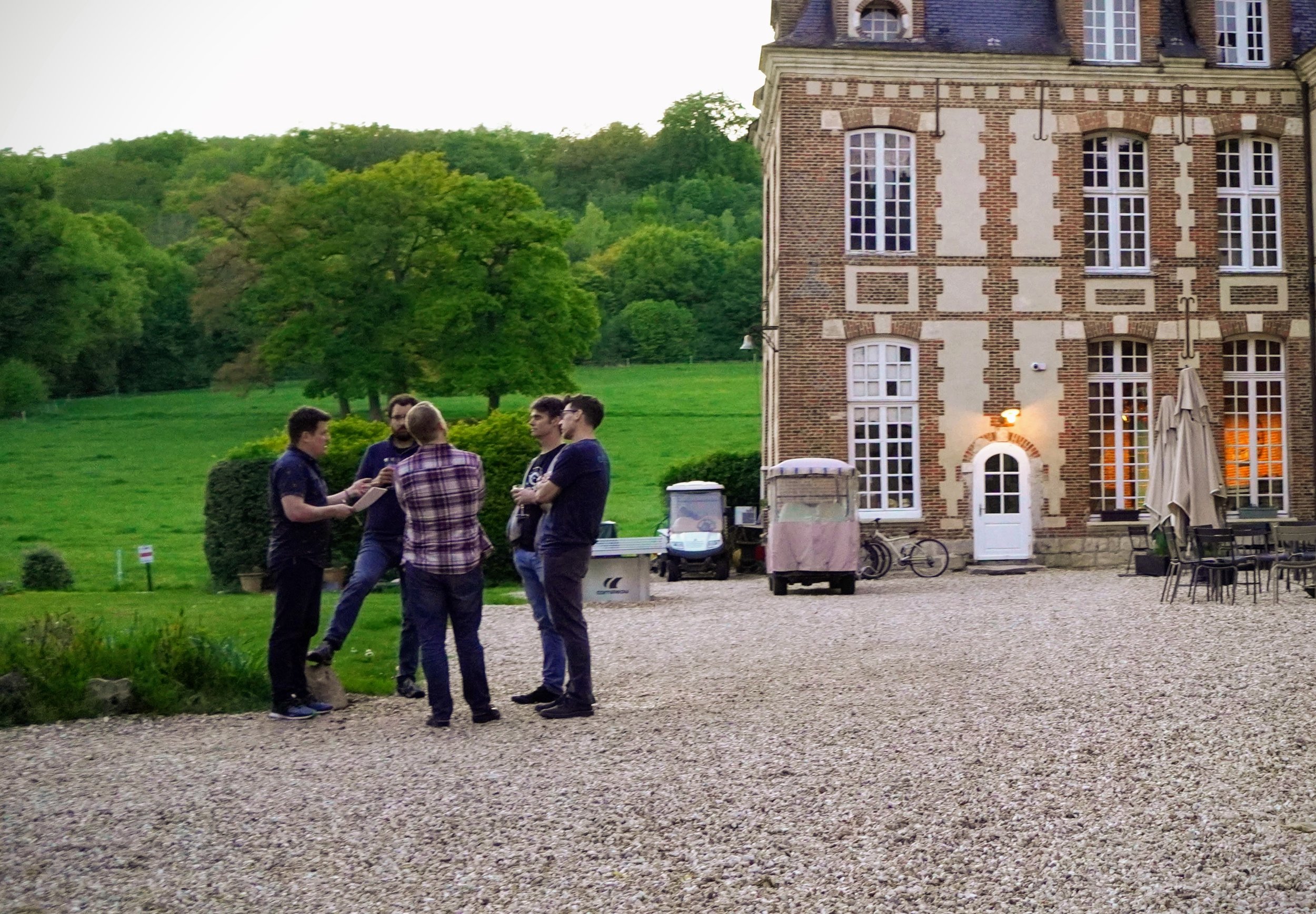
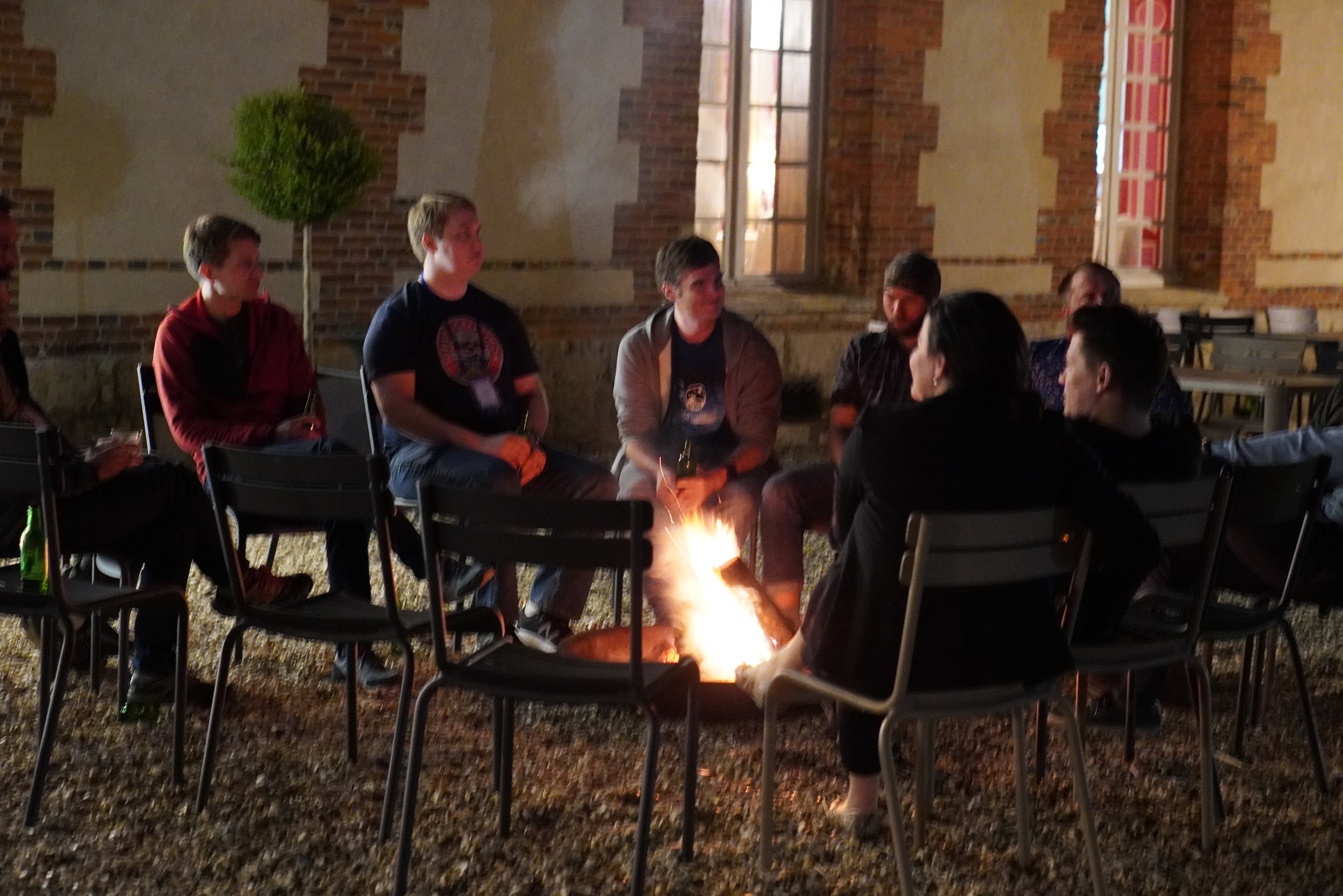
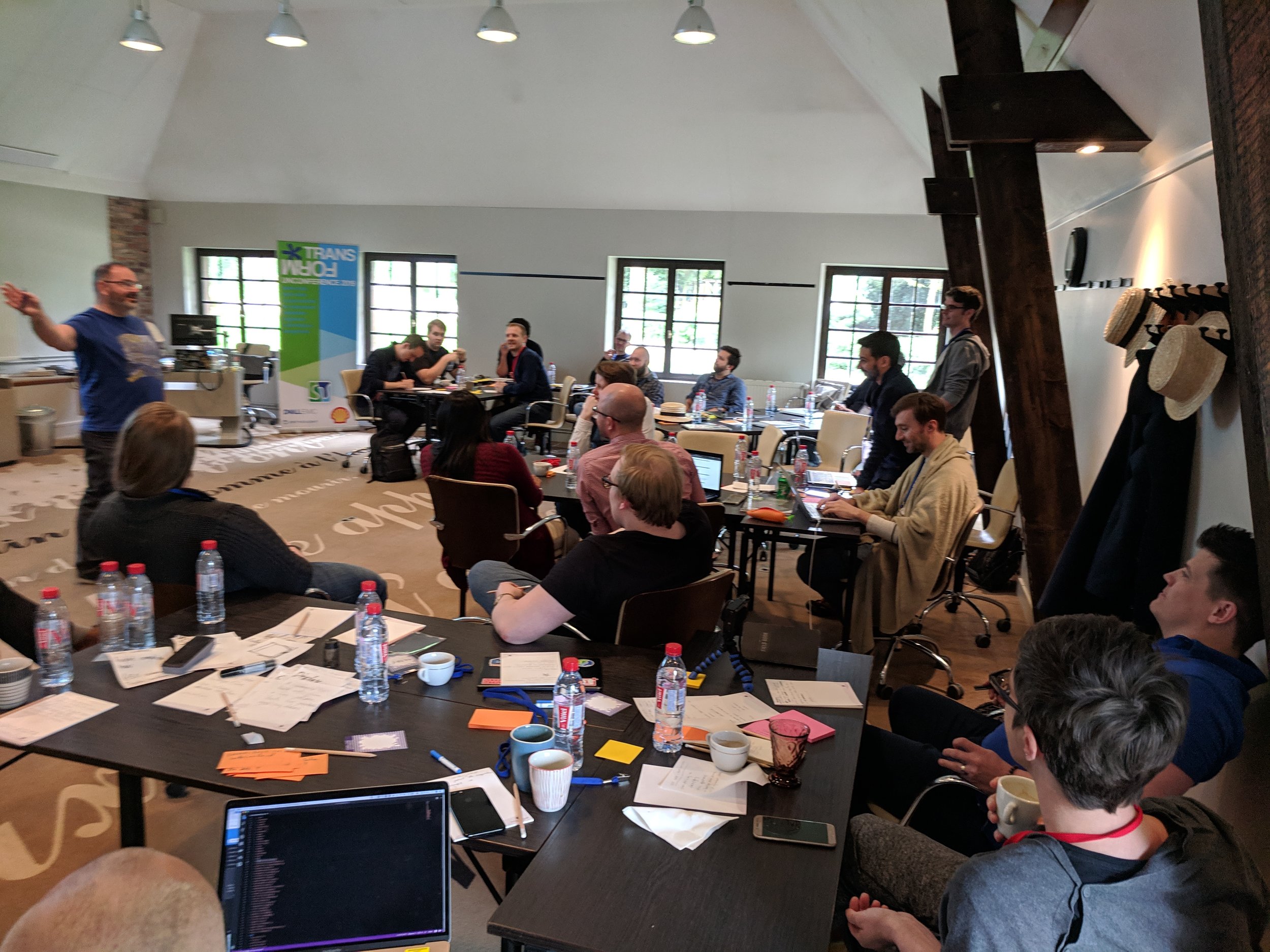
Last week, Agile hosted the TRANSFORM unconference in Normandy, France. We were there to talk about the open suburface stack — the collection of open-source Python tools for earth scientists. We also spent time on the state of the Software Underground, a global community of practice for digital subsurface scientists and engineers. In effect, this was the first annual Software Underground conference. This was SwungCon 1.

The space

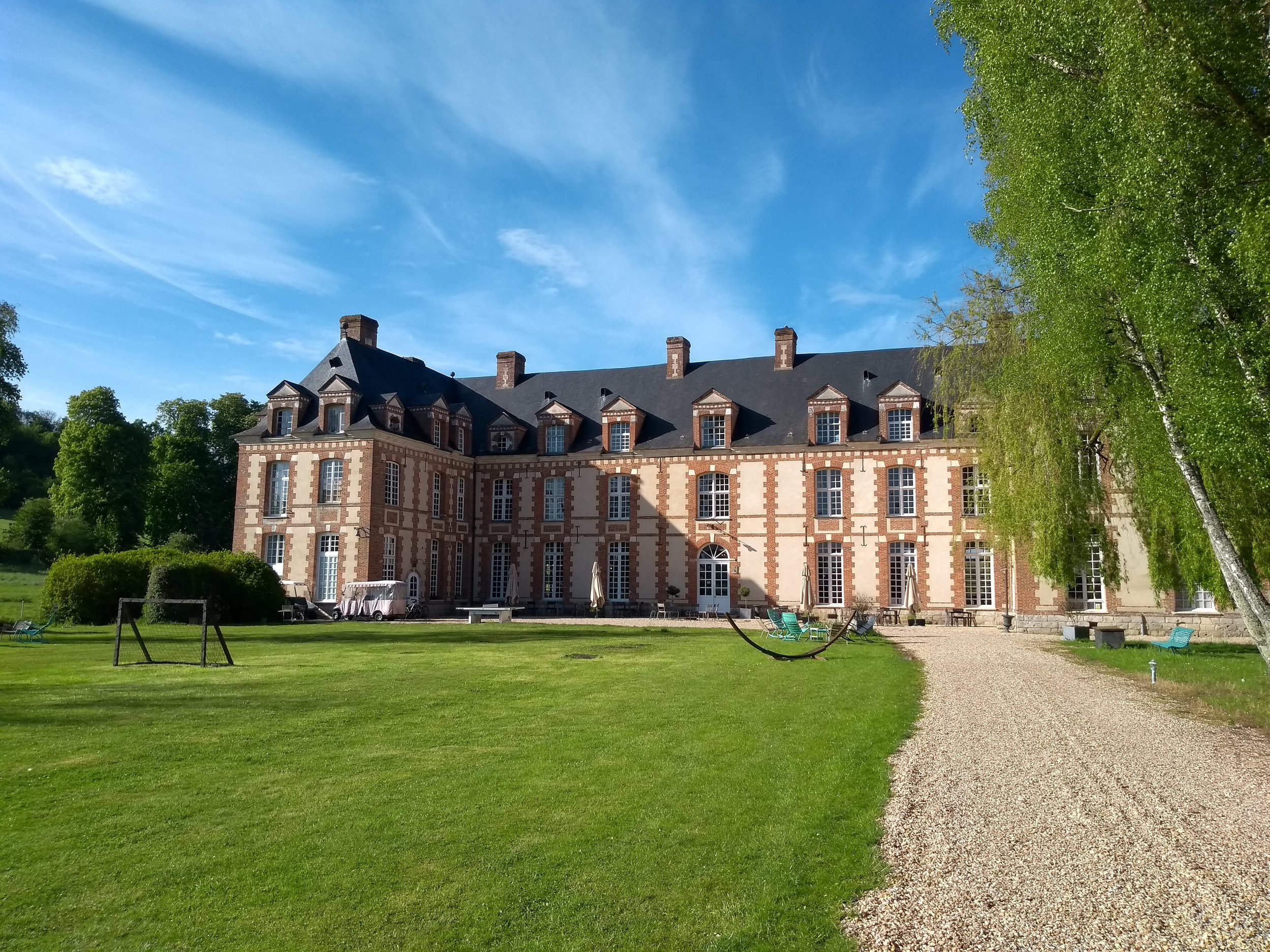
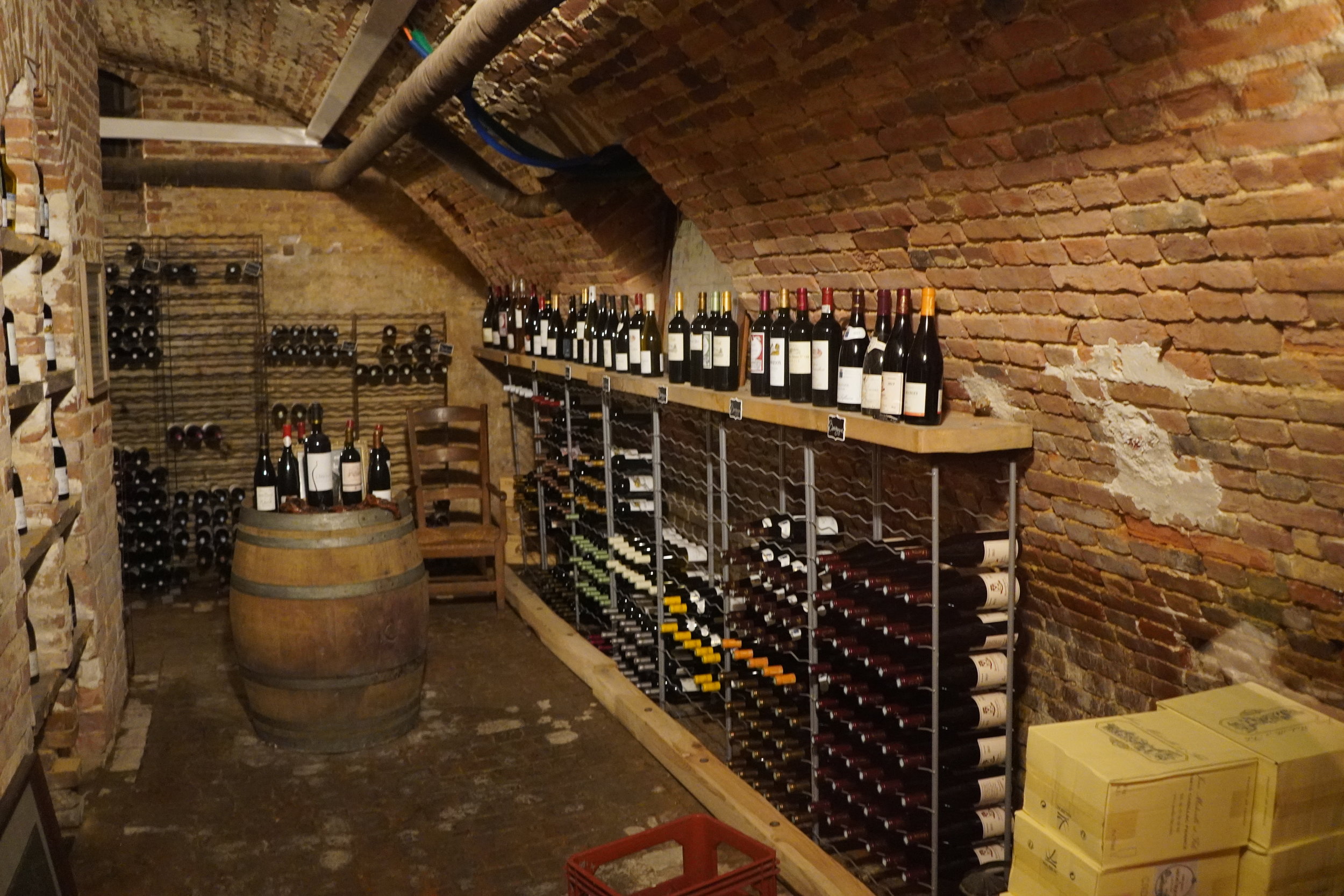
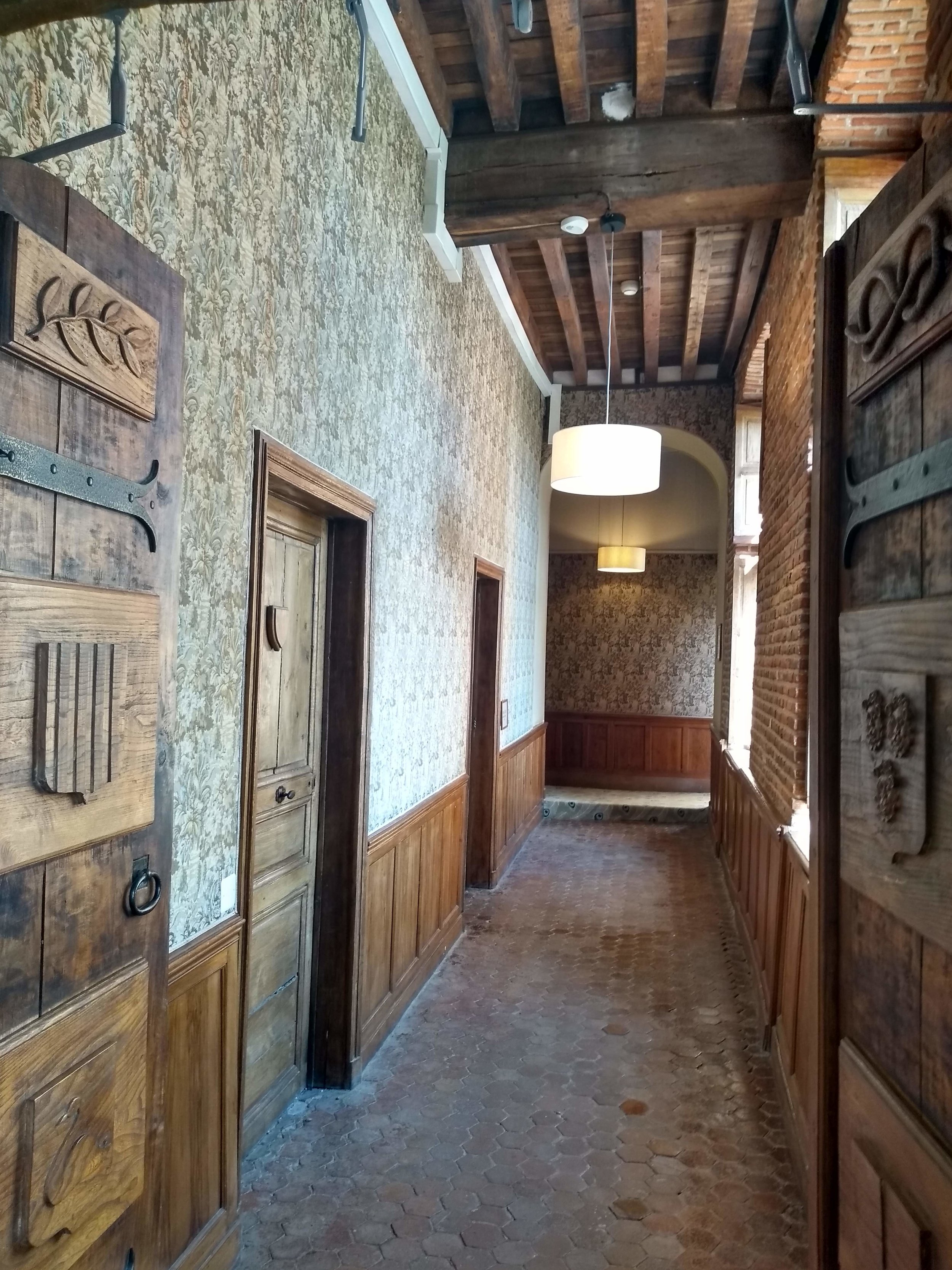
I knew the Château de Rosay was going to be nice. I hoped it was going to be very nice. But it wasn’t either of those things. It exceeded expectations by such a large margin, it seemed a little… indulgent, Excessive even. And yet it was cheaper than a Hilton, and you couldn’t imagine a more perfect place to think and talk about the future of open source geoscience, or a more productive environment in which to write code with new friends and colleagues.

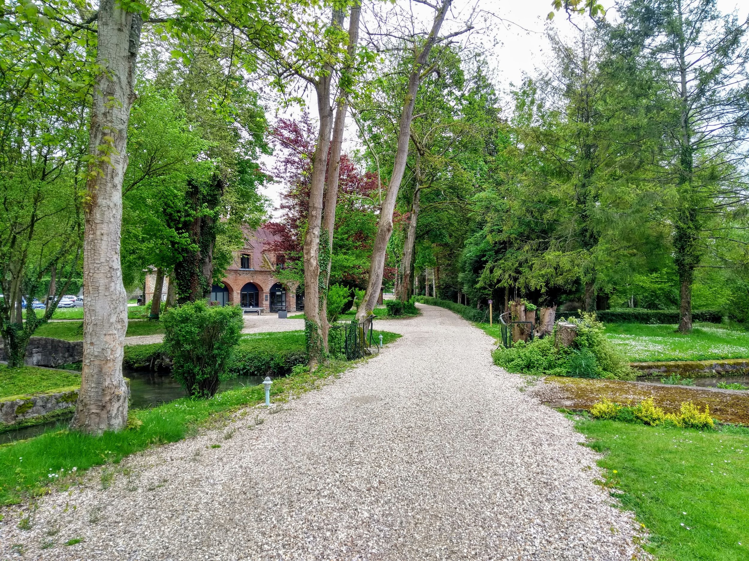
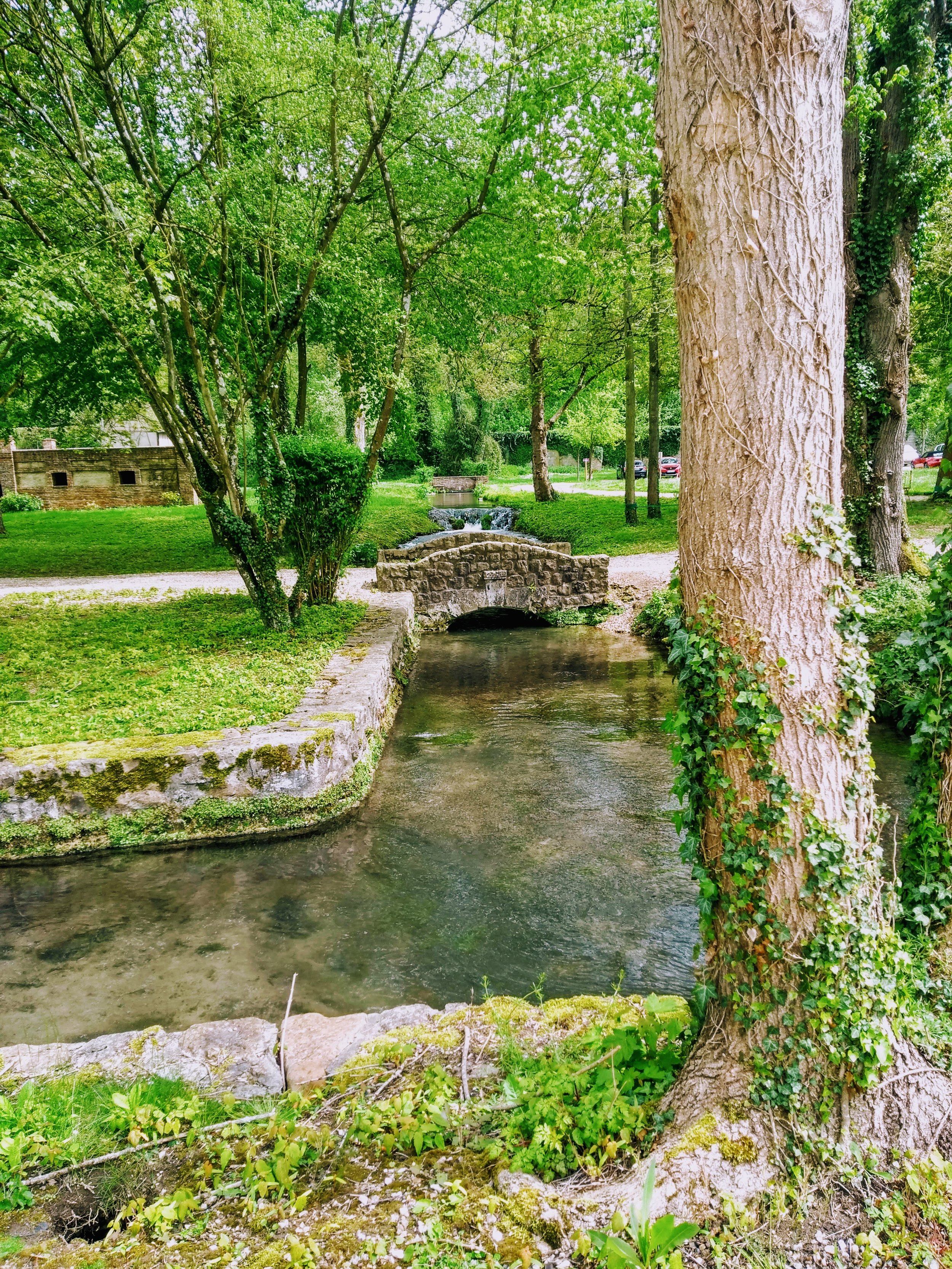
It turns out that a 400-year-old château set in 8 acres of parkland in the heart of Normandy is a great place to create new things. I expect Gustave Flaubert and Guy de Maupassant thought the same when they stayed there 150 years ago. The forty-two bedrooms house exactly the right number of people for a purposeful scientific meeting.

This is frustrating, I’m not doing the place justice at all.

The work

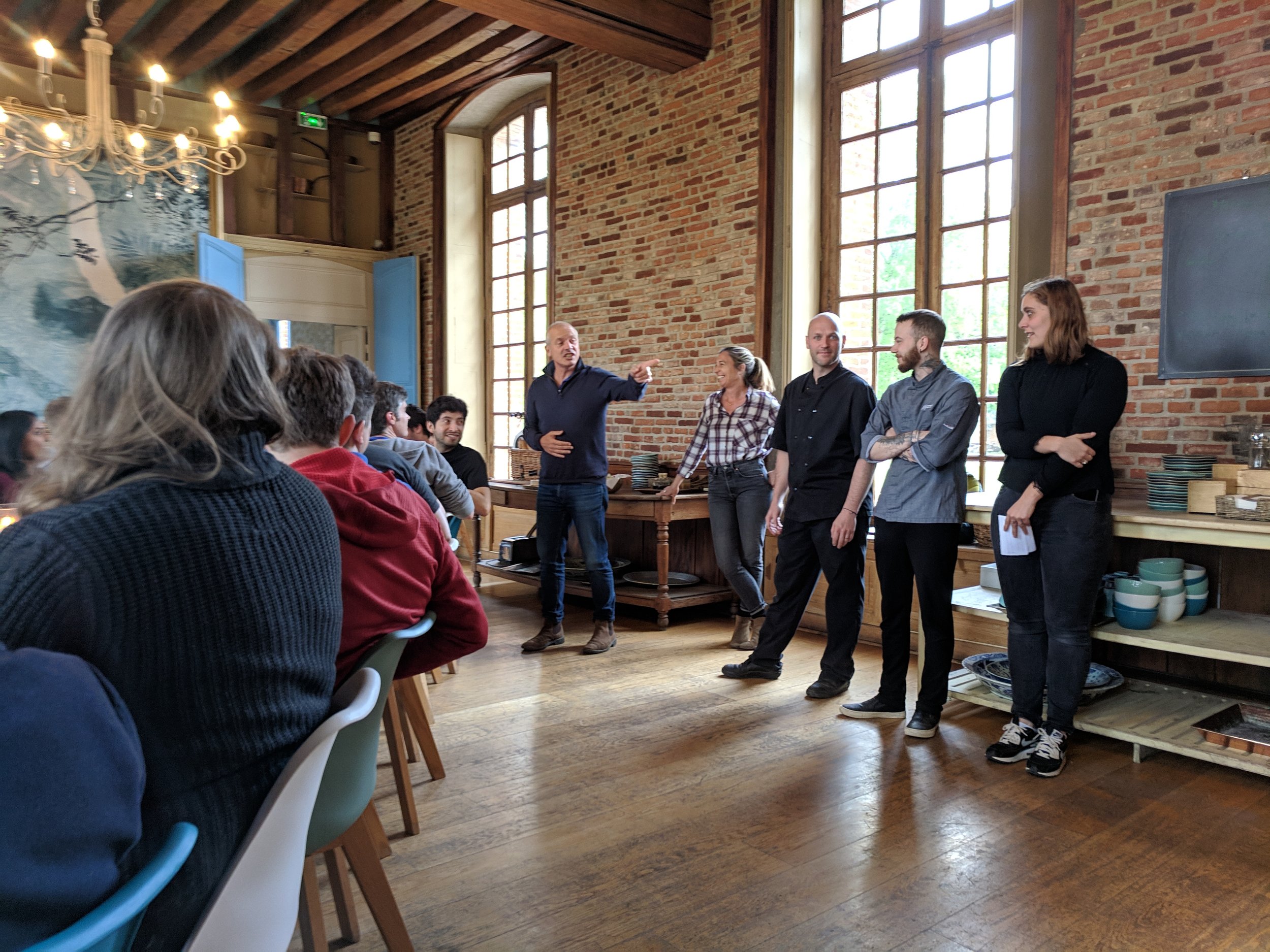
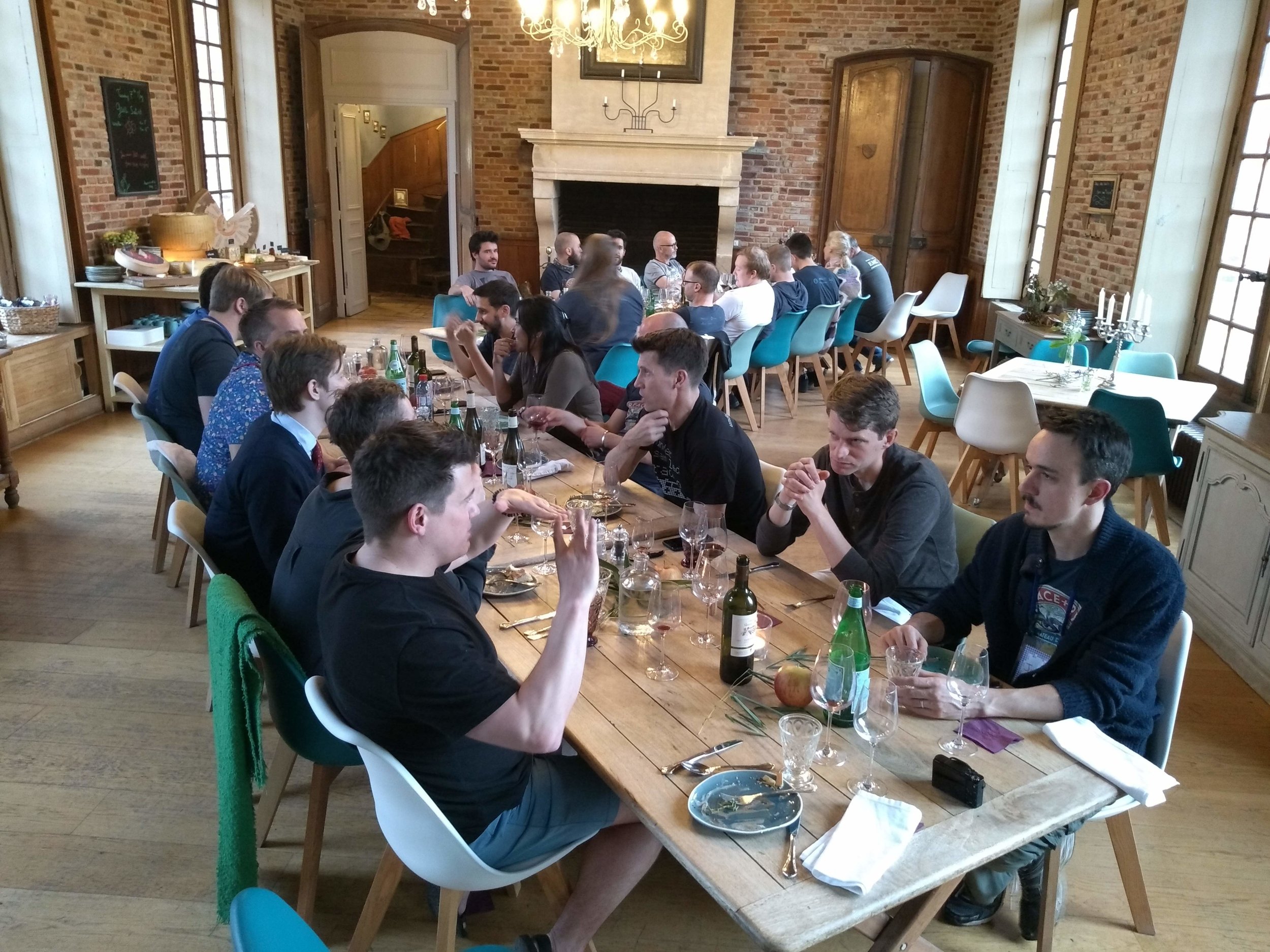
This was most people’s first experience of an unconference. It was undeniably weird walking into a week-long meeting with no schedule of events. But, despite being inexpertly facilitated by me, the 26 participants enthusiastically collaborated to create the agenda on the first morning. With time, we appreciated the possibilities of the open space — it lets the group talk about exactly what it needs to talk about, exactly when it needs to talk about it.

The topics ranged from the governance and future of the Software Underground, to the possibility of a new open access journal, interesting new events in the Software Underground calendar, new libraries for geoscience, a new ‘core’ library for wells and seismic, and — of course — machine learning. I’ll be writing more about all of these topics in the coming weeks, and there’s already lots of chatter about them on the Software Underground Slack (which hit 1500 members yesterday!).

The food

I can’t help it. I have to talk about the food.

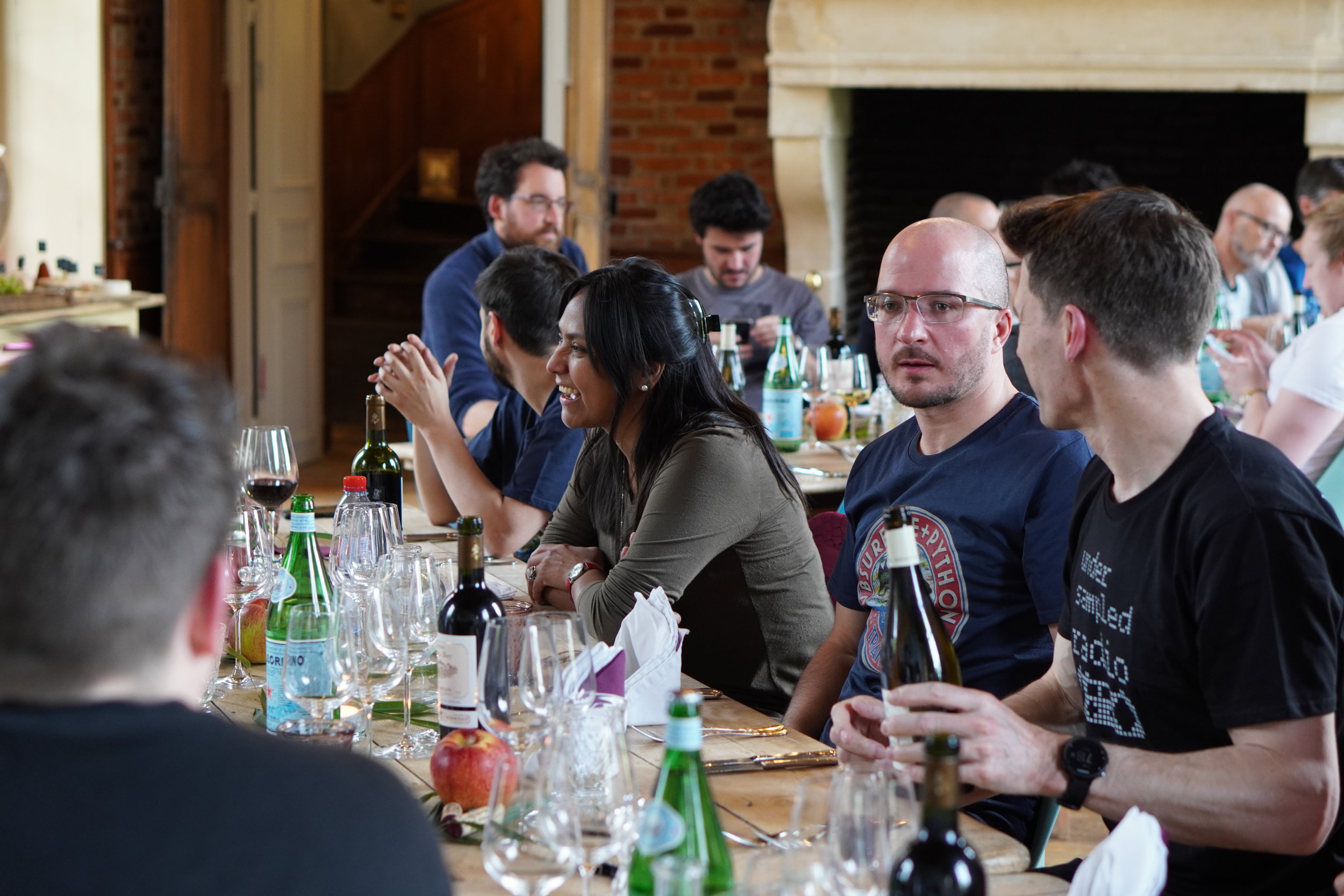
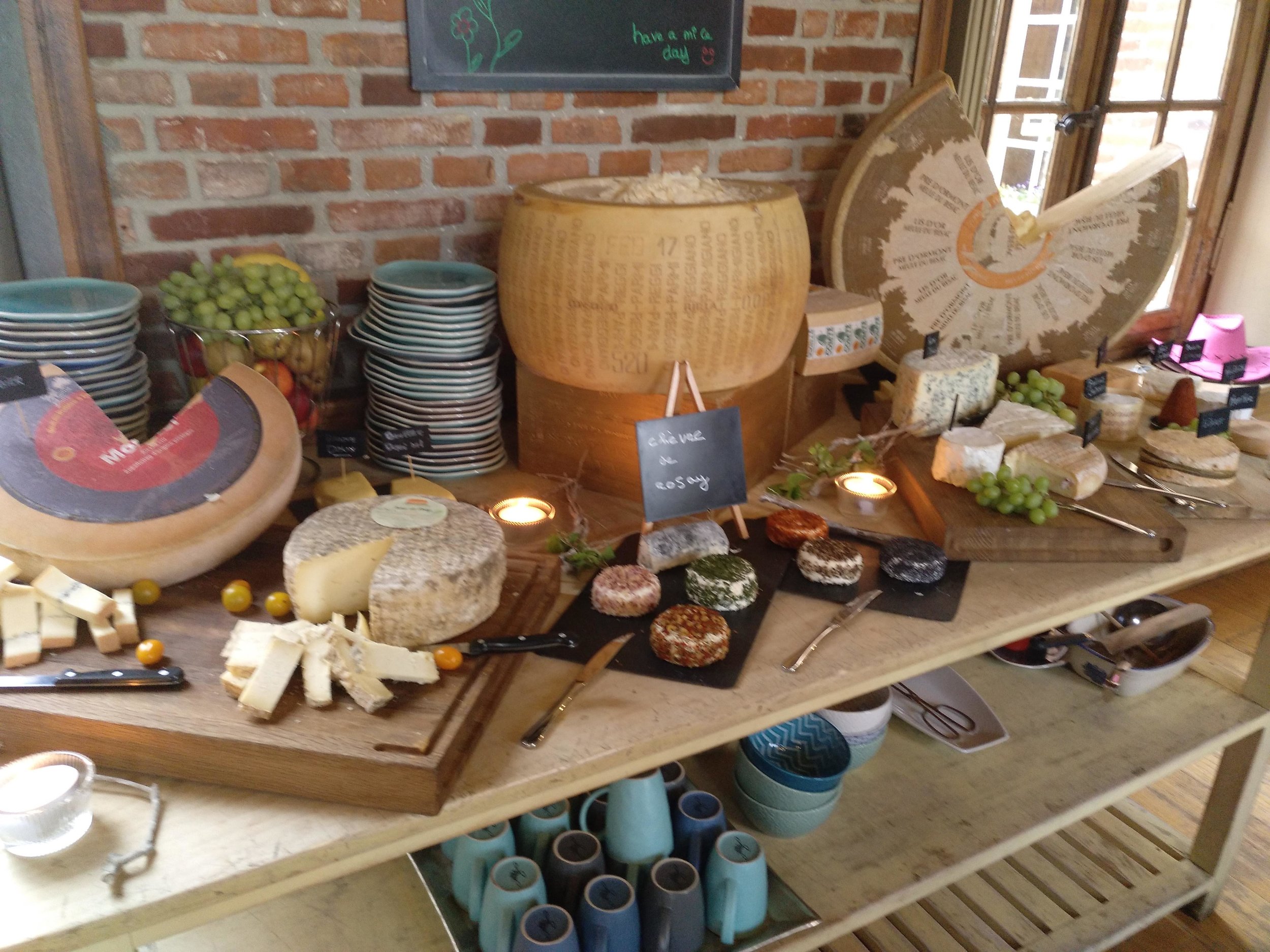
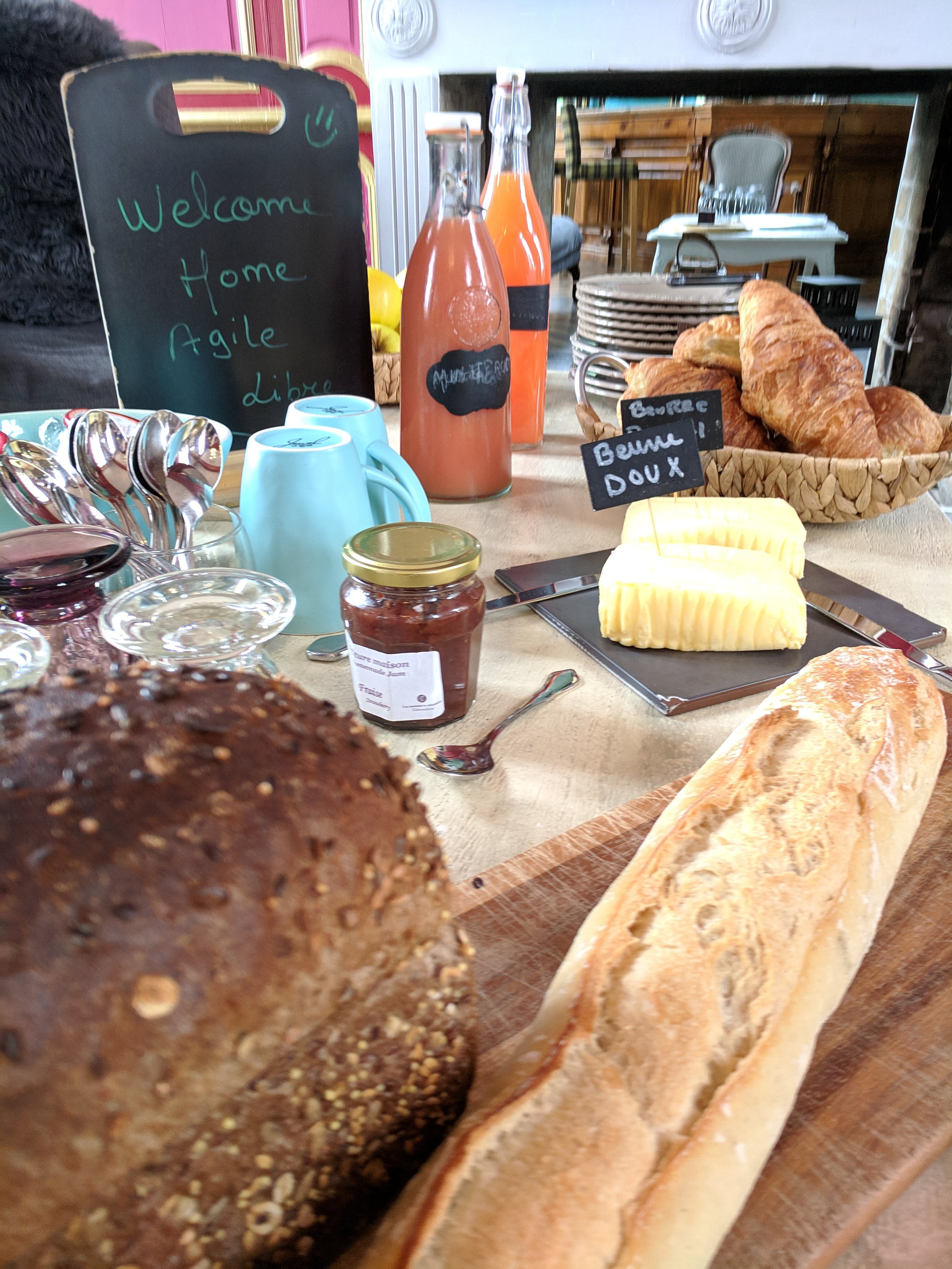
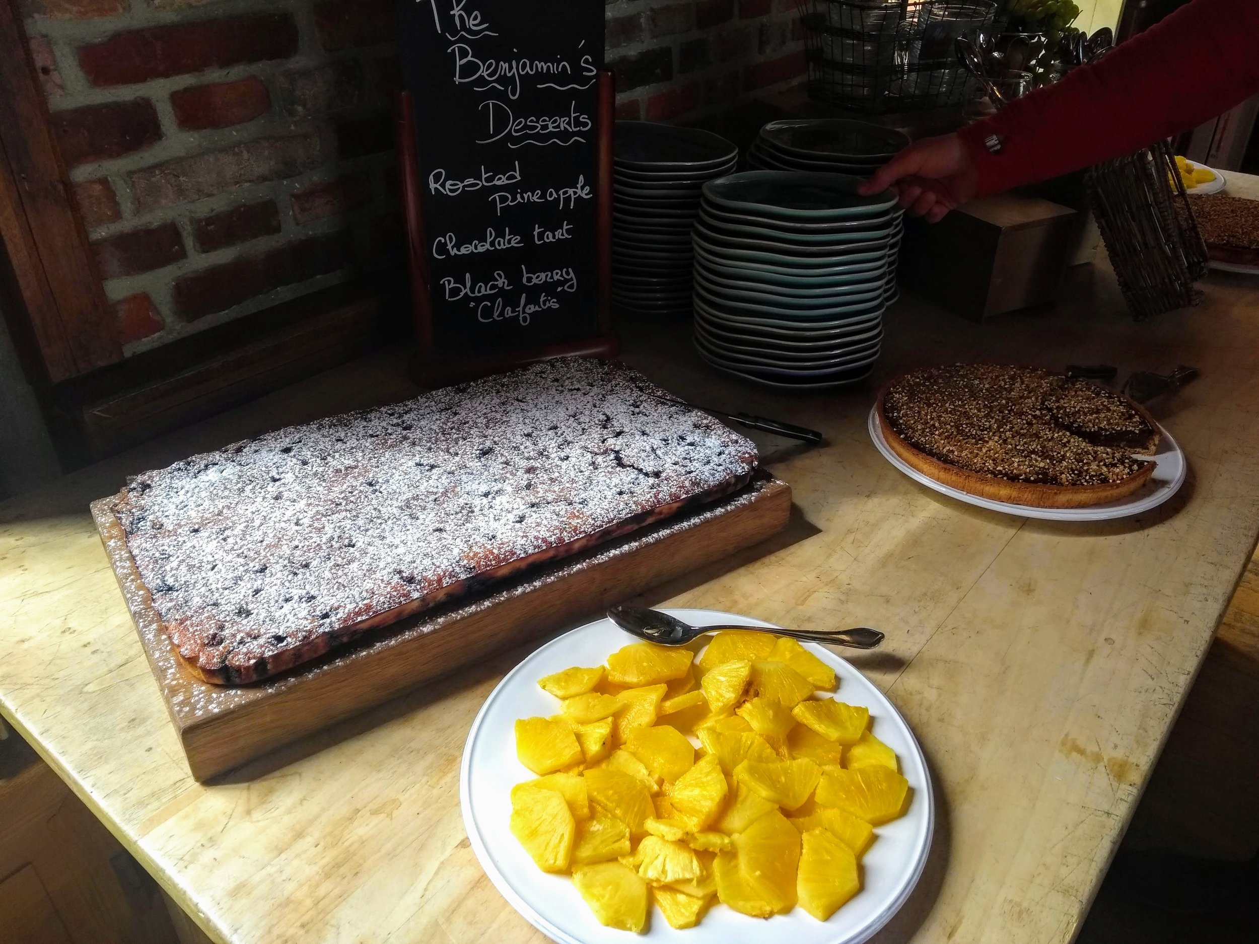
…but I’m not sure where to start. The full potential of food — to satisfy, to delight, to start conversations, to impress, to inspire — was realized. The food was central to the experience, but somehow not even the most wonderful thing about the experience of eating at the chateau. Meals were prefaced by a presentation by the professionals in the kitchen. No dish was repeated… indeed, no seating arrangement was repeated. The cheese was — if you are into cheese — off the charts.

There was a professionalism and thoughtfulness to the dining that can perhaps only be found in France.

Sorry everyone. This was one of those occasions when you had to be there. If you weren’t there, you missed out. I wish you’d been there. You would have loved it.

The good news is that it will happen again. Stay tuned.

Feel superhuman: learning and teaching geocomputing

Diego teaching in Houston in 2018.

Diego teaching in Houston in 2018.

It’s five years since we started teaching Python to geoscientists. To be honest, it might have been premature. At the time, Evan and I were maybe only two years into serious, daily use of Python. But the first class, at the Atlantic Geological Society’s annual meeting in February 2014, was free so the pressure was not too high. And it turns out that only being a step or two ahead of your students can be an advantage. Your ‘expert blind spot’ is partially sighted not completely blind, because you can clearly remember being a noob.

Being a noob is a weird, sometimes very uncomfortable, even scary, feeling for some people. Many of us are used to feeling like experts, at least some of the time. Happy, feeling like a noob is a core competency in programming. Learning new things is a more or less hourly experience for coders. Even a mature language like Python evolves fast enough that it’s hard to keep up. Instead of feeling threatened or exhausted by this, I think the best strategy is to enjoy it. You’ll never be done, there are (way) more questions than answers, and you can learn forever!

One of the bootcamp groups at the Copenhagen hackathon in 2018

One of the bootcamp groups at the Copenhagen hackathon in 2018

This week we’re teaching our 40th course. Last year alone we gave digital superpowers to 325 people, mostly geoscientists, Not all of them learned to code, as such — some people already could, and some found out theydidn’t like it… coding really isn’t for everyone. But I think all of them learned something new about technology, and how it can serve them and their science. I hope all of them look at spreadsheets, and Petrel, and websites differently now. I think most of them want, at some point, to learn more. And everyone is excited about machine learning.

The expanding community of quantitative earth scientists

This year we’ve already spent 50 days teaching, and taught 174 people. Imagine that! I get emotional when I think about what these hundreds of new digital geoscientists and engineers will go and do with their new skills. I get really excited when I see what they are already doing — when they come to hackathons, send us screenshots, or write papers with beautiful figures. If the joy of sharing code and collaborating with peers has also rubbed off on them, there’s no telling where it could lead.

Matt teaching in Aberdeen in October 2018

Matt teaching in Aberdeen in October 2018

The last nine months or so have been an adventure. Teaching is not supposed to be what Agile is about. We’re a consulting company, a technology company. But for now we’re mostly a training company — it’s where we’re needed. And it makes sense... Programming is fundamentally about knowledge sharing. Teaching is about helping, collaborating. It’s perfect for us.

Besides, it’s a privilege and a thrill to meet all these fantastically smart, motivated people and to hear about their projects and their plans. Sometimes I wish it didn’t mean leaving my family in Nova Scotia and flying to Houston and London and Kuala Lumpur and Kalamazoo… but mostly I wish we could do more of it. Especially when we get comments like these:

Given how ‘dry’ programming can be, it was DYNAMIC.”
”Excellent teachers with geoscience background.”
”Great instructors, so so approachable, even for newbies like me.”
”Great course [...] Made me realize what could be done in a short time.”
”My only regret was not taking a class like this sooner.”
”Very positive, feel superhuman.

How many times have you felt superhuman at work recently?

The courses we teach are evolving and expanding in scope. But they all come back to the same thing: growing digital skills in our profession. This is critical because using computers for earth science is really hard. Why? The earth is weird. We’ve spent hundreds of years honing conceptual models, understanding deep time, and figuring out complex spatial relationships.

If data science eats the subsurface without us, we’re all going to get indigestion. Society needs to better understand the earth — for all sorts of reasons — and it’s our duty to build and adopt the most powerful analytical tools available so that we can help.


Learning resources

If you can’t wait to get started, here are some suggestions:

Classroom courses are a big investment in dollars and time, but they can get you a long way really quickly. Our courses are built especially for subsurface scientists and engineers. As far as I know, they are the only ones of their kind. If you think you’d like to take one, talk to us, or look out for a public course. You can find out more or sign up for email alerts here >> https://agilescientific.com/training/

Last thing: I suggest avoiding DataCamp, because of sexual misconduct by an executive, compounded by total inaction, dishonest obfuscation, and basically failing spectacularly. Even their own trainers have boycotted them. Steer clear.

The order of stratigraphic sequences

Much of stratigraphic interpretation depends on a simple idea:

Depositional environments that are adjacent in a geographic sense (like the shoreface and the beach, or a tidal channel and tidal mudflats) are adjacent in a stratigraphic sense, unless separated by an unconformity.

Usually, geologists are faced with only the stratigraphic picture, and are challenged with reconstructing the geographic picture.

One interpretation strategy might be to look at which rocks tend to occur together in the stratigraphy. The idea is that rock types tend to be associated with geographic environments — maybe fine sand on the shoreface, coarse sand on the beach; massive silt in the tidal channel, rhythmically laminated mud in the mud-flats. Since if two rocks tend to occur together, their environments were probably adjacent, we can start to understand associations between the rock types, and thus piece together the geographic picture.

So which rock types tend to occur together, and which juxtapositions are spurious — perhaps the result of allocyclic mechanisms like changes in relative sea-level, or sediment supply? To get at this question, some stratigraphers turn to Markov chain analysis.

What is a Markov chain?

Markov chains are sequences of events, or states, resulting from a Markov process. Here’s how Wikipedia describes a Markov process:

A stochastic process that satisfies the Markov property (sometimes characterized as “memorylessness”). Roughly speaking, a process satisfies the Markov property if one can make predictions for the future of the process based solely on its present state just as well as one could knowing the process’s full history, hence independently from such history; i.e., conditional on the present state of the system, its future and past states are independent.

So if we believe that a stratigraphic sequence (I’m using ‘sequence’ here in the most general sense) can be modeled by a process like this — i.e. that its next state depends substantially on its present state — then perhaps we can model it as a Markov chain.

For example, we might have a hunch that we can model a shallow marine system as a sequence like:

offshore mudstone > lower shoreface siltstone > upper shoreface sandstone > foreshore sandstone

Then we might expect to see these transitions occur more often than other, non-successive transitions. In other words — if we compare the transition frequencies we observe to the transition frquencies we would expect from a random sequence of the same beds in the same proportions, then autocyclic or genetic transitions might happen unusually frequently.

The Powers & Easterling method

Several workers have gone down this path. The standard approach seems to be that of Powers & Easterling (1982). Here are the steps they describe:

  • Count the upwards transitions for each rock type. This results in a matrix of counts. Here’s the transition frequency matrix for the example used in the Powers & Easterling paper, in turn taken from Gingerich (1969):

 
data = [[ 0, 37,  3,  2],
        [21,  0, 41, 14],
        [20, 25,  0,  0],
        [ 1, 14,  1,  0]]
  • Compute the expected counts by an iterative process, which usually converges in a few steps. The expected counts represent what Goodman (1968) called a ‘quasi-independence’ model — a random sequence:

 
array([[ 0. , 31.3,  8.2,  2.6],
       [31.3,  0. , 34.1, 10.7],
       [ 8.2, 34. ,  0. ,  2.8],
       [ 2.6, 10.7,  2.8,  0. ]])
  • Now we can compare our observed frequencies with the expected ones in two ways. First, we can inspect the \(\chi^2\) statistic, and compare it with the \(\chi^2\) distribution, given the degrees of freedom (5 in this case). In this example, it’s 35.7, which is beyond the 99.999th percentile of the chi-squared distribution. This rejects the hypothesis of quasi-independence. In other words: the succession appears to be organized. Phew!

  • Secondly, we can compute a matrix of so-called normalized differences. This lets us compare the observed and expected data. By calculating Z-scores, which are approximately normally distributed; since 95% of the distribution falls between −2 and +2, any value greater in magnitude than 2 is ‘fairly unusual’, in the words of Powers & Easterling. In the example, we can see that the large number of transitions from C (third row) to A (first column) is anomalous:


array([[ 0. ,  1. , -1.8, -0.3],
       [-1.8,  0. ,  1.2,  1. ],
       [ 4.1, -1.6,  0. , -1.7],
       [-1. ,  1. , -1.1,  0. ]])
powers_easterling_normdiff.png
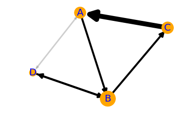
  • The normalized difference matrix can also be interpreted as a directed graph, indicating the ‘strengths’ of the connections (edges) between rock types (nodes):

powers_easterling_graph.png

It would be all too easy to over-interpret this graph — B and D seem to go together, as do A and C, and C tends to pass into A, which tends to pass into a B/D system before passing back into C — and one could get carried away. But as a complement to sedimentological interpretation, knowledge of processes and the succession in hand, perhaps inspecting Markov chains can help understand the stratigraphic story.

One last thing… there is another use for Markov chains. We can also use the model to produce stochastic realizations of stratigraphy. These will share the same statistics as the original data, but are otherwise quite random. Here are 20 random beds generated from our model:

 
'ABABCBABABCABDABABCA'

The code to build your own Markov chains is all in this notebook. It’s very much a work in progress. Eventually I hope to merge it into the striplog library, but for now it’s a ‘minimum viable product’. Stay tuned for more on striplog.

Open In Colab   ⇐   Launch the notebook right here in your browser!


References

Gingerich, PD (1969). Markov analysis of cyclic alluvial sediments. Journal of Sedimentary Petrology, 39, p. 330-332. https://doi.org/10.1306/74D71C4E-2B21-11D7-8648000102C1865D

Goodman, LA (1968), The analysis of cross-classified data: independence, quasi-independence, and interactions in contingency tables with or without missing entries. Journal of American Statistical Association 63, p. 1091-1131. https://doi.org/10.2307/2285873

Powers, DW and RG Easterling (1982). Improved methodology for using embedded Markov chains to describe cyclical sediments. Journal of Sedimentary Petrology 52 (3), p. 0913-0923. https://doi.org/10.1306/212F808F-2B24-11D7-8648000102C1865D

Machine learning project review checklist

Imagine being a manager or technical chief whose team has been working on a machine learning project. What questions should you be thinking about when your team tells you about their work?

Here are some suggestions. Some of the questions are getting at reproducibility (for testing, archiving, or sharing the workflow), others at quality assurance. A few of the questions might depend on the particular task in hand, although I’ve tried to keep it pretty generic.

There are a few must-ask questions, highlighted in bold.

High-level questions about the project

  • What question were you trying to answer? How did you frame it as an ML task?

  • What is human-level performance on that task? What level of performance is needed?

  • Is it possible to approach this problem without machine learning?

  • If the analysis focused on deep learning methods, did you try shallow learning methods?
  • What are the ethical and legal aspects of this project?

  • Which domain experts were involved in this analysis?

  • Which data scientists were involved in this analysis?

  • Which tools or framework did you use? (How much of a known quantity is it?)

  • Where is the pipeline published? (E.g. public or internal git repositories.)

  • How thorough is the documentation?

Questions about the data preparation

  • Where did the feature data come from?

  • Where did the labels come from?

  • What kind of data exploration did you do?

  • How did you clean the data? How long did this take?

  • Are the classes balanced? How did the distribution change your workflow?

  • What kind of normalization did you do?

  • What did you do about missing data? E.g. what kind of imputation did you do?

  • What kind of feature engineering did you do?

  • How did you split the data into train, validate and test?

Questions about training and evaluation

  • Which models did you explore and why? Did you also try the simplest models that fit the problem?

  • How did you tune the hyperparameters of the model? Did you try grid search or other methods?
  • What kind of validation did you do? Did you use cross-validation? How did you choose the folds?

  • What evaluation metric are you using? Why is it the most appropriate one?

  • How do training, validation, and test metrics compare?

  • If this was a classification task, how does a dummy classifier score?

  • How are errors/residuals distributed? (Ideally normally distributed and  homoscedastic.)

  • How interpretable is your model? That is, do the learned parameters mean anything, and can we learn from them? E.g. what is the feature importance?

  • If this was a classification task, are probabilities available in your model and did you use them?

  • If this was a regression task, have you checked the residuals for normality and homoscedasticity?

  • Are there benchmarks for this task, and how well does your model do on them?

Next steps for the project

  • How will you improve the model?

  • Would collecting more data help? Can we address the imbalance with more data?

  • Are there human or computing resources you need access to?

  • How will you deploy the model?

Rather than asking them explicitly, a reviewer might check things off while reading a report or listening to a presentation. A thorough review would cover most of the points without being prompted. And I’d go so far as to say that a person or team who has done a rigorous treatment should readily have answers to all of these questions. They aren't supposed to be 'traps' exactly, but they are supposed to get to the heart of the issues the data scientist or team likely faced during their work.

What do you think? Are the questions fair? Are there any you would remove, or others you would add? Let me know in the comments.

Visit a Google Docs version of this checklist.


Thank you to members of the Software Underground Slack channel for discussion of these questions, especially Anton Biryukov, Justin Gosses, and Lukas Mosser.

What makes a good benchmark dataset?

Last week I mentioned that we need more open benchmark datasets in geoscience. I think benchmarks are important for researchers to work on, as a teaching aid, and as a way for us to objectively measure how well we’re doing on a particular problem. How else can we know how we’re doing, or compare Company X’s claim with Company Y’s?

What makes a good benchmark?

I haven’t unearthed any guides from other domains to help answer this question, and we don’t yet have enought experience to know for ourselves. But here’s what I’m thinking:

  • It must address at least one clear machine learning task. The more obviously useful the task, the more useful (and important) the benchmark. The benchmark dataset should be well suited to the task (but does not have to be comprehensive or definitive).

  • It must be open. That means explicitly licensed with an open, and preferably permissive, license. I think we need to avoid non-permissive (so-called ‘copyleft’) licenses, because it’s not clear how the ‘sharealike’ clause would affect works that depended on the dataset. And we definitely need to avoid restrictive non-commercial clauses.

  • It must be discoverable and accessible. In other words, it needs to be easy to find, and anyone should be able to get it, without registering on a website or waiting for an email or doing anything else that slows down the pace of their research. A properly open dataset can be replicated anywhere, so openness should take care of this.

  • It must have enough features to be interesting. This might mean different things for different tasks, but in general we’d like to see a few physical measurements (e.g. seismic, well logs, RockEval, core photos, field observations, flow rates, and so on). The features should be independent — we can always generate derivatives.

  • It must have labels. As well as some interesting features, the dataset must have some interpretive information with high information value (e.g. seismic facies, lithologies, deposotional environment, sequence boundaries, EURs, and so on). Usually, these are expensive to acquire (which is partly why we’d like to be able to predct them).

  • It should name suitable prediction error evaluation methods, with reference implementations, for the intended task. If people are to use it as a score benchmark, they need to know how to score their own implementations of the task.

  • It can be de-localized, but not completely. We don’t need to know the exact whereabouts of the dataset, but if we remove the relative spatial relationships between wells, say, or don’t know which basin we’re in, then the questions we can ask about the data get a lot less interesting, and the whole situation gets much less realistic.

  • It should not be too big. More than about 1GB means unwieldy. It means difficult to download. It means too much room for nuance. And it means it’s probably impossible to explore in the space of a tutorial. It’s also much harder to get a big dataset into shape than a smaller one. A few thousand records, maybe 100,000 in some cases, is probably plenty.

  • It should be clean, but not too clean. No-one wants to spend hours processing a dataset before it can be used, or — worse — be bitten by some esoteric data problem only a domain expert would spot. But, on the other hand, a dataset with no issues at all might be a bit boring. And, in subsurface at least, completely unrepresentative!

  • It should be well documented. The dataset needs to be described to non-technical people, who know little or nothing about the subsurface. Remember that many users will not be proficient programmers either, so…

  • It should have an accompanying demonstration. For example, a script or notebook, preferably in at least a couple of languages, that shows how to load and inspect the data. Ideally this would include a demonstration of how to pose, and answer, a straightforward question as a machine learning task.

I’m not sure we can call this last one a criterion, but maybe in an ideal world…

  • It should be launched with a data science contest. If you’re felling really brave, what better way to attract attention to the new open dataset than with a Kaggle-style contest?

It’s certainly true that there are several datasets around. Unfortunately, the openness criterion eliminates most of them, so they fall at the first hurdle. For example, the very nice dataset that Brendon Hall used in the SEG machine learning contest is not open.

If you know of a dataset that could be coerced into meeting most of these criteria, we’d like to hear about it. I know a small army of people that would love to help get it into the open, and into the hands of machine learning researchers all over the world.


The thumbnail image for this post was adapted from an image by user arg_flickr on Flickr, licensed CC-BY.

Thanks to several people on Software Underground, for the discussion on this topic. In particular, Justin Gosses and Lukas Mosser pointed out the need for transparent error evaluation.

Closing the gap: what next?

I wrote recently about closing the gap between data science and the subsurface domain, naming some strategies that I think will speed up this process of digitalization.

But even after the gap has closed in your organization, you’re really just getting started. It’s not enough to have contact between the two worlds, you need most of your actvity to be there. This means moving it from wherever it is now. This means time, and effort, and mistakes.

Strategies for 2020+

Hardly any organizations have got to this point yet. And I certainly don’t know what it looks like when we get there as a discipline. But nonetheless I think I’m starting to see what’s going to be required to continue to build into the gap. Soon, we’re going to need to think about these things.

  • We’re bad at hiring; we need to be awesome at it*. We need to stop listening to the pop psychology peddled by HR departments (Myers-Briggs, lol) and get serious about hiring brilliant scientific and technical talent. It’s going to take some work because a lot of brilliant scientists and technical talent aren’t that interested in subsurface.

  • You need to get used to the idea that digital scientists can do amazing things quickly. These are not your corporate timelines. There are no weekly meetings. Protoyping a digital technology, or proving a concept, takes days. Give me a team of 3 people and I can give you a prototype this time next week.

  • You don’t have to do everything yourself. In fact, you don’t want to, because that would be horribly slow. For example, if you have a hard problem at hand, Kaggle can get 3000 teams of fantastically bright people to look at it for you. Next week.

  • We need benchmark datasets. If anyone is going to be able to test anything, or believe any claims about machine learning results, then we need benchmark data. Otherwise, what are we to make of claims like “98% accuracy”? (Nothing, it’s nonsense.)

  • We need faster research. We need to stop asking people for static, finished work — that they can only present with PowerPoint — months ahead of a conference… then present it as if it’s bleeding edge. And do you know how long it takes to get a paper into GEOPHYSICS?

  • You need Slack and Stack Overflow in your business. These two tools have revolutionized how technical people communicate and help each other. If you have a large organization, then your digital scientists need to talk to each other. A lot. Skype and Yammer won’t do. Check out the Software Underground if you want to see how great Slack is.

Even if your organization is not quite ready for these ideas yet, you can start laying the groundwork. Maybe your team is ready. You only need a couple of allies to get started; there’s always something you can do right now to bring change a little sooner. For example, I bet you can:

  • List 3 new places you could look for amazing, hireable scientists to start conversations with.

  • Find out who’s responsible for technical communities of practice and ask them about Slack and SO.

  • Find 3 people who’d like to help organize a hackathon for your department before the summer holidays.

  • Do some research about what it takes to organize a Kaggle-style contest.

  • Get with a colleague and list 3 datasets you could potentially de-locate and release publically.

  • Challenge the committe to let you present in a new way at your next technical conference.

I guarantee that if you pick up one of these ideas and run with it for a bit, it’ll lead somewhere fun and interesting. And if you need help at some point, or just want to talk about it, you know where to find us!


* I’m not being flippant here. Next time you’re at a conference, go and talk to the grad students, all sweaty in their suits, getting fake interviews from recruiters. Look at their CVs and resumes. Visit the recruitment room. Go and look at LinkedIn. The whole thing is totally depressing. We’ve trained them to present the wrong versions of themselves.