News headlines

Our old friend the News post... We fell off the wagon there for a bit. From now on we'll just post news when we collect a few stories, or as it happens. If you miss the old last-Friday-of-the-month missive, we are open to being convinced!

First release of Canopy

Back in November we mentioned Canopy, Austin-based Enthought's new Python programming environment, especially aimed at scientists. Think of it as Python (an easy-to-use language) in MATLAB form (with file management, plotting, etc.). Soon, Enthought plan to add a geophysical toolbox — SEGY read/write, trace display, and so on. We're very, very excited for the future of rapid geophysical problem-solving! More on the Enthought blog.

The $99 supercomputer

I recently got a Raspberry Pi — a $35 Linux machine a shade larger than a credit card. We're planning to use it at The HUB South Shore to help kids learn to code. These little machines are part of what we think could be an R&D revolution, as it gets cheaper and cheaper to experiment. Check out the University of Southampton's Raspberry Pi cluster!

If that's not awesome enough for you, how about Parallella, which ships this summer and packs 64 cores for under $100! If you're a software developer, you need to think about whether your tools are ready for parallel processing — not just on the desktop, but everywhere. What becomes possible?

Geophysics + 3D printing = awesome

Unless you have been living on a seismic boat for the last 3 years, you can't have failed to notice 3D printing. I get very excited when I think about the possibilities — making real 3D geomodels, printing replacement parts in the field, manifesting wavefields, geobodies, and so on. The best actual application we've heard of so far — these awesome little physical models in the Allied Geophysical Laboratories at the University of Houston (scroll down a bit).

Sugru

Nothing to do with geophysics, but continuing the hacker tech and maker theme... check out sugru.com — amazing stuff. Simple, cheap, practical. I am envisaging a maker lab for geophysics — who wants in?

Is Oasis the new Ocean?

Advanced Seismic is a Houston-based geophysical software startup that graduated from the Surge incubator in 2012. So far, they have attracted a large amount of venture capital, and I understand they're after tens of millions more. They make exciting noises about Oasis, a new class of web-aware, social-savvy software with freemium pricing. But so far there's not a lot to see — almost everything on their site says 'coming soon' and Evan and I have had no luck running the (Windows-only) demo tool. Watch this space.
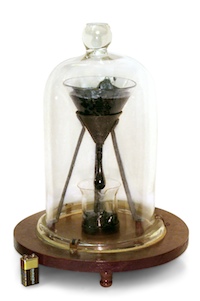
Slow pitch

The world's longest-running lab experiment is a dripping flask of pitch, originally set up in 1927. The hydrocarbon has a viscosity of about 8 billion centipoise, which is 1000 times more viscous than Alberta bitumen. So far 8 drops have fallen, the last on 28 November 2000. The next? Looks like any day now! Or next year. 

Image: University of Queensland, licensed CC-BY-SA. 

Seeing red

Temperature is not often a rock property given a lot of attention by geoscientists. Except in oil sands. Bitumen is a heavily biodegraded oil greater than 10 000 cP and less than 10˚API. It is a viscoelastic solid at room temperature, and flows only when sufficiently heated. Operators inject steam (through a process called SAGD), as opposed to hot water, because steam carrys a large portion of its energy as latent heat. When steam condenses against the chamber walls, it transfers heat into the surrounding reservoir. This is akin to the pain you'd feel when you place your hand over a pot of rolling water.

This image is a heat map across 3 well pairs (green dots) at the Underground Test Facility (UTF) in the Early Cretaceous McMurray Formation in the Athabasca oil sands of Alberta. This data is from downhole thermocouple measurements, shown in white dots, the map was made by doing a linear 2D interpolation.

Rather than geek out on the physics and processes taking place, I'd rather talk about why I think this is a nifty graphic.

What I like about this figure

Colour is intiutive – Blue for cold, red for hot, it doesn't get much more intuitive than that. A single black contour line delineates the zone of stable steam and a peripheral zone being heated.  

Unadulterated interpolation – There are many ways of interpolating or filling-in where there is no data. In this set, the precision of each measurement is high, within a degree or two, but the earth is sampled irregularly. There is much higher sampling in the vertical direction than the x,y direction, and this presents, somewhat unsightly, as horizontal edges on the interpolated colours. To smooth the interpolation, or round its slightly jagged edges would, in my opinion, degrade the information contained in the graphic. It's a display of the sparseness of the measurements. 

Sampling is shown – You see exactly how many points make up the data set. Fifteen thermocouples in each of 7 observation wells. It makes the irregularities in the contours okay, meaningful even. I wouldn’t want to smooth it. I think map makers and technical specialists too readily forget about where their data comes from. Recognize the difference between hard data and interpolation, and recognize the difference between observation and interpretation.

Sampling is scale – Imagine what this image would look like if we took the first, third, fifth, and seventh observation well away. Our observations and thus physical interpretation would be dramatically different. Every data point is accurate, but resolution depends on sample density.

Layers of context – Visualizing data enables heightened interpretation. Interpreting the heated zone is a simply a temperature contour (isotherm). Even though this is just a heat map, you can infer that one steam chamber is isolated, and two have joined into one another. Surely, more can be understood by adding more context, by integrating other subsurface observations.

In commercial scale oil sands operations, it is rare to place observation wells so close to each other. But if we did, and recorded the temperature continuously, would we even need time lapse seismic at all? (see right) 

If you are making a map or plot of any kind, I encourage you to display the source data. Both its location and its value. It compels the viewer to ask questions like, Can we make fewer measurements in the next round? Do we need more? Can we drill fewer observation wells and still infer the same resolution? Will this cost reduction change how we monitor the depletion process?

What is unconventional?

Subsurface science in the oil industry has gradually shifted in emphasis over the last five, maybe ten, years. In 2000, much of the work being done in our field was focused on conventional oil and gas plays. Today, it seems like most of what we do has something to do with unconventional resources. And this is set to continue. According to the American Petroleum Institute, unconventional gas production accounts for almost 50% of today's US Lower 48 production total of about 65 billion cubic feet per day, and is expected to reach 64% by 2020. In Canada, where unconventional gas is also very important, unconventional oil is at least as significant to geoscientists, especially bitumen. According to the Alberta govermnent, production from the Athabasca oil sands in 2011 will be about 2 million barrels per day.

But what does 'unconventional' mean? The short answer is "not conventional", which is more helpful than it sounds, and the long answer is "it depends who you ask". This is because where you draw the line between conventional and unconventional depends on what you care most about. To illustrate the point, here are some points of view...

Read More

Rock physics and steam

Over the last few weeks, I have been revisiting and reminiscing over some past work, and found this poster I made for the 2007 SEG Development & Production Forum on the geophysics of heavy oil. A few months ago, the organizers of the workshop made a book out of many great articles that followed. Posters, however, often get printed only once, but that doesn't mean they need only be viewed once.

The poster illustrates the majority of my MSc thesis on the rock physics of steam injection in Canadian oil sands. You might be interested in this if you are interested in small scale seismic monitoring experiments, volume visualization, and novel seismic attributes for SAGD projects. For all you geocomputing enthusiasts, you'll recognize that all the figures were made with MathWorks MATLAB (something I hope to blog about later). It was a fun project, because it merged disparate data types, rock physics, finite-difference modeling, time-lapse seismic, and production engineering. There are a ton of subsurface problems that still need to be solved in oil sands, many opportunities to work across disciplines, and challenge the limits of our geoscience creativity. 

Here's the full reference: Bianco, E & D Schmitt (2007). High resolution modeling and monitoring of the SAGD process at the Athabasca tar sands: Underground Test Facility (UTF), 2007 SEG D&P Forum, Edmonton, Canada. If you prefer, you can grab these slides which I gave as an oral presentation on the same material, or flip to chapter 6 in the book.