
Seeing red
/Temperature is not often a rock property given a lot of attention by geoscientists. Except in oil sands. Bitumen is a heavily biodegraded oil greater than 10 000 cP and less than 10˚API. It is a viscoelastic solid at room temperature, and flows only when sufficiently heated. Operators inject steam (through a process called SAGD), as opposed to hot water, because steam carrys a large portion of its energy as latent heat. When steam condenses against the chamber walls, it transfers heat into the surrounding reservoir. This is akin to the pain you'd feel when you place your hand over a pot of rolling water.
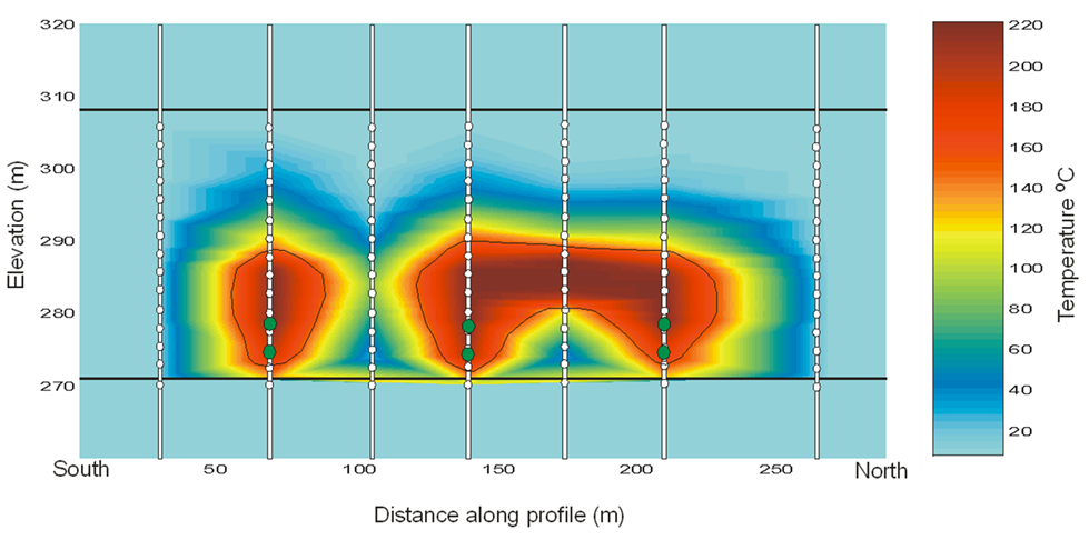
This image is a heat map across 3 well pairs (green dots) at the Underground Test Facility (UTF) in the Early Cretaceous McMurray Formation in the Athabasca oil sands of Alberta. This data is from downhole thermocouple measurements, shown in white dots, the map was made by doing a linear 2D interpolation.
Rather than geek out on the physics and processes taking place, I'd rather talk about why I think this is a nifty graphic.
What I like about this figure
Colour is intiutive – Blue for cold, red for hot, it doesn't get much more intuitive than that. A single black contour line delineates the zone of stable steam and a peripheral zone being heated.
Unadulterated interpolation – There are many ways of interpolating or filling-in where there is no data. In this set, the precision of each measurement is high, within a degree or two, but the earth is sampled irregularly. There is much higher sampling in the vertical direction than the x,y direction, and this presents, somewhat unsightly, as horizontal edges on the interpolated colours. To smooth the interpolation, or round its slightly jagged edges would, in my opinion, degrade the information contained in the graphic. It's a display of the sparseness of the measurements.
Sampling is shown – You see exactly how many points make up the data set. Fifteen thermocouples in each of 7 observation wells. It makes the irregularities in the contours okay, meaningful even. I wouldn’t want to smooth it. I think map makers and technical specialists too readily forget about where their data comes from. Recognize the difference between hard data and interpolation, and recognize the difference between observation and interpretation.
Sampling is scale – Imagine what this image would look like if we took the first, third, fifth, and seventh observation well away. Our observations and thus physical interpretation would be dramatically different. Every data point is accurate, but resolution depends on sample density.
 Layers of context – Visualizing data enables heightened interpretation. Interpreting the heated zone is a simply a temperature contour (isotherm). Even though this is just a heat map, you can infer that one steam chamber is isolated, and two have joined into one another. Surely, more can be understood by adding more context, by integrating other subsurface observations.
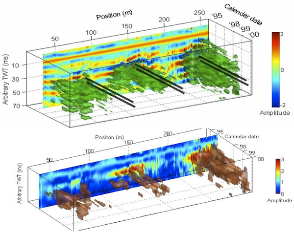
In commercial scale oil sands operations, it is rare to place observation wells so close to each other. But if we did, and recorded the temperature continuously, would we even need time lapse seismic at all? (see right)
If you are making a map or plot of any kind, I encourage you to display the source data. Both its location and its value. It compels the viewer to ask questions like, Can we make fewer measurements in the next round? Do we need more? Can we drill fewer observation wells and still infer the same resolution? Will this cost reduction change how we monitor the depletion process?


 Except where noted, this content is licensed