Machine learning goes mainstream

At our first machine-learning-themed hackathon, in New Orleans in 2015, we had fifteen hackers. TImes were hard in the industry. Few were willing or able to compe out and play. Well, it’s now clear that times have changed! After two epic ML hacks last year (in Paris and Houston), at which we hosted about 115 scientists, it’s clear this year is continuing the trend. Indeed, by the end of 2018 we expect to have welcomed at least 240 more digital scientists to hackathons in the US and Europe.

Conclusion: something remarkable is happening in our field.

The FORCE hackathon

Last Tuesday and Wednesday, Agile co-organized the FORCE Machine Learning Hackathon in Stavanger, Norway. FORCE is a cross-industry geoscience organization, coordinating meetings and research in subsurface. The event preceeded a 1-day symposium on the same theme: machine learning in geoscience. And it was spectacular.

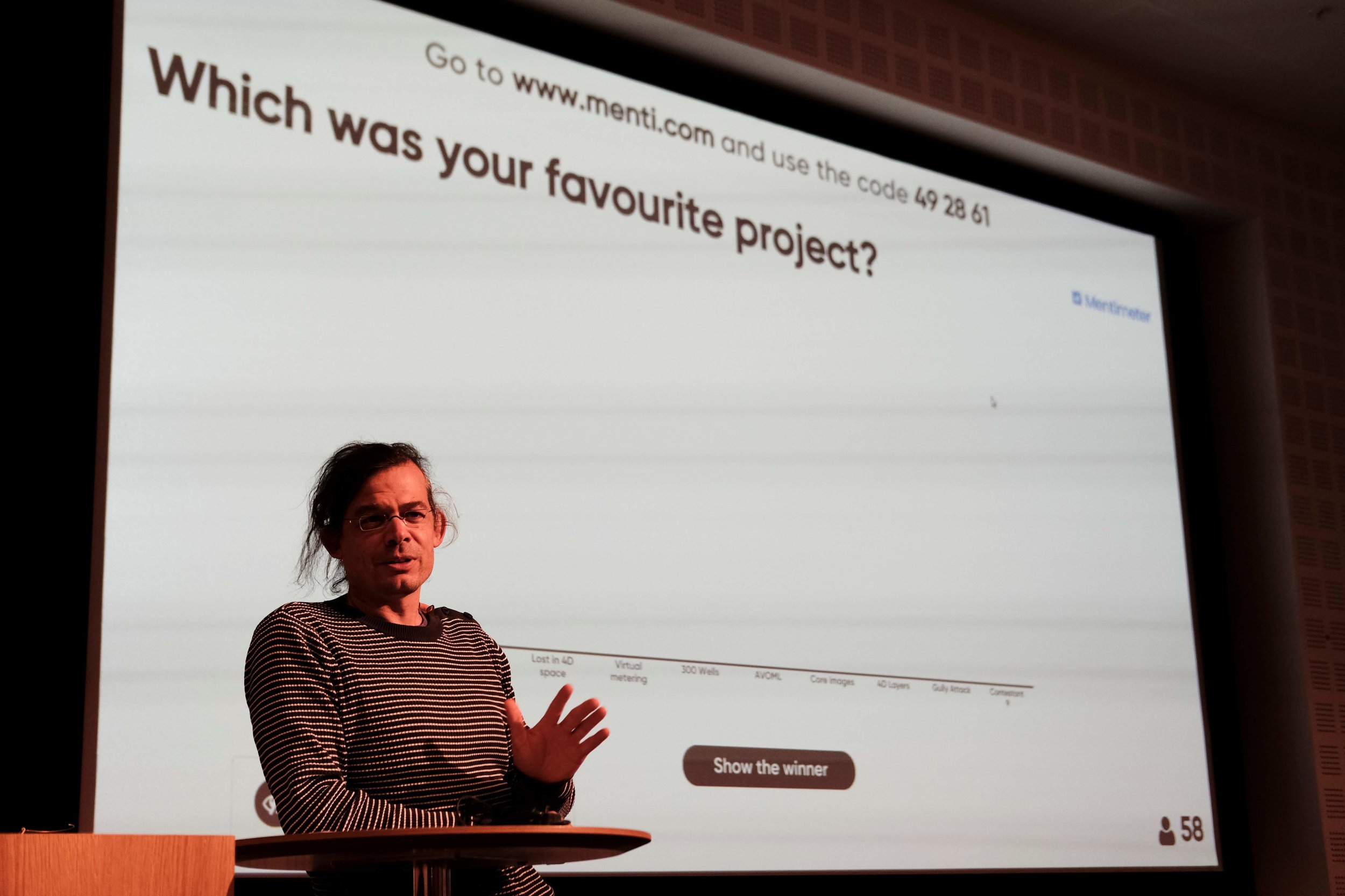
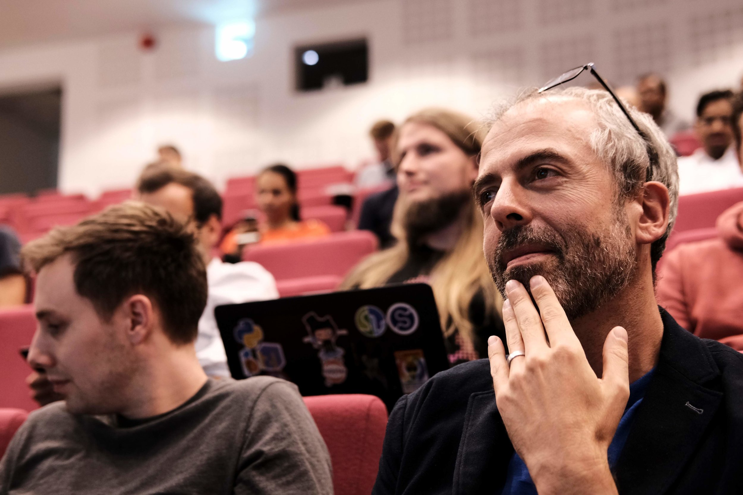
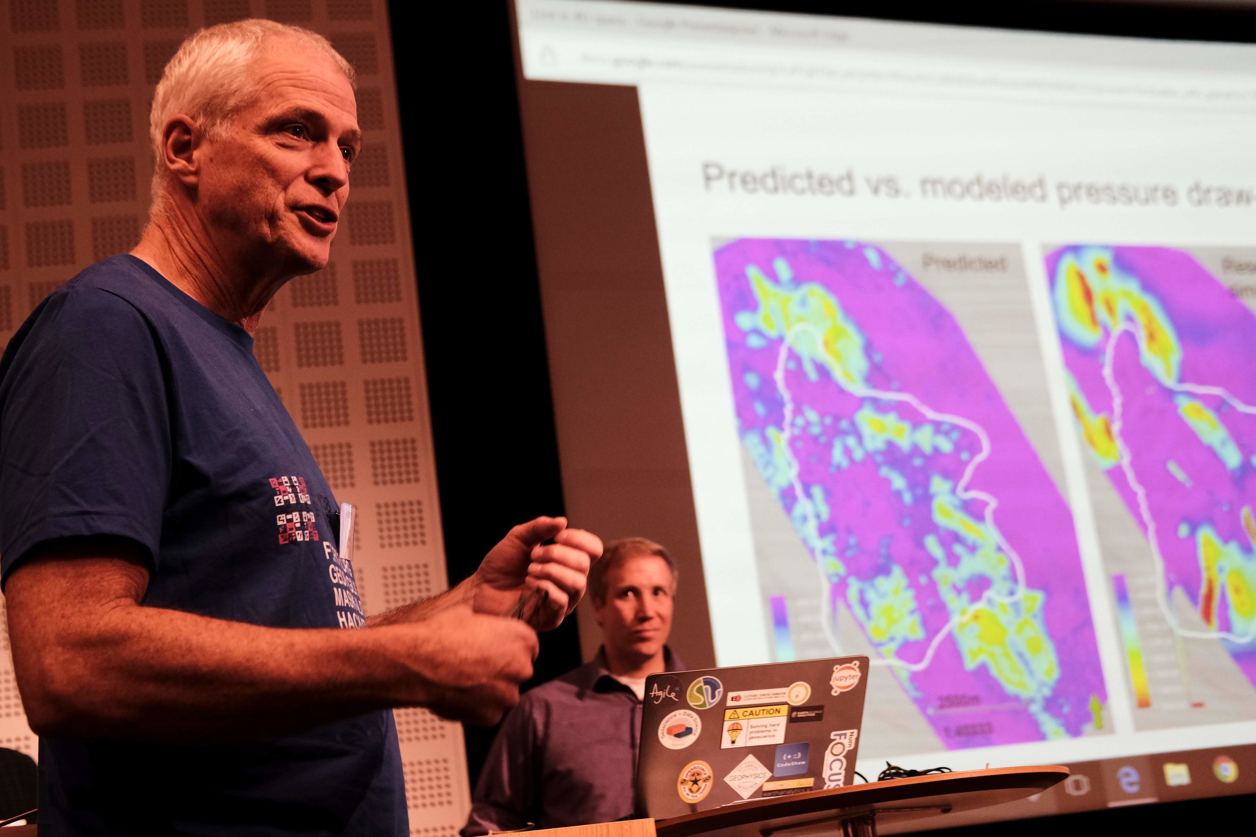
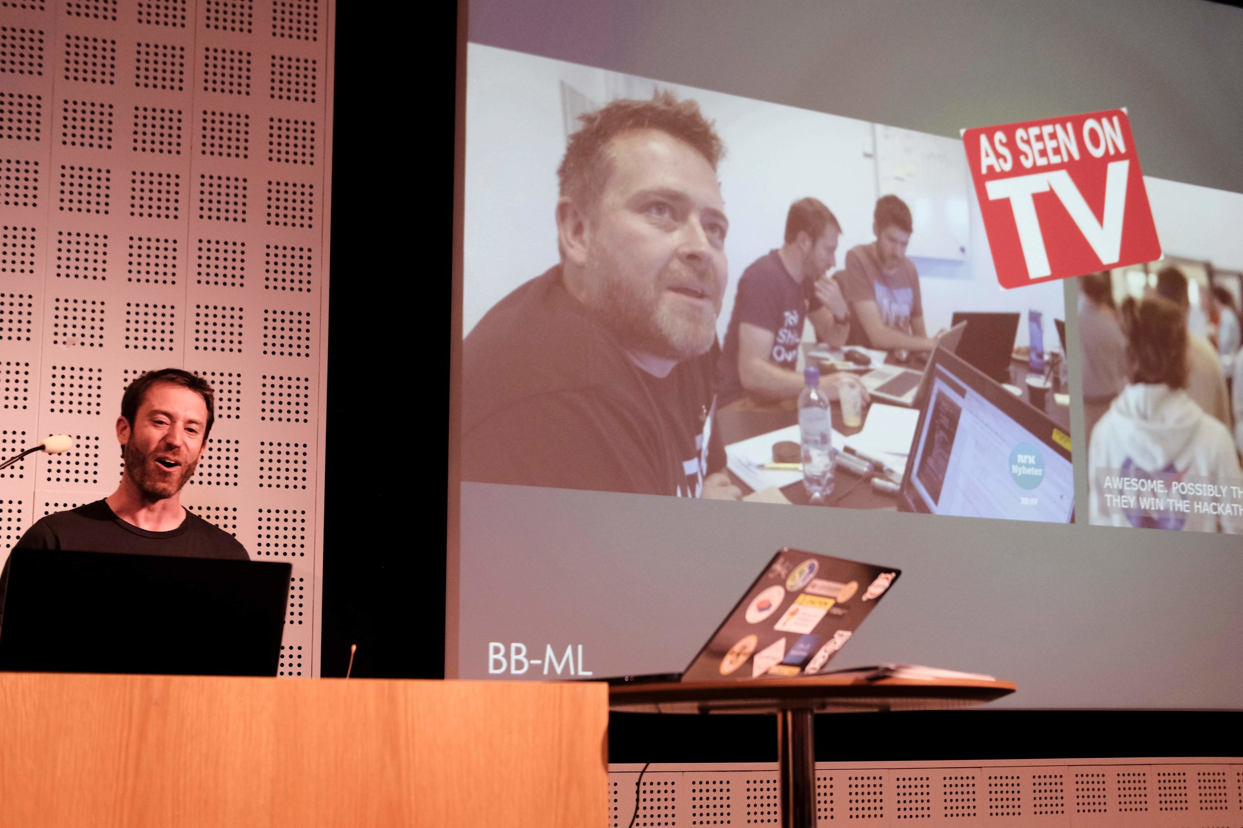
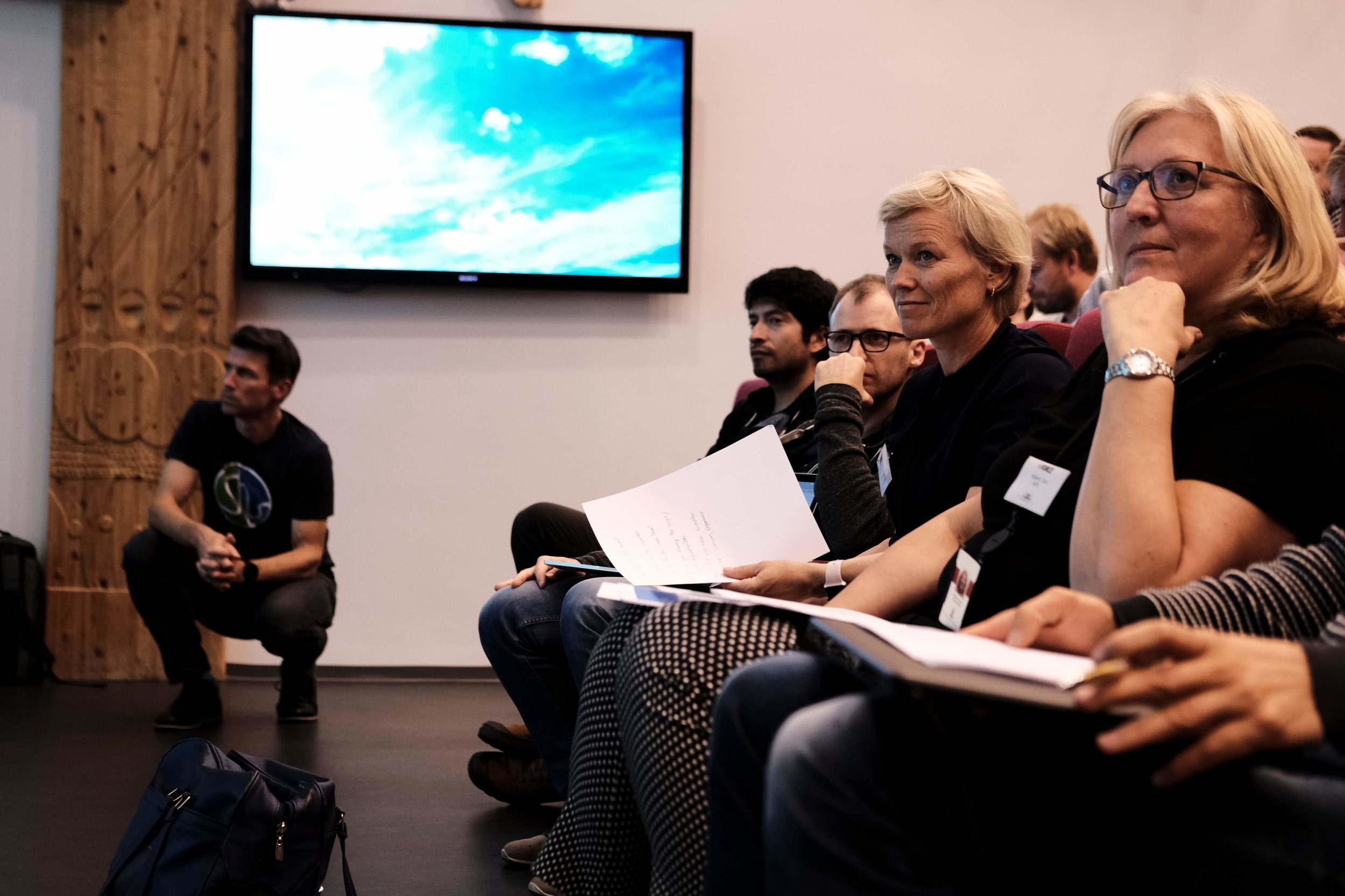
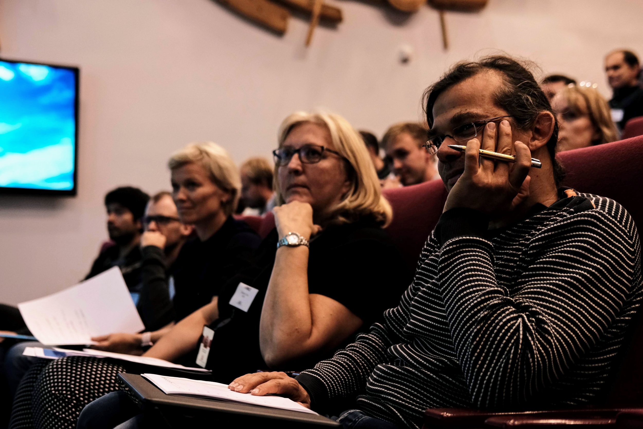
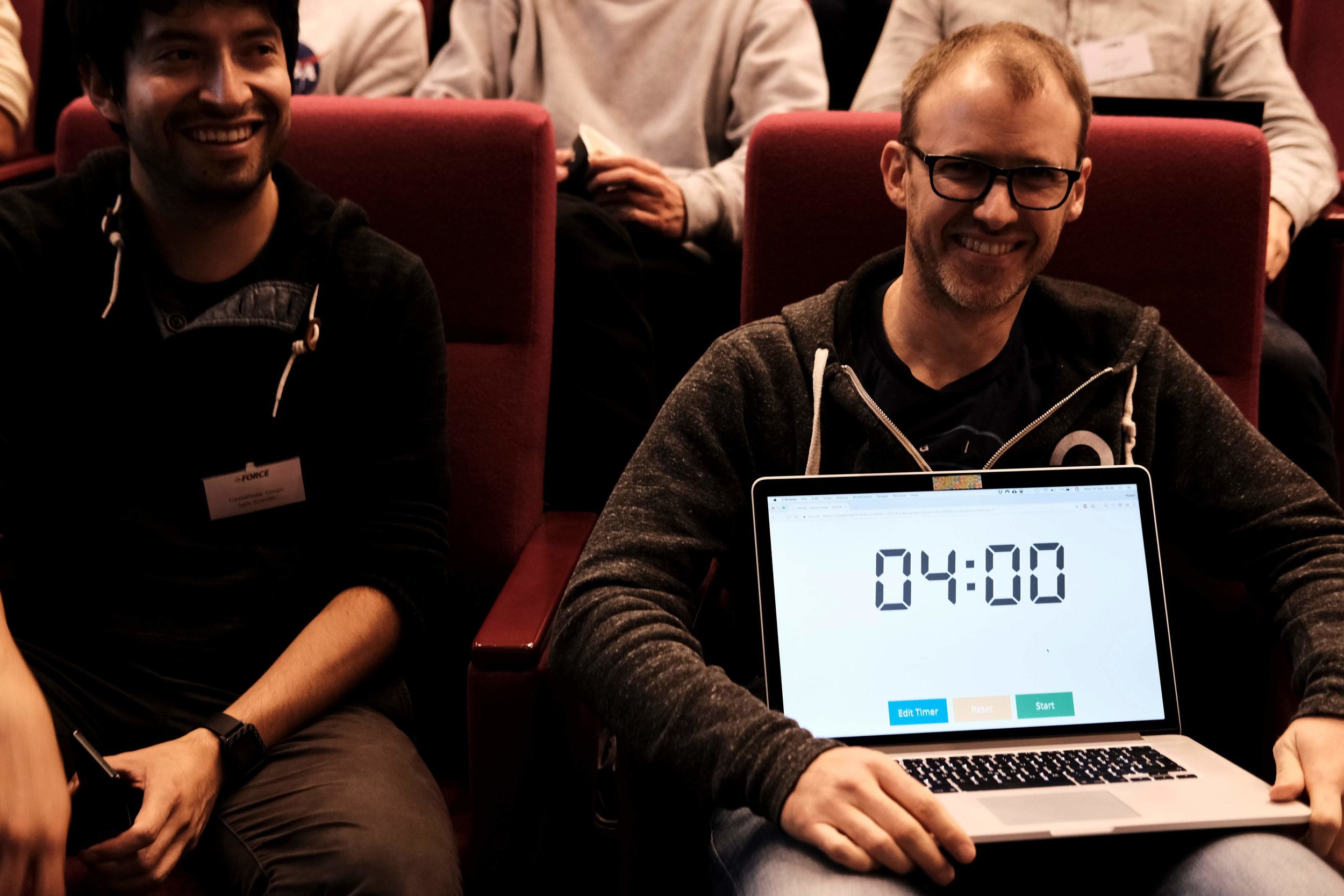
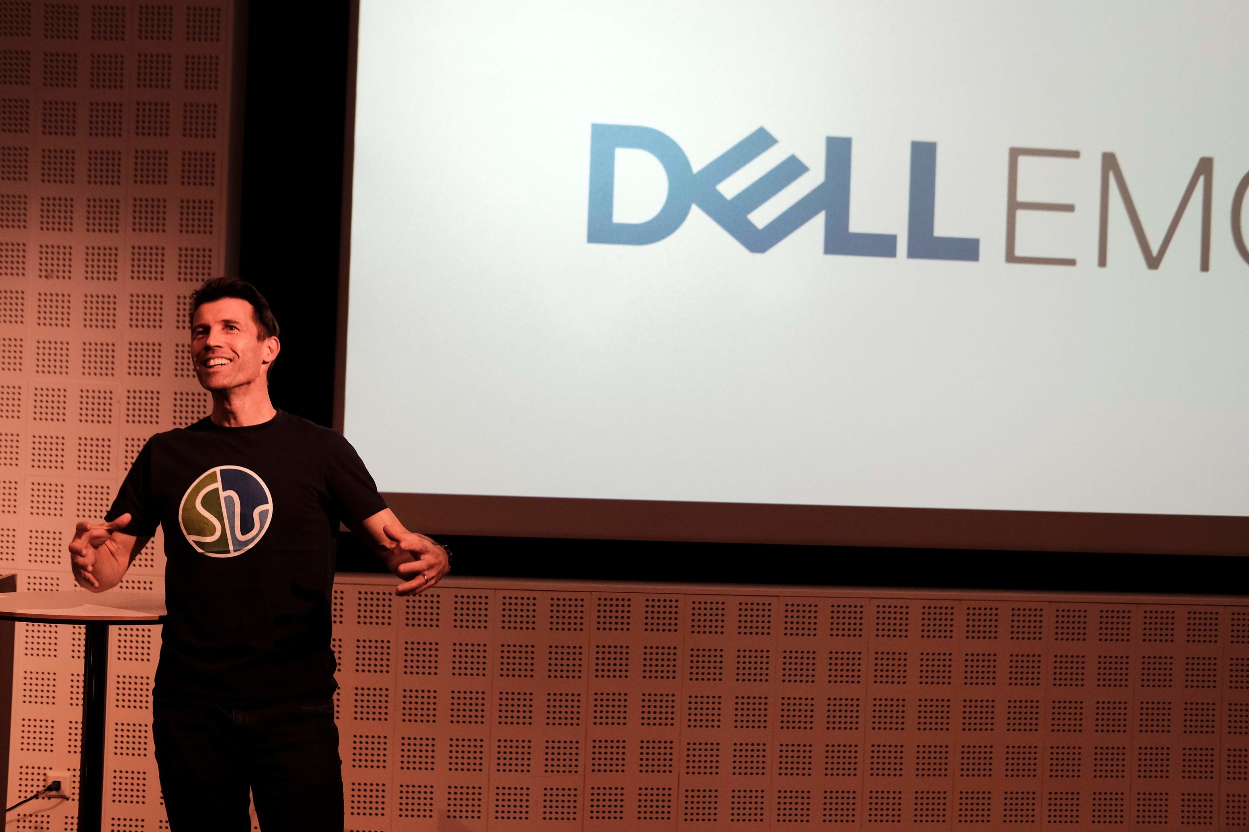
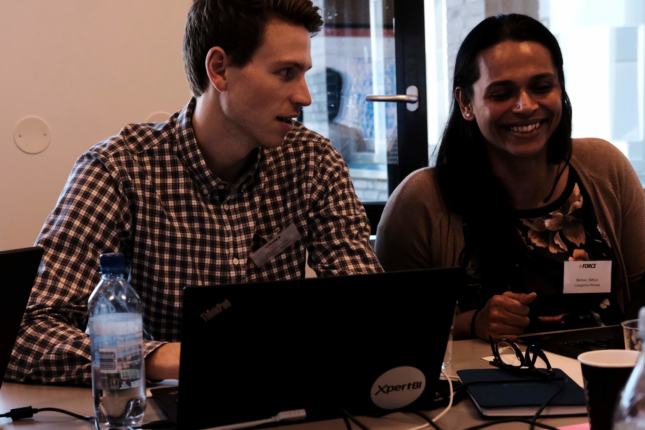
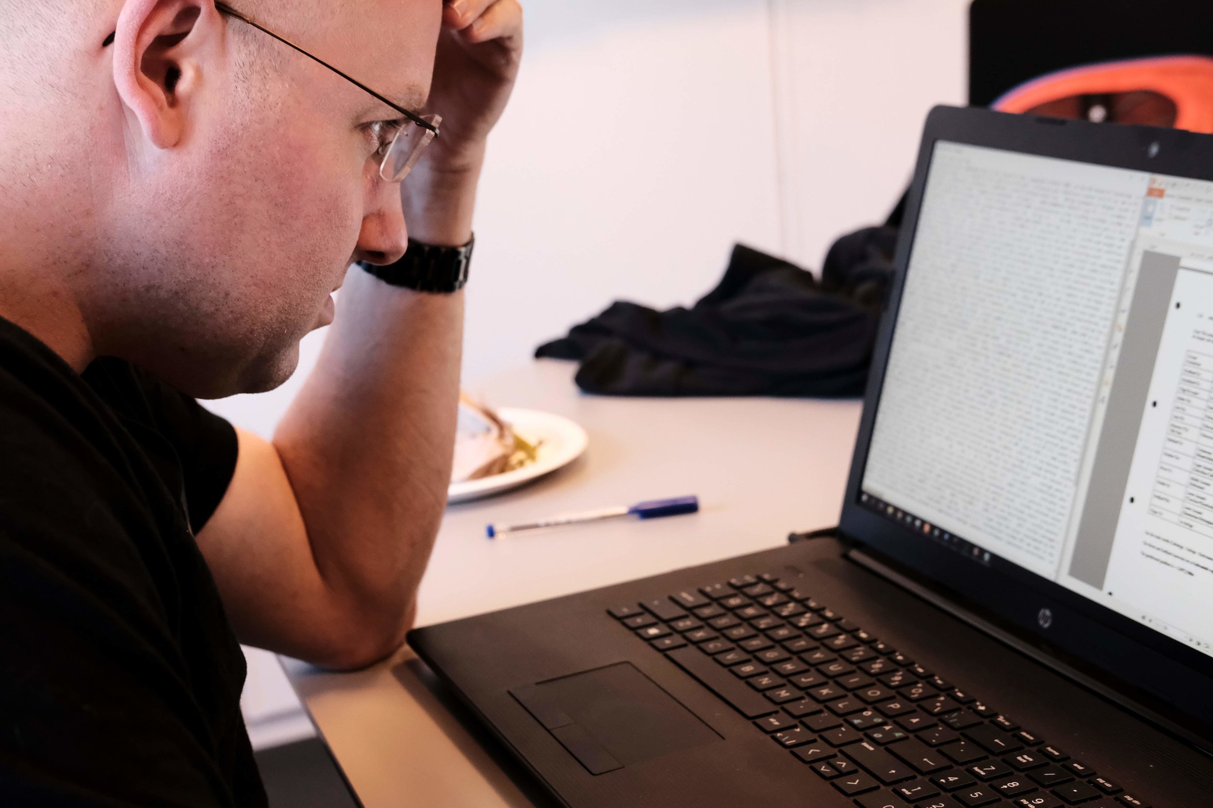
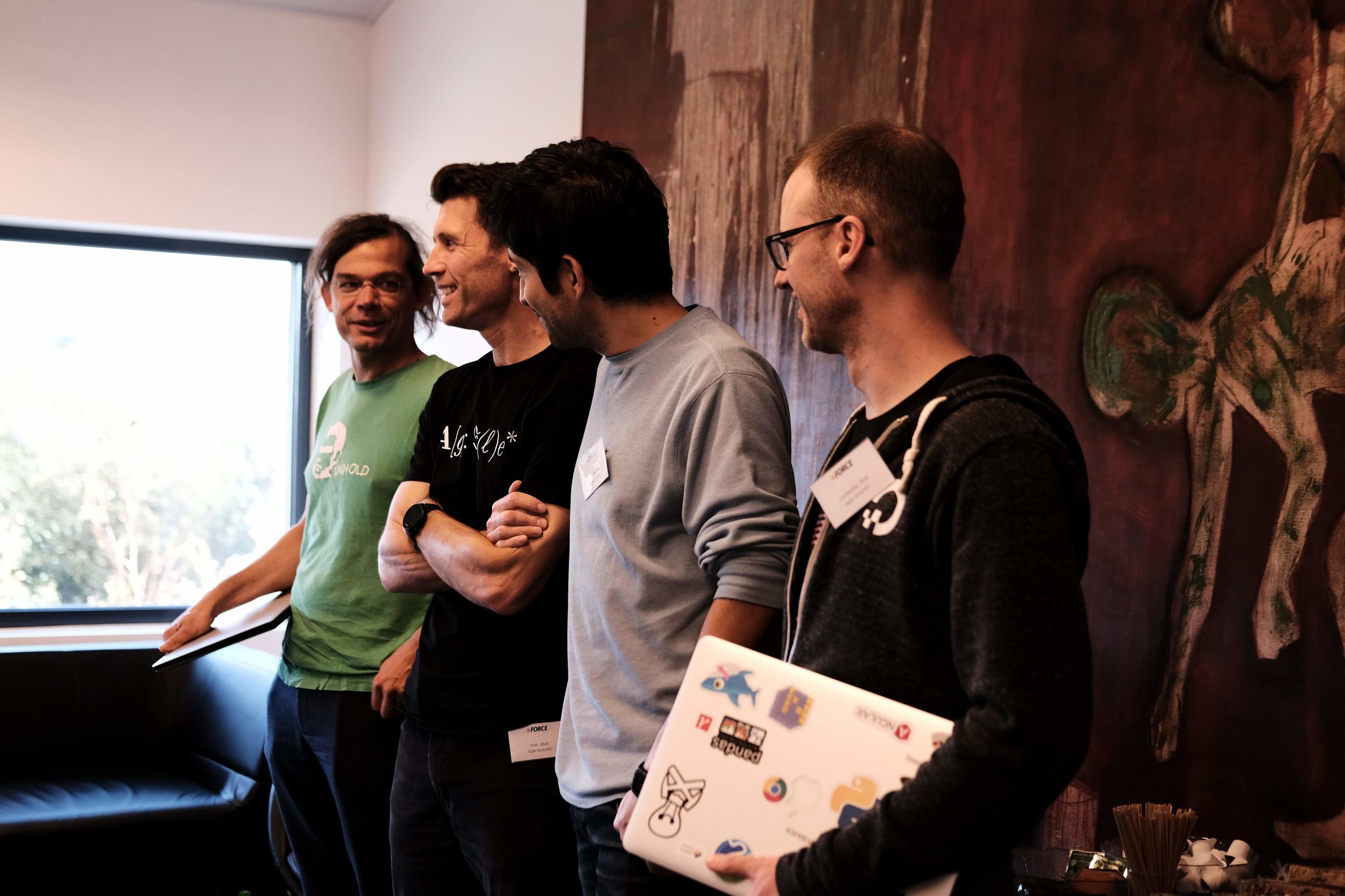
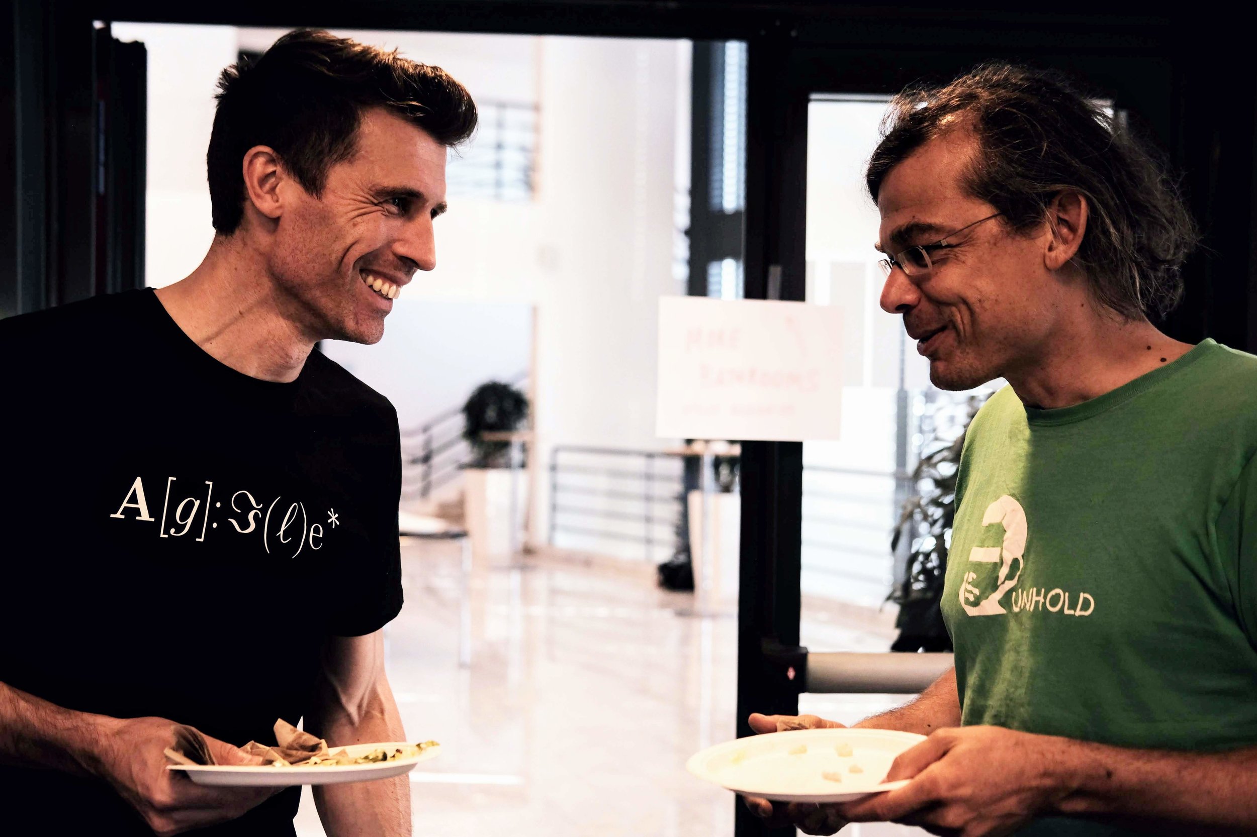
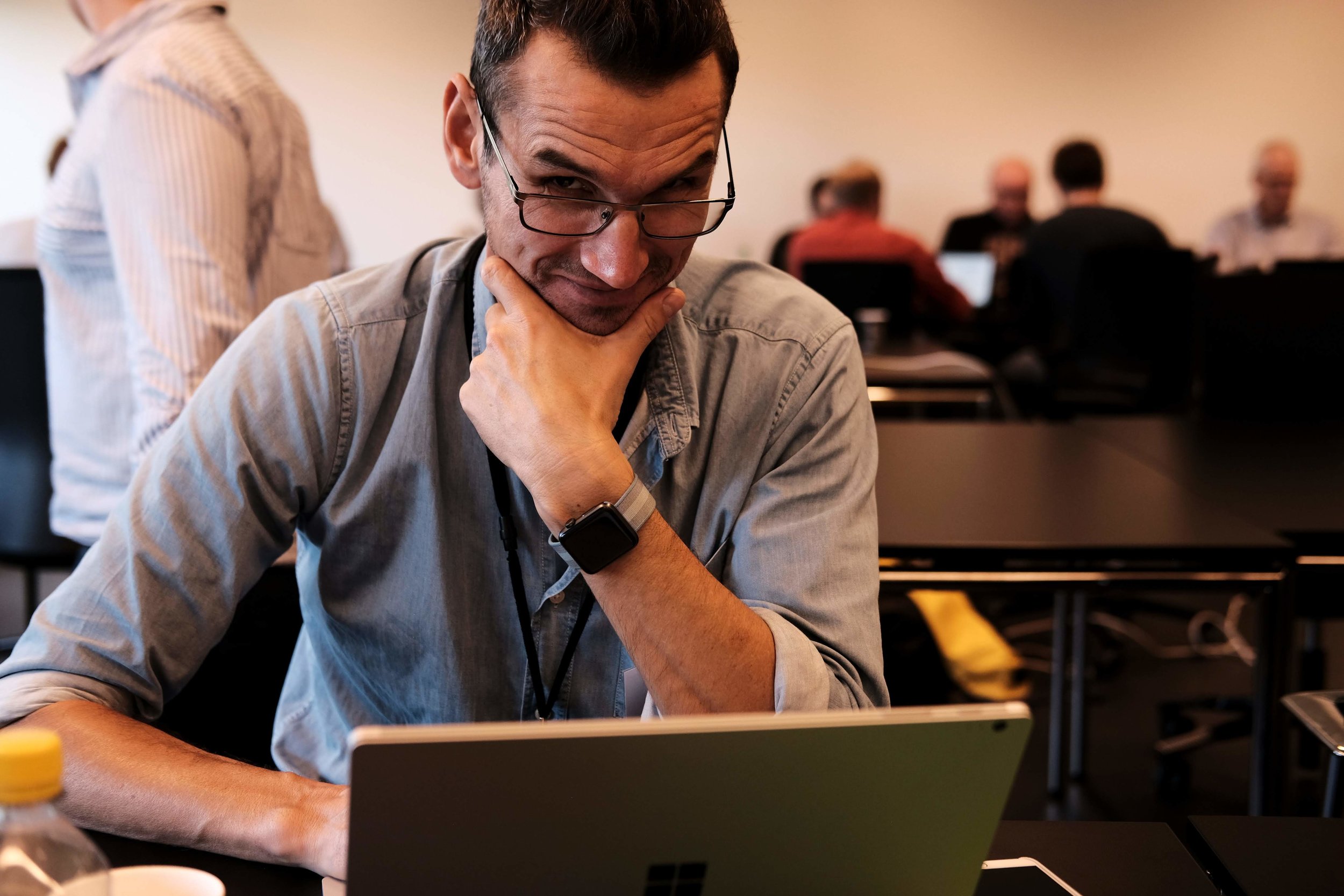
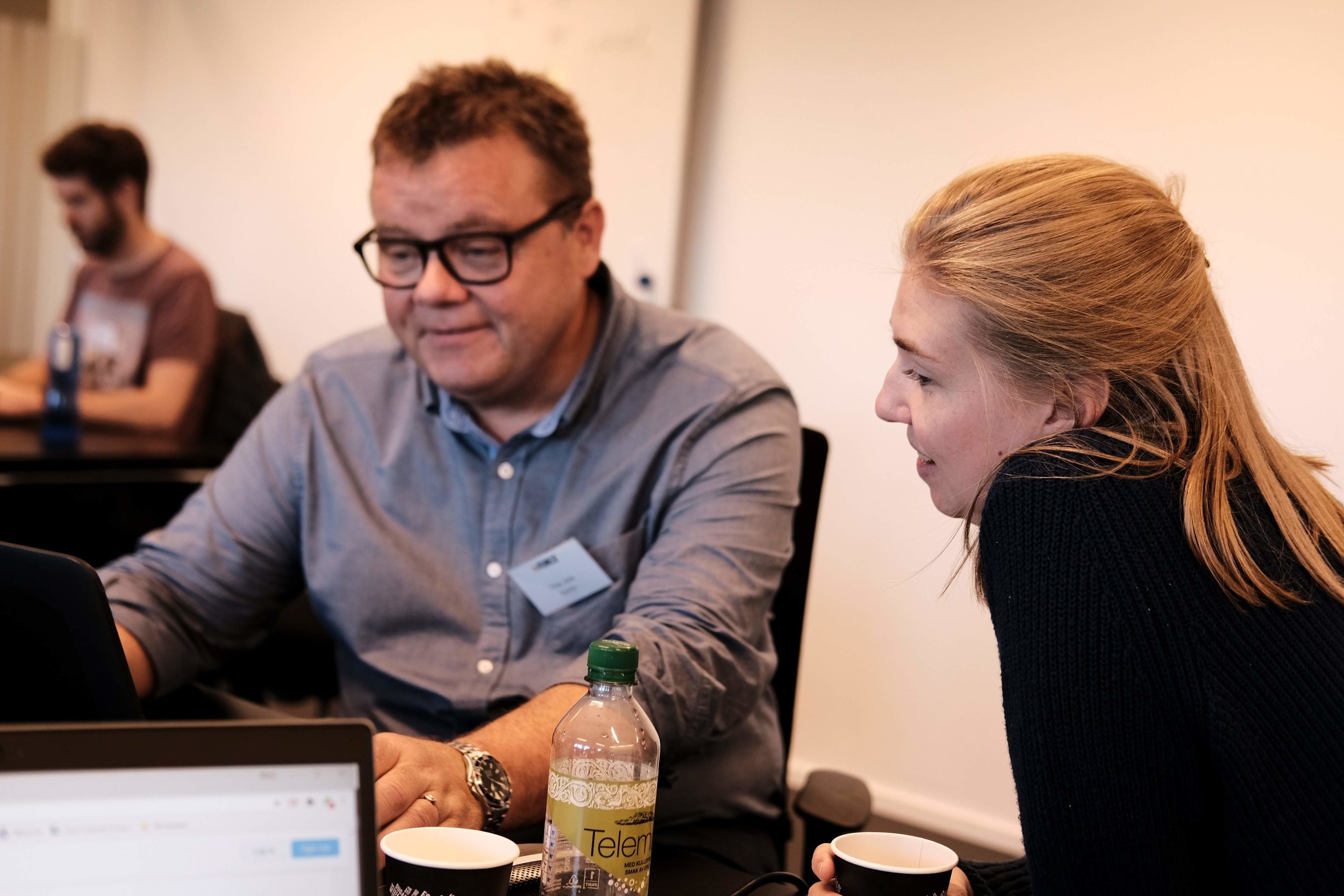
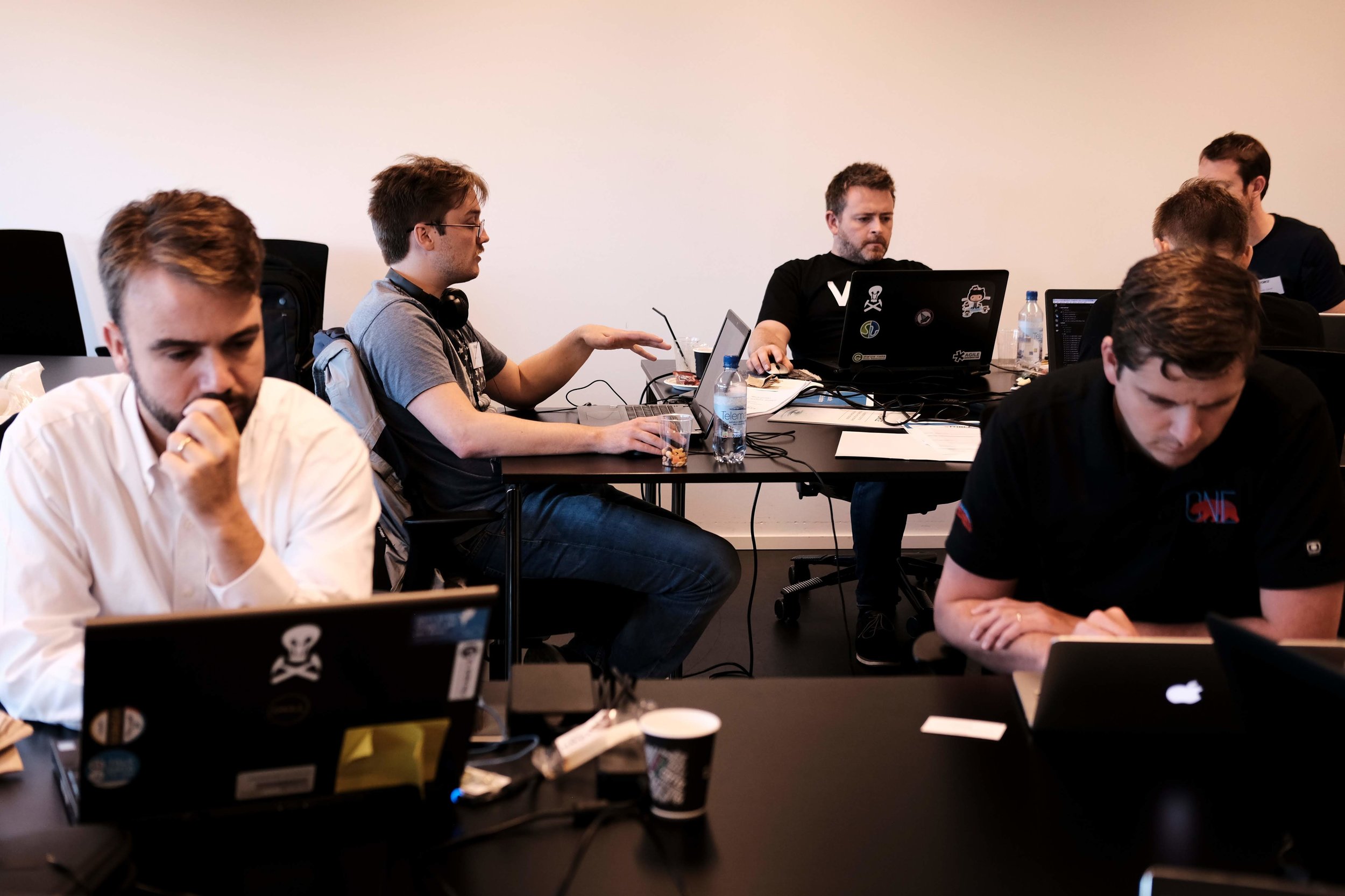
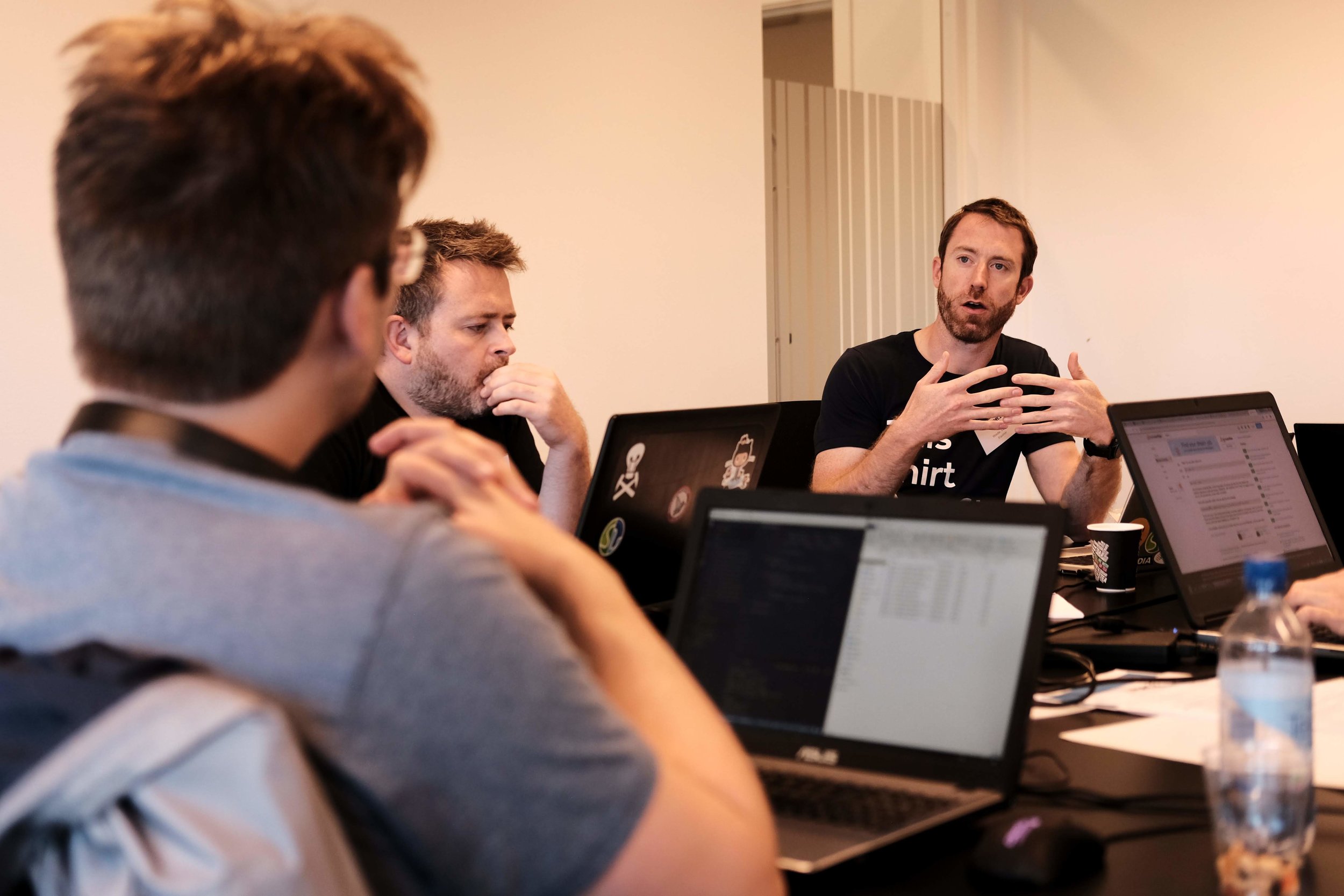
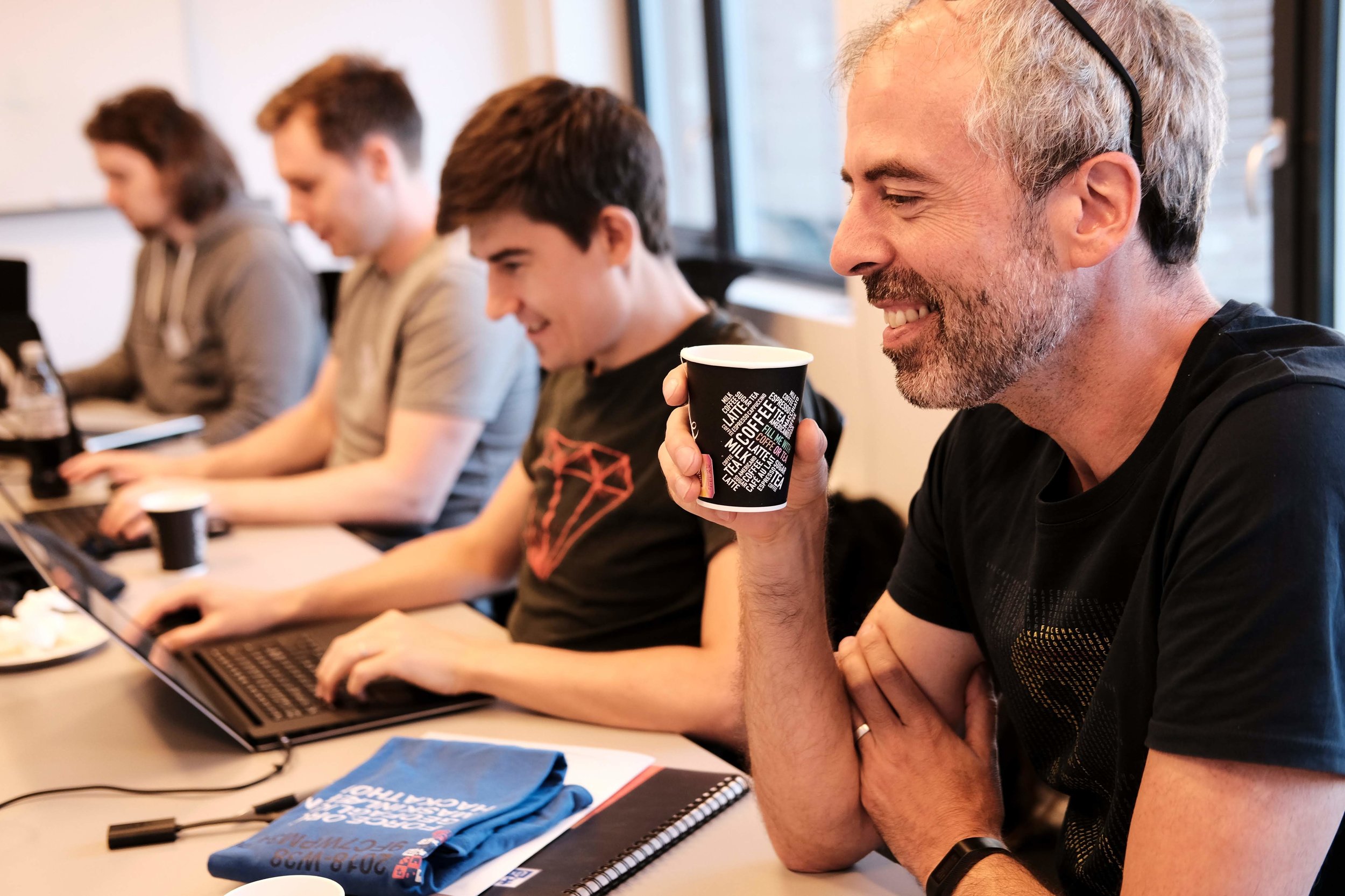
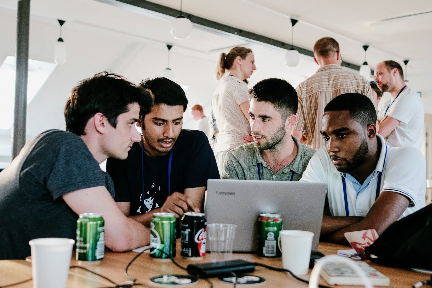
Get a flavour of the spectacularness in Alessandro Amato’s beautiful photographs:
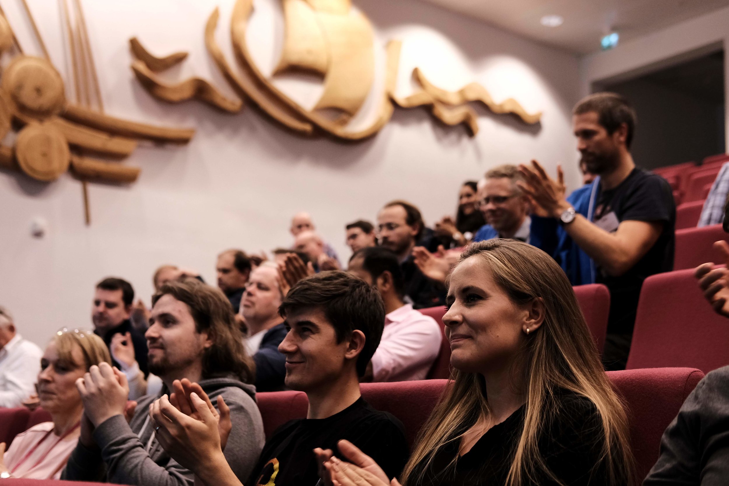
Fifty geoscientists and engineers spent two days at the Norwegian Petroleum Directorate (NPD) in Stavanger. Our hosts were welcoming, accommodating, and generous with the waffles. As usual, we gently nudged the participants into teams, and encouraged them to define projects and find data to work on. It always amazes me how smoothly this potentially daunting task goes; I think this says something about the purposefulness and resourcefulness of our community.

Here’s a quick run-down of the projects:

  • Biostrat! Geological ages from species counts.

  • Lost in 4D Space. Pressure drawdown prediction.

  • Virtual Metering. Predicting wellhead pressure in real time.

  • 300 Wells. Extracting shows and uncertainty from well reports.

  • AVO ML. Unsupervised machine learning for more geological AVO.

  • Core Images. Grain size and lithology from core photos.

  • 4D Layers. Classification engine for 4D seismic data.

  • Gully Attack. Strat trap picking with deep reinforcement learning.

  • sketch2seis. Turning geological cartoons into seismic with pix2pix.

I will do a complete review of the projects in the coming few days, but notice the diversity here. Five of the projects straddle geological topics, and five are geophysical. Two or three involve petroleum engineering issues, while two or three move into sed/strat. We saw natural language processing. We saw random forests. We saw GANs, VAEs, and deep reinforcement learning. In terms of input data, we saw core photos, PDF reports, synthetic seismograms, real-time production data, and hastily assembled label sets. In short — we saw everything.

Takk skal du ha

Many thanks to everyone that helped the event come together:

  • Peter Bormann, the mastermind behind the symposium, was instrumental in making the hackathon happen.

  • Grete Block Vargle (AkerBP) and Pernille Hammernes (Equinor) kept everyone organized and inspired.

  • Tone Helene Mydland (NPD) and Soelvi Amundrud (NPD) made sure everything was logistically honed.

  • Eva Halland (NPD) supported the event throughout and helped with the judging.

  • Alessandro Amato del Monte (Eni) took some fantastic photos — as seen in this post.

  • Diego Castaneda and Rob Leckenby helped me on the Agile side of things, and helped several teams.

And a huge thank you to the sponsors of the event — too many to name, but here they all are:

all_small.png

There’s more to come!

If you’re reading this thinking, “I’d love to go to a geoscience hackathon”, and you happen to live in or near the UK, you’re in luck! There are two machine learning geoscience hackathons coming up this fall:

Don’t miss out! Get signed up and we’ll see you there.

How good is what?

Geology is a descriptive science, which is to say, geologists are label-makers. We record observations by assigning labels to data. Labels can either be numbers or they can be words. As such, of the numerous tasks that machine learning is fit for attacking, supervised classification problems are perhaps the most accessible – the most intuitive – for geoscientists. Take data that already has labels. Build a model that learns the relationships between the data and labels. Use that model to make labels for new data. The concept is the same whether a geologist or an algorithm is doing it, and in both cases we want to test how well our classifier is at doing its label-making.

2d_2class_classifier_left.png

Say we have a classifier that will tell us whether a given combination of rock properties is either a dolomite (purple) or a sandstone (orange). Our classifier could be a person named Sally, who has seen a lot of rocks, or it could be a statistical model trained on a lot of rocks (e.g. this one on the right). For the sake of illustration, say we only have two tools to measure our rocks – that will make visualizing things easier. Maybe we have the gamma-ray tool that measures natural radioactivity, and the density tool that measures bulk density. Give these two measurements to our classifier, and they return to you a label. 

How good is my classifier?

Once you've trained your classifier – you've done the machine learning and all that – you've got yourself an automatic label maker. But that's not even the best part. The best part is that we get to analyze our system and get a handle on how good we can expect our predictions to be. We do this by seeing if the classifier returns the correct labels for samples that it has never seen before, using a dataset for which we know the labels. This dataset is called validation data.

Using the validation data, we can generate a suite of statistical scores to tell us unambiguously how this particular classifier is performing. In scikit-learn, this information compiled into a so-called classification report, and it’s available to you with a few simple lines of code. It’s a window into the behaviour of the classifier that warrants deeper inquiry.

To describe various elements in a classification report, it will be helpful to refer to some validation data:

Our Two-class Classifier (left) has not seen the Validation Data (middle). We can calculate a classification report by Analyzing the intersection of the two (right).

Our Two-class Classifier (left) has not seen the Validation Data (middle). We can calculate a classification report by Analyzing the intersection of the two (right).

Accuracy is not enough

When people straight up ask about a model’s accuracy, it could be that they aren't thinking deeply enough about the performance of the classifier. Accuracy is a measure of the entire classifier. It tells us nothing about how well we are doing with one class compared to another, but there are other metrics that tell us this:

metric_definitions2.png

Support — how many instances there were of that label in the validation set.

Precision — the fraction of correct predictions for a given label. Also known as positive predictive value.

Recall — the proportion of the class that we correctly predicted. Also known as sensitivity.

F1 score — the harmonic mean of precision and recall. It's a combined metric for each class.

Accuracy – the total fraction of correct predictions for all classes. You can calculate this for each class, but it will be the same value for each of the class.   

DIY classification report

If you're like me and you find the grammar of true positives and false negatives confusing, it might help to to treat each class within the classifier as its own mini diagnostic test, and build up data for the classification report row by row. Then it's as simple as counting hits and misses from the validation data and computing some fractions. Inspired by this diagram on the Wikipedia page for the F1 score, I've given both text and pictorial versions of the equations:

dolomite_and_classifier_report_sheet.png

Have a go at filling in the scores for the two classes above. After that, fill in your answers into your own hand-drawn version of the empty table below. Notice that there is only a single score for accuracy for the entire classifier, and that there may be a richer story between the various other scores in the table. Do you want to optimize accuracy overall? Or perhaps you care about maximizing recall in one class above all else? What matters most to you? Should you penalize some mistakes stronger than others?

clf_report.png

When data sets get larger – by either increasing the number of samples, or increasing the dimensionality of the data – even though this scoring-by-hand technique becomes impractical, the implementation stays the same. In classification problems that have more than two classes we can add in a confusion matrix to our reporting, which is something that deserves a whole other post. 

Upon finishing logging a slab of core, if you were to ask Sally the stratigrapher, "How accurate are your facies?", she may dismiss your inquiry outright, or maybe point to some samples she's not completely confident in. Or she might tell you that she was extra diligent in the transition zones, or point to regions where this is very sandy sand, or this is very hydrothermally altered. Sadly, we in geoscience – emphasis on the science – seldom take the extra steps to test and report our own performance. But we totally could.

The ANSWERS. Upside Down. To two Decimal places.

The ANSWERS. Upside Down. To two Decimal places.

Are there benefits to pseudoscience?

No, of course there aren't. 

Balance! The scourge of modern news. CC-BY by SkepticalScience.com

Balance! The scourge of modern news. CC-BY by SkepticalScience.com

Unless... unless you're a journalist, perhaps. Then a bit of pseudoscience can provide some much-needed balance — just to be fair! — to the monotonic barrage of boring old scientific consensus. Now you can write stories about flat-earthers, anti-vaxxers, homeopathy, or the benefits of climate change!*

So far, so good. It's fun to pillory the dimwits who think the moon landings were filmed in a studio in Utah, or that humans have had no impact on Earth's climate. The important thing is for the journalist to have a clear and unequivocal opinion about it. If an article doesn't make it clear that the deluded people at the flat-earth convention ("Hey, everyone thought Copernicus was mad!") have formed their opinions in spite of, not because of, the overwhelming evidence before them, then readers might think the journalist — and the publisher — agree with them.

In other words, if you report on hogwash, then you had better say that it's hogwash, or you end up looking like one of the washers of the hog.


Fake geoscience?

AAPG found this out recently, when the August issue of its Explorer magazine published an article by Ken Milam called Are there benefits to climate change? Ken was reporting on a talk by AAPG member Greg Wrightstone at URTeC in July. Greg wrote a book called Inconvenient Facts: The Science That Al Gore Doesn't Want You To Know. The gist: no need to be concerned about carbon dioxide because, "The U.S. Navy’s submarines often exceed 8,000 ppm (20 times current levels) and there is no danger to our sailors" — surely some of the least watertight reasoning I've ever encountered. Greg's basic idea is that, since the earth has been warmer before, with higher levels of CO2, there's nothing to worry about today (those Cretaceous conurbations and Silurian civilizations had no trouble adapting!) So he thinks, "the correct policy to address climate change is to have the courage to do nothing".

So far, so good. Except that Ken — in reporting 'just the facts' — didn't mention that Greg's talk was full of half-truths and inaccuracies and that few earth scientists agree with him. He forgot to remark upon the real news story: how worrying it is that URTeC 2018 put on a breakfast promoting Greg and his marginal views. He omitted to point out that this industry needs to grow up and face the future with reponsibility, supporting society with sound geoscience.

So it looked a bit like Explorer and AAPG were contributing to the washing of this particular hog.


Discussion

As you might expect, there was some discussion about the article — both on aapg.org and on Twitter (and probably elsewhere). For example, Mark Tingay (University of Adelaide) called AAPG and SPE out:

So did Brian Romans (Virginia Tech):

And there was further discussion (sort of) involving Greg Wrightstone himself. Trawl through Mark Tingay's timeline, especially his systematic dismantling of Greg's 'evidence', if your curiosity gets the better of you.


Response

Of course AAPG noticed the commotion. The September issue of Explorer contains two statements from AAPG staff. David Curtiss, AAPG Executive Director, said this in his column:

Milam was assigned to report on an invited presentation by Greg Wrightstone, a past president of AAPG’s Eastern Section, based on a recently self-published book on climate change, at the Unconventional Resources Technology Conference in July. Here was an AAPG Member and past section officer speaking about climate change – an issue of interest to many of our members, who had been invited by a group of his geoscience and engineering peers to present at a topical breakfast – not a technical session – at a major conference.

This sounds fine, on the face of it, but details matter. A glance at the book in question should have been enough to indicate that the content of the talk could only have been presented in a non-technical session, with a side of hash browns.

Anyway, David does go on to point out the tension between the petroleum industry's activities and society's environmental concerns. The tension is real, and AAPG and its members, are in the middle of it. We can contribute scientifically to the conversations that need to happen to resolve that tension. But pushing junk science and polemical bluster is definitely not going to help. I believe that most of the officers and members of AAPG agree. 

The editor of Explorer, Brian Ervin, had this to say:

For the record, none of our coverage of any issue or any given perspective on an issue should be taken as an endorsement — explicit or implicit — of that perspective. Also, the EXPLORER is — quite emphatically — not a scientific journal. Our content is not peer-reviewed. [...] No, the EXPLORER exists for an entirely different purpose. We provide news about Earth science, the industry and the Association, so our mission is different and unrelated to that of a scientific publication.

He goes on to say that he knew that Wrightstone's views are not popular and that it would provoke some reaction, but wanted to present it impartially and "give [readers] the opportunity to evaluate his position for themselves".

I just hope Explorer doesn't start doing this with too many other marginal opinions.


I'd have preferred to see AAPG back-pedal a bit more energetically. Publishing this article was a mistake. AAPG needs to think about the purpose, and influence, of its reporting, as well as its stance on climate change (which, according to David Curtiss, hasn't been discussed substantially in more than 10 years). This isn't about pushing agendas, any more than talking about the moon landings is about pushing agendas. It's about being a modern scientific association with high aspirations for itself, its members, and society.

What is a sprint?

In October we're hosting our first 'code sprint'! What is that?

A code sprint is a type of hackathon, in which efforts are focused around a small number of open source projects. They are related to, but not really the same as, sprints in the Scrum software development framework. They are non-competitive — the only goal is to improve the software in question, whether it's adding functionality, fixing bugs, writing tests, improving documentation, or doing any of the other countless things that good software needs. 

On 13 and 14 October, we'll be hacking on 3 projects:

  • Devito: a high-level finite difference library for Python. Devito featured in three Geophysical Tutorials at the end of 2017 and beginning of 2018 (see Witte et al. for Part 3). The project needs help with code, tests, model examples, and documentation. There will be core devs from the project at the sprint. GitHub repo is here.
  • Bruges: a simple collection of Python functions representing basic geophysical equations. We built this library back in 2015, and have been chipping away ever since. It needs more equations, better docs, and better tests — and the project is basic enough for anyone to contribute to it, even a total Python newbie. GitHub repo is here.
  • G3.js: a JavaScript wrapper for D3.js, a popular plotting toolkit for web developers. When we tried to adapt D3.js to geoscience data, we found we wanted to simplify basic tasks like making vertical plots, and plotting raster-like data (e.g. seismic) with line plots on top (e.g. horizons). Experience with JavaScript is a must. GitHub repo is here.

The sprint will be at a small joint called MAZ Café Con Leche, located in Santa Ana about 10 km or 15 minutes from the Anaheim Convention Center where the SEG Annual Meeting is happening the following week.

Thank you, as ever, to our fantastic sponsors: Dell EMC and Enthought. These two companies are powered by amazing people doing amazing things. I'm very grateful to them both for being such enthusiastic champions of the change we're working for in our science and our industry. 

If you like the sound of spending the weekend coding, talking geophysics, and enjoying the best coffee in southern California, please join us at the Geophysics Sprint! Register on Eventbrite and we'll see you there.

Get out of the way

This tweet from the Ecological Society of America conference was interesting:

This kind of thing is not new — many conferences have 'No photos' signs around the posters and the talk sessions. 'No tweeting' seems pretty extreme though. I'm not sure if that's what the ESA was pushing for in this case, but either way the message is: 'No sharing stuff'. They do have a hashtag though, so...

Anyway, I tweeted this in response:

I think this tells you just as much about how broken the conference model is, as about how naïve/afraid our technical societies are.

I think there's a general rule: if you're trying to control the flow of information, you're getting in the way. You're also going to be disappointed because you can't control the flow of information — perhaps because it's not yours to control. I want to say to the organizers: The people you invited into your society are, thankfully, enthusiastic collaborators who can't wait to share the exciting things they heard at your conference. Why on earth would you try to shut that down? Why wouldn't you go out of your way to support them, amplify them, and find more people like them?

But wait, the no-tweeting society asks, what if the author didn't want anyone to share their work? My first question is: why did you give a talk then? My second question is: did the sharer give you proper attribution? If not — you are right to be annoyed and your society should help set this norm in your community. If so — see my first question.

Technical societies need to get over the idea that they own their communities and the knowledge their communities produce. They fret about revenue and membership numbers, but they just need to focus on making their members' technical and professional lives richer and more connected. The rest will take care of itself.


Interested in this topic? Here's a great post about tweeting at conferences, by Jacquelyn Gill. It also links to lots of other opinions, and there are lots of comments.

Image by Rob Salguero-Gómez.

Life lessons from a neural network

The latest Geophysical Tutorial came out this week in The Leading Edge. It's by my friend Gram Ganssle, and it's about neural networks. Although the example in the article is not, strictly speaking, a deep net (it only has one hidden layer), it concisely illustrates many of the features of deep learning.

Whilst editing the article, it struck me that some of the features of deep learning are really features of life. Maybe humans can learn a few life lessons from neural networks! 

Seek nonlinearity

Activation functions are one of the most important ingredients in a neural network. They are the reason neural nets are able to learn complex, nonlinear relationships without a gigantic number of parameters.

Life lesson: look for nonlinearities in your life. Go to an event aimed at another profession. Take a new route to work. Buy a random volume at your local bookshop. Pick that ice-cream flavour you've never dared try (durian, anyone?).

Iterate

Neural networks learn by repetition. They start with random guesses about what might work, then they process each data point a hundred, maybe 100,000 times, check the answer, adjust weights, and get a little better each time. 

Life lesson: practice makes perfect. You won't get anything right the first time (if you do, celebrate!). The important thing is that you pay attention, figure out what to change, and tweak it. Then try again.

More data

One of the things we know for sure about neural networks is that they work best when they train on a lot of data. They need to see as much of the problem domain as possible, including the edge cases and the worst cases.

Life lesson: seek data. If you're a geologist, get out into the field and see more rocks. Geophysicists: look at more seismic. Whoever you are, read more. Afterwards, share what you find with others, and listen to what they have learned.

Stretch metaphors

Yes, well, I could probably go on. Convolutional networks teach us to create new things by mixing ideas from different parts of our experience. Long training times for neural nets teach us to be patient, and invest in GPUs. Hidden layers with many units teach us to... er, expect a lot of parameters in our lives...?

Anyway, the point is that life is like a neural net. Or maybe, no less interestingly, neural nets are like life. My impression is that most of the innovations in deep learning have come from people looking at their own interpretive and discriminatory powers and asking, "What do I do here? How do I make these decisions?" — and then trying to approximate that heuristic or thought process in code.

What's the lesson here? I have no idea. Enjoy your weekend!


Thumbnail image by Flickr user latteda, licensed CC-BY. The Leading Edge cover is copyright of SEG, fair use terms.

Results from the AAPG Machine Learning Unsession

Click here to visit the Google Doc write-up

Click here to visit the Google Doc write-up

Back in May, I co-hosted a different kind of conference session — an 'unsession' — at the AAPG Annual Conference and Exhibition in Salt Lake City, Utah. It was successful in achieving its main goal, which was to show the geoscience community and AAPG organizers a new way of collaborating, networking, and producing tangible outcomes from conference sessions.

It also succeeded in drawing out hundreds of ideas and questions around machine learning in geoscience. We have now combed over what the 120 people (roughly) produced on that afternoon, written it up in a Google Doc (right), and present some highlights right here in this post.

Click here to visit the Flickr photo album.

Click here to visit the Flickr photo album.

The unsession had three phases:

  1. Exploring current and future skills for geoscientists.

  2. Asking about the big questions in machine learning in geoscience.

  3. Digging into some of those questions.

Let's look at each one in turn.


skills_blog.jpg

Current and future skills

As an icebreaker, we asked everyone to list three skills they have that set them apart from others in their teams or organizations — their superpowers, if you will. They wrote these on green Post-It notes. We also asked for three more skills they didn't have today, but wanted to acquire in the next decade or so. These went on orange Post-Its. We were especially interested in those skills that felt intimidating or urgent. The 8 or 10 people at each table then shared these with each other, by way of introducing themselves.

The skills are listed in this Google Sheets document.

Unsurprisingly, the most common 'skills I have' were around geoscience: seismic interpretation, seismic analysis, stratigraphy, engineering, modeling, sedimentology, petrophysics, and programming. And computational methods dominated the 'skills I want' category: machine learning, Python, coding or programming, deep learning, statistics, and mathematics.

We followed this up with a more general question — How would you rate the industry's preparedness for this picture of the future, as implied by the skill gap we've identified?. People could substitute 'industry' for whatever similar scale institution felt meaningful to them. As shown (right), this resulted in a bimodal distribution: apparently there are two ways to think about the future of applied geoscience — this may merit more investigation with a more thorough survey.

Get the histogram data.

preparedness_histogram.png

Big questions in ML

After the icebreaker, we asked the tables to respond to a big question:

What are the most pressing questions in applied geoscience that can probably be tackled with machine learning?

We realized that this sounds a bit 'hammer looking for a nail', but justified asking the question this way by drawing an anology with other important new tools of the past — well logging, or 3D seismic, or sequence stratigrapghy. The point is that we have this powerful new (to us) set of tools; what are we going to look at first? At this point, we wanted people to brainstorm, without applying constraints like time or money.

This yielded approximately 280 ideas, all documented in the Google Sheet. Once the problems had been captured, the tables rotated so that each team walked to a neighboring table, leaving all their problems behind... and adopting new ones. We then asked them to score the new problems on two axes: scope (local vs global problems) and tractability (easy vs hard problems). This provided the basis for each table to choose one problem to take to the room for voting (each person had 9 votes to cast). This filtering process resulted in the following list:

  1. How do we communicate error and uncertainty when using machine learning models and solutions? 85 votes.

  2. How do we account for data integration, integrity, and provenance in our models? 78 votes.

  3. How do we revamp the geoscience curriculum for future geoscientists? 71 votes.

  4. What does guided, searchable, legacy data integration look like? 68 votes.

  5. How can machine learning improve seismic data quality, or provide assistive technology on poor data? 65 votes.

  6. How does the interpretability of machine learning model predictions affect their acceptance? 54 votes.

  7. How do we train a model to assign value to prospects? 51 votes.

  8. How do we teach artificial intelligences foundational geology? 45 votes.

  9. How can we implement automatic core description? 42 votes.

  10. How can we contain bad uses of AI? 40 votes.

  11. Is self-steering well drilling possible? 21 votes.

I am paraphrasing most of those, but you can read the originals in the Google Sheet data harvest.


Exploring the questions

In the final stage of the afternoon, we took the top 6 questions from the list above, and dug into them a little deeper. Tables picked their way through our Solution Sketchpads — especially updated for machine learning problems — to help them navigate the problems. Clearly, these questions were too enormous to make much progress in the hour or so left in the day, but the point here was to sound out some ideas, identify some possible actions, and connect with others interested in working on the problem.

One of the solution sketches is shown here (right), for the Revamp the geoscience curriculum problem. They discussed the problem animatedly for an hour.

This team included — among others — an academic geostatistician, an industry geostatistician, a PhD student, a DOE geophysicist, an SEC geologist, and a young machine learning brainbox. Amazingly, this kind of diversity was typical of the tables.

See the rest of the solution sketches in Flickr.


That's it! Many thanks to Evan Bianco for the labour of capturing and digitizing the data from the event. Thanks also to AAPG for the great photos, and for granting them an open license. And thank you to my co-chairs Brendon Hall and Yan Zaretskiy of Enthought, and all the other folks who helped make the event happen — see the Productive chaos post for details.

To dig deeper, look for the complete write up in Google Docs, and the photos in Flickr


calendar.png

Just a reminder... if it's Python and machine learning skills you want, we're running a Summer School in downtown Houston the week of 13 August. Come along and get your hands on the latest in geocomputing methods. Suitable for beginners or intermediate programmers.

Don't miss out! Find out more or register now.

Visualization in Copenhagen, part 2

In Part 1, I wrote about six of the projects teams contributed at the Subsurface Hackathon in Copenhagen in June. Today I want to tell you about the rest of them. 


A data exploration tool

Team GeoClusterFu...n: Dan Stanton (University of Leeds), Filippo Broggini (ETH Zürich), Francois Bonneau (Nancy), Danny Javier Tapiero Luna (Equinor), Sabyasachi Dash (Cairn India), Nnanna Ijioma (geophysicist). 

Tech: Plotly Dash. GitHub repo.

Project: The team set out to build an interactive web app — a totally new thing for all of them — to make interactive plots from data in a CSV. They ended up with the basis of a useful tool for exploring geoscience data. Project page.

Four sixths of the GeoClusterFu...n team cluster around a laptop.

Four sixths of the GeoClusterFu...n team cluster around a laptop.


AR outcrop on your phone

Team SmARt_OGs: Brian Burnham (University of Aberdeen), Tala Maria Aabø (Natural History Museum of Denmark), Björn Wieczoreck, Georg Semmler and Johannes Camin (GiGa Infosystems).

Tech: ARKit/ARCore, WebAR, Firebase. GitLab repo. 

Project: Bjørn and his colleagues from GiGa Infosystems have been at all the European hackathons. This time, he knew he wanted to get virtual outcrops on mobiles phones. He found a willing team, and they got it done! Project page.

Three views from the SmartOGs's video. See the full version.

Three views from the SmartOGs's video. See the full version.


Rock clusters in latent space

The Embedders: Lukas Mosser (Imperial College London), Jesper Dramsch (Technical University of Denmark), Ben Fischer (PricewaterhouseCoopers), Harry McHugh (DUG), Shubhodip Konar (Cairn India), Song Hou (CGG), Peter Bormann (ConocoPhillips).

Tech: Bokeh, scikit-learn, Multicore-TSNE. GitHub repo.

Project: There has been a lot of recent interest in the t-SNE algorithm as a way to reduce the dimensionality of complex data. The team explored its application to subsurface data, and found promising applications. Web page. Project page.

The Embeders built a web app to cluster the data in an LAS file. The clusters (top left) are generated by the t-SNE algorithm.

The Embeders built a web app to cluster the data in an LAS file. The clusters (top left) are generated by the t-SNE algorithm.


Fully mixed reality

Team Hands On GeoLabs: Will Sanger (Western Geco), Chance Sanger (Houston Museum of Fine Arts), Pierre Goutorbe (Total), Fernando Villanueva (Institut de Physique du Globe de Paris).

Project: Starting with the ambitious goal of combining the mixed reality of the Meta AR gear with the mixed reality of the Gempy sandbox, the team managed to display and interact with some seismic data in the AR headset, which  allows interaction with simple hand gestures. Project page.

The team demonstrate the Meta AR headset.

The team demonstrate the Meta AR headset.


Huge grids over the web

Team Grid Vizards: Fabian Kampe, Daniel Buse, Jonas Kopcsek, Paul Gabriel (all from GiGa Infosystems)

Tech: three.js. GitHub repo.

Project: Paul and his team wanted to visualize hundreds of millions or billions of grid cells — all in the browser. They ended up with about 20 million points working very smoothly, and impressed everyone. Project page.

grid_vizards.png

Interpreting RGB displays for spec decomp

Team: Florian Smit (Technical University of Denmark), Gijs Straathof (SGS), Thomas Gazzola (Total), Julien Capgras (Total), Steve Purves (Euclidity), Tom Sandison (Shell)

Tech: Python, react.js. GitHub repos: Client. Backend.

Project: Spectral decomposition is still a mostly quantitative tool, especially the interpretation of RGB-blended displays. This team set out to make intuitive, attractive forward models of the spectral response of wells. This should help interpret seismic data, and perhaps make more useful RGB displays too. Intriguing and promising work. Project page.

RGB_log.png

That's it for another year! Twelve new geoscience visualization projects — ten of them open source. And another fun, creative weekend for 63 geoscientists — all of whom left with new connections and new skills. All this compressed into one weekend. If you haven't experienced a hackathon yet, I urge you to seek one out.

I will leave you with two videos — and an apology. We are so focused on creating a memorable experience for everyone in the room, that we tend to neglect the importance of capturing what's happening. Early hackathons only had the resulting blog post as the document of record, but lately we've been trying to livestream the demos at the end. Our success has been, er, mixed... but they were especially wonky this time because we didn't have livestream maestro Gram Ganssle there. So, these videos exist, and are part of the documentation of the event, but they barely begin to convey the awesomeness of the individuals, the teams, or their projects. Enjoy them, but next time — you should be there!

Visualization in Copenhagen, part 1

CPH_blog_banner.png

It's finally here! The round-up of projects from the Subsurface Hacakthon in Copenhagen last month. This is the first of two posts presenting the teams and their efforts, in the same random order the teams presented them at the end of the event.


Subsurface data meets Pokemon Go

Team Geo Go: Karine Schmidt, Max Gribner, Hans Sturm (all from Wintershall), Stine Lærke Andersen (University of Copenhagen), Ole Johan Hornenes (University of Bergen), Per Fjellheim (Emerson), Arne Kjetil Andersen (Emerson), Keith Armstrong (Dell EMC). 

Project: With Pokemon Go as inspiration, the team set out to prototype a geoscience visualization app that placed interactive subsurface data elements into a realistic 3D environment.

180610_agile_scientific_78.jpg

Visualizing blind spots in data

Team Blind Spots: Jo Bagguley (UK Oil & Gas Authority), Duncan Irving (Teradata), Laura Froelich (Teradata), Christian Hirsch (Aalborg University), Sean Walker (Campbell & Walker Geophysics).

Tech: Flask, Bokeh, AWS for hosting app. GitHub repo.

Project: Data management always comes up as an issue in conversations about geocomputing, but few are bold enough to tackle it head on. This team built components for checking the integrity of large amounts of raw data, before passing it to data science projects. Project page.

Sean, Laura, and Christian. Jo and Duncan were out doing research. Note the kanban board in the background — agile all the way!

Sean, Laura, and Christian. Jo and Duncan were out doing research. Note the kanban board in the background — agile all the way!


Volume uncertainties visualization

Team Fortuna: Natalia Shchukina (Total), Behrooz Bashokooh (Shell), Tobias Staal (University of Tasmania), Robert Leckenby (now Agile!), Graham Brew (Dynamic Graphics), Marco van Veen (RWTH Aachen). 

Tech: Flask, Bokeh, Altair, Holoviews. GitHub repo.

Project: Natalia brought some data with her: lots of surface grids. The team built a web app to compute uncertainty sections and maps, then display them dynamically and interactively — eliciting audible gasps from the room. Project page.

The Fortuna app: Probability of being the the zone (left) and entropy (right). Cross-sections are shown at the top, maps on the bottom.


Differences and similarities with RGB blends

Team RGBlend: Melanie Plainchault and Jonathan Gallon (Total), Per Olav Svendsen, Jørgen Kvalsvik and Max Schuberth (Equinor).

Tech: Python, Bokeh. GitHub repo.

Project: One of the more intriguing ideas of the hackathon was not just so much a fancy visualization technique, as a novel way of producing a visualization — differencing 3 images and visualizing the differences in RGB space. It reminded me of an old blog post about the spot the difference game. Project page.

The differences (lower right) between three time-lapse seismic amplitude maps.

The differences (lower right) between three time-lapse seismic amplitude maps.


Augmented reality geological maps

Team AR Sandbox: Simon Virgo (RWTH Aachen), Miguel de la Varga (RWTH Aachen), Fabian Antonio Stamm (RWTH Aachen), Alexander Schaaf (University of Aberdeen).

Tech: Gempy. GitHub repo.

Project: I don't have favourite projects, but if I did, this would be it. The GemPy group had already built their sandbox when they arrived, but they extended it during the hackathon. Wonderful stuff. Project page.

magic box of sand: Sculpting a landscape (left), and the projected map (right). You can't even imagine how much fun it was to play with.


Augmented reality seismic wavefields

Team Sandbox Seismics: Yuriy Ivanov (NTNU Trondheim), Ana Lim (NTNU Trondheim), Anton Kühl (University of Copenhagen), Jean Philippe Montel (Total).

Tech: GemPy, Devito. GitHub repo.

Project: This team worked closely with Team AR Sandbox, but took it in a different direction. They instead read the velocity from the surface of the sand, then used devito to simulate a seismic wavefield propagating across the model, and projected that wavefield onto the sand. See it in action in my recent Code Show post. Project page.

Yuriy Ivanov demoing the seismic wavefield moving across the sandbox.


Pretty cool, right? As usual, all of these projects were built during the hackathon weekend, almost exclusively by teams that formed spontaneously at the event itself (I think one team was self-contained from the start). If you didn't notice the affiliations of the participants — go back and check them out; I think this might have been an unprecedented level of collaboration!

Next time we'll look at the other six projects. [UPDATE: Next post is here.]

Before you go, check out this awesome video Wintershall made about the event. A massive thank you to them for supporting the event and for recording this beautiful footage — and for agreeing to share it under a CC-BY license. Amazing stuff!

Lots of news!

I can't believe it's been a month since my last post! But I've now recovered from the craziness of the spring — with its two hackathons, two conferences, two new experiments, as well as the usual courses and client projects — and am ready to start getting back to normal. My goal with this post is to tell you all the exciting stuff that's happened in the last few weeks.

Meet our newest team member

There's a new Agilist! Robert Leckenby is a British–Swiss geologist with technology tendencies. Rob has a PhD in Dynamic characterisation and fluid flow modelling of fractured reservoirs, and has worked in various geoscience roles in large and small oil & gas companies. We're stoked to have him in the team!

Rob lives near Geneva, Switzerland, and speaks French and several other human languages, as well as Python and JavaScript. He'll be helping us develop and teach our famous Geocomputing course, among other things. Reach him at robert@agilescientific.com.

Rob.png

Geocomputing Summer School

We have trained over 120 geoscientists in Python so far this year, but most of our training is in private classes. We wanted to fix that, and offer the Geocomputing class back for anyone to take. Well, anyone in the Houston area :) It's called Summer School, it's happening the week of 13 August, and it's a 5-day crash course in scientific Python and the rudiments of machine learning. It's designed to get you a long way up the learning curve. Read more and enroll. 


A new kind of event

We have several more events happening this year, including hackathons in Norway and in the UK. But the event in Anaheim, right before the SEG Annual Meeting, is going to be a bit different. Instead of the usual Geophysics Hackathon, we're going to try a sprint around open source projects in geophysics. The event is called the Open Geophysics Sprint, and you can find out more here on events.agilescientific.com.

That site — events.agilescientific.com — is our new events portal, and our attempt to stay on top of the community events we are running. Soon, you'll be able to sign up for events on there too (right now, most of them are still handled through Eventbrite), but for now it's at least a place to see everything that's going on. Thanks to Diego for putting it together!