Impact structures in seismic

I saw this lovely tweet from PGS yesterday:

Kudos to them for sharing this. It’s always great to see seismic data and interpretations on Twitter — especially of weird things. And impact structures are just cool. I’ve interpreted them in seismic myself. Then uninterpreted them.

I wish PGS were able to post a little more here, like a vertical profile, maybe a timeslice. I’m sure there would be tons of debate if we could see more. But not all things are possible when it comes to commercial seismic data.

It’s crazy to say more about it without more data (one-line interpretation, yada yada). So here’s what I think.


Impact craters are rare

There are at least two important things to think about when considering an interpretation:

  1. How well does this match the model? (In this case, how much does it look like an impact structure?)

  2. How likely are we to see an instance of this model in this dataset? (What’s the base rate of impact structures here?)

Interpreters often forget about the second part. (There’s another part too: How reliable are my interpretations? Let’s leave that for another day, but you can read Bond et al. 2007 as homework if you like.)

The problem is that impact structures, or astroblemes, are pretty rare on Earth. The atmosphere takes care of most would-be meteorites, and then there’s the oceans, weather, tectonics and so on. The result is that the earth’s record of surface events is quite irregular compared to, say, the moon’s. But they certainly exist, and occasionally pop up in seismic data.

In my 2011 post Reliable predictions of unlikely geology, I described how skeptical we have to be when predicting rare things (‘wotsits’). Bayes’ theorem tells us that we must modify our assigned probability (let’s say I’m 80% sure it’s a wotsit) with the prior probability (let’s pretend a 1% a priori chance of there being a wotsit in my dataset). Here’s the maths:

\( \ \ \ P = \frac{0.8 \times 0.01}{0.8 \times 0.01\ +\ 0.2 \times 0.99} = 0.0388 \)

In other words, the conditional probability of the feature being a rare wotsit, given my 80%-sure interpretation, is 0.0388 or just under 4%.

As cool as it would be to find a rare wotsit, I probably need a back-up hypothesis. Now, what’s that base rate for astroblemes? (Spoiler: it’s much less than 1%.)

Just how rare are astroblemes?

First things first. If you’re interpreting circular structures in seismic, you need to read Simon Stewart’s paper on the subject (Stewart 1999), and his follow-up impact crater paper (Stewart 2003), which expands on the topic. Notwithstanding Stewart’s disputed interpretation of the Silverpit not-a-crater structure in the North Sea, these two papers are two of my favourites.

According to Stewart, the probability P of encountering r craters of diameter d or more in an area A over a time period t years is given by:

\( \ \ \ P(r) = \mathrm{e}^{-\lambda A}\frac{(\lambda A)^r}{r!} \)

where

\( \ \ \ \lambda = t n \)

and

\( \ \ \ \log n = - (11.67 \pm 0.21) - (2.01 \pm 0.13) \log d \)

Astrobleme_prob.png

We can use these equations to compute the probability plot on the right. It shows the probability of encountering an astrobleme of a given diameter on a 2400 km² seismic survey spanning the Phanerozoic. (This doesn’t take into account anything to do with preservation or detection.) I’ve estimated that survey size from PGS’s tweet, and I’ve highlighted the 7.5 km diameter they mentioned. The probability is very small: about 0.00025. So Bayes tells us that an 80%-confident interpretation has a conditional probability of about 0.001. One in a thousand.

Here’s the Jupyter notebook I used to make that chart using Python.

So what?

My point here isn’t to claim that this structure is not an astrobleme. I haven’t seen the data, I’ve no idea. The PGS team mentioned that they considered the possiblity of influence by salt or shale, and fluid escape, and rejected these based on the evidence.

My point is to remind interpreters that when your conclusion is that something is rare, you need commensurately more and better evidence to support the claim. And it’s even more important than usual to have multiple working hypotheses.

Last thing: if I were PGS and this was my data (i.e. not a client’s), I’d release a little cube (anonymized, time-shifted, bit-reduced, whatever) to the community and enjoy the engagement and publicity. With a proper license, obviously.


References

Hughes, D, 1998, The mass distribution of the crater-producing bodies. In Meteorites: Flux with time and impact effects, Geological Society of London Special Publication 140, 31–42.

Davis, J, 1986, Statistics and data analysis in geology, John Wiley & Sons, New York.

Stewart, SA (1999). Seismic interpretation of circular geological structures. Petroleum Geoscience 5, p 273–285.

Stewart, SA (2003). How will we recognize buried impact craters in terrestrial sedimentary basins? Geology 31 (11), p 929–932.


The digital subsurface water-cooler

swung_round_orange.png

Back in August 2016 I told you about the Software Underground, an informal, grass-roots community of people who are into rocks and computers. At its heart is a public Slack group (Slack is a bit like Yammer or Skype but much more awesome). At the time, the Underground had 130 members. This morning, we hit ten times that number: there are now 1300 enthusiasts in the Underground!

If you’re one of them, you already know that it’s easily the best place there is to find and chat to people who are involved in researching and applying machine learning in the subsurface — in geoscience, reservoir engineering, and enything else to do with the hard parts of the earth. And it’s not just about AI… it’s about data management, visualization, Python, and web applications. Here are some things that have been shared in the last 7 days:

  • News about the upcoming Software Underground hackathon in London.

  • A new Udacity course on TensorFlow.

  • Questions to ask when reviewing machine learning projects.

  • A Dockerfile to make installing Seismic Unix a snap.

  • Mark Zoback’s new geomechanics course.

It gets better. One of the most interesting conversations recently has been about starting a new online-only, open-access journal for the geeky side of geo. Look for the #journal channel.

Another emerging feature is the ‘real life’ meetup. Several social+science gatherings have happened recently in Aberdeen, Houston, and Calgary… and more are planned, check #meetups for details. If you’d like to organize a meetup where you live, Software Underground will support it financially.

softwareunderground_merch.png

We’ve also gained a website, softwareunderground.org, where you’ll find a link to sign-up in the Slack group, some recommended reading, and fantastic Software Underground T-shirts and mugs! There are also other ways to support the community with a subscription or sponsorship.

If you’ve been looking for the geeks, data-heads, coders and makers in geoscience and engineering, you’ve found them. It’s free to sign up — I hope we see you in there soon!


Slack has nice desktop, web and mobile clients. Check out all the channels — they are listed on the left:

swung_convo.png

2018 retrospective

It’s almost the end of another trip around the sun. I hope it’s been kind to you. I mean, I know it’s sometimes hard to see the kindness for all the nonsense and nefariousness in <ahem> certain parts of the world, but I hope 2018 at least didn’t poke its finger in your eye, or set fire to any of your belongings. If it did — may 2019 bring you some eye drops and a fire extinguisher.

Anyway, at this time of year, I like to take a quick look over my shoulder at the past 12 months. Since I’m the over-sharing type, I like to write down what I see and put it on the Internet. I apologize, and/or you’re welcome.

Top of the posts

We’ve been busier than ever this year, and the blog has taken a bit of a hit. In spite of the reduced activity (only 45 posts, compared to 53 last year), traffic continues to grow and currently averages 9000 unique visitors per month. These were the most visited posts in 2018:

Last December’s post, No more rainbows, got more traffic this year than any of these posts. And, yet again, k is for wavenumber got more than any. What is it with that post??

Where in the world?

Every year I take a look at where our people are reading the blog from (according to Google). We’ve travelled more than usual this year too, so I’ve added our various destinations to the map… it makes me realize we’re still missing most of you.

blog-map-2018.png
  1. Houston (number 1 last year)

  2. London (up from 3)
  3. Calgary (down from 2)

  4. Stavanger (6)

  5. Paris (9)

  6. New York (—)

  7. Perth (4)

  8. Bangalore (—)

  9. Jakarta (—)

  10. Kuala Lumpur (8)

Together these cities capture at least 15% of our readship. New York might be an anomaly related to the location of cloud infrastructure there. (Boardman, Oregon, shows up for the same reason.) But who knows what any of these numbers mean…

Work

People often ask us how we earn a living, and sometime I wonder myself. But not this year: there was a clear role for us to play in 2018 — training the next wave of digital scientists and engineers in subsurface.

Rob.jpeg
  • We continued the machine learning project on GPR interpretation that we started last year.

  • We revived Pick This and have it running on a private corporate cloud at a major oil company, as well as on the Internet.

  • We have spent 63 days in the classroom this year, and taught 325 geoscientists the fundamentals of Python and machine learning.

  • Apart from the 6 events of our own that we organized, we were involved in 3 other public hackathons and 2 in-house hackathons.

  • We hired awesome digital geologist Robert Leckenby (right) full time. 

The large number of people we’re training at the moment is especially exciting, because of what it means for the community. We spent 18 days in the classroom and trained 139 scientists in the previous four years combined — so it’s clear that digital geoscience is important to people today. I cannot wait to see what these new coders do in 2019 and beyond!

The hackathon trend is similar: we hosted 310 scientists and engineers this year, compared to 183 in the four years from 2013 to 2017. Numbers are only numbers of course, but the reality is that we’re seeing more mature projects, and more capable coders, at every event. I know it’s corny to say so, but I feel so lucky to be a scientist today, there is just so much to do.

Cheers to you

Agile is, as they say, only wee. And we all live in far-flung places. But the Intertubes are a marvellous thing, and every week we meet new people and have new conversations via this blog, and on Twitter, and the Software Underground. We love our community, and are grateful to be part of it. So thank you for seeking us out, cheering us on, hiring us, and just generally being a good sport about things.

From all of us at Agile, have a fantastic festive season — and may the new year bring you peace and happiness.

I’m dreaming of a blueschist Christmas

The festive season is speeding towards us at the terrifying rate of 3600 seconds per hour. Have you thought about what kind of geoscientific wonders to make or buy for the most awesome kids and/or grownups in your life yet? I hope not, because otherwise this post is pretty redundant… If you have, I’m sure you can think of <AHEM> at least one more earth scientist in your life you’d like to bring a smile to this winter.

I mean, here’s a bargain to start you off: a hammer and chisel for under USD 15 — an amazing deal. The fact that they are, unbelievably, made of chocolate only adds to the uses you could put them to.

If your geoscientist is on a diet or does their fieldwork in a warm country, then obviously these chocolate tools won’t work. You could always get some metal ones instead (UK supplier, US supplier).

Image © The Chocolate Workshop

Image © The Chocolate Workshop


Before you start smashing things to bits with a hammer, especially one that melts at 34°C, it’s sometimes nice to know how hard they are. Tapping them with a chocolate bar or scratching them with your fingernail are time-tested methods, but the true geologist whips out a hardness pick.

I have never actually seen one of these (I’m not a true geologist) so the chances of your geoscientist having one, especially one as nice as this, are minuscule. USD 90 at geology.com.

Image © Geology.com

Image © Geology.com


Hammers can be used around the house too, of course, for knocking in nails or sampling interesting countertops. If your geoscientist is houseproud, how about some of Jane Hunter’s beautiful textile artworks, many of which explore geological and geomorphological themes, especially Scottish ones. The excerpt shown here is from Faults and Folds (ca. USD 1000); there are lots of others.

If textiles aren’t your thing, these hydrology maps from Muir Way are pretty cool too. From USD 80 each.

Image © Jane Hunter

Image © Jane Hunter


Topographic maps are somehow more satisfying when they are three-dimensional. So these beautiful little wooden maps from ElevatedWoodworking on Etsy, which seem too cheap to be true, look perfect.

There’s plenty more for geoscientists on Etsy, if you can look past the crass puns slapped clumsily onto mugs and T-shirts. For example, if geostatistics get you going, start at NausicaaDistribution and keep clicking. My favourites: the Chisquareatops shirt and the MCMC Hammer cross-stitch pattern.

Image © ElevatedWoodworking on Etsy

Image © ElevatedWoodworking on Etsy


I like statistics. Sometimes, not very often, people ask my where my online handle kwinkunks comes from. It’s a phonetic spelling of one of my favourite words, quincunx, which has a couple of meanings, but the most interesting one is a synonym for a Galton board or bean machine. Galton boards are awesome! Demonstrate the central limit theorem right on your desktop! From USD 10: a cheap one, and an expensive one.

Oh, and there’s a really lovely/expensive one from Lightning Calculator if your geoscientist is the sort of person who likes to have the best of everything. It costs USD 1190 and it looks fantastic.

Image © Random Walker

Image © Random Walker


Let’s get back to rocks. You can actually just give a rock to a geologist, and they’ll be happy. You just might not see much of them over the holiday, as they disappear off to look at it.

If your geologist has worked in the North Sea in their career, they will definitely, 100% enjoy these amazing things. Henk Kombrink and Kirstie Wright are distributing chunks of actual North Sea core. The best part is that you can choose the well and formation the rock comes from! We gave some resinated core slabs away as prizes at the hackathons this month, and the winners loved them.

Image © Henk Kombrink

Image © Henk Kombrink


Traditionally, I mention some books. Not that I read books anymore (reasons). If I did read books, these are the ones I’d read:

xmas-books-2018.png

That’s it for this year! I hope there’s something here to brighten your geoscientist’s day. Have fun shopping!

PS In case there’s not enough here to choose from, you can trawl through the posts from previous years too:


Unlike most images on agilescientific.com, the ones in this post are not my property and are not open access. They are the copyright of their respective owners, and I’m using them here in accordance with typical Fair Use terms. If owners object, please let me know.

Life lessons from a neural network

The latest Geophysical Tutorial came out this week in The Leading Edge. It's by my friend Gram Ganssle, and it's about neural networks. Although the example in the article is not, strictly speaking, a deep net (it only has one hidden layer), it concisely illustrates many of the features of deep learning.

Whilst editing the article, it struck me that some of the features of deep learning are really features of life. Maybe humans can learn a few life lessons from neural networks! 

Seek nonlinearity

Activation functions are one of the most important ingredients in a neural network. They are the reason neural nets are able to learn complex, nonlinear relationships without a gigantic number of parameters.

Life lesson: look for nonlinearities in your life. Go to an event aimed at another profession. Take a new route to work. Buy a random volume at your local bookshop. Pick that ice-cream flavour you've never dared try (durian, anyone?).

Iterate

Neural networks learn by repetition. They start with random guesses about what might work, then they process each data point a hundred, maybe 100,000 times, check the answer, adjust weights, and get a little better each time. 

Life lesson: practice makes perfect. You won't get anything right the first time (if you do, celebrate!). The important thing is that you pay attention, figure out what to change, and tweak it. Then try again.

More data

One of the things we know for sure about neural networks is that they work best when they train on a lot of data. They need to see as much of the problem domain as possible, including the edge cases and the worst cases.

Life lesson: seek data. If you're a geologist, get out into the field and see more rocks. Geophysicists: look at more seismic. Whoever you are, read more. Afterwards, share what you find with others, and listen to what they have learned.

Stretch metaphors

Yes, well, I could probably go on. Convolutional networks teach us to create new things by mixing ideas from different parts of our experience. Long training times for neural nets teach us to be patient, and invest in GPUs. Hidden layers with many units teach us to... er, expect a lot of parameters in our lives...?

Anyway, the point is that life is like a neural net. Or maybe, no less interestingly, neural nets are like life. My impression is that most of the innovations in deep learning have come from people looking at their own interpretive and discriminatory powers and asking, "What do I do here? How do I make these decisions?" — and then trying to approximate that heuristic or thought process in code.

What's the lesson here? I have no idea. Enjoy your weekend!


Thumbnail image by Flickr user latteda, licensed CC-BY. The Leading Edge cover is copyright of SEG, fair use terms.

Productive chaos

Wednesday was a good day.

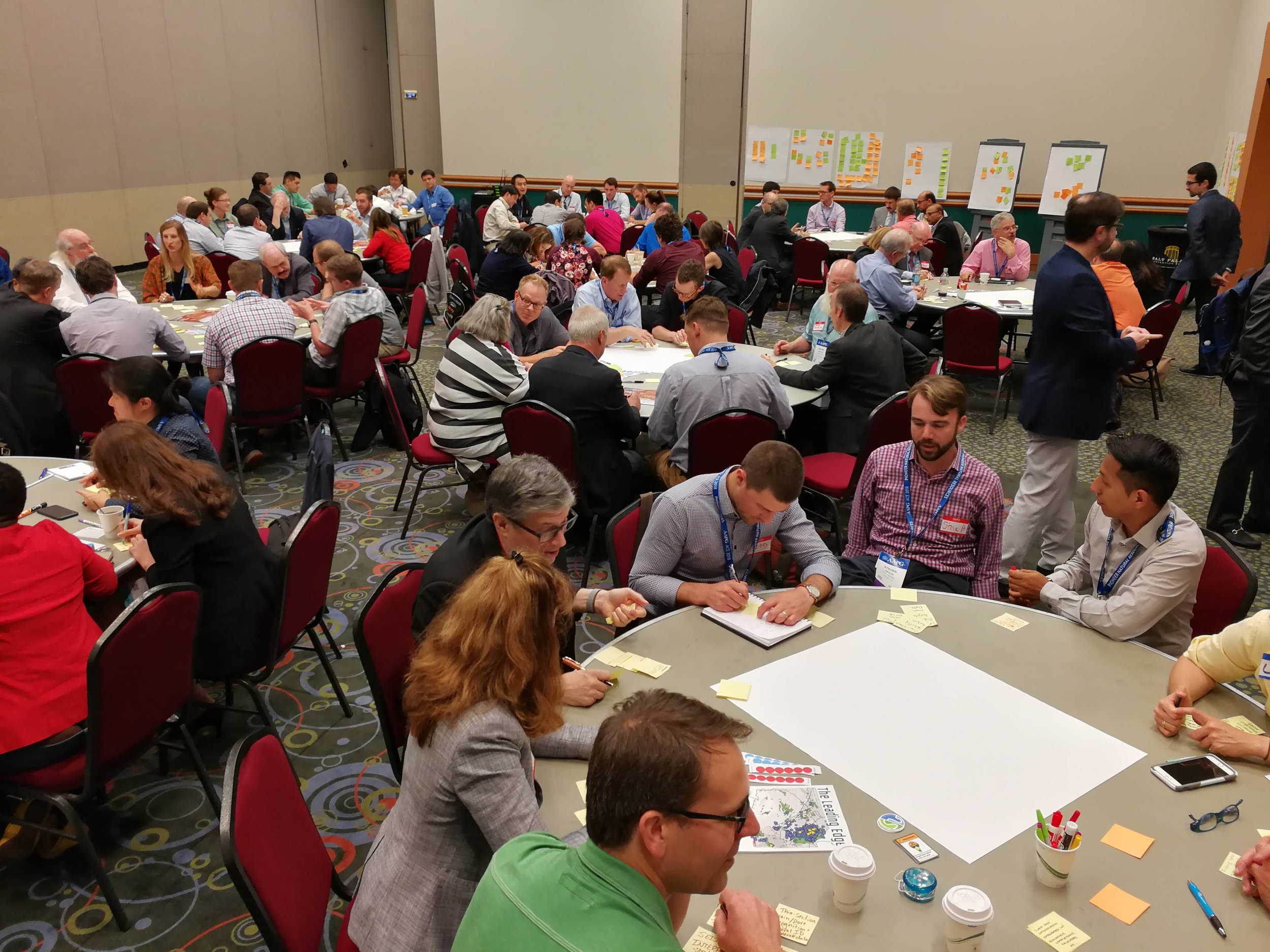
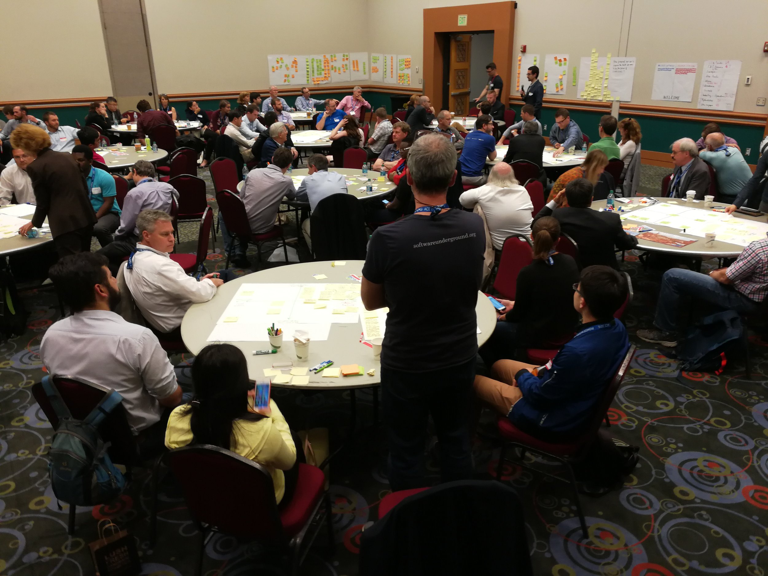
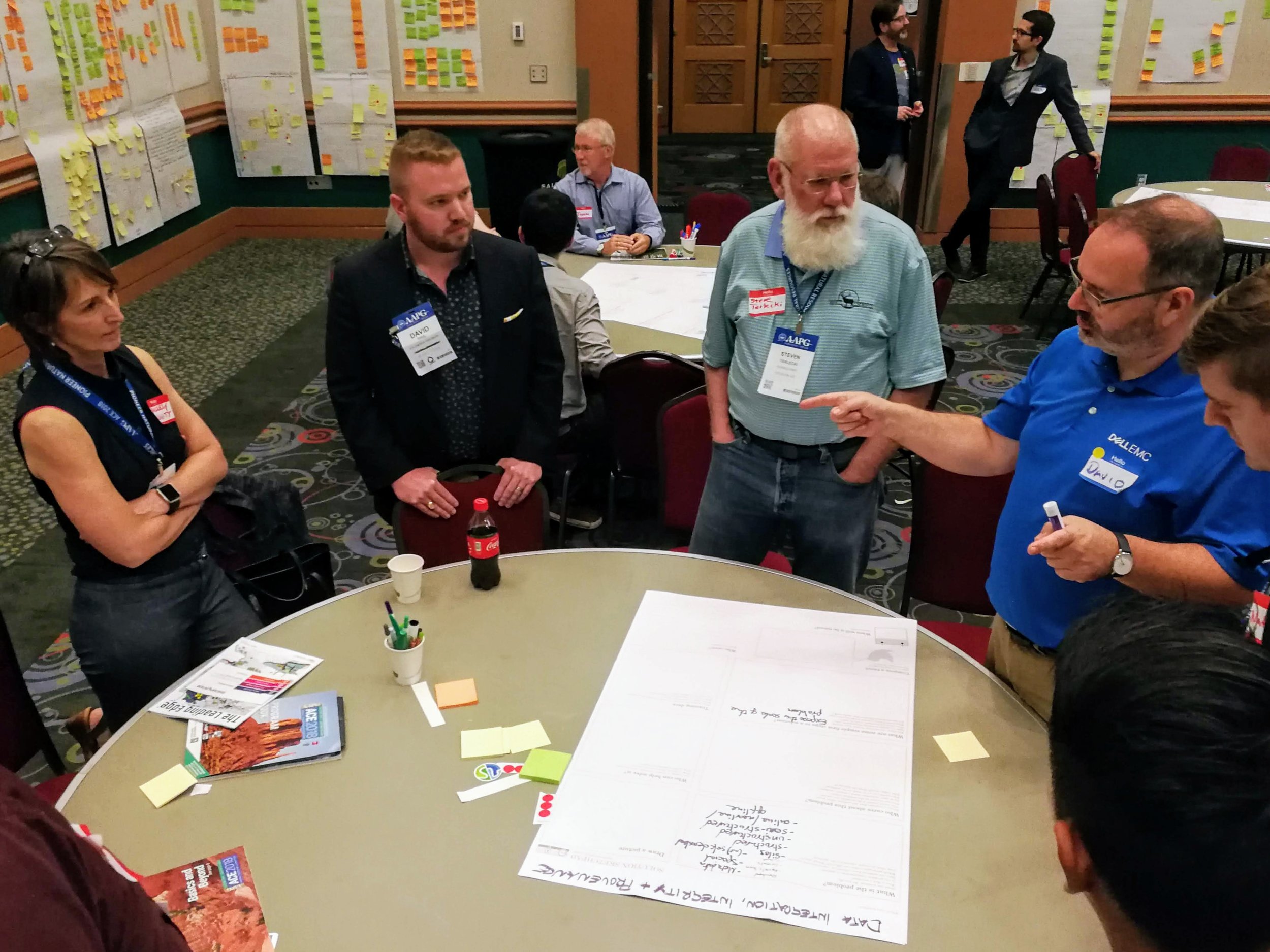
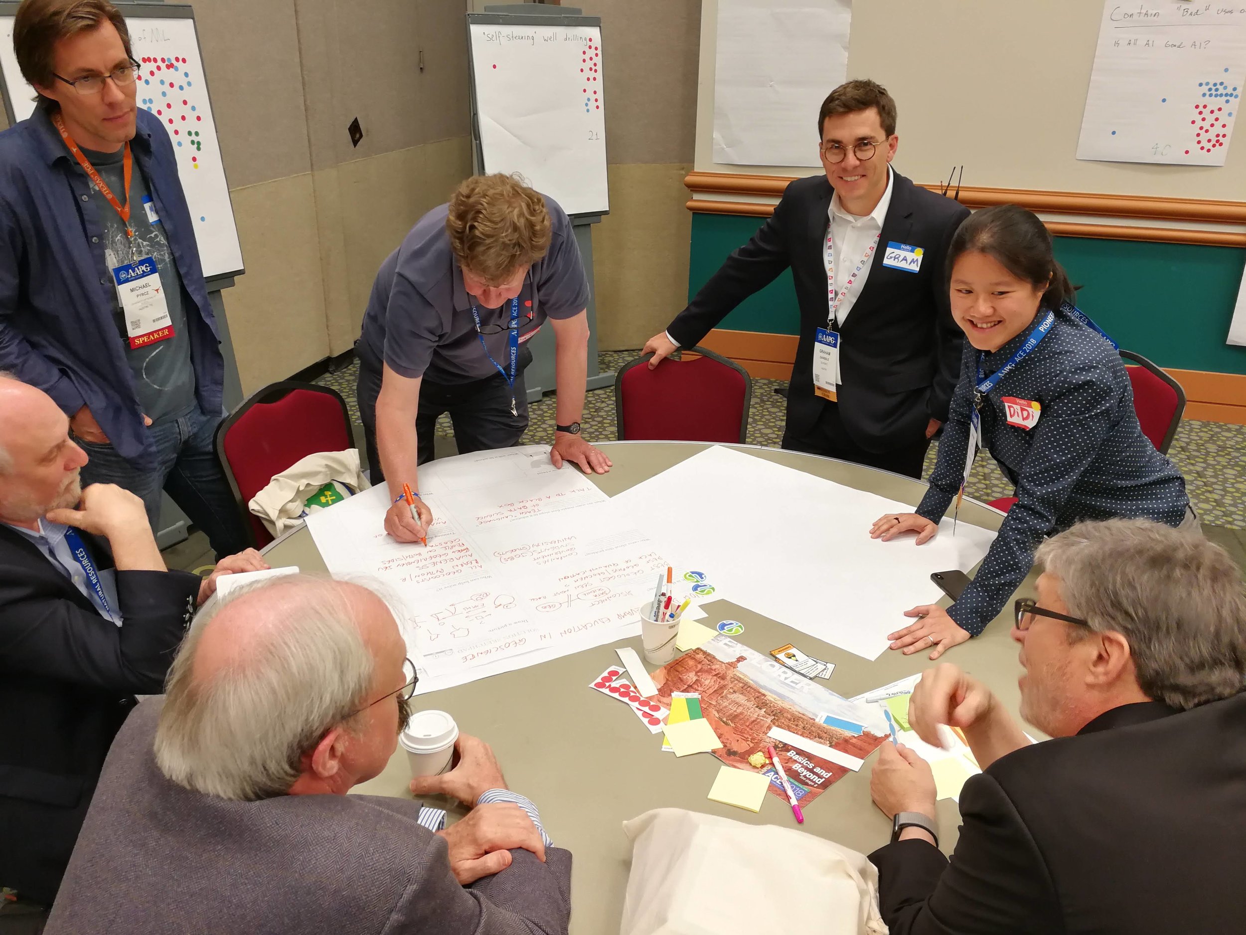
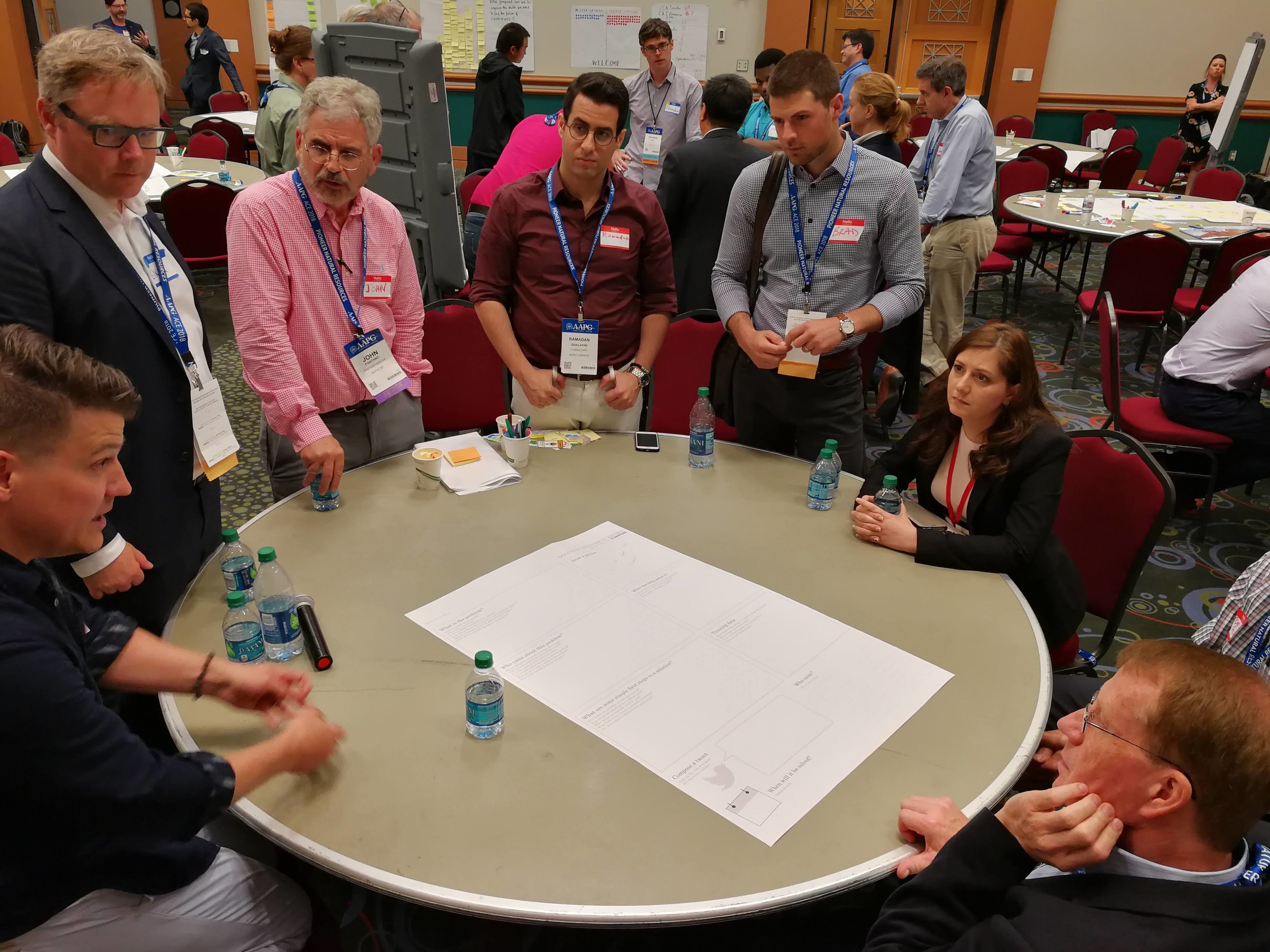
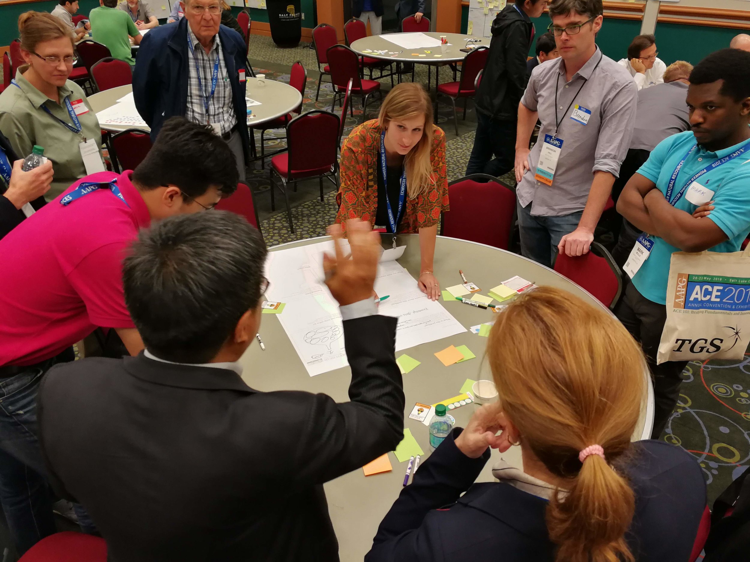
Over 150 participants came to Room 251 for all or part of the first 'unsession' at the AAPG Annual Conference and Exhibition in Salt Lake City. I was one of the hosts of the event, and emceed the afternoon.

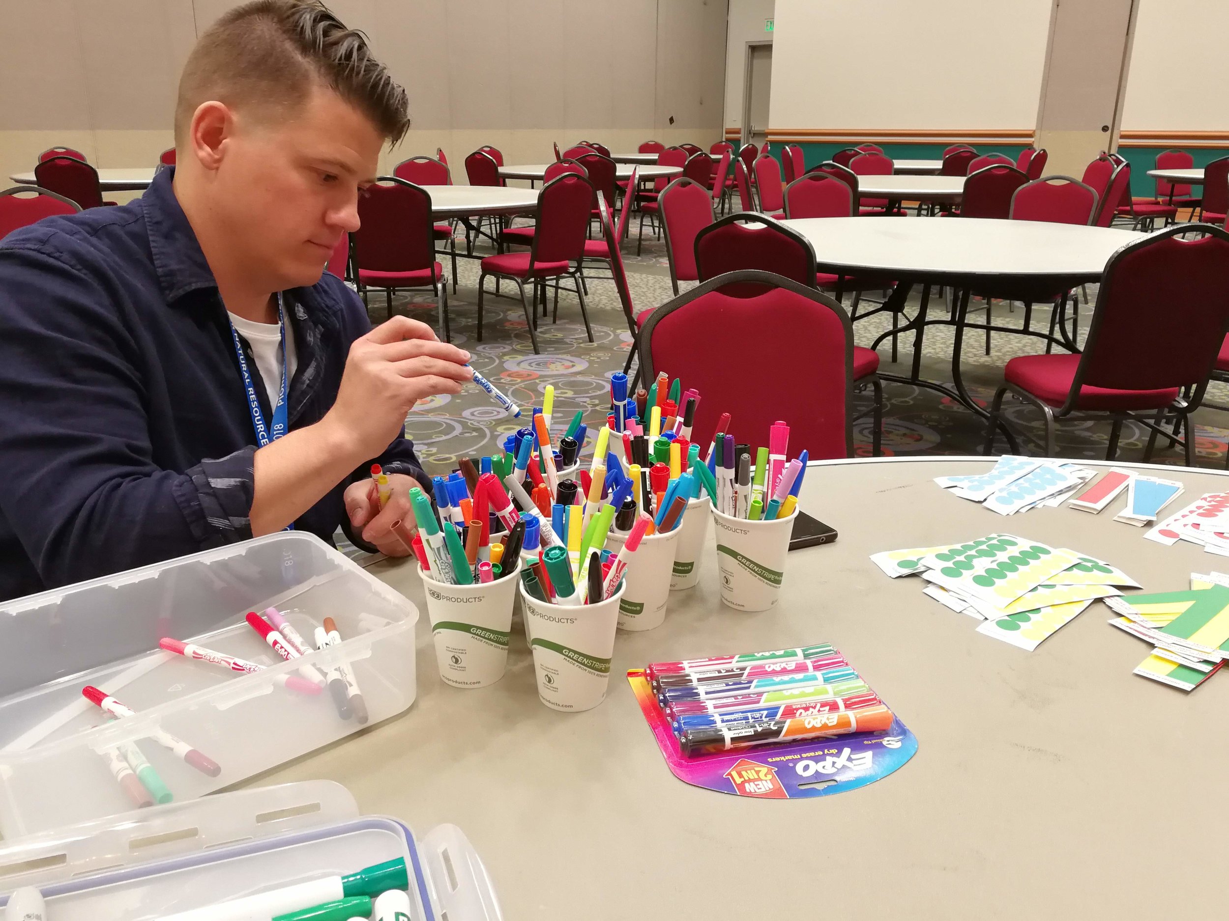
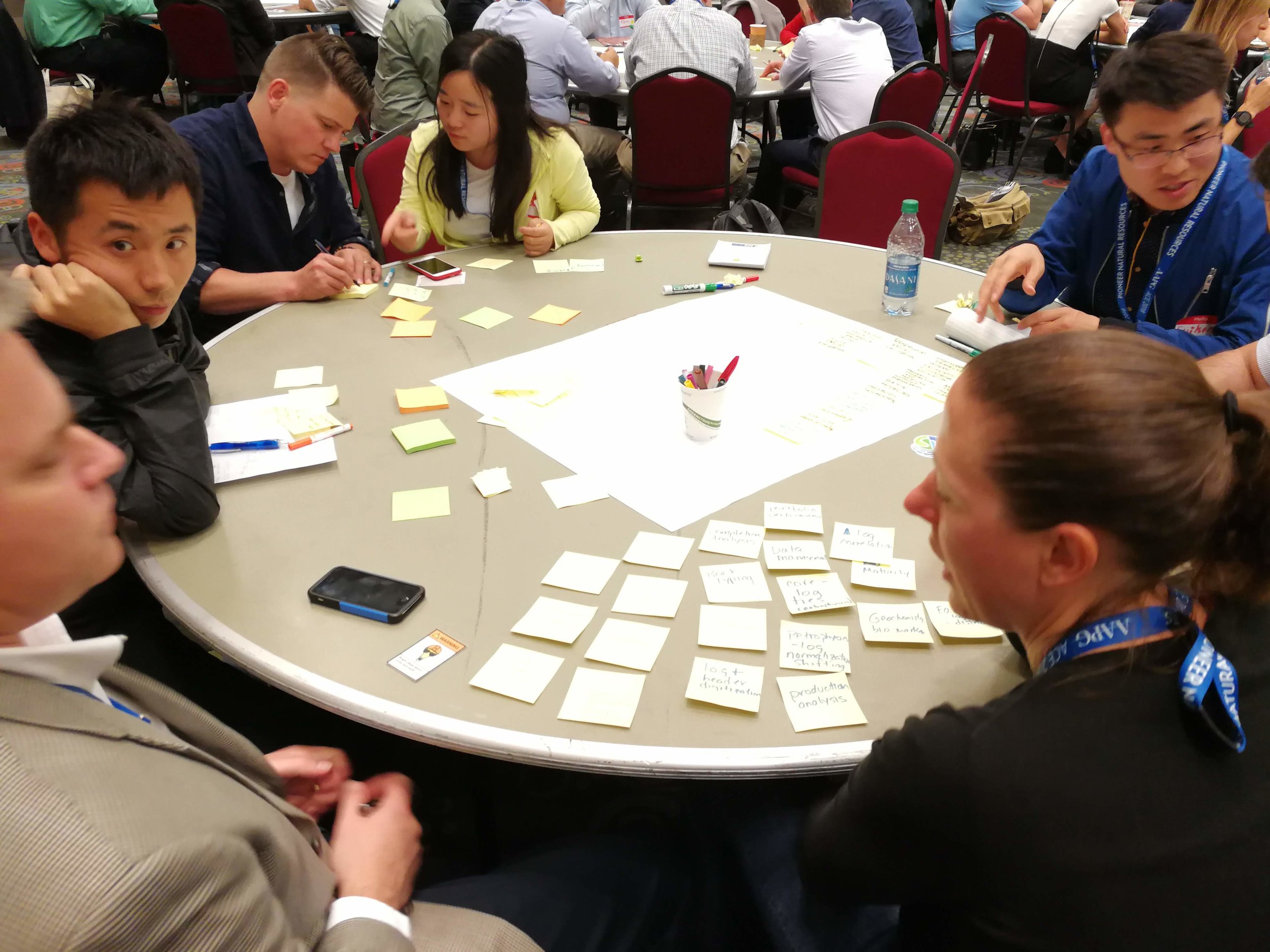
In a nutshell, it was awesome. I have facilitated unsessions before, but this event was on a new scale. Twelve tables of 8–10 seats — covered in sticky notes, stickers, coloured pens, and large sheets of paper — quickly filled up. Together, we burned about 10 person-weeks of human productivity, raising the temperature in the room by several degrees in the process.

Diversity means good conversation

On the way in, people self-identified as mostly software (blue name tags) or mostly soft rocks (red), as a non-serious way to get a handle on how many data scientists we had vs how many people are focused on the rocks themselves — without, I hope, any kind of value judgment. The ratio was about 1:2.

As people continued to drift in, we counted people identifying with various categories, to get a very rough idea of who was in the room. The results are shown here. In addition, I counted 24 women present at the start. Part of the point here is to introduce participants to each other, but there's another purpose too. AAPG, like many scientific organizations, is grappling with diversity today. Like others, it needs to do much better. A small part of the solution is, I think, to name it and measure how we're doing at every opportunity. It's one way to pay more attention.

Harder to capture is the profound level of job diversity. People responsible for billion-dollar budgets sat with graduate students, AAPG medal winners with SEC executives. We even had a venture capitalist and a physician.

Look at all these lovely people:

Tangible and intangible output

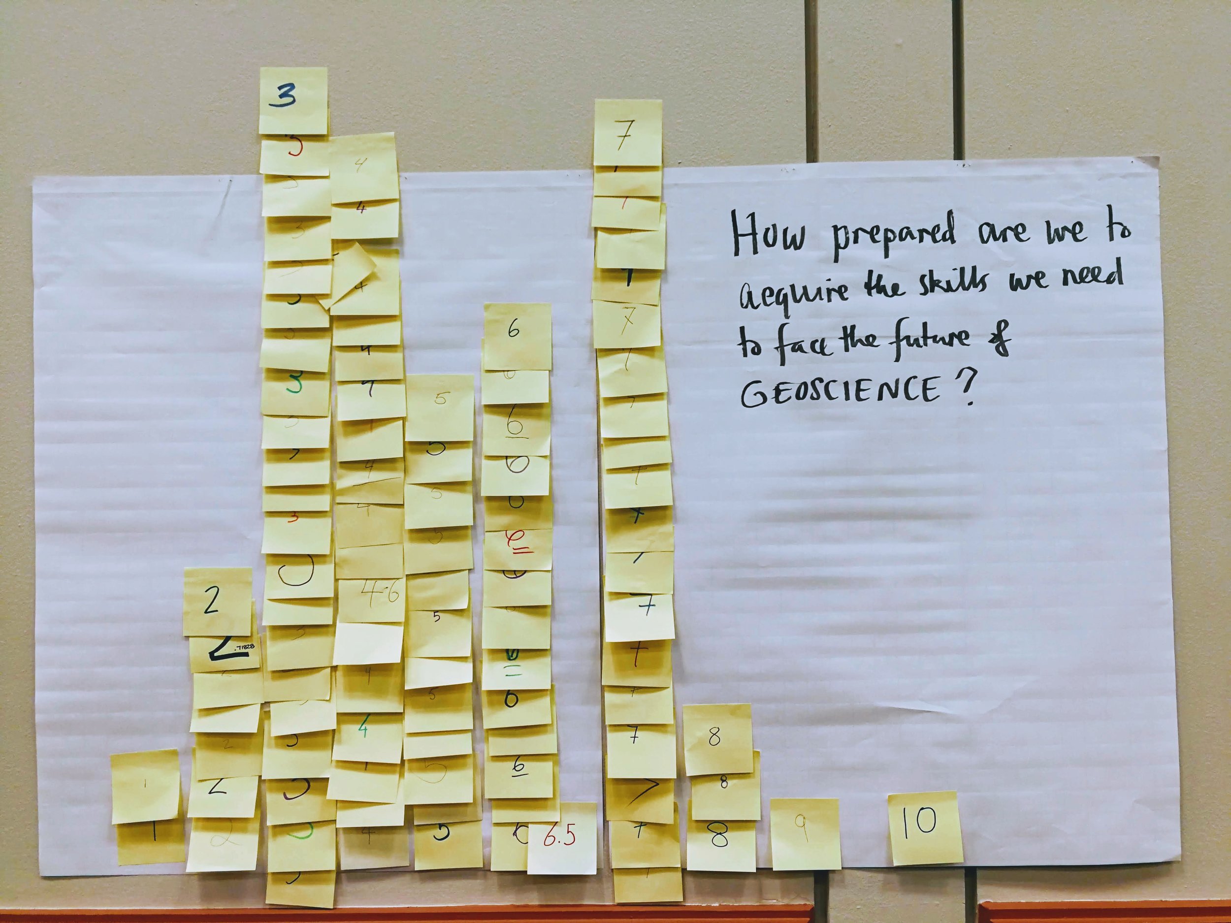
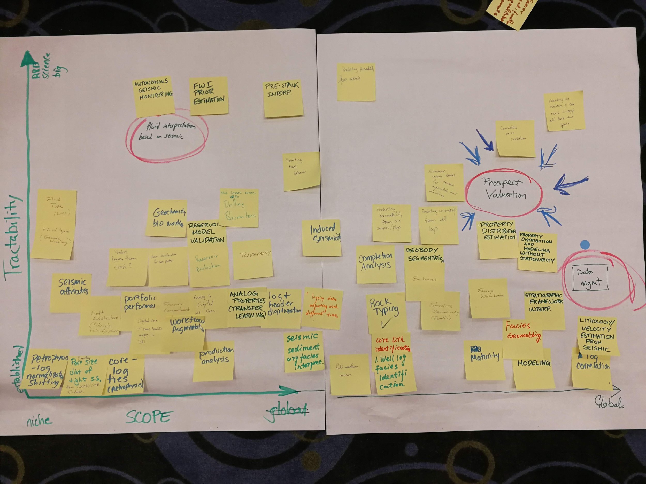
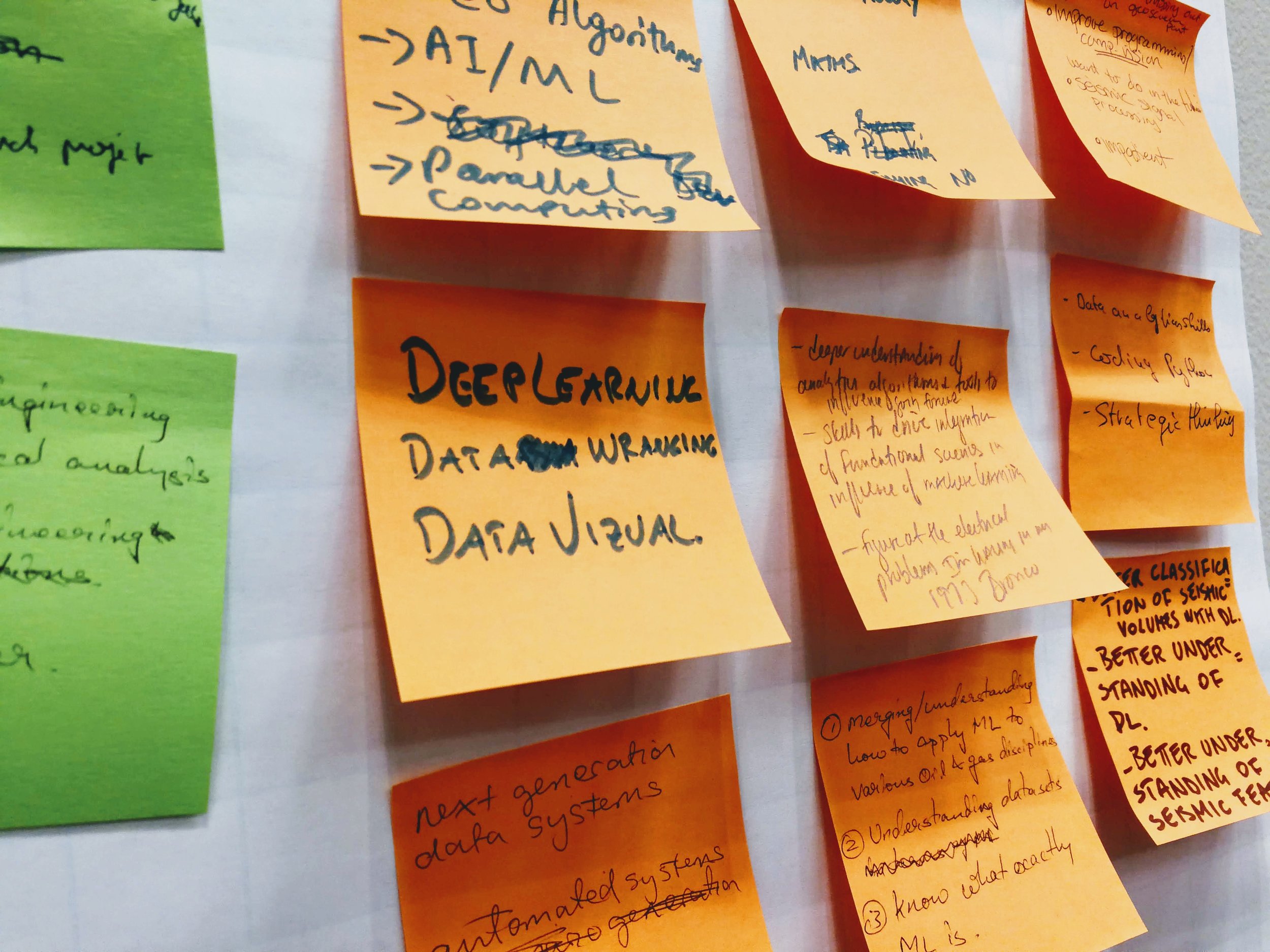
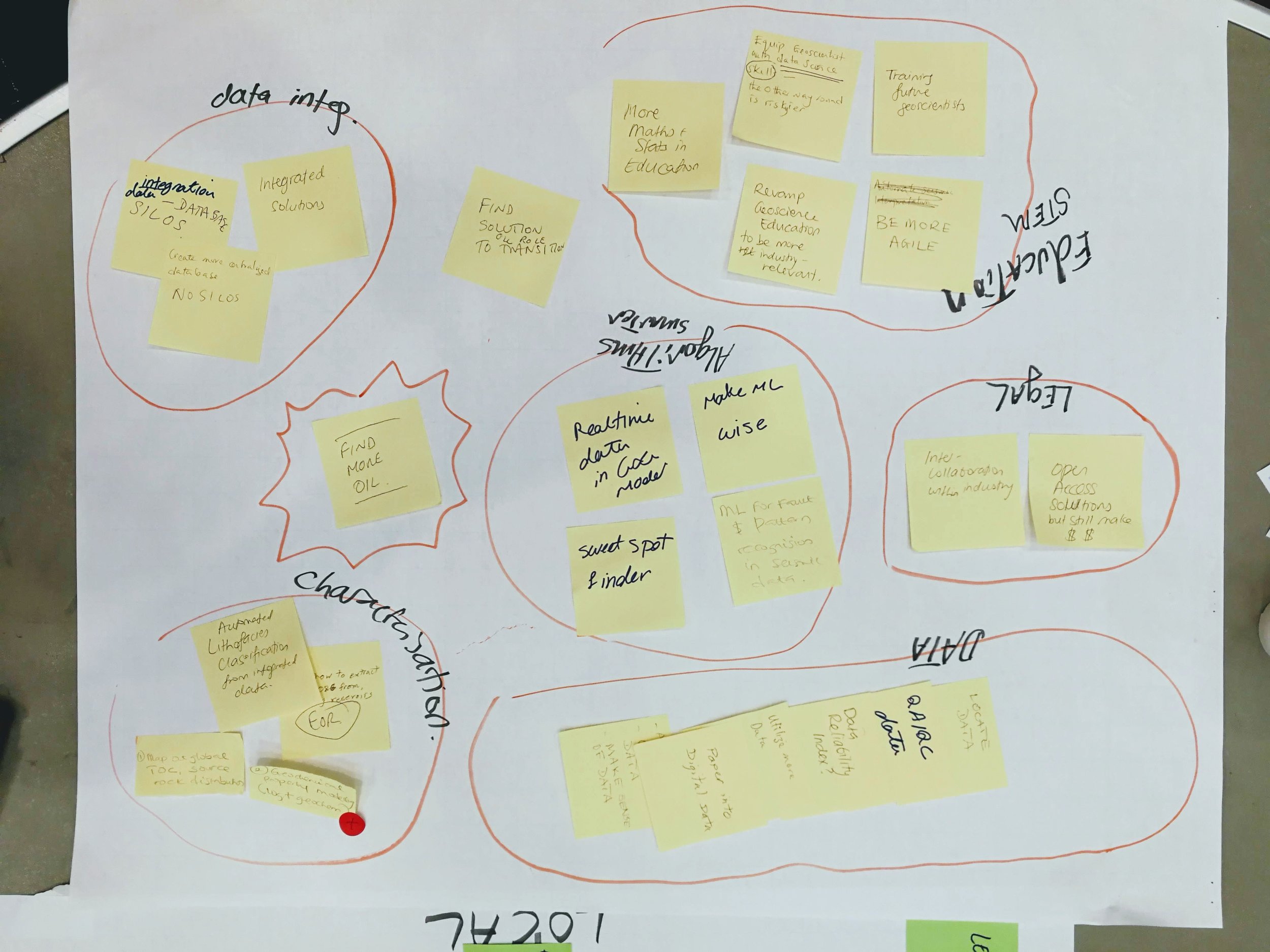
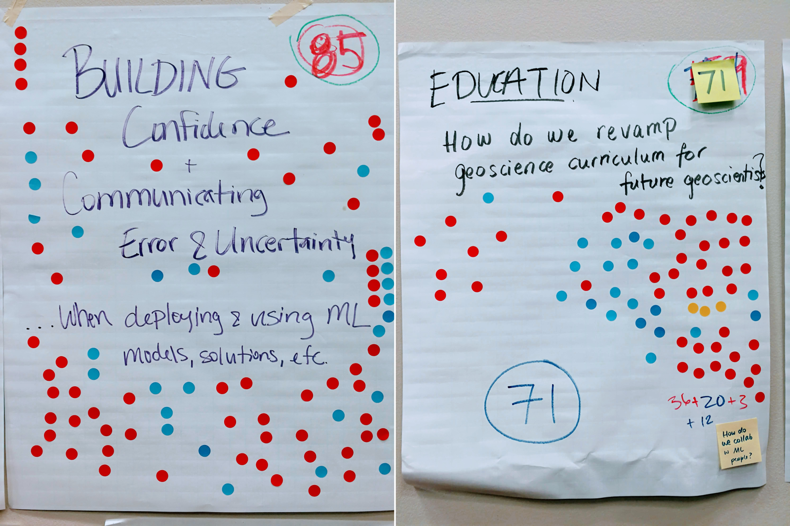
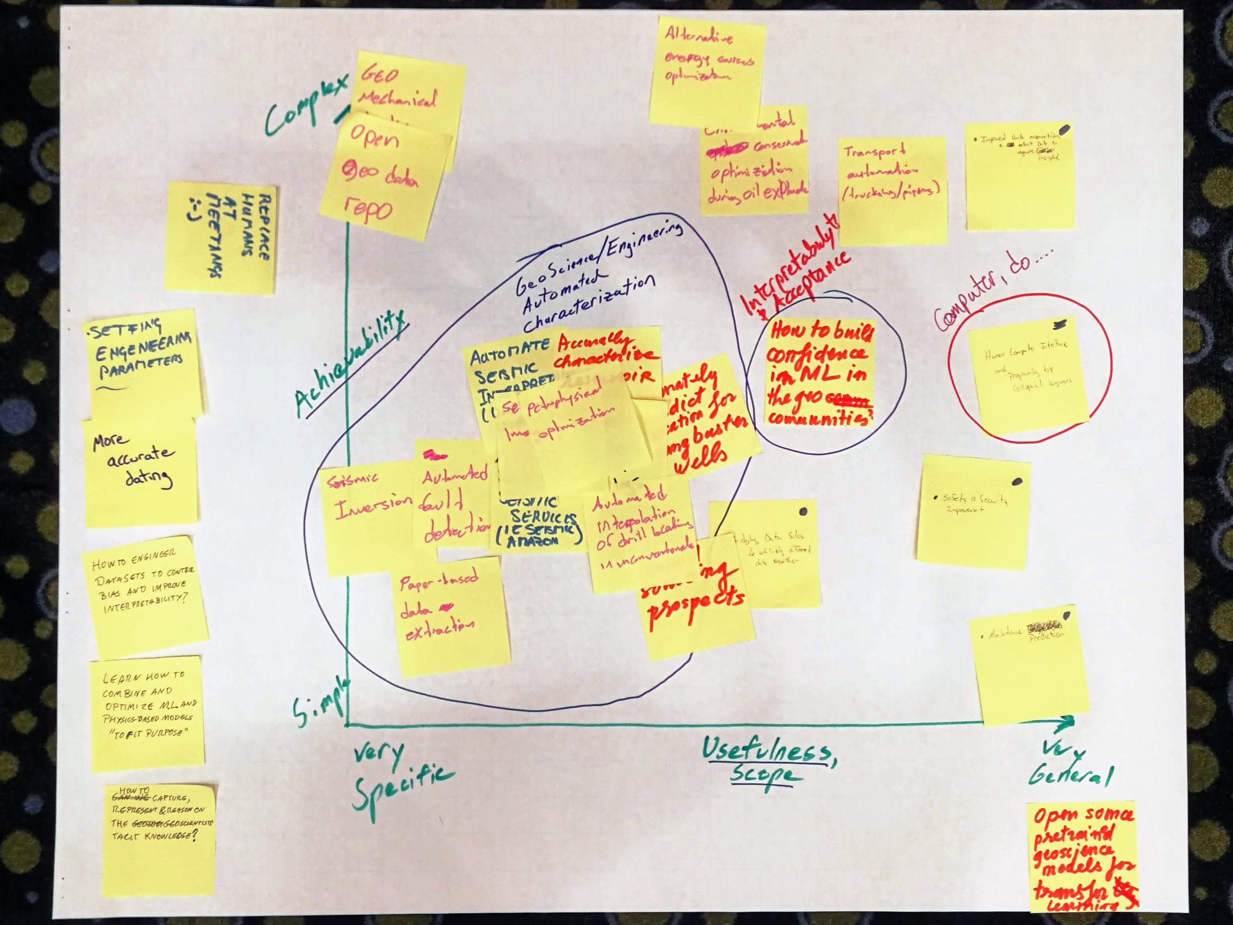
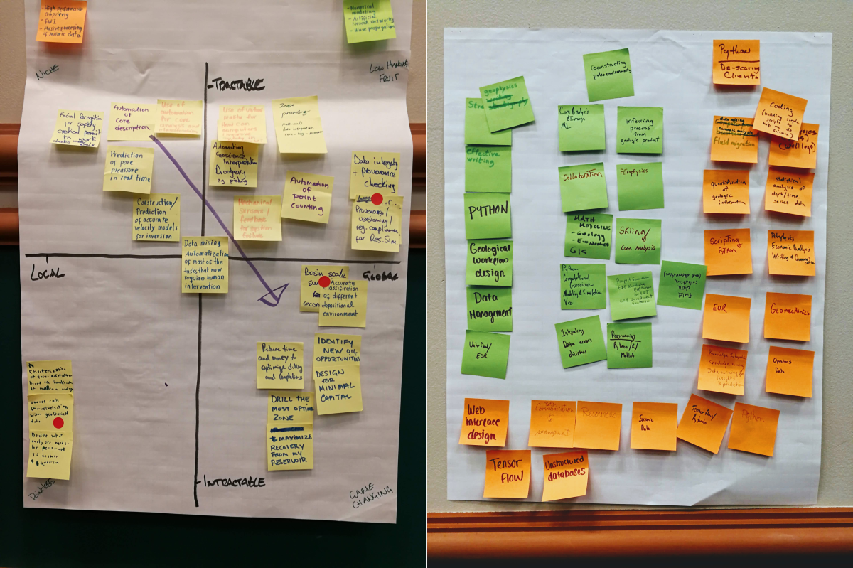
At the start of the session, I told the room I wanted to fill the walls with things we made — with data. We easily achieved this, producing a survey of the skills geoscientists will need in the future, hundreds of high-value machine learning tasks in geoscience, a ranked list of the most interesting of these, and even some problem analysis of some of them. None of this was definitive, but I hope it will provide grist for the mill of future conversations about machine learning in geoscience.

As well as these tangible products, each person in the room walked away with new connections and new ideas — about machine learning, about collaboration, and about what scientific meetings can be like.

Acknowledgments

A lot of people contributed to making this event happen.

My unsession co-chairs, Brendon Hall and Yan Zaretskiy of Enthought — spent several hours on the phone with me over the last few weeks, shaping the content and flow of an event that was a bit, er, fuzzy.

We seeded the tables with some of the Software Underground crowd who were in town for the hackathon and AAPG. This ensures that there's no failure case: twelve people are definitely coming. And in the unlikely event that 100 people come, there are twelve allies to manage some of the chaos. Heartfelt thanks to the table hosts:

  • Didi Ooi of the University of Bristol
  • Graham Ganssle of Expero
  • Lisa Stright of Colorado State University
  • Thomas Martin of Colorado School of Mines
  • Tom Creech of ExxonMobil
  • David Holmes of Dell EMC
  • Steve Purves of Euclidity
  • Diego Castaneda of Agile
  • Evan Bianco of Agile

Jenny Cole of SEG came along to observe the session and I appreciated her enthusiastic help as it became clear we were in for more than the usual amount of entropy in the room. Theresa Curry of AAPG did an amazing job getting the venue set up, providing refreshments, and ensuring the photographers were there to capture some of the action. The ACE 2018 organizing committee, especially Zane Jobe and Lauren Birgenheier, did their part by agreeing to supprt including such a weird-sounding thing in the program.

Finally, thank you to the 100+ scientists that came to the event, not knowing at all what to expect. It was a privilege to receive your enthusiastic participation and thoughtful contributions. Let's do it again some time!


We will digitize the ideas and products of the unsession over the coming weeks. They will be released under an open license. Watch this space for updates.

If you're interested in the methodology we use for these events, check out Proceedings of an unsession in CSEG Recorder, November 2013. If you'd like help running an event like this, get in touch.

The geospatial sport

An orienteer leaving a control site. 

If you love studying maps or solving puzzles, and you love being outside, then orienteering — the thinking runner's sport — might be the sport you've been looking for.

There are many, many flavours of orienteering (on foot, on skis, in kayaks, etc), but here's how it generally works:

  • Competitors make their way to an event, perhaps on a weekday evening, maybe a weekend morning.
  • Several courses are offered, varying in length (usually 2 to 12 km) and difficulty (from walk-in-the-park to he's-still-not-back-call-search-and-rescue).
  • A course consists of about 20 or so 'controls', which must be visited in order. Visits are recorded on an electronic 'dibber' carried by the orienteer, or by shapes punched on a card.
  • Each person chooses a course , and is allotted a start time.
  • You can't see your course — or the map — until you start. You have 0 seconds to prepare.
  • You walk or run or ski or bike around the controls, at various speeds and in various (occasionally incorrect) directions.
  • After making it to the finish, everyone engages in at least 30 minutes of analysis and dissection of route choices and split times, while eating everything in sight.

The catch is that your navigation system is entirely analog: you are only allowed a paper map and an analog compass, plus a whistle for safety. The only digital components are the timing system and the map-making process — which starts with LiDAR and ends in a software package like OCAD or OOM.

Orienteering maps are especially awesome. They are usually made especially for the sport, typically at 1:5000 or 1:7500, with a 2.5 m or 5 m contour interval. Many small features are mapped, for example walls and fences, small pits and mounds, and even individual trees and boulders.

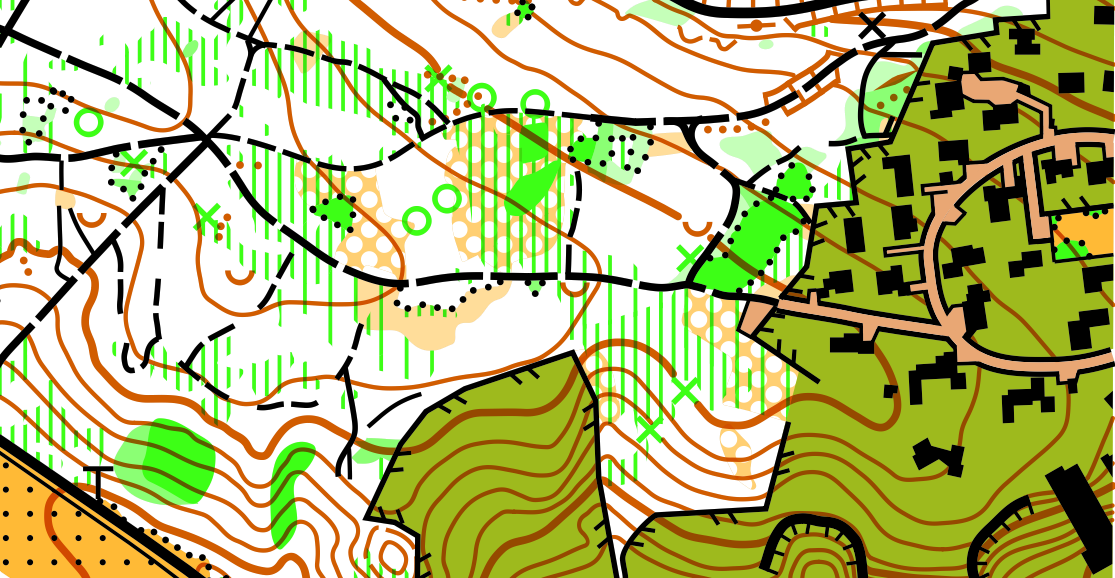
The sample orienteering map from the Open Orienteering Mapper software, licensed GNU GPL. White areas correspond to open, runnable (high velocity) woodland, with darker shades of green indicating slower running. Yellow areas are open. Olive green ar…

The sample orienteering map from the Open Orienteering Mapper software, licensed GNU GPL. White areas correspond to open, runnable (high velocity) woodland, with darker shades of green indicating slower running. Yellow areas are open. Olive green areas are out of bounds.

Other than the contours and paths, the most salient feature is usually the vegetation, which is always carefully mapped. Geophysicists will like this: the colours correspond more to the speed with which you can run than to the type of vegetation. Orienteering maps are velocity maps!

Here's part of another map, this one from Debert, Nova Scotia:

bluenose-map-debert.png

So, sporty cartophile friends, I urge you to get out and give it a try. My family loves it because it's something we can do together — we all get to compete on our own terms, with our own peers, and there's a course for everyone. I'm coming up on 26 years in the sport, and every event is still a new adventure!


World Orienteering Day — really a whole week — is in the last week in May. It's a great time to give orienteering a try. There are events all over the world, but especially in Europe. If you can't find one near you, track down your national organization and check for events near you.

It's Dynamic Range Day!

OK signal processing nerds, which side are you on in the Loudness War?

If you haven't heard of the Loudness War, you have some catching up to do! This little video by Matt Mayfield is kinda low-res but it's the shortest and best explanation I've been able to find. Watch it, then choose sides >>>>

There's a similar-but-slightly-different war going on in photography: high-dynamic-range or HDR photography is, according to some purists, an existential threat to photography. I'm not going to say any more about it today, but these HDR disasters speak volumes.

True amplitudes

The ideology at the heart of the Loudness War is that music production should be 'pure'. It's analogous to the notion that amplitudes in seismic images should be 'true', and just as nuanced. For some, the idea could be to get as close as possible to a live performance, for others it might be to create a completely synthetic auditory experience; for a record company the main point is to be noticed and then purchased (or at least searched for on Spotify). It reminds me a bit of the aesthetically

For a couple of decades, mainstream producers succumbed to the misconception that driving up the loudness — by increasing the mean amplitude, in turn by reducing the peaks and boosting the quiet passages — was the solution. But this seems to be changing. Through his tireless dedication to the cause, engineer Ian Shepherd has been a key figure in unpeeling this idée fixe. As part of his campaigning, he instituted Dynamic Range Day, and tomorrow is the 8th edition. 

If you want to hear examples of well-produced, dynamic music, check out the previous winners and runners up of the Dynamic Range Day Award — including tunes by Daft Punk, The XX, Kendrick Lamar, and at the risk of dating myself, Orbital.

The end is in sight

I'll warn you right now — this Loudness War thing is a bit of a YouTube rabbithole. But if you still haven't had enough, it's worth listening to the legendary Bob Katz talking about the weapons of war.

My takeaway: the war is not over, but battles are being won. For example, Spotify last year reduced its target output levels, encouraging producers to make more dynamic records. Katz ends his video with "2020 will be like 1980" — which is a good thing, in terms of audio engineering — and most people seem to think the Loudness War will be over.

Happy π day, Einstein

It's Pi Day today, and also Einstein's 139th birthday. MIT celebrates it at 6:28 pm — in honour of pi's arch enemy, tau — by sending out its admission notices.

And Stephen Hawking died today. He will leave a great, black hole in modern science. I saw him lecture in London not long after A Brief History of Time came out. It was one of the events that inspired me along my path to science. I recall he got more laughs than a lot of stand-ups I've seen.

But I can't really get behind 3/14. The weird American way of writing dates, mixed-endian style, really irks me. As a result, I have previously boycotted Pi Day, instead celebrating it on 31/4, aka 31 April, aka 1 May. Admittedly, this takes the edge off the whole experience a bit, so I've decided to go full big-endian and adopt ISO-8601 from now on, which means Pi Day is on 3141-5-9. Expect an epic blog post that day.

Transcendence

Anyway, I will transcend the bickering over dates (pausing only to reject 22/7 and 6/28 entirely so don't even start) to get back to pi. It so happens that Pi Day is of great interest in our house this year because my middle child, Evie (10), is a bit obsessed with pi at the moment. Obsessed enough to be writing a book about it (she writes a lot of books; some previous topics: zebras, Switzerland, octopuses, and Settlers of Catan fan fiction, if that's even a thing).

I helped her find some ways to generate pi numerically. My favourite one uses Riemann's zeta function, which we'd recently watched a Numberphile video about. It's the sum of the reciprocals of the natural numbers raised to increasing powers:

$$\zeta(s) = \sum_{n=1}^\infty \frac{1}{n^s}$$

Leonhard Euler solved the Basel problem in 1734, proving that \(\zeta(2) = \pi^2 / 6\), so you can compute pi slowly with a naive implementation of the zeta function:

 
def zeta(s, terms=1000):
    z = 0
    for t in range(1, int(terms)):
        z += 1 / t**s
    return z

(6 * zeta(2, terms=1e7))**0.5

Which returns pi, correct to 6 places:

 
3.141592558095893

Or you can use one of the various optimized versions of the zeta function, for example this one from the floating point math library mpmath (which I got from this awesome list of 100 ways to compute pi):

 
>>> from mpmath import *
>>> mp.dps = 50
>>> mp.pretty = True
>>>
>>> sqrt(6*zeta(2))
3.1415926535897932384626433832795028841971693993751068

...which is correct to 50 decimal places.

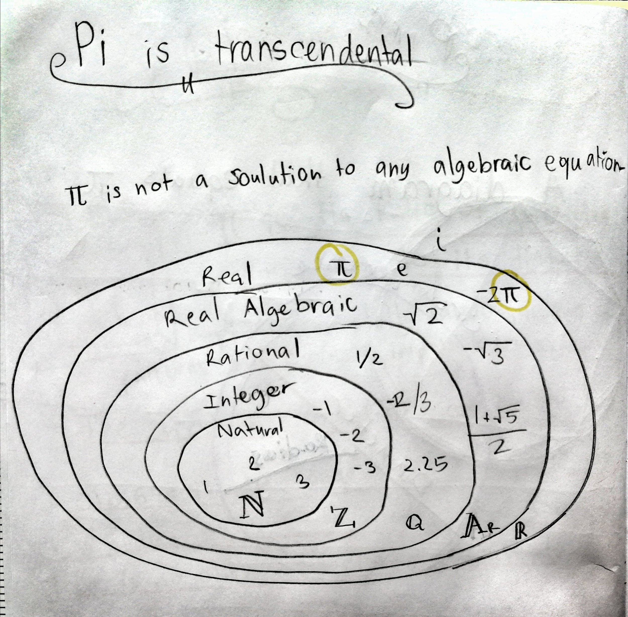
Here's the bit of Evie's book where she explains a bit about transcendental numbers.

Evie's book shows the relationships between the sets of natural numbers (N), integers (Z), rationals (Q), algebraic numbers (A), and real numbers (R). Transcendental numbers are real, but not algebraic. (Some definitions also let them be complex.)

Evie's book shows the relationships between the sets of natural numbers (N), integers (Z), rationals (Q), algebraic numbers (A), and real numbers (R). Transcendental numbers are real, but not algebraic. (Some definitions also let them be complex.)

I was interested in this, because while I 'knew' that pi is transcendental, I couldn't really articulate what that really meant, and why (say) √2, which is also irrational, is not also transcendental. Succinctly, transcendental means 'non-algebraic' (equivalent to being non-constructible). Since √2 is obviously the solution to \(x^2 - 2 = 0\), it is algebraic and therefore not transcendental. 

Weirdly, although hardly any numbers are known to be transcendental, almost all real numbers are. Isn't maths awesome?

Have a transcendental pi day!


The xkcd comic is by Randall Munroe and licensed CC-BY-NC.

Jounce, Crackle and Pop

jerk_shirt.png

I saw this T-shirt recently, and didn't get it. (The joke or the T-shirt.)

It turns out that the third derivative of displacement \(x\) with respect to time \(t\) — that is, the derivative of acceleration \(\mathbf{a}\) — is called 'jerk' (or sometimes, boringly, jolt, surge, or lurch) and is measured in units of m/s³. 

So far, so hilarious, but is it useful? It turns out that it is. Since the force \(\mathbf{F}\) on a mass \(m\) is given by \(\mathbf{F} = m\mathbf{a}\), you can think of jerk as being equivalent to a change in force. The lurch you feel at the onset of a car's acceleration — that's jerk. The designers of transport systems and rollercoasters manage it daily.

$$ \mathrm{jerk,}\ \mathbf{j} = \frac{\mathrm{d}^3 x}{\mathrm{d}t^3}$$

Here's a visualization of velocity (green line) of a Tesla Model S driving in a parking lot. The coloured stripes show the acceleration (upper plot) and the jerk (lower plot). Notice that the peaks in jerk correspond to changes in acceleration.

jerk_velocity_acceleration.png
jerk_velocity_jerk.png

The snap you feel at the start of the lurch? That's jounce  — the fourth derivative of displacement and the derivative of jerk. Eager et al (2016) wrote up a nice analysis of these quantities for the examples of a trampolinist and roller coaster passenger. Jounce is sometimes called snap... and the next two derivatives are called crackle and pop. 

What about momentum?

If the momentum \(\mathrm{p}\) of a mass \(m\) moving at a velocity \(v\) is \(m\mathbf{v}\) and \(\mathbf{F} = m\mathbf{a}\), what is mass times jerk? According to the physicist Philip Gibbs, who investigated the matter in 1996, it's called yank:

Momentum equals mass times velocity.
Force equals mass times acceleration.
Yank equals mass times jerk.
Tug equals mass times snap.
Snatch equals mass times crackle.
Shake equals mass times pop.

There are jokes in there, help yourself.

What about integrating?

Clearly the integral of jerk is acceleration, and that of acceleration is velocity, the integral of which is displacement. But what is the integral of displacement with respect to time? It's called absement, and it's a pretty peculiar quantity to think about. In the same way that an object with linearly increasing displacement has constant velocity and zero acceleration, an object with linearly increasing absement has constant displacement and zero velocity. (Constant absement at zero displacement gives rise to the name 'absement': an absence of displacement.)

Integrating displacement over time might be useful: the area under the displacement curve for a throttle lever could conceivably be proportional to fuel consumption for example. So absement seems to be a potentially useful quantity, measured in metre-seconds.

Integrate absement and you get absity (a play on 'velocity'). Keep going and you get abseleration, abserk, and absounce. Are these useful quantities? I don't think so. A quick look at them all — for the same Tesla S dataset I used before — shows that the loss of detail from multiple cumulative summations makes for rather uninformative transformations: 

jerk_jounce_etc.png

You can reproduce the figures in this article with the Jupyter Notebook Jerk_jounce_etc.ipynb. Or you can launch a Binder right here in your browser and play with it there, without installing a thing!


References

David Eager et al (2016). Beyond velocity and acceleration: jerk, snap and higher derivatives. Eur. J. Phys. 37 065008. DOI: 10.1088/0143-0807/37/6/065008

Amarashiki (2012). Derivatives of position. The Spectrum of Riemannium blog, retrieved on 4 Mar 2018.

The dataset is from Jerry Jongerius's blog post, The Tesla (Elon Musk) and
New York Times (John Broder) Feud
. I have no interest in the 'feud', I just wanted a dataset.

The T-shirt is from Chummy Tees; the image is their copyright and used here under Fair Use terms.

The vintage Snap, Crackle and Pop logo is copyright of Kellogg's and used here under Fair Use terms.