
Ternary diagrams
/I like spectrums (or spectra, if you must). It's not just because I like signals and Fourier transforms, or because I think frequency content is the most under-appreciated attribute of seismic data. They're also an important thinking tool. They represent a continuum between two end-member states, both rare or unlikely; in between there are shades of ambiguity, and this is usually where nature lives.
Take the sport–game continuum. Sports are pure competition — a test of strength and endurance, with few rules and unequivocal outcomes. Surely marathon running is pure sport. Contrast that with a pure game, like darts: no fitness, pure technique. (Establishing where various pastimes lie on this continuum is a good way to start an argument in a pub.)
There's a science purity continuum too, with mathematics at one end and social sciences somewhere near the other. I wonder where geology and geophysics lie...

Degrees of freedom
 The thing about a spectrum is that it's two-dimensional, like a scatter plot, but it has only one degree of freedom, so we can map it onto one dimension: a line.
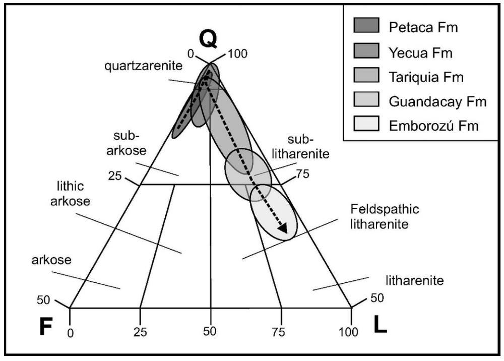
The three-dimensional equivalent of the spectrum is the ternary diagram: 3-parameter space mapped onto 2D. Not a projection, like a 3D scatter plot, because there are only two degrees of freedom — the parameters of a ternary diagram cannot be independent. This works well for volume fractions, which must sum to one. Hence their popularity for the results of point-count data, like this Folk classification from Hulk & Heubeck (2010).
We can go a step further, natch. You can always go a step further. How about four parameters with three degrees of freedom mapped onto a tetrahedron? Fun to make, not so fun to look at. But not as bad as a pentachoron.
How to make one
The only tools I've used on the battlefield, so to speak are Trinity, for ternary plots, and TetLab, for tetrahedrons (yes, I went there), both Mac OS X only, and both from Peter Appel of Christian-Albrechts-Universität zu Kiel. But there are more...
 A great many tools are discussed in this StackOverflow thread, mostly using R and Python.
- Of those tools, ggtern (in R) seems to have a lot of features, like contours and density maps.
- For Python, WxTernary and Veusz look like they may be the best choices.
- There's a script here too, but it looks a little dated. Ripe for rescuing in a Notebook...
- If you are stuck in Excel (we can help!), there may be options for you too.
- If you like pencils, there's a printable template on SubSurfWiki.
Do you use ternary plots, or are they nothing more than a cute way to show some boring data? How do you make them? Care to share any?
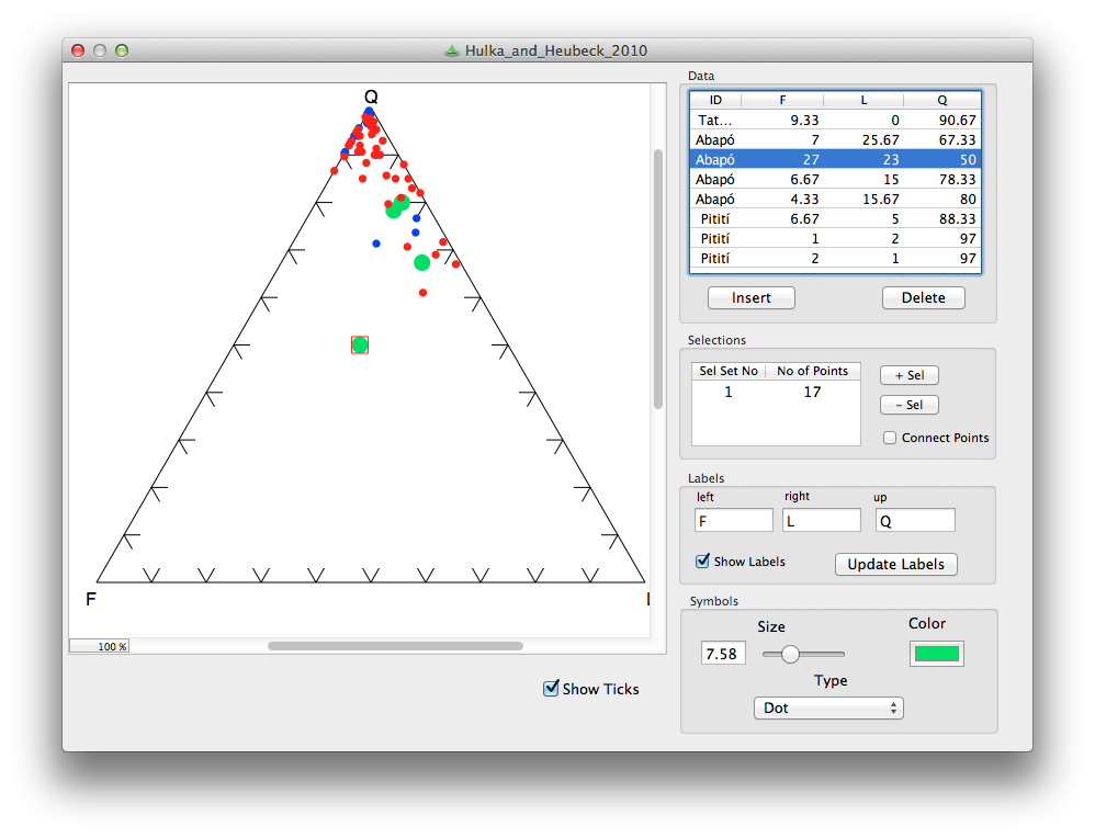
The cartoon is from xkcd.com, licensed CC-BY-NC. The example diagram and example data are from Hulka, C and C Heubeck (2010). Composition and provenance history of Late Cenozoic sediments in southeastern Bolivia: Implications for Chaco foreland basin evolution and Andean uplift. Journal of Sedimentary Research 80, 288–299. DOI: 10.2110/jsr.2010.029 and available online from the authors.


 Except where noted, this content is licensed