An update on Volve

Writing about the new almost-open dataset at Groningen yesterday reminded me that things have changed a little on Equinor’s Volve dataset in Norway. Illustrating the principle that there are more ways to get something wrong than to get them right, here’s the situation there.


In 2018, Equinor generously released a very large dataset from the decommissioned field Volve. The data is undoubtedly cool, but initially it was released with no licence. Later in 2018, a licence was added but it was a non-open licence, CC BY-NC-SA. Then, earlier this year, the licence was changed to a modified CC BY licence. Progress, sort of.

I think CC BY is an awesome licence for open data. But modifying licences is always iffy and in this case the modifications mean that the licence can no longer be called ‘open’, because the restrictions they add are not permitted by the Open Definition. For me, the problematic clauses in the modification are:

  • You can’t sell the dataset. This is almost as ambiguous as the previous “non-commercial” clause. What if it’s a small part of a bigger offering that adds massive value, for example as demo data for a software package? Or as one piece in a large data collection? Or as the basis for a large and expensive analysis? Or if it was used to train a commercial neural network?

  • The license covers all data in the dataset whether or not it is by law covered by copyright. It's a bit weird that this is tucked away in a footnote, but okay. I don't know how it would work in practice because CC licenses depend on copyright. (The whole point of uncopyrightable content is that you can't own rights in it, nevermind license it.)

It’s easy to say, “It’s fine, that’s not what Equinor meant.” My impression is that the subsurface folks in Equinor have always said, "This is open," and their motivation is pure and good, but then some legal people get involved and so now we have what we have. Equinor is an enormous company with (compared to me) infinite resources and a lot of lawyers. Who knows how their lawyers in a decade will interpret these terms, and my motivations? Can you really guarantee that I won’t be put in an awkward situation, or bankrupted, by a later claim — like some of GSI’s clients were when they decided to get tough on their seismic licenses?

Personally, I’ve decided not to touch Volve until it has a proper open licence that does not carry this risk.

A big new almost-open dataset: Groningen

Open data enthusiasts rejoice! There’s a large new openly licensed subsurface dataset. And it’s almost awesome.

The dataset has been released by Dutch oil and gas operator Nederlandse Aardolie Maatschappij (NAM), which is a 50–50 joint venture between Shell and ExxonMobil. They have operated the giant Groningen gas field since 1963, producing from the Permian Rotliegend Group, a 50 to 225 metre-thick sandstone with excellent reservoir properties. The dataset consists of a static geological model and its various components: data from over [edit: 6000 well logs], a prestack-depth migrated seismic volume, plus seismic horizons, and a large number of interpreted faults. It’s 4.4GB in total — not ginormous.

Induced seismicity

There’s a great deal of public interest in the geology of the area: Groningen has been plagued by induced seismicity for over 30 years. The cause has been identified as subsidence resulting from production, and became enough of a concern that the government took steps to limit production in 2014, and has imposed a plan to shut down the field completely by 2030. There are also pressure maintenance measures in place, as well as a lot of monitoring. However, the earthquakes continue, and have been as large as magnitude 3.6 — a big worry for people living in the area. I assume this issue is one of the major reasons for NAM releasing the data.*

In the map of the Top Rotliegendes (right, from Kortekaas & Jaarsma 2017), the elevation varies from –2442 m (red) to –3926 m. Major faults are shown in blue, along with seismic events of local magnitude 1.3 to 3.6. The Groningen field outline is shown in red.

Rotliegendes_at_Groningen.png

Can you use the data? Er, maybe.

Anyone can access the data. NAM and Utrecht University, who have published the data, have selected a Creative Commons Attribution 4.0 licence, which is (in my opinion) the best licence to use. And unlike certain other data owners (see below!) they have resisted the temptation to modify the licence and confuse everyone. (It seems like they were tempted though, as the metadata contains the plea, “If you intend on using the model, please let us know […]”, but it’s not a requirement.)

However, the dataset does not meet the Open Definition (see section 1.4). As the owners themselves point out, there’s a rather major flaw in their dataset:


This model can only be used in combination with Petrel software • The model has taken years of expert development. Please use only if you are a skilled Petrel user.


I’ll assume this is a statement of fact, as opposed to a formal licence restriction. It’s clear that requiring (de facto or otherwise) the use of proprietary software (let alone software costing more than USD 100,000!) is not ‘open’ at all. No normal person has access to Petrel, and the annoying thing is that there’s absolutely no reason to make the dataset this inconvenient to use. The obvious format for seismic data is SEG-Y (although there is a ZGY reader out now), and there’s LAS 2 or even DLIS for wireline logs. There are no open standard formats for seismic horizons or formation tops, but some sort of text file would be fine. All of these formats have open source file readers, or can be parsed as text. Admittedly the geomodel is a tricky one; I don’t know about any open formats. [UPDATE: see the note below from EPOS-NL.]

petrel_logo.png

Happily, even if the data owners do nothing, I think this problem will be remedied by the community. Some kind soul with access to Petrel will export the data into open formats, and then this dataset really will be a remarkable addition to the open subsurface data family. Stay tuned for more on this.


References

NAM (2020). Petrel geological model of the Groningen gas field, the Netherlands. Open access through EPOS-NL. Yoda data publication platform Utrecht University. DOI 10.24416/UU01-1QH0MW.

M Kortekaas & B Jaarsma (2017). Improved definition of faults in the Groningen field using seismic attributes. Netherlands Journal of Geosciences — Geologie en Mijnbouw 96 (5), p 71–85, 2017 DOI 10.1017/njg.2017.24.


UPDATE on 7 December 2020

* According to Henk Kombrink’s sources, the dataset release is “an initiative from NAM itself, driven primarily by a need from the research community for a model of the field.” Check out Henk’s article about the dataset:

Kombrink, H (2020). Static model giant Groningen field publicly available. Article in Expro News. https://expronews.com/technology/static-model-giant-groningen-field-publicly-available/


UPDATE 10 December 2020

I got the following information from EPOS-NL:

EPOS-NL and NAM are happy to see the enthusiasm for this most recent data publication. Petrel is one of the most commonly used software among geologists in both academia and industry, and so provides a useful platform for many users worldwide. For those without a Petrel license, the data publication includes a RESCUE 3d grid data export of the model. RESCUE data can be read by a number of open source software. This information was not yet very clearly provided in the data description, so thanks for pointing this out. Finally, the well log data and seismic data used in the Petrel model are also openly accessible, without having to use Petrel software, on the NLOG website (https://www.nlog.nl/en/data), i.e. the Dutch oil and gas portal. Hope this helps!

FORCE ML 2019: project round-up

The FORCE Machine Learning Hackathon and Symposium were a great success again this year (read all about last year). Kudos to Peter Bormann of ConocoPhillips Norge, who put the programme together — held over 3 days at the NPD in Stavanger, Norway, together. Here’s a round-up of the projects.

A visualization of how human-generated rock descriptions were distributed with respect to porosity measured from the core plug.

A visualization of how human-generated rock descriptions were distributed with respect to porosity measured from the core plug.

from.cr.dscrptn.to.clssfctn

The team took up Peter’s challenge of translating abbreviated core descriptions (hence the strange team name) into something useful. Overall, the pipeline was clean > translate > classify. Cleaning was required to deal with a lot of ‘as above’ and other expediencies. As a first pass for translation, they tried simply substituting complete words for abbreviations: sandstone for ss, limestone for ls, and so on, but had more success with a bidirectional LSTM.

Find it clean it analyse it

Given a pile of undifferentiated well files containing over 40,000 curves including LAS and DLIS, the team wanted to find and analyse image log data, especially FMIs. They successfully read the data they wanted with the new dlisio library from Equinor, then threw some texture analysis at it after interpolating across the data gaps and resampling to 360 bins. They then applied a k-means clustering with 6 clusters, to find some key textures in the data. GitHub repo.

Just Surf

Using a synthetic dataset, the team (mostly coders from Emerson) set out to use convolutional deep neural networks to check if the structural model seems sensible, quantify the uncertainty, and validate the gridding algorithm used. The team brought 100 realizations for each map, and tried various combinations of single realizations and statistics from the cohort. They found that transfer learning on ResNet-50 did better than training from scratch. They said they looked forward to building on the work to produce tools for quality assurance, and they hope to use seismic data next time.

Screenshot from 2019-10-11 14-40-39.png

Siamese seismic

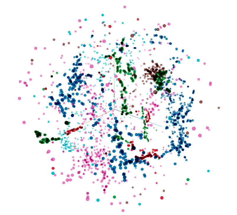
The team applied a Siamese network, normally used on human faces, to the problem of classifying 3D seismic facies. The method is semi-supervised: the network is trained on the entire dataset, with some labeled subimages. This establises a latent space (a 3D latent space of the F3 seismic data is shown to the right) with semantically meaningful norms (i.e. distance between points means something useful), in which clusters can be found. Classification on unseen subimages is done in the latent space. The team almost had an app working, and also produced the start of a new open dataset of labels for the F3 seismic volume. The team was rewarded with a prize for innovation. GitHub repo.

Lost Frequencies

This team formed spontaneously at the Tuesday meetup when it looked like there might not be any seismic projects! They set out to estimate attenuation using neural networks. This involved learning to pick maximum frequency from the peak frequency plus the seismic trace. They found that a 1D CNN did best out of all the methods they tried, and that including well logs somehow would likely improve the result quite a bit.

Rock Pandas

A creenshot from the app the team built. Each circle is a collection of documents that can be filtered dynamically.

A creenshot from the app the team built. Each circle is a collection of documents that can be filtered dynamically.

Geolocalizing documents is a much-needed task in any pile of PDF files. This team got lots of documents from Peter, with the goal to put them on a map. The characteristically diverse team extracted keywords from an NPD corpus, with preprocessing and regular expressions for well names and so on. They built a nice-looking slippy map app allowing a user to click on a well or field entity, and see the documents associated with the location. Documents hitting multiple keywords were tagged on many entities. The Rock Pandas team won the coveted People's Choice Award, for making a great start on a hard problem, and producing a working app in limited time. GitHub repo.

Core team

In a reprise of a project last year, the team set out to get grain size from core photos. But then they thought: why not cut out the middle man and go straight for reservoir parameters? So they tried to get permeability from core photos. Using simple models, they got an accuracy of 60% with linear regression, and 69% with a neural network. Although they had some glitches in their approach (using porosity and not using depth, for example), they built a first pipeline for an interesting problem.

Some Unsupervised team members clustering around a problem.

Some Unsupervised team members clustering around a problem.

Somehow Unsupervised

Unsupervised learning has been a theme in a coupe of previous hackathons (Copenhagen and FORCE 2018), and it was good to see another iteration of these exciting ideas. The team used the very nice Geolink dataset. After filtering out poor quality data (based on caliper and local statistics), the team applied dimensionality reduction methods like UMAP and t-SNE (these are conceptually like PCA, but much more effective) to reduce the dataset to just 2 dimensions — allowing them to make lots of crossplots. Coloring points by lithology, sand type, GR, or fluid type allowed them to look at all sorts of trends and patterns. The team won a prize for the amount of ground they covered and the attractive plots. GitHub repo.

Rock Stars

The Rock Stars took on Peter’s Make me that rock project. He wants an app which provides plausible rock properties and uncertainty for any location, depth, and formation on the Norwegian shelf. This gigantic team (12 of them!) decided to cluster the data first, then build a model for each cluster. They built an app which could indeed provide porosity and permeability given a location and depth. That such a huge team managed to converge on anything was an achievement, and they won a prize for taking on a tough project and getting a good way into it.


That’s it for this year! Thanks to all the participants for a fun week, and thank you to the sponsors (below) for supporting the event. Hope to see you in 2020.

FORCE_2019_sponsors.png

More pictures from the event. Thanks to Alex Schaaf and the others that took photos.

Superpowers for striplogs

In between recent courses and hackathons, I’ve been chipping away at some new features in striplog. An open-source Python package, striplog handles irregularly sampled data, like lithologic intervals, chronostratigraphic zones, or anything that isn’t regularly sampled like, say, a well log. Instead of defining what is present at every depth location, you define intervals with a top and a base. The interval can contain whatever you like: names of rocks, images, or special core analyses, or anything at all.

You can read about all of the newer features in the changelog, but let’s look at a couple of the more interesting ones…

Binary morphology filters

Sometimes we’d like to simplify a striplog a bit, for example by ‘weeding out’ the thin beds. The tool has long had a method prune to systematically remove all intervals (e.g. beds) thinner than some cutoff; one can then optionally anneal the gaps, and merge the resulting striplog to combine similar neighbours. The result of this sequence of operations (prune, anneal, merge, or ‘PAM’) is shown below on the left.

striplog_binary_ops.png

If the intervals of a striplog have at least one property of a binary nature — with only two states, like sand and shale, or pay and non-pay — one can also use binary morphological operations. This well-known image processing technique aims to simplify data by eliminating small things. The result of opening vs closing operations is shown above.

Markov chains

I wrote about Markov chains earlier this year; they offer a way to identify bias in the order of units in a stratigraphic column. I’ve now put all the code into striplog — albeit not in a very fancy way. You can import the Markov_chain class from striplog.markov, then use it in exactly the same way as in the notebook I shared in that Markov chain post:

I started with some pseudorandom data (top) representing a known succession of Mudstone (M), Siltstone (S), Fine Sandstone (F) and coarse sandstone (C). Then I generate a Markov chain model of the succession. The chi-squared test indicates that the succession is highly unlikely to be unordered. We can look at the normalized difference matrix, generate a synthetic sequence of lithologies, or plot the difference matrix as a heatmap or a directed graph. The graph illustrates the order we originally imposed: M-S-F-C.

There is one additional feature compared to the original implementation: multi-step Markov chains. Previously, I was only looking at immediately adjacent intervals (beds or whatever). Now you can look at actual vs expected transition frequencies for next-but-one interval, or next-but-two. Don’t ask me how to interpret that information though…

Other new things

  • New ways to anneal. Now the user can choose whether the gaps in the log are filled in by flooding upwards (that is, by extending the interval below the gap upwards), flooding downwards (extending the upper interval), or flooding symmetrically into the middle from both above and below, meeting in the middle. (Note, you can also fill gaps with another component, using the fill() method.)

  • New merging strategies. Now you can merge overlapping intervals by precedence, rather than by blending the contents of the intervals. Precedence is defined however you like; for example, you can choose to keep the thickest interval in all overlaps, or if intervals have a date, you could keep the latest interval.

  • Improved bar charts. The histogram is easier to use, and there is a new bar chart summary of intervals. The bars can be sorted by any property you like.

Try it out and help add new stuff

You can install the latest version of striplog using pip. It’s as easy as:

pip install striplog

Start by checking out the tutorial notebooks in the repo, especially Striplog_basics.ipynb. Let me know how you get on, or jump on the Software Underground Slack to ask for help.

Here are some things I’d like striplog to support in the future:

  • Stratigraphic prediction.

  • Well-to-well correlation.

  • More interactions with well logs.

What ideas do you have? Or maybe you can help define how these things should work? Either way, do get in touch or check out the Striplog repository on GitHub.

The hack returns to Norway

Last autumn Agile helped Peter Bormann (ConocoPhillips Norge) and the FORCE consortium host the first geo-flavoured hackathon in Norway. Maybe you were there, or maybe you read about the nine fascinating machine learning projects here on the blog. If so, you’ll know it was a great event, so we’re doing it again!

Hackthon: 18 and 19 September
Symposium: 20 September


Check out last year’s projects here. Projects included Biostrat!, Virtual Metering, sketch2seis, and AVO ML — a really interesting AVO approach exploiting latent spaces (see image, right). Most of them are on GitHub and could be extended this year.

Part of what I love about these things is that we have no idea what the projects will be. As last year, there’ll be a pre-hackathon meetup in Storhaug the evening before Day 1 (on 17 September) — we’ll figure it all out there. In the meantime, if you have an idea check out the link at the end of this post where you can share and discuss it with others.


20180919_FUJ8654.jpg

The hackathon will be followed by a one-day symposium on machine learning in the subsurface (left). This well attended event was also excellent last year, and promises to deliver again in 2019. Peter did a briliant job of keeping things rooted in real results from real research, so you won’t be subjected to the parade of marketing talks you might have been subjected to at certain other conferences.


Find out more and sign up on NPD.no! Don’t delay; places are limited.

Submit and discuss project ideas on Agile’s Events page. Note that this does not sign you up for the event.

Get on softwareunderground.com/slack to discuss the event in the #force-hack-2019 channel.

See you there!

Machine learning project review checklist

Imagine being a manager or technical chief whose team has been working on a machine learning project. What questions should you be thinking about when your team tells you about their work?

Here are some suggestions. Some of the questions are getting at reproducibility (for testing, archiving, or sharing the workflow), others at quality assurance. A few of the questions might depend on the particular task in hand, although I’ve tried to keep it pretty generic.

There are a few must-ask questions, highlighted in bold.

High-level questions about the project

  • What question were you trying to answer? How did you frame it as an ML task?

  • What is human-level performance on that task? What level of performance is needed?

  • Is it possible to approach this problem without machine learning?

  • If the analysis focused on deep learning methods, did you try shallow learning methods?

  • What are the ethical and legal aspects of this project?

  • Which domain experts were involved in this analysis?

  • Which data scientists were involved in this analysis?

  • Which tools or framework did you use? (How much of a known quantity is it?)

  • Where is the pipeline published? (E.g. public or internal git repositories.)

  • How thorough is the documentation?

Questions about the data preparation

  • Where did the feature data come from?

  • Where did the labels come from?

  • What kind of data exploration did you do?

  • How did you clean the data? How long did this take?

  • Are the classes balanced? How did the distribution change your workflow?

  • What kind of normalization did you do?

  • What did you do about missing data? E.g. what kind of imputation did you do?

  • What kind of feature engineering did you do?

  • How did you split the data into train, validate and test?

Questions about training and evaluation

  • Which models did you explore and why? Did you also try the simplest models that fit the problem?

  • How did you tune the hyperparameters of the model? Did you try grid search or other methods?

  • What kind of validation did you do? Did you use cross-validation? How did you choose the folds?

  • What evaluation metric are you using? Why is it the most appropriate one?

  • How do training, validation, and test metrics compare?

  • If this was a classification task, how does a dummy classifier score?

  • How are errors/residuals distributed? (Ideally normally distributed and  homoscedastic.)

  • How interpretable is your model? That is, do the learned parameters mean anything, and can we learn from them? E.g. what is the feature importance?

  • If this was a classification task, are probabilities available in your model and did you use them?

  • If this was a regression task, have you checked the residuals for normality and homoscedasticity?

  • Are there benchmarks for this task, and how well does your model do on them?

Next steps for the project

  • How will you improve the model?

  • Would collecting more data help? Can we address the imbalance with more data?

  • Are there human or computing resources you need access to?

  • How will you deploy the model?

Rather than asking them explicitly, a reviewer might check things off while reading a report or listening to a presentation. A thorough review would cover most of the points without being prompted. And I’d go so far as to say that a person or team who has done a rigorous treatment should readily have answers to all of these questions. They aren't supposed to be 'traps' exactly, but they are supposed to get to the heart of the issues the data scientist or team likely faced during their work.

What do you think? Are the questions fair? Are there any you would remove, or others you would add? Let me know in the comments.

Visit a Google Docs version of this checklist.


Thank you to members of the Software Underground Slack channel for discussion of these questions, especially Anton Biryukov, Justin Gosses, and Lukas Mosser.

What makes a good benchmark dataset?

Last week I mentioned that we need more open benchmark datasets in geoscience. I think benchmarks are important for researchers to work on, as a teaching aid, and as a way for us to objectively measure how well we’re doing on a particular problem. How else can we know how we’re doing, or compare Company X’s claim with Company Y’s?

What makes a good benchmark?

I haven’t unearthed any guides from other domains to help answer this question, and we don’t yet have enought experience to know for ourselves. But here’s what I’m thinking:

  • It must address at least one clear machine learning task. The more obviously useful the task, the more useful (and important) the benchmark. The benchmark dataset should be well suited to the task (but does not have to be comprehensive or definitive).

  • It must be open. That means explicitly licensed with an open, and preferably permissive, license. I think we need to avoid non-permissive (so-called ‘copyleft’) licenses, because it’s not clear how the ‘sharealike’ clause would affect works that depended on the dataset. And we definitely need to avoid restrictive non-commercial clauses.

  • It must be discoverable and accessible. In other words, it needs to be easy to find, and anyone should be able to get it, without registering on a website or waiting for an email or doing anything else that slows down the pace of their research. A properly open dataset can be replicated anywhere, so openness should take care of this.

  • It must have enough features to be interesting. This might mean different things for different tasks, but in general we’d like to see a few physical measurements (e.g. seismic, well logs, RockEval, core photos, field observations, flow rates, and so on). The features should be independent — we can always generate derivatives.

  • It must have labels. As well as some interesting features, the dataset must have some interpretive information with high information value (e.g. seismic facies, lithologies, deposotional environment, sequence boundaries, EURs, and so on). Usually, these are expensive to acquire (which is partly why we’d like to be able to predct them).

  • It should name suitable prediction error evaluation methods, with reference implementations, for the intended task. If people are to use it as a score benchmark, they need to know how to score their own implementations of the task.

  • It can be de-localized, but not completely. We don’t need to know the exact whereabouts of the dataset, but if we remove the relative spatial relationships between wells, say, or don’t know which basin we’re in, then the questions we can ask about the data get a lot less interesting, and the whole situation gets much less realistic.

  • It should not be too big. More than about 1GB means unwieldy. It means difficult to download. It means too much room for nuance. And it means it’s probably impossible to explore in the space of a tutorial. It’s also much harder to get a big dataset into shape than a smaller one. A few thousand records, maybe 100,000 in some cases, is probably plenty.

  • It should be clean, but not too clean. No-one wants to spend hours processing a dataset before it can be used, or — worse — be bitten by some esoteric data problem only a domain expert would spot. But, on the other hand, a dataset with no issues at all might be a bit boring. And, in subsurface at least, completely unrepresentative!

  • It should be well documented. The dataset needs to be described to non-technical people, who know little or nothing about the subsurface. Remember that many users will not be proficient programmers either, so…

  • It should have an accompanying demonstration. For example, a script or notebook, preferably in at least a couple of languages, that shows how to load and inspect the data. Ideally this would include a demonstration of how to pose, and answer, a straightforward question as a machine learning task.

I’m not sure we can call this last one a criterion, but maybe in an ideal world…

  • It should be launched with a data science contest. If you’re felling really brave, what better way to attract attention to the new open dataset than with a Kaggle-style contest?

It’s certainly true that there are several datasets around. Unfortunately, the openness criterion eliminates most of them, so they fall at the first hurdle. For example, the very nice dataset that Brendon Hall used in the SEG machine learning contest is not open.

If you know of a dataset that could be coerced into meeting most of these criteria, we’d like to hear about it. I know a small army of people that would love to help get it into the open, and into the hands of machine learning researchers all over the world.


The thumbnail image for this post was adapted from an image by user arg_flickr on Flickr, licensed CC-BY.

Thanks to several people on Software Underground, for the discussion on this topic. In particular, Justin Gosses and Lukas Mosser pointed out the need for transparent error evaluation.

Closing the analytics–domain gap

I recently figured out where Agile lives. Or at least where we strive to live. We live on the isthmus — the thin sliver of land — between the world of data science and the domain of the subsurface.

We’re not alone. A growing number of others live there with us. There’s an encampment; I wrote about it earlier this week.

Backman’s Island, one of my favourite kayaking destinations, is a passable metaphor for the relationship between machine learning and our scientific domain.

Backman’s Island, one of my favourite kayaking destinations, is a passable metaphor for the relationship between machine learning and our scientific domain.

Closing the gap in your organization

In some organizations, there is barely a connection. Maybe a few rocks at low tide, so you can hop from one to the other. But when we look more closely we find that the mysterious and/or glamorous data science team, and the stories that come out of it, seem distinctly at odds with the daily reality of the subsurface professionals. The VP talks about a data-driven business, deep learning, and 98% accuracy (whatever that means), while the geoscientists and engineers battle with raster logs, giant spreadsheets, and trying to get their data from Petrel into ArcGIS (or, help us all, PowerPoint) so they can just get on with their day.

We’re not going to learn anything from those organizations, except maybe marketing skills.

We can learn, however, from the handful of organizations, or parts of them, that are serious about not only closing the gap, but building new paths, and infrastructure, and new communities out there in the middle. If you’re in a big company, they almost certainly exist somewhere in the building — probably keeping their heads down because they are so productive and don’t want anyone messing with what they’ve achieved.

Here are some of the things they are doing:

  • Blending data science teams into asset teams, sitting machine learning specialists with subsurface scientists and engineers. Don’t make the same mistake with machine learning that our industry made with innovation — giving it to a VP and trying to bottle it. Instead, treat it like Marmite: spread it very thinly on everything.*

  • Treating software like knowledge sharing. Code is, hands down, the best way to share knowledge: it’s unambiguous, tested (we hope anyway), and — above all — you can actually use it. Best practice documents are I’m afraid, not worth the paper they would be printed on if anyone even knew how to find them.

  • Learning to code. OK, I’m biased because we train people… but it seriously works. When you have 300 geoscientists in your organization that embrace computational thinking, that can write a function in Python, that know what a support vector machine is for — that changes things. It changes every conversation.

  • Providing infrastructure for digital science. Once you have people with skills, you need people with powers. The power to install software, instantiate a virtual machine, or recruit a coder. You need people with tools, like version control, continuous integration, and communities of practice.

  • Realizing that they need to look in new places. Those much-hyped conversations everyone is having with Google or Amazon are, admittedly, pretty cool to see in the extractive industries (though if you really want to live on the cutting edge of geospatial analytics, you should probably be talking to Uber). You will find more hope and joy in Kaggle, Stack Overflow, and any given hackathon than you will in any of the places you’ve been looking for ‘innovation’ for the last 20 years.

This machine learning bandwagon we’re on is not about being cool, or giving keynotes, or saying ‘deep learning’ and ‘we’re working with Google’ all the time. It’s about equipping subsurface professionals to make better and safer scientific, industrial, and business decisions with more evidence and more certainty.

And that means getting serious about closing that gap.


I thought about this gap, and Agile’s place in it — along with the several hundred other digital subsurface scientists in the world — after drawing an attempt at drawing the ‘big picture’ of data science on one of our courses recently. Here’s a rendering of that drawing, without further comment. It didn’t quite fit with my ‘sliver of land’ analogy somehow…

On the left, the world of ‘advanced analytics’, on the right, how the disciplines of data science and earth science overlap on and intersect the computational world. We live in the green belt. (yes, we could argue for hours about these terms, but le…

On the left, the world of ‘advanced analytics’, on the right, how the disciplines of data science and earth science overlap on and intersect the computational world. We live in the green belt. (yes, we could argue for hours about these terms, but let’s not.)


* If you don’t know what Marmite is, it’s not too late to catch up.

What is the fastest axis of an array?

One of the participants in our geocomputing course asked us a tricky question earlier this year. She was a C++ and Java programmer — we often teach experienced programmers who want to learn about Python and/or machine learning — and she worked mostly with seismic data. She had a question related to the performance of n-dimensional arrays: what is the fastest axis of a NumPy array?

I’ve written before about how computational geoscience is not ‘software engineering’ and not ‘computer science’, but something else. And there’s a well established principle in programming, first expressed by Michael Jackson:

We follow two rules in the matter of optimization:
Rule 1: Don’t do it.
Rule 2 (for experts only). Don’t do it yet — that is, not until you have a perfectly clear and unoptimized solution.

Most of the time the computer is much faster than we need it to be, so we don’t spend too much time thinking about making our programs faster. We’re mostly concerned with making them work, then making them correct. But sometimes we have to think about speed. And sometimes that means writing smarter code. (Other times it means buying another GPU.) If your computer spends its days looping over seismic volumes extracting slices for processing, you should probably know whether you want to put time in the first dimension or the last dimension of your array.

The 2D case

Let’s think about a two-dimensional case first — imagine a small 2D array, also known as a matrix in some contexts. I’ve coloured in the elements of the matrix to make the next bit easier to understand.

matrix-memory-a.png

When we store a matrix in a computer (or an image, or any array), we have a decision to make. In simple terms, the computer’s memory is like a long row of boxes, each with a unique address — shown here as a 3-digit hexadecimal number:

We can only store one number in each box, so we’re going to have to flatten the 2D array. The question is, do we put the rows in together, effectively splitting up the columns, or do we put the columns in together? These two options are commonly known as ‘row major’, or C-style, and ‘column major’, or Fortran-style:

matrix-memory-b.png

Let’s see what this looks like in terms of the indices of the elements. We can plot the index number on each axis vs. the position of the element in memory. Notice that the C-ordered elements are contiguous in axis 0:

If you spend a lot of time loading seismic data, you probably recognize this issue — it’s analgous to how traces are stored in a SEG-Y file. Of couse, with seismic data, two dimensions aren’t always enough…

Higher dimensions

The problem multiplies at higher dimensions. If we have a cube of data, then C-style ordering results in the first dimension having large contiguous chunks, and the last dimension being broken up. The middle dimension is somewhere in between. As before, we can illustrating this by plotting the indices of the data. This time I’m highlighting the positions of the elements with index 2 (i.e. the third element) in each dimension:

So if this was a seismic volume, we might organize inlines in the first dimension, and travel-time in the last dimension. That way, we can access inlines very quickly, but timeslices will take longer.

In Fortran order, which we can optionally specify in NumPy, the situation is reversed. Now the fast axis is the last axis:

3d-array-forder.png

Lots of programming languages and libraries use row-major memory layout, including C, C++, Torch and NumPy. Most others use column-major ordering, including MATLAB, R, Julia, and Fortran. (Some other languages, such as Java and .NET, use a variant of row-major order called Iliffe vectors). NumPy calls row-major order ‘C’ (for C, not for column), and column-major ‘F’ for Fortran (thankfully they didn’t use R, for R not for row).

I expect it’s related to their heritage, but the Fortran-style languages also start counting at 1, whereas the C-style languages, including Python, start at 0.

What difference does it make?

The main practical difference is in the time it takes to access elements in different orientations. It’s faster for the computer to take a contiguous chunk of neighbours from the memory ‘boxes’ than it is to have to ‘stride’ across the memory taking elements from here and there.

How much faster? To find out, I made datasets full of random numbers, then selected slices and added 1 to them. This was the simplest operation I could think of that actually forces NumPy to do something with the data. Here are some statistics — the absolute times are pretty irrelevant as the data volumes I used are all different sizes, and the speeds will vary on different machines and architectures:

  • 2D data: 3.6× faster. Axis 0: 24.4 µs, axis 1: 88.1 µs (times relative to first axis: 1, 3.6).

  • 3D data: 43× faster. 229 µs, 714 µs, 9750 µs (relatively 1, 3.1, 43).

  • 4D data: 24× faster. 1.27 ms, 1.36 ms, 4.77 ms, 30 ms (relatively 1, 1.07, 3.75, 23.6).

  • 5D data: 20× faster. 3.02 ms, 3.07 ms, 5.42 ms, 11.1 ms, 61.3 ms (relatively 1, 1.02, 1.79, 3.67, 20.3).

  • 6D data: 5.5× faster. 24.4 ms, 23.9 ms, 24.1 ms, 37.8 ms, 55.3 ms, 136 ms (relatively 1, 0.98, 0.99, 1.55, 2.27, 5.57).

These figures are more or less simply reversed for Fortran-ordered arrays (see the notebook for datails).

Clearly, the biggest difference is with 3D data, so if you are manipulating seismic data a lot and need to access the data in that last dimension, usually travel-time, you might want to think about ways to reduce this overhead.

What difference does it really make?

The good news is that, for most of us most of the time, we don’t have to worry about any of this. For one thing, NumPy’s internal workings (in particular, its universal functions, or ufuncs) know which directions are fastest and take advantage of this when possible. For another thing, we generally try to avoid looping over arrays at all, leaving the iterative components of our algorithms to the ufuncs — so the slicing speed isn’t a factor. Even when it is a factor, or if we can’t avoid looping, it’s often not the bottleneck in the code. Usually the guts of our algorithm are what are slowing the computer down, not the access to memory. The net result of all this is that we don’t often have to think about the memory layout of our arrays.

So when does it matter? The following situations merit a bit of thought:

  • When you’re doing a very large number of accesses to memory or disk. Saving a few microseconds might add up to a lot if you’re doing it a billion times.
  • When the objects you’re accessing are very large. Reading and writing elements of a 200GB array in memory brings new challenges compared to handling a few gigabytes.

  • Reading and writing data files — really just another kind of memory — brings all the same issues. Reading a chunk of contiguous data is much faster than reading bytes from here and there. Landmark’s BRI seismic data format, Schlumberger’s ZGY files, and HDF5 files, all implement strategies to help make reading arbitrary data faster.

  • Converting code from other languages, especially MATLAB, although do realize that other languages may have their own indexing rules, as well as differing in how they store n-dimensional arrays.

If you determine that you do need to think about this stuff, then you’re going to need to read this essay about NumPy’s internal representations, and I recommend checking out this blog post by Eli Bendersky too.

There you have it. Very occasionally we scientists also need to think a bit about how computers work… but most of the time someone has done that thinking for us.

Some of the figures and all of the timings for this post came from this notebook — please have a look. If you have anything to add, or (better yet) correct, please get in touch. I’d love to hear from you.
The London hackathon

At the end of November I reported on the projects at the Oil & Gas Authority’s machine learning hackathon in Aberdeen. This post is about the follow-up event at London Olympia.


Like the Aberdeen hackathon the previous weekend, the theme was ‘machine learning’. The event unfolded in the Apex Room at Olympia, during the weekend before the PETEX conference. The venue was excellent, with attentive staff and top-notch catering. Thank you to the PESGB for organizing that side of things.

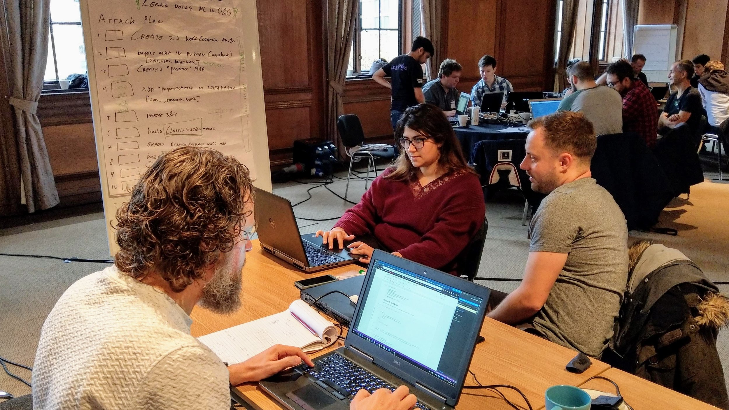
Thirty-eight digital geoscientists spent the weekend with us, and most of them also took advantage of the bootcamp on Friday; at least a dozen of those had not coded at all before the event. It’s such a privilege to work with people on their skills at these events, and to see them writing their own code over the weekend.

Here’s the full list of projects from the event…


Sweet spot hunting

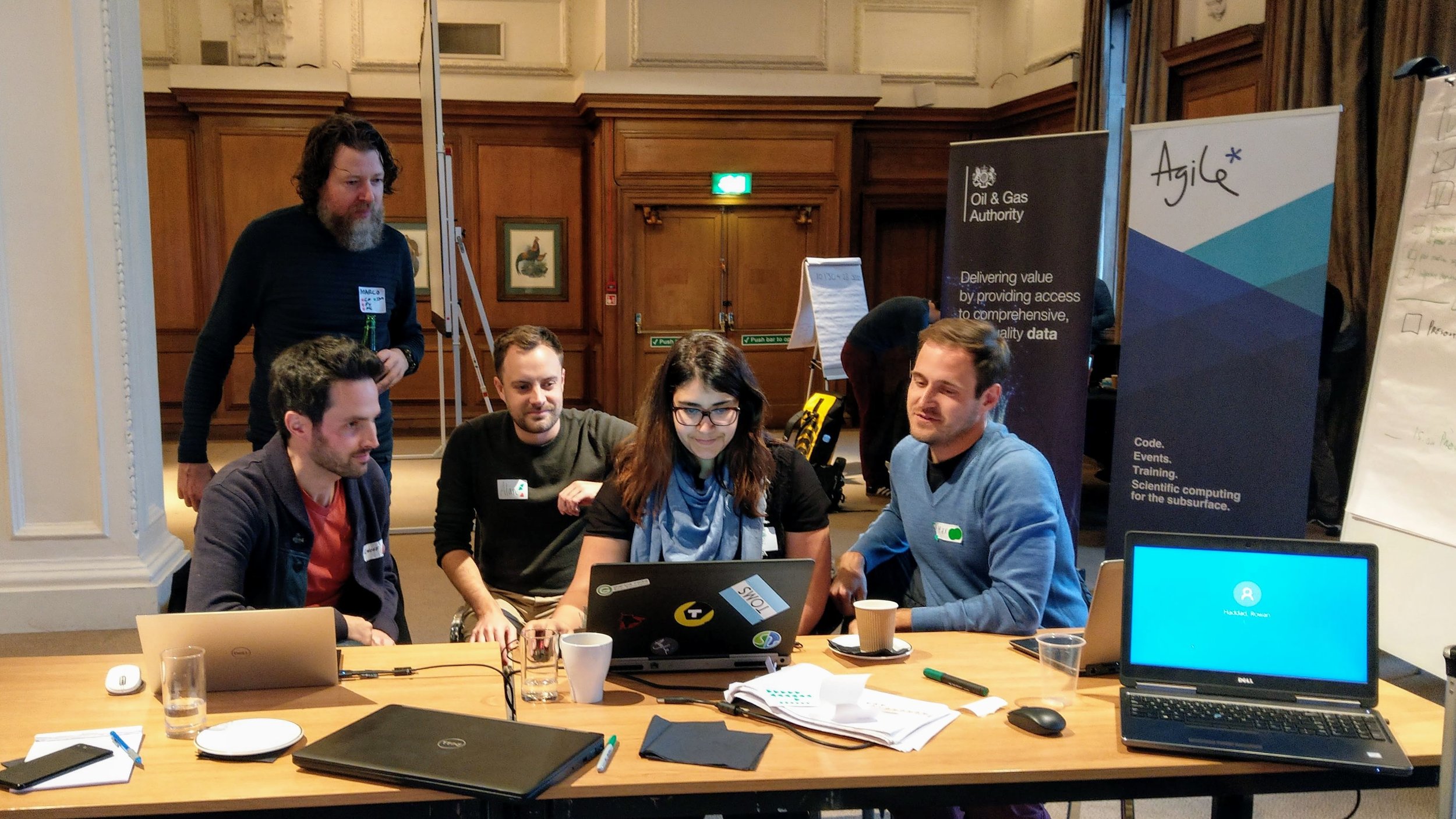
Sweet Spot Sweat Shop: Alan Wilson, Geoff Chambers, Marco van der Linden, Maxim Kotenev, Rowan Haddad.

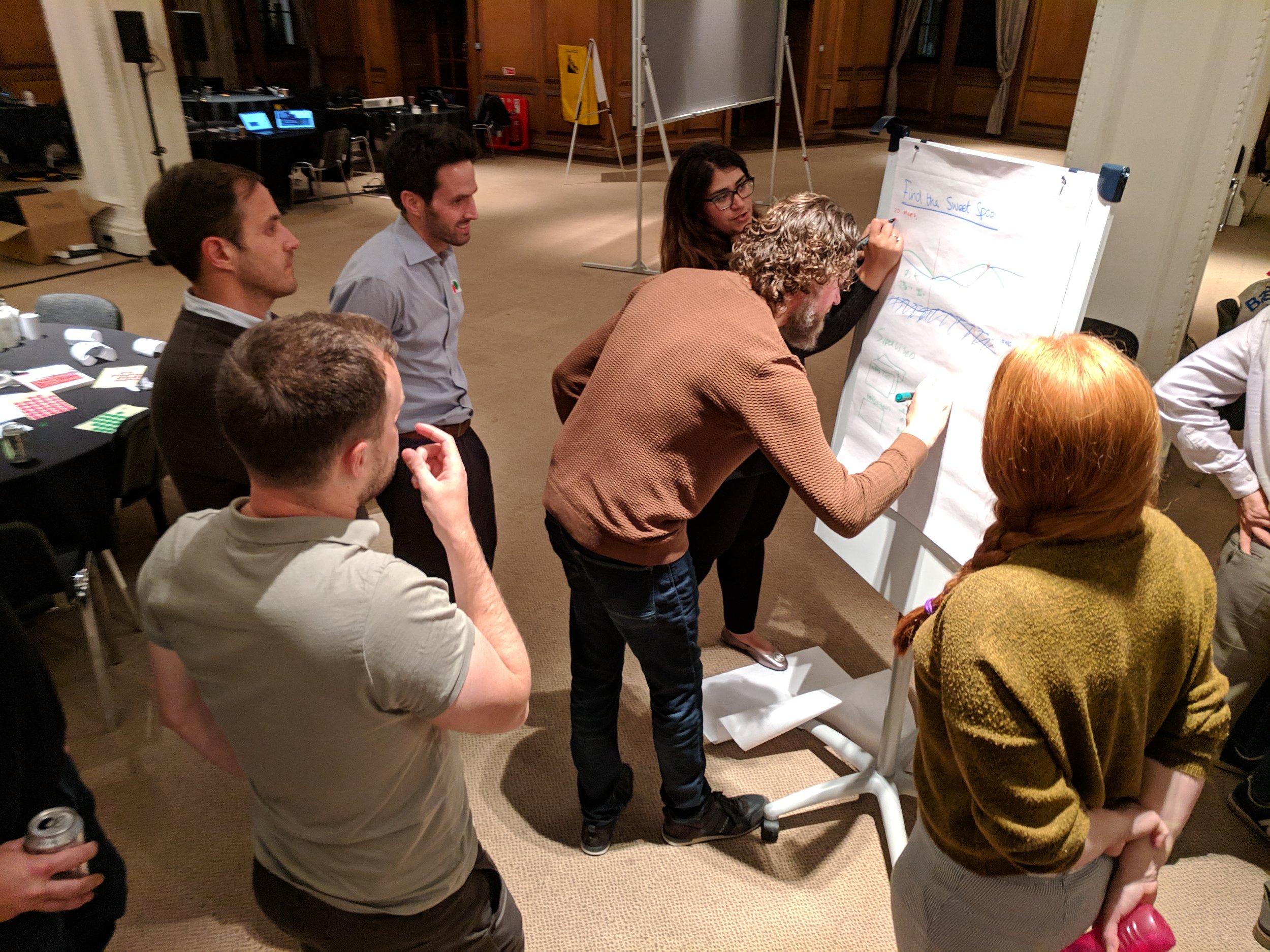
Project: We’ve seen a few people tackling the issue of making decisions from large numbers of realizations recently. The approach here was to generate maps of various outputs from dynamic modeling and present these to the user in an interactive way. The team also had maps of sweet spots, as determined by simulation, and they attempted to train models to predict these sweetspots directly from the property maps. The result was a unique and interesting exploration of the potential for machine learning to augment standard workflows in reservoir modeling and simulation. Project page. GitHub repo.

sweetspot_prediction.png

An intelligent dashboard

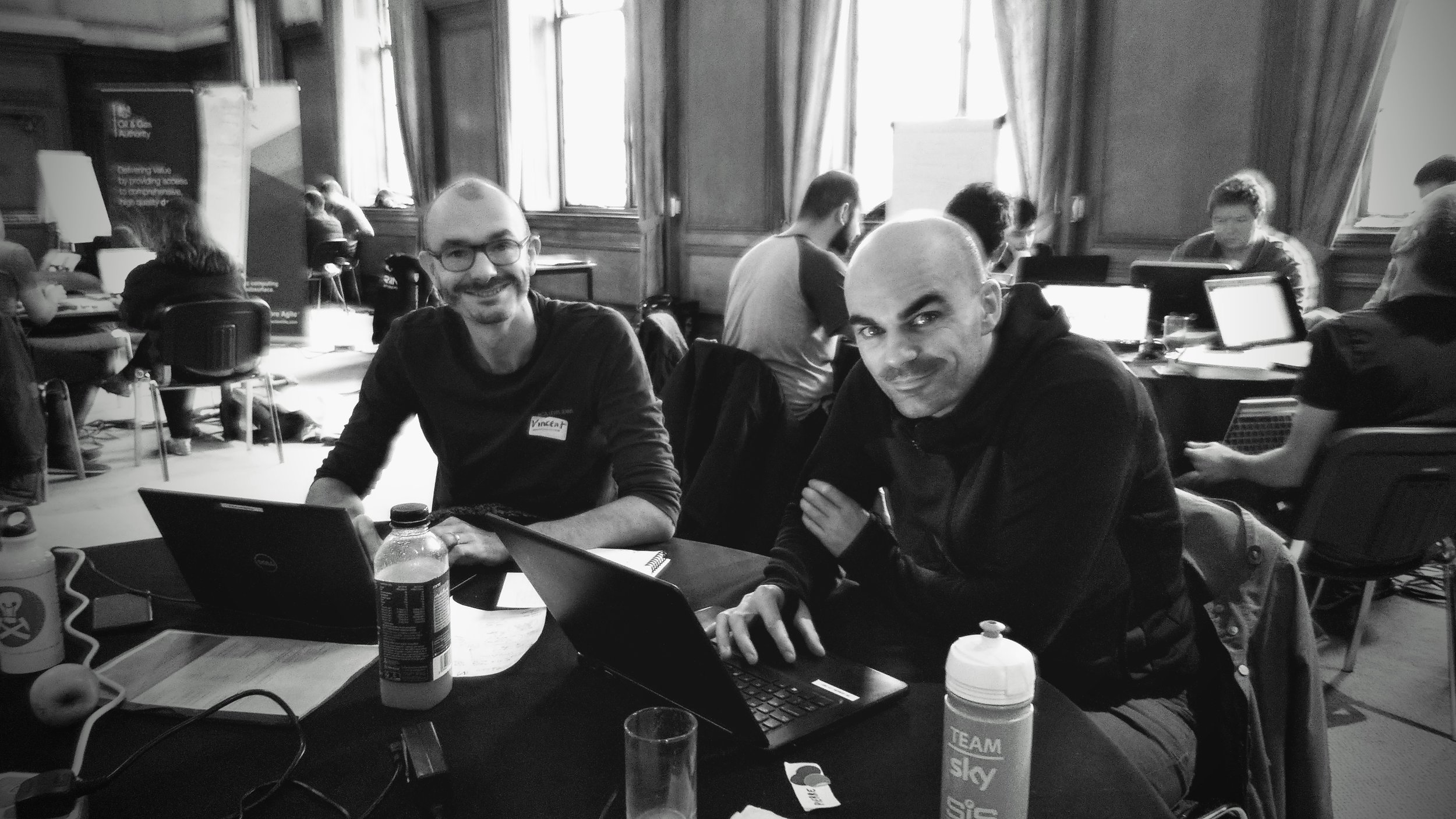
Dash AI: Vincent Penasse, Pierre Guilpain.

Project: Vincent and Pierre believed so strongly in their project that they ran with it as a pair. They started with labelled production history from 8 wells in a Pandas dataframe. They trained some models, including decision trees and KNN classifiers, to recognizedata issues and recommend required actions. Using skills they gained in the bootcamp, they put a flask web app in front of these to allow some interaction. The result was the start of an intelligent dashboard that not only flagged issues, but also recommended a response. Project page.

This project won recognition for impact.

DashAI-team.jpg

Predicting logs ahead of the bit

Team Mystic Bit: Connor Tann, Lawrie Cowliff, Justin Boylan-Toomey, Patrick Davies, Alessandro Christofori, Dan Austin, Jeremy Fortun.

Project: Thinking of this awesome demo, I threw down the gauntlet of real-time look-ahead prediction on the Friday evening, and Connor and the Mystic Bit team picked it up. They did a great job, training a series of models to predict a most likely log (see right) as well as upper and lower bounds. In the figure, the bit is currently at 1770 m. The model is shown the points above this. The orange crosses are the P90, P50 and P10 predictions up to 40 m ahead of the bit. The blue points below 1770 m have not yet been encountered. Project page. GitHub repo.

This project won recognition for best execution.

MysticBit_log-pred.png

The seals make a comeback

Selkie Se7en: Georgina Malas, Matthew Gelsthorpe, Caroline White, Karen Guldbaek Schmidt, Jalil Nasseri, Joshua Fernandes, Max Coussens, Samuel Eckford.

Project: At the Aberdeen hackathon, Julien Moreau brought along a couple of satellite image with the locations of thousands of seals on the images. They succeeded in training a model to correctly identify seal locations 80% of the time. In London, another team of almost all geologists picked up the project. They applied various models to the task, and eventually achieved a binary prediction accuracy of over 97%. In addition, the team trained a multiclass convolutional neural network to distinguish between whitecoats (pups), moulted seals (yearlings and adults), double seals, and dead seals.

Impressive stuff; it’s always inspiring to see people operating way outside their comfort zone. Project page.

selkie-seven.png

Interpreting the language of stratigraphy

The Lithographers: Gijs Straathof, Michael Steventon, Rodolfo Oliveira, Fabio Contreras, Simon Franchini, Malgorzata Drwila.

Project: At the project bazaar on Friday (the kick-off event at which we get people into teams), there was some chat about the recent paper on lithology prediction using recurrent neural networks (Jiang & James, 2018). This team picked up the idea and set out to reproduce the results from the paper. In the process, they digitized lithologies from one of the Posiedon wells. Project page. GitHub repo.

This project won recognition for teamwork.

Lithographers_team_logs.png

Know What You Know

Team KWYK: Malcolm Gall, Thomas Stell, Sebastian Grebe, Marco Conticini, Daniel Brown.

Project: There’s always at least one team willing to take on the billions of pseudodigital documents lying around the industry. The team applied latent semantic analysis (a standard approach in natural language processing) to some of the gnarlier documents in the OGA’s repository. Since the documents don’t have labels, this is essentially an unsupervised task, and therefore difficult to QC, but the method seemed to be returning useful things. They put it all in a nice web app too. Project page. GitHub repo.

This project won recognition for Most Value.


A new approach to source separation

Cocktail Party Problem: Song Hou, Fai Leung, Matthew Haarhoff, Ivan Antonov, Julia Sysoeva.

Project: Song, who works at CGG, has a history of showing up to hackathons with very cool projects, and this was no exception. He has been working on solving the seismic source separation problem, more generally known as the cocktail party problem, using deep learning… and seems to have some remarkable results. This is cool because the current deblending methods are expensive. At the hackathon he and his team looked for ways to express the uncertainty in the deblending result, and even to teach a model to predict which parts of the records were not being resolved with acceptable signal:noise. Highly original work and worth keeping an eye on.

cocktail-party-problem.jpg

A big Thank You to the judges: Gillian White of the OGTC joined us a second time, along with the OGA’s own Jo Bagguley and Tom Sandison from Shell Exploration. Jo and Tom both participated in the Subsurface Hackathon in Copenhagen earlier this year, so were able to identify closely with the teams.

Thank you as well to the sponsors of these events, who all deserve the admiration of the community for stepping up so generously to support skill development in our industry:

oga-sponsors.png

That’s it for hackathons this year! If you feel inspired by all this digital science, do get involved. There are computery geoscience conversations every day over at the Software Underground Slack workspace. We’re hosting a digital subsurface conference in France in May. And there are lots of ways to get started with scientific computing… why not give the tutorials at Learn Python a shot over the holidays?

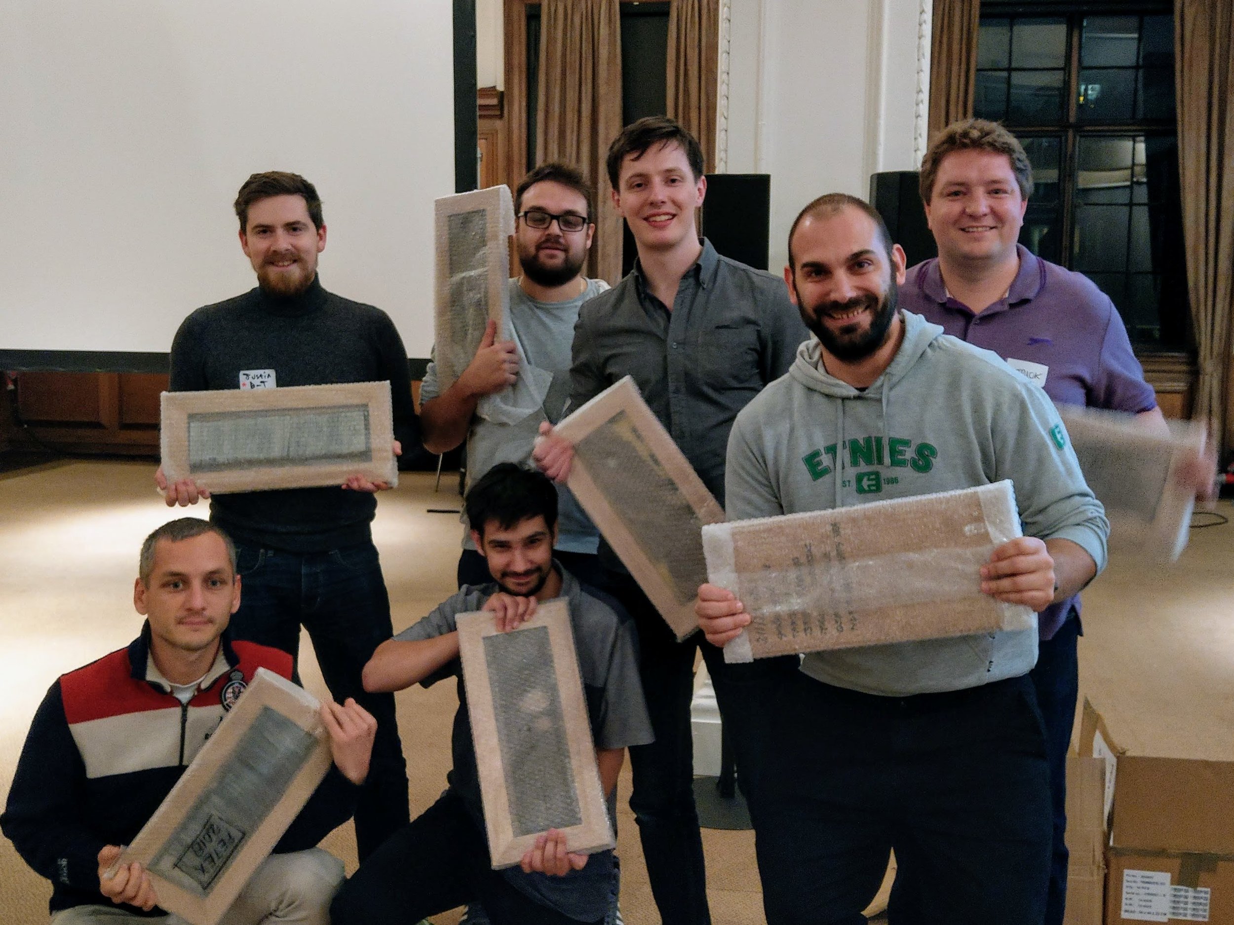
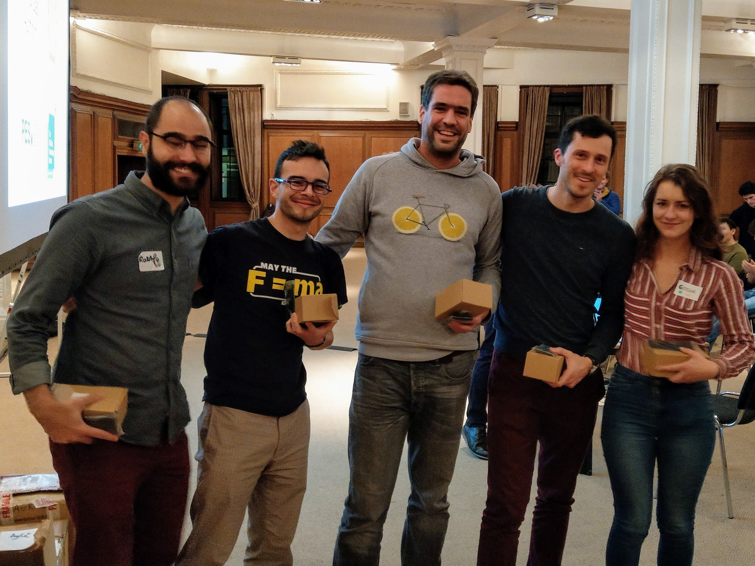
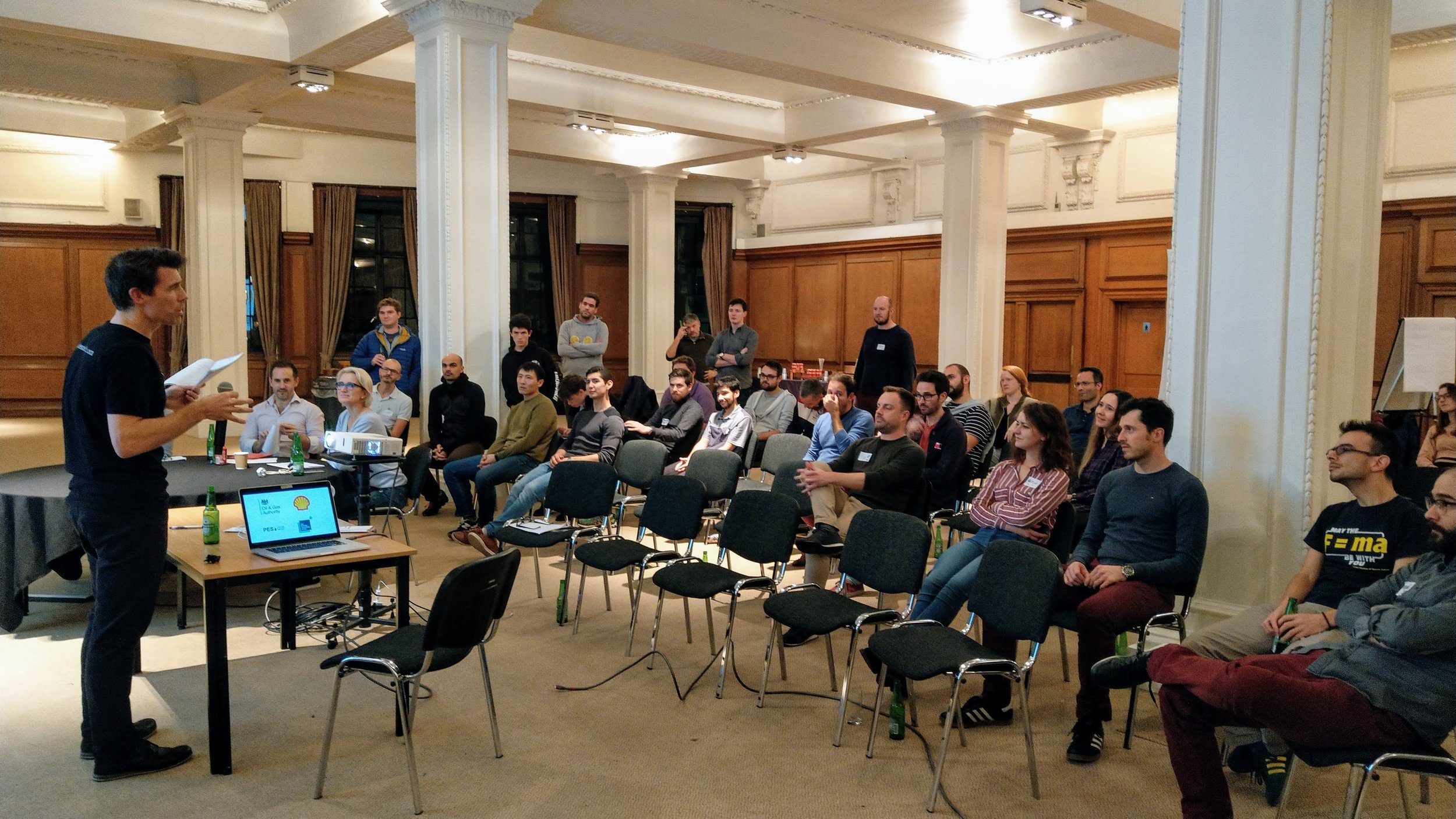
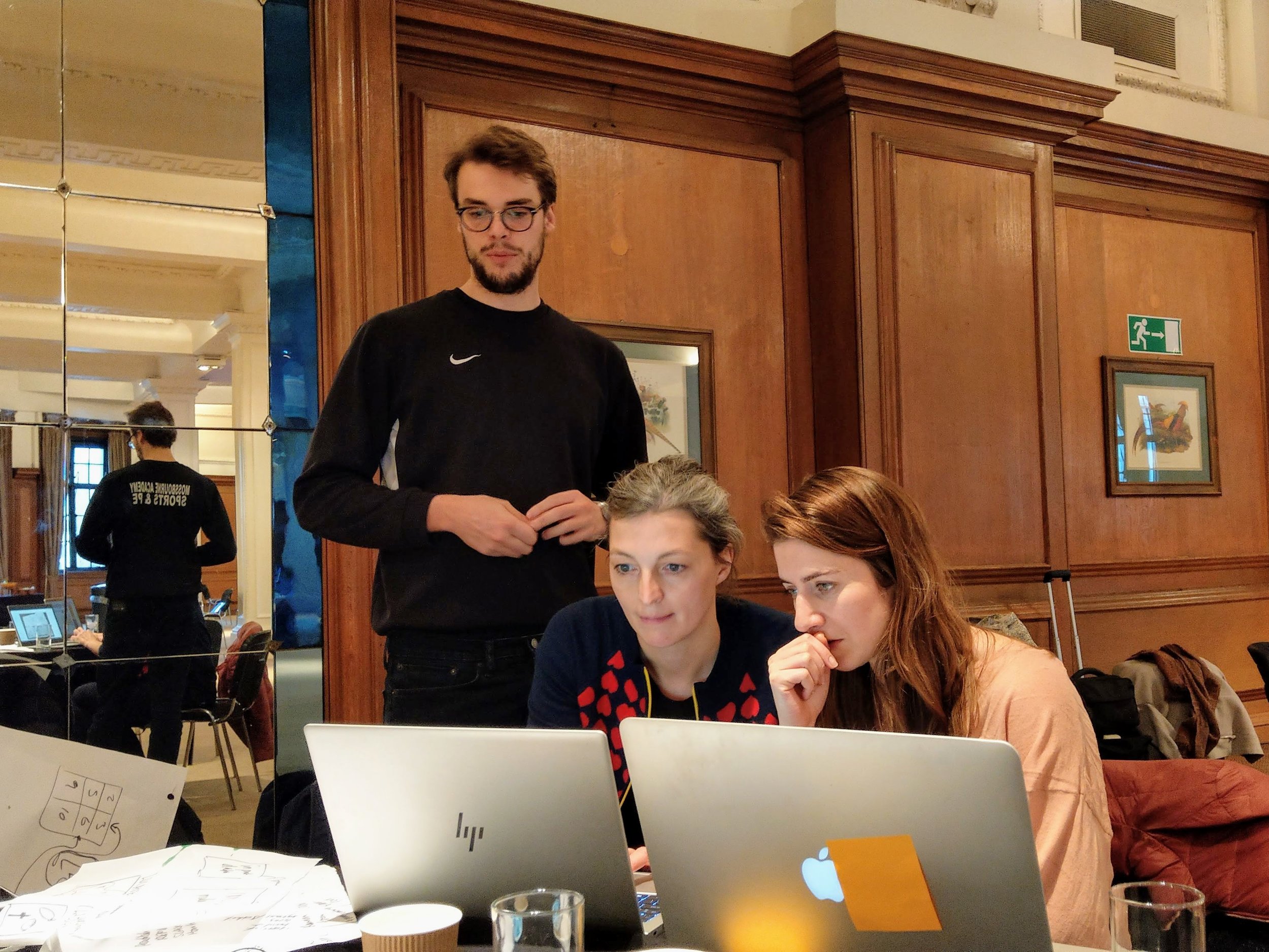
To inspire you a bit more, check out some more pictures from the event…