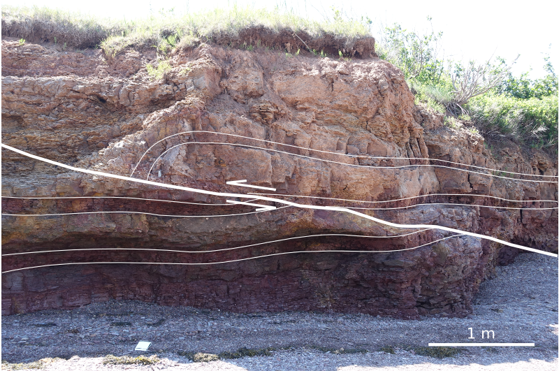
Where is the ground?

This is the upper portion of a land seismic profile in Alaska. Can you pick a horizon where the ground surface is? Have a go at pickthis.io.

Pick the Ground surface at the top of the seismic section at pickthis.io.

Pick the Ground surface at the top of the seismic section at pickthis.io.

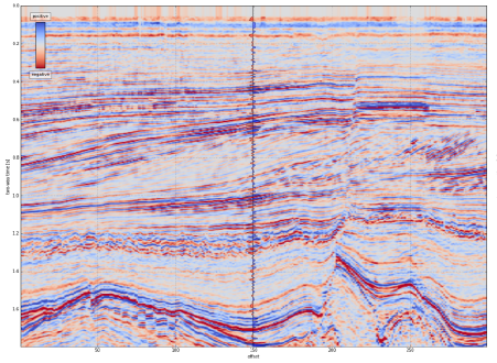
Picking the ground surface on land-based seismic data is not straightforward. Picking the seafloor reflection on marine data, on the other hand, is usually a piece of cake, a warm-up pick. You can often auto-track the whole thing with a few seeds.

Seafloor reflection on Penobscot 3D survey, offshore Nova Scotia. from Matt's tutorial in the April 2016 The Leading Edge, The function of interpolation.

Seafloor reflection on Penobscot 3D survey, offshore Nova Scotia. from Matt's tutorial in the April 2016 The Leading Edge, The function of interpolation.

Why aren't interpreters more nervous that we don't know exactly where the surface of the earth is? I'm sure I'm not the only one that would like to have this information while interpreting. Wouldn't it be great if land seismic were more like marine?

Treacherously Jagged TopographY or Near-Surface processing ArtifactS?

Treacherously Jagged TopographY or Near-Surface processing ArtifactS?

If you're new to land-based seismic data, you might notice that there isn't a nice pickable event across the top of the section like we find in marine seismic data. Shot noise at the surface has been muted (deleted) in processing, and the low fold produces an unclean, jagged look at the top of the section. Additionally, the top of the section, time-zero — the seismic reference datum — usually floats somewhere above the land surface — and we can't know where that is unless it can be found in the file header, or looked up in the processing report.

The seismic reference datum, at a two-way time of zero seconds on seismic data, is typically set at mean sea level for offshore data. For land data, it is usually chosen to 'float' above the land surface.

The seismic reference datum, at a two-way time of zero seconds on seismic data, is typically set at mean sea level for offshore data. For land data, it is usually chosen to 'float' above the land surface.

Reframing the question

This challenge is a bit of a trick question. It begs the viewer to recognize that the seemingly simple task of mapping the ground level on a land seismic section is actually a rudimentary velocity modeling or depth conversion exercise in itself. Wouldn't it be nice to have the ground surface expressed as pickable seismic event? Shouldn't we have it always in our images? Baked into our data, so to speak, such that we've always got an unambiguous pick? In the next post, I'll illustrate what I mean and show what's involved in putting it in. 

In the meantime, I challenge you to pick where you think the (currently absent) ground surface is on this profile, so in the next post we can see how well you did.

In search of the Kennetcook Thrust

Behind every geologic map, is a much more complex geologic truth. Most of the time it's hidden under soil and vegetation, forcing geologists into a detective game in order to fill gaps between hopelessly sparse spatterings of evidence.

Two weeks ago, I joined up with an assortment of geologists on the side of the highway an hour north of Halifax for John Waldron to guide us along some spectacular stratigraphy exposed in the coastline cliffs on the southern side of the Minas Basin (below). John has visited these sites repeatedly over his career, and he's supervised more than a handful of graduate students probing a variety of geologic processes on display here. He's published numerous papers teasing out the complex evolution of the Windsor-Kennetcook Basin: one of three small basins onshore Nova Scotia with the potential to contain economic quantities of hydrocarbons.

John retold the history of mappers past and present riddled by the massively deformed, often duplicated Carboniferous evaporites in the Windsor Group which are underlain by sub-horizontal seismic reflectors at depth. Local geologists agree that this relationship reflects thrusting of the near-surface package, but there is disagreement on where this thrust is located, and whether and where it intersects the surface. On this field trip, John showed us symptoms of this Kennetcook thrust system, at three sites. We started in the footwall. The second and third sites were long stretches spectacularly deformed exposures in the hangingwall.  

Footwall: Cheverie Point

SEE GALLERY BELOW FOR ENLARGEMENT

SEE GALLERY BELOW FOR ENLARGEMENT

The first stop was Cheverie Point and is interpreted to be well in the footwall of the Kennetcook thrust. Small thrust faults (right) cut through the type section of the Macumber Formation and match the general direction of the main thrust system. The Macumber Formation is a shallow marine microbial limestone that would have fooled anyone as a mudstone, except it fizzed violently under a drop of HCl. Just to the right of this photo, we stood on the unconformity between the petroliferous and prospective Horton Group and the overlying Windsor Group. It's a pick that turns out to be one of the most reliably mappable seismic events on seismic sections so it was neat to stand on that interface.

Further down section we studied the Mississippian Cheverie Formation: stacked cycles of point-bar deposits ranging from accretionary lag conglomerates to caliche paleosols with upright tree trunks. Trees more than a metre or more in diameter were around from the mid Devonian, but Cheverie forests are still early and good examples of trees within point-bars and levees.  

Hangingwall: Red Head / Johnson Beach / Split Rock

SEE GALLERY BELOW FOR ENLARGEMENT

SEE GALLERY BELOW FOR ENLARGEMENT

The second site featured some spectacularly folded black shales from the Horton Bluff Formation, as well as protruding sills up to two metres thick that occasionally jumped across bedding (right). We were clumsily contemplating the curious occurrence of these intrusions for quite some time until hard-rock guru Trevor McHattie halted the chatter, struck off a clean piece rock with a few blows of his hammer, wetted it with a slobbering lick, and inspected it with his hand lens. We all watched him in silence and waited for his description. I felt a little schooled. He could have said anything. It was my favourite part of the day.

Hangingwall continued: Rainy Cove

The patterns in the rocks at Rainy Cove are a wonderland for any structural geologist. It's a popular site for geology labs from Atlantic Universities, but it would be an absolute nightmare to try to actually measure the section here. 

SEE GALLERY BELOW FOR ENLARGEMENT

SEE GALLERY BELOW FOR ENLARGEMENT

John stands next to a small system of duplicated thrusts in the main hangingwall that have been subsequently folded (left). I tried tracing out the fault planes by following the offsets in the red sandstone bed amidst black shales whose fabric has been deformed into an accordion effect. Your picks might very well be different from mine.

A short distance away we were pointed to an upside-down view of load structures in folded beds. "This antiform is a syncline", John paused while we processed. "This synform over here is an anticline". Features telling of such intense deformation are hard to fathom. Especially in plain sight.

The rock lessons ended in the early evening at the far end of Rainy Cove where the Triassic Wolfville formation sits unconformably on top of ridiculously folded, sometimes doubly overturned Carboniferous Horton Rocks. John said it has to be one of the most spectacularly exposed unconformities in the world. 

I often take for granted the vast stretches of geology hiding beneath soil and vegetation, and the preciousness of finding quality outcrop. Check out the gallery below for pictures from our day.  

I was quite enamoured with John's format. His field trip technologies. The maps and sections: canvases for communication and works in progress. His white boarding, his map-folding techniques: a practised impresario.

What are some of the key elements from the best field trips you've been on? Let us know in the comments.

Poisson's controversial stretch-squeeze ratio

Before reading this, you might want to check out the previous post about Siméon Denis Poisson's life and career. Then come back here...


Physicists and mathematicians knew about Poisson's ratio well before Poisson got involved with it. Thomas Young described it in his 1807 Lectures on Natural Philosophy and the Mechanical Arts:

We may easily observe that if we compress a piece of elastic gum in any direction, it extends itself in other directions: if we extend it in length, its breadth and thickness are diminished.

Young didn't venture into a rigorous formal definition, and it was referred to simply as the 'stretch-squeeze ratio'.

A new elastic constant?

Twenty years later, at a time when France's scientific muscle was fading along with the reign of Napoleon, Poisson published a paper attempting to restore his slightly bruised (by his standards) reputation in the mechanics of physical materials. In it, he stated that for a solid composed of molecules tightly held together by central forces on a crystalline lattice, the stretch squeeze ratio should equal 1/2 (which is equivalent to what we now call a Poisson's ratio of 1/4). In other words, Poisson regarded the stretch-squeeze ratio as a physical constant: the same value for all solids, claiming, 'This result agrees perfectly' with an experiment that one of his colleagues, Charles Cagniard de la Tour, recently performed on brass. 

Poisson's whole-hearted subscription to the corpuscular school certainly prejudiced his work. But the notion of discovering of a new physical constant, like Newton did for gravity, or Einstein would eventually do for light, must have been a powerful driving force. A would-be singular elastic constant could unify calculations for materials soft or stiff — in contrast to elastic moduli which vary over several orders of magnitude. 

Poisson's (silly) ratio

Later, between 1850 and 1870, the physics community acquired more evidence that the stretch-squeeze ratio was different for different materials, as other materials were deformed with more reliable measurements. Worse still, de la Tour's experiments on the elasticity of brass, upon which Poisson had hung his hat, turned out to be flawed. The stretch-squeeze ratio became known as Poisson's ratio not as a tribute to Poisson, but as a way of labeling a flawed theory. Indeed, the falsehood became so apparent that it drove the scientific community towards treating elastic materials as continuous media, as opposed to an ensemble of particles.

Today we define Poisson's ratio in terms of strain (deformation), or Lamé's parameters, or the speed \(V\) of P- and S-waves:


Interestingly, if Poisson turned out to be correct, and Poisson's ratio was in fact a constant, that would mean that the number of elastic constants it would take to describe an isotropic material would be one instead of two. It wasn't until Augustin Louis Cauchy used the notion of a stress tensor to describe the state of stress at a point within a material, with its three normal stresses and three shear stresses, did the need for two elastic constants become apparent. Tensors gave the mathematical framework to define Hooke's law in three dimensions. Found in the opening chapter in any modern textbook on seismology or mechanical engineering, continuum mechanics represents a unique advancement in science set out to undo Poisson's famously false deductions backed by insufficient data.

References

Greaves, N (2013). Poisson's ratio over two centuries: challenging hypothesis. Notes & Records of the Royal Society 67, 37-58. DOI: 10.1098/rsnr.2012.0021

Editorial (2011). Poisson's ratio at 200, Nature Materials10 (11) Available online.


A coding kitchen in Stavanger

Last week, I travelled to Norway and held a two day session of our Agile Geocomputing Training. We convened at the newly constructed Innovation Dock in Stavanger, and set up shop in an oversized, swanky kitchen. Despite the industry-wide squeeze on spending, the event still drew a modest turnout of seven geoscientists. That's way more traction then we've had in North America lately, so thumbs up to Norway! And, since our training is designed to be very active, a group of seven is plenty comfortable. 

A few of the participants had some prior experience writing code in languages such as Perl, Visual Basic, and C, but the majority showed up without any significant programming experience at all. 

Skills start with syntax and structures 

The first day we covered basic principles or programming, but because Python is awesome, we dive into live coding right from the start. As an instructor, I find that doing live coding has two hidden benefits: it stops me from racing ahead, and making mistakes in the open gives students permission to do the same. 

Using geoscience data right from the start, students learn about key data structures: lists, dicts, tuples, and sets, and for a given job, why they might chose between them. They wrote their own mini-module containing functions and classes for getting stratigraphic tops from a text file. 

Since syntax is rather dry and unsexy, I see the instructor's main role to inspire and motivate through examples that connect to things that learners already know well. The ideal containers for stratigraphic picks is a dictionary. Logs, surfaces, and seismic, are best cast into 1-, 2, and 3-dimensional NumPy arrays, respectively. And so on.

Notebooks inspire learning

We've seen it time and time again. People really like the format of Jupyter Notebooks (formerly IPython Notebooks). It's like there is something fittingly scientific about them: narrative, code, output, repeat. As a learning document, they aren't static — in fact they're meant to be edited. But they aren't so open-ended that learners fail to launch. Professional software developers may not 'get it', but scientists really subscribe do. Start at the start, end at the end, and you've got a complete record of your work. 

You don't get that with the black-box, GUI-heavy software applications we're used to. Maybe, all legitimate work should be reserved for notebooks: self-contained, fully-reproducible, and extensible. Maybe notebooks, in their modularity and granularity, will be the new go-to software for technical work.

Outcomes and feedback

By the end of day two, folks were parsing stratigraphic and petrophysical data from text files, then rendering and stylizing illustrations. A few were even building interactive animations on 3D seismic volumes.  One recommendation was to create a sort of FAQ or cookbook: "How do I read a log?", "How do I read SEGY?", "How do I calculate elastic properties from a well log?". A couple of people of remarked that they would have liked even more coached exercises, maybe even an extra day; a recognition of the virtue of sustained and structured practice.


Want training too?

Head to our courses page for a list of upcoming courses, or more details on how you can train your team


Photographs in this post are courtesy of Alessandro Amato del Monte via aadm on Flickr

Introducing Bruges

bruges_rooves.png

Welcome to Bruges, a Python library (previously known as agilegeo) that contains a variety of geophysical equations used in processing, modeling and analysing seismic reflection and well log data. Here's what's in the box so far, with new stuff being added every week:


Simple AVO example

VP [m/s] VS [m/s] ρ [kg/m3]
Rock 1 3300 1500 2400
Rock 2 3050 1400 2075

Imagine we're studying the interface between the two layers whose rock properties are shown here...

To compute the zero-offset reflection coefficient at zero offset, we pass our rock properties into the Aki-Richards equation and set the incident angle to zero:

 >>> import bruges as b
 >>> b.reflection.akirichards(vp1, vs1, rho1, vp2, vs2, rho2, theta1=0)
 -0.111995777064

Similarly, compute the reflection coefficient at 30 degrees:

 >>> b.reflection.akirichards(vp1, vs1, rho1, vp2, vs2, rho2, theta1=30)
 -0.0965206980095

To calculate the reflection coefficients for a series of angles, we can pass in a list:

 >>> b.reflection.akirichards(vp1, vs1, rho1, vp2, vs2, rho2, theta1=[0,10,20,30])
 [-0.11199578 -0.10982911 -0.10398651 -0.0965207 ]

Similarly, we could compute all the reflection coefficients for all incidence angles from 0 to 70 degrees, in one degree increments, by passing in a range:

 >>> b.reflection.akirichards(vp1, vs1, rho1, vp2, vs2, rho2, theta1=range(70))
 [-0.11199578 -0.11197358 -0.11190703 ... -0.16646998 -0.17619878 -0.18696428]

A few more lines of code, shown in the Jupyter notebook, and we can make some plots:


Elastic moduli calculations

With the same set of rocks in the table above we could quickly calculate the Lamé parameters λ and µ, say for the first rock, like so (in SI units),

 >>> b.rockphysics.lam(vp1, vs1, rho1), b.rockphysics.mu(vp1, vs1, rho1)
 15336000000.0 5400000000.0

Sure, the equations for λ and µ in terms of P-wave velocity, S-wave velocity, and density are pretty straightforward: 


but there are many other elastic moduli formulations that aren't. Bruges knows all of them, even the weird ones in terms of E and λ.


All of these examples, and lots of others — Backus averaging,  examples are available in this Jupyter notebook, if you'd like to work through them on your own.


Bruges is a...

It is very much early days for Bruges, but the goal is to expose all the geophysical equations that geophysicists like us depend on in their daily work. If you can't find what you're looking for, tell us what's missing, and together, we'll make it grow.

What's a handy geophysical equation that you employ in your work? Let us know in the comments!

You'd better read this

The clean white front cover of this month's Bloomberg Businessweek carries a few lines of Python code, and two lines of English as a footnote... If you can't read that, then you'd better read this. The entire issue is a single essay written by Paul Ford. It was an impeccable coincidence: I picked up a copy before boarding the plane to Austin for SciPy 2015. This issue is a grand achievement; it could be the best thing I've ever read. Go out an buy as many copies as you can, and give them to your friends. Or read it online right now.

Not your grandfather's notebook

Jess Hamrick is a cognitive scientist at UC Berkeley who makes computational models of human behaviour. In her talk, she described how she built a multi-user server for Jupyter notebooks to administer course content, assign homework, even do auto-grading for a class with 220 undergrads. During her talk, she invited the audience to list their GitHub usernames on an Etherpad. Minutes after she stood down from her podium, she granted access, so we could all come inside and see how it was done.

Dangerous defaults

I wrote a while ago about the dangers of defaults, and as Matteo Niccoli highlighted in his 52 Things essay, How to choose a colourmap, default colourmaps can be especially harmful. Matplotlib has long been criticized for its nasty default colourmap, but today redeemed itself with a new default. Hear all about it from Stefan van der Walt:

Sound advice

Allen Downey of Olin College gave a wonderful talk this afternoon about teaching digital signal processing to students using fun and intuitive audio signals as the hook. Watch it yourself, it's well worth the 20 minutes or so:

If you're really into musical and audio applications, there was another talk on the subject, by Brian McFee (Librosa project). 

More tomorrow as we head into Day 2 of the conference. 

Corendering more attributes

My recent post on multi-attribute data visualization painted two seismic attributes from on a timeslice. Let's look now at corendering attributes extracted on a seismic horizon. I'll reproduce the example Matt gave in his post on colouring maps.

Although colour choices come down to personal preference, there are some points to keep in mind:

  • Data that varies relatively gradually across the canvas — e.g. elevation here — should use a colour scale that varies monotonically in hue and luminance, e.g. CubeHelix or Matteo Niccoli's colourmaps.
  • Data that varies relatively quickly across the canvas — e.g. my similarity data, (a member of the family that includes coherencesemblance, and so on) — should use a monochromatic colour scale, e.g. black–white. 
  • If we've chosen our colourmaps wisely, there should be some unused hues for rendering other additional attributes. In this case, there are no red hues in the elevation colourmap, so we can map redness to instantaneous amplitude.

Adding a light source

Without wanting to get too gimmicky, we can sometimes enliven the appearance of an attribute, accentuating its texture, by simulating a bumpy surface and shining a virtual light onto it. This isn't the same as casting a light source on the composite display. We can make our light source act on only one of our attributes and leave the others unchanged. 

Similarity attribute Displayed using a Greyscale Colourbar (left). Bump mapping of similarity attribute using a lightsource positioned at azimuth 350 degrees, inclination 20 degrees. 

The technique is called hill-shading. The terrain doesn't have to be a physical surface; it can be a slice. And unlike physical bumps, we're not actually making a new surface with relief, we are merely modifying the surface's luminance from an artificial light source. The result is a more pronounced texture.

One view, two dimensions, three attributes

Constructing this display takes a bit of trial an error. It wasn't immediately clear where to position the light source to get the most pronounced view. Furthermore, the amplitude extraction looked quite noisy, so I softened it a little bit using a Gaussian filter. Plus, I wanted to show only the brightest of the bright spots, so that all took a bit of fiddling.

Even though 3D data visualization is relatively common, my assertion is that it is much harder to get 3D visualization right, than for 2D. Looking at the 3 colour-bars that I've placed in the legend. I'm reminded of this difficulty of adding a third dimension; it's much harder to produce a colour-cube in the legend than a series of colour-bars. Maybe the best we can achieve is a colour-square like last time, with a colour-bar for the overlay on the side.

Check out the IPython notebook for the code used to create these figures.

A focus on building

We've got some big plans for modelr.io, our online forward modeling tool. They're so big, we're hiring! An exhilarating step for a small company. If you are handy with the JavaScript, or know someone who is, scroll down to read all about it!

Here are some of the cool things in Modelr's roadmap:

Interactive 1D models – to support fluid substitution, we need to handle physical properties of pore fluids as well as rocks. Our prototype (right) supports arbitrary layers, but eventually we'd like to allow uploading well logs too.

Exporting models – imagine creating an earth model of your would-be prospect, and sending it around to your asset team to strengthen it's prognosis. Modelr solves the forward problem, PickThis solves the inverse. We need to link them up. We also need SEG-Y export, so you can see your model next to your real data.

Models from sketches – Want to do a quick sketch of a geologic setting, and see what it would look like under the lens of seismic? At the hackathon last month, Matteo Niccoli and friends showed a path to this dream — sketch a picture, take a photo, and upload it to the the app with your phone (right). 

3D models Want to visualize how seismic amplitudes vary according to bed thickness? Build a 2D wedge model and you can analyze a tuning curve. Now, want to explore the same wedge spanning a range of physical properties? That's a job for a 3D wedge model. 

Seismic attributes – Seismic discontinuity attributes, like continuity, or curvature can be ineffective when viewed in cross-section; they're really meant to be shown in time-slices. There is a vast library of attributes and co-rendering technologies we want to provide.

If you get excited about building simple tools on the web for difficult tasks under the ground, we'd love to talk to you. We have an open position for a full-time web developer to help us carry this project forward. Check out the job posting.

Corendering attributes and 2D colourmaps

The reason we use colourmaps is to facilitate the human eye in interpreting the morphology of the data. There are no hard and fast rules when it comes to choosing a good colourmap, but a poorly chosen colourmap can make you see features in your data that don't actually exist. 

Colourmaps are typically implemented in visualization software as 1D lookup tables. Given a value, what colour should I plot it? But most spatial data is multi-dimensional, and it's useful to look at more than one aspect of the data at one time. Previously, Matt asked, "how many attributes can a seismic interpreter show with colour on a single display?" He did this by stacking up a series of semi-opaque layers, each one assigned its own 1D colourbar. 

Another way to add more dimensions to the display is corendering. This effectively adds another dimension to the colourmap itself: instead of a 1D colour line for a single attribute, for two attributes we're defining a colour square; for 3 attributes, a colour cube, and so on.

Let's illustrate this by looking at a time-slice through a portion of the F3 seismic volume. A simple way of displaying two attributes is to decrease the opacity of one, and lay it on top of the other. In the figure below, I'm setting the opacity of the continuity to 75% in the third panel. At first glance, this looks pretty good; you can see both attributes, and because they have different hues, they complement each other without competing for visual bandwidth. But the approach is flawed. The vividness of each dataset is diminished; we don't see the same range of colours as we do in the colour palette shown above.

Overlaying one map on top of the other is one way to look at multiple attributes within a scene. It's not ideal however.

Overlaying one map on top of the other is one way to look at multiple attributes within a scene. It's not ideal however.

Instead of overlaying maps, we can improve the result by modulating the lightness of the amplitude image according to the magnitude of the continuity attribute. This time the corendered result is one image, instead of two. I prefer it, because it preserves the original colours we see in the amplitude image. If anything, it seems to deepen the contrast:

The lightness value of the seismic amplitude time slice has been modulated by the continuity attribute. 

The lightness value of the seismic amplitude time slice has been modulated by the continuity attribute. 

Such a composite display needs a two-dimensional colormap for a legend. Just as a 1D colourbar, it's also a lookup table; each position in the scene corresponds to a unique pair of values in the colourmap plane.

We can go one step further. Say we want to emphasize only the largest discontinuities in the data. We can modulate the opacity with a non-linear function. In this example, I'm using a sigmoid function:

In order to achieve this effect in most conventional software, you usually have to copy the attribute, colour it black, apply an opacity curve, then position it just above the base amplitude layer. Software companies call this workaround a 'workflow'. 

Are there data visualizations you want to create, but you're stuck with software limitations? In a future post, I'll recreate some cool co-rendering effects; like bump-mapping, and hill-shading.

To view and run the code that I used in creating the images for this post, grab the iPython/Jupyter Notebook.


You can do it too!

If you're in Calgary, Houston, New Orleans, or Stavanger, listen up!

If you'd like to gear up on coding skills and explore the benefits of scientific computing, we're going to be running the 2-day version of the Geocomputing Course several times this fall in select cities. To buy tickets or for more information about our courses, check out the courses page.

None of these times or locations good for you? Consider rounding up your colleagues for an in-house training option. We'll come to your turf, we can spend more than 2 days, and customize the content to suit your team's needs. Get in touch.

Seismic survey layout: from theory to practice

Up to this point, we've modeled the subsurface moveout and the range of useful offsets, we've build an array of sources and receivers, and we've examined the offset and azimuth statistics in the bins. And we've done it all using open source Python libraries and only about 100 lines of source code. What we have now is a theoretical seismic program. Now it's time to put that survey on the ground. 

The theoretical survey

Ours is a theoretical plot because it idealizes the locations of sources and receivers, as if there were no surface constraints. But it's unlikely that we'll be able to put sources and receivers in perfectly straight lines and at perfectly regular intervals. Topography, ground conditions, buildings, pipelines, and other surface factors have an impact on where stations can't be placed. One of the jobs of the survey designer is to indicate how far sources and receivers can be skidded, or moved away from their theoretical locations before rejecting them entirely.

From theory to practice

In order to see through the noise, we need to collect lots of traces with plenty of redundancy. The effect of station gaps or relocations won't be as immediately obvious as dead pixels on a digital camera, but they can cause some bins to have fewer traces than the idealized layout, which could be detrimental to the quality of imaging in that region. We can examine the impact of moving and removing stations on the data quality, by recomputing the bin statistics based on the new geometries, and comparing them to the results we were designing for. 

When one station needs to be adjusted, it may make sense to adjust several neighbouring points to compensate, or to add more somewhere nearby. But how can we tell what makes sense? The points should resemble the idealized fold and minimum offset statistics bin by bin. For example, let's assume that we can't put sources or receivers in river valleys and channels. Say they are too steep, or water would destroy the instrumentation, or are otherwise off limits. So we remove the invalid points from our series, giving our survey a more realistic surface layout based on the ground conditions. 

Unlike the theoretical layout, we now have bins that aren't served by any traces at all so we've made them invisible (no data). On the right, bins that have a minimum offset greater than 800 m are highlighted in grey. Beneath these grey bins is where the onset of imaging would be the deepest, which would not be a good thing if we have interests in the shallow part of the subsurface. (Because seismic energy spreads out more or less spherically from the source, we will eventually undershoot all but the largest gaps.)

This ends the mini-series on seismic acquisition. I'll end with the final state of the IPython Notebook we've been developing, complete with the suggested edits of reader Jake Wasserman in the last post — this single change resulted in a speed-up of the midpoint-gathering step from about 30 minutes to under 30 seconds!

We want to know... How do you plan seismic acquisitions? Do you have a favourite back-of-the-envelope calculation, a big giant spreadsheet, or a piece of software you like? Let us know in the comments.