It goes in the bin

The cells of a digital image sensor. CC-BY-SA Natural Philo.

The cells of a digital image sensor. CC-BY-SA Natural Philo.

Inlines and crosslines of a 3D seismic volume are like the rows and columns of the cells in your digital camera's image sensor. Seismic bins are directly analogous to pixels — tile-like containers for digital information. The smaller the tiles, the higher the maximum realisable spatial resolution. A square survey with 4 million bins (or 4 megapixels) gives us 2000 inlines and 2000 crosslines to interpret, after processing the data of course. Small bins can mean high resolution, but just as with cameras, bin size is only one aspect of image quality.

Unlike your digital camera however, seismic surveys don't come with a preset number of megapixels. There aren't any bins until you form them. They are an abstraction.

Making bins

This post picks up where Laying out a seismic survey left off. Follow the link to refresh your memory; I'll wait here. 

At the end of that post, we had a network of sources and receivers, and the Notebook showed how I computed the midpoints of the source–receiver pairs. At the end, we had a plot of the midpoints. Next we'd like to collect those midpoints into bins. We'll use the so-called natural bins of this orthogonal survey — squares with sides half the source and receiver spacing.

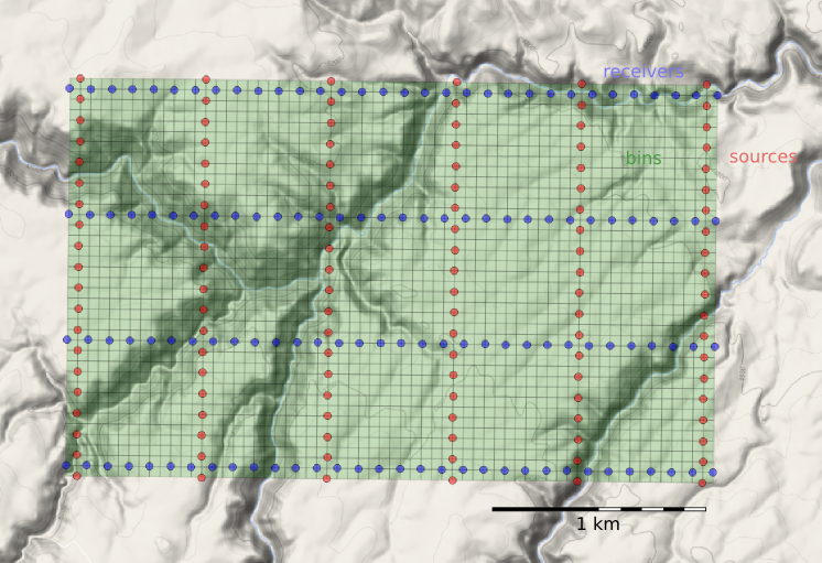
Just as we represented the midpoints as a GeoSeries of Point objects, we will represent  the bins with a GeoSeries of Polygons. GeoPandas provides the GeoSeries; Shapely provides the geometries; take a look at the IPython Notebook for the code. This green mesh is the result, and will hold the stacked traces after processing.

bins_physical.png

Fetching the traces within each bin

To create a CMP gather like the one we modelled at the start, we need to grab all the traces that have midpoints within a particular bin. And we'll want to create gathers for every bin, so it is a huge number of comparisons to make, even for a small example such as this: 128 receivers and 120 sources make 15 320 midpoints. In a purely GIS environment, we could perform a spatial join operation between the midpoint and bin GeoDataFrames, but instead we can use Shapely's contains method inside nested loops. Because of the loops, this code block takes a long time to run.

# Make a copy because I'm going to drop points as I
# assign them to polys, to speed up subsequent search.
midpts = midpoints.copy()

offsets, azimuths = [], [] # To hold complete list.

# Loop over bin polygons with index i.
for i, bin_i in bins.iterrows():
    
    o, a = [], [] # To hold list for this bin only.
    
    # Now loop over all midpoints with index j.
    for j, midpt_j in midpts.iterrows():
        if bin_i.geometry.contains(midpt_j.geometry):
            # Then it's a hit! Add it to the lists,
            # and drop it so we have less hunting.
            o.append(midpt_j.offset)
            a.append(midpt_j.azimuth)
            midpts = midpts.drop([j])
            
    # Add the bin_i lists to the master list
    # and go around the outer loop again.
    offsets.append(o)
    azimuths.append(a)
    
# Add everything to the dataframe.    
bins['offsets'] = gpd.GeoSeries(offsets)
bins['azimuths'] = gpd.GeoSeries(azimuths)

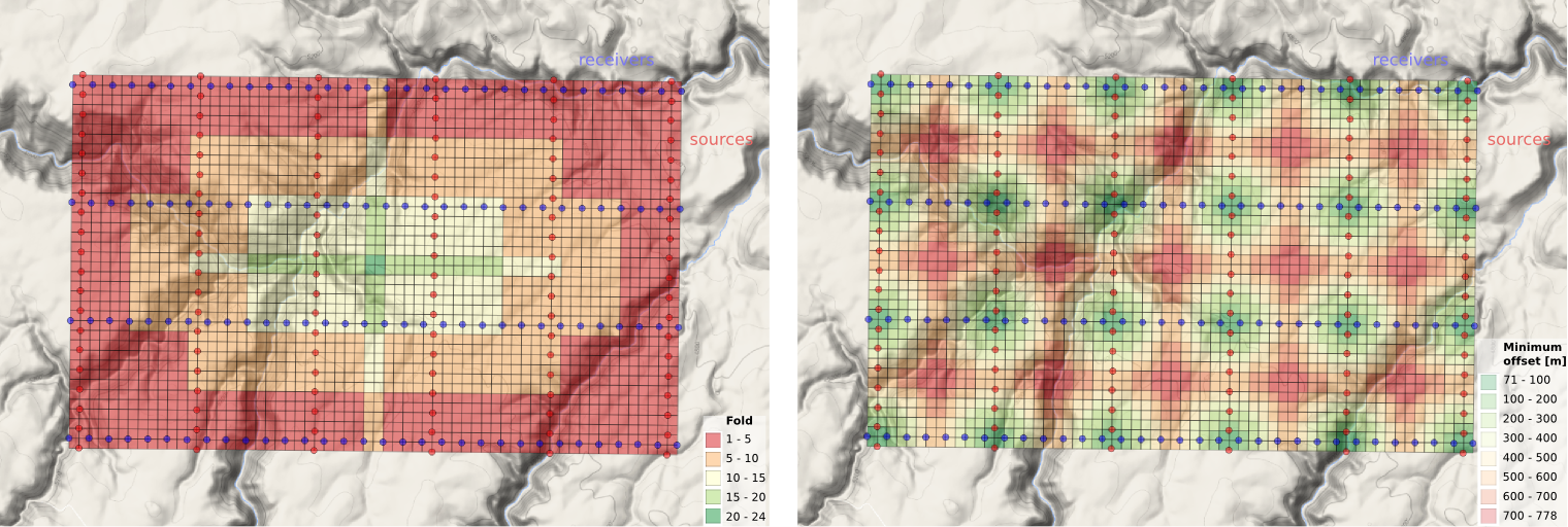
After we've assigned traces to their respective bins, we can make displays of the bin statistics. Three common views we can look at are:

  1. A spider plot to illustrate the offset and azimuth distribution.
  2. A heat map of the number of traces contributing to each bin, usually called fold.
  3. A heat map of the minimum offset that is servicing each bin. 

The spider plot is easily achieved with Matplotlib's quiver plot:

spider_bubble_zoom.png

And the arrays representing our data are also quite easy to display as heatmaps of fold (left) and minimum offset (right): 

fold_and_xmin_physical.png

In the next and final post of this seismic survey mini-series, we'll analyze the impact of data quality when there are gaps and shifts in the source and receiver stations from these idealized locations.

Last thought: if the bins of a seismic survey are like a digital camera's image sensor, then what is the apparatus that acts like a lens? 

Laying out a seismic survey

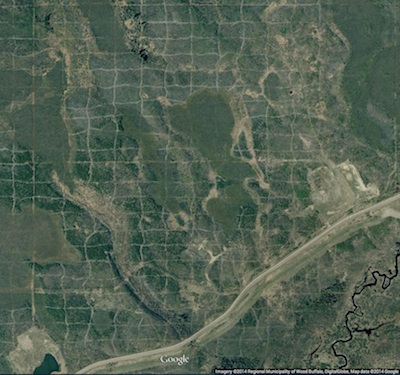
Cutlines for a dense 3D survey at Surmont field, Alberta, Canada. Image: Google Maps.

Cutlines for a dense 3D survey at Surmont field, Alberta, Canada. Image: Google Maps.

Cutlines for a dense 3D survey at Surmont field, Alberta, Canada. Image: Google Maps.There are a number of ways to lay out sources and receivers for a 3D seismic survey. In forested areas, a designer may choose a pattern that minimizes the number of trees that need to be felled. Where land access is easier, designers may opt for a pattern that is efficient for the recording crew to deploy and pick up receivers. However, no matter what survey pattern used, most geometries consist of receivers strung together along receiver lines and source points placed along source lines. The pairing of source points with live receiver stations comprises the collection of traces that go into making a seismic volume.

An orthogonal surface pattern, with receiver lines laid out perpendicular to the source lines, is the simplest surface geometry to think about. This pattern can be specified over an area of interest by merely choosing the spacing interval between lines well as the station intervals along the lines. For instance:

xmi = 575000        # Easting of bottom-left corner of grid (m)
ymi = 4710000       # Northing of bottom-left corner (m)
SL = 600            # Source line interval (m)
RL = 600            # Receiver line interval (m)
si = 100            # Source point interval (m)
ri = 100            # Receiver point interval (m)
x = 3000            # x extent of survey (m)
y = 1800            # y extent of survey (m)

We can calculate the number of receiver lines and source lines, as well as the number of receivers and sources for each.

# Calculate the number of receiver and source lines.
rlines = int(y/RL) + 1
slines = int(x/SL) + 1

# Calculate the number of points per line (add 2 to straddle the edges). 
rperline = int(x/ri) + 2 
sperline = int(y/si) + 2

# Offset the receiver points.
shiftx = -si/2.
shifty = -ri/2.

Computing coordinates

We create a list of x and y coordinates with a nested list comprehension — essentially a compact way to write 'for' loops in Python — that iterates over all the stations along the line, and all the lines in the survey.

# Find x and y coordinates of receivers and sources.
rcvrx = [xmi+rcvr*ri+shifty for line in range(rlines) for rcvr in range(rperline)]
rcvry = [ymi+line*RL+shiftx for line in range(rlines) for rcvr in range(rperline)]

srcx = [xmi+line*SL for line in range(slines) for src in range(sperline)]
srcy = [ymi+src*si for line in range(slines) for src in range(sperline)]

To make a map of the ideal surface locations, we simply pass this list of x and y coordinates to a scatter plot:

srcs_recs_pattern.png

Plotting these lists is useful, but it is rather limited by itself. We're probably going to want to do more calculations with these points — midpoints, azimuth distributions, and so on — and put these data on a real map. What we need is to insert these coordinates into a more flexible data structure that can hold additional information.

Shapely, Pandas, and GeoPandas

Shapely is a library for creating and manipulating geometric objects like points, lines, and polygons. For example, Shapely can easily calculate the (x, y) coordinates halfway along a straight line between two points.

Pandas provides high-performance, easy-to-use data structures and data analysis tools, designed to make working with tabular data easy. The two primary data structures of Pandas are:

  • Series — a one-dimensional labelled array capable of holding any data type (strings, integers, floating point numbers, lists, objects, etc.)
  • DataFrame — a 2-dimensional labelled data structure where the columns can contain many different types of data. This is similar to the NumPy structured array but much easier to use.

GeoPandas combines the capabilities of Shapely and Pandas and greatly simplifies geospatial operations in Python, without the need for a spatial database. GeoDataFrames are a special case of DataFrames that are specifically for representing geospatial data via a geometry column. One awesome thing about GeoDataFrame objects is they have methods for saving data to shapefiles.

So let's make a set of (x,y) pairs for receivers and sources, then make Point objects using Shapely, and in turn add those to GeoDataFrame objects, which we can write out as shapefiles:

# Zip into x,y pairs.
rcvrxy = zip(rcvrx, rcvry)
srcxy = zip(srcx, srcy)

# Create lists of shapely Point objects.
rcvrs = [Point(x,y) for x,y in rcvrxy]
srcs = [Point(x,y) for x,y in srcxy]

# Add lists to GeoPandas GeoDataFrame objects.
receivers = GeoDataFrame({'geometry': rcvrs})
sources = GeoDataFrame({'geometry': srcs})

# Save the GeoDataFrames as shapefiles.
receivers.to_file('receivers.shp')
sources.to_file('sources.shp')

It's a cinch to fire up QGIS and load these files as layers on top of a satellite image or physical topography map. As a survey designer, we can now add, delete, and move source and receiver points based on topography and land issues, sending the data back to Python for further analysis.

seismic_GIS_physical.png

All the code used in this post is in an IPython notebook. You can read it, and even execute it yourself. Put your own data in there and see how it comes out!

NEWSFLASH — If you think the geoscientists in your company would like to learn how to play with geological and geophysical models and data — exploring seismic acquisition, or novel well log displays — we can come and get you started! Best of all, we'll help you get up and running on your own data and your own ideas.

If you or your company needs a dose of creative geocomputing, check out our new geocomputing course brochure, and give us a shout if you have any questions. We're now booking for 2015.

The race for useful offsets

We've been working on a 3D acquisition lately. One of the factors influencing the layout pattern of sources and receivers in a seismic survey is the range of useful offsets over the depth interval of interest. If you've got more than target depth, you'll have more than one range of useful offsets. For shallow targets this range is limited to small offsets, due to direct waves and first breaks. For deeper targets, the range is limited at far offsets by energy losses due to geometric spreading, moveout stretch, and system noise.

In seismic surveying, one must choose a spacing interval between geophones along a receiver line. If phones are spaced close together, we can collect plenty of samples in a small area. If the spacing is far apart, the sample density goes down, but we can collect data over a bigger area. So there is a trade-off and we want to maximize both; high sample density covering the largest possible area.

What are useful offsets?

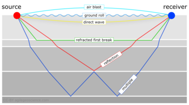
It isn't immediately intuitive why illuminating shallow targets can be troublesome, but with land seismic surveying in particular, first breaks and near surface refractions clobber shallow reflecting events. In the CMP domain, these are linear signals, used for determining statics, and are discarded by muting them out before migration. Reflections that arrive later than the direct wave and first refractions don't get muted out. But if these reflections arrive later than the air blast noise or ground roll noise — pervasive at near offsets — they get caught up in noise too. This region of the gather isn't muted like the top mute, otherwise you'd remove the data at near offsets. Instead, the gathers are attacked with algorithms to eliminate the noise. The extent of each hyperbola that passes through to migration is what we call the range of useful offsets.

muted_moveout2.png

The deepest reflections have plenty of useful offsets. However if we wanted to do adequate imaging somewhere between the first two reflections, for instance, then we need to make sure that we record redundant ray paths over this smaller range as well. We sometimes call this aperture; the shallow reflection is restricted in the number of offsets that it can be illuminated with, the deeper reflections can tolerate an aperture that is more open. In this image, I'm modelling the case of 60 geophones spanning 3000 metres, spaced evenly at 100 metres apart. This layout suggests merely 4 or 5 ray paths will hit the uppermost reflection, the shortest ray paths at small offsets. Also, there is usually no geophone directly on top of the source location to record a vertical ray path at zero offset. The deepest reflections however, should have plenty of fold, as long as NMO stretch, geometric spreading, and noise levels were good.

The problem with determining the range of useful offsets by way of a model is, not only does it require a velocity profile, which is easily attained from a sonic log, VSP, or velocity analysis, but it also requires an estimation of the the speed, intensity, and duration of the near surface events to be muted. Parameters that depend largely on the nature of the source and the local ground conditions, which vary from place to place, and from one season to the next.

In a future post, we'll apply this notion of useful offsets to build a pattern for shooting a 3D.


Click here for details on how I created this figure using the IPython Notebook. If you don't have it, IPython is easy to install. The easiest way is to install all of scientific Python, or use Canopy or Anaconda.

This post was inspired in part by Norm Cooper's 2004 article, A world of reality: Designing 3D seismic programs for signal, noise, and prestack time-migration. The Leading Edge23 (10), 1007-1014.DOI: 10.1190/1.1813357

Update on 2014-12-17 13:04 by Matt Hall
Don't miss the next installment — Laying out a seismic survey — with more IPython goodness!

Neglected near-surface workhorses

Yesterday afternoon, I attended a talk at Dalhousie by Peter Cary who has begun the CSEG distinguished lecture tour series. Peter's work is well known in the seismic processing world, and he's now spreading his insights to the broader geoscience community. This was only his fourth stop out of 26 on the tour, so there's plenty of time to catch it.

Three steps of seismic processing

In the head-spinning jargon of seismic processing, if you're lost, it's maybe not be your fault. Sometimes it might even seem like you're going in circles.

Ask the vendor or processing specialist first to keep it simple, and second to tell you in which of the three processing stages you are in. Seismic data processing has steps:

  • Attenuate all types of noise.
  • Remove the effects of the near surface.
  • Migration, sometimes called imaging.

If time migration is the workshorse of seismic processing, and if is fk filtering (or f–anything filtering) is the workhorse of noise attenuation, then surface consistent deconvolution is the workhorse of the near surface. These topics aren't as sexy or as new as FWI or compressed sensing, but Peter has been questioning the basics of surface-consistent scaling, and the approximations we make when processing land seismic data. 

The ambiguity of phase and travel-time corrections

To the processor, removing the effects of the near surface means making things flat in the CMP domain. It turns out you can do this with travel time corrections (static shifts), you can do this with phase corrections, or you can do it with both.

A simple synthetic example showing (a) a gather with surface-consistent statics and phase variations; (b) the same gather after surface-consistent residual statics correction, and (c) after simultaneous surface-consistent statics and phase correcition. Image © Cary & Nagarajappa and CSEG.

It's troubling that there is more than one way to achieve flatness. Peter's advice is to use shot stacks and receiver stacks to compare the efficacy of static corrections. They eliminate doubt about whether surface consistent scaling is working, and are a better QC tool than other data domains.

Deeper than shallow

It may sound trivial, but the hardest part about using seismic waves for imaging is that they have to travel down and back up through the near surface on their path to the target. It might seem counter-intuitive, but the geometric configurations that work well for the deep earth are not well suited to the shallow earth, and how we might correct for it. I can imagine that two surveys could be useful, one for the target and one for characterizing the shallow that gets in the way of the target, but seismic experiments are already expensive enough when there is only target to be concerned with.

Still, the near surface is something we can't avoid. Much like astronomers using ground-based telescopes shooting for the stars, seismic processors too have to get the noisy stuff that is sitting closest to the detectors out of the way.

Imaging with vectors

Even though it took way too long (I had been admiring it for quite some time), I recently became the first kid on the block to own a Lytro. The Lytro, if you haven't heard, is sort of like a camera, except that it definitely isn't. Apart from a viewfinder on one end, a piece of glass on the other, and a shutter release button on top, it doesn't really look or feel like a point-and-shoot or SLR either. It actually bares a closer resemblance to a pocket-sized telescope. So don't you dare call it a camera. Indeed, the thing that the Lytro is built to do is what makes it completely different than any camera, and this perhaps, is the best mark of its identity. It captures not only the intensity of the light rays hitting the sensor (or film), but the directionality of those light rays as well.

So what. Right? What does this mean? Why is this interesting? It means that with a light-field camera, the focal point and depth of field are parameters that can be controlled by the viewer. It is interesting because of freeing up of space and of the physical atoms of hardware by deliberately removing the motorized auto-focus mechanism, and placing instead into the capable and powerful hands of software. I find it particularly elegant that this technology was acheived as a result of harnessing light's true nature better than any other camera that came before it. A device designed to to record light as light is; a physical property defined by both a magnitude and a direction.

How do I interact with this picture? 

Normally this would be a weird question to ask, but with the Lytro the viewer can take part in the imaging process in three ways. Try it out on the samples above:

  • Point to focus: collecting the light field from a scene is a technical thing. Creating images by deciding what to focus on, and what to not focus on is an artistic thing. It is an interpretive thing. It's a narrative that the viewer has with the data. The goal of the light field camera is not to impose a narrative, but instead get entirely out of the way.
  • Extended focus: for artistic reasons, the viewer might want to have some parts of the image in focus, other parts out of focus. It's how our eyes work; our peripheral vision. But in cases where you want to see the full depth of field, where everything is in focus, the software has an algorithm for that (to try it out you can press 'E' on your keyboard).
  • Stereo viewing: speaks to the multidimensional nature of the vector field data. In the real world, when we move our head, the foreground moves faster than the background. So too with light-field images, you can simulate parallax, by moving your cursor and better understand the spatial relationship between objects in the scene.

These capabilities aren't just components of the device, they are technological paradigms embodied by the device. That, to me, is what is so incredibly beautiful about this technology. It's the best example of what technology should be: a material thing that improves the work of the mind.

A call to the seismic industry

The seismic wavefield is what we should be giving to the interpreter. This probably means engineering a seismic system where less work is done by the processor, and more control is given to the interpreter through software that does the heavy lifting. Interpreters need to have direct feedback with the medium they are interpreting. How does seismic have to change to allow that narrative?

Big imaging, little imaging, and telescopes

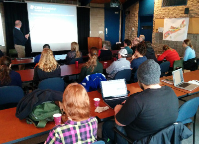
I caught three lovely talks at the special session yesterday afternoon, Recent Advances and the Road Ahead. Here are my notes...

The neglected workhorse

If you were to count up all the presentations at this convention on seismic migration, only 6% of them are on time migration. Even though it is the workhorse of seismic data processing, it is the most neglected topic in migration. It's old technology, it's a commodity. Who needs to do research on time migration anymore? Sergey does.

Speaking as an academic, Fomel said, "we are used to the idea that most of our ideas are ignored by industry," even though many transformative ideas in the industry can be traced back to academics. He noted that it takes at least 5 years to get traction, and the 5 years are up for his time migration ideas, "and I'm starting to lose hope". Here's five things you probably didn't know about time migration:

  • Time migration does not need travel times.
  • Time migration does not need velocity analysis.
  • Single offsets can be used to determine velocities.
  • Time migration does need approximations, but the approximation can be made increasingly accurate.
  • Time migration distorts images, but the distortion can be removed with regularized inversion.

It was joy to listen to Sergey describe these observations through what he called beautiful equations: "the beautiful part about this equation is that it has no parameters", or "the beauty of this equation is that is does not contain velocity", an so on. Mad respect.

Seismic adaptive optics

Alongside seismic multiples, poor illumination, and bandwidth limitations, John Etgen (BP) submitted that, in complex overburden, velocity is the number one problem for seismic imaging. Correct velocity model equals acceptable image. His (perhaps controversial) point was that when velocities are complex, multiples, no matter how severe, are second order thorns in the side of the seismic imager. "It's the thing that's killing us, and that's the frontier." He also posited that full waveform inversion may not save us after all, and image gather analysis looks even less promising.

While FWI looks to catch the wavefield and look at it in the space of the data, migration looks to catch the wavefield and look at it at the image point itself. He elegantly explained these two paradigms, and suggested that both may be flawed.

John urged, "We need things other than what we are working on", and shared his insights from another field. In ground-based optical astronomy, for example, when the image of a star is be distorted by turbulence in our atmosphere, astromoners numerically warp the curvature of the lens to correct for rapid variations in phase of the incoming wavefront. The lenses we use for seismic focusing, velocities, can be tweaked just the same by looking at the wavefield part of the way through its propagation. He quoted Jon Claerbout:

If you want to understand how a horse runs, you gotta run along with it.

Big imaging, little imaging, and combination of the two

There's a number of ways one could summarize what petroleum seismologists do. But hearing (CGG researcher) Sam Gray's talk yesterday was a bit of an awakening. His talk was a remark on the notion of big imaging vs little imaging, and the need for convergence.

Big imaging is the structural stuff. Structural migration, stratigraphic imaging, wide-azimuth acquisition, and so on. It includes the hardware and compute innovations of broadband, blended sources, deblending processing, anisotropic imaging, and the beginnings of viscoacoustic reverse-time migration. 

Little imaging is inversion. It's reservoir characterization. It's AVO and beyond. Azimuthal velocities (fast and slow directions) hint at fracture orientations, azimuthal amplitudes hint even more subtly at fracture compliance.

Big imaging is hard because it's computationally expensive, and velocities are unknown. Little imaging is hard because features like fractures, faults and pores are at the centimetre scale, but on land we lay out inlines and crossline hundreds of metres apart, and use signals that carry only a few bits of information from an area the size of a football field.

What we've been doing with imaging is what he called a separated workflow. We use gathers to make big images. We use gathers to make rock properties, but seldom do they meet. How often have you tested to see if the rock properties the little are explain the wiggles in the big? Our work needs to be such a cycle, if we want our relevance and impact to improve.

The figures are copyright of the authors of SEG, and used in accordance with SEG's permission guidelines.

SEG 2014: sampling from the smorgasbord

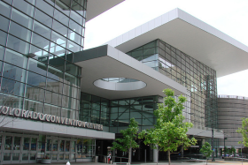
Next week, Matt and I will be attending the 2014 SEG Annual General Meeting at the Colorado Convention Centre in Denver. Join the geo-tweeting using the hashtag #SEG2014 and stay tuned on the blog for our daily highlights.

Fitness training

I spent a couple of hours yesterday reviewing the conference schedule in an attempt to form an opinion on what deserved my attention. The meeting boasts content from over 1600 abstract submissions which it has dispersed over three formats: oral presentations, poster presentations, and oral discussions/e-posters (looking forward to finding out how these work). Any given moment there will be 12 oral, 3 poster, and 6 e-poster presentations going on, not to mention all the happenings on the exhibition floor. A worthy test for my navigation skills, discipline, and endurance, as well as the new and improved SEG events mobile app.

The technical program

There are 101 sessions in the technical program, each with around 8 presentations. Six of these sessions are dubbed special sessions, hosting either invited speakers from other domains such as hydrogeophysics and completions engineering, or a heavyweight lineup of seismic celebs. Special session numero uno, entitled Recent Advances And The Road Ahead is  the session that I'm most looking forward to. It kicks off the technical program on Monday afternoon with talks from:

  • Christof Stork (ION Geophysical), The decline of conventional seismic acquisition and the rise of specialized acquisition: this is compressive sensing.
  • Sergy Fomel (UT Austin), Recent advances in time-domain seismic imaging. 
  • John Etgen (BP), Seismic adaptive optics. 
  • Kurt Marfurt (Univ. of Oklahoma), Seismic attributes and the road ahead. 
  • Reinarldo Michelena (iReservoir), Flow simulation models for unconventional reservoirs: The role of seismic data.

Other presentations throughout the week that have made it onto my must-see list:

  • Andreas Rüger (Halliburton), A practitioner's approach to full waveform inversion.
  • Lewis Li (Stanford), Uncertainty maps for seismic images through geostatistical model randomization.
  • Kevin Liner (Univ. of Arkansas), Study of basement rocks in Northeastern Oklahoma with 3D seismic and well logs.
  • Xinyuan Luan (China Univ. of Petroleum), Laboratory measurements of brittleness anisotropy in synthetic shale with different cementation.
  • Anya Reitz (Colorado School of Mines), Feasibility of surface and borehole time-lapse gravity for SAGD monitoring.
  • Cai Lu (Univ. of Electronic Science and Technology of China), Application of multi-attributes fused volume rendering techniques in 3D seismic interpretation.

To top it all off on Thursday afternoon, Matt and I will be at workshop number 9, Latest Developments in Time-Frequency Analysis. It is one of many post convention workshops worth sticking around for after the booths get torn down and the the exhibition doors close.

SEG Wikithon

If you read The Leading Edge frequently or if you visit the SEG website regularly, you may have noticed an increased presence of SEG Wiki. Matt and his allies Isaac Farley and Andrew Geary will be parked in Room 708 between 12–2pm and 5–6pm October 26–29. For more information about SEG Wiki and the Wikithon, check out Isaac's article from the September issue, and find out all the details on wiki page (naturally).

Whatever you want to call it

Lastly, I couldn't help but snag a selection of the coolest names from the technical session. I can only imagine what the organizing committee was thinking:

Well, they got my attention. And with so much content to choose from, maybe that's all that matters.

Image by user bonjourpeewee on flickr, licensed CC-BY-SA.

Graphics that repay careful study

The Visual Display of Quantitative Information by Edward Tufte (2nd ed., Graphics Press, 2001) celebrates communication through data graphics. The book provides a vocabulary and practical theory for data graphics, and Tufte pulls no punches — he suggests why some graphics are better than others, and even condemns failed ones as lost opportunities. The book outlines empirical measures of graphical performance, and describes the pursuit of graphic-making as one of sequential improvement through revision and editing. I see this book as a sort of moral authority on visualization, and as the reference book for developing graphical taste.

Through design, the graphic artist allows the viewer to enter into a transaction with the data. High performance graphics, according to Tufte, 'repay careful study'. They support discovery, probing questions, and a deeper narrative. These kinds of graphics take a lot of work, but they do a lot of work in return. In later books Tufte writes, 'To clarify, add detail.'

A stochastic AVO crossplot

Consider this graphic from the stochastic AVO modeling section of modelr. Its elements are constructed with code, and since it is a program, it is completely reproducible.

Let's dissect some of the conceptual high points. This graphic shows all the data simultaneously across 3 domains, one in each panel. The data points are sampled from probability density estimates of the physical model. It is a large dataset from many calculations of angle-dependent reflectivity at an interface. The data is revealed with a semi-transparent overlay, so that areas of certainty are visually opaque, and areas of uncertainty are harder to see.

At the same time, you can still see every data point that makes the graphic giving a broad overview (the range and additive intensity of the lines and points) as well as the finer structure. We place the two modeled dimensions with templates in the background, alongside the physical model histograms. We can see, for instance, how likely we are to see a phase reversal, or a Class 3 response subject to the physical probability estimates. The statistical and site-specific nature of subsurface modeling is represented in spirit. All the data has context, and all the data has uncertainty.

Rules for graphics that work

Tufte summarizes that excellent data graphics should:

  • Show all the data.
  • Provoke the viewer into thinking about meaning.
  • Avoid distorting what the data have to say.
  • Present many numbers in a small space.
  • Make large data sets coherent.
  • Encourage the eye to compare different pieces of the data.
  • Reveal the data at several levels of detail, from a broad overview to the fine structure.
  • Serve a reasonably clear purpose: description, exploration, tabulation, or decoration.
  • Be closely integrated with the statistical and verbal descriptions of a data set.

The data density, or data-to-ink ratio, looks reasonably high in my crossplot, but it could like still be optimized. What would you remove? What would you add? What elements need revision?

The event that connects like the web

Last week, Matt, Ben, and I attended SciPy 2014, the 13th annual scientific computing with Python conference. On a superficial level, it was just another conference. But there were other elements, brought forth by the organizers and participants (definitely not just attendees) and slowly revealed over the week. Together, the community created the conditions for a truly remarkable experience.

Immutable accessibility

By design, the experience starts before the event, and continues after it is over. Before each of the four half-day tutorials I attended, the instructors posted their teaching materials, code, and setup instructions. Most oral presentations did the same. Most code and content was served through GitHub or Bitbucket and instructions were posted using Mozilla's Etherpad. Ultimately the tools don't matter — it's the intention that is important. Instructors and speakers plan to connect.

Enhancing the being there

Beyond talks and posters, here are some examples of other events that were executed with engagement in mind:

  • Keynote presentations. If a keynote is truly key, design the schedule so that everyone can show up — they're a great way to start the day on a high note.
  • Birds of a Feather sessions are better than a panel discussion or Q&A. Run around with a microphone, and record notes in Etherpad.
  • Lightning talks at the end the day. Anyone can request 5 minutes on a show & tell. It was the first time I've heard applause erupt in the middle of a talk — and it happened several times.
  • Developer sprints take an hour to teach newbies how to become active members of your community or your project. Then spend two-days showing them how you work.

Record all the things

SciPy is not a conference, it's a hypermedia stream that connects networks across organizational boundaries. And it happens in real time — I overheard several people remarking in astonishment that the video of so-and-so's talk earlier that same morning was already posted online. My trained habit of frantic note-taking was redundant, freeing my concentration for more active listening. Instructors and presenters published their media online, and the majority of presenters pulled up interactive iPython notebooks in the browser and executed code on the fly. 

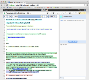
As an example of this, here's Karl Schleicher of Sergey Fomel's group at UT, talking about reproducing the results from a classic paper in The Leading Edge, Spitz (1999)

We need this

On Friday evening Matt remarked to one of the sponsors, "This is the closest thing I have seen to what a conference should be". I think what he meant by that is that it should be about connecting. It should be about pushing our work out to the largest possible scope. It should be open by default, and designed to support ideas and conversations long after it is over. Just like all the things that the web is for as well.

Our question: Can we help SEG, AAPG, or EAGE deliver this to our community? Or do we have to go and build it? 

Well tie calculus

As Matt wrote in March, he is editing a regular Tutorial column in SEG's The Leading Edge. I contributed the June edition, entitled Well-tie calculus. This is a brief synopsis only; if you have any questions about the workflow, or how to get started in Python, get in touch or come to my course.


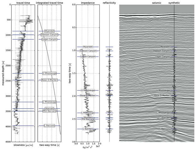
Synthetic seismograms can be created by doing basic calculus on traveltime functions. Integrating slowness (the reciprocal of velocity) yields a time-depth relationship. Differentiating acoustic impedance (velocity times density) yields a reflectivity function along the borehole. In effect, the integral tells us where a rock interface is positioned in the time domain, whereas the derivative tells us how the seismic wavelet will be scaled.

This tutorial starts from nothing more than sonic and density well logs, and some seismic trace data (from the #opendata Penobscot dataset in dGB's awesome Open Seismic Repository). It steps through a simple well-tie workflow, showing every step in an IPython Notebook:

  1. Loading data with the brilliant LASReader
  2. Dealing with incomplete, noisy logs
  3. Computing the time-to-depth relationship
  4. Computing acoustic impedance and reflection coefficients
  5. Converting the logs to 2-way travel time
  6. Creating a Ricker wavelet
  7. Convolving the reflection coefficients with the wavelet to get a synthetic
  8. Making an awesome plot, like so...

Final thoughts

If you find yourself stretching or squeezing a time-depth relationship to make synthetic events align better with seismic events, take the time to compute the implied corrections to the well logs. Differentiate the new time-depth curve. How much have the interval velocities changed? Are the rock properties still reasonable? Synthetic seismograms should adhere to the simple laws of calculus — and not imply unphysical versions of the earth.


Matt is looking for tutorial ideas and offers to write them. Here are the author instructions. If you have an idea for something, please drop him a line.