10 days on the Mid-Atlantic Ridge

I have just returned from a 10-day holiday in Iceland, an anomalous above-sea-level bump in the North Atlantic's mid-ocean ridge. It sits over a mantle hotspot at the junction of the ridge and the WNW–ESE volcanic province stretching from the Greenland to the Faroes.

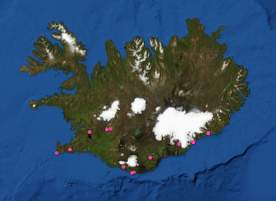
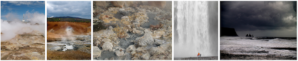
Meteorologically, culinarily, fincancially, Iceland does not score especially highly. But geologically—the only way that really matters—it's the most amazing place I've ever been. And we only visited a few spots (right). Here are some highlights...

Reykjanes. My favourite geological locality was the first place we went, and the most desolate. Barely half-an-hour's drive from the airport, you can go and see the Mid-Atlantic Ridge rise out of the North Atlantic, and start its romp across the country. Reykjanes looks much like you'd expect newborn crust to look: a brutal but pristine landscape of lava, interrupted by clusters of small volcanic cones, elongate fissures, and small grabens. 

Þingvellir. The archetypal rift valley is Þingvellir (Thingvellir), which almost defies description. On top of the textbook geology is a layer of almost magical history — mythical in character, but completely real. For example, you can stand next to the drekkingarhylur (drowning pool), where deviants were executed by drowning, and diligently documented, from about 930 CE onwards. Explorationists know that early rifting is often associated with lacustrine deposits, rapid subsidence, and source rocks. And Iceland's largest lake sits happily in a new (relatively) rift valley, subsiding dutifully since records began. 

Helluhraun (pahoehoe lava) and one of the bounding faults at Þingvellir

Ice. The other thing Iceland has plenty of, apart from lava, is ice. I've seen plenty of glaciers before, and climbed around on a few, but I've never seen them calving icebergs. And I've never seen the products of subglacial eruptions: massive plains of sand dumped by jökulhlaups, and distinctively elongate or flat-topped volcanos.

Icebergs in front of Breiðamerkurjökull

We vowed to return when our youngest, who is only 3 now, is old enough to remember some of it. We mostly stayed in guesthouses, but we decided a camper van is the way to go — there's so much to see. I also realized I need a lot more photographic equipment! And skill.

A stupid seismic model from core

On the plane back from Calgary, I got an itch to do some image processing on some photographs I took of the wonderful rocks on display at the core convention. Almost inadvertently, I composed a sequence of image filters that imitates a seismic response. And I came to these questions:  

  • Is this a viable way to do forward modeling? 
  • Can we exploit scale invariance to make more accurate forward models?
  • Can we take the fabric from core and put it in a reservoir model?
  • What is the goodness of fit between colour and impedance? 

Click to enlargeAbove all, this image processing excerise shows an unambiguous demonstration of the effects of bandwidth. The most important point, no noise has been added. Here is the sequence, it is three steps: convert to grayscale, compute Laplacian, apply bandpass filter. This is analgous to the convolution of a seismic wavelet and the earth's reflectivity. Strictly speaking, it would be more physically sound to make a forward model using wavelet convolution (simple) or finite difference simulation (less simple), but that level of rigour was beyond the scope of my tinkering.

The two panels help illustrate a few points. First, finely layered heterogeneous stratal packages coalesce into crude seismic events. This is the effect of reducing bandwidth. Second, we can probably argue about what is 'signal' and what is 'noise'. However, there is no noise, per se, just geology that looks noisy. What may be mistaken as noise, might in fact be bonafide interfaces within material properties. 

If the geometry of geology is largely scale invariant, perhaps, just perhaps, images like these can be used at the basin and reservoir scale. I really like the look of the crumbly fractures near the bottom of the image. This type of feature could drive the placement of a borehole, and the production in a well. The patches, speckles, and bands in the image are genuine features of the geology, not issues of quality or noise. 

Do you think there is a role for transforming photographs of rocks into seismic objects?

Laying it all out at the Core Conference

Bobbing in the wake of the talks, the Core Conference turned out to be more exemplary of this year's theme, Integration. Best of all were SAGD case studies, where multi-disciplinary experiments are the only way to make sense of the sticky stuff.

Coring through steam

Travis Shackleton from Cenovus did a wonderful presentation showing the impact of bioturbation, facies boundaries, and sedimentary structures on steam chamber evolution in the McMurray Formation at the FCCL project. And because I had the chance to work on this project with ConocoPhillips a few years ago, but didn't, this work induced both jealousy and awe. Their experiment design is best framed as a series of questions:

  • What if we drilled, logged, and instrumented two wells only 10 m apart? (Awesome.)
  • What if we collected core in both of them? (Double awesome.)
  • What if the wells were in the middle of a mature steam chamber? (Triple awesome.)
  • What if we collected 3D seismic after injecting all this steam and compare with with a 3D from before? (Quadruple awesome.)

It is the first public display of SAGD-depleted oil sand, made available by an innovation of high-temperature core recovery. Travis pointed to a portion of core that had been rinsed by more than 5 years of steam circulating through it. It had a pale brown color and a residual oil saturation SO of 15% (bottom sample in the figure). Then he pointed to a segment of core above the top of the steam chamber. It too was depleted, by essentially the same amount. You'd never know just by looking. It was sticky and black and largely unscathed. My eyes were fooled, direct observation deceived.

A bitumen core full of fractures

Jen-Russel-Houston held up a half-tube of core of high-density fractures riddled throughout bitumen saturated rock. The behemoth oil sands that require thermal recovery assistance have an equally promising but lesser known carbonate cousin, still in its infancy. It is the bitumen saturated Grosmont Formation, located to the west of the more mature in-situ projects in sand. The reservoir is entirely dolomite, hosting its own unique structures affecting the spreading of steam and the reduction of bitumen's viscosity to a flowable level.

Jen and her team at OSUM hope their pilot will demonstrate that these fractures serve as transport channels for the steam, allowing it to creep around tight spots in the reservoir, which would otherwise be block the steam in its tracks. These are not the same troubling baffles and barriers caused by mud plugs or IHS, but permeability heterogeneities caused by the dolomitization process. A big question is the effective permeability at the length scales of production, which is phenomenologically different to measurements made from cut core. I overheard a spectator suggest to Jen that she try to freeze a sleeve of core, soak it with acid then rinse the dolomite out the bottom. After which only a frozen sculpture of the bitumen would remain. Crazy? Maybe. Intriguing? Indeed. 

Let's do more science with rocks!

Two impressive experiments, unabashedly and literally laid out for all to see, equipped with clever geologists, and enriched by supplementary technology. Both are thoughtful initiatives—real scientific experiments—that not only make the operating companies more profitable, but also profoundly improve our understanding of a precious resource for society. Two role models for how comprehensive experiments can serve more than just those who conduct them. Integration at its very best, centered on core.

What are the best examples of integrated geoscience that you've seen?

Interpreting spectral gamma-ray logs

Before you can start interpreting spectral gamma-ray logs (or, indeed, any kind of data), you need to ask about quality.

Calibrate your tool...

The main issues affecting the quality of the logs are tool calibration and drilling mud composition. I think there's a tendency to assume that delivered logs have been rigorously quality checked, but... they haven't. The only safe assumption is that nobody cares about your logs as much as you. (There is a huge opportunity for service companies here — but in my experience they tend to be focused on speed and quantity, not quality.)

Calibration is critical. The measurement device in the tool consists of a thallium-laced NaI crystal and a photomultiplier. Both of these components are sensitive to temperature, so calibration is especially important when the temperature of the tool is changing often. If the surface temperature is very different from the downhole—winter in Canada—calibrate often.

Drilling mud containing KCl (to improve borehole stability) increases the apparent potassium content of the formation, while barite acts as a gamma-ray absorber and reduces the count rates, especially in the low energies (potassium).

One of the key quality control indicators is negative readings on the uranium log. A few negative values are normal, but many zero-crossings may indicate that the tool was improperly calibrated. It is imperative to quality control all of the logs, for bad readings and pick-up effects, before doing any quantitative work.

...and your interpretation

Most interpretations of spectral-gamma ray logs focus on the relationships between the three elemental concentrations. In particular, Th/K and Th/U are often used for petrophysical interpretation and log correlation. In calculating these ratios, Schlumberger uses the following cut-offs: if uranium < 0.5 then uranium = 0.5; if potassium < 0.004 then potassium = 0.001 (according to my reference manual for the natural gamma tool).

In general, high K values may be caused by the presence of potassium feldspars or micas. Glauconite usually produces a spike in the K log. High Th values may be associated with the presence of heavy minerals, particularly in channel deposits. Increased Th values may also be associated with an increased input of terrigenous clays. Increases in U are frequently associated with the presence of organic matter. For example, according to the ODP, particularly high U concentrations (> 5 ppm) and low Th/U ratios (< 2) often occur in black shale deposits.

The logs here, from Kansas Geological Survey open file 90-27 by Macfarlane et al. shows a quite overt interpretive approach, with the Th/K log labelled with minerals (feldspar, mica, illite–smectite) and the Th/U log in uranium 'fixedness', a proxy for organic matter.

Sounds useful. But really, you can probably find just a paper to support just about any interpretation you want to make. Which isn't to say that spectral gamma-ray is no use — it's just not diagnostic on its own. You need to calibrate it to your own basin and your own stratigraphy. This means careful, preferably quantitative, comparison of core and logs. 

Further reading 

The digital well scorecard

In my last post, I ranted about the soup of acronyms that refer to well log curves; a too-frequent book-keeping debacle. This pain, along with others before it, has motivated me to design a solution. At this point all I have is this sketch, a wireframe of should-be software that allows you visualize every bit of borehole data you can think of:

The goal is, show me where the data is in the domain of the wellbore. I don't want to see the data explicitly (yet), just its whereabouts in relation to all other data. Data from many disaggregated files, reports, and so on. It is part inventory, part book-keeping, part content management system. Clear the fog before the real work can begin. Because not even experienced folks can see clearly in a fog.

The scorecard doesn't yield a number or a grade point like a multiple choice test. Instead, you build up a quantitative display of your data extents. With the example shown above, I don't even have to look at the well log to tell you that you are in for a challenging well tie, with the absence of sonic measurements in the top half of the well. 

The people that I showed this to immediately undestood what was being expressed. They got it right away, so that bodes well for my preliminary sketch. Can you imagine using a tool like this, and if so, what features would you need? 

Experimental good practice

Like hitting piñatas, scientific experiments need blindfolds. Image: Juergen. CC-BY.I once sent some samples to a biostratigrapher, who immediately asked for the logs to go with the well. 'Fair enough,' I thought, 'he wants to see where the samples are from'. Later, when we went over the results, I asked about a particular organism. I was surprised it was completely absent from one of the samples. He said, 'oh, it’s in there, it’s just not important in that facies, so I don’t count it.' I was stunned. The data had been interpreted before it had even been collected.

I made up my mind to do a blind test next time, but moved to another project before I got the chance. I haven’t ordered lab analyses since, so haven't put my plan into action. To find out if others already do it, I asked my Twitter friends:

Randomized, blinded, controlled testing should be standard practice in geoscience. I mean, if you can randomize trials of government policy, then rocks should be no problem. If there are multiple experimenters involved, like me and the biostrat guy in the story above, perhaps there’s an argument for double-blinding too.

Designing a good experiment

What should we be doing to make geoscience experiments, and the reported results, less prone to bias and error? I'm no expert on lab procedure, but for what it's worth, here are my seven Rs:

  • Randomized blinding or double-blinding. Look for opportunities to fight confirmation bias. There’s some anecdotal evidence that geochronologists do this, at least informally — can you do it too, or can you do more?
  • Regular instrument calibration, per manufacturer instructions. You should be doing this more often than you think you need to do it.
  • Repeatability tests. Does your method give you the same answer today as yesterday? Does an almost identical sample give you the same answer? Of course it does! Right? Right??
  • Report errors. Error estimates should be based on known problems with the method or the instrument, and on the outcomes of calibration and repeatability tests. What is the expected variance in your result?
  • Report all the data. Unless you know there was an operational problem that invalidated an experiment, report all your data. Don’t weed it, report it. 
  • Report precedents. How do your results compare to others’ work on the same stuff? Most academics do this well, but industrial scientists should report this rigorously too. If your results disagree, why is this? Can you prove it?
  • Release your data. Follow Hjalmar Gislason's advice — use CSV and earn at least 3 Berners-Lee stars. And state the license clearly, preferably a copyfree one. Open data is not altruistic — it's scientific.

Why go to all this trouble? Listen to Richard Feynman:

The first principle is that you must not fool yourself, and you are the easiest person to fool.

Thank you to @ToriHerridge@mammathus@volcan01010 and @ZeticaLtd for the stories about blinded experiments in geoscience. There are at least a few out there. Do you know of others? Have you tried blinding? We'd love to hear from you in the comments! 

The map that changed the man

This is my contribution to the Accretionary Wedge geoblogfest, number 43: My Favourite Geological Illustration. You can read all about it, and see the full list of entries, at In the Company of Plants and Rocks. To quote Hollis:

All types of geological illustrations qualify — drawings, paintings, maps, charts, graphs, cross-sections, diagrams, etc., but not photographs.  You might choose something because of its impact, its beauty, its humor, its clear message or perhaps because of a special role it played in your life.  Let us know the reasons for your choice!

The map that changed the man

In 1987, at the age of 16, I became a geologist wannabe. A week on Rùm (called Rhum at the time) with volcanologist Steve Sparks convinced me that it was the most complete science of nature, being a satisfying stew of physics, chemistry, geomorphology, cosmology, fluid dynamics, and single malt whisky. One afternoon, he showed me cross-beds in the Torridonian sandstones on the shore of Loch Scresort, and identical cross-beds in the world-famous layered gabbros in the magma chamber of a Palaeogene volcano. 

View of Rum image by Southside Images, see below for credit.

But I was just a wannabe. So I studied hard at school and went off to the University of Durham. The usual studying and non-studying ensued, during which I discovered which parts of the science drew me in. There were awesome field trips, boring crystallography lectures, and tough structural geology labs. And at the end of the second year, there was the 6-week independent mapping project

As far as I know, independent mapping projects sensu stricto are a British phenomenon. I hope they still exist. Two groups decided the UK, while offering incredible basemaps and rich geological literature, was too soggy. One group went to the French Alps, where carbonates legend Maurice Tucker would be vacationing and available for advice, the other group decided that was too easy and went off to the wild mountains of northern Spain and the thrust front of the Pyrenees, where no-one was vacationing and no-one would be available for anything. Guess which group I was in. 

To say we were green would be like saying geologists think beer is OK. I hitchhiked there (but only had one creepy ride). We lived in tents (but in a peach orchard). It was July, and 35 degrees Celsius on a cool day (but there was a lake). We had no money (but lots of coloured pencils). It wasn't so bad. We all fell in love with Spain. 

Anyway, long story short, I made this map. It's no good, but that's not the point. It's my map. It's the map that turned me from wannabe into actual (if poor). It doesn't really need any commentary. It took hours and hours of scratching with Rotring Rapidographs on drawing film, then colouring the Diazo print by hand. This sounds like ancient history, but the methods I used to create it were already on the verge of extinction—the following year I started using Adobe Illustrator for draughting, and now I use Inkscape. And while some field tools have changed (of course we were not armed with laptops, Google Earth, GPS, or digital cameras), others are pure and true and timeless. Whack, whack,...

The ring of my hammer on Late Cretaceous limestones is still echoing through the Pyrenees. 

Geological map of the Embaase de Santa Ana, Alfarras, Spain; click to enlarge.

My map of the geology around the Embalse de Santa Ana. Hand-drawn by me in 1992, though I admit it looks like it's from 1892. Click for a larger view. View of Rùm by flickr user Southside Images, licensed CC-BY-NC-SA.

Wave-particle duality

Geoblogger Brian Romans has declared it Dune Week (here's part of his tweet), so I thought I'd jump on the bandwagon with one of my favourite dynamic dune examples illustrating the manifold controls on dune shape. 

Barchan dunes and parabolic dunes both form where there is limited sand supply and unimodally-directed wind (that is, the wind always blows from the same direction). Barchans, like these in Qatar, migrate downwind as sand is blown around the tips of the crescent. Consequently, the slip face is concave.

Location: 24.98°N, 51.37°E

In contrast, parabolic dunes have a convex slip face. They form in vegetated areas: vegetation causes drag on the arms of the crescent, resulting in the elongated shape. These low-amplitude dunes in NE Brazil have left obvious trails.

Location: 3.41°S, 39.00°W


The eastern edge of White Sands dunefield in New Mexico shows an interesting transition from barchan to parabolic, as the marginal vegetation is encroached upon by these weird gypsum dunes. The mode transition runs more or less north–south. Can you tell which side is which? Which way does the wind blow?

View Larger Map

Herrmann and Duràn modelled this type of transition, among others, in a series of fascinating papers including this presentation and Durán et al  2007, Parabolic dunes in north-eastern Brazil, in arXiv Soft Condensed Matter. Their figures show how their numerical models represent nature quite well as barchans transition to parabolic dunes:

Duran_Herrmann_2006_Dunes.png

H is for Horizon

Seismic interpretation is done by crafting, extracting, or digitally drawing horizons across data, but what is a horizon anyway? Coming up with a definition of horizon is hard. So I have narrowed it down to three.

Data-centric: a matrix of discrete samples in x,y,z that can be stored in a 3-column ASCII file. As such, a horizon is something that can be unambiguously drawn on a map, and treated like a raster image. Some software tools even call attribute maps horizons, blurring the definition further. The data-centric horizon is devoid of geology, and of geophysics; it is an artifact of software.

Geophysics-centric: an event, a reflection, in the seismic data; something you could pick with an automatic tracking tool. The quality is subject to the data itself. Change the data, or the processing, change the horizon. By this definition, a flat spot (a flattish reflection from a fluid contact) is a horizon, even though it's not stratigraphic. This type of horizon would be one of the inputs to instantaneous attribute analysis. The geophysics-centric horizon is still, in many ways, devoid of geology. It does not match your geological tops at the wells; it's not supposed to. 

Crossline 1241 (left), and geophysics-centric horizon (right) from the Penobscot 3D (Open Seismic Repository). Reds are highs and blues are lows.Geology-centric: a layer, a surface, an interface, in the earth, and its manifestation in the seismic data. It is the goal of seismic interpretation. In its purest form, it is unattainable: you can never know exactly where the horizon is in the subsurface. We do our best to construct it from wells, seismic, and imagination. Interestingly, because it is, to some degree, not consistent with the seismic reflections, it would not be possible to use the geology-centric horizon for instantaneous seismic attributes. It would match your well tops, if you could build it. But you can't. 

A four well model can help us illustrate this nuance. Geological tops have been correlated across these wells, and used as input to a seismic model to study the changes in thickness of the Bakken Formation (green to blue) interval.

Four-well synthetic seismic model illustrating how a geological surface (green, blue) is not necessarily the same as a seismic reflection. From Hall & Trouillot (2004).

The synthetic model shows how the seismic character changes from well to well. Notice that a stratigraphic surface is not the same thing as a seismic event. The top Bakken (BKKN) pick is a peak-to-trough zero-crossing in the middle, and pinches out and tunes at either end. The top Torquay (TRQY), transitions from a trough, to a zero-crossing, and then to another trough.

This uncertainty is part of the integration gap. It is why building a predictive geologic model is so difficult to do. The word horizon can be a catch-all term; reckless to throw around. Instead, clearly communicate the definition of your horizon pick, it will prevent confusion for yourself and for other people who come in contact with it.

REFERENCE
Hall, M & E Trouillot (2004). Predicting stratigraphy with spectral decomposition. Canadian Society of Exploration Geophysicists annual conference, Calgary, May 2004.

Well worth showing off

Have you ever had difficulty displaying a well log in a presentation? Now, instead of cycling through slides, you can fluidly move across a digital, zoomable canvas using Prezi. I think it could be a powerful visual tool and presentation aid for geoscientists. Prezi allows users to to construct intuitive, animated visualizations, using size to denote emphasis or scale, and proximity to convey relevance. You navigate through the content simply by moving the field of view and zooming in and out through scale space. In geoscience, scale isn't just a concept for presentation design, it is a fundamental property that can now be properly tied-in and shown in a dynamic way.

I built this example to illustrate how geoscience images, spread across several orders of magnitude, can be traversed seamlessly for a better presentation. In a matter of seconds, one can navigate a complete petrophysical analysis, a raw FMI log, a segment of core, and thin section microscopy embedded at its true location. Explore heterogeniety and interpret geology with scale in context. How could you use a tool like this in your work?

Clicking on the play button will steer the viewer step by step through a predefined set of animations, but you can break off and roam around freely at any time (click and drag with your mouse, try it!). Prezi could be very handy for workshops, working meetings, or any place where it is appropriate to be transparent and thorough in your visualizations.

You can also try roaming Prezi by clicking on the image of this cheatsheet. Let us know what you think!

Thanks to Burns Cheadle for Prezi enthusiasm, and to Neil Watson for sharing the petrophysical analysis he built from public data in Alberta.