Cross plot or plot cross?

I am stumped. About once a year, for the last nine years or so, I have failed to figure this out.

What could be simpler than predicting porosity from acoustic impedance? Well, lots of things, but let’s pretend for a minute that it’s easy. Here’s what you do:
1.   Measure impedance at a bunch of wells
2.   Measure the porosity — at seismic scale of course — at those wells
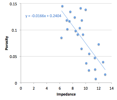
3.   Make a crossplot with porosity on the y-axis and amplitude on the x-axis
4.   Plot the data points and plot the regression line (let’s keep it linear)
5.   Find the equation of the line, which is of the form y = ax + b, or porosity = gradient × impedance + constant
6.   Apply the equation to a map (or volume, if you like) of amplitude, and Bob's your uncle.

Easy!

But, wait a minute. Is Bob your uncle after all? The parameter on the y-axis is also called the dependent variable, and that on the x-axis the independent. In other words, the crossplot represents a relationship of dependency, or causation. Well, porosity certainly does not depend on impedance — it’s the other way around. To put it another way, impedance is not the cause of porosity. So the natural relationship should put impedance, not porosity, on the y-axis. Right?
Therefore we should change some steps:

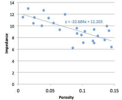
3.   Make a crossplot with impedance on the y-axis and porosity on the x-axis
4.   Plot the data points and plot the regression line
5a. Find the equation of the line, which is of the form y = ax + b, or impedance = gradient × porosity + constant
5b. Rearrange the equation for what we really want:
porosity = (impedance – constant)/gradient

Not quite as easy! But still easy.

More importantly, this gives a different answer. Bob is not your uncle after all. Bob is your aunt. To be clear: you will compute different porosities with these two approaches. So then we have to ask: which is correct? Or rather, since neither going to give us the ‘correct’ porosity, which is better? Which is more physical? Do we care about physicality?

I genuinely do not know the answer to this question. Do you?

If you're interested in playing with this problem, the data I used are from Imaging reservoir quality seismic signatures of geologic effects, report number DE-FC26-04NT15506 for the US Department of Energy by Gary Mavko et al. at Stanford University. I digitized their figure D-8; you can download the data as a CSV here. I have only plotted half of the data points, so I can use the rest as a blind test. 

Great geophysicists #4: Fermat

This Friday is Pierre de Fermat's 411th birthday. The great mathematician was born on 17 August 1601 in Beaumont-de-Lomagne, France, and died on 12 January 1665 in Castres, at the age of 63. While not a geophysicist sensu stricto, Fermat made a vast number of important discoveries that we use every day, including the principle of least time, and the foundations of probability theory. 

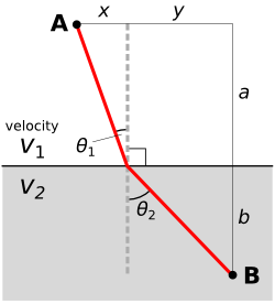
Fermat built on Heron of Alexandria's idea that light takes the shortest path, proposing instead that light takes the path of least time. These ideas might seem equivalent, but think about anisotropic and inhomogenous media. Fermat continued by deriving Snell's law. Let's see how that works.

We start by computing the time taken along a path:

Then we differentiate with respect to space. This effectively gives us the slope of the graph of time vs distance.

We want to minimize the time taken, which happens at the minimum on the time vs distance graph. At the minimum, the derivative is zero. The result is instantly recognizable as Snell's law:

Maupertuis's generalization

The principle is a core component of the principle of least action in classical mechanics, first proposed by Pierre Louis Maupertuis (1698–1759), another Frenchman. Indeed, it was Fermat's handling of Snell's law that Maupertuis objected to: he didn't like Fermat giving preference to least time over least distance.

Maupertuis's generalization of Fermat's principle was an important step. By the application of the calculus of variations, one can derive the equations of motion for any system. These are the equations at the heart of Newton's laws and Hooke's law, which underlie all of the physics of the seismic experiment. So, you know, quite useful.

Probably very clever

It's so hard to appreciate fundamental discoveries in hindsight. Together with Blaise Pascal, he solved basic problems in practical gambling that seem quite straightforward today. For example, Antoine Gombaud, the Chevalier de Méré, asked Pascal: why is it a good idea to bet on getting a 1 in four dice rolls, but not on a double-1 in twenty-four? But at the time, when no-one had thought about analysing problems in terms of permutations and combinations before, the solutions were revolutionary. And profitable.

For setting Snell's law on a firm theoretical footing, and introducing probability into the world, we say Pierre de Fermat (pictured here) is indeed a father of geophysics.

Fabric clusters

There are many reasons we might want to use cluster analysis in our work. Geologists might want to sort hundreds of rock samples into a handful of rock types, a petrophysicist might want to group data points from well logs (as shown here), or a curious kitchen dweller may want to digitally classify patterns found in his (or her) linen collection.

Two algorithms worth knowing about when faced with any clustering problem are called k-means and fuzzy c-means clustering. They aren't the right solution for all clustering problems, but they are a good place to start.

k-means clustering — each data point gets assigned to one of k centroids (or centres) according to the centroid it is closest to. In the image shown here, the number of clusters is 2. The pink dots are closest to the left centroid, and the black dots are closest to the right centroid. To see how the classification is done, watch this short step-by-step video. The main disadvantage with this method is that if the clusters are poorly defined, the result seems rather arbitrary.

Fuzzy c-means clustering — each data point belongs to all clusters, but only to a certain degree. Each data point is assigned a probability of belonging to each cluster, and is thus easily assigned the class for which it has a highest probability. If a data point is midway between two clusters, it is still assigned to its closest cluster, but with lower probability. As the bottom image shows, data points on the periphery of cluster groups, such as those shown in grey may be equally likely to belong to both clusters. Fuzzy c-means clustering provides a way of capturing quantitative uncertainty, and even visualizing it.

Some observations fall naturally into clusters. It is just a matter of the observer choosing an adequate combination of attributes to characterize them. In the fabric and seismic examples shown in the previous post, only two of the four Haralick textures are needed to show a diagnostic arrangement of the data for clustering. Does the distribution of these thumbnail sections in the attribute space align with your powers of visual inspection? 

Fabric textures

Beyond the traditional, well-studied attributes that I referred to last time, are a large family of metrics from image processing and robot vision. The idea is to imitate the simple pattern recognition rules our brains intuitively and continuously apply when we look at seismic data: how do the data look? How smooth or irregular are the reflections? If you thought the adjectives I used for my tea towels were ambiguous, I assure you seismic will be much more cryptic.

In three-dimensional data, texture is harder to see, difficult to draw, and impossible to put on a map. So when language fails us, discard words altogether and use numbers instead. While some attributes describe the data at a particular place (as we might describe a photographic pixel as 'red', 'bright', 'saturated'), other attributes describe the character of the data in a small region or kernel ('speckled', 'stripy', 'blurry').

Texture by numbers

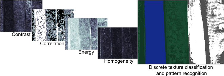
I converted the colour image from the previous post to a greyscale image with 256 levels (a bit-depth of 8) to match this notion of scalar seismic data samples in space. The geek speak is that I am computing local grey-level co-occurence matrices (or GLCMs) in a moving window around the image, and then evaluating some statistics of the local GLCM for each point in the image. These statistics are commonly called Haralick textures. Choosing the best kernel size will depend on the scale of the patterns. The Haralick textures are not particularly illustrative when viewed on their own but they can be used for data clustering and classification, which will be the topic of my next post.

  • Step 1: Reduce the image to 256 grey-levels
  • Step 2: For every pixel, compute a co-occurrence matrix from a p by q kernel (p, q = 15 for my tea towel photo)
  • Step 3: For every pixel, compute the Haralick textures (Contrast, Correlation, Energy, Homogeneity) from the GLCM

Textures in seismic data

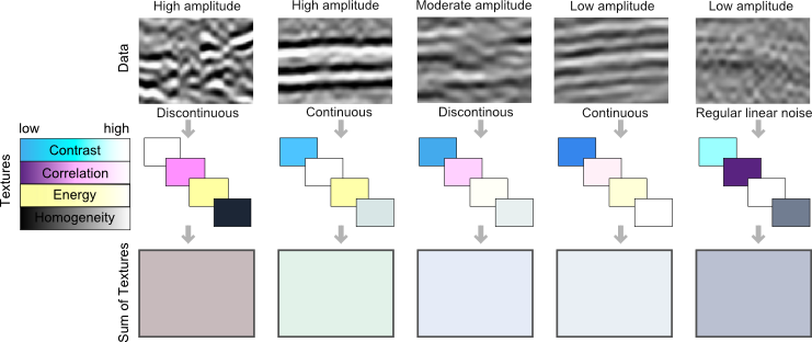
Here are a few tiles of seismic textures that I have loosely labeled as "high-amplitude continous", "high-amplitude discontinuous", "low-amplitude continuous", etc. You certainly might choose different words to describe them, but each has a unique and objective set of Haralick textures. I have explicitly represented the value of each's texture as a color; using cyan for contrast, magenta for correlation, yellow for energy, and black for homogeneity. Thus, the four Haralick textures span the CMYK color space. Merging these components back together into a single color gives you a sense of the degree of difference across the tiles. For instance, the high-amplitude continuous tile, is characterized by high contrast and high energy, but low correlation, relative to the low-amplitude continuous tile. Their textures are similar, so obviously, they map to similar color values in CMYK color space. Whether or not they are truly discernable is the challenge we offer to data clustering; be it employed by visual inspection or computational force.

Further reading:
Gao, D., 2003, Volume texture extraction for 3D seismic visualization and interpretation, Geophysics, 64, No. 4, 1294-1302
Haralick, R., Shanmugam, K., and Dinstein, I., 1973, Textural features for image classification: IEEE Tran. Systems, Man, and Cybernetics, SMC-3, 610-621.
Mryka Hall-Beyer has a great tutorial at http://www.fp.ucalgary.ca/mhallbey/tutorial.htm for learning more about GLCMs.
Images in this post were made using MATLAB, FIJI and Inkscape.

K is for Wavenumber

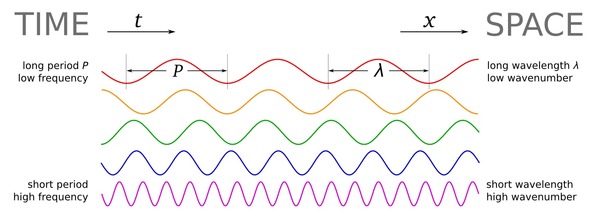
Wavenumber, sometimes called the propagation number, is in broad terms a measure of spatial scale. It can be thought of as a spatial analog to the temporal frequency, and is often called spatial frequency. It is often defined as the number of wavelengths per unit distance, or in terms of wavelength, λ:

$$k = \frac{1}{\lambda}$$

The units are \(\mathrm{m}^{–1}\), which are nameless in the International System, though \(\mathrm{cm}^{–1}\) are called kaysers in the cgs system. The concept is analogous to frequency \(f\), measured in \(\mathrm{s}^{–1}\) or Hertz, which is the reciprocal of period \(T\); that is, \(f = 1/T\). In a sense, period can be thought of as a temporal 'wavelength' — the length of an oscillation in time.

If you've explored the applications of frequency in geophysics, you'll have noticed that we sometimes don't use ordinary frequency f, in Hertz. Because geophysics deals with oscillating waveforms, ones that vary around a central value (think of a wiggle trace of seismic data), we often use the angular frequency. This way we can also express the close relationship between frequency and phase, which is an angle. So in many geophysical applications, we want the angular wavenumber. It is expressed in radians per metre:

$$k = \frac{2\pi}{\lambda}$$

The relationship between angular wavenumber and angular frequency is analogous to that between wavelength and ordinary frequency — they are related by the velocity V:

$$k = \frac{\omega}{V}$$

It's unfortunate that there are two definitions of wavenumber. Some people reserve the term spatial frequency for the ordinary wavenumber, or use ν (that's a Greek nu, not a vee — another potential source of confusion!), or even σ for it. But just as many call it the wavenumber and use k, so the only sure way through the jargon is to specify what you mean by the terms you use. As usual!

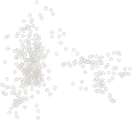
Just as for temporal frequency, the portal to wavenumber is the Fourier transform, computed along each spatial axis. Here are two images and their 2D spectra — a photo of some ripples, a binary image of some particles, and their fast Fourier transforms. Notice how the more organized image has a more organized spectrum (as well as some artifacts from post-processing on the image), while the noisy image's spectrum is nearly 'white':

Explore our other posts about scale.

The particle image is from the sample images in FIJI. The FFTs were produced in FIJI.

Update

on 2012-05-03 16:41 by Matt Hall

Following up on Brian's suggesstion in the comments, I added a brief workflow to the SubSurfWiki page on wavenumber. Please feel free to add to it or correct it if I messed anything up. 

The spectrum of the spectrum

A few weeks ago, I wrote about the notches we see in the spectrums of thin beds, and how they lead to the mysterious quefrency domain. Today I want to delve a bit deeper, borrowing from an article I wrote in 2006.

Why the funny name?

During the Cold War, the United States government was quite concerned with knowing when and where nuclear tests were happening. One method they used was seismic monitoring. To discriminate between detonations and earthquakes, a group of mathematicians from Bell Labs proposed detecting and timing echoes in the seismic recordings. These echoes gave rise to periodic but cryptic notches in the spectrum, the spacing of which was inversely proportional to the timing of the echoes. This is exactly analogous to the seismic response of a thin-bed.

To measure notch spacing, Bogert, Healy and Tukey (1963) invented the cepstrum (an anagram of spectrum and therefore usually pronounced kepstrum). The cepstrum is defined as the Fourier transform of the natural logarithm of the Fourier transform of the signal: in essence, the spectrum of the spectrum. To distinguish this new domain from time, to which is it dimensionally equivalent, they coined several new terms. For example, frequency is transformed to quefrency, phase to saphe, filtering to liftering, even analysis to alanysis.

Today, cepstral analysis is employed extensively in linguistic analysis, especially in connection with voice synthesis. This is because, as I wrote about last time, voiced human speech (consisting of vowel-type sounds that use the vocal chords) has a very different time–frequency signature from unvoiced speech; the difference is easy to quantify with the cepstrum.

What is the cepstrum?

To describe the key properties of the cepstrum, we must look at two fundamental consequences of Fourier theory:

  1. convolution in time is equivalent to multiplication in frequency
  2. the spectrum of an echo contains periodic peaks and notches

Let us look at these in turn. A noise-free seismic trace s can be represented in the time t domain by the convolution of a wavelet w and reflectivity series r thus

convolutional model

Then, in the frequency f domain

In other words, convolution in time becomes multiplication in frequency. The cepstrum is defined as the Fourier transform of the log of the spectrum. Thus, taking logs of the complex moduli

Since the Fourier transform F is a linear operation, the cepstrum is

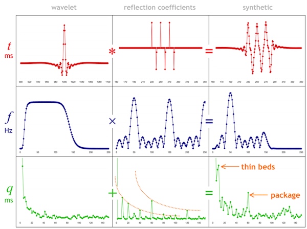
We can see that the spectrums of the wavelet and reflectivity series are additively combined in the cepstrum. I have tried to show this relationship graphically below. The rows are domains. The columns are the components w, r, and s. Clearly, these thin beds are resolved by this wavelet, but they might not be in the presence of low frequencies and noise. Spectral and cepstral analysis—and alanysis—can help us cut through the seismic and get at the geology. 

Time series (top), spectra (middle), and cepstra (bottom) for a wavelet (left), a reflectivity series containing three 10-ms thin-beds (middle), and the corresponding synthetic trace (right). The band-limited wavelet has a featureless cepstrum, whereas the reflectivity series clearly shows two sets of harmonic peaks, corresponding to the thin- beds (each 10 ms thick) and the thicker composite package.

References

Bogert, B, Healy, M and Tukey, J (1963). The quefrency alanysis of time series for echoes: cepstrum, pseudo-autocovariance, cross- cepstrum, and saphe-cracking. Proceedings of the Symposium on Time Series Analysis, Wiley, 1963.

Hall, M (2006). Predicting stratigraphy with cepstral decomposition. The Leading Edge 25 (2), February 2006 (Special issue on spectral decomposition). doi:10.1190/1.2172313

Greenhouse George image is public domain.

What do you mean by average?

I may need some help here. The truth is, while I can tell you what averages are, I can't rigorously explain when to use a particular one. I'll give it a shot, but if you disagree I am happy to be edificated. 

When we compute an average we are measuring the central tendency: a single quantity to represent the dataset. The trouble is, our data can have different distributions, different dimensionality, or different type (to use a computer science term): we may be dealing with lognormal distributions, or rates, or classes. To cope with this, we have different averages. 

Arithmetic mean

Everyone's friend, the plain old mean. The trouble is that it is, statistically speaking, not robust. This means that it's an estimator that is unduly affected by outliers, especially large ones. What are outliers? Data points that depart from some assumption of predictability in your data, from whatever model you have of what your data 'should' look like. Notwithstanding that your model might be wrong! Lots of distributions have important outliers. In exploration, the largest realizations in a gas prospect are critical to know about, even though they're unlikely.

Geometric mean

Like the arithmetic mean, this is one of the classical Pythagorean means. It is always equal to or smaller than the arithmetic mean. It has a simple geometric visualization: the geometric mean of a and b is the side of a square having the same area as the rectangle with sides a and b. Clearly, it is only meaningfully defined for positive numbers. When might you use it? For quantities with exponential distributions — permeability, say. And this is the only mean to use for data that have been normalized to some reference value. 

Harmonic mean

The third and final Pythagorean mean, always equal to or smaller than the geometric mean. It's sometimes (by 'sometimes' I mean 'never') called the subcontrary mean. It tends towards the smaller values in a dataset; if those small numbers are outliers, this is a bug not a feature. Use it for rates: if you drive 10 km at 60 km/hr (10 minutes), then 10 km at 120 km/hr (5 minutes), then your average speed over the 20 km is 80 km/hr, not the 90 km/hr the arithmetic mean might have led you to believe. 

Median average

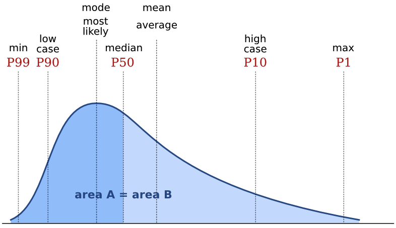
The median is the central value in the sorted data. In some ways, it's the archetypal average: the middle, with 50% of values being greater and 50% being smaller. If there is an even number of data points, then its the arithmetic mean of the middle two. In a probability distribution, the median is often called the P50. In a positively skewed distribution (the most common one in petroleum geoscience), it is larger than the mode and smaller than the mean:

Mode average

The mode, or most likely, is the most frequent result in the data. We often use it for what are called nominal data: classes or names, rather than the cardinal numbers we've been discussing up to now. For example, the name Smith is not the 'average' name in the US, as such, since most people are called something else. But you might say it's the central tendency of names. One of the commonest applications of the mode is in a simple voting system: the person with the most votes wins. If you are averaging data like facies or waveform classes, say, then the mode is the only average that makes sense. 

Honourable mentions

Most geophysicists know about the root mean square, or quadratic mean, because it's a measure of magnitude independent of sign, so works on sinusoids varying around zero, for example. 

The root mean square equation

Finally, the weighted mean is worth a mention. Sometimes this one seems intuitive: if you want to average two datasets, but they have different populations, for example. If you have a mean porosity of 19% from a set of 90 samples, and another mean of 11% from a set of 10 similar samples, then it's clear you can't simply take their arithmetic average — you have to weight them first: (0.9 × 0.21) + (0.1 × 0.14) = 0.20. But other times, it's not so obvious you need the weighted sum, like when you care about the perception of the data points

Are there other averages you use? Do you see misuse and abuse of averages? Have you ever been caught out? I'm almost certain I have, but it's too late now...

There is an even longer version of this article in the wiki. I just couldn't bring myself to post it all here. 

What's hot in geophysics?

Two weeks ago I visited Long Beach, California, attending a conference called Mathematical and Computational Issues in the Geosciences, organized by the Society of Industrial and Applied Mathematicians. I wanted to exercise my cross-thinking skills. 

As expected, the week was very educational for me. Well, some of it was. Some of it was like being beaten about the head with a big bag of math. Anyone for quasi-monotone advection? What about semi-implicit, semi-Lagrangian, P-adaptive discontinuous Galerkin methods then?

Notwithstanding my apparent learning disability, I heard about some fascinating new things. Here are three highlights.

Read More

Great geophysicists #3

Today is a historic day for greatness: Rene Descartes was born exactly 415 years ago, and Isaac Newton died 284 years ago. They both contributed to our understanding of physical phenomena and the natural world and, while not exactly geophysicists, they changed how scientists think about waves in general, and light in particular.

Unweaving the rainbow

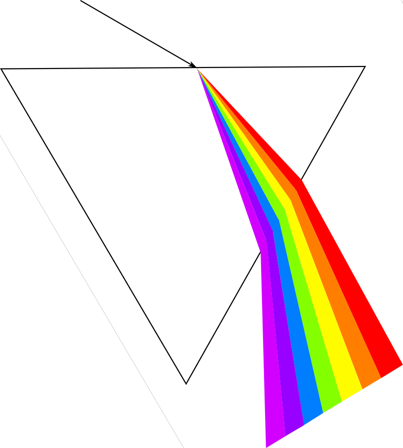
Scientists of the day recognized two types of colour. Apparent colours were those seen in prisms and rainbows, where light itself was refracted into colours. Real colours, on the other hand, were a property of bodies, disclosed by light but not produced by that light. Descartes studied refraction in raindrops and helped propagate Snell’s law in his 1637 paper, Dioptrica. His work severed this apparent–real dichotomy: all colours are apparent, and the colour of an object depends on the light you shine on it.

Newton began to work seriously with crystalline prisms around 1666. He was the first to demonstrate that white light is a scrambled superposition of wavelengths; a visual cacophony of information. Not only does a ray bend in relation to the wave speed of the material it is entering (read the post on Snellius), but Newton made one more connection. The intrinsic wave speed of the material, in turn depends on the frequency of the wave. This phenomenon is known as dispersion; different frequency components are slowed by different amounts, angling onto different paths.

What does all this mean for seismic data?

Seismic pulses, which strut and fret through the earth, reflecting and transmitting through its myriad contrasts, make for a more complicated type of prism-dispersion experiment. Compared to visible light, the effects of dispersion are subtle, negligible even, in the seismic band 2–200 Hz. However, we may measure a rock to have a wave speed of 3000 m/s at 50 Hz, and 3500 m/s at 20 kHz (logging frequencies), and 4000 m/s at 10 MHz (core laboratory frequencies). On one hand, this should be incredibly disconcerting for subsurface scientists: it keeps us from bridging the integration gap empirically. It is also a reason why geophysicists get away with haphazardly stretching and squeezing travel time measurements taken at different scales to tie wells to seismic. Is dispersion the interpreters’ fudge-factor when our multi-scale data don’t corroborate?

Chris Liner, blogging at Seismos, points out

...so much of classical seismology and wave theory is nondispersive: basic theory of P and S waves, Rayleigh waves in a half-space, geometric spreading, reflection and transmission coefficients, head waves, etc. Yet when we look at real data, strong dispersion abounds. The development of spectral decomposition has served to highlight this fact.

We should think about studying dispersion more, not just as a nuisance for what is lost (as it has been traditionally viewed), but as a colourful, scale-dependant property of the earth whose stories we seek to hear.

Confounded paradox

Probabilities are notoriously slippery things to deal with, so it shouldn’t be surprising that proportions, which are really probabilities in disguise, can catch us out too.

Simpson’s paradox is my favourite example of something simple, something we know we understand, indeed have always understood, suddenly turning on us.

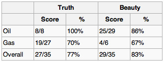
Exploration geophysicists often use information extracted from seismic data, called attributes, to help predict rock properties in the subsurface. Suppose you are a geophysicist comparing two new seismic attributes, truth and beauty, each purported to predict fluid type. You compare their hydrocarbon-predicting success rates on 35 discoveries and it’s close, but beauty has an 83% hit rate, while truth manages only 77%. There's not much in it, but since you only need one attribute, all else being equal, beauty it is.

But then someone asks you about predicting oil in particular. You dig out your data and drill down:

Apparently, truth did a little better when you just look at oil. And what about gas, they ask? Well, the data showed that truth was also better than beauty at predicting gas. So truth does a better job at both oil and gas, but somehow beauty edges out overall.

Impossible? Clearly not: these numbers are real and plausible, I haven't done anything sneaky. In this case, hydrocarbon type is a confounding variable, and it’s important to look for such groupings in your data. Improbable? No, it’s quite common in all kinds of data and this trap is well known among statisticians.

How can you avoid it? Be especially wary when the sample size in one or more of the groups you are interested in is much smaller than the others. Be even more alert if group sizes are inconsistent across the variables, as in my example: oil is under-sampled for truth, gas for beauty.

Ultimately, there's no guarantee this effect won’t crop up; that’s just how proportions are. All you can do is make sure you ask your data the questions you care about. 

This post is a version of part of my article The rational geoscientist, The Leading Edge, May 2010