Old skool plot tool

It's not very glamorous, but sometimes you just want to plot a SEG-Y file. That's why we crafted seisplot. OK, that's why we cobbled seisplot together out of various scripts and functions we had lying around, after a couple of years of blog posts and Leading Edge tutorials and the like.

Pupils of the old skool — when everyone knew how to write a bash script, pencil crayons and lead-filled beanbags ruled the desktop, and Carpal Tunnel Syndrome was just the opening act to the Beastie Boys — will enjoy seisplot. For a start, it's command line only: 

    python seisplot.py -R -c config.py ~/segy_files -o ~/plots

Isn't that... reassuring? In this age of iOS and Android and Oculus Rift... there's still the command line interface.

Features galore

So what sort of features can you look forward to? Other than all the usual things you've come to expect of subsurface software, like a complete lack of support or documentation. (LOL, I'm kidding.) Only these awesome selling points:

  • Make wiggle traces or variable density plots... or don't choose — do both!
  • If you want, the script will descend into subdirectories and make plots for every SEG-Y file it finds.
  • There are plenty of colourmaps to choose from, or if you're insane you can make your own.
  • You can make PNGs, JPGs, SVGs or PDFs. But not CGM, sorry about that.

Well, I say 'selling points', but the tool is 100% free. We think this is a fair price. It's also open source of course, so please — seriously, please — improve the source code, then share it with the world! The code is in GitHub, natch.

Never go full throwback

There is one more feature: you can go full throwback and add scribbles and coffee stains. Here's one for your wall:


The 2D seismic line in this post is from the USGS NPRA Seismic Data Archive, and are in the public domain. This is line number 31-81-PR (links directly to SEG-Y file).

Not picking parameters

I like socks. Bright ones. I've liked bright socks since Grade 6. They were the only visible garment not governed by school uniform, or at least not enforced, and I think that was probably the start of it. The tough boys wore white socks, and I wore odd red and green socks. These days, my favourites are Cole & Parker, and the only problem is: how to choose?

Last Tuesday I wrote about choosing parameters for geophysical algorithms — window lengths, velocities, noise levels, and so on. Like choosing socks, it's subjective, and it's hard to find a pair for every occasion. The comments from Matteo, Toastar, and GuyM raised an interesting question: maybe the best way to pick parameters is to not pick them? I'm not talking about automatically optimizing parameters, because that's still choosing. I'm talking about not choosing at all.

How many ways can we think of to implement this non-choice? I can think of four approaches, but I'm not 100% sure they're all different, or if I can even describe them...
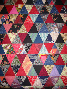
Is the result really optimal, or just a hard-to-interpret patchwork?

Adaptivity

Well, okay, we still choose, but we choose a different value everywhere depending on local conditions. A black pair for a formal function, white for tennis, green for work, and polka dots for special occasions. We can adapt to any property (rather like automatic optimization), along any dimension of our data: spatially, azimuthally,  temporally, or frequentially (there's a word you don't see every day).

Imagine computing seismic continuity. At each sample, we might evaluate some local function — such as contrast — for a range of window sizes. Or, when smoothing, we might specifiy some minimum signal loss compared to the original. We end up using a different value everywhere, and expect an optimal result.

One problem is that we still have to choose a cost function. And to be at all useful, we would need to produce two new data products, besides the actual result: a map of the parameter's value, and a map of the residual cost, so to speak. In other words, we need a way to know what was chosen, and how satisfactory the choice was.

Stochastic shotgun

We could fall back on that geostatistical favourite and pick the parameter values stochastically, grabbing socks at random out of the drawer. This works, but I need a lot of socks to have a chance of getting even a local maximum. And we run into the old problem of really not knowing what to do with all the realizations. Common approaches are to take the P50, P10, and P90, or to average them. Both of these approaches make me want to ask: Why did I generate all those realizations?

Experimental design methods
The design of experiments is a big deal in the life sciences,  but for some reason rarely (never?) talked about in geoscience. Applying a cost function, or even just visual judgment, to a single parameter is perhaps trivial, but what if you have two variables? Three? What if they are non-linear and covariant? Then the optimization process amounts to a sticky inverse problem.

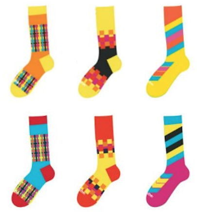
Fortunately, lots of clever people have thought about these problems. I've even seen them implemented in subsurface software. Cool-sounding combinatorial reduction techniques like Greco-Latin squares, or Latin hypercubes offer ways to intelligently sample the parameter space and organize the results. We could do the same with socks, evaluating pattern and toe colour separately...

The mixing board

There is another option: the mixing board. Like a music producer, a film editor, or the Lytro camera, I can leave the raw data in place, and always work from the masters. Given the right tools, I can make myself just the right pair of socks whenever I like.

This way we can navigate the parameter space, applying views, processes, or other tools on the fly. Clearly this would mean changing everything about the way we work. We'd need a totally different approach not just to interpretation, but to the entire subsurface characterization workflow.

Are there other ways to avoid choosing? What are people using in other industries, or other sciences? I think we need to invite some experimental design and machine learning people to SEG...

Cole & Parker socks are awesomeThe quilt image is by missvancamp on Flickr and licensed CC-BY. The spools are by surfzone on Flickr, licensed CC-BY. Many thanks to Cole & Parker for permission to use the sock images, despite not knowing what on earth I was going to do with them. Buy their socks! They're Canadian and everything.

Picking parameters

One of the reasons I got interested in programming was to get smarter about broken workflows like this one from a generic seismic interpretation tool (I'm thinking of Poststack-PAL, but does that even exist any more?)...

  1. I want to make a coherence volume, which requires me to choose a window length.
  2. I use the default on a single line and see how it looks, then try some other values at random.
  3. I can't remember what I did so I get systematic: I try 8 ms, 16 ms, 32 ms, and 64 ms, saving each one as a result with _XXms appended so I can remember what I did
  4. I display them side by side but the windows are annoying to line up and resize, so instead I do it once, display them one at a time, grab screenshots, and import the images into PowerPoint because let's face it I'll need that slide eventually anyway
  5. I can't decide between 16 ms and 32 ms so I try 20 ms, 24 ms, and 28 ms as well, and do it all again, and gaaah I HATE THIS STUPID SOFTWARE

There has to be a better way.

Stumbling towards optimization

Regular readers will know that this is the time to break out the IPython Notebook. Fear not: I will focus on the outcomes here — for the real meat, go to the Notebook. Or click on these images to see larger versions, and code.

Let's run through using the Canny edge detector in scikit-image, a brilliant image processing Python library. The algo uses the derivative of a Gaussian to compute gradient, and I have to choose 3 parameters. First, we'll try to optimize 'sigma', the width of the Gaussian. Let's try the default value of 1:

Clearly, there is too much noise in the result. Let's try the interval method that drove me crazy in desktop software:

Well, I think something between 8 and 16 might work. I could compute the average intensity of each image, choose a value in between them, and then use the sigma that gives that result. OK, it's a horrible hack, but turns out to be 10:

But the whole point of scientific computing is the efficient application of informed human judgment. So let's try adding some interactivity — then we can explore the 3D parameter space in a near-parallel instead of purely serial way:

I finally feel like we're getting somewhere... But it still feels a bit arbitrary. I still don't know I'm getting the optimal result.

What can I try next? I could try to extend the 'goal seek' option, and come up with a more sophisticated cost function. If I could define something well enough — for edge detection, like coherence, I might be interested in contrast — then I could potentially just find the best answers, in much the same way that a digital camera autofocuses (indeed, many of them look for the highest contrast image). But goal seeking, if the cost function is too literal, in a way begs the question. I mean, you sort of have to know the answer — or something about the answer — before you find it.

Social machines

Social machines are the hot new thing in computing (Big Data is so 2013). Perhaps instead I can turn to other humans, in my social and professional networks. I could...

  • Ask my colleagues — perhaps my company has a knowledge sharing network I can go to.
  • Ask t'Internet — I could ask Twitter, or my friends on Facebook, or a seismic interpretation group in LinkedIn. Better yet, Earth Science Stack Exchange!
  • What if the software I was using just told me what other people had used for these parameters? Maybe this is only one step up from the programmer's default... especially if most people just use the programmer's default.
  • But what if people could rate the outcome of the algorithm? What if their colleagues or managers could rate the outcome? Then I could weight the results with these ratings.
  • What if there was a game that involved optimizing images (OK, maybe a bit of a stretch... maybe more like a Mechanical Turk). Then we might have a vast crowd of people all interested in really pushing the edge of what is intuitively reasonable, and maybe exploring the part of the parameter space I'm most interested in.

What if I could combine the best of all these approaches? Interactive exploration, with guided optimization, constrained by some cost function or other expectation. That could be interesting, but unfortunately I have absolutely no idea how that would work. I do think the optimization workflow of the future will contain all of these elements.

What do you think? Do you have an awesome way to optimize the parameters of seismic attributes? Do you have a vision for how it could be better? It occurs to me this could be a great topic for a future hackathon...

ipynb_icon.png
Click here for an IPython Notebook version of this blog post. If you don't have it, IPython is easy to install. The easiest way is to install all of scientific Python, or use Canopy or Anaconda.

Cross sections into seismic sections

We've added to the core functionality of modelr. Instead of creating an arbitrarily shaped wedge (which is plenty useful in its own right), users can now create a synthetic seismogram out of any geology they can think of, or extract from their data.

Turn a geologic-section into an earth model

We implemented a color picker within an image processing scheme, so that each unique colour gets mapped to an editable rock type. Users can create and manage their own rock property catalog, and save models as templates to share and re-use. You can use as many or as few colours as you like, and you'll never run out of rocks.

To give an example, let's use the stratigraphic diagram that Bruce Hart used in making synthetic seismic forward models in his recent Whither seismic stratigraphy article. There are 7 unique colours, so we can generate an earth model by assigning a rock to each of the colours in the image.

If you can imagine it, you can draw it. If you can draw it, you can model it.

Modeling as an interactive experience

We've exposed parameters in the interface and so you can interact with the multidimensional seismic data space. Why is this important? Well, modeling shouldn't be a one-shot deal. It's an iterative process. A feedback cycle where you turn knobs, pull levers, and learn about the behaviour of a physical system; in this case it is the interplay between geologic units and seismic waves. 

A model isn't just a single image, but a swath of possibilities teased out by varying a multitude of inputs. With modelr, the seismic experiment can be manipulated, so that the gamut of geologic variability can be explored. That process is how we train our ability to see geology in seismic.

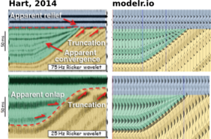
Hart's paper doesn't specifically mention the rock properties used, so it's difficult to match amplitudes, but you can see here how modelr stands up next to Hart's images for high (75 Hz) and low (25 Hz) frequency Ricker wavelets.

There are some cosmetic differences too... I've used fewer wiggle traces to make it easier to see the seismic waveforms. And I think Bruce forgot the blue strata on his 25 Hz model. But I like this display, with the earth model in the background, and the wiggle traces on top — geology and seismic blended in the same graphical space, as they are in the real world, albeit briefly.


Subscribe to the email list to stay in the loop with modelr news, or sign-up at modelr.io and get started today.

This will add you to the email list for the modeling tool. We never share user details with anyone. You can unsubscribe any time.

Seismic models: Hart, BS (2013). Whither seismic stratigraphy? Interpretation, volume 1 (1). The image is copyright of SEG and AAPG.

Getting started with Modelr

Let's take a closer look at modelr.io, our new modeling tool. Just like real seismic experiments, there are four components:

  • Make a framework. Define the geometries of rock layers.
  • Make an earth. Assign a set of rock properties to each layer.
  • Make a kernel. Define the seismic survey.
  • Make a plot. Set the output parameters.

Modelr takes care of the physics of wave propagation and reflection, so you don't have to stick with normal incidence acoustic impedance models if you don't want to. You can explore the full range of possibilities.

3 ways to slice a wedge

To the uninitiated, the classic 3-layer wedge model may seem ridiculously trivial. Surely the earth looks more complicated than that! But we can leverage such geometric simplicity to systematically study how seismic waveforms change across spatial and non-spatial dimensions. 

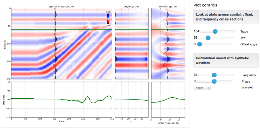
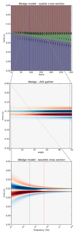
Spatial domain. In cross-section (right), a seismic wedge model lets you analyse the resolving power of a given wavelet. In this display the onset of tuning is marked by the vertical red line, and the thickness at which maximum tuning occurs is shown in blue. Reflection profiles can be shown for any incidence angle, or range of incidence angles (offset stack).

Amplitude versus angle (AVA) domain. Maybe you are working on a seismic inversion problem so you might want to see what a CDP angle gather looks like above and below tuning thickness. Will a tuned AVA response change your quantitative analysis? This 3-layer model looks like a two-layer AVA gather except our original wavelet looks like it has undergone a 90 degree phase rotation. Looks can be deceiving. 

Amplitude versus frequency domain. If you are trying to design a seismic source for your next survey, and you want to ensure you've got sufficient bandwidth to resolve a thin bed, you can compute a frequency gather — right, bottom — and explore a swath of wavelets with regard to critical thickness in your prospect. The tuning frequency (blue) and resolving frequency (red) are revealed in this domain as well. 

Wedges are tools for seismic waveform classification. We aren't just interested in digitizing peaks and troughs, but the subtle interplay of amplitude tuning, and apparent phase rotation variations across the range of angles and bandwidths in the seismic experiment. We need to know what we can expect from the data, from our supposed geology. 

In a nutshell, all seismic models are about illustrating the band-limited nature of seismic data on specific geologic scenarios. They help us calibrate our intuition when bandwidth causes ambiguity in interpretation. Which is nearly all of the time.

The most important thing nobody does

A couple of weeks ago, we told you we were up to something. Today, we're excited to announce modelr.io — a new seismic forward modeling tool for interpreters and the seismically inclined.

Modelr is a web app, so it runs in the browser, on any device. You don't need permission to try it, and there's never anything to install. No licenses, no dongles, no not being able to run it at home, or on the train.

Later this week, we'll look at some of the things Modelr can do. In the meantime, please have a play with it.
Just go to modelr.io and hit Demo, or click on the screenshot below. If you like what you see, then think about signing up — the more support we get, the faster we can make it into the awesome tool we believe it can be. And tell your friends!

If you're intrigued but unconvinced, sign up for occasional news about Modelr:

This will add you to the email list for the modeling tool. We never share user details with anyone. You can unsubscribe any time.

To make a wedge

We'll need a wavelet like the one we made last time. We could import it, if we've made one, but SciPy also has one so we can save ourselves the trouble. Remember to put %pylab inline at the top if using IPython notebook.

import numpy as np
from scipy.signal import ricker
import matplotlib.pyplot as plt

Now we need to make a physical earth model with three rock layers. In this example, let's make an acoustic impedance earth model. To keep it simple, let's define the earth model with two-way-travel time along the vertical axis (as opposed to depth). There are number of ways you could describe a wedge using math, and you could probably come up with a way that is better than mine. Here's a way:

nsamps, ntraces = [600, 500]
rock_names = ['shale 1', 'sand', 'shale 2']
rock_grid = np.zeros((n_samples, n_traces))

def make_wedge(n_samples, n_traces, layer_1_thickness, start_wedge, end_wedge):
    for j in np.arange(n_traces): 
        for i in np.arange(n_samples):      
            if i <= layer_1_thickness:      
rock_grid[i][j] = 1 if i > layer_1_thickness:
rock_grid[i][j] = 3 if j >= start_wedge and i - layer_1_thickness < j-start_wedge:
rock_grid[i][j] = 2 if j >= end_wedge and i > layer_1_thickness+(end_wedge-start_wedge):
rock_grid[i][j] = 3 return rock_grid

Let's insert some numbers into our wedge function and make a particular geometry.

layer_1_thickness = 200
start_wedge = 50
end_wedge = 250
rock_grid = make_wedge(n_samples, n_traces, 
            layer_1_thickness, start_wedge, 
            end_wedge)

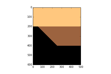
plt.imshow(rock_grid, cmap='copper_r')

Now we can give each layer in the wedge properties.

vp = np.array([3300., 3200., 3300.]) 
rho = np.array([2600., 2550., 2650.]) 
AI = vp*rho
AI = AI / 10e6 # re-scale (optional step)

Then assign values assign them accordingly to every sample in the rock model.

model = np.copy(rock_grid)
model[rock_grid == 1] = AI[0]
model[rock_grid == 2] = AI[1]
model[rock_grid == 3] = AI[2]
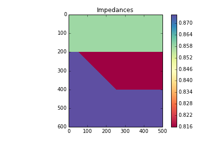
plt.imshow(model, cmap='Spectral')
plt.colorbar()
plt.title('Impedances')

Now we can compute the reflection coefficients. I have left out a plot of the reflection coefficients, but you can check it out in the full version in the nbviewer

upper = model[:-1][:]
lower = model[1:][:]
rc = (lower - upper) / (lower + upper)
maxrc = abs(np.amax(rc))

Now we make the wavelet interact with the model using convolution. The convolution function already exists in the SciPy signal library, so we can just import it.

from scipy.signal import convolve
def make_synth(f):
    synth = np.zeros((n_samples+len(t)-2, n_traces))
    wavelet = ricker(512, 1e3/(4.*f))
    wavelet = wavelet / max(wavelet)   # normalize
    for k in range(n_traces):
        synth[:,k] = convolve(rc[:,k], wavelet)
    synth = synth[ np.ceil(len(wavelet))/2 : -np.ceil(len(wavelet))/2, : ]
    return synth

Finally, we plot the results.

frequencies = array([5, 10, 15]) plt.figure(figsize = (15, 4)) for i in np.arange(len(frequencies)): this_plot = make_synth(frequencies[i]) plt.subplot(1, len(frequencies), i+1) plt.imshow(this_plot, cmap='RdBu', vmax=maxrc, vmin=-maxrc, aspect=1) plt.title( '%d Hz wavelet' % freqs[i] ) plt.grid() plt.axis('tight') # Add some labels for i, names in enumerate(rock_names): plt.text(400, 100+((end_wedge-start_wedge)*i+1), names, fontsize=14, color='gray', horizontalalignment='center', verticalalignment='center')


That's it. As you can see, the marriage of building mathematical functions and plotting them can be a really powerful tool you can apply to almost any physical problem you happen to find yourself working on.

You can access the full version in the nbviewer. It has a few more figures than what is shown in this post.

A day of geocomputing

I will be in Calgary in the new year and running a one-day version of this new course. To start building your own tools, pick a date and sign up:

Eventbrite - Agile Geocomputing    Eventbrite - Agile Geocomputing

The digital well scorecard

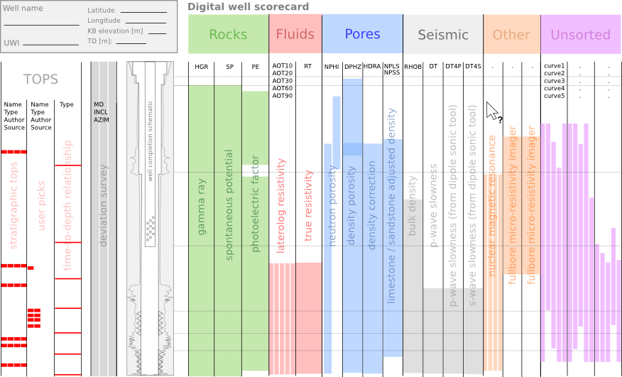
In my last post, I ranted about the soup of acronyms that refer to well log curves; a too-frequent book-keeping debacle. This pain, along with others before it, has motivated me to design a solution. At this point all I have is this sketch, a wireframe of should-be software that allows you visualize every bit of borehole data you can think of:

The goal is, show me where the data is in the domain of the wellbore. I don't want to see the data explicitly (yet), just its whereabouts in relation to all other data. Data from many disaggregated files, reports, and so on. It is part inventory, part book-keeping, part content management system. Clear the fog before the real work can begin. Because not even experienced folks can see clearly in a fog.

The scorecard doesn't yield a number or a grade point like a multiple choice test. Instead, you build up a quantitative display of your data extents. With the example shown above, I don't even have to look at the well log to tell you that you are in for a challenging well tie, with the absence of sonic measurements in the top half of the well. 

The people that I showed this to immediately undestood what was being expressed. They got it right away, so that bodes well for my preliminary sketch. Can you imagine using a tool like this, and if so, what features would you need? 

News of the month

News from the interface between the infinite istropic half-spaces of geoscience and technology. Got tips? 

Matt was at the SEG Annual Meeting in Las Vegas at the beginning of the month. If you didn't make the trip, and even if you did, Don't miss his highlights posts.

Webapp for wells

This is exciting. Subsurfr could be the start of a much-needed and long-overdue wave of rapid web innovation for petrotechnical tools. Much kudos to tiny Wellstorm Development for the bold initiative; it makes you wonder what on earth Halliburton and Schlumberger are up to. Right from your browser, you can fly around the subsurface of North Dakota, see logs, add picks, build surface segments, and provide the creators with feedback. Try it out!

OpendTect gets even awesomer 

OpendTect goes from strength to strength, having passed 100 000 downloads on about 11 November. If you haven't tried it yet, you really should. It's like all those other integrated volume interpretation tools, with the small difference that it's open source-you can read the code. Oh, and it's free. There is that.

Paul de Groot, one of the founders of dGB, told me at SEG that he's been tinkering with code again. He's implemented GLCM-based texture attributes, and it will be in the open source base package soon. Nice.

The next big thing

Landmark's PowerCalculator was good. Geocraft was awesome. Now there's Canopy - Enthought's attempt to bring Python coding to the rest of us. The idea is to provide a MATLAB-like environment for the galaxy of mathematical and scientific computing packs for Python (numpy, scipy, matplotlib, to name a few). It's in beta right now — why not ask for an invite? Even more exiciting for geophysicists — Enthought is developing a set of geoscience plugins, allowing you to load SEGY data, display seismic, and perform other nifty tricks. Can't wait.

More Nova Scotia exploration

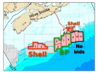
BP won licenses in the latest offshore exploration round (NS12–1), in exchange for a $1.05 billion work bid on 4 deep water parcels. This is in line with Shell's winning bid last January of $970 million, and they also added to their acreage — it seems there's an exploration renaissance happening in Nova Scotia. After the award, there were lots of questions about BP's safety record, but the licensing rules only allow for the highest bidder to win — there's no scrutiny of suitability at this stage. Awarding the license and later denying the right to drill seems a bit disingenuous, however. Water depth: up to about 3500 m!

This regular news feature is for information only. We aren't connected with any of these organizations, and don't necessarily endorse their products or services. Except OpendTect and Canopy, because they are awesome and we use them almost every day.

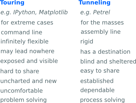
Touring vs tunnel vision

My experience with software started, and still largely sits, at the user end. More often than not, interacting with another's design. One thing I have learned from the user experience is that truly great interfaces are engineered to stay out of the way. The interface is only a skin atop the real work that software does underneath — taking inputs, applying operations, producing outputs. I'd say most users of computers don't know how to compute without an interface. I'm trying to break free from that camp. 

In The dangers of default disdain, I wrote about the power and control that the technology designer has over his users. A kind of tunnel is imposed that restricts the choices for interacting with data. And for me, maybe for you as well, the tunnel has been a welcome structure, directing my focus towards that distant point; the narrow aperture invokes at least some forward motion. I've unknowingly embraced the tunnel vision as a means of interacting without substantial choices, without risk, without wavering digressions. I think it's fair to say that without this tunnel, most travellers would find themselves stuck, incapacitated by the hard graft of touring over or around the mountain.

Tour guides instead of tunnels

But there is nothing to do inside the tunnel, no scenery to observe, just a black void between input and output. For some tasks, taking the tunnel is the only obvious and economic choice — all you want is to get stuff done. But choosing the tunnel means you will be missing things along the way. It's a trade off.

For getting from A to B, there are engineers to build tunnels, there are travellers to travel the tunnels, and there is a third kind of person altogether: tour guides take the scenic route. Building your own tunnel is a grand task, only worthwhile if you can find enough passengers to use it. The scenic route isn't just a casual lackadaisical approach. It's necessary for understanding the landscape; by taking it the traveler becomes connected with the territory. The challenge for software and technology companies is to expose people to the richness of their environment while moving them through at an acceptable pace. Is it possible to have a tunnel with windows?

Oil and gas operating companies are good at purchasing the tunnel access pass, but are not very good at building a robust set of tools to navigate the landscape of their data environment. After all, that is the thing that we travellers need to be in constant contact with. Touring or tunneling? The two approaches may or may not arrive at the same destination and they have different costs along the way, making it different business.