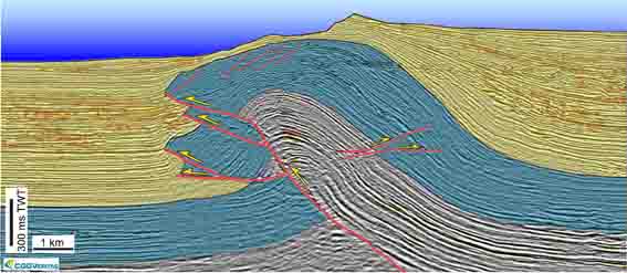
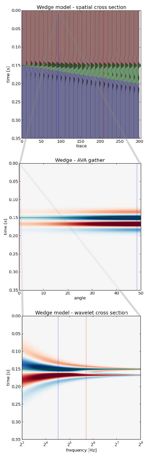
Cross sections into seismic sections

We've added to the core functionality of modelr. Instead of creating an arbitrarily shaped wedge (which is plenty useful in its own right), users can now create a synthetic seismogram out of any geology they can think of, or extract from their data.

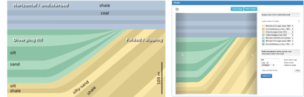
Turn a geologic-section into an earth model

We implemented a color picker within an image processing scheme, so that each unique colour gets mapped to an editable rock type. Users can create and manage their own rock property catalog, and save models as templates to share and re-use. You can use as many or as few colours as you like, and you'll never run out of rocks.

To give an example, let's use the stratigraphic diagram that Bruce Hart used in making synthetic seismic forward models in his recent Whither seismic stratigraphy article. There are 7 unique colours, so we can generate an earth model by assigning a rock to each of the colours in the image.

If you can imagine it, you can draw it. If you can draw it, you can model it.

Modeling as an interactive experience

We've exposed parameters in the interface and so you can interact with the multidimensional seismic data space. Why is this important? Well, modeling shouldn't be a one-shot deal. It's an iterative process. A feedback cycle where you turn knobs, pull levers, and learn about the behaviour of a physical system; in this case it is the interplay between geologic units and seismic waves. 

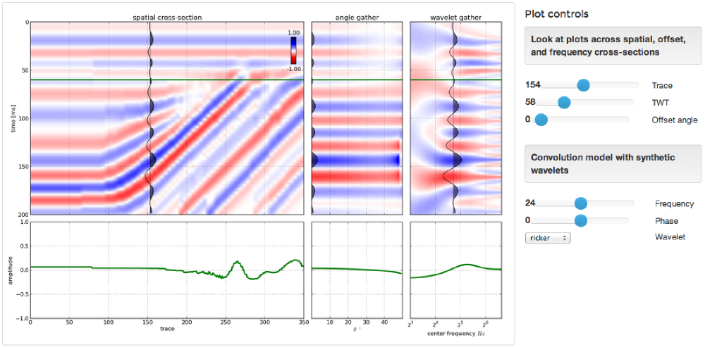
A model isn't just a single image, but a swath of possibilities teased out by varying a multitude of inputs. With modelr, the seismic experiment can be manipulated, so that the gamut of geologic variability can be explored. That process is how we train our ability to see geology in seismic.

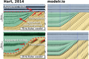
Hart's paper doesn't specifically mention the rock properties used, so it's difficult to match amplitudes, but you can see here how modelr stands up next to Hart's images for high (75 Hz) and low (25 Hz) frequency Ricker wavelets.

There are some cosmetic differences too... I've used fewer wiggle traces to make it easier to see the seismic waveforms. And I think Bruce forgot the blue strata on his 25 Hz model. But I like this display, with the earth model in the background, and the wiggle traces on top — geology and seismic blended in the same graphical space, as they are in the real world, albeit briefly.


Subscribe to the email list to stay in the loop with modelr news, or sign-up at modelr.io and get started today.

This will add you to the email list for the modeling tool. We never share user details with anyone. You can unsubscribe any time.

Seismic models: Hart, BS (2013). Whither seismic stratigraphy? Interpretation, volume 1 (1). The image is copyright of SEG and AAPG.

Slicing seismic arrays

Scientific computing is largely made up of doing linear algebra on matrices, and then visualizing those matrices for their patterns and signals. It's a fundamental concept, and there is no better example than a 3D seismic volume.

Seeing in geoscience, literally

Digital seismic data is nothing but an array of numbers, decorated with header information, sorted and processed along different dimensions depending on the application.

In Python, you can index into any sequence, whether it be a string, list, or array of numbers. For example, we can index into the fourth character (counting from 0) of the word 'geoscience' to select the letter 's':

>>> word = 'geosciences'
>>> word[3]
's'

Or, we can slice the string with the syntax word[start:end:step] to produce a sub-sequence of characters. Note also how we can index backwards with negative numbers, or skip indices to use defaults:

>>> word[3:-1]  # From the 4th character to the penultimate character.
'science'
>>> word[3::2]  # Every other character from the 4th to the end.
'sine'

Seismic data is a matrix

In exactly the same way, we index into a multi-dimensional array in order to select a subset of elements. Slicing and indexing is a cinch using the numerical library NumPy for crunching numbers. Let's look at an example... if data is a 3D array of seismic amplitudes:

timeslice = data[:,:,122] # The 122nd element from the third dimension.
inline = data[30,:,:]     # The 30th element from the first dimension.
crossline = data[:,60,:]  # The 60th element from the second dimension.

Here we have sliced all of the inlines and crosslines at a specific travel time index, to yield a time slice (left). We have sliced all the crossline traces along an inline (middle), and we have sliced the inline traces along a single crossline (right). There's no reason for the slices to remain orthogonal however, and we could, if we wished, index through the multi-dimensional array and extract an arbitrary combination of all three.

Questions involving well logs (a 1D matrix), cross sections (2D), and geomodels (3D) can all be addressed with the rigours of linear algebra and digital signal processing. An essential step in working with your data is treating it as arrays.

View the notebook for this example, or get the get the notebook from GitHub and play with around with the code.

Sign up!

If you want to practise slicing your data into bits, and other power tools you can make, the Agile Geocomputing course will be running twice in the UK this summer. Click one of the buttons below to buy a seat.

Eventbrite - Agile Geocomputing, Aberdeen

Eventbrite - Agile Geocomputing, London

More locations in North America for the fall. If you would like us to bring the course to your organization, get in touch.

Are we alright?

GeoConvention_2014_logo.png

This year's Canada GeoConvention tried a few new things. There was the Openness Unsession, Jen Russel Houston's Best of 2013 PechaKutcha session, and the On Belay careers session. Attendance at the unsession was a bit thin; the others were well attended. Hats off to the organizers for getting out of a rut.

I went to the afternoon of the On Belay session. It featured several applied geoscientists with less than 5 years of experience in the industry. I gather the conference asked them for a candid 'insider' view, with career tips for people like them. I heard 2 talks, and the experience left me literally shaking, prompting Ben Cowie to ask me if I was alright.

I was alright, but I'm not sure about us. Our community — or this industry — has a problem.

Don't be yourself

Marc Enter gave a talk entitled Breaking into Calgary's oil and gas industry, an Aussie's perspective.

Marc narrated the arc of his career: well site geology in a trailer in the outback, re-location to Calgary, being laid-off, stumbling into consultancy (what a person does when they can't find a real job), and so on. On this journey, Marc racked up hundreds of hours of interview experience searching for work in Calgary. Here are some of his learnings, paraphrased but I think they are accurate:

  • Being yourself is impossible in a unfamiliar place. So don't be yourself.
  • Interview experience is crucial to being comfortable, so apply for jobs you have no interest in, just for the experience.
  • If the job description doesn’t sound exactly right to you, apply anyway. It's experience.
  • Confidence is everything. HR people are sniffer dogs for confidence. If you don't have it, invent it.
  • On confidence: it is easier to find a job when you have a job.

What on earth are we teaching these young professionals about working in this industry? This is awful.

How to survive the workday 

Jesse Shoengut gave a talk entitled One man’s tips and tricks for surviving your early professional career

Surviving. That's the word he chose. Might as well have been enduring. Tolerating. TGIF mindset. Like Marc, Jesse spoke about a haphazard transition from university into the working world. If you can't find a job after you finish your undergrad, you can always have a go at grad school. That's one way to get work experience, if all else fails.

Fine, finding work can be hard, and not all jobs are awesome. But with statements like, "Here are some things that keep me sane at work, and help get me through the day," I started to react a bit. C'mon, is that really what people in the audience deserve to hear? Is that really what work is like? It's depressing.

A broken promise

Listening to these talks, I felt embarrassed for our profession. They felt like a candid celebration of mediocrity, where confidence compensates for complacency. I don't blame these young professionals — students have been groomed, through summer internships and hyper-conventional careers events, to get their resumes in order, fit in, and follow instructions. We in industry have built this trap we're mired in. And we are continually seduced. Seduced by the bait of more-then-decent pay and plenty of other rewards. 

I talked to one fellow afterwards. He said, "Yeah, well, a lot of people are finding it hard to find a job right now." If these cynical, jaded young professionals are representative, I'm not surprised.

Were you at this session? Did you see other talks, or walk away with a different impression? I'd love to hear your viewpoints... am I being unfair? Leave a comment.

Fibre optic seismology at #GeoCon14

We've been so busy this week, it's hard to take time to write. But for the record, here are two talks I liked yesterday at the Canada GeoConvention. Short version — Geophysics is awesome!

DAS good

Todd Bown from OptaSense gave an overview of the emerging applications for distributed acoustic sensing (DAS) technology. DAS works by shining laser pulses down a fibre optic cable, and measuring the amount of backscatter from impurities in the cable. Tiny variations in strain on the cable induced by a passing seismic wave, say, are detected as subtle time delays between light pulses. Amazing.

Fibre optic cables aren't as sensitive as standard geophone systems (yet?), but compared to conventional instrumentation, DAS systems have several advantages:

  • Deployment is easy: fibre is strapped to the outside of casing, and left in place for years.
  • You don't have to re-enter and interupt well operations to collect data.
  • You can build ultra-long receiver arrays — as long as your spool of fibre.
  • They are sensitive to a very broad band of signals, from DC to kilohertz.

Strain fronts

Later in the same session, Paul Webster (Shell) showed results from an experiment that used DAS as a fracture diagnosis tool. That means you can record for minutes, hours, even days; if you can cope with all that data. Shell has accumulated over 300 TB of records from a handful of projects, and seems to be a leader in this area.

By placing a cable in one horizontal well in order to listen to the frac treatment from another, the cable can effectively designed to record data similar to a conventional shot gather, except with a time axis of 30 minutes. On the gathers he drew attention to slow-moving arcuate events that he called strain fronts. He hypothesized a number of mechanisms that might cause these curious signals: the flood of fracking fluids finding their way into the wellbore, the settling and closing creep of rock around proppant, and so on. This work is novel and important because it offers insight into the mechanical behavoir of engineered reservoirs, not just during the treatment, but long after.

Why is geophysics awesome? We can measure sound with light. A mile underground. That's all.

How much rock was erupted from Mt St Helens?

One of the reasons we struggle when learning a new skill is not necessarily because this thing is inherently hard, or that we are dim. We just don't yet have enough context for all the connecting ideas to, well, connect. With this in mind I wrote this introductory demo for my Creative Geocomputing class, and tried it out in the garage attached to START Houston, when we ran the course there a few weeks ago.

I walked through the process of transforming USGS text files to data graphics. The motivation was to try to answer the question: How much rock was erupted from Mount St Helens?

This gorgeous data set can be reworked to serve a lot of programming and data manipulation practice, and just have fun solving problems. My goal was to maintain a coherent stream of instructions, especially for folks who have never written a line of code before. The challenge, I found, is anticipating when words, phrases, and syntax are being heard like a foriegn language (as indeed they are), and to cope by augmenting with spoken narrative.

Text file to 3D plot

To start, we'll import a code library called NumPy that's great for crunching numbers, and we'll abbreviate it with the nickname np:

>>> import numpy as np

Then we can use one of its functions to load the text file into an array we'll call data:

>>> data = np.loadtxt('z_after.txt')

The variable data is a 2-dimensional array (matrix) of numbers. It has an attribute that we can call upon, called shape, that holds the number of elements it has in each dimension,

>>> data.shape
(1370, 949)

If we want to make a plot of this data, we might want to take a look at the range of the elements in the array, we can call the peak-to-peak method on data,

>>> data.ptp()
41134.0

Whoa, something's not right, there's not a surface on earth that has a min to max elevation that large. Let's dig a little deeper. The highest point on the surface is,

>>> np.amax(data)
8367.0

Which looks to the adequately trained eye like a reasonable elevation value with units of feet. Let's look at the minimum value of the array,

>>> np.amin(data)
-32767.0 

OK, here's the problem. GIS people might recognize this as a null value for elevation data, but since we aren't assuming any knowledge of GIS formats and data standards, we can simply replace the values in the array with not-a-number (NaN), so they won't contaminate our plot.

>>> data[data==-32767.0] = np.nan

To view this surface in 3D we can import the mlab module from Mayavi

>>> from mayavi import mlab

Finally we call the surface function from mlab, and pass the input data, and a colormap keyword to activate a geographically inspired colormap, and a vertical scale coefficient.

>>> mlab.surf(data,
              colormap='gist_earth',
              warp_scale=0.05)

After applying the same procedure to the pre-eruption digits, we're ready to do some calculations and visualize the result to reveal the output and its fascinating characteristics. Read more in the IPython Notebook.

If this 10 minute introduction is compelling and you'd like to learn how to wrangle data like this, sign up for the two-day version of this course next week in Calgary. 

Eventbrite - Agile Geocomputing

More AAPG highlights

Here are some of our highlights from the second half of the AAPG Annual Convention in Houston.

Conceptual uncertainty in interpretation

Fold-thrust belt, offshore Nigeria. Virtual Seismic Atlas.Rob Butler's research is concerned with the kinematic evolution of mountain ranges and fold thrust belts in order to understand the localization of deformation across many scales. Patterns of deformed rocks aren't adequately explained by stress fields alone; they are also controlled by the mechancial properties of the layers themselves. Given this fact, the definition of the layers becomes a doubly important part of the interpretation.

The biggest risk in structural interpretation is not geometrical accuracy but whether or not the concept is correct. This is not to say that we don't understand geologic processes. Rather, a section can always be described in more than one way. It is this risk in the first order model that impacts everything we do. To deal with conceptual uncertainty we must first capture the range, otherwise it is useless to do any more refinement. 

He showed a crowd-sourced compiliation of 24 interpretations from the Virtual Seismic Atlas as a way to stack up a series of possible structural frameworks. Fifteen out of twenty-four interviewees interpreted a continuous, forward-propagating thrust fault as the main structure. The disagreements were around the existence and location of a back thrust, linkage between fore- and back-thrusts, the existence and location of a detachment surface, and its linkage to the fault planes above. Given such complexity, "it's rather daft," he said, "to get an interpretation from only one or two people." 

CT scanning gravity flows

Mike Tilston and Bill Arnott gave a pair of talks about their research into sediment gravity flows in the lab. This wouldn't be newsworthy in itself, but their 2 key innovations caught our attention: 

  1. A 3D velocity profiler capable of making 23 measurements a second
  2. The flume tank ran through a CT scanner, giving a hi-res cross-section view

These two methods sidestep the two major problems with even low-density (say 4% by weight) sediment gravity flows: they are acoustically attenuative, and optically opaque. Using this approach Tilston and Arnott investigated the effect of grain size on the internal grain distribution, finding that fine-grained turbidity currents sustain a plug-like wall of sediment, while coarse-grained flows have a more carpet-like distribution. Next, they plan to look at particle shape effects, finer grain sizes, and grain mixtures. Technology for the win!

Hypothesizing a martian ocean

Lorena Moscardelli showed topograhic renderings of the Eberswalde delta (right) on the planet Mars, hypothesizing that some martian sedimentary rocks have been deposited by fluvial processes. An assertion that posits the red planet with a watery past. If there are sedimentary rocks formed by fluids, one of the fluids could have been water. If there has been water, who knows what else? Hydrocarbons? Imagine that! Her talk was in the afternoon session on Space and Energy Frontiers, sandwiched by less scientific speakers raising issues for staking claims and models for governing mineral and energy resources away from earth. The idea of tweaking earthly policies and state regulations to manage resources on other planets, somehow doesn't align with my vision of an advanced civilization. But the idea of doing seismic on other planets? So cool.

Poster gorgeousness

Matt and I were both invigorated by the quality, not to mention the giant size, of the posters at the back of the exhibition hall. It was a place for the hardcore geoscientists to retreat from the bright lights, uniformed sales reps, and the my-carpet-is-cushier-than-your-carpet marketing festival. An oasis of authentic geoscience and applied research.

We both finally got to meet Brian Romans, a sedimentologist at Virginia Tech, amidst the poster-paneled walls. He said that this is his 10th year venturing to the channel deposits that crop out in the Magallanes Basin of southern Chile. He is now one of the three young, energetic profs behind the hugely popular Chile Slope Systems consortium.

Three years ago he joined forces with Lisa Stright (University of Utah), and Steve Hubbard (University of Calgary) and formed the project investigating processes of sediment transfer across deepwater slopes exposed around Patagonia. It is a powerhouse of collaborative research, and the quality of graduate student work being pumped out is fantastic. Purposeful and intentional investigations carried out by passionate and tech-savvy scientists. What can be more exciting than that?

Do you have any highlights of your own? Please leave a note in the comments.

Dynamic geology at AAPG

Brad Moorman stands next to his 48 inch (122 cm) Omni Globe spherical projection system on the AAPG exhibition floor, greeting passers by drawn in by its cycling animations of Getech's dynamic plate reconstructions. His map-lamp projects evolutionary visions of geologic processes like a beacon of inspiration for petroleum explorers.

I've attended several themed sessions over the first day and a half at AAPG and the ones that have stood out for me have had this same appeal.

Computational stratigraphy

Processes such as accommodation rate and sedimentation rate can be difficult to unpeel from stratal geometries. Guy Prince's PhD Impact of non-uniqueness on sequence stratigraphy used a variety of input parameters and did numerical computations to make key stratigraphic surfaces with striking similarity. By forward modeling the depositional dynamics, he showed that there are at least two ways to make a maximum flooding surface, a sequence boundary, and top set aggradations. Non-uniqueness implies that there isn't just one model that fits the data, nor two, however Guy cleverly made simple comparisons to illustrate such ambiguities. The next step in this methodology, and it is a big step, is to express the entire model space: just how many solutions are there? 

If you were a farmer here, you lost your land

Henry Posamentier, seismic geomorphologist at Chevron, showed extremely high-resolution 3D sparker seismic imaging just beneath the seafloor in the Gulf of Thailand. Because this locale is more than 1000 km from the nearest continental shelf, it has been essentially unaffected by sea-level change, making it an ideal place to study pure fluvial depositional patterns. Such fluvial systems result in reservoirs in their accretionary point bars, but they are hard to predict.

To make his point, Henry showed a satellite image of the Ping River from a few years ago in the north of Chiang Mai, where meander loops had shifted sporadically in response to one flood season: "If you were a farmer here, you lost your land."

Wells can tell about channel thickness, and seismic may resolve the channel width and the sinuosity, but only a dynamic model of the environment can suggest how well-connected is the sand.

The evolution of a single meandering channel belt

Ron Boyd from ConocoPhillips showed a four-step process investigating the evolution of a single channel belt in his talk, Tidal-Fluvial Sedimentology and Stratigraphy of the McMurray Formation.

  1. Start with a cartoon facies interpretation of channel evolution.
  2. Trace out the static geomorphological model on seismic time slices.
  3. Identify directions of fluvial migrations point by point, time step by time step.
  4. Distribute petrophysical properties within each channel element in chronological sequence.

Mapping the dynamics of a geologic scenario along a timeline gives you access to all the pieces of a single geologic puzzle. But what really matters is how that puzzle compares with the handful of pieces in your hand.

More tomorrow — stay tuned.

Google Earth imagery ©2014 DigitalGlobe, maps ©2014 Google

This post was modified on April 16, 2014, mentioning and giving redirects to Getech.

Getting started with Modelr

Let's take a closer look at modelr.io, our new modeling tool. Just like real seismic experiments, there are four components:

  • Make a framework. Define the geometries of rock layers.
  • Make an earth. Assign a set of rock properties to each layer.
  • Make a kernel. Define the seismic survey.
  • Make a plot. Set the output parameters.

Modelr takes care of the physics of wave propagation and reflection, so you don't have to stick with normal incidence acoustic impedance models if you don't want to. You can explore the full range of possibilities.

3 ways to slice a wedge

To the uninitiated, the classic 3-layer wedge model may seem ridiculously trivial. Surely the earth looks more complicated than that! But we can leverage such geometric simplicity to systematically study how seismic waveforms change across spatial and non-spatial dimensions. 

Spatial domain. In cross-section (right), a seismic wedge model lets you analyse the resolving power of a given wavelet. In this display the onset of tuning is marked by the vertical red line, and the thickness at which maximum tuning occurs is shown in blue. Reflection profiles can be shown for any incidence angle, or range of incidence angles (offset stack).

Amplitude versus angle (AVA) domain. Maybe you are working on a seismic inversion problem so you might want to see what a CDP angle gather looks like above and below tuning thickness. Will a tuned AVA response change your quantitative analysis? This 3-layer model looks like a two-layer AVA gather except our original wavelet looks like it has undergone a 90 degree phase rotation. Looks can be deceiving. 

Amplitude versus frequency domain. If you are trying to design a seismic source for your next survey, and you want to ensure you've got sufficient bandwidth to resolve a thin bed, you can compute a frequency gather — right, bottom — and explore a swath of wavelets with regard to critical thickness in your prospect. The tuning frequency (blue) and resolving frequency (red) are revealed in this domain as well. 

Wedges are tools for seismic waveform classification. We aren't just interested in digitizing peaks and troughs, but the subtle interplay of amplitude tuning, and apparent phase rotation variations across the range of angles and bandwidths in the seismic experiment. We need to know what we can expect from the data, from our supposed geology. 

In a nutshell, all seismic models are about illustrating the band-limited nature of seismic data on specific geologic scenarios. They help us calibrate our intuition when bandwidth causes ambiguity in interpretation. Which is nearly all of the time.

Creating in the classroom

The day before the Atlantic Geoscience Colloquium, I hosted a one-day workshop on geoscience computing to 26 maritime geoscientists. This was my third time running this course. Each time it has needed tailoring and new exercises to suit the crowd; a room full of signal-processing seismologists has a different set of familiarities than one packed with hydrologists, petrologists, and cartographers. 

Easier to consume than create

At the start of the day, I asked people to write down the top five things they spend time doing with computers. I wanted a record of the tools people use, but also to take collective stock of our creative, as opposed to consumptive, work patterns. Here's the result (right).

My assertion was that even technical people spend most of their time in relatively passive acts of consumption — browsing, emailing, and so on. Creative acts like writing, drawing, or using software were in the minority, and only a small sliver of time is spent programming. Instead of filing into a darkened room and listening to PowerPoint slides, or copying lectures notes from a chalkboard, this course was going to be different. Participation mandatory.

My goal is not to turn every geoscientist into a software developer, but to better our capacity to communicate with computers. Giving people resources and training to master this medium that warrants a new kind of creative expression. Through coaching, tutorials, and exercises, we can support and encourage each other in more powerful ways of thinking. Moreover, we can accelerate learning, and demystify computer programming by deliberately designing exercises that are familiar and relevant to geoscientists. 

Scientific computing

In the first few hours students learned about syntax, built-in functions, how and why to define and call functions, as well as how to tap into external code libraries and documentation. Scientific computing is not necessarily about algorithm theory, passing unit tests, or designing better user experiences. Scientists are above all interested in data, and data processes, helped along by rich graphical displays for story telling.

Elevation model (left), and slope magnitude (right), Cape Breton, Nova Scotia. Click to enlarge.

In the final exercise of the afternoon, students produced a topography map of Nova Scotia (above left) from a georeferenced tiff. Sure, it's the kind of thing that can be done with a GIS, and that is precisely the point. We also computed some statistical properties to answer questions like, "what is the average elevation of the province?", or "what is the steepest part of the province?". Students learned about doing calculus on surfaces as well as plotting their results. 

Programming is a learnable skill through deliberate practice. What's more, if there is one thing you can teach yourself on the internet, it is computer programming. Perhaps what is scarce though, is finding the time to commit to a training regimen. It's rare that any busy student or working professional can set aside a chunk of 8 hours to engage in some deliberate coaching and practice. A huge bonus is to do it alongside a cohort of like-minded individuals willing and motivated to endure the same graft. This is why we're so excited to offer this experience — the time, help, and support to get on with it.

How can I take the course?

We've scheduled two more episodes for the spring, conveniently aligned with the 2014 AAPG convention in Houston, and the 2014 CSPG / CSEG convention in Calgary. It would be great to see you there!

Eventbrite - Agile Geocomputing  Eventbrite - Agile Geocomputing

Or maybe a customized in-house course would suit your needs better? We'd love to help. Get in touch.

A long weekend of Atlantic geology

The Atlantic Geoscience Society Colloquium was hosted by Acadia University in Wolfville, Nova Scotia, this past weekend. It was the 50th Anniversay meeting, and attracted a crowd of about 175 geoscientists. A few members were able to reflect and tell stories first-hand of the first meeting in 1964.

It depends which way you slice it

Nova Scotia is one of the best places for John Waldron to study deformed sedimentary rocks of continental margins and orogenic belts. Being the anniversary, John traced the timeline of tectonic hypotheses over the last 50 years. From his kinematic measurements of Nova Scotia rocks, John showed the complexity of transtensional tectonics. It is easy to be fooled: you will see contraction features in one direction, and extension structures in another direction. It all depends which way you slice it. John is a leader in visualizing geometric complexity; just look at this animation of piecing together a coal mine in Stellarton. Oh, and he has a cut and fold exercise so that you can make your own Grand Canyon! 

The application of the Law of the Sea

In September 2012 the Bedford Institute of Oceanography acquired some multibeam bathymetric data and applied geomorphology equations to extend Canada's boundaries in the Atlantic Ocean. Calvin Campbell described the cruise as like puttering from Halifax to Victoria and back at 20 km per hour, sending a chirp out once a minute, each time waiting for it to go out 20 kilometres and come back.

The United Nation's Convention on the Law of the Sea (UNCLOS) was established to define the rights and responsibilities of nations in their use of the world's oceans, establishing guidelines for businesses, the environment, and the management of marine natural resources. A country is automatically entitled to any natural resources found within a 200 nautical mile limit of its coastlines, but can claim a little bit more if they can prove they have sedimentary basins beyond that. 

Practicing the tools of the trade

Taylor Campbell, applied a post-stack seismic inversion workflow to the Penobscot 3D survey and wells. Compared to other software talks I have seen in industry, Taylor's was a quality piece of integrated technical work. This is even more commendable considering she is an undergraduate student at Dalhousie. My only criticism, which I shared with her after the talk was over, was that the work lacked a probing question. It would have served as an anchor for the work, and I think is one of the critical distinctions between scientific pursuits and engineering.

Image courtesy of Justin Drummond, 2014, personal communication, from his expanded abstract presented at GSA 2013.

Practicing rational inquiry

Justin Drummond's work, on the other hand, started with a nugget of curiosity: How did the biogeochemical cycling of phosphorite change during the Neoproterozoic? Justin's anchoring question came first, only then could he think about the methods, technologies and tools he needed to employ, applying sedimentology, sequence stratigraphy, and petrology to investigate phosphorite accumulation in the Sete Lagoas Formation. He won the award for Best Graduate Student presentation at the conference.

It is hard to know if he won because his work was so good, or if it was because of his impressive vocabulary. He put me in mind of what Rex Murphy would sound like if he were a geologist.

The UNCLOS illustration is licensed CC-BY-SA, by Wikipedia users historicair and MJSmit.