Transforming geology into seismic

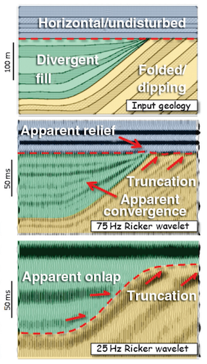
Hart (2013). ©SEG/AAPGForward modeling of seismic data is the most important workflow that nobody does.

Why is it important?

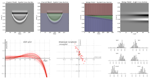
  • Communicate with your team. You know your seismic has a peak frequency of 22 Hz and your target is 15–50 m thick. Modeling can help illustrate the likely resolution limits of your data, and how much better it would be with twice the bandwidth, or half the noise.
  • Calibrate your attributes. Sure, the wells are wet, but what if they had gas in that thick sand? You can predict the effects of changing the lithology, or thickness, or porosity, or anything else, on your seismic data.
  • Calibrate your intuition. Only by predicting the seismic reponse of the geology you think you're dealing with, and comparing this with the response you actually get, can you start to get a feel for what you're really interpreting. Viz Bruce Hart's great review paper we mentioned last year (right).

Why does nobody do it?

Well, not 'nobody'. Most interpreters make 1D forward models — synthetic seismograms — as part of the well tie workflow. Model gathers are common in AVO analysis. But it's very unusual to see other 2D models, and I'm not sure I've ever seen a 3D model outside of an academic environment. Why is this, when there's so much to be gained? I don't know, but I think it has something to do with software.

  • Subsurface software is niche. So vendors are looking at a small group of users for almost any workflow, let alone one that nobody does. So the market isn't very competitive.
  • Modeling workflows aren't rocket surgery, but they are a bit tricky. There's geology, there's signal processing, there's big equations, there's rock physics. Not to mention data wrangling. Who's up for that?
  • Big companies tend to buy one or two licenses of niche software, because it tends to be expensive and there are software committees and gatekeepers to negotiate with. So no-one who needs it has access to it. So you give up and go back to drawing wedges and wavelets in PowerPoint.

Okay, I get it, how is this helping?

We've been busy lately building something we hope will help. We're really, really excited about it. It's on the web, so it runs on any device. It doesn't cost thousands of dollars. And it makes forward models...

That's all I'm saying for now. To be the first to hear when it's out, sign up for news here:

This will add you to the email list for the modeling tool. We never share user details with anyone. You can unsubscribe any time.

Seismic models: Hart, BS (2013). Whither seismic stratigraphy? Interpretation, volume 1 (1). The image is copyright of SEG and AAPG.

January linkfest

Time for the quarterly linkfest! Got stories for next time? Contact us.

BP's new supercomputer, reportedly capable of about 2.2 petaflops, is about as fast as Total's Pangea machine in Paris, which booted up almost a year ago. These machines are pretty amazing — Pangea has over 110,000 cores, and 442 terabytes of memory — but BP claims to have bested that with 1 petabyte of RAM. Remarkable. 

Leo Uieda's open-source modeling tool Fatiando a Terra got an upgrade recently and hit version 0.2. Here's Leo himself demonstrating a forward seismic model:

I'm a geoscientst, get me out of here is a fun-sounding new educational program from the European Geosciences Union, which has recently been the very model of a progressive technical society (along with the AGU is another great example). It's based on the British outreach program, I'm a scientist, get me out of here, and if you're an EGU member (or want to be), I think you should go for it! The deadline: 17 March, St Patrick's Day.

Darren Wilkinson writes a great blog about some of the geekier aspects of geoscience. You should add it to your reader (I'm using The Old Reader to keep up with blogs since Google Reader was marched out of the building). He wrote recently about this cool tool — an iPad controller for desktop apps. I have yet to try it, but it seems a good fit for tools like ArcGIS, Adobe Illustrator.

Speaking of big software, check out Joe Kington's Python library for GeoProbe volumes — I wish I'd had this a few years ago. Brilliant.

And speaking of cool tools, check out this great new book by technology commentator and philosopher Kevin Kelly. Self-published and crowd-sourced... and drawn from his blog, which you can obviously read online if you don't like paper. 

If you're in Atlantic Canada, and coming to the Colloquium next weekend, you might like to know about the wikithon on Sunday 9 February. We'll be looking for articles relevant to geoscientists in Atlantic Canada to improve. Tim Sherry offers some inspiration. I would tell you about Evan's geocomputing course too... but it's sold out.

Heard about any cool geostuff lately? Let us know in the comments. 

May linkfest

The monthly News post wasn't one of our most popular features, so it's on the shelf. Instead, I thought I'd share all the most interesting, quirky, mind-blowing, or just plain cool things I've spotted on the web over the last month.

– Do not miss this. One of them stands out above all the others. If you like modern analogs and satellite imagery, you're going to love Google Earth Engine. I've started a list of geologically interesting places to visit — please add to it!

– More amazing images. I'll never get bored of looking at gigapans, and Callan Bentley's are among the best geological ones. I especially like his annotated ones.

– Classic blog. Greg Gbur writes one of the best physics blogs, and his focus is on optics, so there's often good stuff there for geophysicists. This post on Chladni patterns is pure acoustic goodness and well worth a slow read. 

– New geoscience blog. Darren Wilkinson is a young geoscientist in the UK, and writes a nice geeky blog about his research. 

– Brilliant and simple. Rowan Cockett is a student at UBC, but builds brilliant geological web apps on the side. He has a knack for simplicity and his latest creation makes stereonets seem, well, simple. Impressive. 

– New magazine. Kind of. There's not enough satire or ragging in the petroleum press, so it's refreshing to hear of Proved Plus Probable, a fairly wacky weekly online rag emanating from Calgary [thanks to Dan for the tip!]. Top headline: Legendary geologist invents new crayons

– Counter-factual geology. I love these pictures of an imagined ring around earth.

– Never buy graph paper again. Make some just how you like it!

– Bacon. It was a revelation to find that some rocks look just like bacon.

That's it! I share most of this sort of thing on Twitter. Really useful stuff I tend to stick on my pinboard — you're welcome to browse. If you have a geological or geeky bookmark collection, feel free to share it in the comments!

Cope don't fix

Some things genuinely are broken. International financial practices. Intellectual property law. Most well tie software. 

But some things are the way they are because that's how people like them. People don't like sharing files, so they stash their own. Result: shared-drive cancer — no, it's not just your shared drive that looks that way. The internet is similarly wild, chaotic, and wonderful — but no-one uses Yahoo! Directory to find stuff. When chaos is inevitable, the only way to cope is fast, effective search

So how shall we deal with the chaos of well log names? There are tens of thousands — someone at Schlumberger told me last week that they alone have over 50,000 curve and tool names. But these names weren't dreamt up to confound the geologist and petrophysicist — they reflect decades of tool development and innovation. There is meaning in the morasse.

Standards are doomed

Twelve years ago POSC had a go at organizing everything. I don't know for sure what became of the effort, but I think it died. Most attempts at standardization are doomed. Standards are awash with compromise, so they aren't perfect for anything. And they can't keep up with changes in technology, because they take years to change. Doomed.

Instead of trying to fix the chaos, cope with it.

A search tool for log names

We need a search tool for log names. Here are some features it should have:

  • It should be free, easy to use, and fast
  • It should contain every log and every tool from every formation evaluation company
  • It should provide human- and machine-readable output to make it more versatile
  • You should get a result for every search, never drawing a blank
  • Results should include lots of information about the curve or tool, and links to more details
  • Users should be able to flag or even fix problems, errors, and missing entries in the database

To my knowledge, there are only two tools a little like this: Schlumberger's Curve Mnemonic Dictionary, and the SPWLA's Mnemonics Data Search. Schlumberger's widget only includes their tools, naturally. The SPWLA database does at least include curves from Baker Hughes and Halliburton, but it's at least 10 years out of date. Both fail if the search term is not found. And they don't provide machine-readable output, only HTML tables, so it's difficult to build a service on them.

Introducing fuzzyLAS

We don't know how to solve this problem, but we're making a start. We have compiled a database containing 31,000 curve names, and a simple interface and web API for fuzzily searching it. Our tool is called fuzzyLAS. If you'd like to try it out, please get in touch. We'd especially like to hear from you if you often struggle with rogue curve mnemonics. Help us build something useful for our community.

The Agile toolbox

Some new businesses go out and raise millions in capital before they do anything else. Not us — we only do what we can afford. Money makes you lazy. It's technical consulting on a shoestring!

If you're on a budget, open source is your best friend. More than this, it's important an open toolbox is less dependent on hardware and less tied to workflows. Better yet, avoiding large technology investments helps us avoid vendor lock-in, and the resulting data lock-in, keeping us more agile. And there are two more important things about open source: 

  • You know exactly what the software does, because you can read the source code
  • You can change what the software does, becase you can change the source code

Anyone who has waited 18 months for a software vendor to fix a bug or add a feature, then 18 more months for their organization to upgrade the software, knows why these are good things.

So what do we use?

In the light of all this, people often ask us what software we use to get our work done.

Hardware  Matt is usually on a dual-screen Apple iMac running OS X 10.6, while Evan is on a Samsung Q laptop (with a sweet solid-state drive) running Windows. Our plan, insofar as we have a plan, is to move to Mac Pro as soon as the new ones come out in the next month or two. Pure Linux is tempting, but Macs are just so... nice.

Geoscience interpretation  dGB OpendTect, GeoCraftQuantum GIS (above). The main thing we lack is a log visualization and interpretation tool. Beyond this, we don't use them much yet but Madagascar and GMT are plugged right into OpendTect. For getting started on stratigraphic charts, we use TimeScale Creator

A quick aside, for context: when I sold Landmark's GeoProbe seismic interpretation tool, back in 2003 or so, the list price was USD140 000 per user, choke, plus USD25k per year in maintenance. GeoProbe is very powerful now (and I have no idea what it costs), but OpendTect is a much better tool that that early edition was. And it's free (as in speech, and as in beer).

Geekery, data mining, analysis  Our core tools for data mining are Excel, Spotfire Silver (an amazing but proprietary tool), MATLAB and/or GNU Octave, random Python. We use Gephi for network analysis, FIJI for image analysis, and we have recently discovered VISAT for remote sensing images. All our mobile app development has been in MIT AppInventor so far, but we're playing with the PhoneGap framework in Eclipse too. 

Writing and drawing  Google Docs for words, Inkscape for vector art and composites, GIMP for rasters, iMovie for video, Adobe InDesign for page layout. And yeah, we use Microsoft Office and OpenOffice.org too — sometimes it's just easier that way. For managing references, Mendeley is another recent discovery — it is 100% awesome. If you only look at one tool in this post, look at this.

Collaboration  We collaborate with each other and with clients via SkypeDropbox, Google+ Hangouts, and various other Google tools (for calendars, etc). We also use wikis (especially SubSurfWiki) for asynchronous collaboration and documentation. As for social media, we try to maintain some presence in Google+, Facebook, and LinkedIn, but our main channel is Twitter.

Web  This website is hosted by Squarespace for reliability and reduced maintenance. The MediaWiki instances we maintain (both public and private) are on MediaWiki's open source platform, running on Amazon's Elastic Compute servers for flexibility. An EC2 instance is basically an online Linux box, running Ubuntu and Bitnami's software stack, plus some custom bits and pieces. We are launching another website soon, running WordPress on Amazon EC2. Hover provides our domain names — an awesome Canadian company.

Administrative tools  Every business has some business tools. We use Tick to track our time — it's very useful when working on multiple projects, subscontractors, etc. For accounting we recently found Wave, and it is the best thing ever. If you have a small business, please check it out — after headaches with several other products, it's the best bean-counting tool I've ever used.

If you have a geeky geo-toolbox of your own, we'd love to hear about it. What tools, open or proprietary, couldn't you live without?

Checklists for everyone

Avoidable failures are common and persistent, not to mention demoralizing and frustrating, across many fields — from medicine to finance, business to government. And the reason is increasingly evident: the volume and complexity of what we know has exceeded our individual ability to deliver its benefits correctly, safely, or reliably. Knowledge has both saved and burdened us.

I first learned about Atul Gawande from Bill Murphy's talk at the 1IWRP conference last August, where he offered the surgeon's research model for all imperfect sciences; casting the spectrum of problems in a simple–complicated–complex ternary space. In The Checklist Manifesto, Gawande writes about a topic that is relevant to all all geoscience: the problem of extreme complexity. And I have been batting around the related ideas of cookbooks, flowcharts, recipes, and to-do lists for maximizing professional excellence ever since. After all, it is challenging and takes a great deal of wisdom to cut through the chaff, and reduce a problem to its irreducible and essential bits. Then I finally read this book.

The creation of the now heralded 19-item surgical checklist found its roots in three places — the aviation industry, restaurant kitchens, and building construction:

Thinking about averting plane crashes in 1935, or stopping infections in central lines in 2003, or rescuing drowning victims today, I realized that the key problem in each instance was essentially a simple one, despite the number of contributing factors. One needed only to focus attention on the rudder and elevator controls in the first case, to maintain sterility in the second, and to be prepared for cardiac bypass in the third. All were amenable, as a result, to what engineers call "forcing functions": relatively straightforward solutions that force the necessary behavior — solutions like checklists.

What is amazing is that it took more than two years, and a global project sponsored by the World Health Organization, to devise such a seemingly simple piece of paper. But what a change it has had. Major complications fell by 36%, and deaths fells by 47%. Would you adopt a technology that had a 36% improvement in outcomes, or a 36% reduction in complications? Most would without batting an eye.

But the checklist paradigm is not without skeptics. There is resistance to the introduction of the checklist because it threatens our autonomy as professionals, our ego and intelligence that we have trained hard to attain. An individual must surrender being the virtuoso. It enables teamwork and communication, which engages subordinates and empowers them at crucial points in the activity. The secret is that a checklist, done right, is more than just tick marks on a piece of paper — it is a vehicle for delivering behavioural change.

I can imagine huge potential for checklists in the problems we face in petroleum geoscience. But what would such checklists look like? Do you know of any in use today?

How big is that volume?

Sometimes you need to know how much space you need for a seismic volume. One of my machines only has 4GB of RAM, so if I don't want to run out of memory, I need to know how big a volume will be. Or your IT department might want help figuring out how much disk to buy next year.

Fortunately, since all seismic data is digital these days, it's easy to figure out how much space we will need. We simply count the samples in the volume, then account for the bit-depth. So, for example, if a 3D volume has 400 inlines and 300 traces per line, then it has 120 000 traces in total. If each trace is 6 seconds long, and the sample interval is 2 ms, then each trace has 6000/2 = 3000 samples (3001 actually, but let's not worry too much about that), so that's about 360 million samples. for a 32-bit volume, each sample requires 32/8 = 4 bytes, so we're at... a big number.  To convert to kilobytes, divide by 210, or 1024, then do it again for MB and again for GB.

It's worth noting that some seismic interpretation tools have proprietary compressed formats available for seismic data, Landmark's 'brick' format for example. This optionally applies a JPEG-like compression to reduce the file size, as well as making some sections display faster because of the way the compressed file is organized. The amount of compression depends on the frequency content of the data, and the compression is lossy, however, meaning that some of the original data is irretrievably lost in the process. If you do use such a file for visualization and interpretation, you may want to use a full bit-depth, full-fidelity file for attribute analysis. 

Do you have any tricks for managing large datasets? We'd love to hear them!

Petrophysics cheatsheet

Geophysical logging is magic. After drilling, a set of high-tech sensors is lowered to the bottom of the hole on a cable, then slowly pulled up collecting data as it goes. A sort of geological endoscope, the tool string can measure manifold characteristics of the rocks the drillbit has penetrated: temperature, density, radioactivity, acoustic properties, electrical properties, fluid content, porosity, to name a few. The result is a set of well logs or wireline logs.

The trouble is there are a lot of different logs, each with its own idiosyncracies. The tools have different spatial resolutions, for example, and are used for different geological interpretations. Most exploration and production companies have specialists, called petrophysicists, to interpret logs. But these individuals are sometimes (usually, in my experience) thinly spread, and besides all geologists and geophysicists are sometimes faced with interpreting logs alone.

We wanted to make something to help the non-specialist. Like our previous efforts, our new cheatsheet is a small contribution, but we hope that you will want to stick it into the back of your notebook. We have simplified things quite a bit: almost every single entry in this table needs a lengthy footnote. But we're confident we're giving you the 80% solution. Or 70% anyway. 

Please let us know if and how you use this. We love hearing from our users, especially if you have enhancements or comments about usability. You can use the contact form, or leave a comment here

Building Tune*

Last Friday, I wrote a post on tuning effects in seismic, which serves as the motivation behind our latest app for Android™ devices, Tune*. I have done technical and scientific computing in the past, but I am a newcomer to 'consumer' software programming, so like Matt in a previous post about the back of the digital envelope, I thought I would share some of my experiences trying to put geo-computing on a mobile, tactile, always-handy platform like a phone.

Google's App Inventor tool has two parts: the interface designer and the blocks editor. Programming with the blocks involves defining and assembling a series of procedures and variables that respond to the user interface. I made very little progress doing the introductory demos online, and only made real progress when I programmed the tuning equation itself—the science. The equation only accounts for about 10% of the blocks. But the logic, control elements, and defaults that (I hope) result in a pleasant design and user experience, take up the remainder of the work. This supporting architecture, enabling someone else to pick it up and use it, is where most of the sweat and tears go. I must admit, I found it an intimidating mindset to design for somebody else, but perhaps being a novice means I can think more like a user? 

This screenshot shows the blocks that build the tuning equation I showed in last week's post. It makes a text block out of an equation with variables, and the result is passed to a graph to be plotted. We are making text because the plot is actually built by Google's Charts API, which is called by passing this equation for the tuning curve in a long URL. 

Agile Tune app screenshotUpcoming versions of this app will include handling the 3-layer case, whereby the acoustic properties above and below the wedge can be different. In the future, I would like to incorporate a third dimension into the wedge space, so that the acoustic properties or wavelet can vary in the third dimension, so that seismic response and sensitivity can be tested dynamically.

Even though the Ricker wavelet is the most commonly used, I am working on extending this to include other wavelets like Klauder, Ormsby, and Butterworth filters. I would like build a wavelet toolbox where any type of wavelet can be defined based on frequency and phase spectra. 

Please let me know if you have had a chance to play with this app and if there are other features you would like to see. You can read more about the science in this app on the wiki, or get it from the Android Market. At the risk (and fun) of nakedly exposing my lack of programming prowess to the world, I have put a copy of the package on the DOWNLOAD page, so you can grab Tune.zip, load it into App Inventor and check it out for yourself. It's a little messy; I am learning more elegant and parsimonious ways to build these blocks. But hey, it works!

How to make a strat column

A few weeks ago I posted about the brilliant TSCreator, a Java application for creating custom geological timescales. One of the nicest features of this tool is that you can create your own lithostratigraphic columns, stick charts, transgression-regression plots, isotope curves, etc. It's a slightly fiddly process, so I wanted to try to give some pointers; this post is about how to make a simple lithostrat column. The other column types are built in a similar way; the full details are described in the Manual (starting on page 20). 

The example I'm showing is the Western Cape Breton column, as given by the Nova Scotia Geological Highway Map. I can't vouch for its accuracy as I've never worked this section; I built it purely to show the method. You can see the result here >

You build the data file, which TSCreator calls a Datapack, in a spreadsheet. I use Google Docs, but you can use any tool you like (OpenOffice.org, Microsoft Excel etc), as long as it will save a tab-delimited text file. The spreadsheet has a header and a data section; here's what the header looks like in my example:

format version: 1.4
date: 10/02/2011
Chart Title: Western Cape Breton
age units: Ma

You can see my example file here (opens in Google Docs). To use it, first save it as a text file: Google Docs > File > Download as > Text. Give it a .txt extension when you get the chance. Then launch TSCreator and select File > Add Datapack. If you get an error it's probably because you have violated one of the formatting rules. It may take some back and forth to get it how you want it.

Finally, I just made the unhappy discovery that you cannot save your chart after you load a custom datapack. Apparently to export an image or SVG file (my preference), you need TS-Creator Pro. Or you get very clever with screen grabs!

If you have your own tips, please leave them in the comments!

Note, TimeScale Creator is a trademark of the Geologic TimeScale Foundation. I am not connected with the software or its creators in any way. Microsoft Excel is a trademark of Microsoft Corporation. Java is a trademark of Oracle Corporation.