A long weekend of Atlantic geology

The Atlantic Geoscience Society Colloquium was hosted by Acadia University in Wolfville, Nova Scotia, this past weekend. It was the 50th Anniversay meeting, and attracted a crowd of about 175 geoscientists. A few members were able to reflect and tell stories first-hand of the first meeting in 1964.

It depends which way you slice it

Nova Scotia is one of the best places for John Waldron to study deformed sedimentary rocks of continental margins and orogenic belts. Being the anniversary, John traced the timeline of tectonic hypotheses over the last 50 years. From his kinematic measurements of Nova Scotia rocks, John showed the complexity of transtensional tectonics. It is easy to be fooled: you will see contraction features in one direction, and extension structures in another direction. It all depends which way you slice it. John is a leader in visualizing geometric complexity; just look at this animation of piecing together a coal mine in Stellarton. Oh, and he has a cut and fold exercise so that you can make your own Grand Canyon! 
The application of the Law of the Sea

In September 2012 the Bedford Institute of Oceanography acquired some multibeam bathymetric data and applied geomorphology equations to extend Canada's boundaries in the Atlantic Ocean. Calvin Campbell described the cruise as like puttering from Halifax to Victoria and back at 20 km per hour, sending a chirp out once a minute, each time waiting for it to go out 20 kilometres and come back.

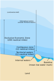
The United Nation's Convention on the Law of the Sea (UNCLOS) was established to define the rights and responsibilities of nations in their use of the world's oceans, establishing guidelines for businesses, the environment, and the management of marine natural resources. A country is automatically entitled to any natural resources found within a 200 nautical mile limit of its coastlines, but can claim a little bit more if they can prove they have sedimentary basins beyond that. 

Practicing the tools of the trade

Taylor Campbell, applied a post-stack seismic inversion workflow to the Penobscot 3D survey and wells. Compared to other software talks I have seen in industry, Taylor's was a quality piece of integrated technical work. This is even more commendable considering she is an undergraduate student at Dalhousie. My only criticism, which I shared with her after the talk was over, was that the work lacked a probing question. It would have served as an anchor for the work, and I think is one of the critical distinctions between scientific pursuits and engineering.
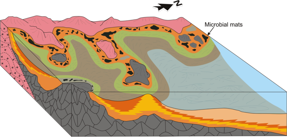
Image courtesy of Justin Drummond, 2014, personal communication, from his expanded abstract presented at GSA 2013.

Practicing rational inquiry

Justin Drummond's work, on the other hand, started with a nugget of curiosity: How did the biogeochemical cycling of phosphorite change during the Neoproterozoic? Justin's anchoring question came first, only then could he think about the methods, technologies and tools he needed to employ, applying sedimentology, sequence stratigraphy, and petrology to investigate phosphorite accumulation in the Sete Lagoas Formation. He won the award for Best Graduate Student presentation at the conference.

It is hard to know if he won because his work was so good, or if it was because of his impressive vocabulary. He put me in mind of what Rex Murphy would sound like if he were a geologist.

The UNCLOS illustration is licensed CC-BY-SA, by Wikipedia users historicair and MJSmit.

Five more things about colour

Last time I shared some colourful games, tools, and curiosities, including the weird chromostereopsis effect (right). Today, I've got links to much, much more 'further reading' on the subject of colour...


The provocation for this miniseries was Robert 'Blue Marble' Simmon's terrific blog series on colour, which he's right in the middle of. Robert is a data visualization pro at NASA Earth Observatory, so we should all listen to him. Here's his collection (updated after the original writing of this post):

Perception is everything! One of Agile's best friends is Matteo Niccoli, a quantitative geophysicist in Norway (for now). And one of his favourite subjects is colour — there are loads of great posts on his blog. He also has a fine collection of perceptual colour bars (left) for most seismic interpretation software. If you're still using Spectrum for maps, you need his help.

Dave Green is a physicist at the University of Cambridge. Like Matteo, he has written about the importance of using colour bars which have a linear increase in perceived brightness. His CUBEHELIX scheme (above) adapts easily to your needs — try out his colour bar creator. And if this level of geekiness gets you going, try David Dalrymple or Gregor Aisch.

ColorBrewer is a legendary web app and add-in for ArcGIS. It's worth playing with the various colour schemes, especially if you need a colour bar that is photocopy friendly, or that can still be used by colour blind people. The equally excellent, perhaps even slightly more excellent, i want hue is also worth playing with (thanks to Robert Simmon for that one). 

In scientific publishing, the Nature family of journals has arguably the finest graphics. Nature Methods carries a column called Points of View, which looks at scientific visualization. This mega-post on their Methagora blog links to them all, and covers everything from colour and 3D graphics to broader issues of design and typography. Wonderful stuff.

Since I don't seem to have exhausted the subject yet, we'll save a couple of practical topics for next time:

  1. A thought experiment: How many attributes can a seismic interpreter show with colour in a single display?
  2. Provoked by a reader via email, we'll think about that age old problem for thickness maps — should the thicks be blue or red?

Five things about colour

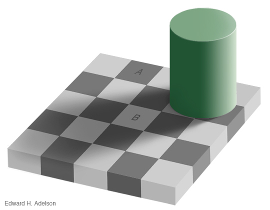
The fact that colour is a slippery subject is powerfully illustrated by my favourite optical illusion. Look at this:

Squares A and B are the same shade of grey. It's so hard to believe that you might need to see the proof to be convinced. 

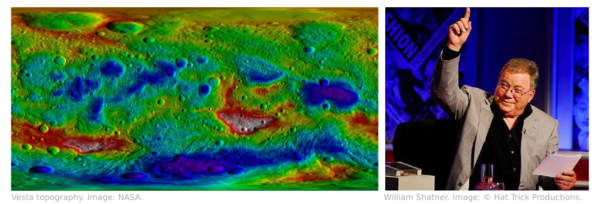
Chromostereopsis is a similarly disarming effect that you may have noticed on maps with bright spectrum colour bars. Most people perceive blue and red on different depth planes, so the pseudo-3D effect can work in your favour and make the map 'pop' (This is not a good reason to use a spectrum colour bar, however... more on this next time). I notice that at least one set designer knows about the effect, making William Shatner pop on the TV show Have I Got News For You:

Color is a fun way to test your colour intuition. The game starts easy, but is very hard by the end as you simulatneously match colour tetrads. The first time I played I managed 9.8, which I am not-very-secretly quite pleased about. But I haven't been able to repeat the performance.

X-Rite's Online Color Challenge is also tough. You have to sort the very subtle colours into order. It takes a while to play but is definitely worth it. If your job depends on spotting subtle effects in images (like seismic data, for example) then stand by to learn something about your detection system. 

Color blindness will change how these games work, of course, and should change how we make maps, figures, and slides. Since up to about 5% of a large audience might be colour blind, you might want to think about how your presentations look to them. You can easily check with Vischeck and correct images for colourblind people with the Daltonizer. They can still be beautiful, but you can avoid certain colour combinations and reach a wider audience.

I have lots more links about colour to share in the next post, including some required reading from Rob Simmon and Matteo Niccoli, among others. In the meantime, have you come across any handy colour tools, or has colour ever caught you out? Let us know in the comments.

The image of William Shatner is copyright and courtesy of Hat Trick Productions Ltd, London, UK, and used with permission.

Capturing conferences

Yesterday I grumbled about secret meetings. Enough whining, what's the opportunity?

Some technical societies already understand the need for recording proceedings. SPE workshops have clearly-stated deliverables, for example at the Marginal Fields workshop in Cairo later this year:

SPE workshop deliverables

That's more like it. It would be better to publish the proceedings to the world, not just attendees, and to use an open license, but it's definitely a good start.

As we reported earlier, we used a variety of methods to capture the unsession we hosted at the Canada GeoConvention in May — video, photos, drawings and notes, interviews, a wiki, and an article. This is messy and chaotic, but it's also transparent and open, making it easier to reference and more likely that someone (including us!) can use it.

What other things should we be considering? Here are some ideas:

  • Livestreaming. This enables people who couldn't make it to take part in at least one or two sessions via streaming video and social media. It's amazingly effective and can increase the audience by a factor of 5 or more. Even better: at the end of it, you have video of everything!
  • Published proceedings. This is something we used to do all the time in geoscience, but it takes a lot of coordination. The GSL is the only body I know of that still manages it regularly. Perhaps a wiki-based publishing approach would be easier to arrange?
  • Graphic recording. I have witnessed this a few times, and even tried it myself. In a workshop, it's a terrific way to engage the audience in real time; in a conference, it makes for some great conversation pieces in the break. It's also a brilliant way to listen.
  • Podcasting. Having a small team of reporters capture the proceedings in short interviews, video clips, and opinion pieces could be a fun way to engage non-attendees, and leave the event with a record of what went on.
  • Code and data. We could experiment with more 'doing' sessions, where code is written, wiki pages are hacked on, data is collected, and so on. The product then is clear: a new code repository, open dataset, or set of wiki pages. This one could be the easiest one to pull off, and the most valuable to the community.

Here's more inspiration: the EGU tweeting its round-up from Vienna this morning:

Looking back at the #EGU2013 - a whole lot of online action, excellent scientists, geo-photos, journals & more ow.ly/lE0jH#GeoQ — EGU (@EuroGeosciences) June 6, 2013

Have you seen unusually effective or innovative ways to record events you've been at? What would you like to see? What would you be prepared to do?


Update on 2013-06-07 21:51 by Matt Hall

In my inbox today: SEG are offering video of something like 200 talks (of the 1000+) from last year's Annual Meeting. Unfortunately, they're trying to monetize, but at least they're only $0.99. I enjoyed this one on 3D image segmentation live — but haven't tried it online.

The plainest English

If you're not already reading xkcd — the must-read sciencey thrice-weekly comic strip — then please give it a try. It's good for you. Check out this wonderful description of the Saturn V rocket, aka Up Goer Five, using only the 1000 most common words in English →

This particular comic took on a life of its own last week, when Theo Sanderson built a clever online text editor that parses your words and highlights the verboten ones. Then, following the lead of @highlyanne, a hydrologist, scientists all over Twitter quickly started describing and sharing parsimonious descriptions of what they do. Anne and her partner in crime, @Allochthonous, then compiled a log of every description they could find. It's worth looking at, though it would take a while to read them all. 

What's it like using only the simplest words? I tried to define a well...

A deep, round, empty space in the ground that is only about as wide as your hand. The empty space is very deep: up to about seven tens of hundreds of times as deep as a man is tall. It is full of water. After making the empty space, we can lower small computers into it. As we pull them out, the computers tell us things about the rocks they can 'see' — like how fast waves move through them, or how much water the rocks have in them.

It's quite hard. But refreshingly so. Here's reflection seismic...

We make a very loud, short sound on the land or in the water — like a cracking sound. The sound waves go down through the rocks under the ground. As they do so, some of them come back — just as waves come back from the side of a body of water when you throw in a small rock. We can listen to the sound waves that come back, and use a computer to help make a picture of what it looks like under the ground.

Is a world without jargon dumbed down, or opened up? What is it we do again?...

It is very hard to do this work. It takes a lot of money and a long time. The people that do it have to think hard about how to do it without hurting other people or the world we live in. We don't always manage to do it well, but we try to learn from the past so we can do better next time. Most people think we should stop, but if we did, the world would go dark, our homes would be cold (or hot), and people would not be able to go very far.

Check out Up Goer Six — Theo's new editor that colour codes each word according to just how common it is. Try it — what do you do for a living? 

The image is licensed CC-BY-NC-2.5 by Randall Munroe at xkcd.com.

Journalists are scientists

Tim Radford. Image: Stevyn Colgan.On Thursday I visited The Guardian’s beautiful offices in King’s Cross for one of their Masterclass sessions. Many of them have sold out, but Tim Radford’s science writing evening did so in hours, and the hundred-or-so budding writers present were palpably excited to be there. The newspaper is one of the most progressive news outlets in the world, and boasts many venerable alumni (John Maddox and John Durant among them). It was a pleasure just to wander around the building with a glass of wine, with some of London’s most eloquent nerds.

Radford is not a trained scientist, but a pure journalist. He left school at 16, idolized Dylan Thomas, joined a paper, wrote like hell, and sat on almost every desk before mostly retiring from The Guardian in 2005. He has won four awards from the Association of British Science Writers. More people read any one of his science articles on a random Tuesday morning over breakfast than will ever read anything I ever write. Tim Radford is, according to Ed Yong, the Yoda of science writers.

Within about 30 minutes it became clear what it means to be a skilled writer: Radford’s real craft is story-telling. He is completely at home addressing a crowd of scientists — he knows how to hold a mirror up to the geeks and reflect the fun, fascinating, world-changing awesomeness back at them. “It’s a terrible mistake to think that because you know about a subject you are equipped to write about it,” he told us, getting at how hard it is to see something from within. It might be easier to write creatively, and with due wonder, about fields outside our own.

Some in the audience weren’t content with being entertained by Radford, watching him in action as it were, preferring instead to dwell on controversy. He mostly swatted them aside, perfectly pleasantly, but one thing he was having none of was the supposed divide between scientists and journalists. Indeed, Radford asserted that journalists and scientists do basically the same thing: imagine a story (hypothesis), ask questions (do experiments), form a coherent story (theory) from the results, and publish. Journalists are scientists. Kind of.

I loved Radford's committed and unapologetic pragmatism, presumably the result of several decades of deadlines. “You don’t have to be ever so clever, you just have to be ever so quick,” and as a sort of corollary: “You can’t be perfectly right, but you must be mostly right.” One questioner accused journalists of sensationalising science (yawn). “Of course we do!” he said — because he wants his story in the paper, and he wants people to read it. Specifically, he wants people who don’t read science stories to read it. After all, writing for other people is all about giving them a sensation of one kind or another.

I got so much out of the 3 hours I could write at least another 2000 words, but I won’t. The evening was so popular that the paper decided to record the event and experiment with a pay-per-view video, so you can get all the goodness yourself. If you want more Radford wisdom, his Manifesto for the simple scribe is a must-read for anyone who writes.

Tim Radford's most recent book, The Address Book: Our Place in the Scheme of Things, came out in spring 2011.

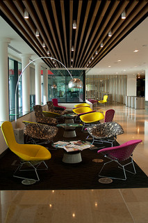
The photograph of Tim Radford, at The World's Most Improbable Event on 30 September, is copyright of Stevyn Colgan, and used with his gracious permission. You should read his blog, Colganology. The photograph of King's Place, the Guardian's office building, is by flickr user Davide Simonetti, licensed CC-BY-NC.

Cut the small print

We received a contract for a new piece of work recently. This wouldn't normally be worth remarking on, but this contract was special. It was different. It was 52 pages long.

It was so comically long that the contracts analyst at the company that sent it to me actually called me up before sending it to say, "The contract is comically long. It's just standard procedure. Sorry." Because it's so long, it's effectively all small print — if there's anything important in there, I'm unlikely to see it. The document bullies me into submission. I give in.

Unfortunately, this is a familiar story. Some (mostly non-lawyers) like Alan Siegel are trying to change it:

Before we all laugh derisively at lawyers, wait a second. Are you sure that everyone reads every word in your reports and emails? Do they look at every slide in your presentations? Do they listen to every word in your talks? 

If you suspect they don't, ask yourself why not. And then cut. Cut until all that's left is what matters. If there's other important stuff — exceptions, examples, footnotes, small print, legal jargon — move it somewhere and give people a link.

Wiki maniacs wanted

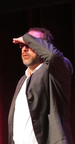
Jimmy Wales, saluting the crowd at Wikimania 2012Jimmy Wales (right) believes profoundly in the Wikimedia Foundation's mission:

Imagine a world in which every single person on the planet is given free access to the sum of all human knowledge. That's what we're doing.

If that mission sounds a bit grand, that's because it is. The amazing thing about this crusade, possibly the most altruistic and ambitious goal ever undertaken, is that you can help. The grand mission, should you choose to accept it, belongs to you—and to every other highly privileged, highly educated person you know.

Wikipedia needs you

One of the most surprising things I heard last week at Wikimania was that the number of active editors is falling, down 4000 since 2011 at 85 000. You can help fix it: 

  • Create an account to watch pages, change the look and behaviour of Wikipedia, and edit articles without revealing your IP address.
  • Next time you see something wrong or incomplete, edit it! Just click Edit.
  • Help improve articles on your home town, your hobbies, and your profession.
  • Pick a subject you care about (Well logging?) and look for red links, which are articles in need of creation.
  • Join a project like WikiProject:Geology to collaborate with other editors.
  • The Wikimedia Foundation runs on donations. Donate!
  • If you want somewhere to practise, use your Wikipedia Sandbox (requires an account), or poke around on SEGwiki or SubSurfWiki, where you're always welcome.

Imagine a world in which you can contribute to the sum of all human knowledge. That's what we have.

Wiki maniacs unite

Last year, we decided to go to at least one non-geoscience conference every year. The idea is to meet other communities, learn about other fields, have some new ideas, and find more ways to be useful. So far, Evan and I have been to symposiums on mathematics, geothermal energy, being more awesome, and science online. Continuing in this vein, I just got home from Wikimania 2012 — the international conference about all things wiki.

Strictly speaking, Wikimania is about the Wikimedia movement, the global effort to "give to every single person on the planet free access to the sum of all human knowledge". This quest is supported by the Wikimedia Foundation, a non-profit organization of professional enthusiasts. Their most conspicuous project is Wikipedia, but it's far from being the only one. Have you heard of Wikimedia Commons? Wikisource? Wikibooks? Read all about them.

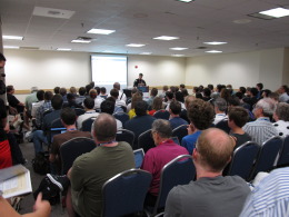
The conference was unlike anything I've ever been to. Despite attracting over 950 delegates, it felt more like a meeting of colleagues and friends than a conference of professionals and strangers. I've never felt such a strong undertow of common purpose, and quiet, deliberate action. The phrase intentional community was made for this group.

In short, Wikipedia looks even more awesome from the inside than it does from the outside.

If you too are a Wikipedia enthusiast, here are some things I learned:

  • The number of active editors has fallen by 4000 since 2011, to 85k
  • During the conference, the number of articles in English Wikipedia passed 4 million
  • Developers are working hard to make Wikipedia easier to edit, and big changes are coming
  • Wikipedia Zero is an important effort to make the site available to everyone
  • Developers are working on making Wikipedia available via SMS and other channels
  • Wikis—both private and public—are everywhere: schools, museums, libraries, galleries, academia, government, societies, and corporations

Next time, I'll list a few ways you can get more involved.

The photo is from Wikimedia Commons, licensed CC-BY-SA by User:Awersowy

Modern illuminations

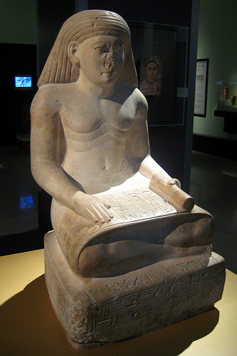
The illuminated manuscripts of the Middle Ages blended words and images, continuing traditions established by the Ancient Egyptians. Words and pictures go together: one without the other is a rather flat experience, like silent cinema, or eating fine food with a cold. This is why I like comic books so much. 

One of the opening sessions on Day 1 at the recent ScienceOnline conference was an hour with sketchnoter and überdoodler Perrin Ireland of Alphachimp Studio. She basically gave away all her secrets for purposeful scientific doodling. Tips like building a canon of fonts, practising icons and dividing lines, and honing an eye for the deft use of colour. 

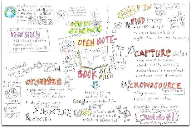
The result... well, I had a lot of fun scribing talks. Two of them I managed to get to a point we might call al dente, or maybe half baked. The first from a session on open notebook science, something that interests me quite a bit: 

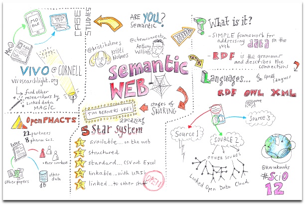
If it looks like you have to really listen and concentrate to produce one of these, that's because you do. I did miss bits, though, as I fretted over important things like what kind of robot to draw. And you might have noticed that I can't draw people. Yeah, I noticed that too. It didn't stop me adding them to the next one, from a session on the semantic web:

I'm not alone in my happiness at finding this sketchy new world. Perrin has given her perspective, and Michele Arduengo has written a lovely post about learning to draw science, and you can see many of the other efforts in this awesome Flickr gallery—the scratchings of amateurs like me sit half-convincingly alongside the professional pieces, and together I think they're rather wonderful.

Amenhotep image from Flickr user wallyg, licensed BY-NC-ND. All Flickr slideshow images are copyright of their respective creators, and may be subject to restrictions. All my work is licensed CC-BY.