5 ways to kickstart an interpretation project

Last Friday, teams around the world started receiving external hard drives containing this year's datasets for the AAPG's Imperial Barrel Award (IBA for short). I competed in the IBA in 2008 when I was a graduate student at the University of Alberta. We were coached by the awesome Dr Murray Gingras (@MurrayGingras), we won the Canadian division, and we placed 4th in the global finals. I was the only geophysical specialist on the team alongside four geology graduate students.

Five things to do

Whether you are a staff geoscientist, a contractor, or competitor, it can help to do these things first:

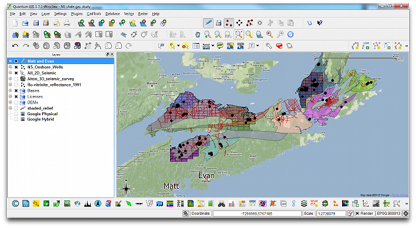
  1. Make a data availability map (preferably in QGIS or ArcGIS). A graphic and geospatial representation of what you have been given.
  2. Make well scorecards: as a means to demonstrate not only that you have wells, but what information you have within the wells.
  3. Make tables, diagrams, maps of data quality and confidence. Indicate if you have doubts about data origins, data quality, interpretability, etc.
  4. Background search: The key word is search, not research. Use Mendeley to organize, tag, and search through the array of literature
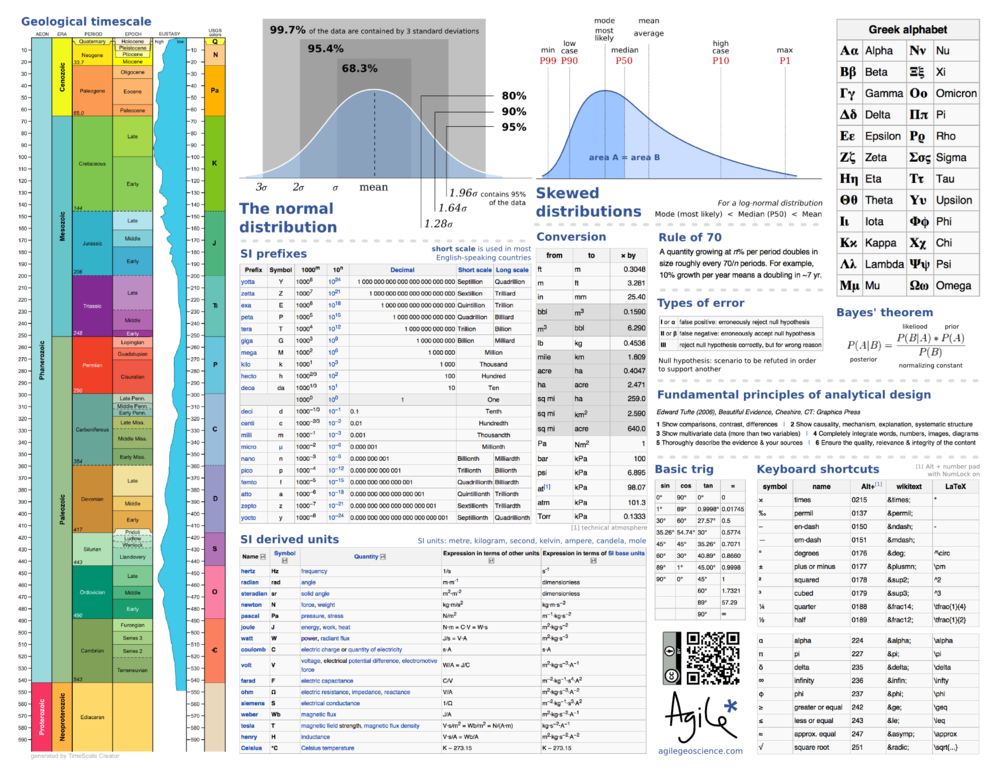
  5. Use Time-Scale Creator to make your own stratigraphic column. You can manipulate the vector graphic, and make it your own. Much better than copying an old published figure. But use it for reference.

All of these things can be done before assigning roles, before saying who needs to do what. All of this needs to be done before the geoscience and the prospecting can happen. To skirt around it is missing the real work, and being complacent. Instead of being a hammer looking for a nail, lay out your materials, get a sense of what you can build. This will enable educated conversations about how you can spend your geoscientific manpower, division of labour, resources, time, etc.

Read more, then go apply it 

In addition to these tips for launching out of the blocks, I have also selected and categorized blog posts that I think might be most relevant and useful. We hope they are helpful to all geoscientists, but especially for students. Visit the Agile blog highlights list on SubSurfWiki.

I wish a happy and exciting IBA competition to all participants, and their supporting university departments. If you are competing, say hi in the comments and tell us where you hail from. 

When to use vectors not rasters

In yesterday's post, I looked at advantages and disadvantages of various image formats. Some chat ensued in the comments and on Twitter about making drawings and figures and such. I realized I hadn't been very clear: when I say 'image', I really mean 'raster' or 'bitmap'. That is, a discretized (pixel-based) grid of data.

What are vector graphics?

Click to enlarge — see a simulation of the difference between vector and raster art.What I was not writing about was drawings and graphics combining text, lines, and images. Such files usually contain vector graphics. Vector graphics do not contain descriptions of pixels, but instead they contain descriptions and positions of text, paths, and polygons. Example file formats are:

  • SVGScalable Vector Graphics, an open format and web standard
  • AI — a proprietary format used by Adobe Illustrator
  • CDRCorelDRAW's proprietary format
  • PPT — pictures in Microsoft PowerPoint are vector format
  • SHP — shapefiles are a (mostly) generic vector format for GIS

One of the most important properties of vector graphics is that you can rescale it without worrying about changing the resolution — as in the example (right).

What are composite formats?

Vector and raster graphics can be combined in all sorts of ways, and vector files can contain raster images. They can therefore be used for very large displays like posters. But vector files are subject to interpretation by different software, may be proprietary, and have complex features like guides and layers that you may not want to expose to someone else. So when you publish or share your work it's often a good idea to export to either a high-res PNG, or a composite page description format:

  • PDFPortable Document Format, the closest thing to an open, ubiquitous format; stable and predictable.
  • EPSEncapsulated PostScript; the precursor to PDF, it's rarely called for today, unless PDF is giving you problems.
  • PSPostScript is a programming and page description language underlying EPS and PDF; avoid it.
  • CGMComputer Graphics Metafiles are best left alone. If you are stuck with them, complain loudly.

What software do I need?

Any time you want to add text, or annotation, or anything else to a raster, or you wish to create a drawing from scratch, vector formats are the way to go. There are several tools for creating such graphics:

Judging by figures I see submitted to journals, some people use Microsoft PowerPoint for creating vector graphics. For a simple figure, this may be fine, but for anything complex — curved or wavy lines, complicated filled objects, image effects, pattern fills — it is hard work. And the drawing tools listed above have some great advantages over PowerPoint — layers, tracing, guides, proper typography, and a hundred other things.

Plus, and perhaps I'm just being a snob here, figures created in PowerPoint make it look like you just don't care. Do yourself a favour: take half a day to teach yourself to use Inkscape, and make beautiful figures for the rest of your career.

How to choose an image format

Choosing a file format for scientific images can be tricky. It seems simple enough on the outside, but the details turn out to be full of nuance and gotchas. Plenty of papers and presentations are spoiled by low quality images. Don't let yours be one! Get to know your image editor (I recommend GIMP), and your formats.

What determines quality?

The factors determining the quality of an image are:

  • The number of pixels in the image (aim for 1 million)
  • The size of the image (large images need more pixels)
  • If the image is compressed, e.g. a JPG, the fidelity of the compression (use 90% or more)
  • If the image is indexed, e.g. a GIF, the number of colours available (the bit-depth)

Beware: what really matters is the lowest-quality version of the image file over its entire history. In other words, it doesn't matter if you have a 1200 × 800 TIF today, if this same file was previously saved as a 600 × 400 GIF with 16 colours. You will never get the lost pixels or bit-depth back, though you can try to mitigate the quality loss with filters and careful editing. This seems obvious, but I have seen it catch people out.

JPG is only for photographs

Click on the image to see some artifacts.The problem with JPG is that the lossy compression can bite you, even if you're careful. What is lossy compression? The JPEG algorithm makes files much smaller by throwing some of the data away. It 'decides' which data to discard based on the smoothness of the image in the wavenumber domain, in which the algorithm looks for a property called sparseness. Once discarded, the data cannot be recovered. In discontinuous data — images with lots of variance or hard edges — you might see artifacts (e.g. see How to cheat at spot the difference). Bottom line: only use JPG for photographs with lots of pixels.

Formats in a nutshell

Rather than list advantages and disadvantages exhaustively, I've tried to summarize everything you need to know in the table below. There are lots of other formats, but you can do almost anything with the ones I've listed... except BMP, which you should just avoid completely. A couple of footnotes: PGM is strictly for geeks only; GIF is alone in supporting animation (animations are easy to make in GIMP). 

All this advice could have been much shorter: use PNG for everything. Unless file size is your main concern, or you need special features like animation or georeferencing, you really can't go wrong.

There's a version of this post on SubSurfWiki. Feel free to edit it!

Polarity cartoons

...it is good practice to state polarity explicitly in discussions of seismic data, with some phrase such as: 'increase in impedance downwards gives rise to a red (or blue, or black) loop.'

Bacon, Simm & Redshaw (2003), 3D Seismic Interpretation, Cambridge

Good practice, but what a mouthful. And perhaps because it is such a cumbersome convention, it is often ignored, assumed, or skipped. We'd like to change that. Polarity is important, everyone needs to know what the wiggles (or colours) of seismic data mean.

Two important things

    Click the image to find your favorite colorbarSeismic data is about contrasts. The data are an abstraction of geological contrasts in the earth. To connect the data to the geology, there are two important things you need to know about your data:

  1. What do the colours mean in terms of digits?

  2. What do the digits mean in terms of impedance?

So whenever you show seismic to someone, you need to answers these questions for them. Show the colourbar, and the sign of the digits (the magnitude of the digits is not very important; amplitude are relative). Show the relationship between the sign of the digits and impedance.

Really useful

To help you show these things, we have created a table of polarity cartoons for some common colour scales.

  1. Decide if you want to use the American–Canadian convention of a downwards increase in impedance resulting in a positive amplitude, or the opposite European–Australian convention. Sometimes people talk about SEG Normal polarity — the de facto SEG standard is the American convention.

  2. Choose whether you want to show a high impedance layer sandwiched between low impedance ones, or vice versa. To make this decision, inspect your well ties or plot impedance against lithology. For example, if your sands are relatively fast and dense, you may want to choose the hard layer option.

  3. Select a colourmap that matches your displays. If you need another, you can download and edit the SVG file, or email us and we'll add it for you.

  4. Right-click on a thumbnail, copy it to your clipboard, and paste it into the corner of your section or timeslice in PowerPoint, Word, or wherever. If the thumbnail is too small or pixelated, click the thumbnail for higher resolution.

With so many options to choose from, we hope this little tool can help make your seismic discussions a little more transparent. What's more, if you see a seismic section without a legend like this, then are you sure the presenter knows about the polarity of their data? Perhaps they do, but it is an oversight to assume that you should know as well. 

What do you make your audience assume?


UPDATE [2020] — we built a small web app to serve up fresh polarity cartoons, whenever you need them! Check it out.

How to cheat at spot the difference

Yesterday I left you, dear reader, with a spot the difference puzzle. Here it is again, with my answer:

SpotTheDiff_result.png

Notice how my answer (made with GIMP) is not just a list of differences or a squiggly circle around each one. It's an exact map of the location and nature of every difference. I like the effect of seeing which 'direction' the difference goes in: blue things are in the left image but not the right. One flaw in this method is that I have reduced the image to a monochrome image; changes in colour only would not show up. 

Another way to do it, a way that would catch even a subtle colour change, is to simply difference the images. Let's look at a detail from the image—the yellow box; the difference is the centre image:

SpotDiff_More_examples.png

The right-hand image here is a further processing of the difference, using a process in ImageJ that inverts the pixels' values, making dark things bright and viceversa. This reveals a difference we would probably never have otherwise noticed: the footprint of the lossy JPEG compression kernel. Even though the two input images were compressed with 98% fidelity, we have introduced a subtle, but pervasive, artifact.

So what? Is this just an image processing gimmick? It depends how much you care about finding these differences. Not only was it easier to find all the differences this way, but now I know for certain that I have not missed any. We even see one or two very tiny differences that were surely unintentional (there's one just next to the cat's right paw). If differences (or similarities) mean a lot to you, because a medical prognosis or well location depends on their identification, the small ones might be very important!

Here's a small tutorial showing how I made the line difference, in case you are interested →

Rock physics cheatsheet

Today, I introduce to you the rock physics cheatsheet. It contains useful information for people working on problems in seismic rock physics, inversion, and the mechanical properties of rocks. Admittedly, there are several equations, but I hope they are laid out in a simple and systematic way. This cheatsheet is the third instalment, following up from the geophysics cheatsheet and basic cheatsheet we posted earlier. 

To me, rock physics is the crucial link between earth science and engineering applications, and between reservoir properties and seismic signals. Rocks are, in fact, a lot like springs. Their intrinsic elastic parameters are what control the extrinsic seismic attributes that we collect using seismic waves. With this cheatsheet in hand you will be able to model fluid depletion in a time-lapse sense, and be able to explain to somebody that Young's modulus and brittleness are not the same thing.

So now with 3 cheatsheets at your fingertips, and only two spaces on the inside covers of you notebooks, you've got some rearranging to do! It's impossible to fit the world of seismic rock physics on a single page, so if you feel something is missing or want to discuss anything on this sheet, please leave a comment.

Click to download the PDF (1.5MB)

How to make a strat column

A few weeks ago I posted about the brilliant TSCreator, a Java application for creating custom geological timescales. One of the nicest features of this tool is that you can create your own lithostratigraphic columns, stick charts, transgression-regression plots, isotope curves, etc. It's a slightly fiddly process, so I wanted to try to give some pointers; this post is about how to make a simple lithostrat column. The other column types are built in a similar way; the full details are described in the Manual (starting on page 20). 

The example I'm showing is the Western Cape Breton column, as given by the Nova Scotia Geological Highway Map. I can't vouch for its accuracy as I've never worked this section; I built it purely to show the method. You can see the result here >

You build the data file, which TSCreator calls a Datapack, in a spreadsheet. I use Google Docs, but you can use any tool you like (OpenOffice.org, Microsoft Excel etc), as long as it will save a tab-delimited text file. The spreadsheet has a header and a data section; here's what the header looks like in my example:

format version: 1.4
date: 10/02/2011
Chart Title: Western Cape Breton
age units: Ma

You can see my example file here (opens in Google Docs). To use it, first save it as a text file: Google Docs > File > Download as > Text. Give it a .txt extension when you get the chance. Then launch TSCreator and select File > Add Datapack. If you get an error it's probably because you have violated one of the formatting rules. It may take some back and forth to get it how you want it.

Finally, I just made the unhappy discovery that you cannot save your chart after you load a custom datapack. Apparently to export an image or SVG file (my preference), you need TS-Creator Pro. Or you get very clever with screen grabs!

If you have your own tips, please leave them in the comments!

Note, TimeScale Creator is a trademark of the Geologic TimeScale Foundation. I am not connected with the software or its creators in any way. Microsoft Excel is a trademark of Microsoft Corporation. Java is a trademark of Oracle Corporation.

The Agile* interpreter's canon

There are only two types of interpretation: those that have been revised and those that need to be.
Don Herron

As Matt mentioned before, we have been forming a concept we call agile interpretation.

Perhaps the essence of the adage "seismic interpretation is an art" suggests that there shouldn't really be a hard and fast set of rules; but having no rules begets chaos and stagnation. We think seismic interpretation is a craft. As with any craft, harnessing skill and creativity enable richer and more meaningful results. Working within a framework of principles allows one's art to flourish; paint not only with brighter, more appealing colors, but with more tailored technique for putting brush to canvas.

We have created this one-page guide as reference for seismic interpreters. Pull it out before starting, a few times in the middle, and then as a checklist or summary nearing completion of your project. We hope it's valuable for the newbie, for sorting out a plan of attack, and for seasoned veterans, to refresh work-worn concepts and tools.

We're looking to get consensus here on the things people actually do when they interpret seismic; this is very much a straw man. Maybe you have adopted some tricks that aren't obivous to the rest of us. Please leave a message in the comments section of this entry if you have any tips that would improve this handout.

Happy interpreting!

Geophysics cheatsheet

A couple of weeks ago I posted the first cheatsheet, with some basic science tables and reminders. The idea is that you print it out, stick it in the back of your notebook, and look like a genius and/or smart alec next time you're in a meeting and someone asks, "How long was the Palaeogene?" (21 Ma) or "Is the P50 the same as the Most Likely? I can never remember," (no, it's not).

Today I present the next instalment: a geophysics cheatsheet. It contains mostly basic stuff, and is aimed at the interpreter rather than the weathered processor or number-crunching seismic analyst. I have included Shuey's linear approximation of the Zoeppritz equations; it forms the basis for many simple amplitude versus offset (AVO) analyses. But there's also the Aki–Richards equation, which is often used in more advanced pre-stack AVO analysis. There are some reminders of typical rock properties, modes of seismic multiples, and seismic polarity. 

As before, if there's anything you think I've messed up, or wrongly omitted, please leave a comment. We will be doing more of these, on topics like rock physics, core description, and log analysis. Further suggestions are welcome!

Click to download the PDF (1.6MB)

Basic cheatsheet

When I was a spotty schoolboy my favourite book was the Science Data Book. This amazing little book, which fit in my jacket pocket (we wore suits to school), went everywhere with me. Everywhere at school, I mean, I'm not that much of a nerd.

It contains some really handy stuff: the Greek alphabet, SI unit definitions, the periodic table, the fundamental constants, handy formulae like the Maclaurin series, (remember that?), and even a very nice table of isotopes (did you know that the half-life of vanadium-50 is 400 trillion years?).

Amazingly, there are some used copies of that little book on Amazon

You might think that in these days of smartphones and WiFi everywhere there's no need for such things. But have you never sat in a meeting or lecture and just couldn't remember how many acres in a hectare (2.47), or when the Silurian was (417 Ma BP)? Usually it's too much hassle to pull out my phone, then find Wikipedia and the one piece of data I need. Especially when tapping away on a cell phone looks like you're texting someone 'So bored, please get me out of this meeting, call me in 5 mins?'.

So, I give you the first in a series of cheatsheets. This one has mostly basic stuff on it; future editions will have more geoscience-related content. Print it out and stick in your notebook, or maybe on your wall, right next to Signs & Symbols.

If you use it, please let me know what you like or dislike, so I can improve it. Have I missed anything you're always looking up?

← Click on the image for the PDF