Future proof

Last week I wrote about the turmoil many subsurface professionals are experiencing today. There’s no advice that will work for everyone, but one thing that changed my life (ok, my career at least) was learning a programming language. Not only because programming computers is useful and fun, but also because of the technology insights it brings. Whether you’re into data management or machine learning, workflow automation or just being a more rounded professional, there really is no faster way to build digital muscles!

learn_python_thumb_2.png

Six classes

We have six public classes coming up in the next few weeks. But there are thousands of online and virtual classes you can take — what’s different about ours? Here’s what I think:

  • All of the instructors are geoscientists, and we have experience in sedimentology, geophysics, and structural geology. We’ve been programming in Python for years, but we remember how it felt to learn it for the first time.

  • We refer to subsurface data and typical workflows throughout the class. We don’t use abstract or unfamiliar examples. We focus 100% on scientific computing and data visualization. You can get a flavour of our material from the X Lines of Python blog series.

  • We want you to be self-sufficient, so we give you everything you need to start being productive right away. You’ll walk away with the full scientific Python stack on your computer, and dozens of notebooks showing you how to do all sorts of things from loading data to making a synthetic seismogram.

Let’s look at what we have on offer.

python_examples.png

Upcoming classes

We have a total of 6 public classes coming up, in two sets of three classes: one set with timing for North, Central and South America, and one set with timing for Europe, Africa, and the Middle East. Here they are:

  • Intro to Geocomputing, 5 half-days, 15–19 Feb — 🌎 Timing for Americas — 🌍 Timing for Europe & Africa — If you’re just getting started in scientific computing, or are coming to Python from another language, this is the class for you. No prerequisites.

  • Digital Geology with Python, 4 half-days, 22–25 Feb — 🌍 Timing for Europe & Africa — A closer look at geological workflows using Python. This class is for scientists and engineers with some Python experience.

  • Digital Geophysics with Python, 4 half-days, 22–25 Feb — 🌎 Timing for Americas — We get into some geophysical workflows using Python. This class is for quantitative scientists with some Python experience.

  • Machine Learning for Subsurface, 4 half-days in March — 🌎 Timing for Americas (1–4 Mar) — 🌍 Timing for Europe & Africa (8–11 Mar) — The best way into machine learning for earth scientists and subsurface engineers. We give you everything you need to manage your data and start exploring the world of data science and machine learning.

Follow the links above to find out more about each class. We have space for 14 people in each class. You find pricing options for students and those currently out of work. If you are in special circumstances, please get in touch — we don’t want price to be a barrier to these classes.

In-house options

If you have more than about 5 people to train, it might be worth thinking about an in-house class. That way, the class is full of colleagues learning things together — they can speak more openly and share more freely. We can also tailor the content and the examples to your needs more easily.

Get in touch if you want more info about this approach.

No going back

At last, 2021 is fully underway. There’s a Covid vaccine. The president of the US is not deranged. Brexit is essentially over. We can go back to normal now, right? Soon anyway… after the summer… right?

No.

There is no ‘back’ on this thing, only forward. Even if there was a back, there is no ‘normal’.

So, as comforting as they are, I try to avoid ideas like ‘recovery’, or ‘getting back to normal’. Instead, I look forward to different — and better — things tomorrow.

You can’t go back

In spite of what you might have gathered from a certain Christoper Nolan movie, the arrow of time only points in one direction: from the past to the future. Sometimes this seems scary, because you can’t control the future. But, unlike the past, you can affect it. Specifically, you can improve it.

The price is uncertainty, because we don’t know what the future holds. If you work in the petroleum industry, debilitating uncertainty is a familiar sensation. I feel like people have been looking forward to ‘the recovery’ for as long as I can remember. People refer to the short-period (roughly 5-year) ups and downs as ‘cyclic’, but that’s not what it is. It never returns to its previous state. Ever. It’s more of a spiral in the multi-dimensional universe, never seeing the same world twice. And it’s not a pretty spiral, because it’s not going anywhere in particular (except, in the case of the oil industry, down).

There are no cycles, returning the world to some previous state now and then. Thank goodness! Instead, we have more of a random walk in a high-dimensional space, never returning to the same state. This is absolutely simplistic, and hard to draw in 2…

There are no cycles, returning the world to some previous state now and then. Thank goodness! Instead, we have more of a random walk in a high-dimensional space, never returning to the same state. This is absolutely simplistic, and hard to draw in 2D… but you get the idea.

The thing is, the world is a complex system, full of feedback and nonlinearity. Changing one thing changes a hundred other things. So the world after an earth-juddering event like the Covid pandemic is not the same as the world before that event. A great many things have changed completely, for example:

  • Working from home means that millions of people have an extra hour or two in their day. That’s hard to roll back.

  • Some industries have been crushed (airlines, hospitality), others have exploded (try and buy a bicycle!).

  • We’ve been shown a new, more inclusive, more accessible, more sustainable way to run events and conferences.

A nudge to adapt

Even if you could go back, do you want to? Sometimes, of course, it’s human nature. We miss people we’ve lost, or feelings we cherished, and it’s comforting to remember old times. And the future will hold new people and new experiences. But it’s impossible to forget that the ‘good old days’ were not awesome for everyone. The 1970’s were filled with overt racism and sexism. The 1980’s saw unfettered capitalism and the palpable threat of nuclear war. The hey-days of the oil industry were tainted by corruption and frequent environmental catastrophe. No-one wants to go back to those things.

If we think of ourselves as evolving beings, then maybe it helps to look at what’s happening around us as environmental pressure. It’s a nudge — or a series of nudges, and unusually big ones at the moment — to adapt. We (ourselves, our families, our employers, our technical societies) can choose to ignore them and try to get ‘back to normal’ for a while. Or we can pay attention and get ready for whatever is next.

Change you didn’t choose is uncomfortable, even scary. But much of the discomfort comes from shielding yourself from the change — waiting it out with gritted teeth — instead of adapting to it. Adaptation isn’t easy either, it takes daily effort to learn new ways to be productive, acquire new skills to help society, and keep on moving towards the things that bring fulfilment. And I think leaving behind the “back to normal” mindset is step 1.


What do you think? Are you sticking to the ‘white knuckle’ strategy, or have you started adjusting course? Let us know in the comments.

Openness is a two-way street

Last week the Data Analysis Study Group of the SPE Gulf Coast Section announced a new machine learning contest (I’m afraid registration is now closed, even though the contest has not started yet). The task is to predict shear-wave sonic from other logs, similar to the SPWLA PDDA contest last year. This is a valuable problem in the subsurface, because shear sonic log is essential for computing elastic properties of rocks and therefore in predicting rock and fluid properties or processing seismic. Indeed, TGS have built a business on predicted logs with their ARLAS product. There’s money in log prediction!

The task looks great, but there’s one big problem: the dataset is not open.

Why is this a problem?

Before answering that, let’s look at some context.

What’s a machine learning contest?

Good question. Typically, an organization releases a dataset (financial timeseries, Netflix viewer data, medical images, or whatever). They invite people to predict some valuable property (when to sell, which show to recommend, how to treat the illness, or whatever). And they pick the best, measured against known labels on a hidden dataset.

Kaggle is one of the largest platforms hosting such challenges, and they often attract thousands of participants — competing for large prizes. TGS ran a seismic salt-picking contest on the platform, attracting almost 74,000 submissions from 3220 teams with a $100k prize purse. Other contests are more grass-roots, like the one I ran with Brendon Hall in 2016 on lithology prediction, and like this SPE contest. It’s being run by a team of enthusiasts without a lot of resources from SPE, and the prize purse is only $1000 — representing about 3 hours of the fully loaded G&A of an oil industry professional.

What has this got to do with reproducibility?

Contests that award a large prize in return for solving a hard problem are essentially just a kind of RFP-combined-with-consulting-job. It’s brutally inefficient: hundreds or even thousands of people spend hours on the problem for free, and a handful are financially rewarded. These contests attract a lot of attention, but I’m not that interested in them.

Community-oriented events like this SPE contest — and the recent FORCE one that Xeek hosted — are more interesting and I believe they are more impactful. They have lots of great outcomes:

  • Lots of people have fun working on a hard problem and connecting with each other.

  • Solutions are often shared after, or even during, the contest, so that everyone learns and grows their toolbox.

  • A new open dataset that might even become a much-needed benchmark for the task in hand.

  • Researchers can publish what they did, or do later. (The SEG ML contest tutorial and results article have 136 citations between them, largely from people revisiting the dataset to show new solutions.)

A lot of new open-source machine learning code is always exciting, but if the data is not open then the work is by definition not reproducible. It seems especially unfair — cheeky, even — to ask participants to open-source their code, but to keep the data proprietary. For sure TGS is interested in how these free solutions compare to their own product.

Well, life’s not fair. Why is this a problem?

The data is being shared with the contest participants on the condition that they may not share it. In other words it’s proprietary. That means:

  • Participants are encumbered with the liability of a proprietary dataset. Sure, TGS is sharing this data in good faith today, but who knows how future TGS lawyers will see it after someone accidentally commits it to their GitHub repo? TGS is a billion-dollar company, they will win a legal argument with you. (Having said that, there’s no NDA or anything, just a checkbox in a form. I don’t know how binding it really is… but I don’t want to be the one that finds out.)

  • Participants can’t publish reproducible papers on their own work. They can publish classic oil-indsutry, non-reproducible work — I did this thing but no-one can check it because I can’t give you the data — but do we really need more of that? (In the contest introductory Zoom, someone asked about publishing plots of the data. The answer: “It should be fine.” Are we really still this naive about data?)

If anyone from TGS is reading this and thinking, “Come on, we’re not going to sue anyone — we’re not GSI! — it’s fine :)” then my response is: Wonderful! In that case, why not just formalize everything by releasing the data under an open licence — preferably Creative Commons Attribution 4.0? (Unmodified! Don’t make the licensing mistakes that Equinor and NAM have made recently.) That way, everyone knows their rights, everyone can safely download the data, and the community can advance. And TGS looks pretty great for contributing an awesome dataset to the subsurface machine learning community.

I hope TGS decides to release the data with an open licence. If they don’t, it feels like a rather one-sided deal to me. And with the arrangement as it stands, there’s no way I would enter this contest.

Illuminated equations

Last year I wrote a post about annotated equations, and why they are useful teaching tools. But I never shared all the cool examples people tweeted back, and some of them are too good not to share.

Let’s start with this one from Andrew Alexander that he uses to explain complex number notation:

illuminated_complex.png

Paige Bailey tweeted some examples of annotated equations and code from the reinforcement learning tutorial, Building a Powerful DQN in TensorFlow by Sebastian Theiler. Here’s one of the algorithms, with slightly muted annotations:

Illuminated_code_Theiler_edit.jpeg.png

Finally, Jesper Dramsch shared a new one today (and reminded me that I never finished this post). It links to Edward Raff’s book, Inside Deep Learning, which has some nice annotations, e.g. expressing a fundamental idea of machine learning:

Raff_cost_function.png

Dynamic explication

The annotations are nice, but it’s quite hard to fully explain an equation or algorithm in one shot like this. It’s easier to do, and easier to digest, over time, in a presentation. I remember a wonderful presentation by Ross Mitchell (then U of Calgary) at the also brilliant lunchtime mathematics lectures that Shell used to sponsor in Calgary. He unpeeled time-frequency analysis, especially the S transform, and I still think about his talk today.

What Ross understood is that the learner really wants to see the maths build, more or less from first principles. Here’s a nice example — admittedly in the non-ideal medium of Twitter: make sure you read the whole thread — from Darrel Francis, a cardiologist at Imperial Colege, London:

A video is even more dynamic of course. Josef Murad shared a video in which he derives the Navier–Stokes equation:

In this video, Grant Sanderson, perhaps the equation explainer nonpareil, unpacks the Fourier transform. He creeps up on the equation, starting instead with building the intuition around frequency decomposition:

If you’d like to try making this sort of thing, you might like to know that Sanderson’s Python software, manim, is open source.


Multi-modal explication

Sanderson illustrates nicely that the teacher has several pedagogic tools at their disposal:

  • The spoken word.

  • The written word, especially the paragraph describing a function.

  • A symbolic representation of the function.

  • A graphical representation of the function.

  • A code representation of the function, which might also have a docstring, which is a formal description of the code, its inputs, and its outputs. It might also produce the graphical representation.

  • Still other modes, e.g. pseudocode (see Theiler’s example, above), a cartoon (esssentially a ‘pseudofigure’),

Virtually all of these things are, or can be dynamic (in a video, on a whiteboard) and annotated. They approach the problem from different directions. The spoken and written descriptions should be rigorous and unambiguous, but this can make them clumsy. Symbolic maths can be useful to those that can read it, but authors must take care to define symbols properly and to be consistent. The code representation must be strict (assuming it works), but might be hard for non-programmers to parse. Figures help most people, but are more about building intuition than providing the detail you might need for implementation, say. So perhaps the best explanations have several modes of explication.

In this vein of multi-modal explication, Jeremy Howard shared a nice example from his book, Deep learning for coders, of combining text, symbolic maths, and code:

illuminated_jeremy_howard.png

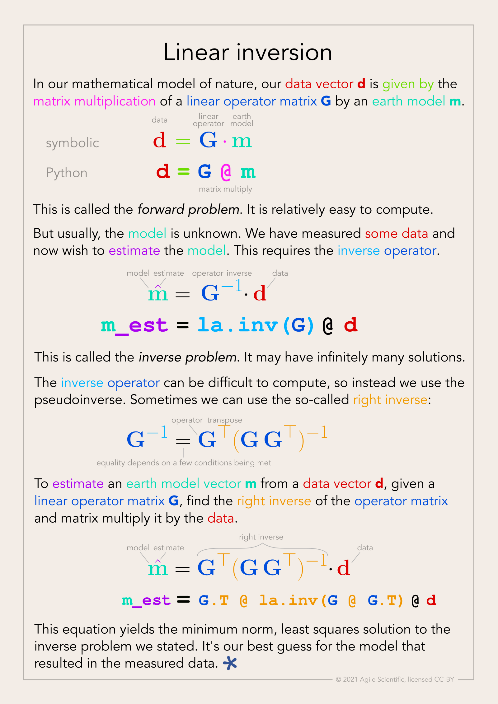
Eventually I settled on calling these things, that go beyond mere annotation, illuminated equations (not to directly compare them to the beautiful works of devotion produced by monks in the 13th century, but that’s the general idea). I made an attempt to describe linear regression and the neural network equation (not sure what else to call it!) in a series of tweets last year. Here’s the all-in-one poster version (as a PDF):

linear_inversion_page.png

There’s nothing intuitive about physics, maths, or programming. The more tricks we have for spreading intuition about these important scientific tools, the better. I think there’s something in illuminated equations for teachers to practice — and students too. In fact, Jackie Caplan-Auerbach decribes coaching her students in creating ‘equation dictionaries’ in her geophysics classes. I think this is a wonderful idea.

If you’re teaching or learning maths, I’d love to hear your thoughts. Are these things worth the effort to produce? Do you have any favourite examples to share?

Machine learning safety measures

Yesterday in Functional but unsafe machine learning I wrote about how easy it is to build machine learning pipelines that yield bad predictions — a clear business risk. Today I want to look at some ways we might reduce this risk.


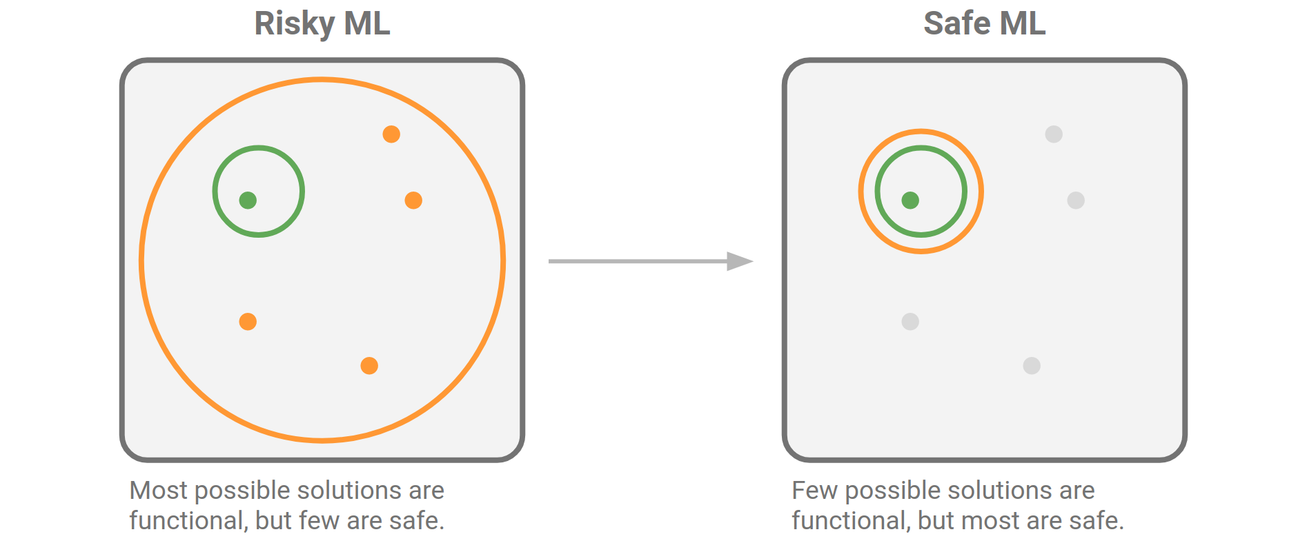
The diagram I shared yesterday tries to illustrate the idea that it’s easy to find a functional solution in machine learning, but only a few of those solutions are safe or fit for purpose. The question to ask is: what can we do about it?

Engineered_system_failure_types.png

You can’t make bad models safe, so there’s only one thing to do: shrink the field of functional models so that almost all of them are safe:

Engineered_system_safer_ML.png

But before we do this any old way, we should ask why the orange circle is so big, and what we’re prepared to do to shrink it.

Part of the reason is that libraries like scikit-learn, and the Python ecosystem in general, are very easy to use and completely free. So it’s absolutely possible for any numerate person with a bit of training to make sophisticated machine learning models in a matter of minutes. This is a wonderful and powerful thing, unprecedented in history, and it’s part of why machine learning has been so hot for the last 6 or 8 years.

Given that we don’t want to lose this feature, what actions could we take to make it harder to build bad models? How can we improve over time like aviation has, and without premature regulation? Here are some ideas:

  • Fix and maintain the data pipeline (not the data!). We spend most of our time getting training and validation data straight, and it always makes a big difference to the outcomes. But we’re obsessed with fixing broken things (which is not sustainable), when we should be coping with them instead.

  • Raise the digital literacy rate: educate all scientists about machine learning and data-driven discovery. This process starts at grade school, but it must continue at university, through grad school, and at work. It’s not a ‘nice to have’, it’s essential to being a scientist in the 21st century.

  • Build software to support good practice. Many of the problems I’m talking about are quite easy to catch, or at least warn about, during the training and evaluation process. Unscaled features, class imbalance, correlated features, non-IID records, and so on. Education is essential, but software can help us notice and act on them.

  • Evolve quality assurance processes to detect ML smell. Organizations that are adopting (building or buying) machine learning (i.e. all of them), must get really good at sniffing out problems with machine learning projects — then fixing those problems — and at connecting practitioners so they can learng together and share good practice.

  • Recognizing that machine learning models are made from code, and must be subject to similar kinds of quality assurance. We should adopt habits such as testing, documentation, code review, continuous integration, and issue tracking for users to report bugs and request enhancements. We already know how to do these things.

I know some of this might sound like I’m advocating command and control, but that approach is not compatible with a lean, agile organization. So if you’re a CTO reading this, the fastest path to success here is not hiring a know-it-all Chief Data Officer from a cool tech giant, then brow-beating your data science practitioners with Best Practice documents. Instead, help your digital professionals create a high-functioning community of practice, connected both inside and outside the organizations, and support them learning and adapting together. Yes it takes longer, but it’s much more effective.

What do you think? Are people already doing these things? Do you see people using other strategies to reduce the risk of building poor machine learning models? Share your stories in the comments below.

Functional but unsafe machine learning

There are always more ways to mess something up than to get it right. That’s just statistics, specifically entropy: building things is a fight against the second law of thermodynamics. And while messing up a machine learning model might sound abstract, it could result in poor decisions, leading to wasted resources, environmental risk, or unsafe conditions.

Okay then, bad solutions outnumber good solutions. No problem: we are professionals, we can tell the difference between good ones and bad ones… most of the time. Sometimes, though, bad solutions are difficult to discern — especially when we’re so motivated to find good solutions to things!

How engineered systems fail

A machine learning pipeline is an engineered system:

Engineered system: a combination of components that work in synergy to collectively perform a useful function

Some engineered systems are difficult to put together badly because when you do, they very obviously don't work. Not only can they not be used for their intended purpose, but any lay person can tell this. Take a poorly assembled aeroplane: it probably won’t fly. If it does, it then has safety criteria to meet. So if you have a working system, you're happy.

There are multiple forces at work here: decades of industrial design narrow the options, physics takes care of big chunk of failed builds, strong regulation takes care of almost all of the rest, and daily inspections keep it all functional. The result: aeroplane accidents are very rare.

In other domains, systems can be put together badly and still function safely. Take cookery — most of the failures are relatively benign, they just taste horrible. They are not unsafe and they 'function' insofar as they sustain you. So in cookery, if you have a working system, you might not be happy, but at least you're alive.

Where does machine learning fit? Is it like building aeroplanes, or cooking supper? Neither.

Engineered_system_failure_types.png

Machine learning with modern tools combines the worst of both worlds: a great many apparently functional but malignantly unfit failure modes. Broken ML models appear to work — given data \(X\), you get predictions \(\hat{y}\) — so you might think you're happy… but the predictions are bad, so you end up in hospital with food poisoning.

What kind of food poisoning? It ranges from severe and acute malfunction to much more subtle and insidious errors. Here are some examples:

  • Allowing information leakage across features or across records, resulting in erroneously high accuracy claims. For example, splitting related (e.g. nearby) records into the training and validation sets.

  • Not accounting for under-represented classes so that predictions are biased towards over-represented ones. This kind of error was common to see in the McMurray Formation of Alberta, which is 80% pay.

  • Forgetting to standardize or normalize numerical inputs to a model in production, producing erroneous predictions. For example, training on gamma-ray Z-scores of roughly –3 to +3, then asking for a prediction for a value of 75.

  • Using cost functions that do not reflect the opinions of humans with expertise about ‘good’ vs ‘bad’ predictions.

  • Racial or gender bias in a human resource model, such as might be used for hiring or career mapping.

Tomorrow I’ll suggest some ways to build safe machine learning models. In the meantime, please share what you think about this idea. Does it help to think about machine learning failures this way? Do you have another perspective? Let me know in the comments below.


UPDATE on 7 January 2021: Here’s the follow-up post, Machine learning safety measures >


Like this? Check out these other posts about quality assurance and machine learning:

Looking forward to 2021

I usually write a ‘lookback’ at this time of year, but who wants to look back on 2#*0? Instead, let’s look forward to 2021 and speculate wildly about it!

More ways to help

Agile has always been small and nimble, but the price we pay is bandwidth: it’s hard to help all the people we want to help. But we’ve taught more than 1250 people Python and machine learning since 2018, and supporting this new community of programmers is our priority. Agile will be offering some new services in the new year, all aimed at helping you ‘just in time’ — what you need, when you need it — so that those little glitches don’t hold you up. The goal is to accelerate as many people as possible, but to be awesome value. Stay tuned!

We are still small, but we did add a new scientist to the team this year: Martin Bentley joined us. Martin is a recent MSc geology graduate from Nelson Mandela University in Port Elizabeth, South Africa. He’s also a very capable Python programmer and GIS wizard, as well as a great teacher, and he’s a familiar face around the Software Underground too.

Martin2.jpeg

All over the world

While we’ll be making ourselves available in new ways in 2021, we’ll continue our live classes too — but we’ll be teaching in more accessible ways and in more time zones. This year we taught 29 virtual classes for people based in Los Angeles, Calgary, Houston, Bogotá, Rio de Janeiro, Glasgow, London, Den Haag, Krakow, Lagos, Brunei, Muscat, Tunis, Kuala Lumpur, and Perth. Next year I want to add Anchorage, Buenos Aires, Durban, Reykjavik, Jakarta, and Wellington. The new virtual world has really driven home to me how inaccessible our classes and events were — we will do better!

Public classes appear here when we schedule them: https://agilescientific.com/training

Maximum accessibility

The event I’m most excited about is TRANSFORM 2021 (mark your calendar: 17 to 23 April!), the annual virtual meeting of the Software Underground. The society incorporated back in April, so it’s now officially a technical society. But it’s unlike most other technical societies in our domain: it’s free, and — so far anyway — it operates exclusively online. Like this year, the conference will focus on helping our community acquire new skills and connections for the future. Want to be part of it? Get notified.

april-2021-big.png

agile-open_star_600px.png

Thank you for reading our blog, following Agile, and being part of the digital subsurface community. If you’re experiencing uncertainty in your career, or in your personal life, I hope you’re able to take some time out to recharge over the next couple of weeks. We can take on 2021 together, and meet it head on — not with a plan, but with a purpose.

Does your machine learning smell?

Martin Fowler and Kent Beck popularized the term ‘code smell’ in the book Refactoring. They were describing the subtle signs of deeper trouble in code — signs that a program’s source code might need refactoring (restructuring and rewriting). There are too many aromas to list here, but here are some examples (remember, these things are not necessarily problems in themselves, but they suggest you need to look more closely):

  • Duplicated code.

  • Contrived complexity (also known as showing off).

  • Functions with many arguments, suggesting overwork.

  • Very long functions, which are hard to read.

More recently, data scientist Felienne Hermans applied the principle to the world’s number one programming environment: spreadsheets. The statistics on spreadsheet bugs are quite worrying, and Hermans enumerated the smells that might lead you to them. Here are four of her original five ‘formula’ smells, notice how they correspond to the code smells above:

  • Duplicated formulas.

  • Conditional complexity (e.g. nested IF statements).

  • Multiple references, analogous to the ‘many arguments’ smell.

  • Multiple operations in one cell.

What does a machine learning project smell like?

Most machine learning projects are code projects, so some familiar smells might be emanating from the codebase (if we even have access to it). But machine learning models are themselves functions — machines that map input X to some target y. And even if the statistical model is simple, like a KNN classifier, the workflow is a sort of ‘metamodel’ and can have complexities of its own. So what are the ‘ML smells’ that might alert us to deeper problems in our prediction tools?

I asked this question on Twitter (below) and in the Software Underground

I got some great responses. Here are some ideas adapted from them, with due credit to the people named:

  • Very high accuracy, especially a complex model on a novel task. (Ari Hartikainen, Helsinki and Lukas Mosser, Athens; both mentioned numbers around 0.99 but on earth science problems I start to get suspicious well before that: anything over 0.7 is excellent, and anything over 0.8 suggests ‘special efforts’ have been made.)

  • Excessive precision on hyperparameters might suggest over-tuning. (Chris Dinneen, Perth)

  • Counterintuitive model weights, e.g. known effects have low feature importance. (Reece Hopkins, Anchorage)

  • Unreproducible, non-deterministic code, e.g. not setting random seeds. (Reece Hopkins again)

  • No description of the train–val–test split, or justification for how it was done. Leakage between training and blind data is easy to introduce with random splits in spatially correlated data. (Justin Gosses, Houston)

  • No discussion of ground truth and how the target labels relate to it. (Justin Gosses again)

  • Less than 80% of the effort spent on preparing the data. (Michael Pyrcz, Austin — who actually said 90%)

  • No discussion of the evaluation metric, eg how it was selected or designed (Dan Buscombe, Flagstaff)

  • No consideration of the precision–recall trade-off, especially in a binary classification task. (Dan Buscombe again)

  • Strong class imbalance and no explicit mention of how it was handled. (Dan Buscombe again)

  • Skewed feature importance (on one or two features) might suggest feature leakage. (John Ramey, Austin)

  • Excuses, excuses — “we need more data”, “the labels are bad”, etc. (Hallgrim Ludvigsen, Stavanger)

  • AutoML, e.g. using a black box service, or an exhaustive automated seach of models and hyperparameters.

That’s already a long list, but I’m sure there are others. Or perhaps some of these are really the same thing, or are at least connected. What do you think? What red — or at least yellow — flags do you look out for when reviewing machine learning projects? Let us know in the comments below.


If you enjoyed this post, check out the Machine learning project review checklist I wrote bout last year. I’m currently working on a new version of the checklist that includes some tips for things to look for when going over the checklist. Stay tuned for that.


The thumbnail for this post was generated automatically from text (something like, “a robot smelling a flower”… but I made so many I can’t remember exactly!). Like a lot of unconstrained image generation by AI’s, it’s not great, but I quite like it all the same.

The AI is LXMERT from the Allen Institute. Try it out or read the paper.

download (7).png

An update on Volve

Writing about the new almost-open dataset at Groningen yesterday reminded me that things have changed a little on Equinor’s Volve dataset in Norway. Illustrating the principle that there are more ways to get something wrong than to get them right, here’s the situation there.


In 2018, Equinor generously released a very large dataset from the decommissioned field Volve. The data is undoubtedly cool, but initially it was released with no licence. Later in 2018, a licence was added but it was a non-open licence, CC BY-NC-SA. Then, earlier this year, the licence was changed to a modified CC BY licence. Progress, sort of.

I think CC BY is an awesome licence for open data. But modifying licences is always iffy and in this case the modifications mean that the licence can no longer be called ‘open’, because the restrictions they add are not permitted by the Open Definition. For me, the problematic clauses in the modification are:

  • You can’t sell the dataset. This is almost as ambiguous as the previous “non-commercial” clause. What if it’s a small part of a bigger offering that adds massive value, for example as demo data for a software package? Or as one piece in a large data collection? Or as the basis for a large and expensive analysis? Or if it was used to train a commercial neural network?

  • The license covers all data in the dataset whether or not it is by law covered by copyright. It's a bit weird that this is tucked away in a footnote, but okay. I don't know how it would work in practice because CC licenses depend on copyright. (The whole point of uncopyrightable content is that you can't own rights in it, nevermind license it.)

It’s easy to say, “It’s fine, that’s not what Equinor meant.” My impression is that the subsurface folks in Equinor have always said, "This is open," and their motivation is pure and good, but then some legal people get involved and so now we have what we have. Equinor is an enormous company with (compared to me) infinite resources and a lot of lawyers. Who knows how their lawyers in a decade will interpret these terms, and my motivations? Can you really guarantee that I won’t be put in an awkward situation, or bankrupted, by a later claim — like some of GSI’s clients were when they decided to get tough on their seismic licenses?

Personally, I’ve decided not to touch Volve until it has a proper open licence that does not carry this risk.

A big new almost-open dataset: Groningen

Open data enthusiasts rejoice! There’s a large new openly licensed subsurface dataset. And it’s almost awesome.

The dataset has been released by Dutch oil and gas operator Nederlandse Aardolie Maatschappij (NAM), which is a 50–50 joint venture between Shell and ExxonMobil. They have operated the giant Groningen gas field since 1963, producing from the Permian Rotliegend Group, a 50 to 225 metre-thick sandstone with excellent reservoir properties. The dataset consists of a static geological model and its various components: data from over [edit: 6000 well logs], a prestack-depth migrated seismic volume, plus seismic horizons, and a large number of interpreted faults. It’s 4.4GB in total — not ginormous.

Induced seismicity

There’s a great deal of public interest in the geology of the area: Groningen has been plagued by induced seismicity for over 30 years. The cause has been identified as subsidence resulting from production, and became enough of a concern that the government took steps to limit production in 2014, and has imposed a plan to shut down the field completely by 2030. There are also pressure maintenance measures in place, as well as a lot of monitoring. However, the earthquakes continue, and have been as large as magnitude 3.6 — a big worry for people living in the area. I assume this issue is one of the major reasons for NAM releasing the data.*

In the map of the Top Rotliegendes (right, from Kortekaas & Jaarsma 2017), the elevation varies from –2442 m (red) to –3926 m. Major faults are shown in blue, along with seismic events of local magnitude 1.3 to 3.6. The Groningen field outline is shown in red.

Rotliegendes_at_Groningen.png

Can you use the data? Er, maybe.

Anyone can access the data. NAM and Utrecht University, who have published the data, have selected a Creative Commons Attribution 4.0 licence, which is (in my opinion) the best licence to use. And unlike certain other data owners (see below!) they have resisted the temptation to modify the licence and confuse everyone. (It seems like they were tempted though, as the metadata contains the plea, “If you intend on using the model, please let us know […]”, but it’s not a requirement.)

However, the dataset does not meet the Open Definition (see section 1.4). As the owners themselves point out, there’s a rather major flaw in their dataset:


This model can only be used in combination with Petrel software • The model has taken years of expert development. Please use only if you are a skilled Petrel user.


I’ll assume this is a statement of fact, as opposed to a formal licence restriction. It’s clear that requiring (de facto or otherwise) the use of proprietary software (let alone software costing more than USD 100,000!) is not ‘open’ at all. No normal person has access to Petrel, and the annoying thing is that there’s absolutely no reason to make the dataset this inconvenient to use. The obvious format for seismic data is SEG-Y (although there is a ZGY reader out now), and there’s LAS 2 or even DLIS for wireline logs. There are no open standard formats for seismic horizons or formation tops, but some sort of text file would be fine. All of these formats have open source file readers, or can be parsed as text. Admittedly the geomodel is a tricky one; I don’t know about any open formats. [UPDATE: see the note below from EPOS-NL.]

petrel_logo.png

Happily, even if the data owners do nothing, I think this problem will be remedied by the community. Some kind soul with access to Petrel will export the data into open formats, and then this dataset really will be a remarkable addition to the open subsurface data family. Stay tuned for more on this.


References

NAM (2020). Petrel geological model of the Groningen gas field, the Netherlands. Open access through EPOS-NL. Yoda data publication platform Utrecht University. DOI 10.24416/UU01-1QH0MW.

M Kortekaas & B Jaarsma (2017). Improved definition of faults in the Groningen field using seismic attributes. Netherlands Journal of Geosciences — Geologie en Mijnbouw 96 (5), p 71–85, 2017 DOI 10.1017/njg.2017.24.


UPDATE on 7 December 2020

* According to Henk Kombrink’s sources, the dataset release is “an initiative from NAM itself, driven primarily by a need from the research community for a model of the field.” Check out Henk’s article about the dataset:

Kombrink, H (2020). Static model giant Groningen field publicly available. Article in Expro News. https://expronews.com/technology/static-model-giant-groningen-field-publicly-available/


UPDATE 10 December 2020

I got the following information from EPOS-NL:

EPOS-NL and NAM are happy to see the enthusiasm for this most recent data publication. Petrel is one of the most commonly used software among geologists in both academia and industry, and so provides a useful platform for many users worldwide. For those without a Petrel license, the data publication includes a RESCUE 3d grid data export of the model. RESCUE data can be read by a number of open source software. This information was not yet very clearly provided in the data description, so thanks for pointing this out. Finally, the well log data and seismic data used in the Petrel model are also openly accessible, without having to use Petrel software, on the NLOG website (https://www.nlog.nl/en/data), i.e. the Dutch oil and gas portal. Hope this helps!