Colouring maps

Over the last fortnight, I've shared five things, and then five more things, about colour. Some of the main points:

  • Our non-linear, heuristic-soaked brains are easily fooled by colour.
  • Lots of the most common colour bars (linear ramps, bright spectrums) are not good choices.
  • You can learn a lot by reading Robert Simmon, Matteo Niccoli, and others.

Last time I finished on two questions:

  1. How many attributes can a seismic interpreter show with colour in a single display?
  2. On thickness maps should the thicks be blue or red?

One attribute, two attributes

The answer to the first question may be a matter of personal preference. Doubtless we could show lots and lots, but the meaning would be lost. Combined red-green-blue displays are a nice way to cram more into a map, but they work best on very closely related attributes, such as seismic amplitude of three particular frequencies

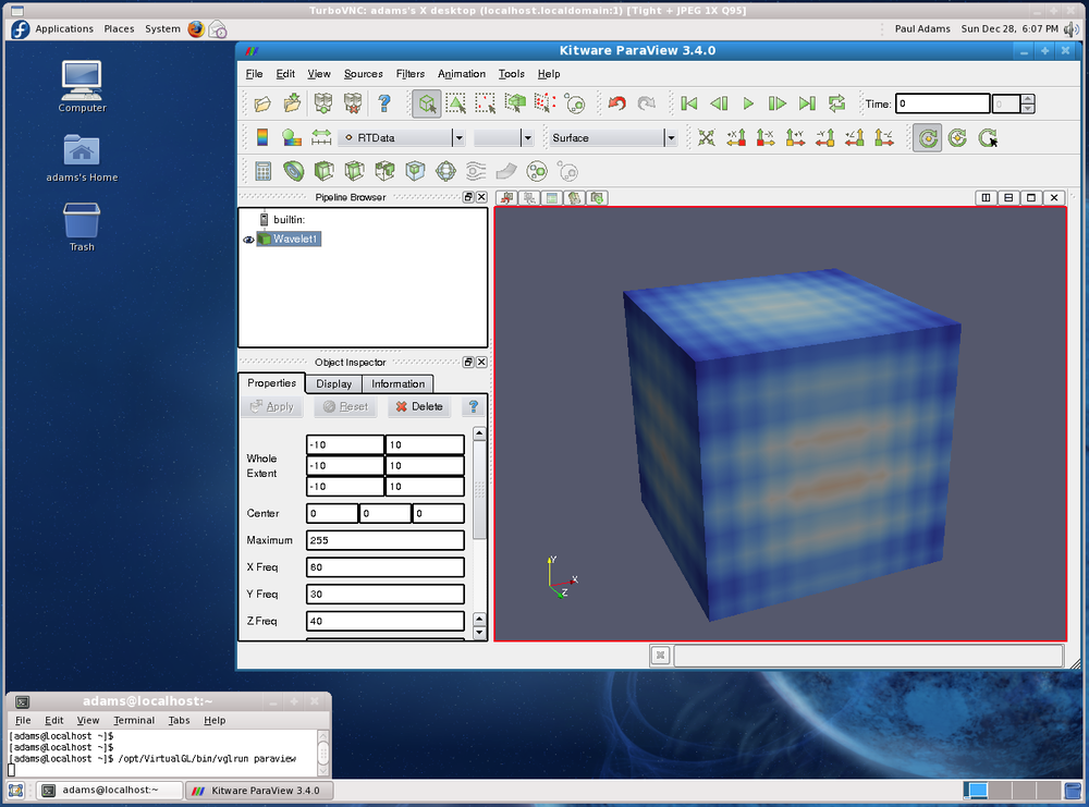
Here's some seismic reflection data — the open F3 dataset, offshore Netherlands, in OpendTect

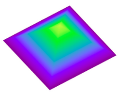
A horizon — just below the prominent clinoforms — is displayed (below, left) and coloured according to elevation, using one of Matteo's perceptual colour bars (now included in OpendTect!). A colour scale like this varies monotonically in hue and luminance.

Some of the luminance channel (sometimes called brightness or value) is showing elevation, and a little is being used up by the 3D shading on the surface, but not much. I think the brain processes this automatically because the 3D illusion is quite good, especially when the scene is moving. Elevation and shape are sort of the same thing, so we've still only really got one attribute. Adding contours is quite nice (above, middle), and only uses a narrow slice of the luminance channel... but again, it's the same data. Much better to add new data. Similarity (a member of the family that includes coherence, semblance, and so on) is a natural fit: it emphasizes a particular aspect of the shape of the surface, but which was measured independently of the interpretaion, directly from the data itself. And it looks awesome (above, right).

Three attributes, four

OK, we have elevation and/or shape, and similarity. What else can we add? Another intuitive attribute of seismic is amplitude (below, left) — closely related to the strength of the reflected energy. Two things: we don't trust amplitudes in areas with low fold — so we can mask those (below, middle). And we're only really interested in bright spots, so we can edit the opacity profile of the attribute and make low values transparent (below, right). Two more attributes — amplitude (with a cut-off that reflects my opinion of what's interesting — is that an attribute?) and fold.

Since we have only used one hue for the amplitude, and it was not in Matteo's colour bar, we can layer it on the original map without clobbering anything. Unfortunately, there's no easy way for the low fold mask to modulate amplitude without interfering with elevation, because the elevation map needs to be almost completely opaque. What I need is a way to modulate a surface's opacity with an attribute it is not displaying with hue...

Thickness maps

The second question — what to colour thicks — is easy. Thicks should be towards the red end of the spectrum, sometimes not-necessarily-intuitively called 'warm' colours. (As I mentioned before in the comments, a quick Google image poll suggests that about 75% of people agree). If you colour your map otherwise, perhaps because you like the way it suggests palaeobathymetry in some depositional settings, be careful to make this very clear with labels and legends (which you always do anyway, right?). And think about just making a 'palaeobathymetry' map, not a thickness map.

I suspect there are lots of quite personal opinions out there. Like grammar, I do think much of this is a matter of taste. The only real test is clarity. Do you agree? Is there a right and wrong here? 

Five more things about colour

Last time I shared some colourful games, tools, and curiosities, including the weird chromostereopsis effect (right). Today, I've got links to much, much more 'further reading' on the subject of colour...


The provocation for this miniseries was Robert 'Blue Marble' Simmon's terrific blog series on colour, which he's right in the middle of. Robert is a data visualization pro at NASA Earth Observatory, so we should all listen to him. Here's his collection (updated after the original writing of this post):

Perception is everything! One of Agile's best friends is Matteo Niccoli, a quantitative geophysicist in Norway (for now). And one of his favourite subjects is colour — there are loads of great posts on his blog. He also has a fine collection of perceptual colour bars (left) for most seismic interpretation software. If you're still using Spectrum for maps, you need his help.

Dave Green is a physicist at the University of Cambridge. Like Matteo, he has written about the importance of using colour bars which have a linear increase in perceived brightness. His CUBEHELIX scheme (above) adapts easily to your needs — try out his colour bar creator. And if this level of geekiness gets you going, try David Dalrymple or Gregor Aisch.

ColorBrewer is a legendary web app and add-in for ArcGIS. It's worth playing with the various colour schemes, especially if you need a colour bar that is photocopy friendly, or that can still be used by colour blind people. The equally excellent, perhaps even slightly more excellent, i want hue is also worth playing with (thanks to Robert Simmon for that one). 

In scientific publishing, the Nature family of journals has arguably the finest graphics. Nature Methods carries a column called Points of View, which looks at scientific visualization. This mega-post on their Methagora blog links to them all, and covers everything from colour and 3D graphics to broader issues of design and typography. Wonderful stuff.

Since I don't seem to have exhausted the subject yet, we'll save a couple of practical topics for next time:

  1. A thought experiment: How many attributes can a seismic interpreter show with colour in a single display?
  2. Provoked by a reader via email, we'll think about that age old problem for thickness maps — should the thicks be blue or red?

Five things about colour

The fact that colour is a slippery subject is powerfully illustrated by my favourite optical illusion. Look at this:

Squares A and B are the same shade of grey. It's so hard to believe that you might need to see the proof to be convinced. 

Chromostereopsis is a similarly disarming effect that you may have noticed on maps with bright spectrum colour bars. Most people perceive blue and red on different depth planes, so the pseudo-3D effect can work in your favour and make the map 'pop' (This is not a good reason to use a spectrum colour bar, however... more on this next time). I notice that at least one set designer knows about the effect, making William Shatner pop on the TV show Have I Got News For You:

Color is a fun way to test your colour intuition. The game starts easy, but is very hard by the end as you simulatneously match colour tetrads. The first time I played I managed 9.8, which I am not-very-secretly quite pleased about. But I haven't been able to repeat the performance.

X-Rite's Online Color Challenge is also tough. You have to sort the very subtle colours into order. It takes a while to play but is definitely worth it. If your job depends on spotting subtle effects in images (like seismic data, for example) then stand by to learn something about your detection system. 

Color blindness will change how these games work, of course, and should change how we make maps, figures, and slides. Since up to about 5% of a large audience might be colour blind, you might want to think about how your presentations look to them. You can easily check with Vischeck and correct images for colourblind people with the Daltonizer. They can still be beautiful, but you can avoid certain colour combinations and reach a wider audience.

I have lots more links about colour to share in the next post, including some required reading from Rob Simmon and Matteo Niccoli, among others. In the meantime, have you come across any handy colour tools, or has colour ever caught you out? Let us know in the comments.

The image of William Shatner is copyright and courtesy of Hat Trick Productions Ltd, London, UK, and used with permission.

News of the week

Newsworthy items of the last fortnight or so. We look for stories in the space between geoscience and technology, but if you come across anything you think we should cover, do tell

CNLOPB map of blocksNewfoundland blocks announced

Back in May we wrote about the offshore licensing round in Newfoundland and Labrador on Canada's Atlantic margin. The result was announced on Wednesday. There was no award on the northern blocks. The two parcels in northwest Newfoundland, in the Gulf of St Lawrence, were awarded to local outfit Ptarmigan Energy for a total work commitment of $2.002 million. The winning bids in the Flemish Pass area were won by a partnership of Statoil (at 50%), Chevron (40%) and Repsol (10%). The bids on these parcels were $202,171,394 and $145,603,270. Such arbitrary-looking numbers suggest that there was some characteristically detailed technical assessment going on at Statoil, or that a game theorist got to engineer the final bid. We'd love to know which. 

CanGeoRef for Canadian literature

CanGeoRef is a new effort to bring Canadian geoscience references in from the cold to the AGI's GeoRef bibliographic database. The Canadian Federation of Earth Sciences is coordinating the addition of literature from the Survey, various provincial and territorial agencies, as well as Canadian universities. Better yet, CanGeoRef has a 30-day free trial offer plus a 15% discount if you subscribe before December. 

In related news, the AGI has updated its famous Glossary of Geology, now in its 5th edition. We love the idea, but don't much like the $100 price tag. 

Tibbr at work

Tibbr logoTibbr is a social media engine for the enterprise, a sort of in-house Facebook. Launched in January by TIBCO, it's noteworthy because of TIBCO's experience; they're the company behind Spotfire among other things. It has some interesting features, like videocalling, voicemail integration and analytics (of course), that should differentiate it from competitors like Yammer. What these tools do for teamwork and integration is yet to be seen. 

The 3D world in 3D

Occasionally you see software you can't wait to get your hands on. When Ron Schott posted this video of some mud-cracks, we immediately started thinking of the possibilities for outcrops, hand specimens, SEM photography,... However, the new 123D Catch software from Autodesk only runs on Windows so Matt hasn't been able to test it yet. On the plus side, it's free, for now at least.

To continue the social media thread, Ron is very interested in its role in geoscience. He's an early adopter of Google+, so if you're interested in how these tools might help you, add him to one of your circles or hangout with him. As for us, we're still finding our way in G+.

This regular news feature is for information only. We aren't connected with any of these people or organizations, and don't necessarily endorse their products or services. Unless we say we think they're great.

Four days of oil

The long-awaited news of oil in the Falkland Islands arrived in May last year when UK company Rockhopper Exploration drilled a successful well in the North Falkland Basin. After testing a second well, the estimated volume of recoverable oil in the field, called Sea Lion, was upped last month to 325 million barrels. A barrel is one bathtub, or 42 gallons, or 159 litres, or 0.159 m3. Let's be scientific and stick to SI units: the discovery is about 52 million cubic metres. Recoverable means the oil can be produced with foreseeable technology; about half the oil will likely not be produced and remain in the ground forever. Or until humans are desperate enough to get it out.

On its own, a claim of 325 million barrels is meaningless to those outside the oil business. But this is a good-sized discovery, certainly a company-maker for a small player like Rockhopper. But as we read news of recent big discoveries in the Gulf of Mexico by BP, Chevron and ExxonMobil, it's worth having some sort of yardstick to help visualize these strange units and huge numbers...

Read More

News of the week

CCGVeritas moves towards a million channels

DSU1 receiverSercel, a subsidiary of CGGVeritas, has introduced new data transmission technology, Giga Transverse, an add-on to the 428XL land acquisition system. The technology increases the maximum channels per line from 10 000 to 100 000, and brings them a big step closer to the possiblity of one million channels on a single job. It will immediately benefit their UltraSeis offering for high-density point-receiver land acquisition. They also refreshed the DSU1 receiver (left), making it smaller and sharper. Young geophysicists must be salivating over the data they will be processing and interpreting in the decades to come.

Petrophysics coming to OpendTect

dGB has a built a comprehensive software suite for the seismic world, but OpendTect is a little light on petrophysics and log analysis. Not anymore! There's a new plugin coming to OpendTect, from Argentinian company Geoinfo: CLAS, or Computer Log Analysis Software. This will make the software attractive to a wider spread of the subsurface spectrum. dGB are on a clear path to creating a full-featured, deeply integrated platform. And OpendTect is open source, so petrophysicists may enjoy creating their own programs and plugins for working with well log data.

Petrel 2011 incorporates knowledge sharing

In Petrel, Schlumberger is introducing a multi-faceted knowledge environment for the entire spectrum of subsurface specialists. The announced improvements for the 2011 version include coordinate conversion for seismic data, better seismic flattening, more interpretation functions, and, most interesting of all, introduces the Studio™ environment. Geoscientists and engineers can search and browse projects, select data, and customize their screens by creating personal collections of often-used processes. It doesn't sound as interactive or social as the awaited Convofy for GeoGraphix, but it is good to see software companies thinking about large-scale, long-term knowledge issues, and it already exists!

Open source vizualization virtualization

High-end visualizaiton performance on a laptop... perhaps even a tablet! TurboVNC in action in the US government. Image: US Data Analysis & Assessment Center wiki.Australian E&P company Santos Ltd recently won the 2011 Red Hat Innovator of the Year award. From the award submission: "Santos has been burnt in the past by hanging its hat on proprietary solutions only to have them rendered uneconomical through being acquired by bigger fish. So for Santos, the move to open source—and to Red Hat—also proved to be a security blanket, as they could be assured that no one could walk in and take its solution away".  Borne out of an explosion of geo-computing costs, and their desire to push the limits of technology, the company sponsored the TurboVNC and VirtualGL projects. The result: users can interpret from anywhere using a standard issue laptop (with dual 24" monitors when at their desks), achieving better performance than traditional workstations. Great foresight! What are you doing about your geo-computing problems?

This regular news feature is for information only. We aren't connected with any of these organizations, and don't necessarily endorse their products or services. Petrel and Studio are trademarks of Schlumberger. Giga Transverse is a trademark of Sercel. Low res DSU1 image from Sercel marketing material.