
Well worth showing off
/Have you ever had difficulty displaying a well log in a presentation? Now, instead of cycling through slides, you can fluidly move across a digital, zoomable canvas using Prezi. I think it could be a powerful visual tool and presentation aid for geoscientists. Prezi allows users to to construct intuitive, animated visualizations, using size to denote emphasis or scale, and proximity to convey relevance. You navigate through the content simply by moving the field of view and zooming in and out through scale space. In geoscience, scale isn't just a concept for presentation design, it is a fundamental property that can now be properly tied-in and shown in a dynamic way.
I built this example to illustrate how geoscience images, spread across several orders of magnitude, can be traversed seamlessly for a better presentation. In a matter of seconds, one can navigate a complete petrophysical analysis, a raw FMI log, a segment of core, and thin section microscopy embedded at its true location. Explore heterogeniety and interpret geology with scale in context. How could you use a tool like this in your work?
 Clicking on the play button will steer the viewer step by step through a predefined set of animations, but you can break off and roam around freely at any time (click and drag with your mouse, try it!). Prezi could be very handy for workshops, working meetings, or any place where it is appropriate to be transparent and thorough in your visualizations.
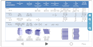
You can also try roaming Prezi by clicking on the image of this cheatsheet. Let us know what you think!
Thanks to Burns Cheadle for Prezi enthusiasm, and to Neil Watson for sharing the petrophysical analysis he built from public data in Alberta.


 Except where noted, this content is licensed