x lines of Python: static basemaps with contextily

Difficulty rating: Beginner

Something that is often useful in planning is to have a basemap of the area in which you have data or an interest. This can be made using a number of different tools, up to and including full-fledged GIS software, but we will use Contextily for a quick static basemap using Python. Installation is as simple as using conda install contextily or pip install contextily.

The steps that we want to take are the following, expressed in plain English, each of which will roughly be one line of code:

  1. Get a source for our basemap (placenames and similar things)
  2. Get a source for our geological map
  3. Get the location that we would like to map
  4. Plot the location with our geological data
  5. Add the basemap to our geological map
  6. Add the attribution for both maps
  7. Plot our final map

We will start with the imports, which as usual do not count:

 
import contextily as ctx
import matplotlib.pyplot as plt

Contextily has a number of built-in providers of map tiles, which can be accessed using the ctx.providers dictionary. This is nested, with some providers offering multiple tiles. An example is the ctx.providers.OpenStreetMap.Mapnik provider, which contains the following:

 
{'url': 'https://{s}.tile.openstreetmap.org/{z}/{x}/{y}.png',
 'max_zoom': 19,
 'attribution': '(C) OpenStreetMap contributors',
 'name': 'OpenStreetMap.Mapnik'}

The most important parameter in the dictionary for each provider is the url. These are of the form example.com/{z}/{x}/{y}.png. The {z} is the zoom level, while {x} and {y} relate to the latitude and longitude of a given tile, respectively. Note that these are the same as those used by interactive Slippy maps; contextily just downloads them as a single static image.

The easiest is to use one of these providers, but we can also define our own provider, using the above pattern for the URL. For geological data, the Macrostrat project is a great resource, especially because they have a tileserver supplying some detail. Their tileserver can be added using

 
geology_tiles = 'https://tiles.macrostrat.org/carto/{z}/{x}/{y}.png'

We also need a place to map. Contextily has a geocoder that can return the tiles covering a given location. It uses OpenStreetMap, so anything that is present there is useable as a location. This includes countries (e.g. 'Paraguay'), provinces/states ('Nova Scotia'), cities ('Lubumbashi'), and so on.

We will use Nova Scotia as our area of interest, as well as giving our desired map tiles. We can also use .plot() on the Place object to get a look at it immediately, using that basemap.

 
ctx.Place('Nova Scotia', source=ctx.providers.CartoDB.Positron).plot()
The Positron style from Carto for Nova Scotia.

The Positron style from Carto for Nova Scotia.

We'll use a different basemap though:

 
basemap = ctx.providers.Stamen.Toner

We can create the Place with our desired source — geology_tiles in this case — and then plot this on the basemap with some transparency. We will also add an attribution, since we need to credit MacroStrat.

 
place = ctx.Place('Nova Scotia', source=geology_tiles)

base_ax = place.plot()
ctx.add_basemap(ax=base_ax, source=basemap, alpha=0.5)
text = basemap.attribution + ' | Geological data: MacroStrat.org (CC-BY)'
ctx.add_attribution(ax=base_ax, text=text)

Finally, after a plt.show() call, we get the following:

nova_scotia_geology.png

Obviously this is still missing some important things, like a proper legend, but as a quick overview of what we can expect in a given area, it is a good approach. This workflow is probably better suited for general location maps.

Contextily also plays well with geopandas, allowing for an easy locality map of a given GeoDataFrame. Check out the accompanying Notebook for an example.

Binder  Run the accompanying notebook in MyBinder

x lines of Python: Loading images

Difficulty rating: Beginner

We'd often like to load images into Python. Once loaded, we might want to treat them as images, for example cropping them, saving in another format, or adjusting brightness and contrast. Or we might want to treat a greyscale image as a two-dimensional NumPy array, perhaps so that we can apply a custom filter, or because the image is actually seismic data.

This image-or-array duality is entirely semantic — there is really no difference between images and arrays. An image is a regular array of numbers, or, in the case of multi-channel rasters like full-colour images, a regular array of several numbers: one for each channel. So each pixel location in an RGB image contains 3 numbers:

raster_with_RGB_triples.png

In general, you can go one of two ways with images:

  1. Load the image using a library that 'knows about' (i.e. uses language related to) images. The preeminent tool here is pillow (which is a fork of the grandparent of all Python imaging solutions, PIL).
  2. Load the image using a library that knows about arrays, like matplotlib or scipy. These wrap PIL, making it a bit easier to use, but potentially losing some options on the way.

The Jupyter Notebook accompanying this post shows you how to do both of these things. I recommend learning to use some of PIL's power, but knowing about the easier options too.

Here's the way I generally load an image:

 
from PIL import Image
im = Image.open("my_image.png")

(One strange thing about pillow is that, while you install it with pip install pillow, you still actually import and use PIL in your code.) This im is an instance of PIL's Image class, which is a data structure especially for images. It has some handy methods, like im.crop(), im.rotate(), im.resize(), im.filter(), im.quantize(), and lots more. Doing some of these operations with NumPy arrays is fiddly — hence PIL's popularity.

But if you just want your image as a NumPy array:

 
import numpy as np
arr = np.array(im)

Note that arr is a 3-dimensional array, the dimensions being row, column, channel. You can go off with arr and do whatever you need, then cast back to an Image with Image.fromarray(arr).

All this stuff is demonstrated in the Notebook accompanying this post, or you can use one of these links to run it right now in your browser:

Binder   Run the accompanying notebook in MyBinder


Is your data digital or just pseudodigital?

pseudodigital_analog.png

A rite of passage for a geologist is the making of an original geological map, starting from scratch. In the UK, this is known as the ‘independent mapping project’ and is usually done at the end of the second year of an undergrad degree. I did mine on the eastern shore of the Embalse de Santa Ana, just north of Alfarras in Catalunya, Spain. (I wrote all about it back in 2012.)

The map I drew was about as analog as you can get. I drew it with Rotring Rapidograph pens on drafting film. Mistakes had to be painstakingly scraped away with a razor blade. Colour had to be added in pencil after the map had been transferred onto paper. There is only one map in existence. The data is gone. It is absolutely unreproducible.

pseudodigital_palaeo.png

Digitize!

In order to show you the map, I had to digitize it. This word makes it sound like the map is now ‘digital data’, but it’s really not useful for anything scientific. In other words, while it is ‘digital’ in the loosest sense — it’s a bunch of binary bits in the cloud — it is not digital in the sense of organized data elements with semantic meaning. Let’s call this non-useful format palaeodigital. The lowest rung on the digital ladder.

You can get palaeodigital files from many state and national data repositories. For example, it’s how the Government of Nova Scotia stores its offshore seismic ‘data’ files — as TIFF files representing scans of paper sections submitted by operators. Wiggle trace, obviously, making them almost completely useless.

pseudodigital_proto.png

Protodigital

Nobody draws map by hand anymore, that would be crazy. Adobe Illustrator and (better) Inkscape mean we can produce beautifully rendered maps with about the same amount of effort as the hand-drawn version. But… this still isn’t digital. This is nothing more than a computerized rip-off of the analog workflow. The result is almost as static and difficult to edit as it was on film. (Wish you’d used a thicker line for your fault traces on those 20 maps? Have fun editing those files!)

Let’s call the computerization of analog workflows or artifacts protodigital. I’m thinking of Word and Powerpoint. Email. SeisWorks. Techlog. We can think of data in the same way… LAS files are really just a text-file manifestation of a composite log (plus their headers are often garbage). SEG-Y is nothing more than a bunch of traces with a sidelabel.


Together, palaeodigital and protodigital data might be called pseudodigital. They look digital, but they’re not quite there.

(Just to be clear, I made all these words up. They are definitely silly… but the point is that there’s a lot of room between analog and useful, machine-learning-ready digital.)


pseudodigital_digital.png

Digital data

So what’s at the top of the digital ladder? In the case of maps, it’s shapefiles or, better yet, GeoJSON. In these files, objects are described in terms of real geographic parameters, such at latitiude and longitude. The file contains the CRS (you know you need that, right?) and other things you might need like units, data provenance, attributes, and so on.

What makes these things truly digital? I think the following things are important:

  • They can all be self-documenting

  • …and can carry more or less arbitrary amounts of metadata.

  • They depend on open formats, some text and some binary, that are widely used.

  • There is free, open-source tooling for reading and writing these formats, usually with reference implementations in major languages (e.g. C/C++, Python, Java).

  • They are composable. Without too much trouble, you could write a script to process batches of these files, adapting to their content and context.

Here’s how non-digital versions of a document, e.g. a scholoarly article, compare to digital data:

pseudodigital_document.png

And pseudodigital well logs:

pseudodigital_log.png

Some more examples:

  • Photographs with EXIF data and geolocation.

  • GIS tools like QGIS let us make beautiful maps with data.

  • Drawing striplogs with a data-driven tool like Python striplog.

  • A fully-labeled HDF5 file containing QC’d, machine-learning-ready well logs.

  • Structured, metadata-rich documents, perhaps in JSON format.

Watch out for pseudodigital

Why does all this matter? It matters because we need digital data before we can do any analysis, or any machine learning. If you give me pseudodigital data for a project, I’m going to spend at least 50% of my time, probably more, making it digital before I can even get started. So before embarking on a machine learning project, you really, really need to know what you’re dealing with: digital or just pseudodigital?

The Surmont Supermerge

In my recent Abstract horror post, I mentioned an interesting paper in passing, Durkin et al. (2017):


Paul R. Durkin, Ron L. Boyd, Stephen M. Hubbard, Albert W. Shultz, Michael D. Blum (2017). Three-Dimensional Reconstruction of Meander-Belt Evolution, Cretaceous Mcmurray Formation, Alberta Foreland Basin, Canada. Journal of Sedimentary Research 87 (10), p 1075–1099. doi: 10.2110/jsr.2017.59


I wanted to write about it, or rather about its dataset, because I spent about 3 years of my life working on the USD 75 million seismic volume featured in the paper. Not just on interpreting it, but also on acquiring and processing the data.

Let's start by feasting our eyes on a horizon slice, plus interpretation, of the Surmont 'Supermerge' 3D seismic volume:

Figure 1 from Durkin et al (2017), showing a stratal slice from 10 ms below the top of the McMurray Formation (left), and its interpretation (right). © 2017, SEPM (Society for Sedimentary Geology) and licensed CC-BY.

Figure 1 from Durkin et al (2017), showing a stratal slice from 10 ms below the top of the McMurray Formation (left), and its interpretation (right). © 2017, SEPM (Society for Sedimentary Geology) and licensed CC-BY.

A decade ago, I was 'geophysics advisor' on Surmont, which is jointly operated by ConocoPhillips Canada, where I worked, and Total E&P Canada. My line manager was a Total employee; his managers were ex-Gulf Canada. It was a fantastic, high-functioning team, and working on this project had a profound effect on me as a geoscientist. 

The Surmont bitumen field

The dataset covers most of the Surmont lease, in the giant Athabasca Oil Sands play of northern Alberta, Canada. The Surmont field alone contains something like 25 billions barrels of bitumen in place. It's ridiculously massive — you'd be delighted to find 300 million bbl offshore. Given that it's expensive and carbon-intensive to produce bitumen with today's methods — steam-assisted gravity drainage (SAGD, "sag-dee") in Surmont's case — it's understandable that there's a great deal of debate about producing the oil sands. One factoid: you have to burn about 1 Mscf or 30 m³ of natural gas, costing about USD 10–15, to make enough steam to produce 1 bbl of bitumen.

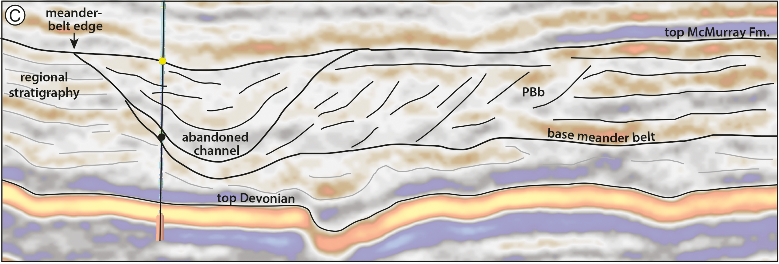
Detail from Figure 12 from Durkin et al (2017), showing a seismic section through the McMurray Formation. Most of the abandoned channels are filled with mudstone (really a siltstone). The dipping heterolithic strata of the point bars, so obvious in …

Detail from Figure 12 from Durkin et al (2017), showing a seismic section through the McMurray Formation. Most of the abandoned channels are filled with mudstone (really a siltstone). The dipping heterolithic strata of the point bars, so obvious in horizon slices, are quite subtle in section. © 2017, SEPM (Society for Sedimentary Geology) and licensed CC-BY.

The field is a geoscience wonderland. Apart from the 600 km² of beautiful 3D seismic, there are now about 1500 wells, most of which are on the 3D. In places there are more than 20 wells per section (1 sq mile, 2.6 km², 640 acres). Most of the wells have a full suite of logs, including FMI in 2/3 wells and shear sonic as well in many cases, and about 550 wells now have core through the entire reservoir interval — about 65–75 m across most of Surmont. Let that sink in for a minute.

What's so awesome about the seismic?

OK, I'm a bit biased, because I planned the acquisition of several pieces of this survey. There are some challenges to collecting great data at Surmont. The reservoir is only about 500 m below the surface. Much of the pay sand can barely be called 'rock' because it's unconsolidated sand, and the reservoir 'fluid' is a quasi-solid with a viscosity of 1 million cP. The surface has some decent topography, and the near surface is glacial till, with plenty of boulders and gravel-filled channels. There are surface lakes and the area is covered in dense forest. In short, it's a geophysical challenge.

Nonetheless, we did collect great data; here's how:

  • General information
    • The ca. 600 km² Supermerge consists of a dozen 3Ds recorded over about a decade starting in 2001.
    • The northern 60% or so of the dataset was recombined from field records into a single 3D volume, with pre- and post-stack time imaging.
    • The merge was performed by CGG Veritas, cost nearly $2 million, and took about 18 months.
  • Geometry
    • Most of the surveys had a 20 m shot and receiver spacing, giving the volume a 10 m by 10 m natural bin size
    • The original survey had parallel and coincident shot and receiver lines (Megabin); later surveys were orthogonal.
    • We varied the line spacing between 80 m and 160 m to get trace density we needed in different areas.
  • Sources
    • Some surveys used 125 g dynamite at a depth of 6 m; others the IVI EnviroVibe sweeping 8–230 Hz.
    • We used an airgun on some of the lakes, but the data was terrible so we stopped doing it.
  • Receivers
    • Most of the surveys were recorded into single-point 3C digital MEMS receivers planted on the surface.
  • Bandwidth
    • Most of the datasets have data from about 8–10 Hz to about 180–200 Hz (and have a 1 ms sample interval).

The planning of these surveys was quite a process. Because access in the muskeg is limited to 'freeze up' (late December until March), and often curtailed by wildlife concerns (moose and elk rutting), only about 6 weeks of shooting are possible each year. This means you have to plan ahead, then mobilize a fairly large crew with as many channels as possible. After acquisition, each volume spent about 6 months in processing — mostly at Veritas and then CGG Veritas, who did fantastic work on these datasets.

Kudos to ConocoPhillips and Total for letting people work on this dataset. And kudos to Paul Durkin for this fine piece of work, and for making it open access. I'm excited to see it in the open. I hope we see more papers based on Surmont, because it may be the world's finest subsurface dataset. I hope it is released some day, it would have huge impact.


References & bibliography

Paul R. Durkin, Ron L. Boyd, Stephen M. Hubbard, Albert W. Shultz, Michael D. Blum (2017). Three-Dimensional Reconstruction of Meander-Belt Evolution, Cretaceous Mcmurray Formation, Alberta Foreland Basin, Canada. Journal of Sedimentary Research 87 (10), p 1075–1099. doi: 10.2110/jsr.2017.59 (not live yet).

Hall, M (2007). Cost-effective, fit-for-purpose, lease-wide 3D seismic at Surmont. SEG Development and Production Forum, Edmonton, Canada, July 2007.

Hall, M (2009). Lithofacies prediction from seismic, one step at a time: An example from the McMurray Formation bitumen reservoir at Surmont. Canadian Society of Exploration Geophysicists National Convention, Calgary, Canada, May 2009. Oral paper.

Zhu, X, S Shaw, B Roy, M Hall, M Gurch, D Whitmore and P Anno (2008). Near-surface complexity masquerades as anisotropy. SEG Annual Convention, Las Vegas, USA, November 2008. Oral paper. doi: 10.1190/1.3063976.

Surmont SAGD Performance Review (2016), by ConocoPhillips and Total geoscientists and engineers. Submitted to AER, 258 pp. Available online [PDF] — and well worth looking at.

Trad, D, M Hall, and M Cotra (2008). Reshooting a survey by 5D interpolation. Canadian Society of Exploration Geophysicists National Convention, Calgary, Canada, May 2006. Oral paper. 

x lines of Python: read and write CSV

A couple of weeks ago, in Murphy's Law for Excel, I wrote about the dominance of spreadsheets in applied analysis, and how they may be getting out of hand. Then in Organizing spreadsheets I wrote about how — if you are going to store data in spreadsheets — to organize your data so that you do the least amount of damage. The general goal being to make your data machine-readable. Or, to put it another way, to allow you to save your data as comma-separated values or CSV files.

CSV is the de facto standard way to store data in text files. They are human-readable, easy to parse with multiple tools, and they compress easily. So you need to know how to read and write them in your analysis tool of choice. In our case, this is the Python language. So today I present a few different ways to get at data stored in CSV files.

How many ways can I read thee?

In the accompanying Jupyter Notebook, we read a CSV file into Python in six different ways:

  1. Using the pandas data analysis library. It's the easiest way to read CSV and XLS data into your Python environment...
  2. ...and can happily consume a file on the web too. Another nice thing about pandas. It also writes CSV files very easily.
  3. Using the built-in csv package. There are a couple of standard ways to do this — csv.reader...
  4. ...and csv.DictReader. This library is handy for when you don't have (or don't want) pandas.
  5. Using numpy, the numeric library for Python. If you just have a CSV full of numbers and you want an array in the end, you can skip pandas.
  6. OK, it's not really a CSV file, but for the finale we read a spreadsheet directly from Google Sheets.

I usually count my lines diligently in these posts, but not this time. With pandas you're looking at a one-liner to read your data:

df = pd.read_csv("myfile.csv")

and a one-liner to write it out again. With csv.DictReader you're looking at 3 lines to get a list of dicts (but watch out: your numbers will be strings). Reading a Google Doc is a little more involved, not least because you'll need to set up an app and get an API key to handle authentication.

That's all there is to CSV files. Go forth and wield data like a pro! 

Next time in the xlines of Python series we'll look at reading seismic station data from the web, and doing a bit of time-series analysis on it. No more stuff about spreadsheets and CSV files, I promise :)


The thumbnail image is based on the possibly apocryphal banksy image of an armed panda, and one of texturepalace.com's CC-BY textures.

Organizing spreadsheets

A couple of weeks ago I alluded to ill-formed spreadsheets in my post Murphy's Law for Excel. Spreadsheets are clearly indispensable, and are definitely great for storing data and checking CSV files. But some spreadsheets need to die a horrible death. I'm talking about spreadsheets that look like this (click here for the entire sheet):

Bad_spreadsheet_3.png

This spreadsheet has several problems. Among them:

  • The position of a piece of data changes how I interpret it. E.g. a blank row means 'new sheet' or 'new well'.
  • The cells contain a mixture of information (e.g. 'Site' and the actual data) and appear in varying units.
  • Some information is encoded by styles (e.g. using red to denote a mineral species). If you store your sheet as a CSV (which you should), this information will be lost.
  • Columns are hidden, there are footnotes, it's just a bit gross.

Using this spreadsheet to make plots, or reading it with software, with be a horrible experience. I will probably swear at my computer, suffer a repetitive strain injury, and go home early with a headache, cursing the muppet that made the spreadsheet in the first place. (Admittedly, I am the muppet that made this spreadsheet in this case, but I promise I did not invent these pathologies. I have seen them all.)

Let's make the world a better place

Consider making separate sheets for the following:

  • Raw data. This is important. See below.
  • Computed columns. There may be good reasons to keep these with the data.
  • Charts.
  • 'Tabulated' data, like my bad spreadsheet above, with tables meant for summarization or printing.
  • Some metadata, either in the file properties or a separate sheet. Explain the purpose of the dataset, any major sources, important assumptions, and your contact details.
  • A rich description of each column, with its caveats and assumptions.

The all-important data sheet has its own special requirements. Here's my guide for a pain-free experience:

  • No computed fields or plots in the data sheet.
  • No hidden columns.
  • No semantic meaning in formatting (e.g. highlighting cells or bolding values).
  • Headers in the first row, only data in all the other rows.
  • The column headers should contain only a unique name and [units], e.g. Depth [m], Porosity [v/v].
  • Only one type of data per column: text OR numbers, discrete categories OR continuous scalars.
  • No units in numeric data cells, only quantities. Record depth as 500, not 500 m.
  • Avoid keys or abbreviations: use Sandstone, Limestone, Shale, not Ss, Ls, Sh.
  • Zero means zero, empty cell means no data.
  • Only one unit per column. (You only use SI units right?)
  • Attribution! Include a citation or citations for every record.
  • If you have two distinct types or sources of data, e.g. grain size from sieve analysis and grain size from photomicrographs, then use two different columns.
  • Personally, I like the data sheet to be the first sheet in the file, but maybe that's just me.
  • Check that it turns into a valid CSV so you can use this awesome format.

      After all that, here's what we have (click here for the entire sheet):

    The same data as the first image, but improved. The long strings in columns 3 and 4 are troublesome, but we can tolerate them. Click to enlarge.

    Maybe the 'clean' analysis-friendly sheet looks boring to you, but to me it looks awesome. Above all, it's easy to use for SCIENCE! And I won't have to go home with a headache.


    The data in this post came from this Cretaceous shale dataset [XLS file] from the government of Manitoba. Their spreadsheet is pretty good and only breaks a couple of my golden rules. Here's my version with the broken and fixed spreadsheets shown here. Let me know if you spot something else that should be fixed!

    Well data woes

    I probably shouldn't be telling you this, but we've built a little tool for wrangling well data. I wanted to mention it, becase it's doing some really useful things for us — and maybe it can help you too. But I probably shouldn't because it's far from stable and we're messing with it every day.

    But hey, what software doesn't have a few or several or loads of bugs?

    Buggy data?

    It's not just software that's buggy. Data is as buggy as heck, and subsurface data is, I assert, the buggiest data of all. Give units or datums or coordinate reference systems or filenames or standards or basically anything at all a chance to get corrupted in cryptic ways, and they take it. Twice if possible.

    By way of example, we got a package of 10 wells recently. It came from a "data management" company. There are issues... Here are some of them:

    • All of the latitude and longitude data were in the wrong header fields. No coordinate reference system in sight anywhere. This is normal of course, and the only real side-effect is that YOU HAVE NO IDEA WHERE THE WELL IS.
    • Header chaos aside, the files were non-standard LAS sort-of-2.0 format, because tops had been added in their own little completely illegal section. But the LAS specification has a section for stuff like this (it's called OTHER in LAS 2.0).
    • Half the porosity curves had units of v/v, and half %. No big deal...
    • ...but a different half of the porosity curves were actually v/v. Nice.
    • One of the porosity curves couldn't make its mind up and changed scale halfway down. I am not making this up.
    • Several of the curves were repeated with other names, e.g. GR and GAM, DT and AC. Always good to have a spare, if only you knew if or how they were different. Our tool curvenam.es tries to help with this, but it's far from perfect.
    • One well's RHOB curve was actually the PEF curve. I can't even...

    The remarkable thing is not really that I have this headache. It's that I expected it. But this time, I was out of paracetamol.

    Cards on the table

    Our tool welly, which I stress is very much still in development, tries to simplify the process of wrangling data like this. It has a project object for collecting a lot of wells into a single data structure, so we can get a nice overview of everything: 

    Click to enlarge.

    Our goal is to include these curves in the training data for a machine learning task to predict lithology from well logs. The trained model can make really good lithology predictions... if we start with non-terrible data. Next time I'll tell you more about how welly has been helping us get from this chaos to non-terrible data.

    x lines of Python: read and write SEG-Y

    Reading SEG-Y files comes up a lot in the geophysicist's workflow. Writing, less often, but it does come up occasionally. As long as we're mostly concerned with trace data and not location, both of these tasks can be fairly easily accomplished with ObsPy. 

    Today we'll load some seismic, compute an attribute on it, and save a new SEG-Y, in 10 lines of Python.


    ObsPy is a rare thing. It demonstrates what a research group can accomplish with a little planning and a lot of perseverance (cf my whinging earlier this year about certain consortiums in our field). It's an open source Python package from the geophysicists at the University of Munich — Karl Bernhard Zoeppritz studied there for a while, so you know it's legit. The tool serves their research in earthquake and global seismology needs, and also happens to handle SEG-Y files quite nicely.

    Aside: I think SixtyNorth's segpy is actually the way to go for reading and writing SEG-Y; ObsPy is probably overkill for most applications — it's about 80 times the size for one thing. I just happen to be familiar with it and it's super easy to install: conda install obspy. So, since minimalism is kind of the point here, look out for a future x lines of Python using that library.

    The sentences

    As before, we'd like to express the process in just a few sentences of plain English. Assuming we just want to read the data into a NumPy array, look at it, do something to it, and write a new file, here's what we're doing:

    1. Read (or really index) the file as an ObsPy Stream object.
    2. Stack (in the NumPy sense) the Trace objects into a single NumPy array. We have data!
    3. Get the 99th percentile of the amplitudes to make plotting easier.
    4. Plot the data so we can see it.
    5. Get the sample interval of the data from a trace header.
    6. Compute the similarity attribute using our library bruges.
    7. Make a new Stream object to hold the outbound data.
    8. Add a Stats object, which holds the header, and recycle some header info.
    9. Append info about our data to the header.
    10. Write a new SEG-Y file with our computed data in it!

    There's a bit more in the Jupyter Notebook (examining the file and trace headers, for example, and a few more plots) which, remember, you can run right in your browser! You don't need to install a thing. Please give it a look! Quick tip: Just keep hitting Shift+Enter to run the cells.

    If you like this sort of thing, and are planning to be at the SEG Annual Meeting in Dallas next month, you might like to know that we'll be teaching our Creative Geocomputing class there. It's basically two days of this sort of thing, only with friends to learn with and us to help. Come and learn some new skills!

    The seismic data used in this post is from the NPRA seismic repository of the USGS. The data is in the public domain.

    The big data eye-roll

    First, let's agree on one thing: 'big data' is a half-empty buzzword. It's shorthand for 'more data than you can look at', but really it's more than that: it branches off into other hazy territory like 'data science', 'analytics', 'deep learning', and 'machine intelligence'. In other words, it's not just 'large data'. 

    Anyway, the buzzword doesn't bother me too much. What bothers me is when I talk to people at geoscience conferences about 'big data', about half of them roll their eyes and proclaim something like this: "Big data? We've been doing big data since before these punks were born. Don't talk to me about big data."

    This is pretty demonstrably a load of rubbish.

    What the 'big data' movement is trying to do is not acquire loads of data then throw 99% of it away. They are not processing it in a purely serial pipeline, making arbitrary decisions about parameters on the way. They are not losing most of it in farcical enterprise data management train-wrecks. They are not locking most of their data up in such closed systems that even they don't know they have it.

    They are doing the opposite of all of these things.

    If you think 'big data', 'data' science' and 'machine learning' are old hat in geophysics, then you have some catching up to do. Sure, we've been toying with simple neural networks for years, eg probabilistic neural nets with 1 hidden layer — though this approach is very, very far from being mainstream in subsurface — but today this is child's play. Over and over, and increasingly so in the last 3 years, people are showing how new technology — built specifically to handle the special challenge that terabytes bring — can transform any quantitative endeavour: social media and online shopping, sure, but also astronomy, robotics, weather prediction, and transportation. These technologies will show up in petroleum geoscience and engineering. They will eat geostatistics for breakfast. They will change interpretation.

    So when you read that Google has open sourced its TensorFlow deep learning library (9 November), or that Microsoft has too (yesterday), or that Facebook has too (months ago), or that Airbnb has too (in August), or that there are a bazillion other super easy-to-use packages out there for sophisticated statistical learning, you should pay a whole heap of attention! Because machine learning is coming to subsurface.

    Rock property catalog

    RPC.png

    One of the first things I do on a new play is to start building a Big Giant Spreadsheet. What goes in the big giant spreadsheet? Everything — XRD results, petrography, geochemistry, curve values, elastic parameters, core photo attributes (e.g. RGB triples), and so on. If you're working in the Athabasca or the Eagle Ford then one thing you have is heaps of wells. So the spreadsheet is Big. And Giant. 

    But other people's spreadsheets are hard to use. There's no documentation, no references. And how to share them? Email just generates obsolete duplicates and data chaos. And while XLS files are not hard to put on the intranet or Internet,  it's hard to do it in a way that doesn't involve asking people to download the entire spreadsheet — duplicates again. So spreadsheets are not the best choice for collaboration or open science. But wikis might be...

    The wiki as database

    Regular readers will know that I'm a big fan of MediaWiki. One of the most interesting extensions for the software is Semantic MediaWiki (SMW), which essentially turns a wiki into a database — I've written about it before. Of course we can read any wiki page over the web, but you can query an SMW-powered wiki, which means you can, for example, ask for the elastic properties of a rock, such as this Mesaverde sandstone from Thomsen (1986). And the wiki will send you this JSON string:

    {u'exists': True,
     u'fulltext': u'Mesaverde immature sandstone 3 (Kelly 1983)',
     u'fullurl': u'http://subsurfwiki.org/wiki/Mesaverde_immature_sandstone_3_(Kelly_1983)',
     u'namespace': 0,
     u'printouts': {
        u'Lithology': [{u'exists': True,
          u'fulltext': u'Sandstone',
          u'fullurl': u'http://www.subsurfwiki.org/wiki/Sandstone',
          u'namespace': 0}],
        u'Delta': [0.148],
        u'Epsilon': [0.091],
        u'Rho': [{u'unit': u'kg/m\xb3', u'value': 2460}],
        u'Vp': [{u'unit': u'm/s', u'value': 4349}],
        u'Vs': [{u'unit': u'm/s', u'value': 2571}]
      }
    }

    This might look horrendous at first, or even at last, but it's actually perfectly legible to Python. A little bit of data wrangling and we end up with data we can easily plot. It takes no more than a few lines of code to read the wiki's data, and construct this plot of \(V_\text{P}\) vs \(V_\text{S}\) for all the rocks I have so far put in the wiki — grouped by gross lithology:

    A page from the Rock Property Catalog in Subsurfwiki.org. Very much an experiment, rocks contain only a few key properties today.

    A page from the Rock Property Catalog in Subsurfwiki.org. Very much an experiment, rocks contain only a few key properties today.

    If you're interested in seeing how to make these queries, have a look at this IPython Notebook. It takes you through reading the data from my embryonic catalogue on Subsurfwiki, processing the JSON response from the wiki, and making the plot. Once you see how easy it is, I hope you can imagine a day when people are publishing open data on the web, and sharing tools to query and visualize it.

    Imagine it, then figure out how you can help build it!


    References

    Thomsen, L (1986). Weak elastic anisotropy. Geophysics 51 (10), 1954–1966. DOI 10.1190/1.1442051.