Open up

After a short trip to Houston, today I am heading to London, Ontario, for a visit with Professor Burns Cheadle at the University of Western Ontario. I’m stoked about the trip. On Saturday I’m running my still-developing course on writing for geoscientists, and tomorrow I’m giving the latest iteration of my talk on openness in geoscience. I’ll post a version of it here once I get some notes into the slides. What follows is based on the abstract I gave Burns.

A recent survey by APEGBC's Innovation magazine revealed that geoscience is not among the most highly respected professions. Only 20% of people surveyed had a ‘great deal of respect’ for geologists and geophysicists, compared to 30% for engineers, and 40% for teachers. This is far from a crisis, but as our profession struggles to meet energy demands, predict natural disasters, and understand environmental change, we must ask, How can we earn more trust? Perhaps more openness can help. I’m pretty sure it can’t hurt.

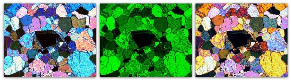
Many people first hear about ‘open’ in connection with software, but open software is just one point on the open compass. And even though open software is free, and can spread very easily in principle, awareness is a problem—open source marketing budgets are usually small. Open source widgets are great, but far more powerful are platforms and frameworks, because these allow geoscientists to focus on science, not software, and collaborate. Emerging open frameworks include OpendTect and GeoCraft for seismic interpretation, and SeaSeis and BotoSeis for seismic processing.

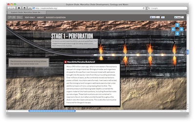
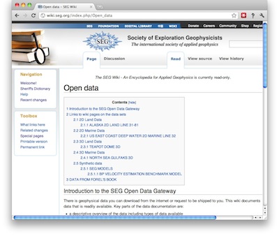
If open software is important for real science, then open data are equally vital because they promote reproducibility. Compared to the life sciences, where datasets like the Human Genome Project and Visible Human abound, the geosciences lag. In some cases, the pieces exist already in components like government well data, the Open Seismic Repository, and SEG’s list of open datasets, but they are not integrated or easy to find. In other cases, the data exist but are obscure and lack a simple portal. Some important plays, of global political and social as well as scientific interest, have little or no representation: industry should release integrated datasets from the Athabasca oil sands and a major shale gas play as soon as possible.

Open workflows are another point, because they allow us to accelerate learning, iteration, and failure, and thus advance more quickly. We can share easily but slowly and inefficiently by publishing, or attending meetings, but we can also write blogs, contribute to wikis, tweet, and exploit the power of the internet as a dynamic, multi-dimensional network, not just another publishing and consumption medium. Online readers respond, get engaged, and become creators, completing the feedback loop. The irony is that, in most organizations, it’s easier to share with the general public, and thus competitors, than it is to share with colleagues.

The fourth point of the compass is in our attitude. An open mindset recognizes our true competitive strengths, which typically are not our software, our data, or our workflows. Inevitably there are things we cannot share, but there’s far more that we can. Industry has already started with low-risk topics for which sharing may be to our common advantage—for example safety, or the environment. The question is, can we broaden the scope, especially to the subsurface, and make openness the default, always asking, is there any reason why I shouldn’t share this?

In learning to embrace openness, it’s important to avoid some common misconceptions. For example, open does not necessarily mean free-as-in-beer. It does not require relinquishing ownership or rights, and it is certainly not the same as public domain. We must also educate ourselves so that we understand the consequences of subtle and innocuous-seeming clauses in licences, for example those pertaining to non-commerciality. If we can be as adept in this new language as many of us are today in intellectual property law, say, then I believe we can accelerate innovation in energy and build trust among our public stakeholders.

So what are you waiting for? Open up!

Stop waiting for permission to knock someone's socks off

When I had a normal job, this was the time of year when we set our goals for the coming months. Actually, we sometimes didn't do it till March. Then we'd have the end-of-year review in October... Anyway, when I thought of this, it made me think about my own goals for the year, for Agile, and my career (if you can call it that). Here's my list:

1. Knock someone's socks off.

That's it. That's my goal. I know it's completely stupid. It's not SMART: specific, measurable, attainable, realistic, or timely. I don't believe in SMART. For a start, it's obviously a backronym. That's why there's attainable and realistic in there—what's the difference? They're equally depressing and uninspiring. Measurable, attainable goals are easy, and I'm going to do them anyway: it's called work. It's the corporate equivalent of saying my goals for the day are waking up, getting out of bed, having a shower, making a list of attainable goals... Maybe those are goals if you're in rehab, but if you're a person with a job or a family they're just part of being a person.

I don't mean we should not make plans and share lists of tasks to help get stuff done. It's important to have everyone working at least occasionally in concert. In my experience people tend to do this anyway, but there's no harm in writing them down for everyone to see. Managers can handle this, and everyone should read them.

Why do these goals seem so dry? You love geoscience or engineering or whatever you do. That's a given. (If you don't, for goodness's sake save yourself.) But people keep making you do boring stuff that you don't like or aren't much good at and there's no time left for the awesomeness you are ready to unleash, if only there was more time, if someone would just ask. 

Stop thinking like this. 

You are not paid to be at work, or really to do your job. Your line manager might think this way, because that's how hierarchical management works: it's essentially a system of passing goals and responsiblities down to the workforce. A nameless, interchangeable workforce. But what the executives and shareholders of your company really want from you, what they really pay you for, is Something Amazing. They don't know what it is, or what you're capable of — that's your job. Your job is to systematically hunt and break and try and build until you find the golden insight, the new play, the better way. The real challenge is how you fit the boring stuff alongside this, not the other way around.

Knock someone's socks off, then knock them back on again with these seismic beauties.Few managers will ever come to you and say, "If you think there's something around here you can transform into the most awesome thing I've ever seen, go ahead and spend some time on it." You will never get permission to take risks, commit to something daring, and enjoy yourself. But secretly, everyone around you is dying to have their socks knocked right off. Every day they sadly go home with their socks firmly on: nothing awesome today.

I guarantee that, in the process of trying to do something no-one has ever done or thought of before, you will still get the boring bits of your job done. The irony is that no-one will notice, because they're blinded by the awesome thing no-one asked you for. And their socks have been knocked off.

Modern illuminations

The illuminated manuscripts of the Middle Ages blended words and images, continuing traditions established by the Ancient Egyptians. Words and pictures go together: one without the other is a rather flat experience, like silent cinema, or eating fine food with a cold. This is why I like comic books so much. 

One of the opening sessions on Day 1 at the recent ScienceOnline conference was an hour with sketchnoter and überdoodler Perrin Ireland of Alphachimp Studio. She basically gave away all her secrets for purposeful scientific doodling. Tips like building a canon of fonts, practising icons and dividing lines, and honing an eye for the deft use of colour. 

The result... well, I had a lot of fun scribing talks. Two of them I managed to get to a point we might call al dente, or maybe half baked. The first from a session on open notebook science, something that interests me quite a bit: 

If it looks like you have to really listen and concentrate to produce one of these, that's because you do. I did miss bits, though, as I fretted over important things like what kind of robot to draw. And you might have noticed that I can't draw people. Yeah, I noticed that too. It didn't stop me adding them to the next one, from a session on the semantic web:

I'm not alone in my happiness at finding this sketchy new world. Perrin has given her perspective, and Michele Arduengo has written a lovely post about learning to draw science, and you can see many of the other efforts in this awesome Flickr gallery—the scratchings of amateurs like me sit half-convincingly alongside the professional pieces, and together I think they're rather wonderful.

Amenhotep image from Flickr user wallyg, licensed BY-NC-ND. All Flickr slideshow images are copyright of their respective creators, and may be subject to restrictions. All my work is licensed CC-BY.

Ten things I loved about ScienceOnline2012

ScienceOnline logoI spent Thursday and Friday at the annual Science Online unconference at North Carolina State University in Raleigh, NC. I had been looking forward to it since peeking in on—and even participating in—sessions last January at ScienceOnline2011. As soon as I had emerged from the swanky airport and navigated my way to the charmingly peculiar Velvet Cloak Inn I knew the first thing I loved was...

Raleigh, and NC State University. What a peaceful, unpretentious, human-scale place. And the university campus and facilities were beyond first class. I was born in Durham, England, and met my wife at university there, so I was irrationally prepared to have a soft spot for Durham, North Carolina, and by extension Raleigh too. And now I do. It's one of those rare places I've visited and known at once: I could live here. I was still basking in this glow of fondness when I opened my laptop at the hotel and found that the hard drive was doornail dead. So within 12 hours of arriving, I had...

Read More

The filtered earth

Ground-based image (top left) vs Hubble's image. Click for a larger view. One of the reasons for launching the Hubble Space Telescope in 1990 was to eliminate the filter of the atmosphere that affects earth-bound observations of the night sky. The results speak for themselves: more than 10 000 peer-reviewed papers using Hubble data, around 98% of which have citations (only 70% of all astronomy papers are cited). There are plenty of other filters at work on Hubble's data: the optical system, the electronics of image capture and communication, space weather, and even the experience and perceptive power of the human observer. But it's clear: eliminating one filter changed the way we see the cosmos.

What is a filter? Mathematically, it's a subset of a larger set. In optics, it's a wavelength-selection device. In general, it's a thing or process which removes part of the input, leaving some output which may or may not be useful. For example, in seismic processing we apply filters which we hope remove noise, leaving signal for the interpreter. But if the filters are not under our control, if we don't even know what they are, then the relationship between output and input is not clear.

Imagine you fit a green filter to your petrographic microscope. You can't tell the difference between the scene on the left and the one on the right—they have the same amount and distribution of green. Indeed, without the benefit of geological knowledge, the range of possible inputs is infinite. If you could only see a monochrome view, and you didn't know what the filter was, or even if there was one, it's easy to see that the situation would be even worse. 

Like astronomy, the goal of geoscience is to glimpse the objective reality via our subjective observations. All we can do is collect, analyse and interpret filtered data, the sifted ghost of the reality we tried to observe. This is the best we can do. 

What do our filters look like? In the case of seismic reflection data, the filters are mostly familiar: 

  • the design determines the spatial and temporal resolution you can achieve
  • the source system and near-surface conditions determine the wavelet
  • the boundaries and interval properties of the earth filter the wavelet
  • the recording system and conditions affect the image resolution and fidelity
  • the processing flow can destroy or enhance every aspect of the data
  • the data loading process can be a filter, though it should not be
  • the display and interpretation methods control what the interpreter sees
  • the experience and insight of the interpreter decides what comes out of the entire process

Every other piece of data you touch, from wireline logs to point-count analyses, and from pressure plots to production volumes, is a filtered expression of the earth. Do you know your filters? Try making a list—it might surprise you how long it is. Then ask yourself if you can do anything about any of them, and imagine what you might see if you could. 

Hubble image is public domain. Photomicrograph from Flickr user Nagem R., licensed CC-BY-NC-SA. 

News of the week

Some news from the last fortnight or so. Things seem to be getting going again after the winter break. If you see anything you think our readers would be interested in, please get in touch

Shale education

Penn State University have put together an interactive infographic on the Marcellus Shale development in Pennsylvania. My first impression was that it was pro-industry. On reflection, I think it's quite objective, if idealized. As an industry, we need to get away from claims like "fracking fluid is 99% water" and "shale gas developments cover only 0.05% of the state". They may be true, but they don't give the whole story. Attractive, solid websites like this can be part of fixing this.

New technology

This week all the technlogy news has come from the Consumer Electronics Show in Las Vegas. It's mostly about tablets this year, it seems. Seems reasonable—we have been seeing them everywhere recently, even in the workplace. Indeed, the rumour is that Schlumberger is buying lots of iPads for field staff.

So what's new in tech? Well, one company has conjured up a 10-finger multi-touch display, bringing the famous Minority Report dream a step closer. I want one of these augmented reality monocles. Maybe we will no longer have to choose between paper and digital!

Geophysical magic?

tiny press story piqued our interest. Who can resist the lure of Quantum Resonance Interferometry? Well, apparently some people can, because ViaLogy has yet to turn a profit, but we were intrigued. What is QRI? ViaLogy's website is not the most enlightening source of information—they really need some pictures!—but they seem to be inferring signal from subtle changes in noise. In our opinion, a little more openness might build trust and help their business. 

New things to read

Sometimes we check out the new and forthcoming books in Amazon. Notwithstanding their nonsensical prices, a few caught our eye this week:

Detect and Deter: Can Countries Verify the Nuclear Test Ban? Dahlman, et al, December 2011, Springer, 281 pages, $129. I've been interested in nuclear test monitoring since reading about the seismic insights of Tukey, Bogert, and others at Bell Labs in the 1960s. There's geophysics, nuclear physics and politics in here.

Deepwater Petroleum Exploration & Production: A Nontechnical Guide Leffler, et al, October 2011, Pennwell, 275 pages, $79. This is the second edition of this book by ex-Shell engineer Bill Leffler, aimed at a broad industry audience. There are new chapters on geoscience, according to the blurb.

Petrophysics: Theory and Practice of Measuring Reservoir Rock and Fluid Transport Properties Tiab and Donaldson, November 2011, Gulf Professional Publishing, 971 pages, $180. A five-star book at Amazon, this outrageously priced book is now in its third edition.

This regular news feature is for information only. We aren't connected with any of these organizations, and don't necessarily endorse their products or services. Low-res images of book and website considered fair use.

What do you mean by average?

I may need some help here. The truth is, while I can tell you what averages are, I can't rigorously explain when to use a particular one. I'll give it a shot, but if you disagree I am happy to be edificated. 

When we compute an average we are measuring the central tendency: a single quantity to represent the dataset. The trouble is, our data can have different distributions, different dimensionality, or different type (to use a computer science term): we may be dealing with lognormal distributions, or rates, or classes. To cope with this, we have different averages. 

Arithmetic mean

Everyone's friend, the plain old mean. The trouble is that it is, statistically speaking, not robust. This means that it's an estimator that is unduly affected by outliers, especially large ones. What are outliers? Data points that depart from some assumption of predictability in your data, from whatever model you have of what your data 'should' look like. Notwithstanding that your model might be wrong! Lots of distributions have important outliers. In exploration, the largest realizations in a gas prospect are critical to know about, even though they're unlikely.

Geometric mean

Like the arithmetic mean, this is one of the classical Pythagorean means. It is always equal to or smaller than the arithmetic mean. It has a simple geometric visualization: the geometric mean of a and b is the side of a square having the same area as the rectangle with sides a and b. Clearly, it is only meaningfully defined for positive numbers. When might you use it? For quantities with exponential distributions — permeability, say. And this is the only mean to use for data that have been normalized to some reference value. 

Harmonic mean

The third and final Pythagorean mean, always equal to or smaller than the geometric mean. It's sometimes (by 'sometimes' I mean 'never') called the subcontrary mean. It tends towards the smaller values in a dataset; if those small numbers are outliers, this is a bug not a feature. Use it for rates: if you drive 10 km at 60 km/hr (10 minutes), then 10 km at 120 km/hr (5 minutes), then your average speed over the 20 km is 80 km/hr, not the 90 km/hr the arithmetic mean might have led you to believe. 

Median average

The median is the central value in the sorted data. In some ways, it's the archetypal average: the middle, with 50% of values being greater and 50% being smaller. If there is an even number of data points, then its the arithmetic mean of the middle two. In a probability distribution, the median is often called the P50. In a positively skewed distribution (the most common one in petroleum geoscience), it is larger than the mode and smaller than the mean:

Mode average

The mode, or most likely, is the most frequent result in the data. We often use it for what are called nominal data: classes or names, rather than the cardinal numbers we've been discussing up to now. For example, the name Smith is not the 'average' name in the US, as such, since most people are called something else. But you might say it's the central tendency of names. One of the commonest applications of the mode is in a simple voting system: the person with the most votes wins. If you are averaging data like facies or waveform classes, say, then the mode is the only average that makes sense. 

Honourable mentions

Most geophysicists know about the root mean square, or quadratic mean, because it's a measure of magnitude independent of sign, so works on sinusoids varying around zero, for example. 

The root mean square equation

Finally, the weighted mean is worth a mention. Sometimes this one seems intuitive: if you want to average two datasets, but they have different populations, for example. If you have a mean porosity of 19% from a set of 90 samples, and another mean of 11% from a set of 10 similar samples, then it's clear you can't simply take their arithmetic average — you have to weight them first: (0.9 × 0.21) + (0.1 × 0.14) = 0.20. But other times, it's not so obvious you need the weighted sum, like when you care about the perception of the data points

Are there other averages you use? Do you see misuse and abuse of averages? Have you ever been caught out? I'm almost certain I have, but it's too late now...

There is an even longer version of this article in the wiki. I just couldn't bring myself to post it all here. 

How to keep up with Agile*

I mentioned the other day that there are a few ways to keep up with this blog. I thought I'd list some of them out, in case you have not yet found one you like. 

The easiest thing for many is probably to get the email updates. They go out early in the morning the day after we put up a new post. We do not use your email address for anything else and would certainly never share it. To get these, just enter your email address in the box to the right →

If you already get them, don't worry, nothing has changed.

For many diehard blog readers, the only way is the RSS feed. You can access this from the link in the box on the right too. Just copy the URL of the feed [http://feeds.feedburner.com/agilegeoscience] into an RSS reader, sometimes called an aggregator. There are dozens — here's a list. Lots of people like Google Reader. Some people don't.

Visit our Twitter account to see what it's all about — no account requiredEvery new post is tweeted by the Twitter account @agilegeo. This is more or less all this Twitter account does, at least for now, so it's high signal-to-noise (if you consider our posts and comments signal, that is). These tweets also post to our Facebook page, so you can Like us to see the new posts in your Facebook feed.

We've started playing with Google+, but it's quite different from Facebook and Twitter, so is taking some getting used to. If you use Google+, follow Agile, me or Evan to get a smattering there. And Evan and I usually post about new writing in our LinkedIn profiles too, if you know us personally.

Lastly, there's always the trusty bookmark. Just remember to hit it occasionally. 

Thank you for reading! Seriously. Thank you.

The blog post

People sometimes eye Evan and I with suspicion when they ask about what we do. Even after a whole year of Agile, I admit I am sometimes at a loss for a snappy answer. In a nutshell, I'd say:

We solve geoscience problems for geoscientists. We like fast and useful solutions, not perfect or expensive solutions—we don't believe in perfect or expensive solutions. We love the things you might not have time for: data, technology, and documentation.

Above all, we love to help people. And that's what the blog is for: we want to be useful, mostly relevant, perhaps interesting, occasionally insightful. And we live on the edge of the continent and don't want to fall off, small and forgotten, into the North Atlantic. For us, the blog is a portal to Houston, Calgary, Aberdeen, Perth, and the rest of our world.

Is it worth it? Well, that depends how you measure 'worth it'. I reckon we spend 8 to 16 hours on an average of 3 weekly posts to the blog, so it's a substantial investment for us. A lot of it ends up in the wiki, or in a paper, or elsewhere; it's definitely a good catalyst for thinking, making useful stuff, and starting conversations. I don't think the blog has generated business purely on its own yet, but it has helped keep our profile up, and made us easier to find. 

Who reads it? We don't know for sure, but we have some clues. Our website has been visited almost exactly 30 000 times this year. We currently get about 800 visits a week, from about 550 unique visitors (shown in the chart above). Of those, about 30% are in the US, 20% are in Canada, 9% in the UK, then it's Australia, Germany, India, and Norway. The list contains 136 countries. This last fact alone fills us with joy, even if it's wrong by a factor of two.

How do the readers find us? About 140 people subscribe to our feed by email, which means they get an email alert the morning after we publish a post. Each week, only about 20 people come to us via Google, with search terms like seismic rock physics, agile geophysics, and tight gas vs shale gas. Since we announce new posts on LinkedIn, Twitter, and Facebook (and now Google+ too), we get visitors from those sources too: they send about 24%, 18%, and 6% of our traffic respectively (G+ has too little data). The average visitor looks at 2.2 pages and stays for 3 mins and 2 seconds. But hey, 3 minutes is a long time on the Internet. Right?

If you were looking for some juicy geoscience, not this navel gazing, then check out our recent Greatest Hits, and have an amazing New Year! See you in 2012.

Blog traffic data are summarized from Google Analytics and are for interest only—the data are prone to all sorts of errors and artifacts. What's more, I do not have data for the first 6 weeks or so of traffic. Pinches of salt all round.

I is for integrated trace

A zero-phase wavelet has peaks and troughs that line up with interfaces, and has side-lobe events not associated with physical boundaries. Because of this, we see that seismic amplitude is only, at best, a proxy for earth's material contrasts (as shown below by the impedance log) and can be difficult to interpret. The largest positive amplitude corresponds to a downward increase in impedance, and the largest negative amplitude corresponds to a downward decrease in impedance.

Now consider the integral of the seismic trace. In the illustration, I have coloured the positive amplitude values blue, and the negative amplitude values red, for each time sample. The integral is literally the sample-by-sample cumulative sum of amplitudes. Notice how the shape of the trace integral now looks similar to the impedance log (far left). The inflections correlate to the bed boundaries; the integration has done a 90 degree phase rotation of the data. The integrated trace looks more like the geologic contrasts. To think of it another way, if the derivative of impedance is reflectivity, then the derivative of the integrated trace is the seismic trace.  

Impedance_Int_tr_Inversion.png

In the final column on the right, the integrated trace has been scaled so that the relative variations approximately match the absolute variations of the actual acoustic impedance log. This curve is merely a squeeze and bulkshift of the integrated trace, to align with the impedance of the background lithology. In practice, scaling seismic measurements to geologically realistic ranges requires the knowledge of rock properties from nearby well logs. The trace on the far right is a rudimentary geology-from-seismic transformation of the data. Although the general shape of the 3-layer model is reconstructed, there are some complications. The first and third layer is too soft, the middle layer is too hard (and wobbly). The appearance of a high impedance doublet is because the seismic is band-limited. 

It is important to note that a trace integral does not yield a seismic estimate of impedance, it is only a proxy. Consider it a starting point for seismic inversion, not a substitute for it. In oil sands, for instance, Matt showed how the integrated trace gives a considerably more robust estimate of impedance for reservoir characterization compared to a more time consuming and expensive seismic inversion process.

Integrated trace is not meant to be the final product in a reservoir characterization workflow, but it is a seismic attribute that you should be working with anytime you are are trying to do inversion. It should be a starting point, a sanity check, because it is fast to run, easy to understand, completely deterministic (no guess work). If it is not available on your standard interpretation software, Geocraft is one place where you can do it.