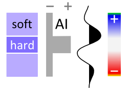
Polarity cartoons
/...it is good practice to state polarity explicitly in discussions of seismic data, with some phrase such as: 'increase in impedance downwards gives rise to a red (or blue, or black) loop.'
Bacon, Simm & Redshaw (2003), 3D Seismic Interpretation, Cambridge
Good practice, but what a mouthful. And perhaps because it is such a cumbersome convention, it is often ignored, assumed, or skipped. We'd like to change that. Polarity is important, everyone needs to know what the wiggles (or colours) of seismic data mean.
Two important things
Click the image to find your favorite colorbarSeismic data is about contrasts. The data are an abstraction of geological contrasts in the earth. To connect the data to the geology, there are two important things you need to know about your data:
What do the colours mean in terms of digits?
What do the digits mean in terms of impedance?
So whenever you show seismic to someone, you need to answers these questions for them. Show the colourbar, and the sign of the digits (the magnitude of the digits is not very important; amplitude are relative). Show the relationship between the sign of the digits and impedance.
Really useful
To help you show these things, we have created a table of polarity cartoons for some common colour scales.
Decide if you want to use the American–Canadian convention of a downwards increase in impedance resulting in a positive amplitude, or the opposite European–Australian convention. Sometimes people talk about SEG Normal polarity — the de facto SEG standard is the American convention.
Choose whether you want to show a high impedance layer sandwiched between low impedance ones, or vice versa. To make this decision, inspect your well ties or plot impedance against lithology. For example, if your sands are relatively fast and dense, you may want to choose the hard layer option.
Select a colourmap that matches your displays. If you need another, you can download and edit the SVG file, or email us and we'll add it for you.
Right-click on a thumbnail, copy it to your clipboard, and paste it into the corner of your section or timeslice in PowerPoint, Word, or wherever. If the thumbnail is too small or pixelated, click the thumbnail for higher resolution.
With so many options to choose from, we hope this little tool can help make your seismic discussions a little more transparent. What's more, if you see a seismic section without a legend like this, then are you sure the presenter knows about the polarity of their data? Perhaps they do, but it is an oversight to assume that you should know as well.
What do you make your audience assume?
UPDATE [2020] — we built a small web app to serve up fresh polarity cartoons, whenever you need them! Check it out.


 Except where noted, this content is licensed